
Creating Boxplots with the Seaborn Python Library | by Andy McDonald | Jul, 2022
A Quick Getting Started Guide for Seaborn Boxplots
Boxplots are a great statistical tool for visualising data and are commonly used during the Exploratory Data Analysis (EDA) phase of data science projects. They provide us with a quick statistical summary of the data, help us understand how data is distributed and help identify anomalous data points (outliers).
Within this short tutorial we are going to see how to generate boxplots using the popular Seaborn Python library.
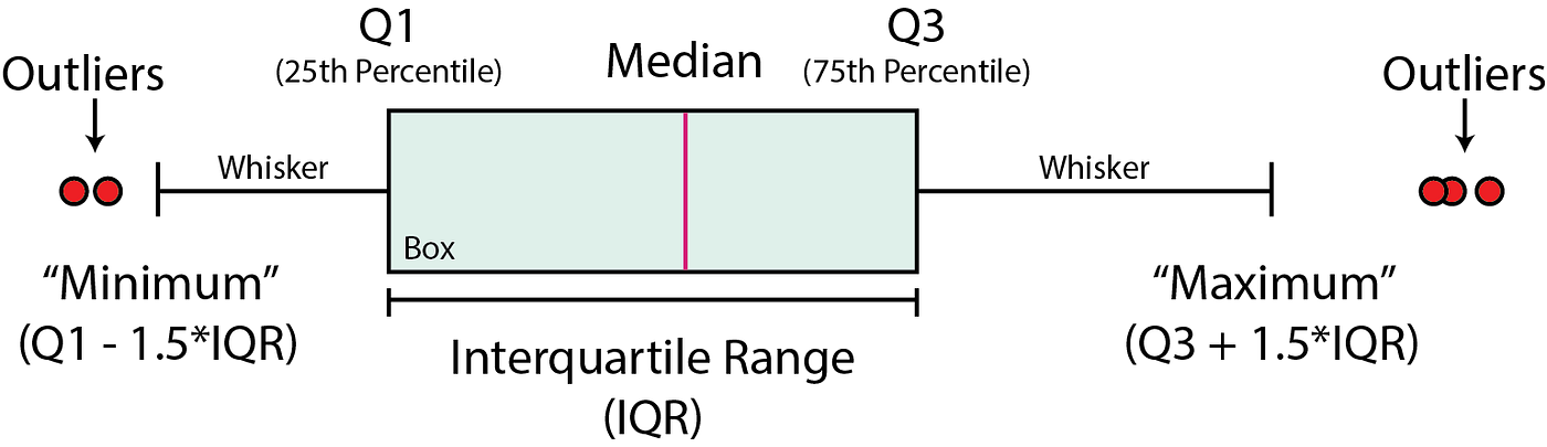
A boxplot is a graphical and standardised way to display the distribution of data based on five key numbers:
- “minimum”
- 1st Quartile (25th percentile)
- median (2nd Quartile/ 50th Percentile)
- 3rd Quartile (75th percentile)
- “maximum”
The minimum and maximum values are defined as Q1–1.5 * IQR and Q3 + 1.5 * IQR respectively. Any points that fall outside of these limits are referred to as outliers.
Boxplots can be used to:
- Identify outliers or anomalous data points
- To determine if our data is skewed
- To understand the spread/range of the data
To construct a boxplot, we first start with the median value (50th percentile). This represents the middle value within our data.
A box is then formed between the 25th and 75th percentiles (Q1 and Q3 respectively). The range represented by this box is known as the interquartile range (IQR).
From this box extends two lines, which are also known as the whiskers. These extend to Q1–1.5 * IQR and Q3 + 1.5 * IQR or to the last data point if it is less than this value.
Any points that fall beyond the whisker limits are known as outliers.
The dataset we are using for this tutorial is a subset of a training dataset used as part of a Machine Learning competition run by Xeek and FORCE 2020 (Bormann et al., 2020).
The full dataset can be accessed at the following link: https://doi.org/10.5281/zenodo.4351155.
The objective of the competition was to predict lithology from existing labelled data using well log measurements. The full dataset consists of 118 wells from the Norwegian Sea.
Additionally, you can download the subset of the data used in this tutorial from the GitHub Repository:
Seaborn is a high level data visualisation library that is built on top of matplotlib. It provides much easier to use syntax for creating more advanced plots. The default figures are also more visually appealing compared to matplotib
Importing Libraries and Data
To begin, we first need to import the libraries we are going to be working with: pandas for loading and storing our data, and Seaborn for visualising our data.
import seaborn as sns
import pandas as pd
Once the libraries are imported we can import the data from our CSV file and view the header.
df = pd.read_csv('Data/Xeek_train_subset_clean.csv')
df.head()

Within the dataset we have details about the well, geological grouping and formations, as well as our well logging measurements. Do not worry if you are not familiar with this data as the techniques below can be applied to any dataset.
Creating a Simple Boxplot
We can generate our first boxplot as follows. Within the brackets we pass in the column we want to access from the dataframe.
sns.boxplot(x=df['GR']);

We can also rotate our plot so that the box is vertical. In order to do this we provide a value for y instead of x.
sns.boxplot(y=df['GR']);

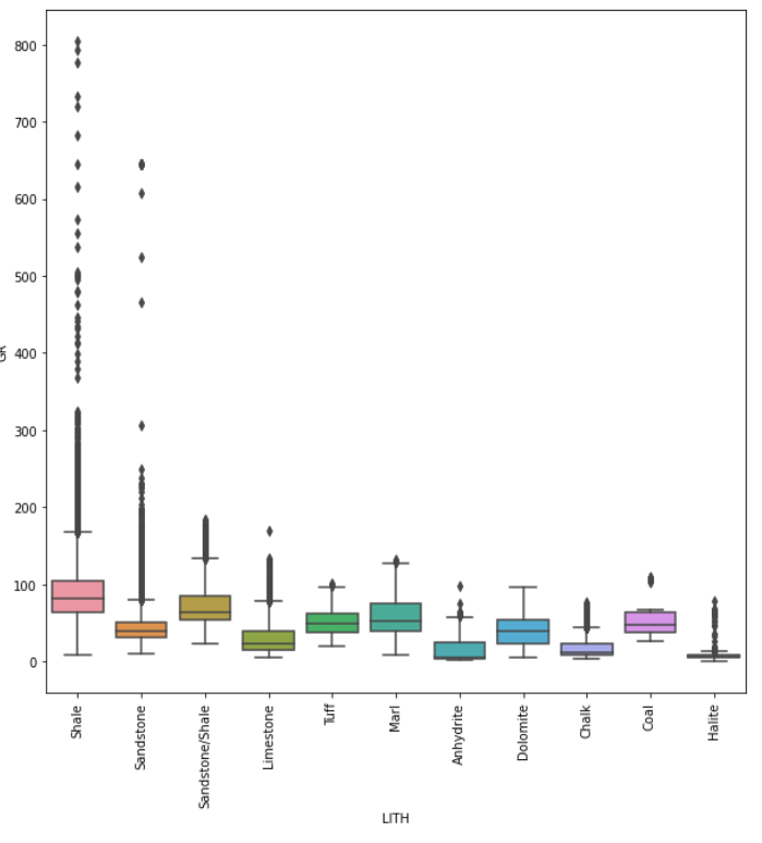
We can combine both the x and y arguments to create multiple box plots. In this example we are setting the y-axis to be GR (Gamma Ray), and that will be split into individual boxplots by the LITH (Lithology) column.
sns.boxplot( x=df['LITH'], y=df['GR']);

At face value we now have a figure with multiple boxplots split out by lithology. However, it is a little messy. We can tidy this up and make it much better with a few extra lines of code.
Changing Figure Size & Rotating x-axis Labels
As Seaborn is built on top of matplotlib, we can use the functionality of matplotlib to improve the quality of our plot.
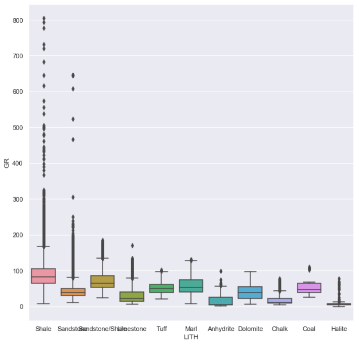
Using matplotlibs .subplots function we can define the size of our figure using figsize and also call upon elements of the figure such as the xticks. In the example below we have set the figure size to 10 by 10, and set the rotation of the xtick labels to 90 degrees.
import matplotlib.pyplot as pltfig, ax = plt.subplots(1, figsize=(10, 10))sns.boxplot(x=df['LITH'], y=df['GR']);
plt.xticks(rotation = 90)
plt.show()
When we run this code we get back a much easier to read figure.
Changing the Figure Size of a Seaborn Boxplot Method 2
An alternative way of changing the size of a Seaborn plot is to call upon sns.set(rc={“figure.figsize”:(10, 10)}). With this command we can easily change the size of the plot.
However, when we use this line it will set all subsequent plots to this size, which may not be ideal.
sns.set(rc={"figure.figsize":(10, 10)})
sns.boxplot( x=df['LITH'], y=df['GR']);
Seaborn comes with five preset styles (darkgrid, whitegrid, dark, white and ticks) that can transform the look of the entire plot in a quick and easy way.
To use one of these styles, we call upon sns.set_style() and pass in one of the styles as an argument. In this example we are going to use whitegrid.
sns.set_style('whitegrid')
sns.boxplot( y=df['LITH'], x=df['GR']);
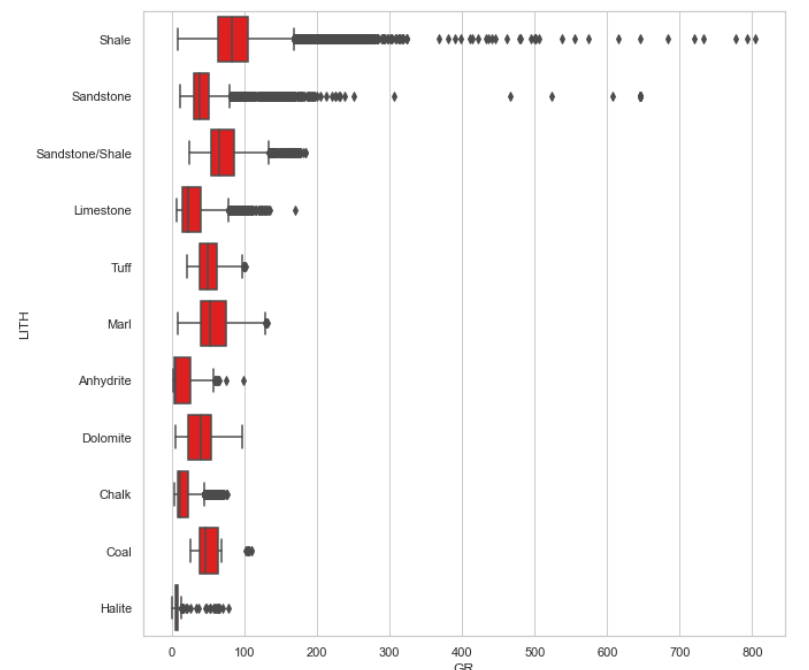
When we run the code we get the following plot. Note that I have also swapped the x and y axis so that the boxes are plotting horizontally.

If we want to change the colour of the boxplot boxes we simply use the color argument and pass in a colour of our choice.
sns.set_style('whitegrid')
sns.boxplot( y=df['LITH'], x=df['GR'], color='red');
This returns the following plot with red boxes.
Instead of a fixed colour, we can also apply a palette to the boxplot. This will make each of the boxes a different colour. In this example, we will call upon the Blues palette. You can more details about Seaborn palettes here.
sns.set_style('whitegrid')
sns.boxplot( y=df['LITH'], x=df['GR'], palette='Blues');

Styling the X-axis and Y-axis Labels of a Seaborn Plot
By default, Seaborn will use the column name for the axis labels.
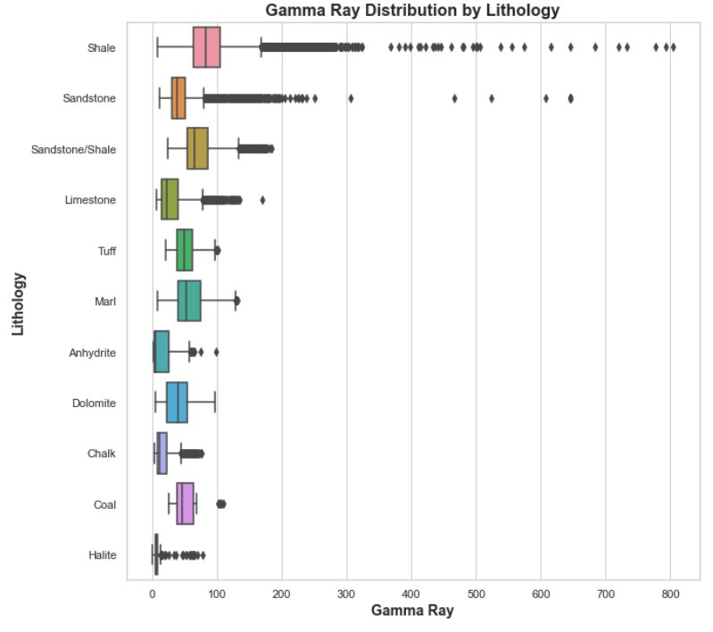
First we have to assign our boxplot to a variable, and then access the required functions: set_xlabel, set_y_label , and set_title. When we call upon these methods, we can also set the font size and the font weight.
p = sns.boxplot(y=df['LITH'], x=df['GR'])
p.set_xlabel('Gamma Ray', fontsize= 14, fontweight='bold')
p.set_ylabel('Lithology', fontsize= 14, fontweight='bold')
p.set_title('Gamma Ray Distribution by Lithology', fontsize= 16, fontweight='bold');
When we run this code we get back a much better looking plot with easy to read labels.
Styling the Outliers of a Seaborn Boxplot
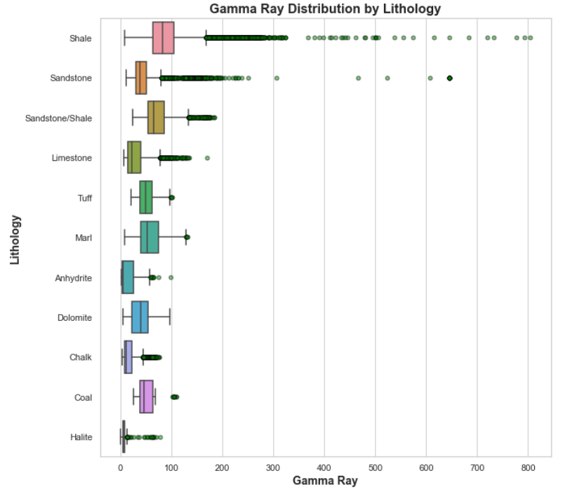
As well as being able to style the boxes, we can also style the outliers. In order to do this we need to create a dictionary of variables. In the example below we are going to change the marker shape (marker) , the size of the marker (markersize), the edge colour of the outlier (markeredgecolor) and the fill colour (markerfacecolor) and the outlier transparance (alpha).
flierprops = dict(marker='o', markersize=5, markeredgecolor='black', markerfacecolor='green', alpha=0.5)p = sns.boxplot(y=df['LITH'], x=df['GR'], flierprops=flierprops)
p.set_xlabel('Gamma Ray', fontsize= 14, fontweight='bold')
p.set_ylabel('Lithology', fontsize= 14, fontweight='bold')
p.set_title('Gamma Ray Distribution by Lithology', fontsize= 16, fontweight='bold');
In this short tutorial we have seen how to use the Python Seaborn library to generate basic boxplots of well log data and splitting it out by lithology. Seaborn provides much nicer plots straight out of the box compared to matplotlib.
We can use boxplots to visualise our data and understand the data’s range and distribution. However, they are an excellent tool for identifying outliers with your data.
A Quick Getting Started Guide for Seaborn Boxplots

Boxplots are a great statistical tool for visualising data and are commonly used during the Exploratory Data Analysis (EDA) phase of data science projects. They provide us with a quick statistical summary of the data, help us understand how data is distributed and help identify anomalous data points (outliers).
Within this short tutorial we are going to see how to generate boxplots using the popular Seaborn Python library.
A boxplot is a graphical and standardised way to display the distribution of data based on five key numbers:
- “minimum”
- 1st Quartile (25th percentile)
- median (2nd Quartile/ 50th Percentile)
- 3rd Quartile (75th percentile)
- “maximum”
The minimum and maximum values are defined as Q1–1.5 * IQR and Q3 + 1.5 * IQR respectively. Any points that fall outside of these limits are referred to as outliers.
Boxplots can be used to:
- Identify outliers or anomalous data points
- To determine if our data is skewed
- To understand the spread/range of the data
To construct a boxplot, we first start with the median value (50th percentile). This represents the middle value within our data.
A box is then formed between the 25th and 75th percentiles (Q1 and Q3 respectively). The range represented by this box is known as the interquartile range (IQR).
From this box extends two lines, which are also known as the whiskers. These extend to Q1–1.5 * IQR and Q3 + 1.5 * IQR or to the last data point if it is less than this value.
Any points that fall beyond the whisker limits are known as outliers.
The dataset we are using for this tutorial is a subset of a training dataset used as part of a Machine Learning competition run by Xeek and FORCE 2020 (Bormann et al., 2020).
The full dataset can be accessed at the following link: https://doi.org/10.5281/zenodo.4351155.
The objective of the competition was to predict lithology from existing labelled data using well log measurements. The full dataset consists of 118 wells from the Norwegian Sea.
Additionally, you can download the subset of the data used in this tutorial from the GitHub Repository:
Seaborn is a high level data visualisation library that is built on top of matplotlib. It provides much easier to use syntax for creating more advanced plots. The default figures are also more visually appealing compared to matplotib
Importing Libraries and Data
To begin, we first need to import the libraries we are going to be working with: pandas for loading and storing our data, and Seaborn for visualising our data.
import seaborn as sns
import pandas as pd
Once the libraries are imported we can import the data from our CSV file and view the header.
df = pd.read_csv('Data/Xeek_train_subset_clean.csv')
df.head()
Within the dataset we have details about the well, geological grouping and formations, as well as our well logging measurements. Do not worry if you are not familiar with this data as the techniques below can be applied to any dataset.
Creating a Simple Boxplot
We can generate our first boxplot as follows. Within the brackets we pass in the column we want to access from the dataframe.
sns.boxplot(x=df['GR']);
We can also rotate our plot so that the box is vertical. In order to do this we provide a value for y instead of x.
sns.boxplot(y=df['GR']);
We can combine both the x and y arguments to create multiple box plots. In this example we are setting the y-axis to be GR (Gamma Ray), and that will be split into individual boxplots by the LITH (Lithology) column.
sns.boxplot( x=df['LITH'], y=df['GR']);
At face value we now have a figure with multiple boxplots split out by lithology. However, it is a little messy. We can tidy this up and make it much better with a few extra lines of code.
Changing Figure Size & Rotating x-axis Labels
As Seaborn is built on top of matplotlib, we can use the functionality of matplotlib to improve the quality of our plot.
Using matplotlibs .subplots function we can define the size of our figure using figsize and also call upon elements of the figure such as the xticks. In the example below we have set the figure size to 10 by 10, and set the rotation of the xtick labels to 90 degrees.
import matplotlib.pyplot as pltfig, ax = plt.subplots(1, figsize=(10, 10))sns.boxplot(x=df['LITH'], y=df['GR']);
plt.xticks(rotation = 90)
plt.show()
When we run this code we get back a much easier to read figure.
Changing the Figure Size of a Seaborn Boxplot Method 2
An alternative way of changing the size of a Seaborn plot is to call upon sns.set(rc={“figure.figsize”:(10, 10)}). With this command we can easily change the size of the plot.
However, when we use this line it will set all subsequent plots to this size, which may not be ideal.
sns.set(rc={"figure.figsize":(10, 10)})
sns.boxplot( x=df['LITH'], y=df['GR']);
Seaborn comes with five preset styles (darkgrid, whitegrid, dark, white and ticks) that can transform the look of the entire plot in a quick and easy way.
To use one of these styles, we call upon sns.set_style() and pass in one of the styles as an argument. In this example we are going to use whitegrid.
sns.set_style('whitegrid')
sns.boxplot( y=df['LITH'], x=df['GR']);
When we run the code we get the following plot. Note that I have also swapped the x and y axis so that the boxes are plotting horizontally.
If we want to change the colour of the boxplot boxes we simply use the color argument and pass in a colour of our choice.
sns.set_style('whitegrid')
sns.boxplot( y=df['LITH'], x=df['GR'], color='red');
This returns the following plot with red boxes.
Instead of a fixed colour, we can also apply a palette to the boxplot. This will make each of the boxes a different colour. In this example, we will call upon the Blues palette. You can more details about Seaborn palettes here.
sns.set_style('whitegrid')
sns.boxplot( y=df['LITH'], x=df['GR'], palette='Blues');
Styling the X-axis and Y-axis Labels of a Seaborn Plot
By default, Seaborn will use the column name for the axis labels.
First we have to assign our boxplot to a variable, and then access the required functions: set_xlabel, set_y_label , and set_title. When we call upon these methods, we can also set the font size and the font weight.
p = sns.boxplot(y=df['LITH'], x=df['GR'])
p.set_xlabel('Gamma Ray', fontsize= 14, fontweight='bold')
p.set_ylabel('Lithology', fontsize= 14, fontweight='bold')
p.set_title('Gamma Ray Distribution by Lithology', fontsize= 16, fontweight='bold');
When we run this code we get back a much better looking plot with easy to read labels.
Styling the Outliers of a Seaborn Boxplot
As well as being able to style the boxes, we can also style the outliers. In order to do this we need to create a dictionary of variables. In the example below we are going to change the marker shape (marker) , the size of the marker (markersize), the edge colour of the outlier (markeredgecolor) and the fill colour (markerfacecolor) and the outlier transparance (alpha).
flierprops = dict(marker='o', markersize=5, markeredgecolor='black', markerfacecolor='green', alpha=0.5)p = sns.boxplot(y=df['LITH'], x=df['GR'], flierprops=flierprops)
p.set_xlabel('Gamma Ray', fontsize= 14, fontweight='bold')
p.set_ylabel('Lithology', fontsize= 14, fontweight='bold')
p.set_title('Gamma Ray Distribution by Lithology', fontsize= 16, fontweight='bold');
In this short tutorial we have seen how to use the Python Seaborn library to generate basic boxplots of well log data and splitting it out by lithology. Seaborn provides much nicer plots straight out of the box compared to matplotlib.
We can use boxplots to visualise our data and understand the data’s range and distribution. However, they are an excellent tool for identifying outliers with your data.
Denial of responsibility! Techno Blender is an automatic aggregator of the all world’s media. In each content, the hyperlink to the primary source is specified. All trademarks belong to their rightful owners, all materials to their authors. If you are the owner of the content and do not want us to publish your materials, please contact us by email – [email protected]. The content will be deleted within 24 hours.