
Exploring Brazil’s National Accounts through a Dashboard
Implementation details and analytical possibilities
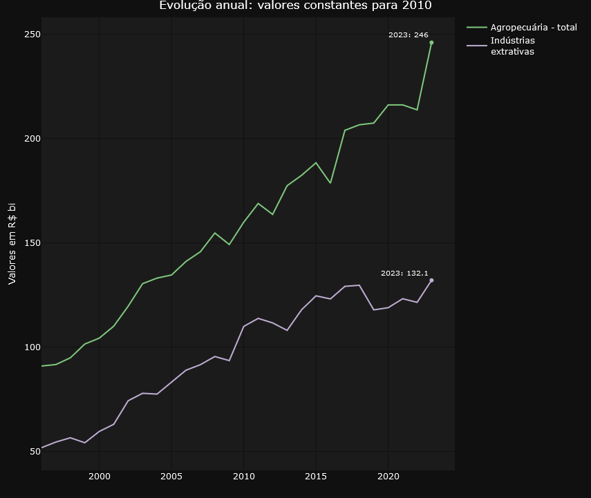
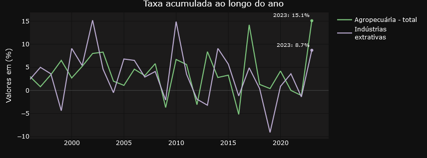
At the end of the first week of March 2024, the news revealed that Brazil’s GDP grew by almost 3% in 2023 compared to the previous year, reaching a total value of US$ 2,17 trillion. This advance placed the country in ninth position among the world’s largest economies, surpassing Canada. The analysis specifically indicates that a significant portion of this increase is attributed to the agricultural sector, which witnessed an impressive growth of 15,1%. This scenario arouses interest not only from investors but also from researchers, specialists, and governmental analysts who seek to understand not just the performance of the agricultural sector, but also industrial production, the services sector, exports, and imports, among other crucial elements that make up the National Accounts System (NAS)
The NAS, managed by the Brazilian Institute of Geography and Statistics (IBGE), is a vital source of information on the generation, distribution, and use of income in the country. Although the Institute offers an online platform for accessing NAS data, including filters and basic charts, many users face difficulties in navigation and analysis due to the lack of modern data visualization resources. The charts provided, while useful for a quick understanding of trends, often lack the quality needed to be included in detailed reports or articles, and cover a breadth of information that can be excessive for certain needs.
In light of these limitations, the initiative to develop a dashboard specifically on national accounts emerged, designed to meet the demands of users less familiar with the SCN structure. This dashboard allows simplified queries and analyses, presenting charts that address a selected set of issues related to the evolution of GDP and its components over the quarters and years since 1996. If you recognize the importance of national accounts data in your work or research and wish to explore how a dashboard can be constructed using the R language, understand the main technical and business challenges involved in implementing this solution, I invite you to enjoy the following paragraphs, try out the dashboard using this link, and explore the provided code.
The Origin of the Data
The data powering our dashboard are directly consumed from an API provided by the IBGE through the R package {sidrar}. This API grants access to a variety of tables associated with the national accounts, updated quarterly. For our analysis, we focus on two of these tables: “Current Prices” (table 1846) and “Quarterly Volume Index Variation Rate” (table 5932). These datasets provide a solid foundation for understanding not only the absolute values of the national accounts but also their growth trends and variations over time. It’s important to note that by using the API, the dashboard ensures that the data presented are always up to date.
For those who are interested in the R programming language, an opportunity to explore it further is present in the analysis of the code responsible for consuming data from the API. As usual in my texts, I share relevant excerpts from the code to enrich your understanding. However, if programming is not your focus, you can skip the code blocks without compromising your understanding of the text.
cnt_vt_precos_correntes<-
  get_sidra(x = 1846,
            period = lista_trimestres)

cnt_vt_precos_correntes <- janitor::clean_names(cnt_vt_precos_correntes)


cnt_taxa_variacao<-
    get_sidra(x = 5932,
            period = lista_trimestres
            )


cnt_taxa_variacao<- janitor::clean_names(cnt_taxa_variacao)
The get_sidra function extracts data from the System of National Accounts (SNA). To use it, the programmer only needs to indicate the name of the table (1846 for the first call and 5932 for the second) and the desired period, specified as a vector of quarters from 1996 to the last available quarter. See the example below.
 lista_trimestres
  [1] "199601" "199602" "199603" "199604" "199701" "199702" "199703" "199704" "199801" "199802" "199803" "199804" "199901"
 [14] "199902" "199903" "199904" "200001" "200002" "200003" "200004" "200101" "200102" "200103" "200104" "200201" "200202"
 [27] "200203" "200204" "200301" "200302" "200303" "200304" "200401" "200402" "200403" "200404" "200501" "200502" "200503"
 [40] "200504" "200601" "200602" "200603" "200604" "200701" "200702" "200703" "200704" "200801" "200802" "200803" "200804"
 [53] "200901" "200902" "200903" "200904" "201001" "201002" "201003" "201004" "201101" "201102" "201103" "201104" "201201"
 [66] "201202" "201203" "201204" "201301" "201302" "201303" "201304" "201401" "201402" "201403" "201404" "201501" "201502"
 [79] "201503" "201504" "201601" "201602" "201603" "201604" "201701" "201702" "201703" "201704" "201801" "201802" "201803"
 [92] "201804" "201901" "201902" "201903" "201904" "202001" "202002" "202003" "202004" "202101" "202102" "202103" "202104"
[105] "202201" "202202" "202203" "202204" "202301" "202302" "202303" "202304" "202401" "202402" "202403" "202404"
Technological Design
R developers often turn to Shiny to create interactive dashboards. This is an established product that offers extensive customization possibilities, making use of advanced user experience (UX) features. However, for those looking for more agile initial productivity, using Flexdashboard in conjunction with Shiny is a viable alternative. Although this approach may result in simpler, less customized interfaces, it is a choice that offers rapid implementation. To enhance the visual and professional appearance of applications developed with Flexdashboard, one option is to incorporate the {thematic} library. We chose to follow this approach in our dashboard, ensuring a refined and attractive appearance for users.
Below is a screenshot showing the product layout using the flexdashboard + shiny + thematic combination.
And below is a snippet of code where you can see the combination of libraries that allows the user to interact with the application components
library(flexdashboard)
library(plotly)
library(shiny)
library(purrr)

# Install thematic and un-comment for themed static plots (i.e., ggplot2)
 thematic::thematic_rmd(bg= "#101010", fg="#ffda00", accent = NA )
The choice of Plotly is shown above in the list of libraries invoked by the application. This decision stems from its distinctive features, especially with regard to user interaction. Plotly facilitates a fluid data visualization experience, highlighted by the feature that allows the user to explore the graph data by moving the mouse. In addition, this library offers the convenience of being able to download the figure in PNG format, as well as the ability to mark specific parts of the graph for zooming, providing greater utility to the interactive experience of the application’s users.
We should highlight:
- For all the charts is
- For all graphs it is possible to select more than one time series for simultaneous visualization
- To make the graphs easier to understand for audiences who will consume the graphs via printed text, it is possible to highlight points that may make sense for further analysis. In the example below, we see the impact of the pandemic in 2020, which caused the GDP figure to fall back to what it was in 2016..
- The data for each graph can be easily downloaded to the user’s environment using the download buttons.
Below are some codes that refer to what we are dealing with in this topic.
- Selecting multiple time series and periods to highlight using the input$account_year and input$year objects
  # Preparação dos dados
  dados_grafico_corrente_ano <<- cnt_vt_precos_correntes %>%
    filter(setores_e_subsetores %in% input$conta_ano) %>%
    inner_join(dados_pib) %>%
    mutate(data_nominal = gera_meses_trimestre(trimestre_codigo), # Essa função precisa ser definida ou alterada conforme o contexto
           setores_e_subsetores = str_wrap(setores_e_subsetores,20))  %>%
    group_by(ano = format(data_nominal, "%Y"),
             setores_e_subsetores) %>%
    summarize(data_nominal = min(data_nominal),
              valor = sum(valor),
              valor_pib = sum(valor_pib)) %>%
    ungroup() %>%
    mutate(valor_perc = ((valor/valor_pib))*100)


  sel_data <- dados_grafico_corrente_ano %>%
    filter(year(data_nominal) %in% input$ano)
- Downloading the data. Note the write.table function, which writes to a file the contents of the global object dados_grafico_corrente_ano generated in the code block above.
# Create placeholder for the downloadButton
uiOutput("downloadUI_conta_perc_ano")
# Create the actual downloadButton
output$downloadUI_conta_perc_ano <- renderUI( {
  downloadButton("download_conta_perc_ano","Download", style = "width:100%;")
})
output$download_conta_perc_ano<- downloadHandler(
  filename = function() {
    paste('dados_grafico_perc_ano',  '.csv', sep='')
  },
  content = function(file) {
    #dados_conta_trimestre_corrente <- graph_mapa_regic$data
    write.table(dados_grafico_corrente_ano, file, sep = ";",row.names = FALSE,fileEncoding = "UTF-8",dec=",")
  }
)
Business design
The application offers a choice of seven different types of graphs, allowing users to select the most suitable representation for analyzing and interpreting the information relevant to their decisions. This variety allows for a flexible approach, adaptable to different needs and visualization preferences.
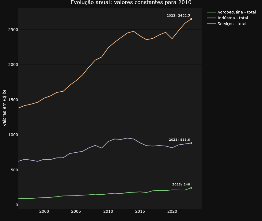
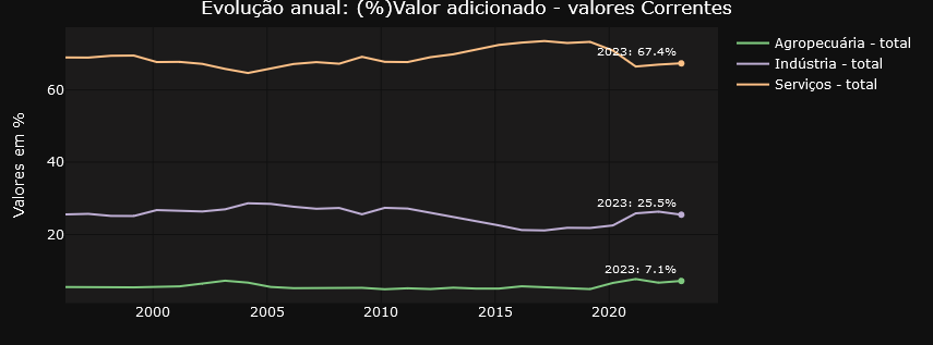
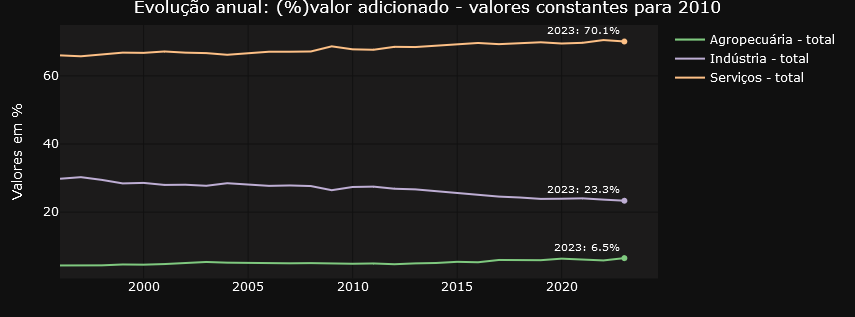
To make it easier to navigate and organize the graphs, the application divides them into two well-defined tabs. The “Annual Data” tab focuses on providing a panoramic view of evolution over time, with graphs highlighting annual changes in accounts. Here, users can analyze the annual evolution of the accounts in constant values for 2010, the annual evolution of the accounts in percentage of value added at current values and the annual evolution of the accounts in percentage of value added at constant values for 2010.
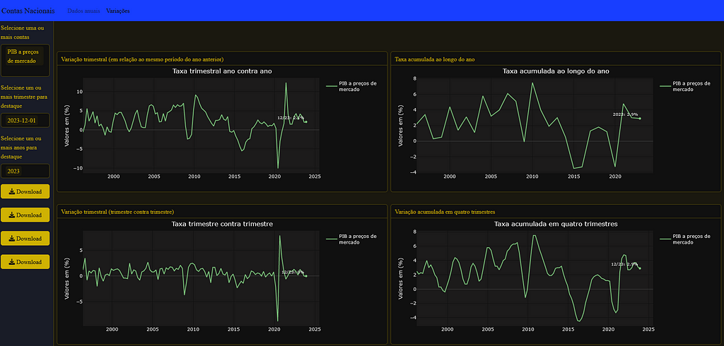
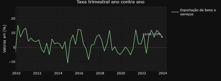
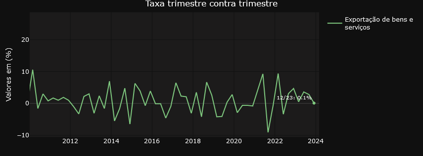
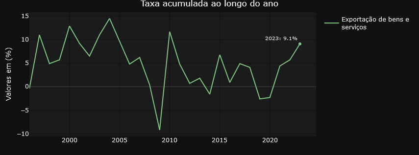
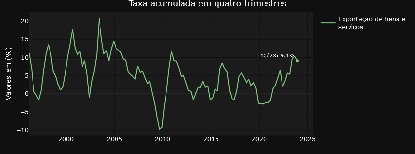
On the other hand, the “Variations” tab focuses on providing insights into the relative changes between different time periods. Users can examine in detail the quarterly variations in relation to the same period in the previous year, the quarterly variations quarter by quarter, the accumulated rate over the year and the accumulated variation over four quarters. This detailed, time-variant approach allows for a more granular analysis of trends and patterns in the data.
Transforming Economic Data
In general, the graphs on the Variations tab are filters on the result of the initial query using the API. The variables are selected from the Quarterly Volume Index Rate of Change table and the result dataset is used in the visualization structure. For those who like R, it’s something like the one below..
  dados_grafico_taxa_acum_ano<<-
    cnt_taxa_variacao %>%
    filter(setores_e_subsetores %in% input$conta_var,
           variavel_codigo == "6562") %>%
    mutate(data_nominal = gera_meses_trimestre(trimestre_codigo),
           setores_e_subsetores = str_wrap(setores_e_subsetores,20))
Note above the selection of variable 6562, which contains the accumulated variation data over four quarters. The dados_grafico_taxa_acum_ano object is used in the plot_ly function as the reference data for the graph.
The graphs displayed in the “Annual Data” tab undergo various transformations before being displayed on the screen. Of particular note is the calculation of constant values for the year 2010, which is used in two of the three annual data visualizations. This process requires the time series data for 2010 to be updated by the actual change in the selected account, both for previous and subsequent years. This requirement resulted in the need to develop complex functions to calculate the values prior to 2010, employing an inverse logic to that used for the years after this reference point, guaranteeing the consistency of the constant values. For a more in-depth understanding of the procedure adopted, we suggest analyzing the code presented below.
calcula_serie_constante<- function(tabela_taxa, tabela_precos, trimestres_filtro, conta, ano_referencia){

  # Preparação dos dados
  dados_grafico_acumulado_lab <- tabela_taxa %>%
    filter(setores_e_subsetores %in% conta, variavel_codigo == "6563", trimestre_codigo %in% trimestres_filtro) %>%
    mutate(data_nominal = gera_meses_trimestre(trimestre_codigo), setores_e_subsetores = str_wrap(setores_e_subsetores, 20), ano = year(data_nominal)) %>%
    select(ano, setores_e_subsetores, valor) %>%
    rename(variacao = valor)


  tabela_base <- tabela_precos %>%
    filter(setores_e_subsetores %in% conta) %>%
    mutate(data_nominal = gera_meses_trimestre(trimestre_codigo), setores_e_subsetores = str_wrap(setores_e_subsetores, 20), ano = as.numeric(format(data_nominal, "%Y"))) %>%
    summarise(valor = sum(valor), .by = c(setores_e_subsetores, ano)) %>%
    ungroup() %>%
    inner_join(dados_grafico_acumulado_lab, by = c("ano", "setores_e_subsetores"))


  dados_grafico_constante_ano <- unique(tabela_base$setores_e_subsetores) %>%
    map_dfr(function(setor) {
      tabela_anterior <- calcular_valor_referencia(tabela_base, setor, ano_referencia, "anterior")
      tabela_posterior <- calcular_valor_referencia(tabela_base, setor, ano_referencia, "posterior")

      bind_rows(tabela_anterior, tabela_posterior[-1, ]) %>%
        arrange(ano) %>%
        mutate(valor_constante = valor_referencia/10^3)})

}

# Função para otimizar a criação de tabelas e cálculo de valor_referencia
calcular_valor_referencia <- function(tabela_base, setor, ano_referencia, direcao) {

  if (direcao=="anterior"){
    tabela_filtrada <-
      tabela_base %>%
      filter(setores_e_subsetores == setor,
             ano <= ano_referencia) %>%
      arrange(desc(ano))


  } else{
    tabela_filtrada <-
      tabela_base %>%
      filter(setores_e_subsetores == setor,
             ano >= ano_referencia) %>%
      arrange(ano)

  }

  if(nrow(tabela_filtrada) > 1) {

    tabela_filtrada$valor_referencia <- NA
    tabela_filtrada$valor_referencia[1] <- tabela_filtrada$valor[1]

    ajuste <- if_else(direcao == "anterior", -1, 1)

    for(i in 2:nrow(tabela_filtrada)){

      if (ajuste==-1){

        tabela_filtrada$valor_referencia[i] <- tabela_filtrada$valor_referencia[i-1] * (1 + ajuste * (tabela_filtrada$variacao[i-1]/100))

      } else{

        tabela_filtrada$valor_referencia[i] <- tabela_filtrada$valor_referencia[i-1] * (1 + ajuste * (tabela_filtrada$variacao[i]/100))
      }

    }
  }

  return(tabela_filtrada)
}
The script above has two functions that together manipulate the current price and variation tables to generate the constant values before and after the 2010 reference year.
Some use cases.
To finish off the article, a short list of three use cases associated with the dashboard. The inspirations come straight from twitter.
https://medium.com/media/40145e7a3400fc2b2b2cadde53bcea50/href
The tweet from LCA Consultores deals with the participation of agriculture and the extractive industry in GDP expansion. In the dashboard we can easily identify the evolution of the volume of these elements in GDP and also check their annual variations.
Here’s another tweet, this time from Minister Esther Dweck.
https://medium.com/media/f5dd746e029c47fc81d9df73777a9146/href
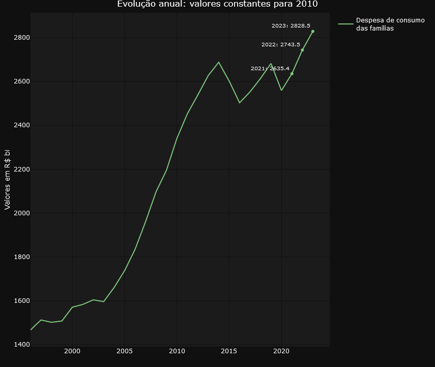
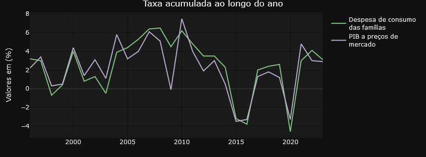
The GDP of agribusiness has already been explored in the previous tweet. What’s new here is the emphasis on household consumption. This is another account that is also tracked on the dashboard. See below.
Finally, it’s worth highlighting this tweet from Ricardo Bezerra below.
https://medium.com/media/78661a390b202ce509075052fd557415/href
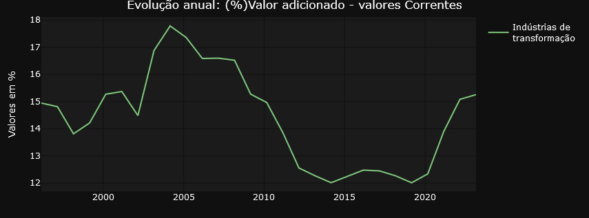
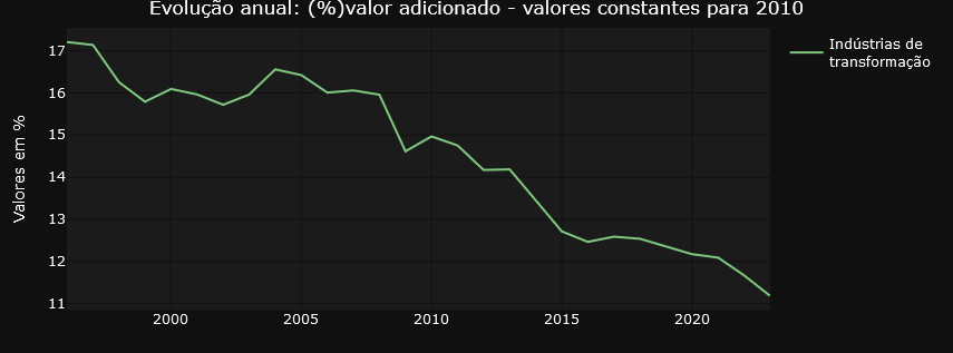
Ricardo Bezerra shows the importance of monitoring the share of the manufacturing industry in GDP (or value added). He highlights the significant differences that arise when using ratios based on current prices versus constant prices. The dashboard accurately and faithfully presents both curves drawn up by Ricardo, providing a detailed and clear representation of these variations.
Do you have your own use case? Why dont´t you try to navigate the dashboard using this link and then let me know about your experience?
Code and Data
The complete code is available at gist.
The datasets used in this text are characterized as public domain since they are data produced by federal government institutions, made available on the internet as active transparency, and are subject to the Brazilian FOIA.
IBGE: National Account System
Exploring Brazil’s National Accounts through a Dashboard was originally published in Towards Data Science on Medium, where people are continuing the conversation by highlighting and responding to this story.
Implementation details and analytical possibilities
At the end of the first week of March 2024, the news revealed that Brazil’s GDP grew by almost 3% in 2023 compared to the previous year, reaching a total value of US$ 2,17 trillion. This advance placed the country in ninth position among the world’s largest economies, surpassing Canada. The analysis specifically indicates that a significant portion of this increase is attributed to the agricultural sector, which witnessed an impressive growth of 15,1%. This scenario arouses interest not only from investors but also from researchers, specialists, and governmental analysts who seek to understand not just the performance of the agricultural sector, but also industrial production, the services sector, exports, and imports, among other crucial elements that make up the National Accounts System (NAS)
The NAS, managed by the Brazilian Institute of Geography and Statistics (IBGE), is a vital source of information on the generation, distribution, and use of income in the country. Although the Institute offers an online platform for accessing NAS data, including filters and basic charts, many users face difficulties in navigation and analysis due to the lack of modern data visualization resources. The charts provided, while useful for a quick understanding of trends, often lack the quality needed to be included in detailed reports or articles, and cover a breadth of information that can be excessive for certain needs.
In light of these limitations, the initiative to develop a dashboard specifically on national accounts emerged, designed to meet the demands of users less familiar with the SCN structure. This dashboard allows simplified queries and analyses, presenting charts that address a selected set of issues related to the evolution of GDP and its components over the quarters and years since 1996. If you recognize the importance of national accounts data in your work or research and wish to explore how a dashboard can be constructed using the R language, understand the main technical and business challenges involved in implementing this solution, I invite you to enjoy the following paragraphs, try out the dashboard using this link, and explore the provided code.
The Origin of the Data
The data powering our dashboard are directly consumed from an API provided by the IBGE through the R package {sidrar}. This API grants access to a variety of tables associated with the national accounts, updated quarterly. For our analysis, we focus on two of these tables: “Current Prices” (table 1846) and “Quarterly Volume Index Variation Rate” (table 5932). These datasets provide a solid foundation for understanding not only the absolute values of the national accounts but also their growth trends and variations over time. It’s important to note that by using the API, the dashboard ensures that the data presented are always up to date.
For those who are interested in the R programming language, an opportunity to explore it further is present in the analysis of the code responsible for consuming data from the API. As usual in my texts, I share relevant excerpts from the code to enrich your understanding. However, if programming is not your focus, you can skip the code blocks without compromising your understanding of the text.
cnt_vt_precos_correntes<-
  get_sidra(x = 1846,
            period = lista_trimestres)

cnt_vt_precos_correntes <- janitor::clean_names(cnt_vt_precos_correntes)


cnt_taxa_variacao<-
    get_sidra(x = 5932,
            period = lista_trimestres
            )


cnt_taxa_variacao<- janitor::clean_names(cnt_taxa_variacao)
The get_sidra function extracts data from the System of National Accounts (SNA). To use it, the programmer only needs to indicate the name of the table (1846 for the first call and 5932 for the second) and the desired period, specified as a vector of quarters from 1996 to the last available quarter. See the example below.
 lista_trimestres
  [1] "199601" "199602" "199603" "199604" "199701" "199702" "199703" "199704" "199801" "199802" "199803" "199804" "199901"
 [14] "199902" "199903" "199904" "200001" "200002" "200003" "200004" "200101" "200102" "200103" "200104" "200201" "200202"
 [27] "200203" "200204" "200301" "200302" "200303" "200304" "200401" "200402" "200403" "200404" "200501" "200502" "200503"
 [40] "200504" "200601" "200602" "200603" "200604" "200701" "200702" "200703" "200704" "200801" "200802" "200803" "200804"
 [53] "200901" "200902" "200903" "200904" "201001" "201002" "201003" "201004" "201101" "201102" "201103" "201104" "201201"
 [66] "201202" "201203" "201204" "201301" "201302" "201303" "201304" "201401" "201402" "201403" "201404" "201501" "201502"
 [79] "201503" "201504" "201601" "201602" "201603" "201604" "201701" "201702" "201703" "201704" "201801" "201802" "201803"
 [92] "201804" "201901" "201902" "201903" "201904" "202001" "202002" "202003" "202004" "202101" "202102" "202103" "202104"
[105] "202201" "202202" "202203" "202204" "202301" "202302" "202303" "202304" "202401" "202402" "202403" "202404"
Technological Design
R developers often turn to Shiny to create interactive dashboards. This is an established product that offers extensive customization possibilities, making use of advanced user experience (UX) features. However, for those looking for more agile initial productivity, using Flexdashboard in conjunction with Shiny is a viable alternative. Although this approach may result in simpler, less customized interfaces, it is a choice that offers rapid implementation. To enhance the visual and professional appearance of applications developed with Flexdashboard, one option is to incorporate the {thematic} library. We chose to follow this approach in our dashboard, ensuring a refined and attractive appearance for users.
Below is a screenshot showing the product layout using the flexdashboard + shiny + thematic combination.
And below is a snippet of code where you can see the combination of libraries that allows the user to interact with the application components
library(flexdashboard)
library(plotly)
library(shiny)
library(purrr)

# Install thematic and un-comment for themed static plots (i.e., ggplot2)
 thematic::thematic_rmd(bg= "#101010", fg="#ffda00", accent = NA )
The choice of Plotly is shown above in the list of libraries invoked by the application. This decision stems from its distinctive features, especially with regard to user interaction. Plotly facilitates a fluid data visualization experience, highlighted by the feature that allows the user to explore the graph data by moving the mouse. In addition, this library offers the convenience of being able to download the figure in PNG format, as well as the ability to mark specific parts of the graph for zooming, providing greater utility to the interactive experience of the application’s users.
We should highlight:
- For all the charts is
- For all graphs it is possible to select more than one time series for simultaneous visualization
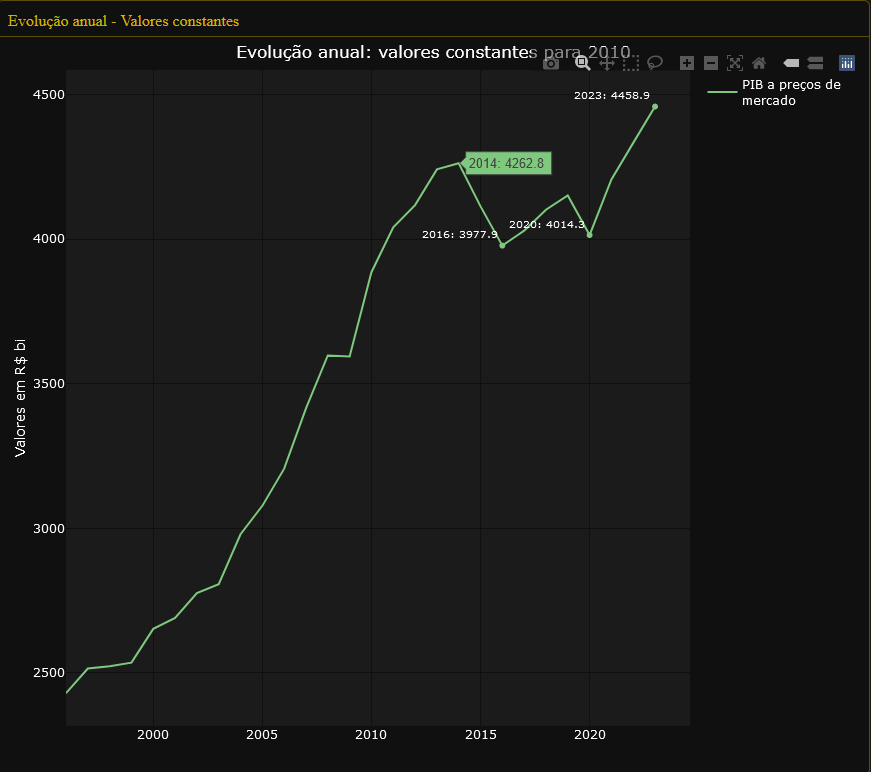
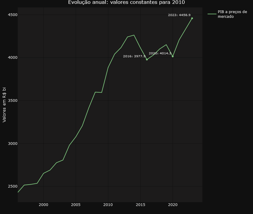
- To make the graphs easier to understand for audiences who will consume the graphs via printed text, it is possible to highlight points that may make sense for further analysis. In the example below, we see the impact of the pandemic in 2020, which caused the GDP figure to fall back to what it was in 2016..
- The data for each graph can be easily downloaded to the user’s environment using the download buttons.
Below are some codes that refer to what we are dealing with in this topic.
- Selecting multiple time series and periods to highlight using the input$account_year and input$year objects
  # Preparação dos dados
  dados_grafico_corrente_ano <<- cnt_vt_precos_correntes %>%
    filter(setores_e_subsetores %in% input$conta_ano) %>%
    inner_join(dados_pib) %>%
    mutate(data_nominal = gera_meses_trimestre(trimestre_codigo), # Essa função precisa ser definida ou alterada conforme o contexto
           setores_e_subsetores = str_wrap(setores_e_subsetores,20))  %>%
    group_by(ano = format(data_nominal, "%Y"),
             setores_e_subsetores) %>%
    summarize(data_nominal = min(data_nominal),
              valor = sum(valor),
              valor_pib = sum(valor_pib)) %>%
    ungroup() %>%
    mutate(valor_perc = ((valor/valor_pib))*100)


  sel_data <- dados_grafico_corrente_ano %>%
    filter(year(data_nominal) %in% input$ano)
- Downloading the data. Note the write.table function, which writes to a file the contents of the global object dados_grafico_corrente_ano generated in the code block above.
# Create placeholder for the downloadButton
uiOutput("downloadUI_conta_perc_ano")
# Create the actual downloadButton
output$downloadUI_conta_perc_ano <- renderUI( {
  downloadButton("download_conta_perc_ano","Download", style = "width:100%;")
})
output$download_conta_perc_ano<- downloadHandler(
  filename = function() {
    paste('dados_grafico_perc_ano',  '.csv', sep='')
  },
  content = function(file) {
    #dados_conta_trimestre_corrente <- graph_mapa_regic$data
    write.table(dados_grafico_corrente_ano, file, sep = ";",row.names = FALSE,fileEncoding = "UTF-8",dec=",")
  }
)
Business design
The application offers a choice of seven different types of graphs, allowing users to select the most suitable representation for analyzing and interpreting the information relevant to their decisions. This variety allows for a flexible approach, adaptable to different needs and visualization preferences.
To make it easier to navigate and organize the graphs, the application divides them into two well-defined tabs. The “Annual Data” tab focuses on providing a panoramic view of evolution over time, with graphs highlighting annual changes in accounts. Here, users can analyze the annual evolution of the accounts in constant values for 2010, the annual evolution of the accounts in percentage of value added at current values and the annual evolution of the accounts in percentage of value added at constant values for 2010.
On the other hand, the “Variations” tab focuses on providing insights into the relative changes between different time periods. Users can examine in detail the quarterly variations in relation to the same period in the previous year, the quarterly variations quarter by quarter, the accumulated rate over the year and the accumulated variation over four quarters. This detailed, time-variant approach allows for a more granular analysis of trends and patterns in the data.
Transforming Economic Data
In general, the graphs on the Variations tab are filters on the result of the initial query using the API. The variables are selected from the Quarterly Volume Index Rate of Change table and the result dataset is used in the visualization structure. For those who like R, it’s something like the one below..
  dados_grafico_taxa_acum_ano<<-
    cnt_taxa_variacao %>%
    filter(setores_e_subsetores %in% input$conta_var,
           variavel_codigo == "6562") %>%
    mutate(data_nominal = gera_meses_trimestre(trimestre_codigo),
           setores_e_subsetores = str_wrap(setores_e_subsetores,20))
Note above the selection of variable 6562, which contains the accumulated variation data over four quarters. The dados_grafico_taxa_acum_ano object is used in the plot_ly function as the reference data for the graph.
The graphs displayed in the “Annual Data” tab undergo various transformations before being displayed on the screen. Of particular note is the calculation of constant values for the year 2010, which is used in two of the three annual data visualizations. This process requires the time series data for 2010 to be updated by the actual change in the selected account, both for previous and subsequent years. This requirement resulted in the need to develop complex functions to calculate the values prior to 2010, employing an inverse logic to that used for the years after this reference point, guaranteeing the consistency of the constant values. For a more in-depth understanding of the procedure adopted, we suggest analyzing the code presented below.
calcula_serie_constante<- function(tabela_taxa, tabela_precos, trimestres_filtro, conta, ano_referencia){

  # Preparação dos dados
  dados_grafico_acumulado_lab <- tabela_taxa %>%
    filter(setores_e_subsetores %in% conta, variavel_codigo == "6563", trimestre_codigo %in% trimestres_filtro) %>%
    mutate(data_nominal = gera_meses_trimestre(trimestre_codigo), setores_e_subsetores = str_wrap(setores_e_subsetores, 20), ano = year(data_nominal)) %>%
    select(ano, setores_e_subsetores, valor) %>%
    rename(variacao = valor)


  tabela_base <- tabela_precos %>%
    filter(setores_e_subsetores %in% conta) %>%
    mutate(data_nominal = gera_meses_trimestre(trimestre_codigo), setores_e_subsetores = str_wrap(setores_e_subsetores, 20), ano = as.numeric(format(data_nominal, "%Y"))) %>%
    summarise(valor = sum(valor), .by = c(setores_e_subsetores, ano)) %>%
    ungroup() %>%
    inner_join(dados_grafico_acumulado_lab, by = c("ano", "setores_e_subsetores"))


  dados_grafico_constante_ano <- unique(tabela_base$setores_e_subsetores) %>%
    map_dfr(function(setor) {
      tabela_anterior <- calcular_valor_referencia(tabela_base, setor, ano_referencia, "anterior")
      tabela_posterior <- calcular_valor_referencia(tabela_base, setor, ano_referencia, "posterior")

      bind_rows(tabela_anterior, tabela_posterior[-1, ]) %>%
        arrange(ano) %>%
        mutate(valor_constante = valor_referencia/10^3)})

}

# Função para otimizar a criação de tabelas e cálculo de valor_referencia
calcular_valor_referencia <- function(tabela_base, setor, ano_referencia, direcao) {

  if (direcao=="anterior"){
    tabela_filtrada <-
      tabela_base %>%
      filter(setores_e_subsetores == setor,
             ano <= ano_referencia) %>%
      arrange(desc(ano))


  } else{
    tabela_filtrada <-
      tabela_base %>%
      filter(setores_e_subsetores == setor,
             ano >= ano_referencia) %>%
      arrange(ano)

  }

  if(nrow(tabela_filtrada) > 1) {

    tabela_filtrada$valor_referencia <- NA
    tabela_filtrada$valor_referencia[1] <- tabela_filtrada$valor[1]

    ajuste <- if_else(direcao == "anterior", -1, 1)

    for(i in 2:nrow(tabela_filtrada)){

      if (ajuste==-1){

        tabela_filtrada$valor_referencia[i] <- tabela_filtrada$valor_referencia[i-1] * (1 + ajuste * (tabela_filtrada$variacao[i-1]/100))

      } else{

        tabela_filtrada$valor_referencia[i] <- tabela_filtrada$valor_referencia[i-1] * (1 + ajuste * (tabela_filtrada$variacao[i]/100))
      }

    }
  }

  return(tabela_filtrada)
}
The script above has two functions that together manipulate the current price and variation tables to generate the constant values before and after the 2010 reference year.
Some use cases.
To finish off the article, a short list of three use cases associated with the dashboard. The inspirations come straight from twitter.
https://medium.com/media/40145e7a3400fc2b2b2cadde53bcea50/href
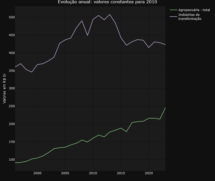
The tweet from LCA Consultores deals with the participation of agriculture and the extractive industry in GDP expansion. In the dashboard we can easily identify the evolution of the volume of these elements in GDP and also check their annual variations.
Here’s another tweet, this time from Minister Esther Dweck.
https://medium.com/media/f5dd746e029c47fc81d9df73777a9146/href
The GDP of agribusiness has already been explored in the previous tweet. What’s new here is the emphasis on household consumption. This is another account that is also tracked on the dashboard. See below.
Finally, it’s worth highlighting this tweet from Ricardo Bezerra below.
https://medium.com/media/78661a390b202ce509075052fd557415/href
Ricardo Bezerra shows the importance of monitoring the share of the manufacturing industry in GDP (or value added). He highlights the significant differences that arise when using ratios based on current prices versus constant prices. The dashboard accurately and faithfully presents both curves drawn up by Ricardo, providing a detailed and clear representation of these variations.
Do you have your own use case? Why dont´t you try to navigate the dashboard using this link and then let me know about your experience?
Code and Data
The complete code is available at gist.
The datasets used in this text are characterized as public domain since they are data produced by federal government institutions, made available on the internet as active transparency, and are subject to the Brazilian FOIA.
IBGE: National Account System
Exploring Brazil’s National Accounts through a Dashboard was originally published in Towards Data Science on Medium, where people are continuing the conversation by highlighting and responding to this story.
Denial of responsibility! Techno Blender is an automatic aggregator of the all world’s media. In each content, the hyperlink to the primary source is specified. All trademarks belong to their rightful owners, all materials to their authors. If you are the owner of the content and do not want us to publish your materials, please contact us by email – [email protected]. The content will be deleted within 24 hours.