
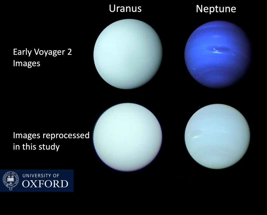
Neptune’s true colors showcased for first time in new image
When you think of Neptune, you probably think of a rich blue planet with swirls visible within it. However, that isn’t what Neptune looks like at all. In fact, the planet is more akin to the pale blue that we usually associate with Uranus. While that was noted when the first images of the planets were shared, it has since been lost in the excitement. Now, though, you can see Neptune’s true colors in a new image from the University of Oxford.
The new image showcases the two icy giants side by side, just like we’ve seen in earlier images of the two. And, based on the changes made by the team at the University of Oxford, the true colors of the planets make it a bit harder to see some of the other details on them.
But why would astronomers lie to us? Why would they make us believe that Neptune’s true color is this deep, rich blue when it’s really more of a pale blue? They didn’t. In fact, the original images were heavily captioned with information that the colors had been tweaked to show more of the planet’s details. Unfortunately, over time, that messaging has been lost in the mix.
This is why the University of Oxford decided to showcase the two planet’s true colors in this new image. Both planets are actually a greenish-blue color, with very similar makeup. This also helps address other arguments, including why Neptune is so much bluer. It’s really interesting to see these two planets in their true colors, though, and it also helps to highlight an important note that should be made with all images of the cosmos.
See, whenever space telescopes like James Webb capture images of a faraway galaxy, the astronomers who look at the images must interpret that data. While many follow similar models, the exact way they colorize these images can vary, thus providing us with different views of the same cosmic objects. That’s why Neptune’s true colors are so different from what we have been shown over the years.
It is important to note that any images of the cosmos that are shared are most likely not actually that color. This is just how the data has been interpreted to help showcase the various pieces of information and details visible in the data. So, while Webb’s image of the Pillars of Creation might be enthralling, that’s not actually what the cosmic object looks like.
Denial of responsibility! Techno Blender is an automatic aggregator of the all world’s media. In each content, the hyperlink to the primary source is specified. All trademarks belong to their rightful owners, all materials to their authors. If you are the owner of the content and do not want us to publish your materials, please contact us by email – [email protected]. The content will be deleted within 24 hours.