
Sample Seed pitch deck: Rypplzz’s $3m deck
This week, we’re taking a look at a pitch deck from Rypplzz (pronounced “ripples”), a spatial technology startup that recently raised $3 million. Rypplzz uses radio waves to provide location tracking since they are supposedly more precise and easier to work with than GPS. Venues like museums and sporting arenas can use its tech to help guide visitors through their space or deliver information depending on their location.
I have to admit, this deck didn’t set me alight, so I was a bit surprised by its success. Still, it’s worth exploring what could be improved here, so let’s dig in!
We’re looking for more unique pitch decks to tear down, so if you want to submit your own, here’s how you can do that.
Slides in this deck
Reading Rypplzz’ nine-slide deck might leave you a bit surprised. First, it doesn’t have much of the information you’d expect to see in a deck used to raise $3 million. There’s no slide about the team, none about the problem it’s tackling, no business model or pricing information, no competitive analysis, and no email to contact the CEO. As you’ll see below, the deck fails to answer many of the questions an investor would ask. Still as I’ve said before: Your deck is just one part of the fundraising puzzle.
The deck is also hefty, weighing a whopping 33MB — an awful lot for nine slides. As a rule, a pitch deck should never exceed 20MB because many email servers don’t like big attachments.
Here are the slides in the deck, minus some client names that the company redacted:
- Cover slide
- Product overview
- How it works
- Disrupting the augmented reality industry
- Market applications
- Physical and cyber security
- Current GTM partners/clients
- Investment proposition
- Closing slide
Three things I didn’t completely hate
I’m not going to sugarcoat this one: I honestly struggled to find three good slides that had useful information in an accessible form. This section is usually called “Three things I love,” but that would not be entirely honest in this case.
Still, it wasn’t all bad.
Exploring some use cases
[Slide 6] The text here is as legible as a doctor’s handwriting. Image Credits: Rypplzz
There’s a lot to struggle with on this slide: The text is almost unreadable on the messy background, and the center panel makes very little sense to me. Perhaps a voice-over could have helped, but slide decks should be able to stand by themselves most of the time. You won’t always have the luxury of being able to talk a potential investor through your deck.
That said, I did enjoy the two panels on the side here. Painting a picture of how a customer might use the product is a great way to help investors envision the various ways the new tech could be applied.
Product overview
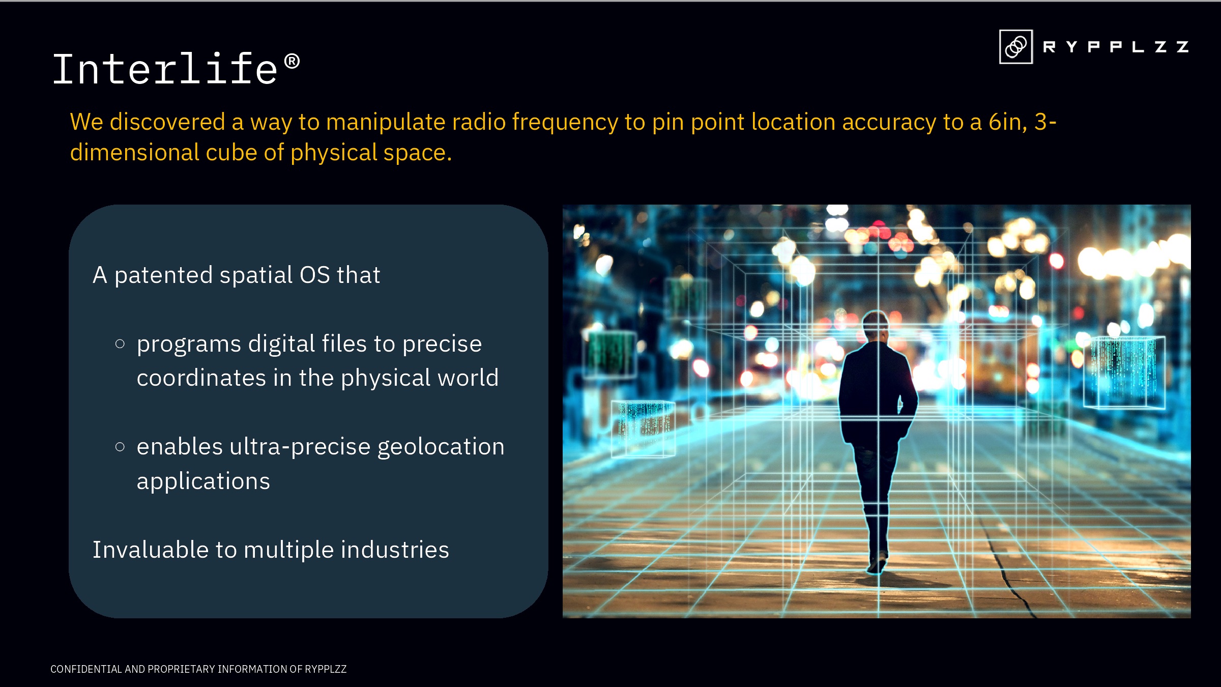
[Slide 2] Taking a closer look at the product. Image Credits: Rypplzz
Rypplzz’ deck doesn’t have an explicit problem slide, which would have been helpful for explaining the problem space the company sees itself operating in. The upshot is that this product slide has to do some heavy lifting and explain the problem, solution and product all at once. Sure, some companies can pull that off effectively, but I’m not sure that’s the case here.
While this slide explains what the product is and its capabilities, it falls short of being a comprehensive product slide. Investors often look for details like the product’s unique features, its development stage, and how it is different from the competition. Enhancing a product slide with these details can elevate the pitch and make it more compelling.
I do love the simplicity of this slide, though. It’s short, crisp and product-forward. It does make me wonder why they did it so, however. It’s great that the product can be useful for “multiple industries,” for example, but that would have been a great opportunity to share some examples.
The ask and use of funds

[Slide 8] Straight to the point. Image Credits: Rypplzz
I love the clarity of the ask here: Raising $3 million — no nonsense, no beating about the bush.
Of course, the “use of funds” part of this slide leaves quite a few things to be desired. It’s way too fuzzy:
- “Fulfill existing deployment contracts”: Be specific. How many? How much revenue will be unlocked once those contracts are fulfilled?
- “Capitalize on immediate opportunities”: That’s so vague and generic that literally every startup that has ever put together a deck could add that to their pitch. Which opportunities? Why? How does that de-risk the company and drive growth?
- “Stand up the infrastructure”: Well, obviously.
- “Additional patents”: Great, but how many and why?
In the rest of this teardown, we’ll take a look at three things Rypplzz could have improved or done differently, along with its full pitch deck!
This week, we’re taking a look at a pitch deck from Rypplzz (pronounced “ripples”), a spatial technology startup that recently raised $3 million. Rypplzz uses radio waves to provide location tracking since they are supposedly more precise and easier to work with than GPS. Venues like museums and sporting arenas can use its tech to help guide visitors through their space or deliver information depending on their location.
I have to admit, this deck didn’t set me alight, so I was a bit surprised by its success. Still, it’s worth exploring what could be improved here, so let’s dig in!
We’re looking for more unique pitch decks to tear down, so if you want to submit your own, here’s how you can do that.
Slides in this deck
Reading Rypplzz’ nine-slide deck might leave you a bit surprised. First, it doesn’t have much of the information you’d expect to see in a deck used to raise $3 million. There’s no slide about the team, none about the problem it’s tackling, no business model or pricing information, no competitive analysis, and no email to contact the CEO. As you’ll see below, the deck fails to answer many of the questions an investor would ask. Still as I’ve said before: Your deck is just one part of the fundraising puzzle.
The deck is also hefty, weighing a whopping 33MB — an awful lot for nine slides. As a rule, a pitch deck should never exceed 20MB because many email servers don’t like big attachments.
Here are the slides in the deck, minus some client names that the company redacted:
- Cover slide
- Product overview
- How it works
- Disrupting the augmented reality industry
- Market applications
- Physical and cyber security
- Current GTM partners/clients
- Investment proposition
- Closing slide
Three things I didn’t completely hate
I’m not going to sugarcoat this one: I honestly struggled to find three good slides that had useful information in an accessible form. This section is usually called “Three things I love,” but that would not be entirely honest in this case.
Still, it wasn’t all bad.
Exploring some use cases

[Slide 6] The text here is as legible as a doctor’s handwriting. Image Credits: Rypplzz
There’s a lot to struggle with on this slide: The text is almost unreadable on the messy background, and the center panel makes very little sense to me. Perhaps a voice-over could have helped, but slide decks should be able to stand by themselves most of the time. You won’t always have the luxury of being able to talk a potential investor through your deck.
That said, I did enjoy the two panels on the side here. Painting a picture of how a customer might use the product is a great way to help investors envision the various ways the new tech could be applied.
Product overview
[Slide 2] Taking a closer look at the product. Image Credits: Rypplzz
Rypplzz’ deck doesn’t have an explicit problem slide, which would have been helpful for explaining the problem space the company sees itself operating in. The upshot is that this product slide has to do some heavy lifting and explain the problem, solution and product all at once. Sure, some companies can pull that off effectively, but I’m not sure that’s the case here.
While this slide explains what the product is and its capabilities, it falls short of being a comprehensive product slide. Investors often look for details like the product’s unique features, its development stage, and how it is different from the competition. Enhancing a product slide with these details can elevate the pitch and make it more compelling.
I do love the simplicity of this slide, though. It’s short, crisp and product-forward. It does make me wonder why they did it so, however. It’s great that the product can be useful for “multiple industries,” for example, but that would have been a great opportunity to share some examples.
The ask and use of funds
[Slide 8] Straight to the point. Image Credits: Rypplzz
I love the clarity of the ask here: Raising $3 million — no nonsense, no beating about the bush.
Of course, the “use of funds” part of this slide leaves quite a few things to be desired. It’s way too fuzzy:
- “Fulfill existing deployment contracts”: Be specific. How many? How much revenue will be unlocked once those contracts are fulfilled?
- “Capitalize on immediate opportunities”: That’s so vague and generic that literally every startup that has ever put together a deck could add that to their pitch. Which opportunities? Why? How does that de-risk the company and drive growth?
- “Stand up the infrastructure”: Well, obviously.
- “Additional patents”: Great, but how many and why?
In the rest of this teardown, we’ll take a look at three things Rypplzz could have improved or done differently, along with its full pitch deck!
Denial of responsibility! Techno Blender is an automatic aggregator of the all world’s media. In each content, the hyperlink to the primary source is specified. All trademarks belong to their rightful owners, all materials to their authors. If you are the owner of the content and do not want us to publish your materials, please contact us by email – [email protected]. The content will be deleted within 24 hours.