
With One UI 6’s quick panel design, Samsung ignores its own principles
Have you seen the changelog for the Android 14 and One UI 6.0 update that Samsung is beta testing right now on many of its devices? The first bullet point in the changelog is about the new button layout for the quick panel, and how the new layout makes it “easier to access the features you use most” with dedicated Wi-Fi and Bluetooth buttons at the top and less frequently used buttons moved to the bottom.
But if Samsung had remembered one of One UI’s core principles when developing One UI 6, it probably would have realized that those dedicated buttons at the top of the quick panel are not an improvement. Why? On One UI 6.0, those buttons at the top of the quick panel stay at the top at all times, which completely destroys any notion of comfortable one-handed use.
One UI debuted in 2018 alongside Android 9 Pie, and one of its goals was to make it easier to use large phones with one hand. To achieve that goal, Samsung came up with the idea of pushing usable/clickable content inside settings menus and first-party apps down to the bottom half of the screen so you could access all interactive elements without having to adjust your grip or hold the device with two hands.
One UI 6 quick panel design isn’t good for one-handed use
And that’s where the redesigned quick panel in One UI 6.0 becomes a problem. Before One UI 6, expanding the quick panel would put the buttons in the lower half of the screen for easy access with your thumb. That’s no longer the case, so those dedicated buttons at the top that are supposed to make it “easier to access the features you use most” do the opposite and force you to awkwardly stretch your thumb or hold the phone in both hands.
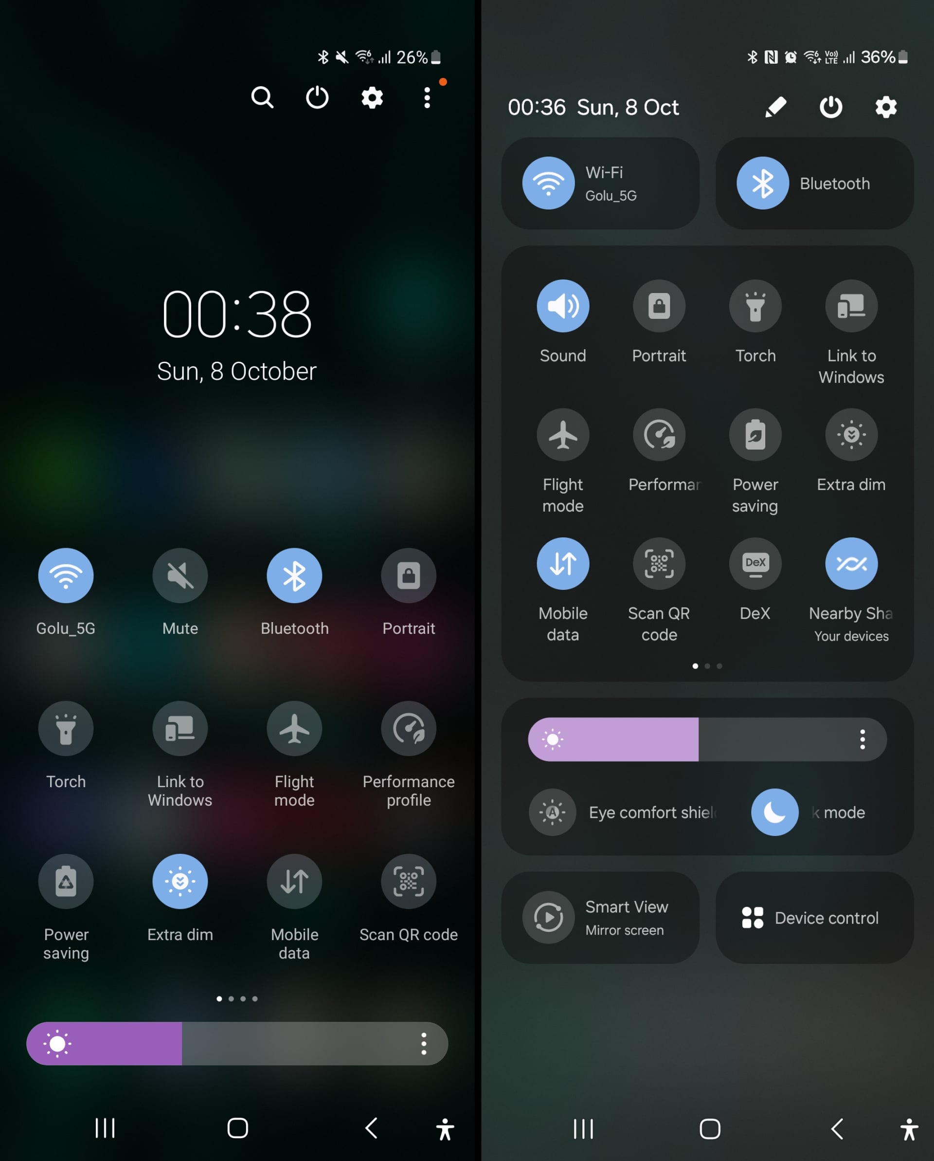
In fact, the One UI 6 quick panel even leaves some unused space at the bottom, as you can see in the image below that compares it with the One UI 5.1 quick panel (left).
It’s especially problematic if you use a Samsung foldable, which have taller screens than regular phones. On a Galaxy Z Fold, it’s not too much of an issue, at least on the narrow cover display. But the same can’t be said about the Galaxy Z Flip lineup, as the main display on a Galaxy Z Flip is both wide and tall, which will make things pretty inconvenient (though we will have to wait and see just how inconvenient it will be, as One UI 6 hasn’t been released for any Z Flip yet).
Unfortunately, it seems Samsung has prioritized form over function. The One UI 6 quick panel may look like an iOS rip-off, but if you ignore that part, the new design looks great. And, well, I do appreciate that the quick panel now shows a lot more buttons and controls than it did before and feels like a proper ‘control center’, if you know what I mean.
But it’s a good example of how Samsung has a problem sticking to its convictions, and its habit of making changes for the sake of change. One UI 6 has some neat new features and UI improvements, but the redesigned quick panel isn’t one of them, at least in my opinion.
Have you seen the changelog for the Android 14 and One UI 6.0 update that Samsung is beta testing right now on many of its devices? The first bullet point in the changelog is about the new button layout for the quick panel, and how the new layout makes it “easier to access the features you use most” with dedicated Wi-Fi and Bluetooth buttons at the top and less frequently used buttons moved to the bottom.
But if Samsung had remembered one of One UI’s core principles when developing One UI 6, it probably would have realized that those dedicated buttons at the top of the quick panel are not an improvement. Why? On One UI 6.0, those buttons at the top of the quick panel stay at the top at all times, which completely destroys any notion of comfortable one-handed use.
One UI debuted in 2018 alongside Android 9 Pie, and one of its goals was to make it easier to use large phones with one hand. To achieve that goal, Samsung came up with the idea of pushing usable/clickable content inside settings menus and first-party apps down to the bottom half of the screen so you could access all interactive elements without having to adjust your grip or hold the device with two hands.
One UI 6 quick panel design isn’t good for one-handed use
And that’s where the redesigned quick panel in One UI 6.0 becomes a problem. Before One UI 6, expanding the quick panel would put the buttons in the lower half of the screen for easy access with your thumb. That’s no longer the case, so those dedicated buttons at the top that are supposed to make it “easier to access the features you use most” do the opposite and force you to awkwardly stretch your thumb or hold the phone in both hands.
In fact, the One UI 6 quick panel even leaves some unused space at the bottom, as you can see in the image below that compares it with the One UI 5.1 quick panel (left).
It’s especially problematic if you use a Samsung foldable, which have taller screens than regular phones. On a Galaxy Z Fold, it’s not too much of an issue, at least on the narrow cover display. But the same can’t be said about the Galaxy Z Flip lineup, as the main display on a Galaxy Z Flip is both wide and tall, which will make things pretty inconvenient (though we will have to wait and see just how inconvenient it will be, as One UI 6 hasn’t been released for any Z Flip yet).
Unfortunately, it seems Samsung has prioritized form over function. The One UI 6 quick panel may look like an iOS rip-off, but if you ignore that part, the new design looks great. And, well, I do appreciate that the quick panel now shows a lot more buttons and controls than it did before and feels like a proper ‘control center’, if you know what I mean.
But it’s a good example of how Samsung has a problem sticking to its convictions, and its habit of making changes for the sake of change. One UI 6 has some neat new features and UI improvements, but the redesigned quick panel isn’t one of them, at least in my opinion.
Denial of responsibility! Techno Blender is an automatic aggregator of the all world’s media. In each content, the hyperlink to the primary source is specified. All trademarks belong to their rightful owners, all materials to their authors. If you are the owner of the content and do not want us to publish your materials, please contact us by email – [email protected]. The content will be deleted within 24 hours.