
4 Python Packages to Create Interactive Dashboards | by Cornellius Yudha Wijaya | May, 2022
Use these packages to improve your data science project
A data science project is inherently a storytelling project for your audience. It doesn’t matter how good your project is; if the other party doesn’t understand your data insight and findings, no action can be taken.
One way to present your project to the audience is by creating an interactive dashboard. Why interactive? Because the action was significantly remembered by the audience more than a static insight. That is why, if possible, creating a data science project into an interactive dashboard is advisable.
In this article, I want to outline 4 Python packages you could use to create an interactive dashboard for your data science project. What are these packages? Let’s get into it.
Ipywidgets (often shortened as Widgets) is an interactive package that provides HTML architecture for GUI within Jupyter Notebooks. The package allows us to create an interactive dashboard directly in our Jupyter Notebook cells. I would show the example in the GIF below.
With a few lines of code, you could improve your Jupyter Notebook as a dashboard. Let me show how we do that in a few lines of code.
First, we need to install the required packages.
pip install ipywidgets
Then we need to enable Ipywidgets in our Jupyter Notebook. To enable it, pass the following code in your command prompt.
jupyter nbextension enable --py widgetsnbextension
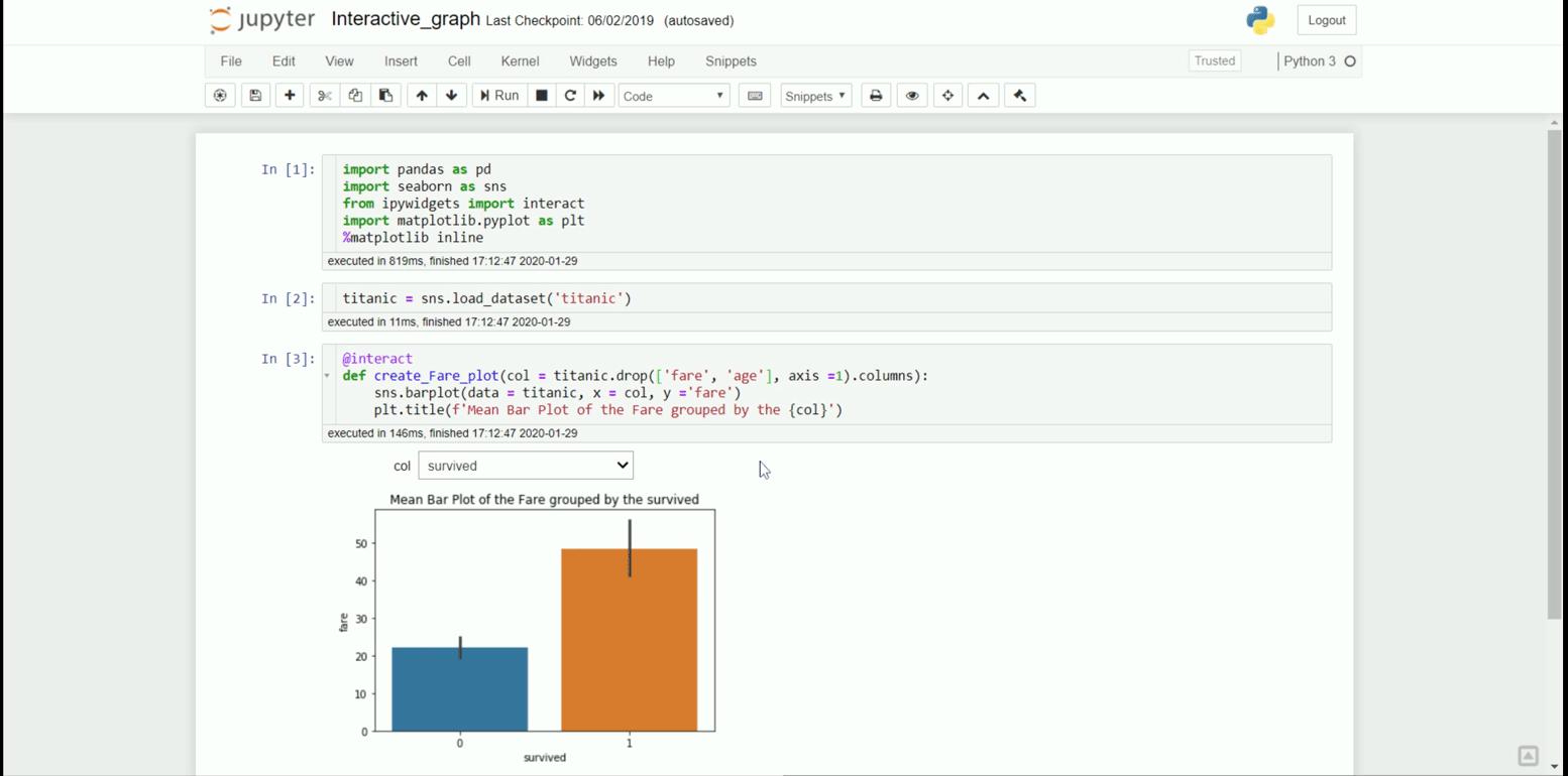
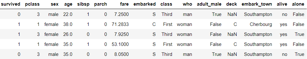
We could create our interactive dashboard in our Jupyter Notebook with all the necessary packages in place. For our example, I would use titanic sample data.
import seaborn as snstitanic = sns.load_dataset('titanic')
titanic.head()
With the dataset ready, we would create the interactive dashboard. For example, I want to create an interactive dashboard where I could get the titanic fare mean grouped by the categorical variable. In that case, I would use the following code.
#Creating the interactive dashboard
from ipywidgets import interact@interact
def create_fare_plot(col = titanic.drop(['fare', 'age'], axis =1).columns):
sns.barplot(data = titanic, x = col, y ='fare')
plt.title(f'Mean Bar Plot of the Fare grouped by the {col}')
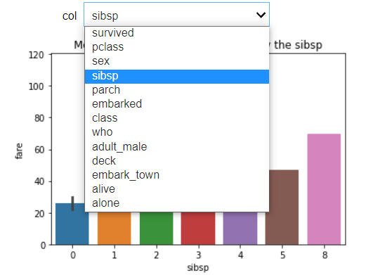
With the addition of @interact code, we initiate the interactive process. In the following code, you would begin the dashboard by creating a function to filter.
The code is simple and intuitive; however, it might not answer all the processes you need as Ipywidgest is only limited to your Jupyter Notebook. Let’s take a look at the other packages.
Voila-dashboards is a simple Python package that turns a simple Jupyter Notebook into a presentable web app dashboard. With a single line of installation code, we could quickly render our Jupyter Notebook. Let’s try to install the Voila dashboard.
pip install voila
When you have finished installing the Voila package, refresh your Jupyter Notebook and look at the notebook tabs. There you would find a new Voila button.
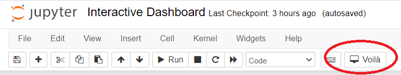
Now try to press the button, and you will automatically be taken to the other web page, which is the Voila dashboard.

Remember the previous interactive code I used to create the titanic dashboard with Piywidgets in the Jupyter Notebook? Now they were transformed into interactive dashboards outside of the Notebook. Furthermore, all the code we typed was not displayed on the Voila dashboard. This is good as we want to focus only on the result.
Voila-dashboards are enough for a simple Jupyter Notebook dashboard, but what if we want more flexibility? Let’s get into our next package.
Dash by Plotly is an open-source Python package to give an interactive dashboard using Python language and create the flexibility of creating a web application.
If you are not familiar with Plotly, it is an interactive visualization package. Dash is the low-code framework package to develop a web app based on the Plotly visualization.
To try out Dash, let’s install the package first.
pip install dash
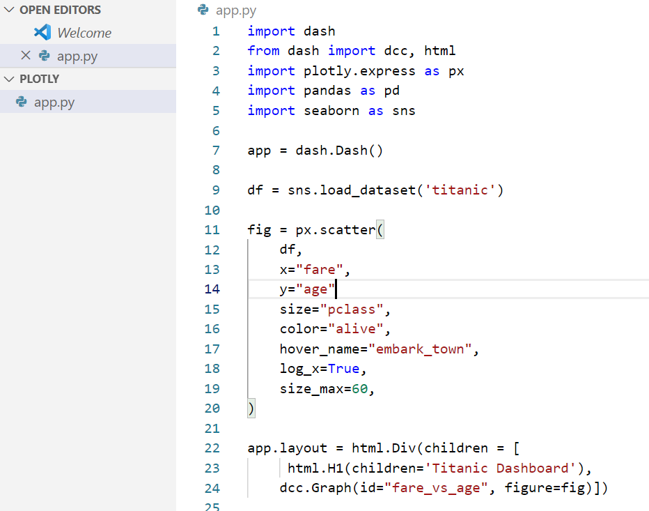
After the installation is finished, I would create a simple Titanic dashboard using the following code.
import dash
from dash import dcc, html
import plotly.express as px
import pandas as pd
import seaborn as snsapp = dash.Dash()df = sns.load_dataset('titanic')fig = px.scatter(
df,
x="fare",
y="age",
size="pclass",
color="alive",
hover_name="embark_town",
log_x=True,
size_max=60
)app.layout = html.Div(children = [
html.H1(children='Titanic Dashboard'),
dcc.Graph(id="fare_vs_age", figure=fig)])
if __name__ == "__main__":
app.run_server(debug=True)
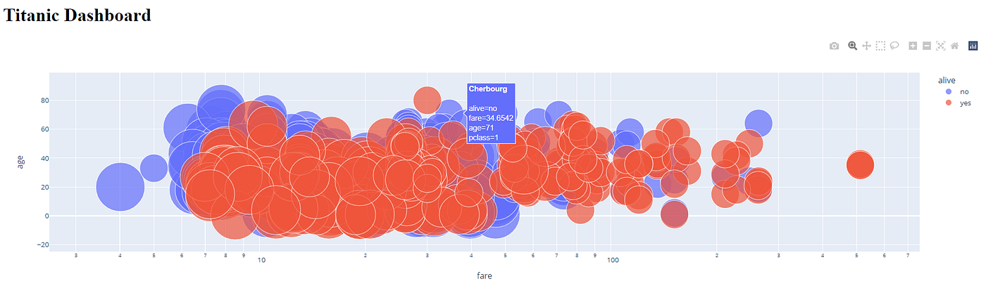
I run the above code with Visual Studio Code and save the script as app.py.
After running the above code, we would initiate the dashboard in the default (http://127.0.0.1:8050/), which you could change later.
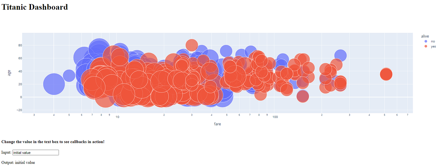
With an additional code, we could add a callback interactive to having input from the user with certain output.
import dash
from dash import dcc, html, Input, Output
import plotly.express as px
import pandas as pd
import seaborn as snsapp = dash.Dash()df = sns.load_dataset('titanic')fig = px.scatter(
df,
x="fare",
y="age",
size="pclass",
color="alive",
hover_name="embark_town",
log_x=True,
size_max=60
)app.layout = html.Div(children = [
html.H1(children='Titanic Dashboard'),
dcc.Graph(id="fare_vs_age", figure=fig),#Add interactive callback here
html.H4("Change the value in the text box to see callbacks in action"),
html.Div([
"Input: ",
dcc.Input(id='my-input', value='initial value', type='text')
]),
html.Br(),
html.Div(id='my-output'),
])@app.callback(
Output(component_id='my-output', component_property='children'),
Input(component_id='my-input', component_property='value')
)def update_output_div(input_value):
return f'Output: {input_value}'if __name__ == "__main__":
app.run_server(debug=True)
With some tweaks, we could improve our interactive process.
Dash by Plotly is handy in creating a dashboard as it offers many helpful APIs; however, sometimes, the code structure is hard to read as the language used is low-level. We would use another package to create our interactive dashboard to solve the problem.
What is Streamlit? Streamlit is an open-source Python package intended to create a web app for data scientists and machine learning projects. Below is an example data app you could make with Streamlit.
The APIs offered by Streamlit are easy to use by any beginner and are perfect for anyone who wants to build their data portfolio interactively. Moreover, Streamlit provides a free app deployment which we could utilize to spread our project online. Let’ss install the Streamlit package first.
pip install streamlit
With the installation process finished, we could create our interactive dashboard. Let me give you the code example below.
import streamlit as st
import pandas as pd
import plotly.express as px
import seaborn as snsdf = sns.load_dataset('titanic')st.title('Titanic Dashboard')st.subheader('Dataset')
st.dataframe(df)st.subheader('Data Numerical Statistic')
st.dataframe(df.describe())st.subheader('Data Visualization with respect to Survived')left_column, right_column = st.columns(2)with left_column:   'Numerical Plot'
num_feat = st.selectbox(
'Select Numerical Feature', df.select_dtypes('number').columns)    fig = px.histogram(df, x = num_feat, color = 'survived')    st.plotly_chart(fig, use_container_width=True)with right_column:   'Categorical column'
cat_feat = st.selectbox(
'Select Categorical Feature', df.select_dtypes(exclude =   'number').columns)
fig = px.histogram(df, x =cat_feat, color = 'survived' )st.plotly_chart(fig, use_container_width=True)
Using the Visual Studio Code, I saved the file as titanic_st.py, and I would run the file in the terminal using the following code.
streamlit run titanic_st.py
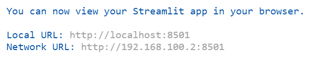
The Streamlit app now runs on the above address, you could choose either one, and we could access our dashboard.
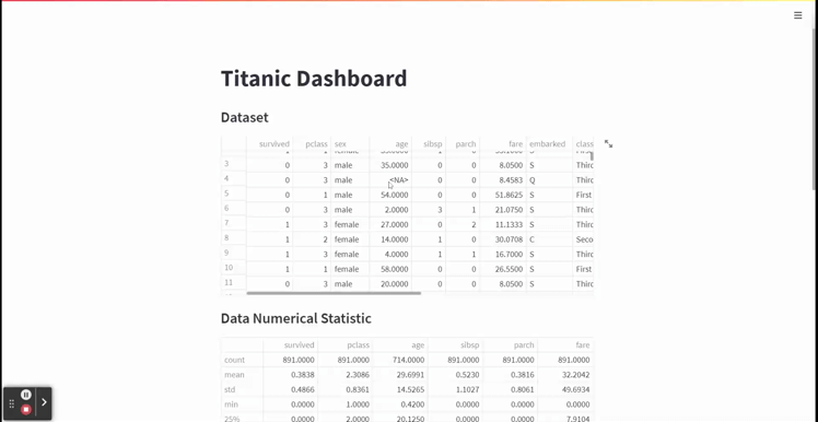
With the simple code above, we have created an interactive dashboard web app that is intuitive and smoothly runs in our browsers. The APIs are not hard to understand as we only use the least number of codes.
Streamlit also offers a free app deployment which you could utilize as your data science portfolio.
An interactive dashboard would improve the audience experience when you present your data science project. I have introduced 4 Python Packages you could use to create the interactive dashboard to make it easier. They are:
- Widgets
- Voila
- Dash by Plotly
- Streamlit
I hope it helps!
Use these packages to improve your data science project
A data science project is inherently a storytelling project for your audience. It doesn’t matter how good your project is; if the other party doesn’t understand your data insight and findings, no action can be taken.
One way to present your project to the audience is by creating an interactive dashboard. Why interactive? Because the action was significantly remembered by the audience more than a static insight. That is why, if possible, creating a data science project into an interactive dashboard is advisable.
In this article, I want to outline 4 Python packages you could use to create an interactive dashboard for your data science project. What are these packages? Let’s get into it.
Ipywidgets (often shortened as Widgets) is an interactive package that provides HTML architecture for GUI within Jupyter Notebooks. The package allows us to create an interactive dashboard directly in our Jupyter Notebook cells. I would show the example in the GIF below.
With a few lines of code, you could improve your Jupyter Notebook as a dashboard. Let me show how we do that in a few lines of code.
First, we need to install the required packages.
pip install ipywidgets
Then we need to enable Ipywidgets in our Jupyter Notebook. To enable it, pass the following code in your command prompt.
jupyter nbextension enable --py widgetsnbextension
We could create our interactive dashboard in our Jupyter Notebook with all the necessary packages in place. For our example, I would use titanic sample data.
import seaborn as snstitanic = sns.load_dataset('titanic')
titanic.head()
With the dataset ready, we would create the interactive dashboard. For example, I want to create an interactive dashboard where I could get the titanic fare mean grouped by the categorical variable. In that case, I would use the following code.
#Creating the interactive dashboard
from ipywidgets import interact@interact
def create_fare_plot(col = titanic.drop(['fare', 'age'], axis =1).columns):
sns.barplot(data = titanic, x = col, y ='fare')
plt.title(f'Mean Bar Plot of the Fare grouped by the {col}')
With the addition of @interact code, we initiate the interactive process. In the following code, you would begin the dashboard by creating a function to filter.
The code is simple and intuitive; however, it might not answer all the processes you need as Ipywidgest is only limited to your Jupyter Notebook. Let’s take a look at the other packages.
Voila-dashboards is a simple Python package that turns a simple Jupyter Notebook into a presentable web app dashboard. With a single line of installation code, we could quickly render our Jupyter Notebook. Let’s try to install the Voila dashboard.
pip install voila
When you have finished installing the Voila package, refresh your Jupyter Notebook and look at the notebook tabs. There you would find a new Voila button.
Now try to press the button, and you will automatically be taken to the other web page, which is the Voila dashboard.
Remember the previous interactive code I used to create the titanic dashboard with Piywidgets in the Jupyter Notebook? Now they were transformed into interactive dashboards outside of the Notebook. Furthermore, all the code we typed was not displayed on the Voila dashboard. This is good as we want to focus only on the result.
Voila-dashboards are enough for a simple Jupyter Notebook dashboard, but what if we want more flexibility? Let’s get into our next package.
Dash by Plotly is an open-source Python package to give an interactive dashboard using Python language and create the flexibility of creating a web application.
If you are not familiar with Plotly, it is an interactive visualization package. Dash is the low-code framework package to develop a web app based on the Plotly visualization.
To try out Dash, let’s install the package first.
pip install dash
After the installation is finished, I would create a simple Titanic dashboard using the following code.
import dash
from dash import dcc, html
import plotly.express as px
import pandas as pd
import seaborn as snsapp = dash.Dash()df = sns.load_dataset('titanic')fig = px.scatter(
df,
x="fare",
y="age",
size="pclass",
color="alive",
hover_name="embark_town",
log_x=True,
size_max=60
)app.layout = html.Div(children = [
html.H1(children='Titanic Dashboard'),
dcc.Graph(id="fare_vs_age", figure=fig)])
if __name__ == "__main__":
app.run_server(debug=True)
I run the above code with Visual Studio Code and save the script as app.py.
After running the above code, we would initiate the dashboard in the default (http://127.0.0.1:8050/), which you could change later.
With an additional code, we could add a callback interactive to having input from the user with certain output.
import dash
from dash import dcc, html, Input, Output
import plotly.express as px
import pandas as pd
import seaborn as snsapp = dash.Dash()df = sns.load_dataset('titanic')fig = px.scatter(
df,
x="fare",
y="age",
size="pclass",
color="alive",
hover_name="embark_town",
log_x=True,
size_max=60
)app.layout = html.Div(children = [
html.H1(children='Titanic Dashboard'),
dcc.Graph(id="fare_vs_age", figure=fig),#Add interactive callback here
html.H4("Change the value in the text box to see callbacks in action"),
html.Div([
"Input: ",
dcc.Input(id='my-input', value='initial value', type='text')
]),
html.Br(),
html.Div(id='my-output'),
])@app.callback(
Output(component_id='my-output', component_property='children'),
Input(component_id='my-input', component_property='value')
)def update_output_div(input_value):
return f'Output: {input_value}'if __name__ == "__main__":
app.run_server(debug=True)
With some tweaks, we could improve our interactive process.
Dash by Plotly is handy in creating a dashboard as it offers many helpful APIs; however, sometimes, the code structure is hard to read as the language used is low-level. We would use another package to create our interactive dashboard to solve the problem.
What is Streamlit? Streamlit is an open-source Python package intended to create a web app for data scientists and machine learning projects. Below is an example data app you could make with Streamlit.
The APIs offered by Streamlit are easy to use by any beginner and are perfect for anyone who wants to build their data portfolio interactively. Moreover, Streamlit provides a free app deployment which we could utilize to spread our project online. Let’ss install the Streamlit package first.
pip install streamlit
With the installation process finished, we could create our interactive dashboard. Let me give you the code example below.
import streamlit as st
import pandas as pd
import plotly.express as px
import seaborn as snsdf = sns.load_dataset('titanic')st.title('Titanic Dashboard')st.subheader('Dataset')
st.dataframe(df)st.subheader('Data Numerical Statistic')
st.dataframe(df.describe())st.subheader('Data Visualization with respect to Survived')left_column, right_column = st.columns(2)with left_column:   'Numerical Plot'
num_feat = st.selectbox(
'Select Numerical Feature', df.select_dtypes('number').columns)    fig = px.histogram(df, x = num_feat, color = 'survived')    st.plotly_chart(fig, use_container_width=True)with right_column:   'Categorical column'
cat_feat = st.selectbox(
'Select Categorical Feature', df.select_dtypes(exclude =   'number').columns)
fig = px.histogram(df, x =cat_feat, color = 'survived' )st.plotly_chart(fig, use_container_width=True)
Using the Visual Studio Code, I saved the file as titanic_st.py, and I would run the file in the terminal using the following code.
streamlit run titanic_st.py
The Streamlit app now runs on the above address, you could choose either one, and we could access our dashboard.
With the simple code above, we have created an interactive dashboard web app that is intuitive and smoothly runs in our browsers. The APIs are not hard to understand as we only use the least number of codes.
Streamlit also offers a free app deployment which you could utilize as your data science portfolio.
An interactive dashboard would improve the audience experience when you present your data science project. I have introduced 4 Python Packages you could use to create the interactive dashboard to make it easier. They are:
- Widgets
- Voila
- Dash by Plotly
- Streamlit
I hope it helps!
Denial of responsibility! Techno Blender is an automatic aggregator of the all world’s media. In each content, the hyperlink to the primary source is specified. All trademarks belong to their rightful owners, all materials to their authors. If you are the owner of the content and do not want us to publish your materials, please contact us by email – [email protected]. The content will be deleted within 24 hours.