
4 Quick Tricks For Better Plots in Matplotlib | by Brian Mattis | Jul, 2022
Easily adding arrows, multiple axes, gradient fill, and more
When we start learning data visualization methods with tools like matplotlib, we generally start with the simplest possible plots for ease of coding. However, as we begin sharing our visualizations with others, it’s important to customize our plots to craft our message and make everything more visually appealing.
Rather than create complex code and spending hours to make a plot look “just right,” we can drop in a couple of lines of code to make our plots more functional and help the data tell a story to our audience.
Here are 4 quick tips to add emphasis, functionality, and visual appeal to basic matplotlib line and bar plots:
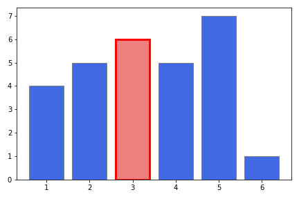
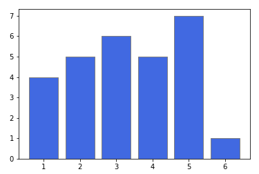
The goal is to make standalone plots that can tell a story, whether you’re there to present the slides or not. Before sharing a graph, you should be thinking “what conclusions do I want my audience to draw from this?” and “what part of the data do I really want them to notice?” To help with this, we can use lists to customize a large number of the tunable parameters that come with bar plots. What was color='blue' can become color=['blue', 'red', ...] with each entry indicating what to do with each bar in our plot.
As an example, a simple bar plot looks something like this:
However, if we wanted to draw attention to the third bar (for example), we can do that by changing the color, edgecolor, and linewidth inputs into lists:
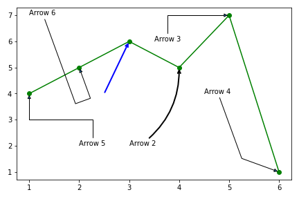
Line plots can be challenging to add emphasis. For line plots, simplest is usually best — adding an arrow pointing to a specific data point is a great way to pull the audience’s eyes. While matplotlib has a specific arrow function, it’s pretty inflexible and oddly challenging to get arrows to show up “just right”. A much simpler and quicker way to go is using the annotate function. Here, we get lots of functionality that is pretty intuitive. Our two main variables xytext and xy tell where the arrow starts and ends, respectively. The xytext is also the end of the arrow where text will be placed, should we choose to label the arrow (but we don’t have to!).
We can adjust the arrow properties using arrowprops=dict(), wherein we can use the standard keys like color, linewidth, and more. That gets you simple, straight lines — but things can get more interesting from there. We can adjust the shape of the arrowhead with arrowstyle (full list here), and also deviate from a straight arrow path. connectionstyle comes in three main flavors —
arc3— curved path where the degree of curvature is set in radians (rad). Play with positive and negativeradvalues to turn your curve from concave to convex. In a line plot with straight connections, adding a bit of curvature to the arrow path definitely helps it get noticed.angle— segments of the line drawn at a specified angles (angleA,angleB). The method is smart enough to make just about whatever angles you choose connect between your text andxycoordinates.bar— segments are kept at 90 degree bends of one-another, though the entire arrow can be based on a common angle. By playing withfractionhere we’re changing where the turn is in relation to the endpoints. Try negative values on the code below and see what happens!
Given the large number of varieties of arrows you can create, it’s best to experiment with the parameters to get exactly what you’re looking for. Here’s an example with 6 different arrows applied to our plot to help visualize what is possible.
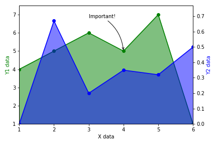
Overlaying multiple columns of data on a single plot can drive conclusions about the relationships between them. However, it’s rare that both columns operate on the same numerical scale, causing scaling issues where one of the lines hovers near the axis. To build a secondary y-axis, we use the twinx() function to create a secondary y-axis that shares the same x-axis. This secondary axis will automatically be positioned on the far right, and will be auto-scaled based on the data fed to this ax item. It is important to use color to help our audience understand which plot is associated with each axis. To really drive the point home, arrows can be added using the tricks we just learned.
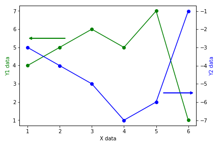
Side note: adding a secondary y-axis can also be easily done in native pandas, using the secondary_y = True attribute, yielding an almost identical result. If you’re curious, the code is here and the resulting plot is here.
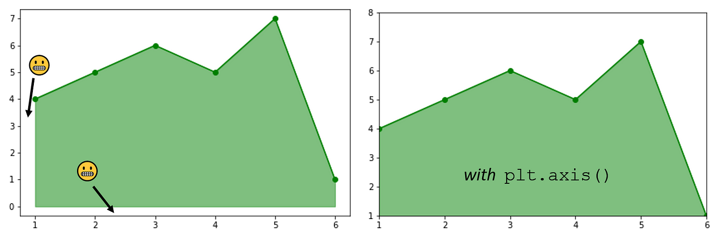
We can also add emphasis and general visual appeal to our line plots by filling in the region below the line. This is a quick addition using the fill_between() function where we indicate the x range that we want it to fill, and the two “lines” that we’d like to fill between. In this case, we’re wanting to fill between the data and the bottom of the plot (y=0 in this case). It’s also a good idea to set the plot area to match your data with plt.axis(), otherwise the color won’t continue to fill outside of your data range, leaving unsightly white areas in your plot.
We can push the limits a bit further — turning our fill into a color gradient. In this case, we have to get creative. imshow() is great for adding gradients, but it traditionally does it over our entire plot area. To overcome this, we add a gradient with imshow(), then use fill_between() to color everything above our line white. imshow() is a bit tricky to get off the ground, and I’ve gone into more depth of it in one of my prior articles linked here. However, the simple version has us set the range of the color map we’re using in X — here we choose a vertical color gradient using the bottom 80% of the cm.Blues color map with [[0.8, 0.8],[0,0]]. (A similar horizontal gradient could be achieved like this: X=[[0,0.8][0,0.8]]).
We also set the extent of the imshow() fill, effectively setting the bounding box for this gradient image fill. We can set the values manually, or use our min() and max() functions on our data series. These can be simply augmented to extend the plot region further down. Finally, we set the upper bound of the plot area in the fill_between() function, as we now go from our data to a the top of the plot (defined here as df.b.max()+0.5 ).

Taking what we’ve learned, we can now combine our methods to join two line plots using a secondary axis, while also adding fill and annotating an important point with an arrow.
With a few quick adjustments to our code we can add both emphasis and visual appeal to our matplotlib plots. Emphasized plots enable our data to speak for itself and can instantly drive others to focus on the data points that we think are worth paying attention to. Luckily, we can reach this goal with just a few lines of code!
As always, the entire code walk-through notebook can be snagged from my github. Please follow me if you found this useful! Cheers, and happy coding out there.
Easily adding arrows, multiple axes, gradient fill, and more
When we start learning data visualization methods with tools like matplotlib, we generally start with the simplest possible plots for ease of coding. However, as we begin sharing our visualizations with others, it’s important to customize our plots to craft our message and make everything more visually appealing.
Rather than create complex code and spending hours to make a plot look “just right,” we can drop in a couple of lines of code to make our plots more functional and help the data tell a story to our audience.
Here are 4 quick tips to add emphasis, functionality, and visual appeal to basic matplotlib line and bar plots:
The goal is to make standalone plots that can tell a story, whether you’re there to present the slides or not. Before sharing a graph, you should be thinking “what conclusions do I want my audience to draw from this?” and “what part of the data do I really want them to notice?” To help with this, we can use lists to customize a large number of the tunable parameters that come with bar plots. What was color='blue' can become color=['blue', 'red', ...] with each entry indicating what to do with each bar in our plot.
As an example, a simple bar plot looks something like this:
However, if we wanted to draw attention to the third bar (for example), we can do that by changing the color, edgecolor, and linewidth inputs into lists:
Line plots can be challenging to add emphasis. For line plots, simplest is usually best — adding an arrow pointing to a specific data point is a great way to pull the audience’s eyes. While matplotlib has a specific arrow function, it’s pretty inflexible and oddly challenging to get arrows to show up “just right”. A much simpler and quicker way to go is using the annotate function. Here, we get lots of functionality that is pretty intuitive. Our two main variables xytext and xy tell where the arrow starts and ends, respectively. The xytext is also the end of the arrow where text will be placed, should we choose to label the arrow (but we don’t have to!).
We can adjust the arrow properties using arrowprops=dict(), wherein we can use the standard keys like color, linewidth, and more. That gets you simple, straight lines — but things can get more interesting from there. We can adjust the shape of the arrowhead with arrowstyle (full list here), and also deviate from a straight arrow path. connectionstyle comes in three main flavors —
arc3— curved path where the degree of curvature is set in radians (rad). Play with positive and negativeradvalues to turn your curve from concave to convex. In a line plot with straight connections, adding a bit of curvature to the arrow path definitely helps it get noticed.angle— segments of the line drawn at a specified angles (angleA,angleB). The method is smart enough to make just about whatever angles you choose connect between your text andxycoordinates.bar— segments are kept at 90 degree bends of one-another, though the entire arrow can be based on a common angle. By playing withfractionhere we’re changing where the turn is in relation to the endpoints. Try negative values on the code below and see what happens!
Given the large number of varieties of arrows you can create, it’s best to experiment with the parameters to get exactly what you’re looking for. Here’s an example with 6 different arrows applied to our plot to help visualize what is possible.
Overlaying multiple columns of data on a single plot can drive conclusions about the relationships between them. However, it’s rare that both columns operate on the same numerical scale, causing scaling issues where one of the lines hovers near the axis. To build a secondary y-axis, we use the twinx() function to create a secondary y-axis that shares the same x-axis. This secondary axis will automatically be positioned on the far right, and will be auto-scaled based on the data fed to this ax item. It is important to use color to help our audience understand which plot is associated with each axis. To really drive the point home, arrows can be added using the tricks we just learned.
Side note: adding a secondary y-axis can also be easily done in native pandas, using the secondary_y = True attribute, yielding an almost identical result. If you’re curious, the code is here and the resulting plot is here.
We can also add emphasis and general visual appeal to our line plots by filling in the region below the line. This is a quick addition using the fill_between() function where we indicate the x range that we want it to fill, and the two “lines” that we’d like to fill between. In this case, we’re wanting to fill between the data and the bottom of the plot (y=0 in this case). It’s also a good idea to set the plot area to match your data with plt.axis(), otherwise the color won’t continue to fill outside of your data range, leaving unsightly white areas in your plot.
We can push the limits a bit further — turning our fill into a color gradient. In this case, we have to get creative. imshow() is great for adding gradients, but it traditionally does it over our entire plot area. To overcome this, we add a gradient with imshow(), then use fill_between() to color everything above our line white. imshow() is a bit tricky to get off the ground, and I’ve gone into more depth of it in one of my prior articles linked here. However, the simple version has us set the range of the color map we’re using in X — here we choose a vertical color gradient using the bottom 80% of the cm.Blues color map with [[0.8, 0.8],[0,0]]. (A similar horizontal gradient could be achieved like this: X=[[0,0.8][0,0.8]]).
We also set the extent of the imshow() fill, effectively setting the bounding box for this gradient image fill. We can set the values manually, or use our min() and max() functions on our data series. These can be simply augmented to extend the plot region further down. Finally, we set the upper bound of the plot area in the fill_between() function, as we now go from our data to a the top of the plot (defined here as df.b.max()+0.5 ).
Taking what we’ve learned, we can now combine our methods to join two line plots using a secondary axis, while also adding fill and annotating an important point with an arrow.
With a few quick adjustments to our code we can add both emphasis and visual appeal to our matplotlib plots. Emphasized plots enable our data to speak for itself and can instantly drive others to focus on the data points that we think are worth paying attention to. Luckily, we can reach this goal with just a few lines of code!
As always, the entire code walk-through notebook can be snagged from my github. Please follow me if you found this useful! Cheers, and happy coding out there.
Denial of responsibility! Techno Blender is an automatic aggregator of the all world’s media. In each content, the hyperlink to the primary source is specified. All trademarks belong to their rightful owners, all materials to their authors. If you are the owner of the content and do not want us to publish your materials, please contact us by email – [email protected]. The content will be deleted within 24 hours.