
A Data Person’s Guide to Tackling Analysis Paralysis
A simple and effective framework to build confidence in your data presentations
“If you can’t explain it simply, you don’t understand it well enough. “ — Albert Einstein
If you are a Data Person, it’s very much possible that you spend a substantial amount of time in your career going through various phases of lowered confidence levels in creating effective data presentations. We all get trained extensively in college, grad schools and boot camps on the various steps required to perform Data mining and gather insights from complex datasets. By the book, we know that you start with the Data Cleaning and preparation, then move on Data exploration and eventually to mining and finding patterns. But often times when we’re thrown into the real world with very real business problems we end up spending hours doubting our methodologies and sometimes the entire premise. Or even worse, get stuck in hours and hours of Analysis Paralysis. I’m sharing a simple framework to tackle this state of mind.
Note : Throughout the article, instead of interchangeably using the terms Data Analyst, Data Scientist, Data specialist, Data Subject Matter Expert etc. I’ll be using the term “Data Person”. No matter what our titles are, after all we’re curious humans with access to rich information trying to create impact with the data resources available to us.
- Frame the Business Questions in your own terms :
As a Data person, you will learn many data manipulation and scripting languages throughout your career. But understanding business questions and being able to interpret them in plain English is a skill that is much more essential. A Data person has the unique capability to dissect the problem statement and map them into data points available, make the connections and find answers. Here’s an example :
Question from stakeholder :”I don’t know why my customers aren’t converting more to subscription plans anymore since last quarter.”
Data person’s interpretation : “I’m looking for a downward trend in number of customers opting for subscription plans compared to one time purchases for the past three months.”
Data person’s Analysis Plan: “I can look into the mix of new vs. returning customers for the past few months and see what acquisition channels they’re coming from. I should also look if there are any drop offs in the subscription flow in our website, page by page. I should also check what regions stand out in the drop off rate.”
2. Identify the Stakeholders
Your main stakeholder is the person with the business question, but depending on what the data unveils there might be several other stakeholder groups that need to be included in your presentation audience. The Data literacy levels of your audience also dictates the language you use in your presentations. More importantly, you’d want to make sure that this group is willing to listen to your recommendations, so your data work can create the organization level impact it deserves.
3.Prepare your slides before you dive into the data
This seems counterintuitive and out of order, but preparing your slides with placeholders will ensure that you have a tentative list of the required data points ready before you venture out looking for them in your organization’s data sphere. This will also keep you focused on the problem statement without getting distracted by other interesting data points you discover. If something interesting comes up that doesn’t really align the with the problem statement, you can always save them for the appendix. Personally, I found this mindset shift game changing. Doing this step prior to Data exploration ensures that:
- You have a coherent data story in place that’s aligned with the problem statement can be edited later based on your findings from the analysis.
- You save yourself from getting into too many tangents and getting distracted by new and shiny data things. ( Yes, rich and clean datasets are a privilege. But it can lead to time consuming data rabbit holes when it prevents us from being focused on the purpose. )
A more in depth view of this step is being illustrated in the latter half of the article.
4.Resist the urge to include all the details from the Analysis and Methodology
This is the hardest step of all in my opinion. No matter how straightforward, the question is, the Data person spends a substantial amount of time in Data prep and exploration, before narrowing down the answer to a specific set of data points. It might have taken you several days or weeks to get a clean dataset prepared, your exploration steps may have involved several failed hypotheses and assumptions before landing on the answer. New and more interesting correlations may have emerged, but resist the urge to include it in your presentation if it doesn’t add any useful details to the data story you’re presenting.
5.Populate the slides
If you’ve gone through all the previous steps, it should be very easy to just the plug the numbers and findings in your slides.
I like to arrange them in the order of Problem, Problem’s Impact, Findings, Recommendations and Next steps. This ensures that your data story is easy to follow and speaks for itself even when you’re not around to narrate and walkthrough the whole deck.
The order may look different in other use cases such as routine performance updates or retrospective summaries. But for a typical request requiring data insights to aid decision making, this order is a great starting point. The main thing to ensure in this step is to have accurate and relevant data points that clearly supports your story. Apart from that, I have a few tips to help wrap up your Analysis solution neatly. These little details go a long way in presentation delivery and helping the audience remember the key insights.
- Clearly indicate if the key data point being shared is a good sign or bad sign by using arrows and colors. (Example : A low bounce rate is a good thing, but a low conversion rate is a bad sign.)
- Always add context for any number (data point) shared in the slide by including benchmarking details or trend analyses. ( Example : Conversion rate for this month was 12%, this is in line with other SKUs in the same product line and higher compared to the average conversion rate for the same months in the past three years.)
- Tie back the insights to the some part of the original business question in each slide.
- Including details such as sample size, analysis time frames and important annotations in the footnote will help build trust and credibility.
In addition to all of this, finding ways to create your own style of data story telling will help your work stand out among all other templated analysis deliveries.
You can’t always watermark your presentations you produce, but your story telling style along with the credibility you build using the techniques above will help people associate you with data excellence.
6.Document learnings
The easy and effective way to get better is by failing and documenting the learnings. As you get more opportunities to present your data work, don’t forget to document what worked and what did not. Soon enough, you’ll have a little inventory of types of visualizations, analyses and recommendations to include based on your audience and stakeholder group. The bigger this list gets, the more impactful your data presentations will become.
During my first few weeks as an Analytics intern, I felt very much out of place since most of the acquaintances I made in my cohort during the orientation chose a rotation track completely unrelated to data science. This was back in 2012, so I didn’t know enough to label my feelings as “Imposter syndrome”, but I started a little section on One Note to document all instances where my analyses were well received and the ones where I had to spend a lot of time on back and forth emails to explain what I meant in some of the slides. This exercise helped me understand that:
- If you’re not well aligned with the organizational priorities the stuff that you ( the data person) gets excited about are probably not the same stuff the audience get excited about.
(Almost a decade ago, I spent several weeks tracking down a data source that will gave me the ability to connect records from two different product lines and perform Look alike modeling. I was way too excited about it and spent several slides talking about how great that is and dedicated time to analyze it. But ultimately, since it did not have a direct tie to the company’s priorities for that quarter, none of my audience were able to share my level of enthusiasm. I now want to wrap a blanket on my past Junior Analyst self and tell them to zoom out and pay attention to the business briefings. )
- The audience for your Analyses presentations are not just the people in the meeting, it’s all the people to whom your presentation will get forwarded to in the organization. A data backed presentation with clear and concise observations and recommendation speaks for itself and has the potential to reach more decision makers.
These two learnings I documented during my beginner Analyst days has stayed with me for over a decade. What started as a simple habit has now grown into a big list of personal rules tailored towards specific audience in my organization which helps me make impactful presentations.
Let’s put this framework into action with an Example Scenario
Let’s look at a hypothetical business question and how the analysis solution-ing process would look like with and without these tactics.
Business Question : The Desktop and Mobile web experiences for an ecommerce office supplies store are disparate. (Let’s assume that this was the late 2000s and responsive web design wasn’t a thing. ) Your department leadership is wondering which redesign effort they should prioritize first and if that decision will affect revenue metrics.
Newbie Data Person’s Version :
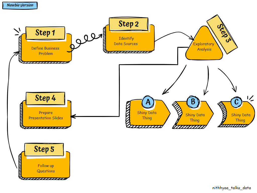
- Data person picks up the question.
- Scours the company data warehouse to identify data sources that contain details about each website visit. They have found a rich dataset which has about 30 attributes.
- They spend time exploring the dataset, and they find several new shiny data attributes.
Shiny thing 1: Mobile Device brands- Gets curious and looks for purchase patterns by Mobile Device brand. Secretly judges them. (No eye rolls, we’ve all done it.)
Shiny thing 2: Screen resolution — Gets curious to find out if User Engagement metrics are affected screen resolution.
Shiny thing 3: Mobile Device Brand — Gets curious to find out if “time to purchase” is lower for certain device brands.
Shiny thing 4: Demographic data — Gets curious to see purchase patterns through the lens of seven different user attributes.
4.Prepares the presentation slides : Proceeds to include all their learnings and analysis methodologies in the slides.
5.Business has more follow up questions since clear recommendations were not provided. Start again at step 1 for each follow up question.
Seasoned Data Person’s Version:
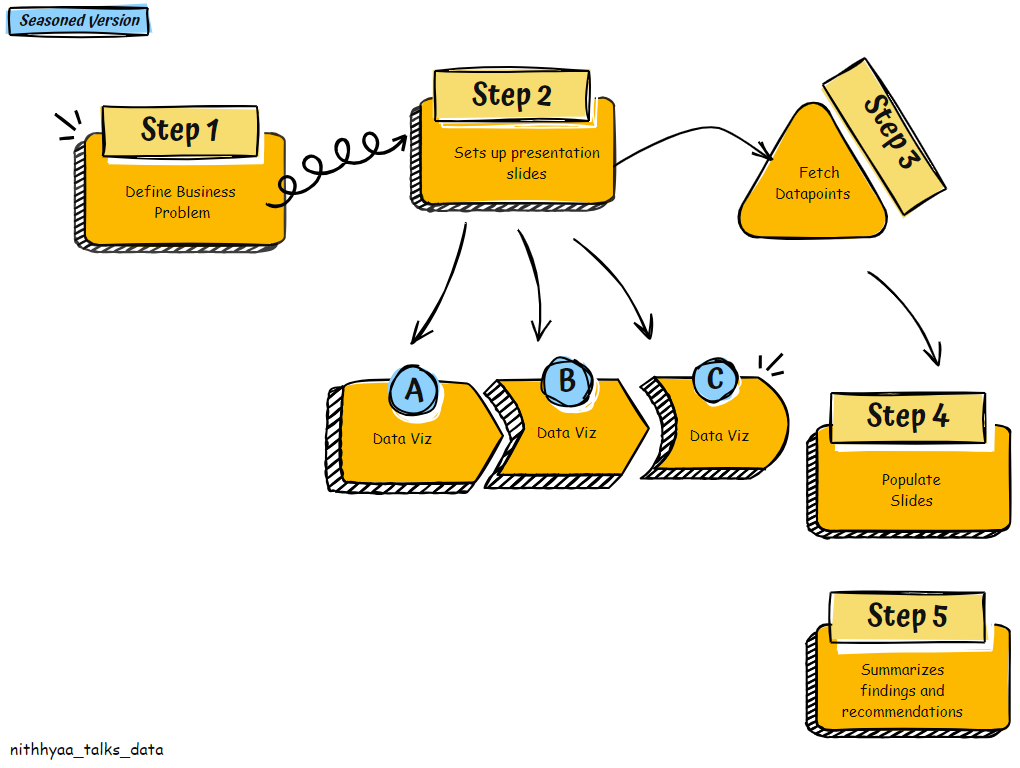
- Data person picks up the question.
- Sets up their presentation slides in the following order
Slide 1 : Business Question , Decision being influenced, Stakeholders
Slide 2: Data Visualizations representing the share of Visits by Desktop vs. Mobile and share of Conversions by Desktop vs. Mobile.
Slide 3 : Data Visualizations representing the share of New Customers vs. Returning Customers Overall and by each Device Type.
Slide 4: Data Visualizations representing the Device used on subsequent visits by the same user.
Slide 5: Place holders for Learnings and Recommendations
3.Identifies data sources and necessary attributes to populate the slides.
4. Populates the slides :Based on observations from slides 1–4, Data person illustrates that Returning users make up the major portion of their customer base. >70% of Returning orders are placed in a Desktop. While first orders are placed in Mobile devices, reorder requests are often processed via Desktop. So keeping an outdated Desktop experience would affect a major share of loyal customers. This helps the leadership conclude that they need to prioritize Desktop redesign efforts.
Conclusion :
In summary, Effective Data story telling is all about making difficult things look easy, so your data skills can empower decision making across the organization despite varying Data literacy levels.
About the Author :
Nithhyaa Ramamoorthy is a Data Subject matter Expert with over 12 years’ worth of experience in Analytics and Big Data, specifically in the intersection of healthcare and consumer behavior. She holds a Master’s Degree in Information Sciences and more recently a CSPO along with several other certifications. She is passionate about leveraging her analytics skills to drive business decisions that create inclusive and equitable digital products rooted in empathy. She currently serves as an Analytics Lead at the Mayo Clinic — Center for Digital Health.
A Data Person’s Guide to Tackling Analysis Paralysis was originally published in Towards Data Science on Medium, where people are continuing the conversation by highlighting and responding to this story.
A simple and effective framework to build confidence in your data presentations
“If you can’t explain it simply, you don’t understand it well enough. “ — Albert Einstein
If you are a Data Person, it’s very much possible that you spend a substantial amount of time in your career going through various phases of lowered confidence levels in creating effective data presentations. We all get trained extensively in college, grad schools and boot camps on the various steps required to perform Data mining and gather insights from complex datasets. By the book, we know that you start with the Data Cleaning and preparation, then move on Data exploration and eventually to mining and finding patterns. But often times when we’re thrown into the real world with very real business problems we end up spending hours doubting our methodologies and sometimes the entire premise. Or even worse, get stuck in hours and hours of Analysis Paralysis. I’m sharing a simple framework to tackle this state of mind.
Note : Throughout the article, instead of interchangeably using the terms Data Analyst, Data Scientist, Data specialist, Data Subject Matter Expert etc. I’ll be using the term “Data Person”. No matter what our titles are, after all we’re curious humans with access to rich information trying to create impact with the data resources available to us.
- Frame the Business Questions in your own terms :
As a Data person, you will learn many data manipulation and scripting languages throughout your career. But understanding business questions and being able to interpret them in plain English is a skill that is much more essential. A Data person has the unique capability to dissect the problem statement and map them into data points available, make the connections and find answers. Here’s an example :
Question from stakeholder :”I don’t know why my customers aren’t converting more to subscription plans anymore since last quarter.”
Data person’s interpretation : “I’m looking for a downward trend in number of customers opting for subscription plans compared to one time purchases for the past three months.”
Data person’s Analysis Plan: “I can look into the mix of new vs. returning customers for the past few months and see what acquisition channels they’re coming from. I should also look if there are any drop offs in the subscription flow in our website, page by page. I should also check what regions stand out in the drop off rate.”
2. Identify the Stakeholders
Your main stakeholder is the person with the business question, but depending on what the data unveils there might be several other stakeholder groups that need to be included in your presentation audience. The Data literacy levels of your audience also dictates the language you use in your presentations. More importantly, you’d want to make sure that this group is willing to listen to your recommendations, so your data work can create the organization level impact it deserves.
3.Prepare your slides before you dive into the data
This seems counterintuitive and out of order, but preparing your slides with placeholders will ensure that you have a tentative list of the required data points ready before you venture out looking for them in your organization’s data sphere. This will also keep you focused on the problem statement without getting distracted by other interesting data points you discover. If something interesting comes up that doesn’t really align the with the problem statement, you can always save them for the appendix. Personally, I found this mindset shift game changing. Doing this step prior to Data exploration ensures that:
- You have a coherent data story in place that’s aligned with the problem statement can be edited later based on your findings from the analysis.
- You save yourself from getting into too many tangents and getting distracted by new and shiny data things. ( Yes, rich and clean datasets are a privilege. But it can lead to time consuming data rabbit holes when it prevents us from being focused on the purpose. )
A more in depth view of this step is being illustrated in the latter half of the article.
4.Resist the urge to include all the details from the Analysis and Methodology
This is the hardest step of all in my opinion. No matter how straightforward, the question is, the Data person spends a substantial amount of time in Data prep and exploration, before narrowing down the answer to a specific set of data points. It might have taken you several days or weeks to get a clean dataset prepared, your exploration steps may have involved several failed hypotheses and assumptions before landing on the answer. New and more interesting correlations may have emerged, but resist the urge to include it in your presentation if it doesn’t add any useful details to the data story you’re presenting.
5.Populate the slides
If you’ve gone through all the previous steps, it should be very easy to just the plug the numbers and findings in your slides.
I like to arrange them in the order of Problem, Problem’s Impact, Findings, Recommendations and Next steps. This ensures that your data story is easy to follow and speaks for itself even when you’re not around to narrate and walkthrough the whole deck.
The order may look different in other use cases such as routine performance updates or retrospective summaries. But for a typical request requiring data insights to aid decision making, this order is a great starting point. The main thing to ensure in this step is to have accurate and relevant data points that clearly supports your story. Apart from that, I have a few tips to help wrap up your Analysis solution neatly. These little details go a long way in presentation delivery and helping the audience remember the key insights.
- Clearly indicate if the key data point being shared is a good sign or bad sign by using arrows and colors. (Example : A low bounce rate is a good thing, but a low conversion rate is a bad sign.)
- Always add context for any number (data point) shared in the slide by including benchmarking details or trend analyses. ( Example : Conversion rate for this month was 12%, this is in line with other SKUs in the same product line and higher compared to the average conversion rate for the same months in the past three years.)
- Tie back the insights to the some part of the original business question in each slide.
- Including details such as sample size, analysis time frames and important annotations in the footnote will help build trust and credibility.
In addition to all of this, finding ways to create your own style of data story telling will help your work stand out among all other templated analysis deliveries.
You can’t always watermark your presentations you produce, but your story telling style along with the credibility you build using the techniques above will help people associate you with data excellence.
6.Document learnings
The easy and effective way to get better is by failing and documenting the learnings. As you get more opportunities to present your data work, don’t forget to document what worked and what did not. Soon enough, you’ll have a little inventory of types of visualizations, analyses and recommendations to include based on your audience and stakeholder group. The bigger this list gets, the more impactful your data presentations will become.
During my first few weeks as an Analytics intern, I felt very much out of place since most of the acquaintances I made in my cohort during the orientation chose a rotation track completely unrelated to data science. This was back in 2012, so I didn’t know enough to label my feelings as “Imposter syndrome”, but I started a little section on One Note to document all instances where my analyses were well received and the ones where I had to spend a lot of time on back and forth emails to explain what I meant in some of the slides. This exercise helped me understand that:
- If you’re not well aligned with the organizational priorities the stuff that you ( the data person) gets excited about are probably not the same stuff the audience get excited about.
(Almost a decade ago, I spent several weeks tracking down a data source that will gave me the ability to connect records from two different product lines and perform Look alike modeling. I was way too excited about it and spent several slides talking about how great that is and dedicated time to analyze it. But ultimately, since it did not have a direct tie to the company’s priorities for that quarter, none of my audience were able to share my level of enthusiasm. I now want to wrap a blanket on my past Junior Analyst self and tell them to zoom out and pay attention to the business briefings. )
- The audience for your Analyses presentations are not just the people in the meeting, it’s all the people to whom your presentation will get forwarded to in the organization. A data backed presentation with clear and concise observations and recommendation speaks for itself and has the potential to reach more decision makers.
These two learnings I documented during my beginner Analyst days has stayed with me for over a decade. What started as a simple habit has now grown into a big list of personal rules tailored towards specific audience in my organization which helps me make impactful presentations.
Let’s put this framework into action with an Example Scenario
Let’s look at a hypothetical business question and how the analysis solution-ing process would look like with and without these tactics.
Business Question : The Desktop and Mobile web experiences for an ecommerce office supplies store are disparate. (Let’s assume that this was the late 2000s and responsive web design wasn’t a thing. ) Your department leadership is wondering which redesign effort they should prioritize first and if that decision will affect revenue metrics.
Newbie Data Person’s Version :
- Data person picks up the question.
- Scours the company data warehouse to identify data sources that contain details about each website visit. They have found a rich dataset which has about 30 attributes.
- They spend time exploring the dataset, and they find several new shiny data attributes.
Shiny thing 1: Mobile Device brands- Gets curious and looks for purchase patterns by Mobile Device brand. Secretly judges them. (No eye rolls, we’ve all done it.)
Shiny thing 2: Screen resolution — Gets curious to find out if User Engagement metrics are affected screen resolution.
Shiny thing 3: Mobile Device Brand — Gets curious to find out if “time to purchase” is lower for certain device brands.
Shiny thing 4: Demographic data — Gets curious to see purchase patterns through the lens of seven different user attributes.
4.Prepares the presentation slides : Proceeds to include all their learnings and analysis methodologies in the slides.
5.Business has more follow up questions since clear recommendations were not provided. Start again at step 1 for each follow up question.
Seasoned Data Person’s Version:
- Data person picks up the question.
- Sets up their presentation slides in the following order
Slide 1 : Business Question , Decision being influenced, Stakeholders
Slide 2: Data Visualizations representing the share of Visits by Desktop vs. Mobile and share of Conversions by Desktop vs. Mobile.
Slide 3 : Data Visualizations representing the share of New Customers vs. Returning Customers Overall and by each Device Type.
Slide 4: Data Visualizations representing the Device used on subsequent visits by the same user.
Slide 5: Place holders for Learnings and Recommendations
3.Identifies data sources and necessary attributes to populate the slides.
4. Populates the slides :Based on observations from slides 1–4, Data person illustrates that Returning users make up the major portion of their customer base. >70% of Returning orders are placed in a Desktop. While first orders are placed in Mobile devices, reorder requests are often processed via Desktop. So keeping an outdated Desktop experience would affect a major share of loyal customers. This helps the leadership conclude that they need to prioritize Desktop redesign efforts.
Conclusion :
In summary, Effective Data story telling is all about making difficult things look easy, so your data skills can empower decision making across the organization despite varying Data literacy levels.
About the Author :
Nithhyaa Ramamoorthy is a Data Subject matter Expert with over 12 years’ worth of experience in Analytics and Big Data, specifically in the intersection of healthcare and consumer behavior. She holds a Master’s Degree in Information Sciences and more recently a CSPO along with several other certifications. She is passionate about leveraging her analytics skills to drive business decisions that create inclusive and equitable digital products rooted in empathy. She currently serves as an Analytics Lead at the Mayo Clinic — Center for Digital Health.
A Data Person’s Guide to Tackling Analysis Paralysis was originally published in Towards Data Science on Medium, where people are continuing the conversation by highlighting and responding to this story.
Denial of responsibility! Techno Blender is an automatic aggregator of the all world’s media. In each content, the hyperlink to the primary source is specified. All trademarks belong to their rightful owners, all materials to their authors. If you are the owner of the content and do not want us to publish your materials, please contact us by email – [email protected]. The content will be deleted within 24 hours.