
A Data Science Course Project About Crop Yield and Price Prediction I’m Still Not Ashamed Of
Even from the perspective of an experienced Data Scientist
Hello, dear reader! During these Christmas holidays, I experienced a feeling of nostalgia for the past student years. That’s why I decided to write a post about a student project that was done almost four years ago as a project on the course “Methods and models for Multivariate data analysis” during my Master’s degree in ITMO University.
Disclaimer: I decided to write this post for two reasons:
- to share an approach to organizing university studies that has proven to be very effective (at least for me);
- to inspire people who are just starting to study programming and/or statistics to try and experiment with their pet or course projects, because sometimes such projects are memorable for many years and surprisingly enjoyable
The article mentions, in tips format, good practices that I’ve been able to apply during course project.
Beginning of the story
So, at the beginning of the course, we were informed that students could form teams of 2–3 people on our own and propose a course project that we would present at the end of the course. During the learning process (about 5 months), we will make intermediate presentations to our lecturers. This way, the professors can see how the progress is (or is not) going on.
After that, I immediately teamed up with my dudes: Egor and Camilo (just because we knew how to have fun together), and we started thinking about the topic…
Choosing the topic
I suggested choosing
- a theme that was big enough that we could work independently on different parts of it
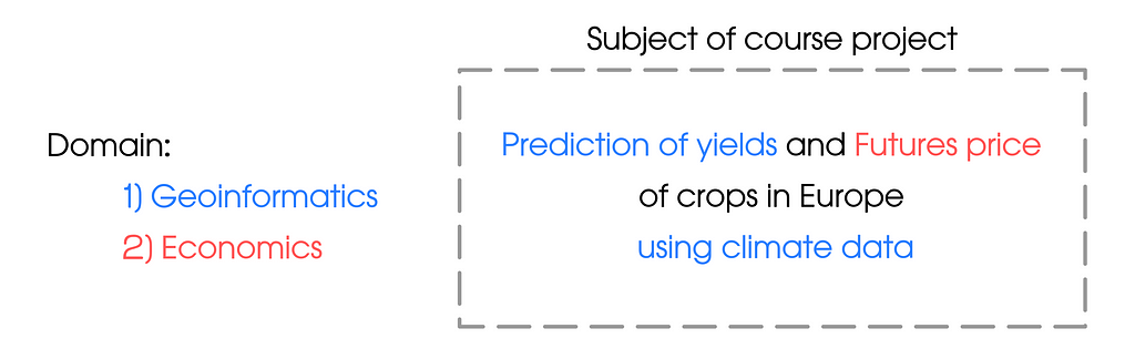
- the domain which was close to our interests (geographic information analysis for me and economics for my colleagues)
So, it was…
Camilo also wanted to try to make dashboards with visualisations (using PowerBI), but pretty much any task would be suitable for this desire.
Tip 1: Choose a topic that you (and your colleagues) will be passionate about. It may not be the coolest project on a topic that is not very popular, but you will enjoy spending your “evenings” working on it
What was the main idea
The course consisted of a big number of topics each of which is a set of methods for statistical analysis. We decided that we would try to forecast yield and crop price in as many different ways as possible and then ensemble the forecasts using some statistical method. This allowed us to try most of the methods discussed in the course in practice.
Also, the spatio-temporal data was truly multidimensional — this related pretty well to the main theme of the course.
Spoiler: we all got a score 5 out of 5
Research (& data sources)
We started with a literature review to understand exactly how crop yield and crop price are predicted. We also wanted to understand what kind of forecast error could be considered satisfactory.
I will not cite in this post the thesis resulting from this review. I will simply mention that we decided to use the following metric and threshold to evaluate the quality of the solution (for both crop yield and crop price):
Acceptable performance: Mean absolute percentage error (MAPE) for a reasonably good forecast should not exceed 10%
2 tip: Start your project (no matter at work or during your studies) with a review of contemporary solutions. Maybe the problem you are looking at now has already been solved.
3 tip: Before starting a development, determine what metric you will use to evaluate the solution. Remember, you can’t improve what you can’t measure.
Going back to the research, we have identified the following data sources (Links are up to date at 28th of December 2023):
- Climate data — E-OBS daily gridded meteorological data for Europe from 1950 to present derived from in-situ observations. Licence — Licence Agreement;
- Matrix of landscape types — LandMatrix. Licence — Creative Commons CC BY 4.0 International. Data Policy —Data Policy | Land Matrix;
- Vector layers with countries borders — GIS-Lab. Licence — GNU Lesser General Public License;
- Crop yield data by countries — Crop Yields. Licence — Creative Commons BY license;
- Crop yields Futures price (EU market) —Barchart. Licence — License to use barchart.com.
Why these sources? — We have assumed that the price of a crop will depend on the amount of product produced. And in agriculture, the quantity produced depends on weather conditions.
The model was implemented for:
- Yield of wheat, rice, maize, and barley;
- Countries: Germany, France, Italy, Romania, Poland, Austria, the Netherlands, Switzerland, Spain and the Czech Republic.
Climate data preprocessing
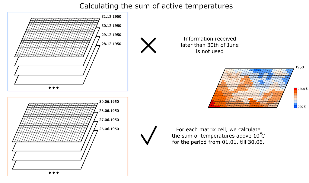
So, we have started with an assumption: “Wheat, rice, maize, and barley yields depend on weather conditions in the first half of the year (until 30 June)” (Figure 2)
The source archives obtained from the European space Agency website contain netCDF files. The files have daily fields for the following parameters:
- Mean daily air temperature, ℃
- Minimum daily air temperature, ℃
- Maximum daily air temperature, ℃
- Pressure, HPa
- Precipitation, mm
Based on the initial fields, the following parameters for the first half of each year were calculated:
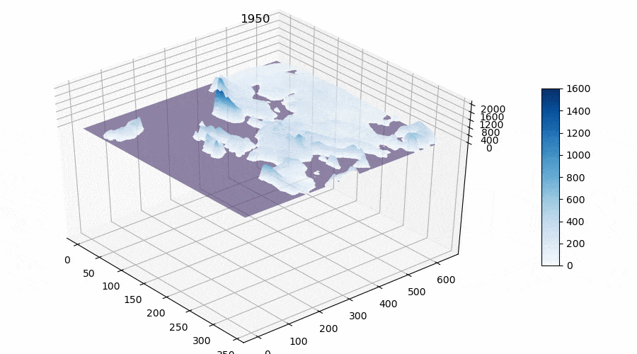
- Total rainfall for the first half of the year, mm (see Animation);
- The number of days with precipitation for the first half of the year, days;
- Average pressure, hpa;
- Maximum average daily air temperature for the first six months, ℃;
- Minimum average daily temperature for the first six months, ℃;
- The sum of active temperatures above 10 degrees Celsius, ℃ (see Figure 3).
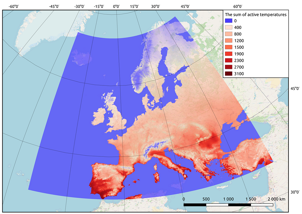
Thus we obtained matrices for the whole territory of Europe with calculated features for the future model(s). The reader may notice that I calculate such a parameter as “The sum of active temperatures above 10 degrees Celsius”. This is such a popular parameter in ecology and botany that helps to determine the temperature optimums for different species of organisms (mainly plants, for example “The sum of active temperatures as a method of determining the optimum harvest date of ‘S̆ampion’ and ‘Ligol’ apple cultivars”)
4 tip: If you have expertise in the domain (which is not related to Data Science), make sure you use it in the project — show that you are not only making a “fit-predict” but also adapting and improving domain-specific approaches
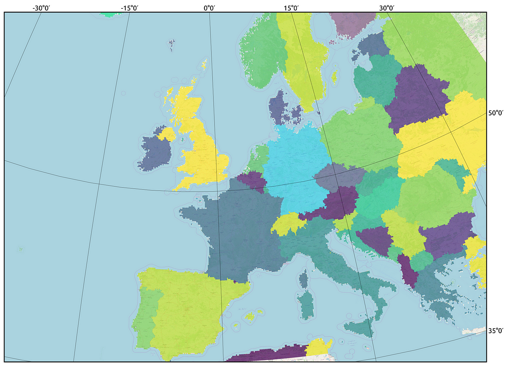
The next step is Aggregation of information by country. For values from the meteorological parameter matrices were extracted for each country separately (Figure 4).
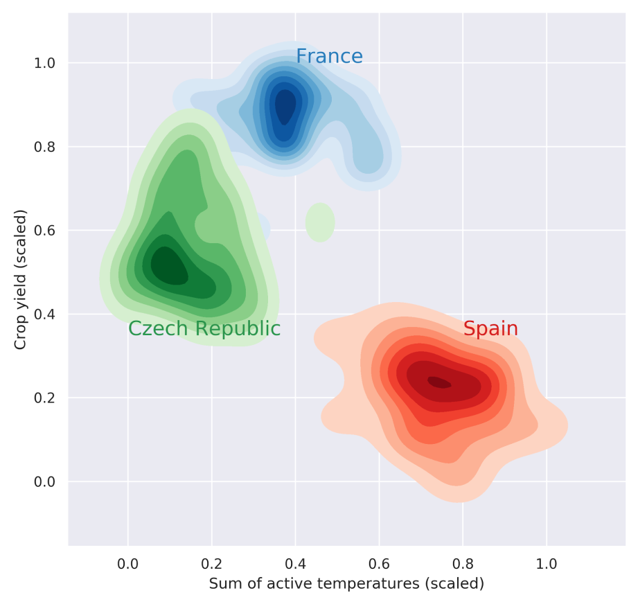
I would note that this strategy made sense (Figure 5): For example, the picture shows that for Spain, wheat yields are almost unaffected by the sum of active temperatures. However, for the Czech Republic, a hotter first half of the year is more likely to result in lower yields. It is therefore a good idea to model yields separately for each country.
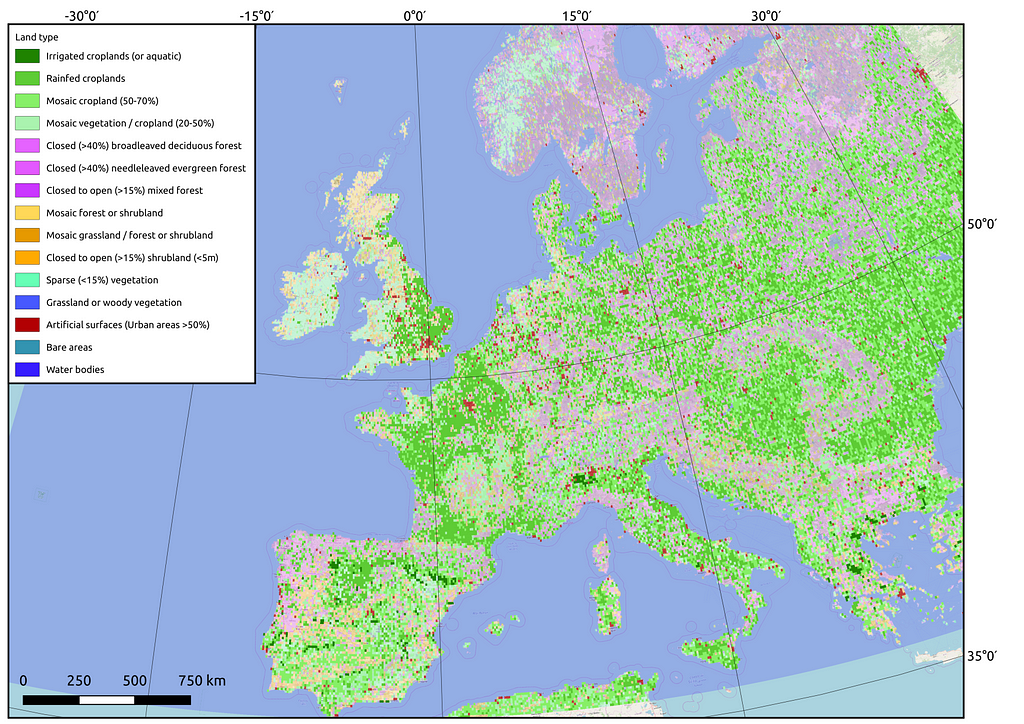
Not all of the country’s territory is suitable for agriculture. Therefore, it was necessary to aggregate information only from certain pixels. In order to account for the location of agricultural land, the following matrix was prepared (Figure 6).
1. The topic of the lecture is: univariate statistical testing
So, we’ve got the data ready. However, agriculture is a very complex industry that has improved markedly year by year, decade by decade. It may make sense to limit the training sample for the model. For this purpose, we used the cumulative sum method (Figure 7):
Cumulative sum method:
To each number from the sample, successive numbers are added sequentially to the following. That is, if the sample includes only three years: 1950, 1951, and 1952, the number for 1950 will be plotted on the Y-axis for 1950, and 1951 will show the sum of 1950 and 1951, etc.
– If the shape of the line is close to a straight line and there are no fractures, the sample is homogeneous
– If the shape of the line has fractures the sample is divided into 2 parts based on this fracture
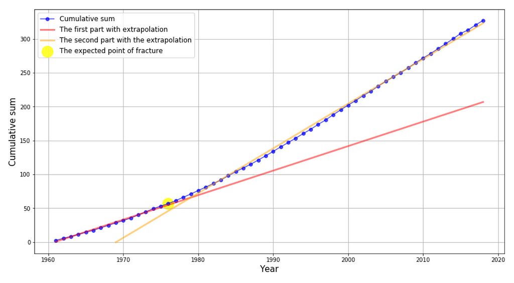
If a fracture was detected, we compared the two samples for belonging to the general population (Kolmogorov-Smirnov statistic). If the samples were statistically significantly different, we used the second part to train the model for prediction. If not, we used the entire sample.
5 tip: Don’t be afraid to combine approaches to statistical analysis (it is a course project!). For example, in the lecture we were not told about the cumulative sums method — the topic was about comparing distributions. However, I have previously used this approach to compare trends in ice conditions during the processing of ice maps. It seemed to me that it could be useful here as well
I should note here that we have assumed that the process is ergodic, so we decided to compare in this way.
So, after the preparation, we are ready to start building statistical models — let’s take a look at the most interesting part!
2. The topic of the lecture is: multivariate regression
The following features was included in the model:
- Total rainfall;
- The number of days with precipitation;
- The sum of active temperatures above 10 ℃;
- Mean pressure;
- Minimum air temperature ℃.
Target variables: Yield of wheat, rice, maize, and barley
Validation years: 2008–2018 for each country
Let’s move on to the visualisations to make it a little clearer.
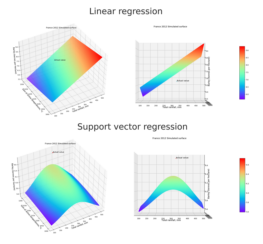
And here is Figure 9 showing the residuals (residual = observed value -estimated (predicted) value) from the linear model for France and Italy:
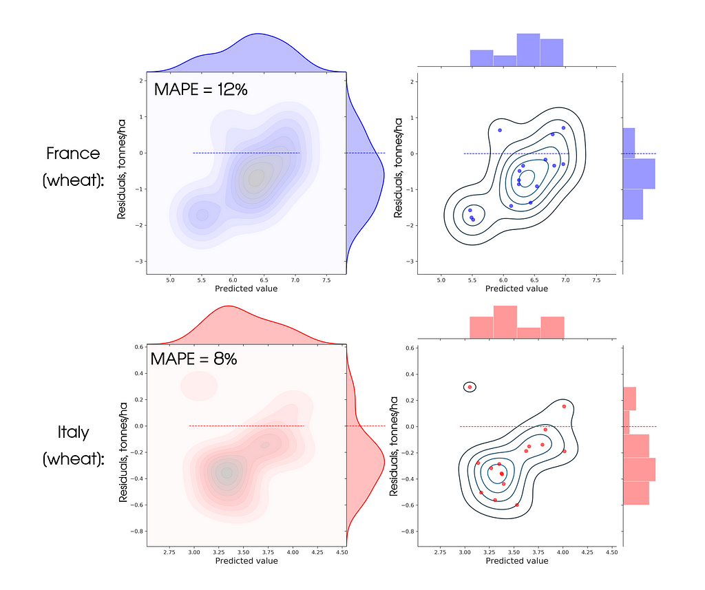
It can be seen from the graphs that the metric is satisfactory, but the error distribution is biased from zero — this means that the model has systematic error. We tried to correct in the new models below
Validation sample MAPE metric value: 10.42%
6 tip: Start with the simplest models (e.g. linear regression). This will give you a baseline against which you can compare improved versions of the model. The simpler the model, the better it is, as long as it shows a satisfactory metric
3. The topic of the lecture is: multivariate distributions analysis
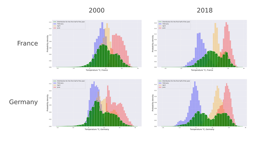
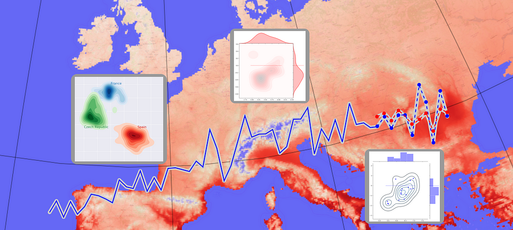
We’ve turned the material from this lecture into a model “Distribution analysis”. The assumption was simple — we analysed the distributions of climatic parameters for each year and for the current year and found an analogue year of the current one to predict the value of yield exactly the same as that of the known in the past (Figure 10).
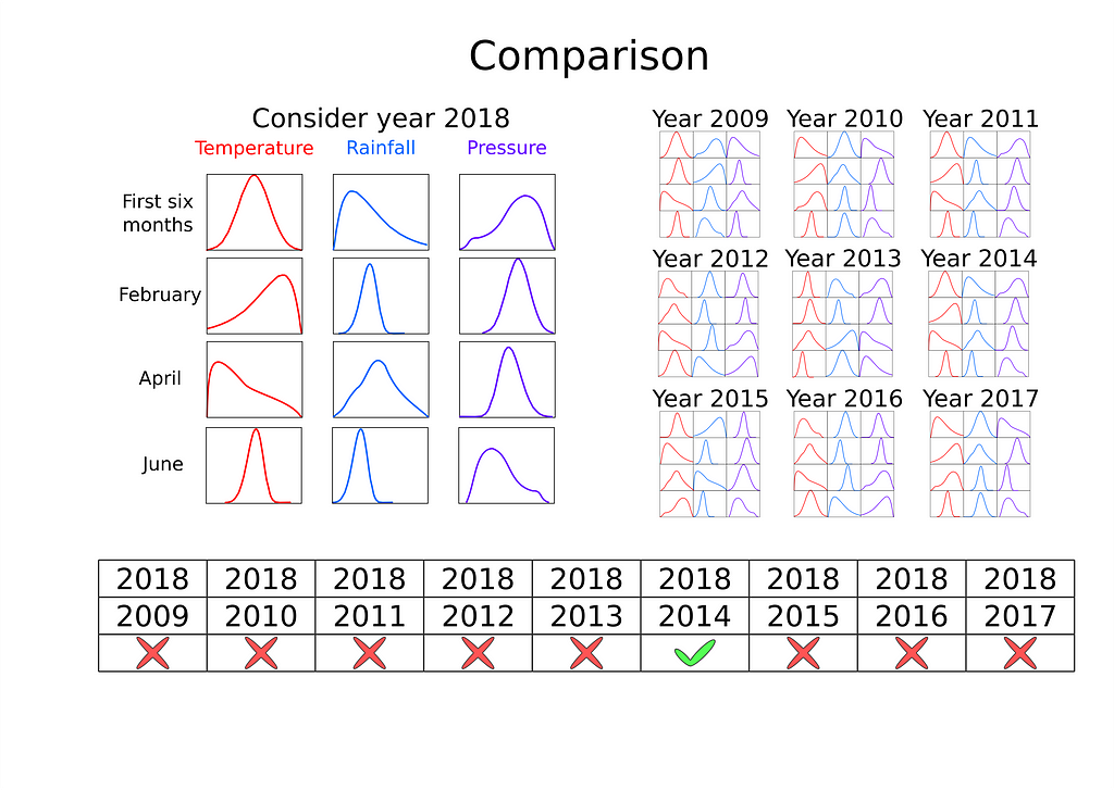
Idea: Yields for years with similar weather conditions will be similar
The approach: Pairwise comparison of temperature, precipitation, and pressure distributions. Prediction-yield for the year that is most similar to the considered one
Distributions used:
- Temperature for the first half of the year, temperature for the months: February, April, June;
- Precipitation for the first half of the year, precipitation for the months: February, April, June;
- Pressure for the first half of the year, pressure for the months: February, April, June.
For comparison of distributions we used Kruskal-Wallis test. To adjust p-value, a multiple testing correction is introduced — the Bonferroni correction.
Validation sample MAPE metric value: 13.80%
7 tip: If you are doing multiple statistical testing, don’t forget to include the correction (for example, Bonferroni correction)
4. The topic of the lecture is: Bayesian network
One of the lectures was focused on the Bayesian networks. Therefore, we decided to adapt the approach for yield prediction. We considered that each year is described by a set of group of variables A, B, C etc. where A is a set of categories describing crop yields, B is, for example, the Sum of active temperatures conditions and so on. A, for example, could take only three values: “High crop yield”, “Medium crop yield”, “Low crop yield”. The same for B and C and others. Thus, if we categorise the conditions and the target variable, we obtain the following description of each year:
- 1950 — “High heat supply”, “Low rainfall supply”, “High atmospheric pressure”— “High crop yield”
- 1951 — “Low heat supply”, “High rainfall supply”, “High atmospheric pressure” — “Medium crop yield”
- 1952 — “Low heat supply”, “Low rainfall supply”, “High atmospheric pressure” — Which crop yeild?
The algorithm was designed to predict a yield category based on a combination of three other categories:
- Crop yield (3 categories) — hidden state — target variable
- Sum of active temperatures (3 categories)
- Rainfall (3 categories)
- Mean pressure (3 categories)
How can we define these categories? — by using a clustering algorithm! For example, the following 3 clusters were identified for wheat yields
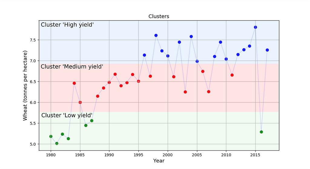
The final forecast of this model — the average yield of the predicted cluster.
Validation sample MAPE metric value: 14.55%
8 tip: Do experiment! Bayesian networks with clustering for time series forecasting? — Sure! Pairwise analysis of distributions — Why not? Sometimes the boldest approaches lead to significant improvements
5. The topic of the lecture is: Time series forecasting
Of course, we can forecast the target variable as a time series. Our task here was to understand how classical forecasting methods work in theory and practice.
Putting this method into practice proved to be the easiest. For example, in Python there are several libraries that allow to customise and apply the ARIMA model, for example pmdarima.
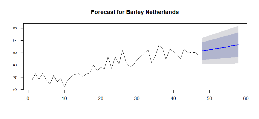
Validation sample MAPE metric value: 10.41%
9 tip: Don’t forget the comparison with classical approaches. An abstract metric will not tell your colleague much about how good your model is, but a comparison with well-known standards will show the true level of performance
6. The topic of the lecture is: Ensembling
After all the models were built, we explored exactly how each model is “mistaken” (remember residual plots for linear regression model — see Figure 9):
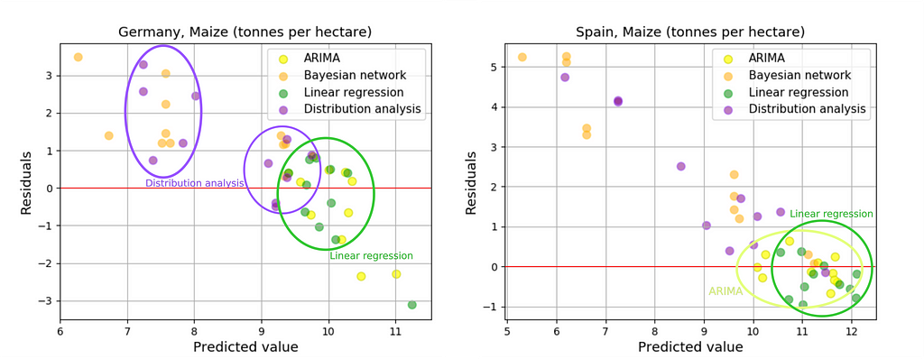
None of the presented algorithms allowed to overcome the 10% threshold (according to MAPE).
The Kalman filter was used to improve the quality of the forecast (to ensemble it). Satisfactory results have been achieved for some countries (Figure 15)
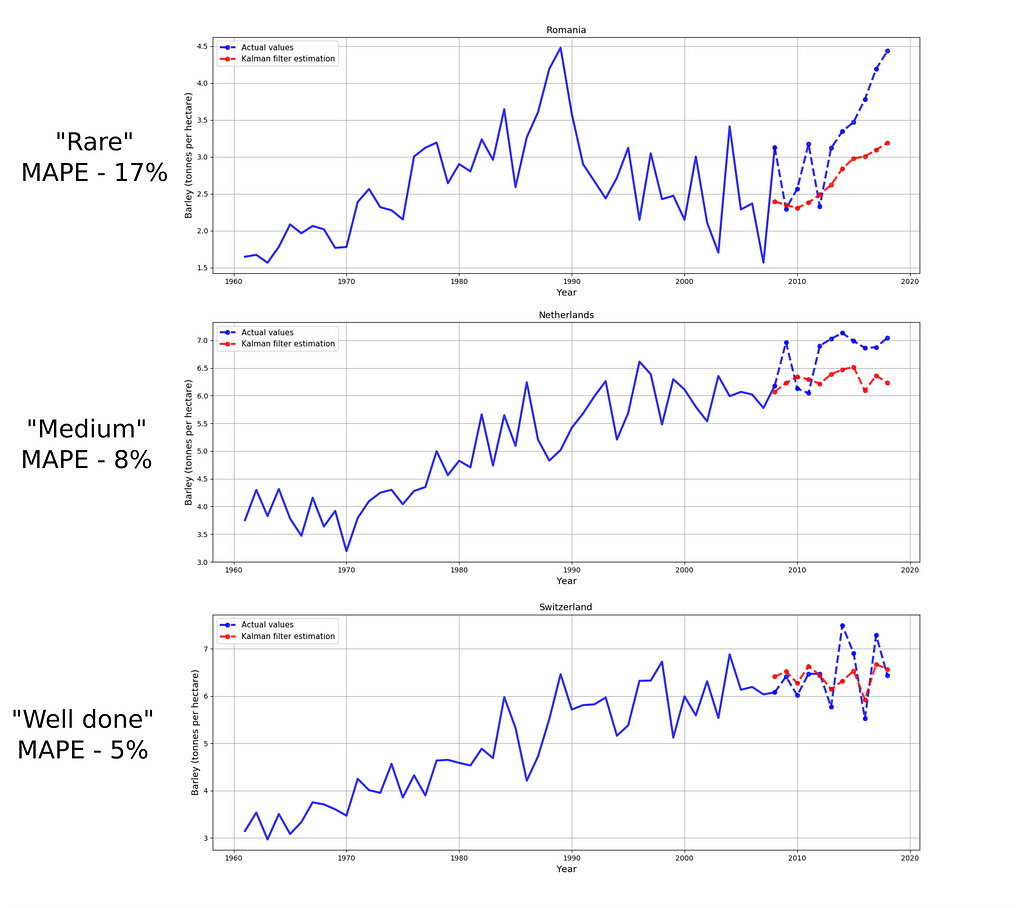
Validation sample MAPE metric value: 9.89%
10 tip: If I were asked to integrate the developed model into Production service, I would integrate either ARIMA or linear regression, even though the ensemble metric is better. However, metrics in business problems are sometimes not the key. A standalone model is sometimes better than an ensemble because it is simpler and more reliable (even if the error metric is slightly higher)
Futures price prediction
And the final part: model (lasso regression), which used predicted yield values and Futures features to estimate possible price values (Figure 16):
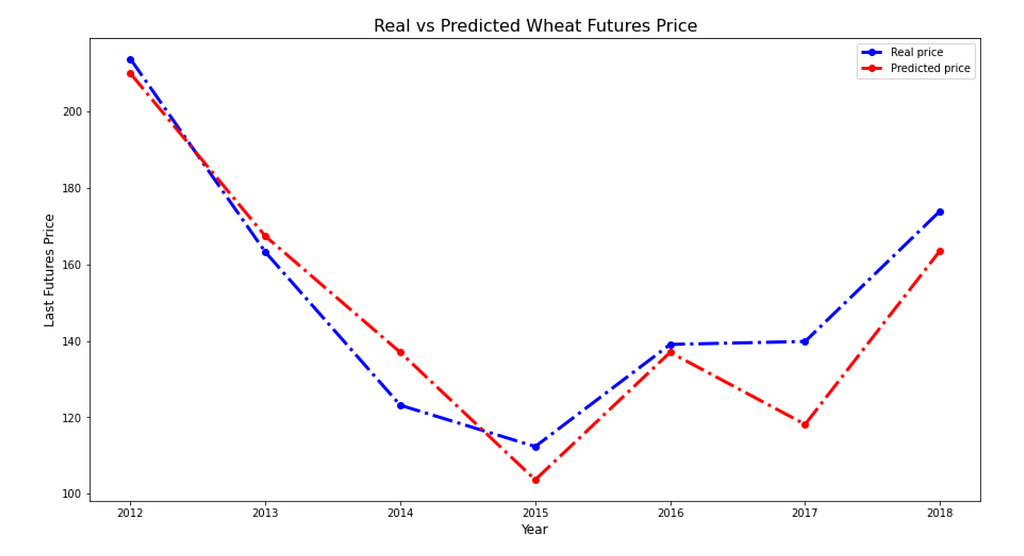
Mape on validation sample: 6.61%
Why I still think this project is a good one
So that’s the end of the story. Above there were posted some of tips. And in the last paragraph, I want to summarise the final point and say why I am satisfied with that project. Here are three main items:
- Organisation of work and choice of topic — we combined our strengths and best qualities very well, planned the work stack nicely and managed as a team to prepare a good project and deliver it on time. So, I have improved my soft skills;
- Meaningful theme — I was passionate about what we were doing. Even if I had a few weeks free now for a pet project, I would happily apply my current experience and skills to such a case study again. So, I was satisfied with the work we had done;
- Hard skills — During our work we have tried new statistical methods, improved our understanding of already familiar ones, and enhanced our programming skills.
Well, we also got great marks on the exam XD
I hope your projects at university and elsewhere will be as exciting for you. Happy New Year!
Sincerely yours, Mikhail Sarafanov
A Data Science Course Project About Crop Yield and Price Prediction I’m Still Not Ashamed Of was originally published in Towards Data Science on Medium, where people are continuing the conversation by highlighting and responding to this story.
Even from the perspective of an experienced Data Scientist
Hello, dear reader! During these Christmas holidays, I experienced a feeling of nostalgia for the past student years. That’s why I decided to write a post about a student project that was done almost four years ago as a project on the course “Methods and models for Multivariate data analysis” during my Master’s degree in ITMO University.
Disclaimer: I decided to write this post for two reasons:
- to share an approach to organizing university studies that has proven to be very effective (at least for me);
- to inspire people who are just starting to study programming and/or statistics to try and experiment with their pet or course projects, because sometimes such projects are memorable for many years and surprisingly enjoyable
The article mentions, in tips format, good practices that I’ve been able to apply during course project.
Beginning of the story
So, at the beginning of the course, we were informed that students could form teams of 2–3 people on our own and propose a course project that we would present at the end of the course. During the learning process (about 5 months), we will make intermediate presentations to our lecturers. This way, the professors can see how the progress is (or is not) going on.
After that, I immediately teamed up with my dudes: Egor and Camilo (just because we knew how to have fun together), and we started thinking about the topic…
Choosing the topic
I suggested choosing
- a theme that was big enough that we could work independently on different parts of it
- the domain which was close to our interests (geographic information analysis for me and economics for my colleagues)
So, it was…
Camilo also wanted to try to make dashboards with visualisations (using PowerBI), but pretty much any task would be suitable for this desire.
Tip 1: Choose a topic that you (and your colleagues) will be passionate about. It may not be the coolest project on a topic that is not very popular, but you will enjoy spending your “evenings” working on it
What was the main idea
The course consisted of a big number of topics each of which is a set of methods for statistical analysis. We decided that we would try to forecast yield and crop price in as many different ways as possible and then ensemble the forecasts using some statistical method. This allowed us to try most of the methods discussed in the course in practice.
Also, the spatio-temporal data was truly multidimensional — this related pretty well to the main theme of the course.
Spoiler: we all got a score 5 out of 5
Research (& data sources)
We started with a literature review to understand exactly how crop yield and crop price are predicted. We also wanted to understand what kind of forecast error could be considered satisfactory.
I will not cite in this post the thesis resulting from this review. I will simply mention that we decided to use the following metric and threshold to evaluate the quality of the solution (for both crop yield and crop price):
Acceptable performance: Mean absolute percentage error (MAPE) for a reasonably good forecast should not exceed 10%
2 tip: Start your project (no matter at work or during your studies) with a review of contemporary solutions. Maybe the problem you are looking at now has already been solved.
3 tip: Before starting a development, determine what metric you will use to evaluate the solution. Remember, you can’t improve what you can’t measure.
Going back to the research, we have identified the following data sources (Links are up to date at 28th of December 2023):
- Climate data — E-OBS daily gridded meteorological data for Europe from 1950 to present derived from in-situ observations. Licence — Licence Agreement;
- Matrix of landscape types — LandMatrix. Licence — Creative Commons CC BY 4.0 International. Data Policy —Data Policy | Land Matrix;
- Vector layers with countries borders — GIS-Lab. Licence — GNU Lesser General Public License;
- Crop yield data by countries — Crop Yields. Licence — Creative Commons BY license;
- Crop yields Futures price (EU market) —Barchart. Licence — License to use barchart.com.
Why these sources? — We have assumed that the price of a crop will depend on the amount of product produced. And in agriculture, the quantity produced depends on weather conditions.
The model was implemented for:
- Yield of wheat, rice, maize, and barley;
- Countries: Germany, France, Italy, Romania, Poland, Austria, the Netherlands, Switzerland, Spain and the Czech Republic.
Climate data preprocessing
So, we have started with an assumption: “Wheat, rice, maize, and barley yields depend on weather conditions in the first half of the year (until 30 June)” (Figure 2)
The source archives obtained from the European space Agency website contain netCDF files. The files have daily fields for the following parameters:
- Mean daily air temperature, ℃
- Minimum daily air temperature, ℃
- Maximum daily air temperature, ℃
- Pressure, HPa
- Precipitation, mm
Based on the initial fields, the following parameters for the first half of each year were calculated:
- Total rainfall for the first half of the year, mm (see Animation);
- The number of days with precipitation for the first half of the year, days;
- Average pressure, hpa;
- Maximum average daily air temperature for the first six months, ℃;
- Minimum average daily temperature for the first six months, ℃;
- The sum of active temperatures above 10 degrees Celsius, ℃ (see Figure 3).
Thus we obtained matrices for the whole territory of Europe with calculated features for the future model(s). The reader may notice that I calculate such a parameter as “The sum of active temperatures above 10 degrees Celsius”. This is such a popular parameter in ecology and botany that helps to determine the temperature optimums for different species of organisms (mainly plants, for example “The sum of active temperatures as a method of determining the optimum harvest date of ‘S̆ampion’ and ‘Ligol’ apple cultivars”)
4 tip: If you have expertise in the domain (which is not related to Data Science), make sure you use it in the project — show that you are not only making a “fit-predict” but also adapting and improving domain-specific approaches
The next step is Aggregation of information by country. For values from the meteorological parameter matrices were extracted for each country separately (Figure 4).
I would note that this strategy made sense (Figure 5): For example, the picture shows that for Spain, wheat yields are almost unaffected by the sum of active temperatures. However, for the Czech Republic, a hotter first half of the year is more likely to result in lower yields. It is therefore a good idea to model yields separately for each country.
Not all of the country’s territory is suitable for agriculture. Therefore, it was necessary to aggregate information only from certain pixels. In order to account for the location of agricultural land, the following matrix was prepared (Figure 6).
1. The topic of the lecture is: univariate statistical testing
So, we’ve got the data ready. However, agriculture is a very complex industry that has improved markedly year by year, decade by decade. It may make sense to limit the training sample for the model. For this purpose, we used the cumulative sum method (Figure 7):
Cumulative sum method:
To each number from the sample, successive numbers are added sequentially to the following. That is, if the sample includes only three years: 1950, 1951, and 1952, the number for 1950 will be plotted on the Y-axis for 1950, and 1951 will show the sum of 1950 and 1951, etc.
– If the shape of the line is close to a straight line and there are no fractures, the sample is homogeneous
– If the shape of the line has fractures the sample is divided into 2 parts based on this fracture
If a fracture was detected, we compared the two samples for belonging to the general population (Kolmogorov-Smirnov statistic). If the samples were statistically significantly different, we used the second part to train the model for prediction. If not, we used the entire sample.
5 tip: Don’t be afraid to combine approaches to statistical analysis (it is a course project!). For example, in the lecture we were not told about the cumulative sums method — the topic was about comparing distributions. However, I have previously used this approach to compare trends in ice conditions during the processing of ice maps. It seemed to me that it could be useful here as well
I should note here that we have assumed that the process is ergodic, so we decided to compare in this way.
So, after the preparation, we are ready to start building statistical models — let’s take a look at the most interesting part!
2. The topic of the lecture is: multivariate regression
The following features was included in the model:
- Total rainfall;
- The number of days with precipitation;
- The sum of active temperatures above 10 ℃;
- Mean pressure;
- Minimum air temperature ℃.
Target variables: Yield of wheat, rice, maize, and barley
Validation years: 2008–2018 for each country
Let’s move on to the visualisations to make it a little clearer.
And here is Figure 9 showing the residuals (residual = observed value -estimated (predicted) value) from the linear model for France and Italy:
It can be seen from the graphs that the metric is satisfactory, but the error distribution is biased from zero — this means that the model has systematic error. We tried to correct in the new models below
Validation sample MAPE metric value: 10.42%
6 tip: Start with the simplest models (e.g. linear regression). This will give you a baseline against which you can compare improved versions of the model. The simpler the model, the better it is, as long as it shows a satisfactory metric
3. The topic of the lecture is: multivariate distributions analysis
We’ve turned the material from this lecture into a model “Distribution analysis”. The assumption was simple — we analysed the distributions of climatic parameters for each year and for the current year and found an analogue year of the current one to predict the value of yield exactly the same as that of the known in the past (Figure 10).
Idea: Yields for years with similar weather conditions will be similar
The approach: Pairwise comparison of temperature, precipitation, and pressure distributions. Prediction-yield for the year that is most similar to the considered one
Distributions used:
- Temperature for the first half of the year, temperature for the months: February, April, June;
- Precipitation for the first half of the year, precipitation for the months: February, April, June;
- Pressure for the first half of the year, pressure for the months: February, April, June.
For comparison of distributions we used Kruskal-Wallis test. To adjust p-value, a multiple testing correction is introduced — the Bonferroni correction.
Validation sample MAPE metric value: 13.80%
7 tip: If you are doing multiple statistical testing, don’t forget to include the correction (for example, Bonferroni correction)
4. The topic of the lecture is: Bayesian network
One of the lectures was focused on the Bayesian networks. Therefore, we decided to adapt the approach for yield prediction. We considered that each year is described by a set of group of variables A, B, C etc. where A is a set of categories describing crop yields, B is, for example, the Sum of active temperatures conditions and so on. A, for example, could take only three values: “High crop yield”, “Medium crop yield”, “Low crop yield”. The same for B and C and others. Thus, if we categorise the conditions and the target variable, we obtain the following description of each year:
- 1950 — “High heat supply”, “Low rainfall supply”, “High atmospheric pressure”— “High crop yield”
- 1951 — “Low heat supply”, “High rainfall supply”, “High atmospheric pressure” — “Medium crop yield”
- 1952 — “Low heat supply”, “Low rainfall supply”, “High atmospheric pressure” — Which crop yeild?
The algorithm was designed to predict a yield category based on a combination of three other categories:
- Crop yield (3 categories) — hidden state — target variable
- Sum of active temperatures (3 categories)
- Rainfall (3 categories)
- Mean pressure (3 categories)
How can we define these categories? — by using a clustering algorithm! For example, the following 3 clusters were identified for wheat yields
The final forecast of this model — the average yield of the predicted cluster.
Validation sample MAPE metric value: 14.55%
8 tip: Do experiment! Bayesian networks with clustering for time series forecasting? — Sure! Pairwise analysis of distributions — Why not? Sometimes the boldest approaches lead to significant improvements
5. The topic of the lecture is: Time series forecasting
Of course, we can forecast the target variable as a time series. Our task here was to understand how classical forecasting methods work in theory and practice.
Putting this method into practice proved to be the easiest. For example, in Python there are several libraries that allow to customise and apply the ARIMA model, for example pmdarima.
Validation sample MAPE metric value: 10.41%
9 tip: Don’t forget the comparison with classical approaches. An abstract metric will not tell your colleague much about how good your model is, but a comparison with well-known standards will show the true level of performance
6. The topic of the lecture is: Ensembling
After all the models were built, we explored exactly how each model is “mistaken” (remember residual plots for linear regression model — see Figure 9):
None of the presented algorithms allowed to overcome the 10% threshold (according to MAPE).
The Kalman filter was used to improve the quality of the forecast (to ensemble it). Satisfactory results have been achieved for some countries (Figure 15)
Validation sample MAPE metric value: 9.89%
10 tip: If I were asked to integrate the developed model into Production service, I would integrate either ARIMA or linear regression, even though the ensemble metric is better. However, metrics in business problems are sometimes not the key. A standalone model is sometimes better than an ensemble because it is simpler and more reliable (even if the error metric is slightly higher)
Futures price prediction
And the final part: model (lasso regression), which used predicted yield values and Futures features to estimate possible price values (Figure 16):
Mape on validation sample: 6.61%
Why I still think this project is a good one
So that’s the end of the story. Above there were posted some of tips. And in the last paragraph, I want to summarise the final point and say why I am satisfied with that project. Here are three main items:
- Organisation of work and choice of topic — we combined our strengths and best qualities very well, planned the work stack nicely and managed as a team to prepare a good project and deliver it on time. So, I have improved my soft skills;
- Meaningful theme — I was passionate about what we were doing. Even if I had a few weeks free now for a pet project, I would happily apply my current experience and skills to such a case study again. So, I was satisfied with the work we had done;
- Hard skills — During our work we have tried new statistical methods, improved our understanding of already familiar ones, and enhanced our programming skills.
Well, we also got great marks on the exam XD
I hope your projects at university and elsewhere will be as exciting for you. Happy New Year!
Sincerely yours, Mikhail Sarafanov
A Data Science Course Project About Crop Yield and Price Prediction I’m Still Not Ashamed Of was originally published in Towards Data Science on Medium, where people are continuing the conversation by highlighting and responding to this story.
Denial of responsibility! Techno Blender is an automatic aggregator of the all world’s media. In each content, the hyperlink to the primary source is specified. All trademarks belong to their rightful owners, all materials to their authors. If you are the owner of the content and do not want us to publish your materials, please contact us by email – [email protected]. The content will be deleted within 24 hours.