
Creating a better dashboard — myth or reality?
Creating a Better Dashboard — Myth or Reality?
My beta version 2.0 built using Dash & Plotly instead of Matplotlib
Introduction
In February 2023 I wrote my first Medium post:
How to Customize Infographics in Python: Tips and Tricks
Here I explained how to create a simplified dashboard with various diagrams, including a line plot, pie & bar charts, and a choropleth map. For plotting them I used ‘good old’ Matplotlib [1], because I was familiar with its keywords and main functions. I still believe that Matplotlib is a great library for starting your data journey with Python, as there is a very large collective knowledge base. If something is unclear with Matplotlib, you can google your queries and most likely you will get answers.
However, Matplotlib may encounter some difficulties when creating interactive and web-based visualizations. For the latter purpose, Plotly [2] can be a good alternative, allowing you to create unusual interactive dashboards. Matplotlib, on the other hand, is a powerful library that offers better control over plot customization, which is good for creating publish-ready visualizations.
In this post, I will try to substitute code which uses Matlab (1) with that based on Plotly (2). The structure will repeat the initial post, because the types of plots and input data [3] are the same. However, here I will add some comments on level of similarity between (1) and (2) for each type of plots. My main intention of writing this article is to look back to my first post and try to remake it with my current level of knowledge.
Note: You will be surprised how short the Plotly code is that’s required for building the choropleth map 🙂
But first things first, and we will start by creating a line graph in Plotly.
#1. Line Plot
The line plot can be a wise choice for displaying the dynamics of changing our data with time. In the case below we will combine a line plot with a scatter plot to mark each location with its own color.
Below you can find a code snippet using Plotly that produces a line chart showing the average attendance at the FIFA World Cup over the period 1990–2018: each value is marked with a label and a colored scatter point.
## Line Plot ##

import plotly.graph_objects as go

time = [1990, 1994, 1998, 2002, 2006, 2010, 2014, 2018]
numbers = [48411, 68626, 44676, 42571, 52609, 49499, 53772, 47371]
labels = ['Italy', 'USA', 'France', 'Japan / South Korea', 'Germany',
'South Africa', 'Brazil', 'Russia']

fig = go.Figure()

# Line plot
fig.add_trace(go.Scatter(x=time, y=numbers, mode='lines+markers',
                         marker=dict(color='black',size=10), line=dict(width=2.5)))

# Scatter plot
for i in range(len(time)):
    fig.add_trace(go.Scatter(x=[time[i]], y=[numbers[i]],
                             mode='markers', name=labels[i]))

# Layout settings
fig.update_layout(title='Average number of attendees per game in 1990-2018',
                  xaxis=dict(tickvals=time),
                  yaxis=dict(range=[35000, 70000]),
                  showlegend=True,
                  legend=dict(x=0.5, y=-0.2),
                  plot_bgcolor='white')

fig.show()
And the result looks as follows:
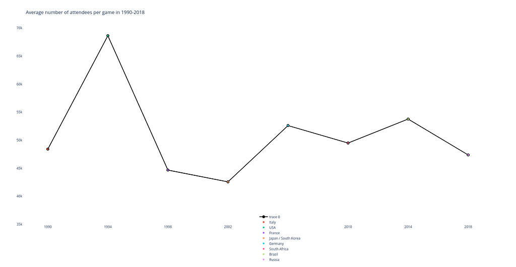
When you hover your mouse over any point of the chart in Plotly, a window pops up showing the number of spectators and the name of the country where the tournament was held.
Level of similarity to Matplotlib plot: 8 out of 10.
In general, the code looks very similar to the initial snippet in terms of structure and the placement of the main code blocks inside it.
What is different: However, some differences are also presented. For instance, pay attention to details how plot elements are declared (e.g. a line plot mode lines+markers which allows to display them simultaneously).
What is important: For building this plot I use the plotly.graph_objects (which is imported as go) module. It provides an automatically-generated hierarchy of classes called ‘graph objects’ that may be used to represent various figures.
#2. Pie Chart (actually, a donut chart)
Pie & donut charts are very good for demonstrating the contributions of different values to a total amount: they are divided in segments, which show the proportional value of each piece of our data.
Here is a code snippet in Plotly that is used to build a pie chart which would display the proportion between the countries with the most World Cup titles.
## Pie Chart ##

import plotly.express as px

# Data
label_list = ['Brazil', 'Germany', 'Italy', 'Argentina', 'Uruguay', 'France', 'England', 'Spain']
freq = [5, 4, 4, 3, 2, 2, 1, 1]

# Customize colors
colors = ['darkorchid', 'royalblue', 'lightsteelblue', 'silver', 'sandybrown', 'lightcoral', 'seagreen', 'salmon']

# Building chart
fig = px.pie(values=freq, names=label_list, title='Countries with the most FIFA World Cup titles',
             color_discrete_map=dict(zip(label_list, colors)),
             labels={'label': 'Country', 'value': 'Frequency'},
             hole=0.3)

fig.update_traces(textposition='inside', textinfo='percent+label')
fig.show()
The resulting visual item is given below (by the way, it is an interactive chart too!):
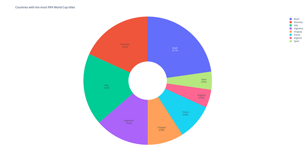
Level of similarity to Matplotlib plot: 7 out of 10. Again the code logic is almost the same for the two versions.
What is different: One might notice that with a help of hole keyword it is possible to turn a pie chart into a donut chart. And see how easy and simple it is to display percentages for each segment of the chart in Plotly compared to Matplotlib.
What is important: Instead of using plotly.graph_objects module, here I apply plotly.express module (usually imported as px) containing functions that can create entire figures at once. This is the easy-to-use Plotly interface, which operates on a variety of types of data.
#3. Bar Chart
Bar charts, no matter whether they are vertical or horizontal, show comparisons among different categories. The vertical axis (‘Stadium’) of the chart shows the specific categories being compared, and the horizontal axis represents a measured value, i.e. the ‘Capacity’ itself.
## Bar Chart ##

import plotly.graph_objects as go

labels = ['Estádio do Maracanã', 'Camp Nou', 'Estadio Azteca',
          'Wembley Stadium', 'Rose Bowl', 'Estadio Santiago Bernabéu',
          'Estadio Centenario', 'Lusail Stadium']
capacity = [200, 121, 115, 99, 94, 90, 90, 89]

fig = go.Figure()

# Horizontal bar chart
fig.add_trace(go.Bar(y=labels, x=capacity, orientation='h', marker_color='blue'))

# Layout settings
fig.update_layout(title='Top-8 stadiums on capacity (in thousands)',
                  yaxis=dict(title='Stadiums'),
                  xaxis=dict(title='Capacity'),
                  showlegend=False,
                  plot_bgcolor='white')

fig.show()
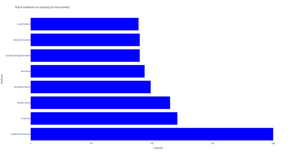
Level of similarity to Matplotlib plot: 6 out of 10.
All in all, the two code pieces have more or less the same blocks, but the code in Plotly is shorter.
What is different: The code fragment in Plotly is shorter because we don’t have to include a paragraph to place labels for each column — Plotly does this automatically thanks to its interactivity.
What is important: For building this type of plot, plotly.express module was also used. For a horizontal bar char, we can use the px.bar function with orientation=’h’.
#4. Choropleth Map
Choropleth map is a great tool for visualizing how a variable varies across a geographic area. A heat map is similar, but uses regions drawn according to a variable’s pattern rather than geographic areas as choropleth maps do.
Below you can see the Plotly code to draw the chorogram. Here each country gets its color depending on the frequency how often it holds the FIFA World Cup. Dark red countries hosted the tournament 2 times, light red countries — 1, and all others (gray) — 0.
## Choropleth Map ##

import polars as pl
import plotly.express as px

df = pl.read_csv('data_football.csv')
df.head(5)
fig = px.choropleth(df, locations='team_code', color='count',
                    hover_name='team_name', projection='natural earth',
                    title='Geography of the FIFA World Cups',
                    color_continuous_scale='Reds')
fig.show()
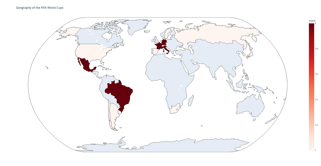
Level of similarity to Matplotlib plot: 4 out of 10.
The code in Plotly is three times smaller than the code in Matplotlib.
What is different: While using Matplotlib to build a choropleth map, we have to do a lot of additional staff, e.g.:
- to download a zip-folder ne_110m_admin_0_countries.zip with shapefiles to draw the map itself and to draw country boundaries, grid lines, etc.;
- to import Basemap, Polygon and PatchCollection items from mpl_toolkits.basemap and matplotlib.patches and matplotlib.collections libraries and to use them to make colored background based on the logic we suggested in data_football.csv file.
What is important: And what is the Plotly do? It takes the same data_football.csv file and with a help of the px.choropleth function displays data that is aggregated across different map regions or countries. Each of them is colored according to the value of a specific information given, in our case this is the count variable in the input file.
As you can see, all Plotly codes are shorter (or the same in a case of building the line plot) than those in Matplotlib. This is achieved because Plotly makes it far easy to create complex plots. Plotly is great for creating interactive visualizations with just a few lines of code.
Sum Up: Creating a Single Dashboard with Dash
Dash allows to build an interactive dashboard on a base of Python code with no need to learn complex JavaScript frameworks like React.js.
Here you can find the code and comments to its important parts:
import polars as pl
import plotly.express as px
import plotly.graph_objects as go
import dash
from dash import dcc
from dash import html

external_stylesheets = ['https://codepen.io/chriddyp/pen/bWLwgP.css']

app = dash.Dash(__name__, external_stylesheets=external_stylesheets)

header = html.H2(children="FIFA World Cup Analysis")

## Line plot with scatters ##

# Data
time = [1990, 1994, 1998, 2002, 2006, 2010, 2014, 2018]
numbers = [48411, 68626, 44676, 42571, 52609, 49499, 53772, 47371]
labels = ['Italy', 'USA', 'France', 'Japan / South Korea', 'Germany', 'South Africa', 'Brazil', 'Russia']

# Building chart
chart1 = go.Figure()

chart1.add_trace(go.Scatter(x=time, y=numbers, mode='lines+markers',
                         marker=dict(color='black',size=10), line=dict(width=2.5)))

for i in range(len(time)):
    chart1.add_trace(go.Scatter(x=[time[i]], y=[numbers[i]],
                             mode='markers', name=labels[i]))

# Layout settings
chart1.update_layout(title='Average number of attendees per game in 1990-2018',
                  xaxis=dict(tickvals=time),
                  yaxis=dict(range=[35000, 70000]),
                  showlegend=True,
                  plot_bgcolor='white')


plot1 = dcc.Graph(
        id='plot1',
        figure=chart1,
        className="six columns"
    )

## Pie chart ##

# Data
label_list = ['Brazil', 'Germany', 'Italy', 'Argentina', 'Uruguay', 'France', 'England', 'Spain']
freq = [5, 4, 4, 3, 2, 2, 1, 1]

# Customize colors
colors = ['darkorchid', 'royalblue', 'lightsteelblue', 'silver', 'sandybrown', 'lightcoral', 'seagreen', 'salmon']

# Building chart
chart2 = px.pie(values=freq, names=label_list, title='Countries with the most FIFA World Cup titles',
             color_discrete_map=dict(zip(label_list, colors)),
             labels={'label': 'Country', 'value': 'Frequency'},
             hole=0.3)

chart2.update_traces(textposition='inside', textinfo='percent+label')

plot2 = dcc.Graph(
        id='plot2',
        figure=chart2,
        className="six columns"
    )

## Horizontal bar chart ##

labels = ['Estádio do Maracanã', 'Camp Nou', 'Estadio Azteca',
          'Wembley Stadium', 'Rose Bowl', 'Estadio Santiago Bernabéu',
          'Estadio Centenario', 'Lusail Stadium']
capacity = [200, 121, 115, 99, 94, 90, 90, 89]

# Building chart
chart3 = go.Figure()

chart3.add_trace(go.Bar(y=labels, x=capacity, orientation='h', marker_color='blue'))

# Layout settings
chart3.update_layout(title='Top-8 stadiums on capacity (in thousands)',
                  yaxis=dict(title='Stadiums'),
                  xaxis=dict(title='Capacity'),
                  showlegend=False,
                  plot_bgcolor='white')


plot3 = dcc.Graph(
        id='plot3',
        figure=chart3,
        className="six columns"
    )

## Chropleth map ##

# Data
df = pl.read_csv('data_football.csv')

# Building chart
chart4 = px.choropleth(df, locations='team_code', color='count',
                    hover_name='team_name', projection='natural earth',
                    title='Geography of the FIFA World Cups',
                    color_continuous_scale='Reds')

plot4 = dcc.Graph(
        id='plot4',
        figure=chart4,
        className="six columns"
    )


row1 = html.Div(children=[plot1, plot2],)
row2 = html.Div(children=[plot3, plot4])
layout = html.Div(children=[header, row1, row2], style={"text-align": "center"})

app.layout = layout

if __name__ == "__main__":
    app.run_server(debug=False)
Comments to the code:
- First, we need to import all libraries (including HTML modules) and initialize dashboard with a help of the string app = dash.Dash(__name__, external_stylesheets=external_stylesheets).
- We then paste each graph into Dash core components to further integrate them with other HTML components (dcc.Graph). Here className=”six columns” needs to use half the screen for each row of plots.
- After that we create 2 rows of html.Div components with 2 plots in each. In addition, a simple CSS with the style attribute can be used to display the header of our dashboard in the layout string. This layout is set as the layout of the app initialized before.
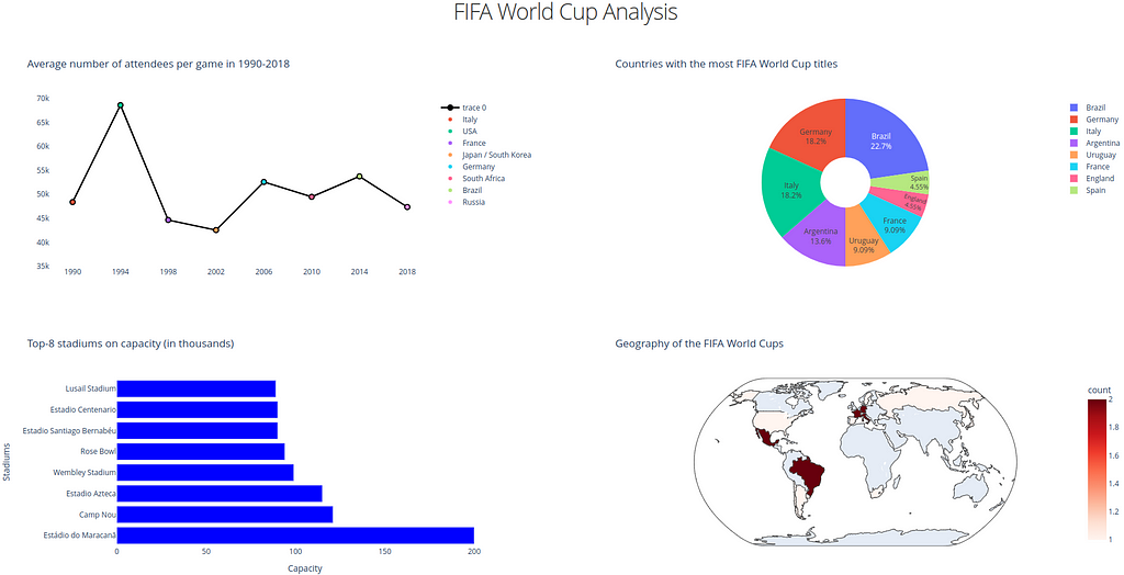
- Finally, the last paragraph allows to run the app locally (app.run_server(debug=False)). To see the dashboard, just follow the link http://127.0.0.1:8050/ and you will find something like the image below.
Final Remarks
Honestly, the question in the title was rhetorical, and only you, dear reader, can decide whether the current version of the dashboard is better than the previous one. But at least I tried my best (and deep inside I believe that version 2.0 is better) 🙂
You may think that this post doesn’t contain any new information, but I couldn’t disagree more. By writing this post, I wanted to emphasize the importance of improving skills over time, even if the first version of the code may not look that bad.
I hope this post encourages you to look at your finished projects and try to remake them using the new techniques available. That is the main reason why I decided to substitute Matplotlib with Plotly & Dash (plus the latter two make it easy to create data analysis results).
The ability to constantly improve your work by improving an old version or using new libraries instead of the ones you used before is a great skill for any programmer. If you take this advice as a habit, you will see progress, because only practice makes perfect.
And as always, thanks for reading!
References
- The main page of Matplotlib library: https://matplotlib.org/stable/
- The main page of Plotly library: https://plotly.com/python/
- Fjelstul, Joshua C. “The Fjelstul World Cup Database v.1.0.” July 8, 2022. https://www.github.com/jfjelstul/worldcup
Creating a better dashboard — myth or reality? was originally published in Towards Data Science on Medium, where people are continuing the conversation by highlighting and responding to this story.

Creating a Better Dashboard — Myth or Reality?
My beta version 2.0 built using Dash & Plotly instead of Matplotlib
Introduction
In February 2023 I wrote my first Medium post:
How to Customize Infographics in Python: Tips and Tricks
Here I explained how to create a simplified dashboard with various diagrams, including a line plot, pie & bar charts, and a choropleth map. For plotting them I used ‘good old’ Matplotlib [1], because I was familiar with its keywords and main functions. I still believe that Matplotlib is a great library for starting your data journey with Python, as there is a very large collective knowledge base. If something is unclear with Matplotlib, you can google your queries and most likely you will get answers.
However, Matplotlib may encounter some difficulties when creating interactive and web-based visualizations. For the latter purpose, Plotly [2] can be a good alternative, allowing you to create unusual interactive dashboards. Matplotlib, on the other hand, is a powerful library that offers better control over plot customization, which is good for creating publish-ready visualizations.
In this post, I will try to substitute code which uses Matlab (1) with that based on Plotly (2). The structure will repeat the initial post, because the types of plots and input data [3] are the same. However, here I will add some comments on level of similarity between (1) and (2) for each type of plots. My main intention of writing this article is to look back to my first post and try to remake it with my current level of knowledge.
Note: You will be surprised how short the Plotly code is that’s required for building the choropleth map 🙂
But first things first, and we will start by creating a line graph in Plotly.
#1. Line Plot
The line plot can be a wise choice for displaying the dynamics of changing our data with time. In the case below we will combine a line plot with a scatter plot to mark each location with its own color.
Below you can find a code snippet using Plotly that produces a line chart showing the average attendance at the FIFA World Cup over the period 1990–2018: each value is marked with a label and a colored scatter point.
## Line Plot ##

import plotly.graph_objects as go

time = [1990, 1994, 1998, 2002, 2006, 2010, 2014, 2018]
numbers = [48411, 68626, 44676, 42571, 52609, 49499, 53772, 47371]
labels = ['Italy', 'USA', 'France', 'Japan / South Korea', 'Germany',
'South Africa', 'Brazil', 'Russia']

fig = go.Figure()

# Line plot
fig.add_trace(go.Scatter(x=time, y=numbers, mode='lines+markers',
                         marker=dict(color='black',size=10), line=dict(width=2.5)))

# Scatter plot
for i in range(len(time)):
    fig.add_trace(go.Scatter(x=[time[i]], y=[numbers[i]],
                             mode='markers', name=labels[i]))

# Layout settings
fig.update_layout(title='Average number of attendees per game in 1990-2018',
                  xaxis=dict(tickvals=time),
                  yaxis=dict(range=[35000, 70000]),
                  showlegend=True,
                  legend=dict(x=0.5, y=-0.2),
                  plot_bgcolor='white')

fig.show()
And the result looks as follows:
When you hover your mouse over any point of the chart in Plotly, a window pops up showing the number of spectators and the name of the country where the tournament was held.
Level of similarity to Matplotlib plot: 8 out of 10.
In general, the code looks very similar to the initial snippet in terms of structure and the placement of the main code blocks inside it.
What is different: However, some differences are also presented. For instance, pay attention to details how plot elements are declared (e.g. a line plot mode lines+markers which allows to display them simultaneously).
What is important: For building this plot I use the plotly.graph_objects (which is imported as go) module. It provides an automatically-generated hierarchy of classes called ‘graph objects’ that may be used to represent various figures.
#2. Pie Chart (actually, a donut chart)
Pie & donut charts are very good for demonstrating the contributions of different values to a total amount: they are divided in segments, which show the proportional value of each piece of our data.
Here is a code snippet in Plotly that is used to build a pie chart which would display the proportion between the countries with the most World Cup titles.
## Pie Chart ##

import plotly.express as px

# Data
label_list = ['Brazil', 'Germany', 'Italy', 'Argentina', 'Uruguay', 'France', 'England', 'Spain']
freq = [5, 4, 4, 3, 2, 2, 1, 1]

# Customize colors
colors = ['darkorchid', 'royalblue', 'lightsteelblue', 'silver', 'sandybrown', 'lightcoral', 'seagreen', 'salmon']

# Building chart
fig = px.pie(values=freq, names=label_list, title='Countries with the most FIFA World Cup titles',
             color_discrete_map=dict(zip(label_list, colors)),
             labels={'label': 'Country', 'value': 'Frequency'},
             hole=0.3)

fig.update_traces(textposition='inside', textinfo='percent+label')
fig.show()
The resulting visual item is given below (by the way, it is an interactive chart too!):
Level of similarity to Matplotlib plot: 7 out of 10. Again the code logic is almost the same for the two versions.
What is different: One might notice that with a help of hole keyword it is possible to turn a pie chart into a donut chart. And see how easy and simple it is to display percentages for each segment of the chart in Plotly compared to Matplotlib.
What is important: Instead of using plotly.graph_objects module, here I apply plotly.express module (usually imported as px) containing functions that can create entire figures at once. This is the easy-to-use Plotly interface, which operates on a variety of types of data.
#3. Bar Chart
Bar charts, no matter whether they are vertical or horizontal, show comparisons among different categories. The vertical axis (‘Stadium’) of the chart shows the specific categories being compared, and the horizontal axis represents a measured value, i.e. the ‘Capacity’ itself.
## Bar Chart ##

import plotly.graph_objects as go

labels = ['Estádio do Maracanã', 'Camp Nou', 'Estadio Azteca',
          'Wembley Stadium', 'Rose Bowl', 'Estadio Santiago Bernabéu',
          'Estadio Centenario', 'Lusail Stadium']
capacity = [200, 121, 115, 99, 94, 90, 90, 89]

fig = go.Figure()

# Horizontal bar chart
fig.add_trace(go.Bar(y=labels, x=capacity, orientation='h', marker_color='blue'))

# Layout settings
fig.update_layout(title='Top-8 stadiums on capacity (in thousands)',
                  yaxis=dict(title='Stadiums'),
                  xaxis=dict(title='Capacity'),
                  showlegend=False,
                  plot_bgcolor='white')

fig.show()
Level of similarity to Matplotlib plot: 6 out of 10.
All in all, the two code pieces have more or less the same blocks, but the code in Plotly is shorter.
What is different: The code fragment in Plotly is shorter because we don’t have to include a paragraph to place labels for each column — Plotly does this automatically thanks to its interactivity.
What is important: For building this type of plot, plotly.express module was also used. For a horizontal bar char, we can use the px.bar function with orientation=’h’.
#4. Choropleth Map
Choropleth map is a great tool for visualizing how a variable varies across a geographic area. A heat map is similar, but uses regions drawn according to a variable’s pattern rather than geographic areas as choropleth maps do.
Below you can see the Plotly code to draw the chorogram. Here each country gets its color depending on the frequency how often it holds the FIFA World Cup. Dark red countries hosted the tournament 2 times, light red countries — 1, and all others (gray) — 0.
## Choropleth Map ##

import polars as pl
import plotly.express as px

df = pl.read_csv('data_football.csv')
df.head(5)
fig = px.choropleth(df, locations='team_code', color='count',
                    hover_name='team_name', projection='natural earth',
                    title='Geography of the FIFA World Cups',
                    color_continuous_scale='Reds')
fig.show()
Level of similarity to Matplotlib plot: 4 out of 10.
The code in Plotly is three times smaller than the code in Matplotlib.
What is different: While using Matplotlib to build a choropleth map, we have to do a lot of additional staff, e.g.:
- to download a zip-folder ne_110m_admin_0_countries.zip with shapefiles to draw the map itself and to draw country boundaries, grid lines, etc.;
- to import Basemap, Polygon and PatchCollection items from mpl_toolkits.basemap and matplotlib.patches and matplotlib.collections libraries and to use them to make colored background based on the logic we suggested in data_football.csv file.
What is important: And what is the Plotly do? It takes the same data_football.csv file and with a help of the px.choropleth function displays data that is aggregated across different map regions or countries. Each of them is colored according to the value of a specific information given, in our case this is the count variable in the input file.
As you can see, all Plotly codes are shorter (or the same in a case of building the line plot) than those in Matplotlib. This is achieved because Plotly makes it far easy to create complex plots. Plotly is great for creating interactive visualizations with just a few lines of code.
Sum Up: Creating a Single Dashboard with Dash
Dash allows to build an interactive dashboard on a base of Python code with no need to learn complex JavaScript frameworks like React.js.
Here you can find the code and comments to its important parts:
import polars as pl
import plotly.express as px
import plotly.graph_objects as go
import dash
from dash import dcc
from dash import html

external_stylesheets = ['https://codepen.io/chriddyp/pen/bWLwgP.css']

app = dash.Dash(__name__, external_stylesheets=external_stylesheets)

header = html.H2(children="FIFA World Cup Analysis")

## Line plot with scatters ##

# Data
time = [1990, 1994, 1998, 2002, 2006, 2010, 2014, 2018]
numbers = [48411, 68626, 44676, 42571, 52609, 49499, 53772, 47371]
labels = ['Italy', 'USA', 'France', 'Japan / South Korea', 'Germany', 'South Africa', 'Brazil', 'Russia']

# Building chart
chart1 = go.Figure()

chart1.add_trace(go.Scatter(x=time, y=numbers, mode='lines+markers',
                         marker=dict(color='black',size=10), line=dict(width=2.5)))

for i in range(len(time)):
    chart1.add_trace(go.Scatter(x=[time[i]], y=[numbers[i]],
                             mode='markers', name=labels[i]))

# Layout settings
chart1.update_layout(title='Average number of attendees per game in 1990-2018',
                  xaxis=dict(tickvals=time),
                  yaxis=dict(range=[35000, 70000]),
                  showlegend=True,
                  plot_bgcolor='white')


plot1 = dcc.Graph(
        id='plot1',
        figure=chart1,
        className="six columns"
    )

## Pie chart ##

# Data
label_list = ['Brazil', 'Germany', 'Italy', 'Argentina', 'Uruguay', 'France', 'England', 'Spain']
freq = [5, 4, 4, 3, 2, 2, 1, 1]

# Customize colors
colors = ['darkorchid', 'royalblue', 'lightsteelblue', 'silver', 'sandybrown', 'lightcoral', 'seagreen', 'salmon']

# Building chart
chart2 = px.pie(values=freq, names=label_list, title='Countries with the most FIFA World Cup titles',
             color_discrete_map=dict(zip(label_list, colors)),
             labels={'label': 'Country', 'value': 'Frequency'},
             hole=0.3)

chart2.update_traces(textposition='inside', textinfo='percent+label')

plot2 = dcc.Graph(
        id='plot2',
        figure=chart2,
        className="six columns"
    )

## Horizontal bar chart ##

labels = ['Estádio do Maracanã', 'Camp Nou', 'Estadio Azteca',
          'Wembley Stadium', 'Rose Bowl', 'Estadio Santiago Bernabéu',
          'Estadio Centenario', 'Lusail Stadium']
capacity = [200, 121, 115, 99, 94, 90, 90, 89]

# Building chart
chart3 = go.Figure()

chart3.add_trace(go.Bar(y=labels, x=capacity, orientation='h', marker_color='blue'))

# Layout settings
chart3.update_layout(title='Top-8 stadiums on capacity (in thousands)',
                  yaxis=dict(title='Stadiums'),
                  xaxis=dict(title='Capacity'),
                  showlegend=False,
                  plot_bgcolor='white')


plot3 = dcc.Graph(
        id='plot3',
        figure=chart3,
        className="six columns"
    )

## Chropleth map ##

# Data
df = pl.read_csv('data_football.csv')

# Building chart
chart4 = px.choropleth(df, locations='team_code', color='count',
                    hover_name='team_name', projection='natural earth',
                    title='Geography of the FIFA World Cups',
                    color_continuous_scale='Reds')

plot4 = dcc.Graph(
        id='plot4',
        figure=chart4,
        className="six columns"
    )


row1 = html.Div(children=[plot1, plot2],)
row2 = html.Div(children=[plot3, plot4])
layout = html.Div(children=[header, row1, row2], style={"text-align": "center"})

app.layout = layout

if __name__ == "__main__":
    app.run_server(debug=False)
Comments to the code:
- First, we need to import all libraries (including HTML modules) and initialize dashboard with a help of the string app = dash.Dash(__name__, external_stylesheets=external_stylesheets).
- We then paste each graph into Dash core components to further integrate them with other HTML components (dcc.Graph). Here className=”six columns” needs to use half the screen for each row of plots.
- After that we create 2 rows of html.Div components with 2 plots in each. In addition, a simple CSS with the style attribute can be used to display the header of our dashboard in the layout string. This layout is set as the layout of the app initialized before.
- Finally, the last paragraph allows to run the app locally (app.run_server(debug=False)). To see the dashboard, just follow the link http://127.0.0.1:8050/ and you will find something like the image below.
Final Remarks
Honestly, the question in the title was rhetorical, and only you, dear reader, can decide whether the current version of the dashboard is better than the previous one. But at least I tried my best (and deep inside I believe that version 2.0 is better) 🙂
You may think that this post doesn’t contain any new information, but I couldn’t disagree more. By writing this post, I wanted to emphasize the importance of improving skills over time, even if the first version of the code may not look that bad.
I hope this post encourages you to look at your finished projects and try to remake them using the new techniques available. That is the main reason why I decided to substitute Matplotlib with Plotly & Dash (plus the latter two make it easy to create data analysis results).
The ability to constantly improve your work by improving an old version or using new libraries instead of the ones you used before is a great skill for any programmer. If you take this advice as a habit, you will see progress, because only practice makes perfect.
And as always, thanks for reading!
References
- The main page of Matplotlib library: https://matplotlib.org/stable/
- The main page of Plotly library: https://plotly.com/python/
- Fjelstul, Joshua C. “The Fjelstul World Cup Database v.1.0.” July 8, 2022. https://www.github.com/jfjelstul/worldcup
Creating a better dashboard — myth or reality? was originally published in Towards Data Science on Medium, where people are continuing the conversation by highlighting and responding to this story.
Denial of responsibility! Techno Blender is an automatic aggregator of the all world’s media. In each content, the hyperlink to the primary source is specified. All trademarks belong to their rightful owners, all materials to their authors. If you are the owner of the content and do not want us to publish your materials, please contact us by email – [email protected]. The content will be deleted within 24 hours.