
Creating Interactive Power BI Dashboards That Engage Your Audience
5 Innovative Techniques to Revamp Your Dashboards
When considering dashboards, it’s evident that many people lack substantial experience using them. Particularly, stakeholders and clients without analytical or data-oriented backgrounds may be unfamiliar with newer tools and their functionalities. Consequently, this discrepancy creates a barrier between analysts and end users from using insights and solutions effectively.
Interestingly, stakeholders frequently show a preference for traditional Excel sheets, despite the threat of information overload. However, this dependence on spreadsheets can unintentionally exclude critical information amidst the sea of data.
As data and business analysts, we often encounter a pivotal question: How can we make our data more accessible? How can we condense comprehensive insights into bite-sized chunks without compromising their substance? Moreover, how can we encourage the adoption of dashboards over the utilization of raw data by stakeholders?
In my quest for solutions, I have found that dashboards with interactivity and user-friendliness are the keys to enhancing engagement. We can encourage engagement by transforming the dashboard into a convenient and inviting interface that resembles everyday websites or familiar tools.
Here are five techniques that I’ve found useful in making my dashboards interactive and compelling:
1. Designing a Collapsible Slicer Panel
One of the major challenges I encountered when working in Power BI was the challenge of maximizing the available space on the canvas. Slicers and filters are great for summarizing vast datasets and offering various avenues to analyze information, but they can also consume a significant amount of real estate. To address this issue, I explored different approaches. While using filters in the filter panel is one way, it’s not always the ideal solution from a stakeholder’s perspective. This approach often needs additional context about the source data and the filter configuration, unlike the straightforward click of a slicer button.
Creating collapsible slicer panels using a few Power BI tools can help maximize canvas space and enhance interactivity, contributing to a smoother workflow.
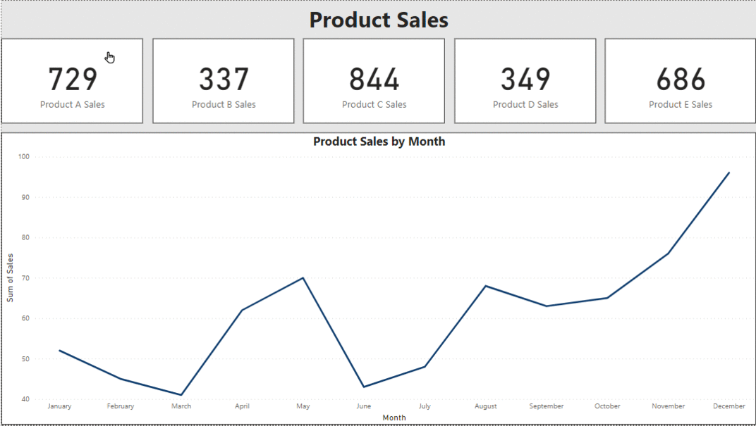
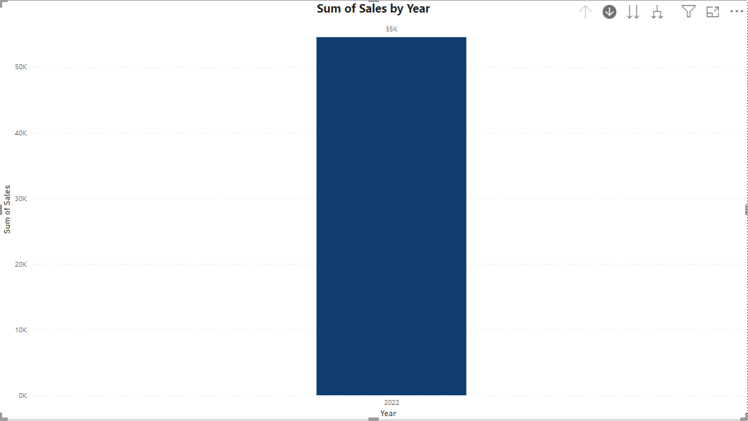
2. Inserting Interactivity into KPI Cards
One aspect I’ve discovered to be less effective in dashboard design is the tendency to include too many pages. The ultimate aim is to capture attention quickly within a limited timeframe. A more efficient approach involves categorizing similar data on one page. Key Performance Indicators (KPIs) play a crucial role in this strategy, providing succinct summaries at a glance. By associating visualizations with specific KPIs, we can dive deeper into the data and convey more comprehensive insights. This integration not only simplifies the user experience but also ensures that essential information is easily accessible by maximizing the dashboard’s effectiveness within the given timeframe.
3. Using Bookmarks as Buttons
When a single dashboard is used by diverse consumer levels, the necessity arises to provide tailored views of the same data. A powerful solution for this problem is to utilize bookmarks. In Power BI, bookmarks serve as markers for specific data states, displays, and pages. They offer a customizable way to capture various functionalities, enabling users to group different bookmarks for seamless navigation using buttons or bookmark navigators. This functionality empowers dashboard creators to craft personalized experiences for users of all levels, ensuring that each consumer can access the insights most relevant to them with ease. Furthermore, it helps eliminate redundant visualizations that essentially convey the same insights across different data points.
4. Incorporating Drill-down and Drill-through Functionality
Data hierarchy allows users to seamlessly navigate through different levels of data, facilitating both drill-down and drill-through capabilities. By leveraging this feature, users can effortlessly transition between high-level summaries and detailed information to fit specific use cases. Power BI offers this functionality within its visualizations, allowing users to interact with data points organized in hierarchical structures. This simple yet powerful feature enhances the ability to answer business questions, providing users with the flexibility to explore insights at different levels of granularity with ease.
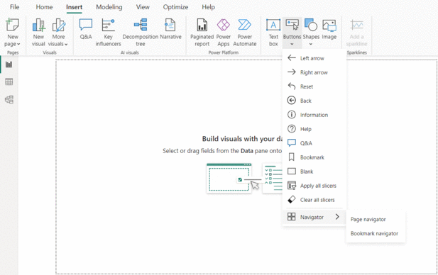
5. Page Navigation for a Website-like Feel
Power BI offers the flexibility of page navigators, enabling a seamless transition between different pages within the dashboard. By adding buttons on each page, users can navigate through the entire dashboard easily. This navigation not only enhances connectivity between different pages of the dashboard but also provides a convenient way to build a narrative across various sources of data within the dashboard. With the ability to tell a story and explore insights across multiple pages, Power BI helps users create dynamic and engaging data-driven experiences.
Dashboards represent a transformative tool in data visualization. Irrespective of your audience from different age groups or functional backgrounds, the creation of a user-friendly dashboard could potentially expand your outreach and connect a wider audience. These user-centric features have greatly helped me in my capacity to narrate captivating stories through data across different levels of my organization. Embrace the power of dashboards and embark on a journey of insightful storytelling.
For suggestions, questions, and all things data, let’s connect on Medium and LinkedIn.
Creating Interactive Power BI Dashboards That Engage Your Audience was originally published in Towards Data Science on Medium, where people are continuing the conversation by highlighting and responding to this story.
5 Innovative Techniques to Revamp Your Dashboards
When considering dashboards, it’s evident that many people lack substantial experience using them. Particularly, stakeholders and clients without analytical or data-oriented backgrounds may be unfamiliar with newer tools and their functionalities. Consequently, this discrepancy creates a barrier between analysts and end users from using insights and solutions effectively.
Interestingly, stakeholders frequently show a preference for traditional Excel sheets, despite the threat of information overload. However, this dependence on spreadsheets can unintentionally exclude critical information amidst the sea of data.
As data and business analysts, we often encounter a pivotal question: How can we make our data more accessible? How can we condense comprehensive insights into bite-sized chunks without compromising their substance? Moreover, how can we encourage the adoption of dashboards over the utilization of raw data by stakeholders?
In my quest for solutions, I have found that dashboards with interactivity and user-friendliness are the keys to enhancing engagement. We can encourage engagement by transforming the dashboard into a convenient and inviting interface that resembles everyday websites or familiar tools.
Here are five techniques that I’ve found useful in making my dashboards interactive and compelling:
1. Designing a Collapsible Slicer Panel
One of the major challenges I encountered when working in Power BI was the challenge of maximizing the available space on the canvas. Slicers and filters are great for summarizing vast datasets and offering various avenues to analyze information, but they can also consume a significant amount of real estate. To address this issue, I explored different approaches. While using filters in the filter panel is one way, it’s not always the ideal solution from a stakeholder’s perspective. This approach often needs additional context about the source data and the filter configuration, unlike the straightforward click of a slicer button.
Creating collapsible slicer panels using a few Power BI tools can help maximize canvas space and enhance interactivity, contributing to a smoother workflow.

2. Inserting Interactivity into KPI Cards
One aspect I’ve discovered to be less effective in dashboard design is the tendency to include too many pages. The ultimate aim is to capture attention quickly within a limited timeframe. A more efficient approach involves categorizing similar data on one page. Key Performance Indicators (KPIs) play a crucial role in this strategy, providing succinct summaries at a glance. By associating visualizations with specific KPIs, we can dive deeper into the data and convey more comprehensive insights. This integration not only simplifies the user experience but also ensures that essential information is easily accessible by maximizing the dashboard’s effectiveness within the given timeframe.
3. Using Bookmarks as Buttons
When a single dashboard is used by diverse consumer levels, the necessity arises to provide tailored views of the same data. A powerful solution for this problem is to utilize bookmarks. In Power BI, bookmarks serve as markers for specific data states, displays, and pages. They offer a customizable way to capture various functionalities, enabling users to group different bookmarks for seamless navigation using buttons or bookmark navigators. This functionality empowers dashboard creators to craft personalized experiences for users of all levels, ensuring that each consumer can access the insights most relevant to them with ease. Furthermore, it helps eliminate redundant visualizations that essentially convey the same insights across different data points.
4. Incorporating Drill-down and Drill-through Functionality
Data hierarchy allows users to seamlessly navigate through different levels of data, facilitating both drill-down and drill-through capabilities. By leveraging this feature, users can effortlessly transition between high-level summaries and detailed information to fit specific use cases. Power BI offers this functionality within its visualizations, allowing users to interact with data points organized in hierarchical structures. This simple yet powerful feature enhances the ability to answer business questions, providing users with the flexibility to explore insights at different levels of granularity with ease.
5. Page Navigation for a Website-like Feel
Power BI offers the flexibility of page navigators, enabling a seamless transition between different pages within the dashboard. By adding buttons on each page, users can navigate through the entire dashboard easily. This navigation not only enhances connectivity between different pages of the dashboard but also provides a convenient way to build a narrative across various sources of data within the dashboard. With the ability to tell a story and explore insights across multiple pages, Power BI helps users create dynamic and engaging data-driven experiences.
Dashboards represent a transformative tool in data visualization. Irrespective of your audience from different age groups or functional backgrounds, the creation of a user-friendly dashboard could potentially expand your outreach and connect a wider audience. These user-centric features have greatly helped me in my capacity to narrate captivating stories through data across different levels of my organization. Embrace the power of dashboards and embark on a journey of insightful storytelling.
For suggestions, questions, and all things data, let’s connect on Medium and LinkedIn.
Creating Interactive Power BI Dashboards That Engage Your Audience was originally published in Towards Data Science on Medium, where people are continuing the conversation by highlighting and responding to this story.
Denial of responsibility! Techno Blender is an automatic aggregator of the all world’s media. In each content, the hyperlink to the primary source is specified. All trademarks belong to their rightful owners, all materials to their authors. If you are the owner of the content and do not want us to publish your materials, please contact us by email – [email protected]. The content will be deleted within 24 hours.