
Explain Machine Learning Models using SHAP library | by Gustavo Santos | Oct, 2022
Shapley Additive Explanations for Python can help you to easily explain how a model predicts the result
Complex machine learning models are constantly referred to as “black boxes”. Here is a good explanation for the concept.
In science, computing, and engineering, a black box is a device, system, or object which produces useful information without revealing any information about its internal workings. The explanations for its conclusions remain opaque or “black”. (Investopedia)
So, simply put, it is when you create a ML model and it works just fine, but if someone asks how did you get to that answer, you won’t know how to explain. “It just happens”.
However, us, as data scientists, work with businesses, executives, and they will frequently ask for an explanation to be sure they’re taking the right decision. Or, at least, they want to know what the model is doing and how it is reaching that conclusion, what helps to make sense of the results.
In this post, we will learn how to use the SHAP module in Python to make “black box” models more explainable. This is good not only to show domain in the Data Science field, but also to sell your model to the client by demonstrating how the data goes in and how it comes out, transformed, as a prediction.
The Shapley values are named after Lloyd Shapley, who won the Nobel Prize for it in 2012. The concept is based on the game theory and proposes a solution to determine the importance of each player to the overall cooperation, to the game.
Transposing the concept to Machine Learning, we could say that the Shapley values will tell the importance of each single data point to a decision of the model.
Making an analogy, let’s imagine a bank account and how the final balance amount is determined.
There is some money coming in (pay check, stocks earnings) and some money going out (bills, food, transportation, rent). Each of those transactions will play a part in increasing or decreasing the final balance, right? Some earnings will be high, others not that much. Likewise, some expenses will be big, others small…
At the end of the month, the balance will be the sum of all the ins and outs. So, each of those numbers are like the Shapley values and they make it easier to tell how each transaction contributed positively or negatively during the month to the balance.
For example, the pay check is impacting a lot positively, while rent is the highest decrease impact.

Right, now that we know what the Shapley values are, how can we actually use them? This is what we will see in the sequence.
We will install and import the Python module named shap.
# Install
pip install shap#import
import shap
We should import a couple of other needs for this exercise too.
import pandas as pd
from sklearn.ensemble import RandomForestClassifier
from sklearn.model_selection import train_test_split
from sklearn.datasets import make_classification
Next, let’s create a classification dataset for training purposes and split it in train and test sets.
# Create dataset
X, y = make_classification(n_samples=1000, n_features=5, n_informative=3,n_redundant=2, n_repeated=0, n_classes=2,scale=10, shuffle=True, random_state=12)# Train Test Split
X_train, X_test, y_train, y_test = train_test_split(X, y, test_size=0.2, random_state=12)
Ok. We have our set. Now let’s train a Random Forest Classifier.
# Model
rf = RandomForestClassifier().fit(X_train, y_train)
And next, we can create a copy of our X_test and add some column names, to help the interpretability of SHAP. We can pretend that the random numbers from our dataset are scores of tests over a given product. The label to be predicted is binary (0 or 1), that can mean 0= failed, 1 = passed.
X_test_df = pd.DataFrame(X_test, columns=['Test1', 'Test2', 'Test3', 'Test4', 'Test5'])

Explainer and SHAP values
The next step is to create an explainer for tree based models. For that, we will input the trained model. In the sequence, we calculate the shap_values() with the recently created test set that carries the features names.
# Create Tree Explainer object that can calculate shap values
explainer = shap.explainers.Tree(rf)# Calculate shap values
shap_values = explainer.shap_values(X_test_df)
Now let’s look at the Shapley values for this dataset. Notice in the code that there is the slicing notation [1] because the .shap_values() function returns a tensor with one array per class. The one in slice [0] considers the prediction of the class 0 as the reference and the slice [1] considers the prediction of 1 as reference.
# SHAP values for predictions with (1 = passed) as reference
pd.DataFrame(shap_values[1])

Ok, cool But what does it mean? Each of those numbers mean how much that data point is contributing to the prediction result 1. So, for example, the first row, the variable 0 contributes more increasing the chances it will be 1, while variable 3 has the greatest negative impact, decreasing the chances of it be classified as 1.
Force Plot
We can see the contributions visually in this really cool force plot.
# Check Single Prediction# Choose observation
observation = X_test_df.loc[[0]]# Calculate Shapley values
shap_values2 = explainer.shap_values(observation)# Initiate Java script for plotting
shap.initjs()# Plot
shap.force_plot(explainer.expected_value[1], shap_values2[1], observation)

Let’s understand piece by piece of this graphic.
- SHAP starts from a base value, that is the mean of the target variable.
y.mean()is 0.505. So, if the base value for class 0 is this, for class 1 will be 1–0.505, which is around 0.495. - From that, the algorithm calculates what increases or decreases the chances of the class to be 0 or 1. The pinks make the chances increase and the blues make it decrease.
- Tests 4 and 5 are pushing the classification to class 0 while Tests 1, 2 and 3 are pushing back, to classify the observation as class 1.
- We see that after each contribution, the final result is 0.48, which is under 0.5, so it makes the prediction for that observation to be class 0 (failed, in our example).
Decision Plot
A similar option to the Force Plot is the Decision plot, that shows the same steps for the algorithm decision, but in a different visualization.
# Choose observation
observation = X_test_df.loc[[0]]# Calculate Shapley values
shap_values2 = explainer.shap_values(observation)# Decision Plot
shap.decision_plot(explainer.expected_value[1], shap_values2[1], observation)
Force Plot (Feature Importance)
To have an overall view, very similar to the feature importance plot from Random Forest, we can plot a summary bar plot. Here is the code, followed by the resulting image.
# Summary bar plot
shap.summary_plot(shap_values[1], x_test_df, plot_type='bar')

The variable Test1 has the main importance to the predictions, followed by tests number 3, 4, 5 and 2.
Summary Plot by data point
Another interesting plot is the summary scatterplot. It shows a summary of how each single data point affects the classifications. The code is simple: just call summary_plot() and feed it with the SHAP values and the data to be plotted.
# Summary scatterplot
shap.summary_plot(shap_values[1], x_test_df)
The result looks scary at first, by it is really easy to interpret. First, observe that the colors are the values of the data points. So, the higher the value, the more it is red, and the lower it is, more blue it gets.
Second point of attention, the X axis is where the SHAP values appear. Positive to the right means more impact towards classification as 1, since we are using the array with slicing shap_values[1]. And the Y axis shows the variables names.

So, interpreting it:
- The higher the Test1 values are, the more it impacts negatively the classification, pushing towards class 0.
- For Test3, the higher the value, the more it impacts the classification as class 1.
- Test4 and Test2 also show higher values more associated with negative impact in SHAP, meaning they push classification to class 0.
- Test5 appears to be more mixed, however lower values influence classification as 1.
Dependence Plot
Finally, let’s look at the dependence plot. This visualization can help us determining which variables are more closely related when the algorithm is classifying an observation.
Here is the code to create it. Use shap.dependence_plot() and input the feature index number, the SHAP values and the dataset for the plot.
# Dependence plot
shap.dependence_plot(0, shap_values[1], x_test_df)
The result is like this.

The interesting points that it brings are:
- This plot shows the two variables that are more closely related while predicting. In our case, Test1 relates a lot with Test4.
- The values on X are the data points. Y brings the SHAP value for the same variable.
- The color is according to the second variable, Test4.
- Here, it shows that for high values of Test1 and Test4, the impact in the classification is negative (SHAP values are low). Hence, an observation with high value on Test1, high value on Test4 is more likely to be classified as class 0.
- See in the figure that follows, that both variables are the main detractors of the classification value.
I have been studying this package and I know that there still a lot to learn. I strongly encourage you to read these references below from Dr. Dataman, that helped me a lot to learn about this awesome library and to create this post.
What made me pursue this was a great article from Aayush Agrawal that I am also attaching as reference regarding Microsoft Research’s interpret module. They wrapped this concept in a nice Python module too. I encourage you to look at the section The “Art” of ML explainability that is just awesome!
Recapping:
- SHAP values calculate the influence of each data point to a given classification.
- SHAP is an additive method, so the sum of the importances will determine the final result
- Explore the plots and explain the classification for each observation.
If you liked this content, follow my blog for more or consider joining Medium using this referral link (part of the resources come to the author).
Find me on Linkedin.
Shapley Additive Explanations for Python can help you to easily explain how a model predicts the result

Complex machine learning models are constantly referred to as “black boxes”. Here is a good explanation for the concept.
In science, computing, and engineering, a black box is a device, system, or object which produces useful information without revealing any information about its internal workings. The explanations for its conclusions remain opaque or “black”. (Investopedia)
So, simply put, it is when you create a ML model and it works just fine, but if someone asks how did you get to that answer, you won’t know how to explain. “It just happens”.
However, us, as data scientists, work with businesses, executives, and they will frequently ask for an explanation to be sure they’re taking the right decision. Or, at least, they want to know what the model is doing and how it is reaching that conclusion, what helps to make sense of the results.
In this post, we will learn how to use the SHAP module in Python to make “black box” models more explainable. This is good not only to show domain in the Data Science field, but also to sell your model to the client by demonstrating how the data goes in and how it comes out, transformed, as a prediction.
The Shapley values are named after Lloyd Shapley, who won the Nobel Prize for it in 2012. The concept is based on the game theory and proposes a solution to determine the importance of each player to the overall cooperation, to the game.
Transposing the concept to Machine Learning, we could say that the Shapley values will tell the importance of each single data point to a decision of the model.
Making an analogy, let’s imagine a bank account and how the final balance amount is determined.
There is some money coming in (pay check, stocks earnings) and some money going out (bills, food, transportation, rent). Each of those transactions will play a part in increasing or decreasing the final balance, right? Some earnings will be high, others not that much. Likewise, some expenses will be big, others small…
At the end of the month, the balance will be the sum of all the ins and outs. So, each of those numbers are like the Shapley values and they make it easier to tell how each transaction contributed positively or negatively during the month to the balance.
For example, the pay check is impacting a lot positively, while rent is the highest decrease impact.
Right, now that we know what the Shapley values are, how can we actually use them? This is what we will see in the sequence.
We will install and import the Python module named shap.
# Install
pip install shap#import
import shap
We should import a couple of other needs for this exercise too.
import pandas as pd
from sklearn.ensemble import RandomForestClassifier
from sklearn.model_selection import train_test_split
from sklearn.datasets import make_classification
Next, let’s create a classification dataset for training purposes and split it in train and test sets.
# Create dataset
X, y = make_classification(n_samples=1000, n_features=5, n_informative=3,n_redundant=2, n_repeated=0, n_classes=2,scale=10, shuffle=True, random_state=12)# Train Test Split
X_train, X_test, y_train, y_test = train_test_split(X, y, test_size=0.2, random_state=12)
Ok. We have our set. Now let’s train a Random Forest Classifier.
# Model
rf = RandomForestClassifier().fit(X_train, y_train)
And next, we can create a copy of our X_test and add some column names, to help the interpretability of SHAP. We can pretend that the random numbers from our dataset are scores of tests over a given product. The label to be predicted is binary (0 or 1), that can mean 0= failed, 1 = passed.
X_test_df = pd.DataFrame(X_test, columns=['Test1', 'Test2', 'Test3', 'Test4', 'Test5'])
Explainer and SHAP values
The next step is to create an explainer for tree based models. For that, we will input the trained model. In the sequence, we calculate the shap_values() with the recently created test set that carries the features names.
# Create Tree Explainer object that can calculate shap values
explainer = shap.explainers.Tree(rf)# Calculate shap values
shap_values = explainer.shap_values(X_test_df)
Now let’s look at the Shapley values for this dataset. Notice in the code that there is the slicing notation [1] because the .shap_values() function returns a tensor with one array per class. The one in slice [0] considers the prediction of the class 0 as the reference and the slice [1] considers the prediction of 1 as reference.
# SHAP values for predictions with (1 = passed) as reference
pd.DataFrame(shap_values[1])
Ok, cool But what does it mean? Each of those numbers mean how much that data point is contributing to the prediction result 1. So, for example, the first row, the variable 0 contributes more increasing the chances it will be 1, while variable 3 has the greatest negative impact, decreasing the chances of it be classified as 1.
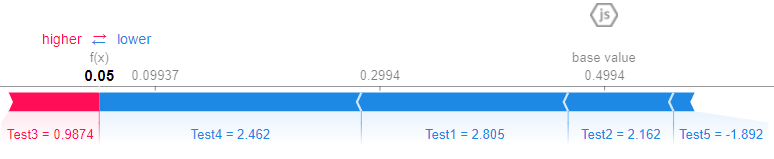
Force Plot
We can see the contributions visually in this really cool force plot.
# Check Single Prediction# Choose observation
observation = X_test_df.loc[[0]]# Calculate Shapley values
shap_values2 = explainer.shap_values(observation)# Initiate Java script for plotting
shap.initjs()# Plot
shap.force_plot(explainer.expected_value[1], shap_values2[1], observation)
Let’s understand piece by piece of this graphic.
- SHAP starts from a base value, that is the mean of the target variable.
y.mean()is 0.505. So, if the base value for class 0 is this, for class 1 will be 1–0.505, which is around 0.495. - From that, the algorithm calculates what increases or decreases the chances of the class to be 0 or 1. The pinks make the chances increase and the blues make it decrease.
- Tests 4 and 5 are pushing the classification to class 0 while Tests 1, 2 and 3 are pushing back, to classify the observation as class 1.
- We see that after each contribution, the final result is 0.48, which is under 0.5, so it makes the prediction for that observation to be class 0 (failed, in our example).
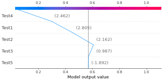
Decision Plot
A similar option to the Force Plot is the Decision plot, that shows the same steps for the algorithm decision, but in a different visualization.
# Choose observation
observation = X_test_df.loc[[0]]# Calculate Shapley values
shap_values2 = explainer.shap_values(observation)# Decision Plot
shap.decision_plot(explainer.expected_value[1], shap_values2[1], observation)
Force Plot (Feature Importance)
To have an overall view, very similar to the feature importance plot from Random Forest, we can plot a summary bar plot. Here is the code, followed by the resulting image.
# Summary bar plot
shap.summary_plot(shap_values[1], x_test_df, plot_type='bar')
The variable Test1 has the main importance to the predictions, followed by tests number 3, 4, 5 and 2.
Summary Plot by data point
Another interesting plot is the summary scatterplot. It shows a summary of how each single data point affects the classifications. The code is simple: just call summary_plot() and feed it with the SHAP values and the data to be plotted.
# Summary scatterplot
shap.summary_plot(shap_values[1], x_test_df)
The result looks scary at first, by it is really easy to interpret. First, observe that the colors are the values of the data points. So, the higher the value, the more it is red, and the lower it is, more blue it gets.
Second point of attention, the X axis is where the SHAP values appear. Positive to the right means more impact towards classification as 1, since we are using the array with slicing shap_values[1]. And the Y axis shows the variables names.
So, interpreting it:
- The higher the Test1 values are, the more it impacts negatively the classification, pushing towards class 0.
- For Test3, the higher the value, the more it impacts the classification as class 1.
- Test4 and Test2 also show higher values more associated with negative impact in SHAP, meaning they push classification to class 0.
- Test5 appears to be more mixed, however lower values influence classification as 1.
Dependence Plot
Finally, let’s look at the dependence plot. This visualization can help us determining which variables are more closely related when the algorithm is classifying an observation.
Here is the code to create it. Use shap.dependence_plot() and input the feature index number, the SHAP values and the dataset for the plot.
# Dependence plot
shap.dependence_plot(0, shap_values[1], x_test_df)
The result is like this.
The interesting points that it brings are:
- This plot shows the two variables that are more closely related while predicting. In our case, Test1 relates a lot with Test4.
- The values on X are the data points. Y brings the SHAP value for the same variable.
- The color is according to the second variable, Test4.
- Here, it shows that for high values of Test1 and Test4, the impact in the classification is negative (SHAP values are low). Hence, an observation with high value on Test1, high value on Test4 is more likely to be classified as class 0.
- See in the figure that follows, that both variables are the main detractors of the classification value.
I have been studying this package and I know that there still a lot to learn. I strongly encourage you to read these references below from Dr. Dataman, that helped me a lot to learn about this awesome library and to create this post.
What made me pursue this was a great article from Aayush Agrawal that I am also attaching as reference regarding Microsoft Research’s interpret module. They wrapped this concept in a nice Python module too. I encourage you to look at the section The “Art” of ML explainability that is just awesome!
Recapping:
- SHAP values calculate the influence of each data point to a given classification.
- SHAP is an additive method, so the sum of the importances will determine the final result
- Explore the plots and explain the classification for each observation.
If you liked this content, follow my blog for more or consider joining Medium using this referral link (part of the resources come to the author).
Find me on Linkedin.
Denial of responsibility! Techno Blender is an automatic aggregator of the all world’s media. In each content, the hyperlink to the primary source is specified. All trademarks belong to their rightful owners, all materials to their authors. If you are the owner of the content and do not want us to publish your materials, please contact us by email – [email protected]. The content will be deleted within 24 hours.