
Exploratory Data Analysis in Python — A Step-by-Step Process | by Andrew D #datascience | Jul, 2022
What is exploratory analysis, how it is structured and how to apply it in Python with the help of Pandas and other data analysis and visualization libraries
Exploratory data analysis (EDA) is an especially important activity in the routine of a data analyst or scientist.
It enables an in depth understanding of the dataset, define or discard hypotheses and create predictive models on a solid basis.
It uses data manipulation techniques and several statistical tools to describe and understand the relationship between variables and how these can impact business.
In fact, it’s thanks to EDA that we can ask ourselves meaningful questions that can impact business.
In this article, I will share with you a template for exploratory analysis that I have used over the years and that has proven to be solid for many projects and domains. This is implemented through the use of the Pandas library — an essential tool for any analyst working with Python.
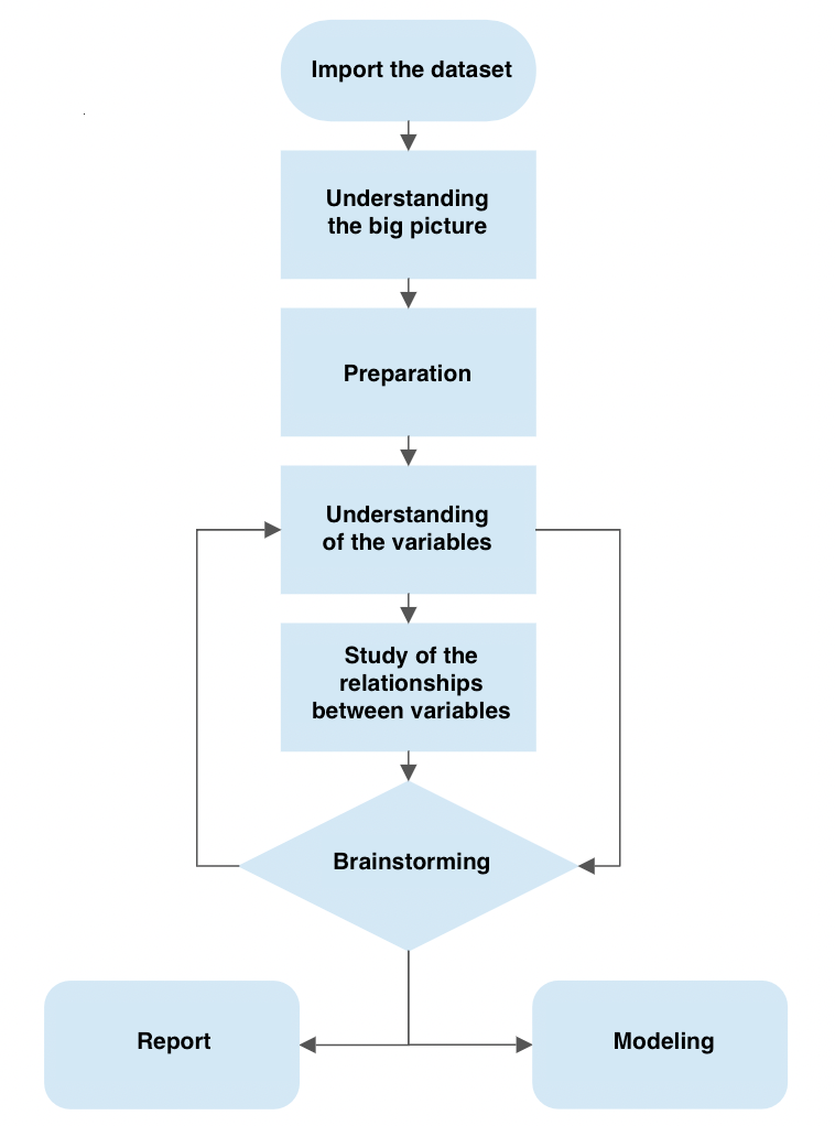
The process consists of several steps:
- Importing a dataset
- Understanding the big picture
- Preparation
- Understanding of variables
- Study of the relationships between variables
- Brainstorming
This template is the result of many iterations and allows me to ask myself meaningful questions about the data in front of me. At the end of the process, we will be able to consolidate a business report or continue with the data modeling phase.
The image below shows how the brainstorming phase is connected with that of understanding the variables and how this in turn is connected again with the brainstorming phase.
This process describes how we can move to ask new questions until we are satisfied.
We will see some of the most common and important features of Pandas and also some techniques to manipulate the data in order to understand it thoroughly.
I have discovered with time and experience that a large number of companies are looking for insights and value that come from fundamentally descriptive activities.
This means that companies are often willing to allocate resources to acquire the necessary awareness of the phenomenon that we analysts are going to study.
The knowledge of something.
If we are able to investigate the data and ask the right questions, the EDA process becomes extremely powerful. By combining data visualization skills, a skilled analyst is able to build a career only by leveraging these skills. You don’t even have to go into modeling.
A good approach to EDA therefore allows us to provide added value to many business contexts, especially where our client / boss finds difficulties in the interpretation or access to data.
This is the basic idea that led me to put down such a template.
I wrote a Twitter thread that puts my thoughts on the matter on paper
Before starting, let’s see what are the fundamental libraries required to carry out the EDA. There are many useful libraries but here we will only see the ones that this template leverages
The data analysis pipeline begins with the import or creation of a working dataset. The exploratory analysis phase begins immediately after.
Importing a dataset is simple with Pandas through functions dedicated to reading the data. If our dataset is a .csv file, we can just use
df = pd.read_csv("path/to/my/file.csv")
df stands for dataframe, which is Pandas’s object similar to an Excel sheet. This nomenclature is often used in the field. The read_csv function takes as input the path of the file we want to read. There are many other arguments that we can specify.
The .csv format is not the only one we can import — there are in fact many others such as Excel, Parquet and Feather.
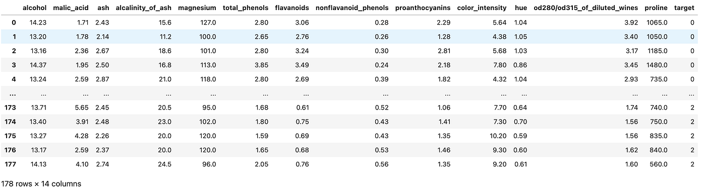
For ease, in this example we will use Sklearn to import the wine dataset. This dataset is widely used in the industry for educational purposes and contains information on the chemical composition of wines for a classification task. We will not use a .csv but a dataset present in Sklearn to create the dataframe
Now that we’ve imported a usable dataset, let’s move on to applying the EDA pipeline.
In this first phase, our goal is to understand what we are looking at, but without going into detail. We try to understand the problem we want to solve, thinking about the entire dataset and the meaning of the variables.
This phase can be slow and sometimes even boring, but it will give us the opportunity to make an opinion of our dataset.
Let’s take some notes
I usually open Excel or create a text file in VSCode to put some notes down, in this fashion:
- Variable: name of the variable
- Type: the type or format of the variable. This can be categorical, numeric, Boolean, and so on
- Context: useful information to understand the semantic space of the variable. In the case of our dataset, the context is always the chemical-physical one, so it’s easy. In another context, for example that of real estate, a variable could belong to a particular segment, such as the anatomy of the material or the social one (how many neighbors are there?)
- Expectation: how relevant is this variable with respect to our task? We can use a scale “High, Medium, Low”.
- Comments: whether or not we have any comments to make on the variable
Of all these, Expectation is one of the most important because it helps us develop the analyst’s “sixth sense” — as we accumulate experience in the field we will be able to mentally map which variables are relevant and which are not.
In any case, the point of carrying out this activity is that it enables us to do some preliminary reflections on our data, which helps us to start the analysis process.
Useful properties and functions in Pandas
We will leverage several Pandas features and properties to understand the big picture. Let’s see some of them.
.head() and .tail()
Two of the most commonly used functions in Pandas are .head() and .tail(). These two allow us to view an arbitrary number of rows (by default 5) from the beginning or end of the dataset. Very useful for accessing a small part of the dataframe quickly.
.shape
If we apply .shape on the dataset, Pandas returns us a pair of numbers that represent the dimensionality of our dataset. This property is very useful for understanding the number of columns and the length of the dataset.
.describe()
The describe function does exactly this: it provides purely descriptive information about the dataset. This information includes statistics that summarize the central tendency of the variable, their dispersion, the presence of empty values and their shape.
.info()
Unlike .describe(), .info() gives us a shorter summary of our dataset. It returns us information about the data type, non-null values and memory usage.
There are also .dtypes and .isna() which respectively give us the data type info and whether the value is null or not. However, using .info() allows us to access this information with a single command.
What is our goal?
This is an important question that we must always ask ourselves. In our case, we see how the target is a numeric categorical variable that covers the values of 0, 1 and 2. These numbers identify the type of wine.
If we check the Sklearn documentation on this dataset we see that it was built precisely for classification tasks. If we wanted to do modeling, the idea would then be to use the features of the wine to predict its type. In a data analysis setting instead, we would want to study how the different types of wine have different features and how these are distributed.
At this stage we want to start cleaning our dataset in order to continue the analysis. Some of the questions we will ask ourselves are
- are there any useless or redundant variables?
- are there any duplicate columns?
- does the nomenclature make sense?
- are there any new variables we want to create?
Let’s see how to apply these ideas to our dataset.
- All the variables appear to be physical-chemical measures. This means they could all be useful and help define the segmentation of the type of wine. We have no reason to remove columns
- To check for duplicate rows we can use
.isduplicated().sum()— this will print us the number of duplicated rows in our dataset
- The nomenclature can certainly be optimized. For example od280 / od315_of_diluted_wines is difficult to understand. Since it indicates a research methodology that measures protein concentration in the liquid, we will call it protein_concentration
- One of the most common feature engineering methods is to create new features that are the linear / polynomial combination of the existing ones. This becomes useful for providing more information to a predictive model to improve its performance. We will not do this in our case though.
Being a toy dataset, it is practically already prepared for us. However, these points are still useful to process more complex datasets.
While in the previous point we are describing the dataset in its entirety, now we try to accurately describe all the variables that interest us. For this reason, this step can also be called univariate analysis.
Categorical variables
In this context, .value_counts() is one of the most important functions to understand how many values of a given variable there are in our dataset. Let’s take the target variable for example.
You can also express the data as a percentage by passing normalize = True
We can also plot the data with
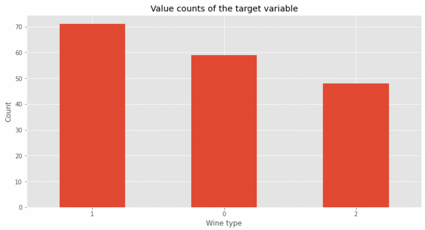
value_counts() can be used with any variable, but works best with categorical variables such as our target. This function also informs us of how balanced the classes are within the dataset. In this case, class 2 appears less than the other two classes — in the modeling phase perhaps we can implement data balancing techniques to not confuse our model.
Numeric variables
If instead we want to analyze a numeric variable, we can describe its distribution with describe() as we have seen before and we can display it with .hist().
Take for example the variable magnesium
Let’s use .describe() first
and then plot the histogram
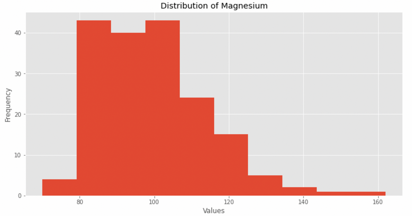
We also evaluate distribution kurtosis and asymmetry:
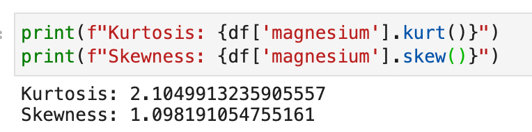
From this information we see how the distribution:
- does not follow a normal curve
- show spikes
- has kurtosis and asymmetry values greater than 1
We do this for each variable, and we will have a pseudo-complete descriptive picture of their behavior.
We need this work to fully understand each variable, and unlocks the study of the relationship between variables.
Now the idea is to find interesting relationships that show the influence of one variable on the other, preferably on the target.
This job unlocks the first intelligence options — in a business context such as digital marketing or online advertising, this information offers value and the ability to act strategically.
We can start exploring relationships with the help of Seaborn and pairplot.
sns.pairplot(df)
As you can see, pairplot displays all the variables against each other in a scatterplot. It is very useful for grasping the most important relationships without having to go through every single combination manually. Be warned though — it is computationally expensive to compute, so it is best suited for datasets with relatively low number of variables like this one.
Let’s analyze the pairplot starting from the target
The best way to understand the relationship between a numeric variable and a categorical variable is through a boxplot.
Let’s create a boxplot for alcohol, flavanoids, color_intensity and proline. Why these variables? Because visually they show slightly more marked segmentations for a given wine type. For example, let’s look at proline vs target
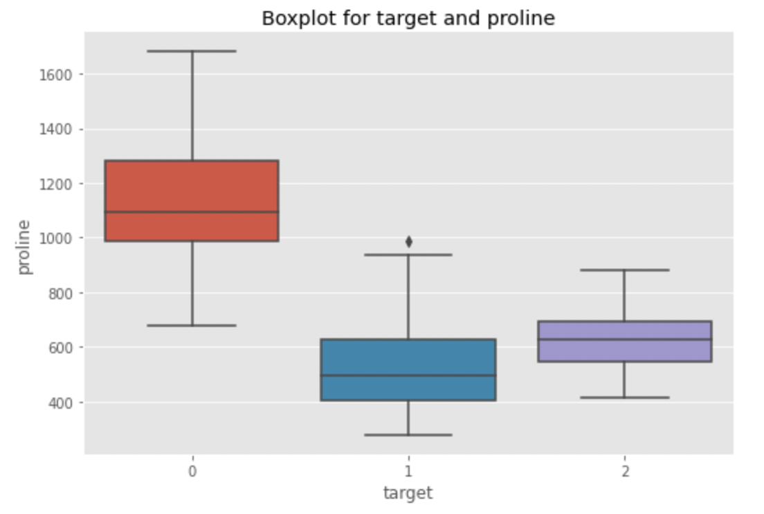
In fact, we see how the proline median of type 0 wine is bigger than that of the other two types. Could it be a differentiating factor? Too early to tell. There may be other variables to consider. Let’s see flavanoids now
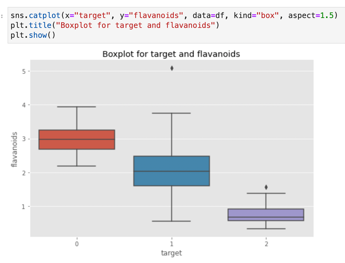
Here too, the type 0 wine seems to have higher values of flavanoids. Is it possible that type 0 wines have higher combined levels of proline and flavanoids? With Seaborn we can create a scatterplot and visualize which wine class a point belongs to. Just specify the hue parameter
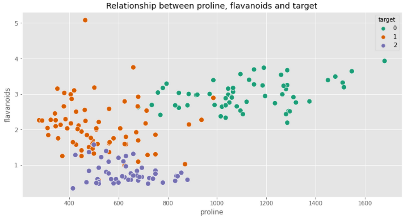
Our intuition was on the right track! Type 0 wines show clear patterns of flavanoids and proline. In particular, the proline levels are much higher while the flavanoid level is stable around the value of 3.
Now let’s see how Seaborn can again help us expand our exploration thanks to the heatmap. We are going to create a correlation matrix with Pandas and to isolate the most correlated variables
The heat map is useful because it allows us to efficiently grasp which variables are strongly correlated with each other.
When the target variable decreases (which must be interpreted as a tendency to go to 0, therefore to the type of wine 0) the flavanoids, total phenols, proline and other proteins tend to increase. And viceversa.
We also see the relationships between the other variables, excluding the target. For example, there is a very strong correlation between alcohol and proline. High levels of alcohol correspond to high levels of proline.
Let’s sum it all up with the brainstorming phase.
We have collected a lot of data to support the hypothesis that class 0 wine has a particular chemical composition. It remains now is to isolate what are the conditions that differentiate type 1 from type 2. I will leave this exercise to the reader. At this point of the analysis we have several things we can do:
- create a report for the stakeholders
- do modeling
- continue with the exploration to further clarify business questions
The importance of asking the right questions
Regardless of the path we take after the EDA, asking the right questions is what separates a good data analyst from a mediocre one. We may be experts with the tools and tech, but these skills are relatively useless if we are unable to retrieve information from the data.
Asking the right questions allows the analyst to “be in sync” with the stakeholder, or to implement a predictive model that really works.
Again, I urge the interested reader to open up their favorite text editor and populate it with questions whenever doubts or specific thoughts arise. Be obsessive — if the answer is in the data, then it is up to us to find it and communicate it in the best possible way.
The process described so far is iterative in its nature. In fact, the exploratory analysis goes on until we have answered all the business questions. It is impossible for me to show or demonstrate all the possible techniques of data exploration —we don’t have specific business requirements or valid real-world dataset. However, I can convey to the reader the importance of applying a template like the following to be efficient in the analysis.
If you want to support my content creation activity, feel free to follow my referral link below and join Medium’s membership program. I will receive a portion of your investment and you’ll be able to access Medium’s plethora of articles on data science and more in a seamless way.
What is your methodology for your exploratory analyses? What do you think of this one? Share your thoughts with a comment 👇
Thanks for your attention and see you soon! 👋
What is exploratory analysis, how it is structured and how to apply it in Python with the help of Pandas and other data analysis and visualization libraries

Exploratory data analysis (EDA) is an especially important activity in the routine of a data analyst or scientist.
It enables an in depth understanding of the dataset, define or discard hypotheses and create predictive models on a solid basis.
It uses data manipulation techniques and several statistical tools to describe and understand the relationship between variables and how these can impact business.
In fact, it’s thanks to EDA that we can ask ourselves meaningful questions that can impact business.
In this article, I will share with you a template for exploratory analysis that I have used over the years and that has proven to be solid for many projects and domains. This is implemented through the use of the Pandas library — an essential tool for any analyst working with Python.
The process consists of several steps:
- Importing a dataset
- Understanding the big picture
- Preparation
- Understanding of variables
- Study of the relationships between variables
- Brainstorming
This template is the result of many iterations and allows me to ask myself meaningful questions about the data in front of me. At the end of the process, we will be able to consolidate a business report or continue with the data modeling phase.
The image below shows how the brainstorming phase is connected with that of understanding the variables and how this in turn is connected again with the brainstorming phase.
This process describes how we can move to ask new questions until we are satisfied.
We will see some of the most common and important features of Pandas and also some techniques to manipulate the data in order to understand it thoroughly.
I have discovered with time and experience that a large number of companies are looking for insights and value that come from fundamentally descriptive activities.
This means that companies are often willing to allocate resources to acquire the necessary awareness of the phenomenon that we analysts are going to study.
The knowledge of something.
If we are able to investigate the data and ask the right questions, the EDA process becomes extremely powerful. By combining data visualization skills, a skilled analyst is able to build a career only by leveraging these skills. You don’t even have to go into modeling.
A good approach to EDA therefore allows us to provide added value to many business contexts, especially where our client / boss finds difficulties in the interpretation or access to data.
This is the basic idea that led me to put down such a template.
I wrote a Twitter thread that puts my thoughts on the matter on paper
Before starting, let’s see what are the fundamental libraries required to carry out the EDA. There are many useful libraries but here we will only see the ones that this template leverages
The data analysis pipeline begins with the import or creation of a working dataset. The exploratory analysis phase begins immediately after.
Importing a dataset is simple with Pandas through functions dedicated to reading the data. If our dataset is a .csv file, we can just use
df = pd.read_csv("path/to/my/file.csv")
df stands for dataframe, which is Pandas’s object similar to an Excel sheet. This nomenclature is often used in the field. The read_csv function takes as input the path of the file we want to read. There are many other arguments that we can specify.
The .csv format is not the only one we can import — there are in fact many others such as Excel, Parquet and Feather.
For ease, in this example we will use Sklearn to import the wine dataset. This dataset is widely used in the industry for educational purposes and contains information on the chemical composition of wines for a classification task. We will not use a .csv but a dataset present in Sklearn to create the dataframe
Now that we’ve imported a usable dataset, let’s move on to applying the EDA pipeline.
In this first phase, our goal is to understand what we are looking at, but without going into detail. We try to understand the problem we want to solve, thinking about the entire dataset and the meaning of the variables.
This phase can be slow and sometimes even boring, but it will give us the opportunity to make an opinion of our dataset.
Let’s take some notes
I usually open Excel or create a text file in VSCode to put some notes down, in this fashion:
- Variable: name of the variable
- Type: the type or format of the variable. This can be categorical, numeric, Boolean, and so on
- Context: useful information to understand the semantic space of the variable. In the case of our dataset, the context is always the chemical-physical one, so it’s easy. In another context, for example that of real estate, a variable could belong to a particular segment, such as the anatomy of the material or the social one (how many neighbors are there?)
- Expectation: how relevant is this variable with respect to our task? We can use a scale “High, Medium, Low”.
- Comments: whether or not we have any comments to make on the variable
Of all these, Expectation is one of the most important because it helps us develop the analyst’s “sixth sense” — as we accumulate experience in the field we will be able to mentally map which variables are relevant and which are not.
In any case, the point of carrying out this activity is that it enables us to do some preliminary reflections on our data, which helps us to start the analysis process.
Useful properties and functions in Pandas
We will leverage several Pandas features and properties to understand the big picture. Let’s see some of them.
.head() and .tail()
Two of the most commonly used functions in Pandas are .head() and .tail(). These two allow us to view an arbitrary number of rows (by default 5) from the beginning or end of the dataset. Very useful for accessing a small part of the dataframe quickly.
.shape
If we apply .shape on the dataset, Pandas returns us a pair of numbers that represent the dimensionality of our dataset. This property is very useful for understanding the number of columns and the length of the dataset.
.describe()
The describe function does exactly this: it provides purely descriptive information about the dataset. This information includes statistics that summarize the central tendency of the variable, their dispersion, the presence of empty values and their shape.
.info()
Unlike .describe(), .info() gives us a shorter summary of our dataset. It returns us information about the data type, non-null values and memory usage.
There are also .dtypes and .isna() which respectively give us the data type info and whether the value is null or not. However, using .info() allows us to access this information with a single command.
What is our goal?
This is an important question that we must always ask ourselves. In our case, we see how the target is a numeric categorical variable that covers the values of 0, 1 and 2. These numbers identify the type of wine.
If we check the Sklearn documentation on this dataset we see that it was built precisely for classification tasks. If we wanted to do modeling, the idea would then be to use the features of the wine to predict its type. In a data analysis setting instead, we would want to study how the different types of wine have different features and how these are distributed.
At this stage we want to start cleaning our dataset in order to continue the analysis. Some of the questions we will ask ourselves are
- are there any useless or redundant variables?
- are there any duplicate columns?
- does the nomenclature make sense?
- are there any new variables we want to create?
Let’s see how to apply these ideas to our dataset.
- All the variables appear to be physical-chemical measures. This means they could all be useful and help define the segmentation of the type of wine. We have no reason to remove columns
- To check for duplicate rows we can use
.isduplicated().sum()— this will print us the number of duplicated rows in our dataset
- The nomenclature can certainly be optimized. For example od280 / od315_of_diluted_wines is difficult to understand. Since it indicates a research methodology that measures protein concentration in the liquid, we will call it protein_concentration
- One of the most common feature engineering methods is to create new features that are the linear / polynomial combination of the existing ones. This becomes useful for providing more information to a predictive model to improve its performance. We will not do this in our case though.
Being a toy dataset, it is practically already prepared for us. However, these points are still useful to process more complex datasets.
While in the previous point we are describing the dataset in its entirety, now we try to accurately describe all the variables that interest us. For this reason, this step can also be called univariate analysis.
Categorical variables
In this context, .value_counts() is one of the most important functions to understand how many values of a given variable there are in our dataset. Let’s take the target variable for example.
You can also express the data as a percentage by passing normalize = True
We can also plot the data with
value_counts() can be used with any variable, but works best with categorical variables such as our target. This function also informs us of how balanced the classes are within the dataset. In this case, class 2 appears less than the other two classes — in the modeling phase perhaps we can implement data balancing techniques to not confuse our model.
Numeric variables
If instead we want to analyze a numeric variable, we can describe its distribution with describe() as we have seen before and we can display it with .hist().
Take for example the variable magnesium
Let’s use .describe() first
and then plot the histogram
We also evaluate distribution kurtosis and asymmetry:
From this information we see how the distribution:
- does not follow a normal curve
- show spikes
- has kurtosis and asymmetry values greater than 1
We do this for each variable, and we will have a pseudo-complete descriptive picture of their behavior.
We need this work to fully understand each variable, and unlocks the study of the relationship between variables.
Now the idea is to find interesting relationships that show the influence of one variable on the other, preferably on the target.
This job unlocks the first intelligence options — in a business context such as digital marketing or online advertising, this information offers value and the ability to act strategically.
We can start exploring relationships with the help of Seaborn and pairplot.
sns.pairplot(df)
As you can see, pairplot displays all the variables against each other in a scatterplot. It is very useful for grasping the most important relationships without having to go through every single combination manually. Be warned though — it is computationally expensive to compute, so it is best suited for datasets with relatively low number of variables like this one.
Let’s analyze the pairplot starting from the target
The best way to understand the relationship between a numeric variable and a categorical variable is through a boxplot.
Let’s create a boxplot for alcohol, flavanoids, color_intensity and proline. Why these variables? Because visually they show slightly more marked segmentations for a given wine type. For example, let’s look at proline vs target
In fact, we see how the proline median of type 0 wine is bigger than that of the other two types. Could it be a differentiating factor? Too early to tell. There may be other variables to consider. Let’s see flavanoids now
Here too, the type 0 wine seems to have higher values of flavanoids. Is it possible that type 0 wines have higher combined levels of proline and flavanoids? With Seaborn we can create a scatterplot and visualize which wine class a point belongs to. Just specify the hue parameter
Our intuition was on the right track! Type 0 wines show clear patterns of flavanoids and proline. In particular, the proline levels are much higher while the flavanoid level is stable around the value of 3.
Now let’s see how Seaborn can again help us expand our exploration thanks to the heatmap. We are going to create a correlation matrix with Pandas and to isolate the most correlated variables
The heat map is useful because it allows us to efficiently grasp which variables are strongly correlated with each other.
When the target variable decreases (which must be interpreted as a tendency to go to 0, therefore to the type of wine 0) the flavanoids, total phenols, proline and other proteins tend to increase. And viceversa.
We also see the relationships between the other variables, excluding the target. For example, there is a very strong correlation between alcohol and proline. High levels of alcohol correspond to high levels of proline.
Let’s sum it all up with the brainstorming phase.
We have collected a lot of data to support the hypothesis that class 0 wine has a particular chemical composition. It remains now is to isolate what are the conditions that differentiate type 1 from type 2. I will leave this exercise to the reader. At this point of the analysis we have several things we can do:
- create a report for the stakeholders
- do modeling
- continue with the exploration to further clarify business questions
The importance of asking the right questions
Regardless of the path we take after the EDA, asking the right questions is what separates a good data analyst from a mediocre one. We may be experts with the tools and tech, but these skills are relatively useless if we are unable to retrieve information from the data.
Asking the right questions allows the analyst to “be in sync” with the stakeholder, or to implement a predictive model that really works.
Again, I urge the interested reader to open up their favorite text editor and populate it with questions whenever doubts or specific thoughts arise. Be obsessive — if the answer is in the data, then it is up to us to find it and communicate it in the best possible way.
The process described so far is iterative in its nature. In fact, the exploratory analysis goes on until we have answered all the business questions. It is impossible for me to show or demonstrate all the possible techniques of data exploration —we don’t have specific business requirements or valid real-world dataset. However, I can convey to the reader the importance of applying a template like the following to be efficient in the analysis.
If you want to support my content creation activity, feel free to follow my referral link below and join Medium’s membership program. I will receive a portion of your investment and you’ll be able to access Medium’s plethora of articles on data science and more in a seamless way.
What is your methodology for your exploratory analyses? What do you think of this one? Share your thoughts with a comment 👇
Thanks for your attention and see you soon! 👋
Denial of responsibility! Techno Blender is an automatic aggregator of the all world’s media. In each content, the hyperlink to the primary source is specified. All trademarks belong to their rightful owners, all materials to their authors. If you are the owner of the content and do not want us to publish your materials, please contact us by email – [email protected]. The content will be deleted within 24 hours.