
Exploring a Two-Decade Trend: College Acceptance Rates and Tuition in the U.S.
Is it harder to get into college these days?
Background
As a recent Grinnell College alum, I’ve closely observed and been impacted by significant shifts in the academic landscape. When I graduated, the acceptance rate at Grinnell had plummeted by 15% from the time I entered, paralleled by a sharp rise in tuition fees. This pattern wasn’t unique to my alma mater; friends from various colleges echoed similar experiences.
This got me thinking: Is this a widespread trend across U.S. colleges? My theory was twofold: firstly, the advent of online applications might have simplified the process of applying to multiple colleges, thereby increasing the applicant pool and reducing acceptance rates. Secondly, an article from the Migration Policy Institute highlighted a doubling in the number of international students in the U.S. from 2000 to 2020 (from 500k to 1 million), potentially intensifying competition. Alongside, I was curious about the tuition fee trends from 2001 to 2022. My aim here is to unravel these patterns through data visualization. For the following analysis, all images, unless otherwise noted, are by the author!
Dataset
The dataset I utilized encompasses a range of data about U.S. colleges from 2001 to 2022, covering aspects like institution type, yearly acceptance rates, state location, and tuition fees. Sourced from the College Scorecard, the original dataset was vast, with over 3,000 columns and 10,000 rows. I meticulously selected pertinent columns for a focused analysis, resulting in a refined dataset available on Kaggle. To ensure relevance and completeness, I concentrated on 4-year colleges featured in the U.S. News college rankings, drawing the list from here.
Change in Acceptance Rates Over the Years
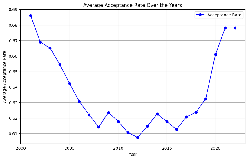
Let’s dive into the evolution of college acceptance rates over the past two decades. Initially, I suspected that I would observe a steady decline. Figure 1 illustrates this trajectory from 2001 to 2022. A consistent drop is evident until 2008, followed by fluctuations leading up to a notable increase around 2020–2021, likely a repercussion of the COVID-19 pandemic influencing gap year decisions and enrollment strategies.
avg_acp_ranked = df_ranked.groupby("year")["ADM_RATE_ALL"].mean().reset_index()

plt.figure(figsize=(10, 6))  # Set the figure size
plt.plot(avg_acp_ranked['year'], avg_acp_ranked['ADM_RATE_ALL'], marker='o', linestyle='-', color='b', label='Acceptance Rate')
plt.title('Average Acceptance Rate Over the Years')  # Set the title
plt.xlabel('Year')  # Label for the x-axis
plt.ylabel('Average Acceptance Rate')  # Label for the y-axis
plt.grid(True)  # Show grid

# Show a legend
plt.legend()
# Display the plot
plt.show()
However, the overall drop wasn’t as steep as my experience at Grinnell suggested. In contrast, when we zoom into the acceptance rates of more prestigious universities (Figure 2), a steady decline becomes apparent. This led me to categorize colleges into three groups based on their 2022 admission rates (Top 10% competitive, top 50%, and others) and analyze the trends within these segments.
pres_colleges = ["Princeton University", "Massachusetts Institute of Technology", "Yale University", "Harvard University", "Stanford University"]
pres_df = df[df['INSTNM'].isin(pres_colleges)]
pivot_pres = pres_df.pivot_table(index="INSTNM", columns="year", values="ADM_RATE_ALL")
pivot_pres.T.plot(linestyle='-')
plt.title('Change in Acceptance Rate Over the Years')
plt.xlabel('Year')
plt.ylabel('Acceptance Rate')
plt.legend(title='Colleges')
plt.show()
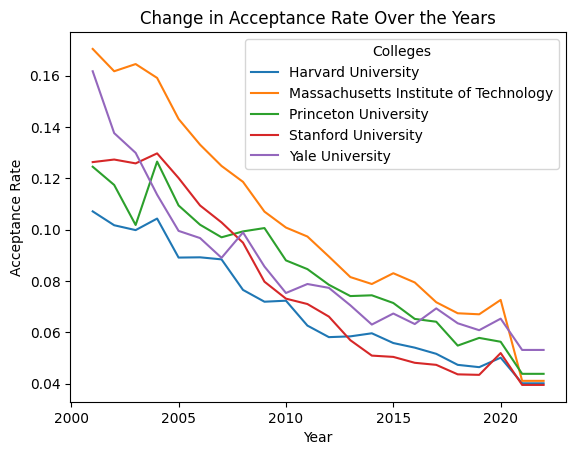
Figure 3 unveils some surprising insights. Except for the least competitive 50%, colleges have generally seen an increase in acceptance rates since 2001. The fluctuations post-2008 across all but the top 10% of colleges could be attributed to economic factors like the recession. Notably, competitive colleges didn’t experience the pandemic-induced spike in acceptance rates seen elsewhere.
top_10_threshold_ranked = df_ranked[df_ranked["year"] == 2001]["ADM_RATE_ALL"].quantile(0.1)
top_50_threshold_ranked = df_ranked[df_ranked["year"] == 2001]["ADM_RATE_ALL"].quantile(0.5)

top_10 = df_ranked[(df_ranked["year"]==2001) & (df_ranked["ADM_RATE_ALL"] <= top_10_threshold_ranked)]["UNITID"]
top_50 = df_ranked[(df_ranked["year"]==2001) & (df_ranked["ADM_RATE_ALL"] > top_10_threshold_ranked) & (df_ranked["ADM_RATE_ALL"] <= top_50_threshold_ranked)]["UNITID"]
others = df_ranked[(df_ranked["year"]==2001) & (df_ranked["ADM_RATE_ALL"] > top_50_threshold_ranked)]["UNITID"]

top_10_df = df_ranked[df_ranked["UNITID"].isin(top_10)]
top50_df = df_ranked[df_ranked["UNITID"].isin(top_50)]
others_df = df_ranked[df_ranked["UNITID"].isin(others)]

avg_acp_top10 = top_10_df.groupby("year")["ADM_RATE_ALL"].mean().reset_index()
avg_acp_others = others_df.groupby("year")["ADM_RATE_ALL"].mean().reset_index()
avg_acp_top50 = top50_df.groupby("year")["ADM_RATE_ALL"].mean().reset_index()

plt.figure(figsize=(10, 6))  # Set the figure size
plt.plot(avg_acp_top10['year'], avg_acp_top10['ADM_RATE_ALL'], marker='o', linestyle='-', color='g', label='Top 10%')
plt.plot(avg_acp_top50['year'], avg_acp_top50['ADM_RATE_ALL'], marker='o', linestyle='-', color='b', label='Top 50%')
plt.plot(avg_acp_others['year'], avg_acp_others['ADM_RATE_ALL'], marker='o', linestyle='-', color='r', label='Others')
plt.title('Average Acceptance Rate Over the Years')  # Set the title
plt.xlabel('Year')  # Label for the x-axis
plt.ylabel('Average Acceptance Rate')  # Label for the y-axis


# Show a legend
plt.legend()
# Display the plot
plt.show()
One finding particularly intrigued me: when considering the top 10% of colleges, their acceptance rates hadn’t decreased notably over the years. This led me to question whether the shift in competitiveness was widespread or if it was a case of some colleges becoming significantly harder or easier to get into. The steady decrease in acceptance rates at prestigious institutions (shown in Figure 2) hinted at the latter.
To get a clearer picture, I visualized the changes in college competitiveness from 2001 to 2022. Figure 4 reveals a surprising trend: about half of the colleges actually became less competitive, contrary to my initial expectations.
pivot_pres_ranked = df_ranked.pivot_table(index="INSTNM", columns="year", values="ADM_RATE_ALL")
pivot_pres_ranked_down = pivot_pres_ranked[pivot_pres_ranked[2001] >= pivot_pres_ranked[2022]]
len(pivot_pres_ranked_down)

pivot_pres_ranked_up = pivot_pres_ranked[pivot_pres_ranked[2001] < pivot_pres_ranked[2022]]
len(pivot_pres_ranked_up)

categories = ["Up", "Down"]
values = [len(pivot_pres_ranked_up), len(pivot_pres_ranked_down)]

plt.figure(figsize=(8, 6))
plt.bar(categories, values, width=0.4, align='center', color=["blue", "red"])
plt.xlabel('Change in acceptance rate')
plt.ylabel('# of colleges')
plt.title('Change in acceptance rate from 2001 to 2022')

# Show the chart
plt.tight_layout()
plt.show()
This prompted me to explore possible factors influencing these shifts. My hypothesis, reinforced by Figure 2, was that already selective colleges became even more so over time. Figure 5 compares acceptance rates in 2001 and 2022.
The 45-degree line delineates colleges that became more or less competitive. Those below the line saw reduced acceptance rates. A noticeable cluster in the lower-left quadrant represents selective colleges that became increasingly exclusive. This trend is underscored by the observation that colleges with initially low acceptance rates (left side of the plot) tend to fall below this dividing line, while those on the right are more evenly distributed.
Furthermore, it’s interesting to note that since 2001, the most selective colleges are predominantly private. To test whether the changes in acceptance rates differed significantly between the top and bottom 50 percentile colleges, I conducted an independent t-test (Null hypothesis: θ_top = θ_bottom). The results showed a statistically significant difference.
import seaborn as sns
from matplotlib.patches import Ellipse

pivot_region = pd.merge(pivot_pres_ranked[[2001, 2022]], df_ranked[["REGION","INSTNM", "UNIVERSITY", "CONTROL"]], on="INSTNM", how="right")

plt.figure(figsize=(8, 8))
sns.scatterplot(data=pivot_region, x=2001, y=2022, hue='CONTROL', palette='Set1', legend='full')
plt.xlabel('Acceptance rate for 2001')
plt.ylabel('Acceptance rate for 2022')
plt.title('Change in acceptance rate')

x_line = np.linspace(0, max(pivot_region[2001]), 100)  # X-values for the line
y_line = x_line  # Y-values for the line (slope = 1)

plt.plot(x_line, y_line, label='45-Degree Line', color='black', linestyle='--')
# Define ellipse parameters (center, width, height, angle)
ellipse_center = (0.25, 0.1)  # Center of the ellipse
ellipse_width = 0.4  # Width of the ellipse
ellipse_height = 0.2  # Height of the ellipse
ellipse_angle = 45  # Rotation angle in degrees

# Create an Ellipse patch
ellipse = Ellipse(
    xy=ellipse_center,
    width=ellipse_width,
    height=ellipse_height,
    angle=ellipse_angle,
    edgecolor='b',  # Edge color of the ellipse
    facecolor='none',  # No fill color (transparent)
    linewidth=2  # Line width of the ellipse border
)

plt.gca().add_patch(ellipse)

# Add the ellipse to the current a

plt.legend()
plt.gca().set_aspect('equal')
plt.show()
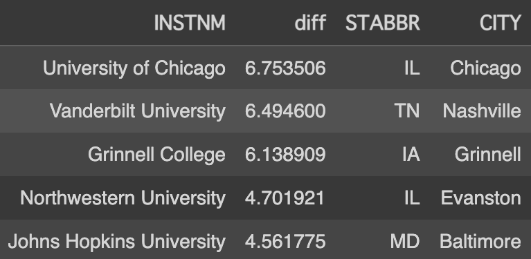
Another aspect that piqued my curiosity was regional differences. Figure 6 lists the top 5 colleges with the most significant decrease in acceptance rates (calculated by dividing the 2022 acceptance rate by the 2001 rate).
It was astonishing to see how high the acceptance rate for the University of Chicago was two decades ago — half of the applicants were admitted then!
This also helped me understand my initial bias towards a general decrease in acceptance rates; notably, Grinnell College, my alma mater, is among these top 5 with a significant drop in acceptance rate.
Interestingly, three of the top five colleges are located in the Midwest. My theory is that with the advent of the internet, these institutions, not as historically renowned as those on the West and East Coasts, have gained more visibility both domestically and internationally.
pivot_pres_ranked["diff"] = pivot_pres_ranked[2001] / pivot_pres_ranked[2022]
tmp = pivot_pres_ranked.reset_index()
tmp = tmp.merge(df_ranked[df_ranked["year"]==2022][["INSTNM", "STABBR", "CITY"]],on="INSTNM")
tmp.sort_values(by="diff",ascending=False)[["INSTNM", "diff", "STABBR", "CITY"]].head(5)
In the following sections, we’ll explore tuition trends and their correlation with these acceptance rate changes, delving deeper into the dynamics shaping modern U.S. higher education.
Change in Tuition Over the Years
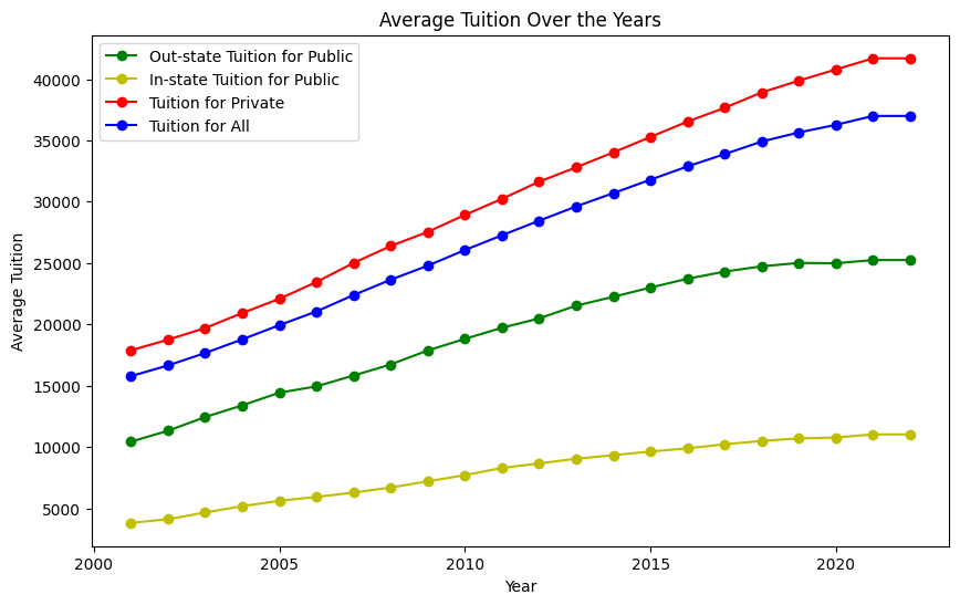
Analyzing tuition trends over the past two decades reveals some eye-opening patterns. Figure 7 presents the average tuition over the years across different categories: private, public in-state, public out-of-state, and overall. A steady climb in tuition fees is evident in all categories.
Notably, private universities exhibit a higher increase compared to public ones, and the rise in public in-state tuition appears relatively modest. However, it’s striking that the overall average tuition has more than doubled since 2001, soaring from $15k to $35k.
avg_tuition = df_ranked.groupby('year')["TUITIONFEE_OUT"].mean().reset_index()
avg_tuition_private = df_ranked[df_ranked['CONTROL'] != "Public"].groupby('year')["TUITIONFEE_OUT"].mean().reset_index()
avg_tuition_public_out = df_ranked[df_ranked['CONTROL'] == "Public"].groupby('year')["TUITIONFEE_OUT"].mean().reset_index()
avg_tuition_public_in = df_ranked[df_ranked['CONTROL'] == "Public"].groupby('year')["TUITIONFEE_IN"].mean().reset_index()

plt.figure(figsize=(10, 6))  # Set the figure size (optional)
plt.plot(avg_tuition_public_out['year'], avg_tuition_public_out['TUITIONFEE_OUT'], marker='o', linestyle='-', color='g', label='Out-state Tuition for Public')
plt.plot(avg_tuition_public_in['year'], avg_tuition_public_in['TUITIONFEE_IN'], marker='o', linestyle='-', color='y', label='In-state Tuition for Public')
plt.plot(avg_tuition_private['year'], avg_tuition_private['TUITIONFEE_OUT'], marker='o', linestyle='-', color='r', label='Tuition for Private')
plt.plot(avg_tuition['year'], avg_tuition['TUITIONFEE_OUT'], marker='o', linestyle='-', color='b', label='Tuition for All')

plt.title('Average Tuition Over the Years')  # Set the title
plt.xlabel('Year')  # Label for the x-axis
plt.ylabel('Average Tuition')  # Label for the y-axis

# Show a legend
plt.legend()
# Display the plot
plt.show()
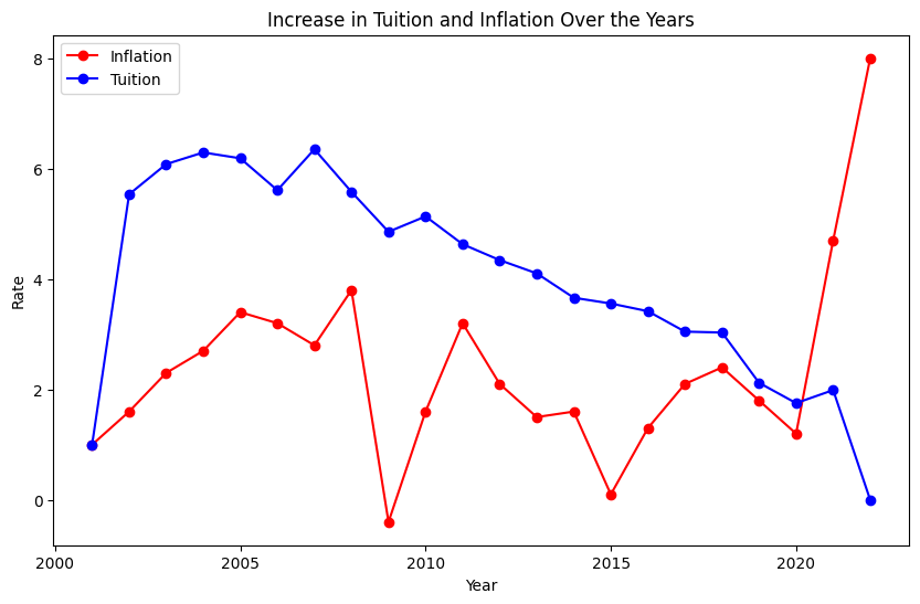
One might argue that this increase is in line with general economic inflation, but a comparison with inflation rates paints a different picture (Figure 8). Except for the last two years, where inflation spiked due to the pandemic, tuition hikes consistently outpaced inflation.
Although the pattern of tuition increases mirrors that of inflation, it’s important to note that unlike inflation, which dipped into negative territory in 2009, tuition increases never fell below zero. Though the rate of increase has been slowing, the hope is for it to eventually stabilize and halt the upward trajectory of tuition costs.
avg_tuition['Inflation tuition'] = avg_tuition['TUITIONFEE_OUT'].pct_change() * 100
avg_tuition.iloc[0,2] = 1
avg_tuition

plt.figure(figsize=(10, 6))  # Set the figure size
plt.plot(df_inflation['year'], df_inflation['Inflation rate'], marker='o', linestyle='-', color='r', label='Inflation')
plt.plot(avg_tuition['year'],avg_tuition['Inflation tuition'], marker='o', linestyle='-', color='b', label='Tuition')
plt.title('Increase in Tuition and Inflation Over the Years')  # Set the title
plt.xlabel('Year')  # Label for the x-axis
plt.ylabel('Rate')  # Label for the y-axis


# Show a legend
plt.legend()
# Display the plot
plt.show()
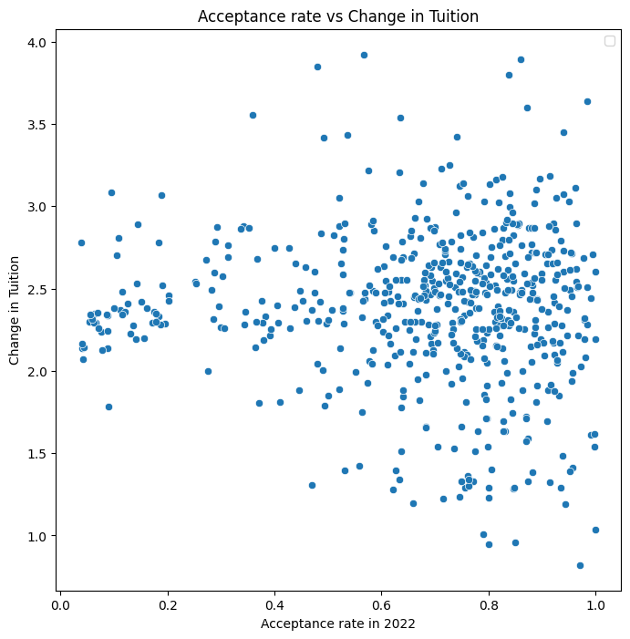
In exploring the characteristics of colleges that have raised tuition fees more significantly, I hypothesized that more selective colleges might exhibit higher increases due to greater demand. Figure 9 investigates this theory. Contrary to expectations, the data does not show a clear trend correlating selectivity with tuition increase. The change in tuition seems to hover around an average of 2.2 times across various acceptance rates. However, it's noteworthy that tuition at almost all selective universities has more than doubled, whereas the distribution for other universities is more varied. This indicates a lower standard deviation in tuition changes at selective schools compared to their less selective counterparts.
tuition_pivot = df_ranked.pivot_table(index="INSTNM", columns="year", values="TUITIONFEE_OUT")
tuition_pivot["TUI_CHANGE"] = tuition_pivot[2022]/tuition_pivot[2001]
tuition_pivot = tuition_pivot[tuition_pivot["TUI_CHANGE"] < 200]
print(tuition_pivot["TUI_CHANGE"].isnull().sum())
tmp = pd.merge(tuition_pivot["TUI_CHANGE"], df_ranked[df_ranked["year"]==2022][["ADM_RATE_ALL", "INSTNM", "REGION", "STABBR", "CONTROL"]], on="INSTNM", how="right")
plt.figure(figsize=(8, 8))
sns.scatterplot(data=tmp, x="ADM_RATE_ALL", y="TUI_CHANGE", palette='Set2', legend='full')
plt.xlabel('Acceptance rate in 2022')
plt.ylabel('Change in Tuition')
plt.title('Acceptance rate vs Change in Tuition')

plt.legend()
plt.show()
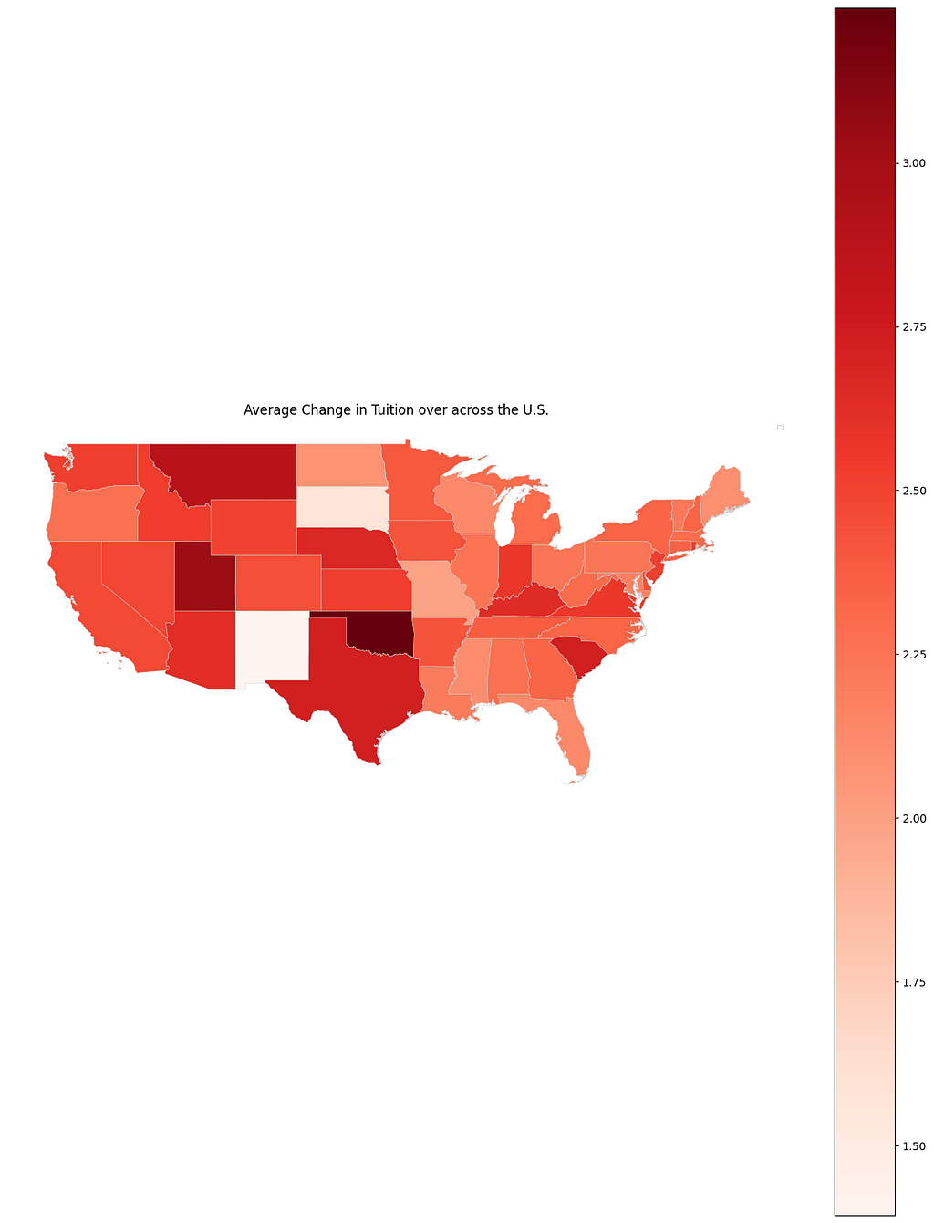
After examining the relationship between acceptance rates and tuition hikes, I turned my attention to regional factors. I hypothesized that schools in the West Coast, influenced by the economic surge of tech companies, might have experienced significant tuition increases. To test this, I visualized the tuition growth for each state in Figure 10.
Contrary to my expectations, the West Coast wasn’t the region with the highest rise in tuition. Instead, states like Oklahoma and Utah saw substantial increases, while South Dakota and New Mexico had the smallest hikes. While there are exceptions, the overall trend suggests that tuition increases in the western states generally outpace those in the eastern states.
import geopandas as gpd

sta_tui = tmp.groupby("STABBR")["TUI_CHANGE"].mean()
sta_tui = sta_tui.reset_index()

shapefile_path = "path_to_shape_file"
gdf = gpd.read_file(shapefile_path)

sta_tui["STUSPS"] = sta_tui["STABBR"]
merged_data = gdf.merge(sta_tui, on="STUSPS", how="left")
final = merged_data.drop([42, 44, 45, 38, 13])

# Plot the choropleth map
fig, ax = plt.subplots(1, 1, figsize=(16, 20))
final.plot(column='TUI_CHANGE', cmap="Reds", ax=ax, linewidth=0.3, edgecolor='0.8', legend=True)
ax.set_title('Average Change in Tuition over across the U.S.')
plt.axis('off')  # Turn off axis
plt.legend(fontsize=6)
plt.show()
Future Directions and Limitations
While this analysis provides insights based on single-year comparisons for changes in acceptance rates and tuition, a more comprehensive view could be obtained from a 5-year average comparison. In my preliminary analysis using this approach, the conclusions were similar.
The dataset used also contains many other attributes like racial proportions, mean SAT scores, and median household income. However, I didn’t utilize these due to missing values in older data. By focusing on more recent years, these additional factors could offer deeper insights. For those interested in further exploration, the dataset is available on Kaggle.
It’s important to note that this analysis is based on colleges ranked in the U.S. News, introducing a certain degree of bias. The trends observed may differ from the overall U.S. college landscape.
For data enthusiasts, my code and methodology are accessible for further exploration. I invite you to delve into it and perhaps uncover new perspectives or validate these findings. Thank you for joining me on this data-driven journey through the changing landscape of U.S. higher education!
Sources
[1] Emma Israel and Jeanne Batalova. “International Students in the United States” (January 14, 2021). https://www.migrationpolicy.org/article/international-students-united-states
[2] U.S. Department of Education College Scoreboard (last updated October 10, 2023). Public Domain, https://will-stanton.com/creating-a-great-data-science-resume/
[3] Andrew G. Reiter, “U.S. News & World Report Historical Liberal Arts College and University Rankings” http://andyreiter.com/datasets/
Exploring a Two-Decade Trend: College Acceptance Rates and Tuition in the U.S. was originally published in Towards Data Science on Medium, where people are continuing the conversation by highlighting and responding to this story.
Is it harder to get into college these days?
Background
As a recent Grinnell College alum, I’ve closely observed and been impacted by significant shifts in the academic landscape. When I graduated, the acceptance rate at Grinnell had plummeted by 15% from the time I entered, paralleled by a sharp rise in tuition fees. This pattern wasn’t unique to my alma mater; friends from various colleges echoed similar experiences.
This got me thinking: Is this a widespread trend across U.S. colleges? My theory was twofold: firstly, the advent of online applications might have simplified the process of applying to multiple colleges, thereby increasing the applicant pool and reducing acceptance rates. Secondly, an article from the Migration Policy Institute highlighted a doubling in the number of international students in the U.S. from 2000 to 2020 (from 500k to 1 million), potentially intensifying competition. Alongside, I was curious about the tuition fee trends from 2001 to 2022. My aim here is to unravel these patterns through data visualization. For the following analysis, all images, unless otherwise noted, are by the author!
Dataset
The dataset I utilized encompasses a range of data about U.S. colleges from 2001 to 2022, covering aspects like institution type, yearly acceptance rates, state location, and tuition fees. Sourced from the College Scorecard, the original dataset was vast, with over 3,000 columns and 10,000 rows. I meticulously selected pertinent columns for a focused analysis, resulting in a refined dataset available on Kaggle. To ensure relevance and completeness, I concentrated on 4-year colleges featured in the U.S. News college rankings, drawing the list from here.
Change in Acceptance Rates Over the Years
Let’s dive into the evolution of college acceptance rates over the past two decades. Initially, I suspected that I would observe a steady decline. Figure 1 illustrates this trajectory from 2001 to 2022. A consistent drop is evident until 2008, followed by fluctuations leading up to a notable increase around 2020–2021, likely a repercussion of the COVID-19 pandemic influencing gap year decisions and enrollment strategies.
avg_acp_ranked = df_ranked.groupby("year")["ADM_RATE_ALL"].mean().reset_index()

plt.figure(figsize=(10, 6))  # Set the figure size
plt.plot(avg_acp_ranked['year'], avg_acp_ranked['ADM_RATE_ALL'], marker='o', linestyle='-', color='b', label='Acceptance Rate')
plt.title('Average Acceptance Rate Over the Years')  # Set the title
plt.xlabel('Year')  # Label for the x-axis
plt.ylabel('Average Acceptance Rate')  # Label for the y-axis
plt.grid(True)  # Show grid

# Show a legend
plt.legend()
# Display the plot
plt.show()
However, the overall drop wasn’t as steep as my experience at Grinnell suggested. In contrast, when we zoom into the acceptance rates of more prestigious universities (Figure 2), a steady decline becomes apparent. This led me to categorize colleges into three groups based on their 2022 admission rates (Top 10% competitive, top 50%, and others) and analyze the trends within these segments.
pres_colleges = ["Princeton University", "Massachusetts Institute of Technology", "Yale University", "Harvard University", "Stanford University"]
pres_df = df[df['INSTNM'].isin(pres_colleges)]
pivot_pres = pres_df.pivot_table(index="INSTNM", columns="year", values="ADM_RATE_ALL")
pivot_pres.T.plot(linestyle='-')
plt.title('Change in Acceptance Rate Over the Years')
plt.xlabel('Year')
plt.ylabel('Acceptance Rate')
plt.legend(title='Colleges')
plt.show()
Figure 3 unveils some surprising insights. Except for the least competitive 50%, colleges have generally seen an increase in acceptance rates since 2001. The fluctuations post-2008 across all but the top 10% of colleges could be attributed to economic factors like the recession. Notably, competitive colleges didn’t experience the pandemic-induced spike in acceptance rates seen elsewhere.
top_10_threshold_ranked = df_ranked[df_ranked["year"] == 2001]["ADM_RATE_ALL"].quantile(0.1)
top_50_threshold_ranked = df_ranked[df_ranked["year"] == 2001]["ADM_RATE_ALL"].quantile(0.5)

top_10 = df_ranked[(df_ranked["year"]==2001) & (df_ranked["ADM_RATE_ALL"] <= top_10_threshold_ranked)]["UNITID"]
top_50 = df_ranked[(df_ranked["year"]==2001) & (df_ranked["ADM_RATE_ALL"] > top_10_threshold_ranked) & (df_ranked["ADM_RATE_ALL"] <= top_50_threshold_ranked)]["UNITID"]
others = df_ranked[(df_ranked["year"]==2001) & (df_ranked["ADM_RATE_ALL"] > top_50_threshold_ranked)]["UNITID"]

top_10_df = df_ranked[df_ranked["UNITID"].isin(top_10)]
top50_df = df_ranked[df_ranked["UNITID"].isin(top_50)]
others_df = df_ranked[df_ranked["UNITID"].isin(others)]

avg_acp_top10 = top_10_df.groupby("year")["ADM_RATE_ALL"].mean().reset_index()
avg_acp_others = others_df.groupby("year")["ADM_RATE_ALL"].mean().reset_index()
avg_acp_top50 = top50_df.groupby("year")["ADM_RATE_ALL"].mean().reset_index()

plt.figure(figsize=(10, 6))  # Set the figure size
plt.plot(avg_acp_top10['year'], avg_acp_top10['ADM_RATE_ALL'], marker='o', linestyle='-', color='g', label='Top 10%')
plt.plot(avg_acp_top50['year'], avg_acp_top50['ADM_RATE_ALL'], marker='o', linestyle='-', color='b', label='Top 50%')
plt.plot(avg_acp_others['year'], avg_acp_others['ADM_RATE_ALL'], marker='o', linestyle='-', color='r', label='Others')
plt.title('Average Acceptance Rate Over the Years')  # Set the title
plt.xlabel('Year')  # Label for the x-axis
plt.ylabel('Average Acceptance Rate')  # Label for the y-axis


# Show a legend
plt.legend()
# Display the plot
plt.show()
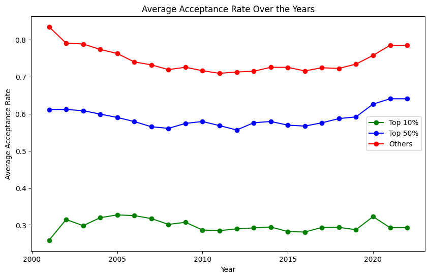
One finding particularly intrigued me: when considering the top 10% of colleges, their acceptance rates hadn’t decreased notably over the years. This led me to question whether the shift in competitiveness was widespread or if it was a case of some colleges becoming significantly harder or easier to get into. The steady decrease in acceptance rates at prestigious institutions (shown in Figure 2) hinted at the latter.
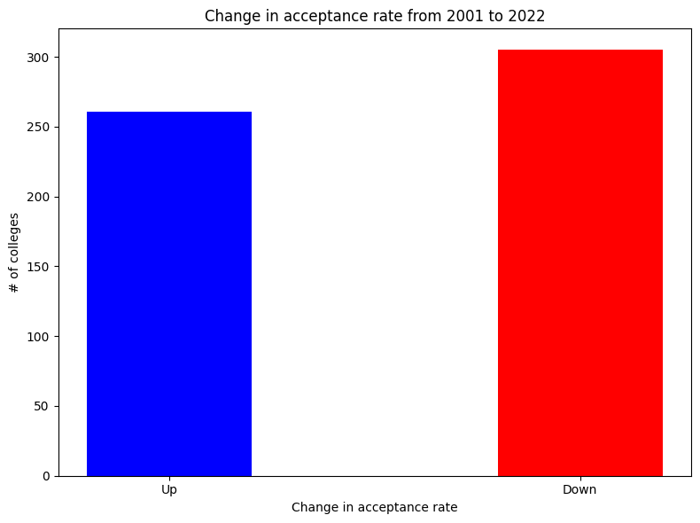
To get a clearer picture, I visualized the changes in college competitiveness from 2001 to 2022. Figure 4 reveals a surprising trend: about half of the colleges actually became less competitive, contrary to my initial expectations.
pivot_pres_ranked = df_ranked.pivot_table(index="INSTNM", columns="year", values="ADM_RATE_ALL")
pivot_pres_ranked_down = pivot_pres_ranked[pivot_pres_ranked[2001] >= pivot_pres_ranked[2022]]
len(pivot_pres_ranked_down)

pivot_pres_ranked_up = pivot_pres_ranked[pivot_pres_ranked[2001] < pivot_pres_ranked[2022]]
len(pivot_pres_ranked_up)

categories = ["Up", "Down"]
values = [len(pivot_pres_ranked_up), len(pivot_pres_ranked_down)]

plt.figure(figsize=(8, 6))
plt.bar(categories, values, width=0.4, align='center', color=["blue", "red"])
plt.xlabel('Change in acceptance rate')
plt.ylabel('# of colleges')
plt.title('Change in acceptance rate from 2001 to 2022')

# Show the chart
plt.tight_layout()
plt.show()
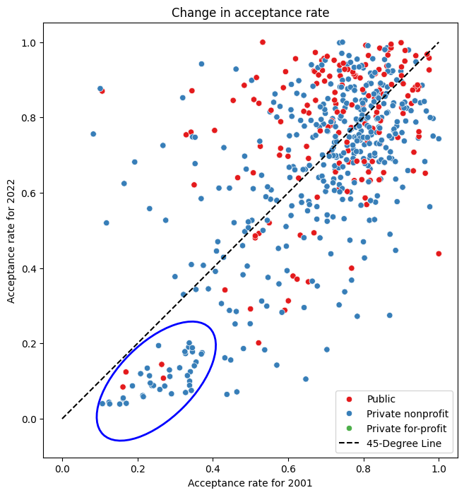
This prompted me to explore possible factors influencing these shifts. My hypothesis, reinforced by Figure 2, was that already selective colleges became even more so over time. Figure 5 compares acceptance rates in 2001 and 2022.
The 45-degree line delineates colleges that became more or less competitive. Those below the line saw reduced acceptance rates. A noticeable cluster in the lower-left quadrant represents selective colleges that became increasingly exclusive. This trend is underscored by the observation that colleges with initially low acceptance rates (left side of the plot) tend to fall below this dividing line, while those on the right are more evenly distributed.
Furthermore, it’s interesting to note that since 2001, the most selective colleges are predominantly private. To test whether the changes in acceptance rates differed significantly between the top and bottom 50 percentile colleges, I conducted an independent t-test (Null hypothesis: θ_top = θ_bottom). The results showed a statistically significant difference.
import seaborn as sns
from matplotlib.patches import Ellipse

pivot_region = pd.merge(pivot_pres_ranked[[2001, 2022]], df_ranked[["REGION","INSTNM", "UNIVERSITY", "CONTROL"]], on="INSTNM", how="right")

plt.figure(figsize=(8, 8))
sns.scatterplot(data=pivot_region, x=2001, y=2022, hue='CONTROL', palette='Set1', legend='full')
plt.xlabel('Acceptance rate for 2001')
plt.ylabel('Acceptance rate for 2022')
plt.title('Change in acceptance rate')

x_line = np.linspace(0, max(pivot_region[2001]), 100)  # X-values for the line
y_line = x_line  # Y-values for the line (slope = 1)

plt.plot(x_line, y_line, label='45-Degree Line', color='black', linestyle='--')
# Define ellipse parameters (center, width, height, angle)
ellipse_center = (0.25, 0.1)  # Center of the ellipse
ellipse_width = 0.4  # Width of the ellipse
ellipse_height = 0.2  # Height of the ellipse
ellipse_angle = 45  # Rotation angle in degrees

# Create an Ellipse patch
ellipse = Ellipse(
    xy=ellipse_center,
    width=ellipse_width,
    height=ellipse_height,
    angle=ellipse_angle,
    edgecolor='b',  # Edge color of the ellipse
    facecolor='none',  # No fill color (transparent)
    linewidth=2  # Line width of the ellipse border
)

plt.gca().add_patch(ellipse)

# Add the ellipse to the current a

plt.legend()
plt.gca().set_aspect('equal')
plt.show()
Another aspect that piqued my curiosity was regional differences. Figure 6 lists the top 5 colleges with the most significant decrease in acceptance rates (calculated by dividing the 2022 acceptance rate by the 2001 rate).
It was astonishing to see how high the acceptance rate for the University of Chicago was two decades ago — half of the applicants were admitted then!
This also helped me understand my initial bias towards a general decrease in acceptance rates; notably, Grinnell College, my alma mater, is among these top 5 with a significant drop in acceptance rate.
Interestingly, three of the top five colleges are located in the Midwest. My theory is that with the advent of the internet, these institutions, not as historically renowned as those on the West and East Coasts, have gained more visibility both domestically and internationally.
pivot_pres_ranked["diff"] = pivot_pres_ranked[2001] / pivot_pres_ranked[2022]
tmp = pivot_pres_ranked.reset_index()
tmp = tmp.merge(df_ranked[df_ranked["year"]==2022][["INSTNM", "STABBR", "CITY"]],on="INSTNM")
tmp.sort_values(by="diff",ascending=False)[["INSTNM", "diff", "STABBR", "CITY"]].head(5)
In the following sections, we’ll explore tuition trends and their correlation with these acceptance rate changes, delving deeper into the dynamics shaping modern U.S. higher education.
Change in Tuition Over the Years
Analyzing tuition trends over the past two decades reveals some eye-opening patterns. Figure 7 presents the average tuition over the years across different categories: private, public in-state, public out-of-state, and overall. A steady climb in tuition fees is evident in all categories.
Notably, private universities exhibit a higher increase compared to public ones, and the rise in public in-state tuition appears relatively modest. However, it’s striking that the overall average tuition has more than doubled since 2001, soaring from $15k to $35k.
avg_tuition = df_ranked.groupby('year')["TUITIONFEE_OUT"].mean().reset_index()
avg_tuition_private = df_ranked[df_ranked['CONTROL'] != "Public"].groupby('year')["TUITIONFEE_OUT"].mean().reset_index()
avg_tuition_public_out = df_ranked[df_ranked['CONTROL'] == "Public"].groupby('year')["TUITIONFEE_OUT"].mean().reset_index()
avg_tuition_public_in = df_ranked[df_ranked['CONTROL'] == "Public"].groupby('year')["TUITIONFEE_IN"].mean().reset_index()

plt.figure(figsize=(10, 6))  # Set the figure size (optional)
plt.plot(avg_tuition_public_out['year'], avg_tuition_public_out['TUITIONFEE_OUT'], marker='o', linestyle='-', color='g', label='Out-state Tuition for Public')
plt.plot(avg_tuition_public_in['year'], avg_tuition_public_in['TUITIONFEE_IN'], marker='o', linestyle='-', color='y', label='In-state Tuition for Public')
plt.plot(avg_tuition_private['year'], avg_tuition_private['TUITIONFEE_OUT'], marker='o', linestyle='-', color='r', label='Tuition for Private')
plt.plot(avg_tuition['year'], avg_tuition['TUITIONFEE_OUT'], marker='o', linestyle='-', color='b', label='Tuition for All')

plt.title('Average Tuition Over the Years')  # Set the title
plt.xlabel('Year')  # Label for the x-axis
plt.ylabel('Average Tuition')  # Label for the y-axis

# Show a legend
plt.legend()
# Display the plot
plt.show()
One might argue that this increase is in line with general economic inflation, but a comparison with inflation rates paints a different picture (Figure 8). Except for the last two years, where inflation spiked due to the pandemic, tuition hikes consistently outpaced inflation.
Although the pattern of tuition increases mirrors that of inflation, it’s important to note that unlike inflation, which dipped into negative territory in 2009, tuition increases never fell below zero. Though the rate of increase has been slowing, the hope is for it to eventually stabilize and halt the upward trajectory of tuition costs.
avg_tuition['Inflation tuition'] = avg_tuition['TUITIONFEE_OUT'].pct_change() * 100
avg_tuition.iloc[0,2] = 1
avg_tuition

plt.figure(figsize=(10, 6))  # Set the figure size
plt.plot(df_inflation['year'], df_inflation['Inflation rate'], marker='o', linestyle='-', color='r', label='Inflation')
plt.plot(avg_tuition['year'],avg_tuition['Inflation tuition'], marker='o', linestyle='-', color='b', label='Tuition')
plt.title('Increase in Tuition and Inflation Over the Years')  # Set the title
plt.xlabel('Year')  # Label for the x-axis
plt.ylabel('Rate')  # Label for the y-axis


# Show a legend
plt.legend()
# Display the plot
plt.show()
In exploring the characteristics of colleges that have raised tuition fees more significantly, I hypothesized that more selective colleges might exhibit higher increases due to greater demand. Figure 9 investigates this theory. Contrary to expectations, the data does not show a clear trend correlating selectivity with tuition increase. The change in tuition seems to hover around an average of 2.2 times across various acceptance rates. However, it's noteworthy that tuition at almost all selective universities has more than doubled, whereas the distribution for other universities is more varied. This indicates a lower standard deviation in tuition changes at selective schools compared to their less selective counterparts.
tuition_pivot = df_ranked.pivot_table(index="INSTNM", columns="year", values="TUITIONFEE_OUT")
tuition_pivot["TUI_CHANGE"] = tuition_pivot[2022]/tuition_pivot[2001]
tuition_pivot = tuition_pivot[tuition_pivot["TUI_CHANGE"] < 200]
print(tuition_pivot["TUI_CHANGE"].isnull().sum())
tmp = pd.merge(tuition_pivot["TUI_CHANGE"], df_ranked[df_ranked["year"]==2022][["ADM_RATE_ALL", "INSTNM", "REGION", "STABBR", "CONTROL"]], on="INSTNM", how="right")
plt.figure(figsize=(8, 8))
sns.scatterplot(data=tmp, x="ADM_RATE_ALL", y="TUI_CHANGE", palette='Set2', legend='full')
plt.xlabel('Acceptance rate in 2022')
plt.ylabel('Change in Tuition')
plt.title('Acceptance rate vs Change in Tuition')

plt.legend()
plt.show()
After examining the relationship between acceptance rates and tuition hikes, I turned my attention to regional factors. I hypothesized that schools in the West Coast, influenced by the economic surge of tech companies, might have experienced significant tuition increases. To test this, I visualized the tuition growth for each state in Figure 10.
Contrary to my expectations, the West Coast wasn’t the region with the highest rise in tuition. Instead, states like Oklahoma and Utah saw substantial increases, while South Dakota and New Mexico had the smallest hikes. While there are exceptions, the overall trend suggests that tuition increases in the western states generally outpace those in the eastern states.
import geopandas as gpd

sta_tui = tmp.groupby("STABBR")["TUI_CHANGE"].mean()
sta_tui = sta_tui.reset_index()

shapefile_path = "path_to_shape_file"
gdf = gpd.read_file(shapefile_path)

sta_tui["STUSPS"] = sta_tui["STABBR"]
merged_data = gdf.merge(sta_tui, on="STUSPS", how="left")
final = merged_data.drop([42, 44, 45, 38, 13])

# Plot the choropleth map
fig, ax = plt.subplots(1, 1, figsize=(16, 20))
final.plot(column='TUI_CHANGE', cmap="Reds", ax=ax, linewidth=0.3, edgecolor='0.8', legend=True)
ax.set_title('Average Change in Tuition over across the U.S.')
plt.axis('off')  # Turn off axis
plt.legend(fontsize=6)
plt.show()
Future Directions and Limitations
While this analysis provides insights based on single-year comparisons for changes in acceptance rates and tuition, a more comprehensive view could be obtained from a 5-year average comparison. In my preliminary analysis using this approach, the conclusions were similar.
The dataset used also contains many other attributes like racial proportions, mean SAT scores, and median household income. However, I didn’t utilize these due to missing values in older data. By focusing on more recent years, these additional factors could offer deeper insights. For those interested in further exploration, the dataset is available on Kaggle.
It’s important to note that this analysis is based on colleges ranked in the U.S. News, introducing a certain degree of bias. The trends observed may differ from the overall U.S. college landscape.
For data enthusiasts, my code and methodology are accessible for further exploration. I invite you to delve into it and perhaps uncover new perspectives or validate these findings. Thank you for joining me on this data-driven journey through the changing landscape of U.S. higher education!
Sources
[1] Emma Israel and Jeanne Batalova. “International Students in the United States” (January 14, 2021). https://www.migrationpolicy.org/article/international-students-united-states
[2] U.S. Department of Education College Scoreboard (last updated October 10, 2023). Public Domain, https://will-stanton.com/creating-a-great-data-science-resume/
[3] Andrew G. Reiter, “U.S. News & World Report Historical Liberal Arts College and University Rankings” http://andyreiter.com/datasets/
Exploring a Two-Decade Trend: College Acceptance Rates and Tuition in the U.S. was originally published in Towards Data Science on Medium, where people are continuing the conversation by highlighting and responding to this story.
Denial of responsibility! Techno Blender is an automatic aggregator of the all world’s media. In each content, the hyperlink to the primary source is specified. All trademarks belong to their rightful owners, all materials to their authors. If you are the owner of the content and do not want us to publish your materials, please contact us by email – [email protected]. The content will be deleted within 24 hours.