
Frequency Polygon: Meaning, Steps to Draw and Examples
What is Frequency Polygon?
A frequency polygon is another way to show a frequency distribution on a graph. In addition to being an alternate for the histogram, the frequency polygon is also an outcome of the histogram. While comparing two or more frequency distributions, a frequency polygon is more suitable than using a histogram. Polygons can be constructed for both discrete and continuous series.
(I) Frequency Polygon in Discrete Series
The steps required to construct a frequency polygon in the case of discrete series are:
Step 1: Write the values of the given variable (say, X) on the X-axis and the corresponding frequencies on the Y-axis.
Step 2: Draw a straight line connecting the points of the various frequencies.
Step 3: Extend the figure to the base (base-line) at both ends by connecting the extreme points (first and last point) to the two hypothetical values of the variable (prior to the first value of the variable and after the last value of the variable), both of which are assumed to have zero frequency.
Example:
The following data shows the number of shops on 70 streets in a city. Construct a frequency polygon for the same.
Solution:
The discrete frequency distribution applies in this case. The number of rooms will be plotted on the X-axis, while the number of houses will be plotted on the Y-axis. A frequency polygon is created by joining the obtained points with a straight line.

(II) Frequency Polygon in Continuous Series
There are two ways of creating a frequency polygon for a continuous frequency distribution:
(i) With the help of a Histogram
(ii) Without the help of a Histogram
(A) Frequency Polygon with the help of a Histogram:
The steps required to construct a frequency polygon in the case of continuous series with the help of a histogram are:
Step 1: Create a histogram for the given frequency distribution.
Step 2: Connect the mid-points of the tops (upper horizontal sides) of the adjacent rectangles of the histogram with straight lines.
Step 3: Close the figure by extending the two ends to the base-line. In order to do so, two hypothetical classes from either end would have to be included, each with a zero frequency.
Example:
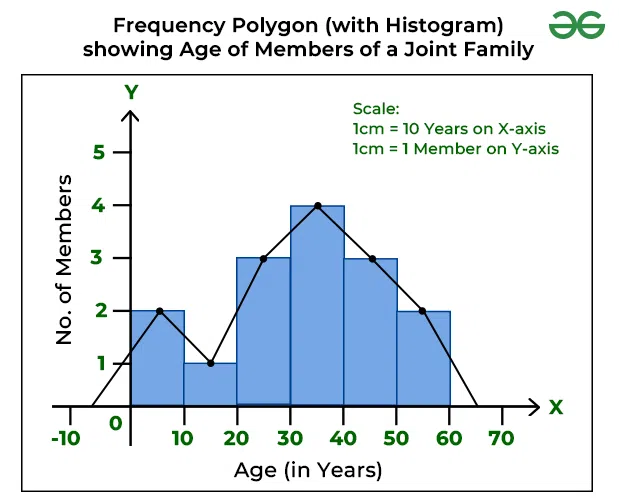
The following is the age distribution of members in a joint family. Create a histogram from this data and convert it to a frequency polygon.

Solution:
The continuous frequency distribution applies in this case, as there is a frequency distribution with equal class intervals. Firstly, the histogram is prepared, and then the frequency polygon. The age of the members will be plotted on the X-axis, while the number of family members will be plotted on the Y-axis.
(B) Frequency Polygon without the help of a Histogram:
The steps required to construct a frequency polygon in the case of continuous series without the help of a histogram are:
Step 1: Take the midpoints of the X-axis for class intervals and the Y-axis for frequency.
Step 2: Plot the different frequencies, joining the points with a straight line.
Step 3: Assuming that the frequencies are zero, the obtained figure is extended to the base at both ends by connecting the extreme points (first and final points) to the midpoints of the two hypothetical classes (before the first class and after the last class).
The resulting figure, in this case, would be the same as in the above example (with a histogram). The only difference is that there is no need of creating the histogram.
-copy.webp)
What is Frequency Curve?
A frequency curve is a result of joining the vertices of a frequency polygon with a smooth curve. It is also referred to as a Smoothed Frequency Curve. The frequency curve may not always go through all of the points of the frequency polygon, but it passes through them as closely as possible.
- A frequency curve should be carefully constructed to avoid sharp edges.
- The curve is drawn freehand in a way that makes the area covered roughly equal to that of the polygon.
- This curve should begin and stop at the baseline. It is usually extended to the middle point of the class interval outside of the histogram.
- The total number of frequencies in the whole distribution should be represented by the area under the curve.
Steps of Frequency Curve
Step 1: Using the given data, create a histogram.
Step 2: Determine the midpoints of the upper horizontal side of each rectangle.
Step 3: To create a frequency curve, join the mid-points of the adjacent rectangles of the histogram using a smooth free hand.
Step 4. With a free hand, extend the ends of the frequency curve to the baseline.
Example:
Draw a frequency curve from the following distribution.

Solution:
The continuous frequency distribution applies in this case, as there is a frequency distribution with equal class intervals. Firstly, the histogram is prepared, and then the frequency curve. The class interval will be plotted on the X-axis, while the frequency distribution will be plotted on the Y-axis.

Last Updated :
11 May, 2023
Like Article
Save Article
What is Frequency Polygon?
A frequency polygon is another way to show a frequency distribution on a graph. In addition to being an alternate for the histogram, the frequency polygon is also an outcome of the histogram. While comparing two or more frequency distributions, a frequency polygon is more suitable than using a histogram. Polygons can be constructed for both discrete and continuous series.
(I) Frequency Polygon in Discrete Series
The steps required to construct a frequency polygon in the case of discrete series are:
Step 1: Write the values of the given variable (say, X) on the X-axis and the corresponding frequencies on the Y-axis.
Step 2: Draw a straight line connecting the points of the various frequencies.
Step 3: Extend the figure to the base (base-line) at both ends by connecting the extreme points (first and last point) to the two hypothetical values of the variable (prior to the first value of the variable and after the last value of the variable), both of which are assumed to have zero frequency.
Example:
The following data shows the number of shops on 70 streets in a city. Construct a frequency polygon for the same.

Solution:
The discrete frequency distribution applies in this case. The number of rooms will be plotted on the X-axis, while the number of houses will be plotted on the Y-axis. A frequency polygon is created by joining the obtained points with a straight line.
(II) Frequency Polygon in Continuous Series
There are two ways of creating a frequency polygon for a continuous frequency distribution:
(i) With the help of a Histogram
(ii) Without the help of a Histogram
(A) Frequency Polygon with the help of a Histogram:
The steps required to construct a frequency polygon in the case of continuous series with the help of a histogram are:
Step 1: Create a histogram for the given frequency distribution.
Step 2: Connect the mid-points of the tops (upper horizontal sides) of the adjacent rectangles of the histogram with straight lines.
Step 3: Close the figure by extending the two ends to the base-line. In order to do so, two hypothetical classes from either end would have to be included, each with a zero frequency.
Example:
The following is the age distribution of members in a joint family. Create a histogram from this data and convert it to a frequency polygon.
Solution:
The continuous frequency distribution applies in this case, as there is a frequency distribution with equal class intervals. Firstly, the histogram is prepared, and then the frequency polygon. The age of the members will be plotted on the X-axis, while the number of family members will be plotted on the Y-axis.
(B) Frequency Polygon without the help of a Histogram:
The steps required to construct a frequency polygon in the case of continuous series without the help of a histogram are:
Step 1: Take the midpoints of the X-axis for class intervals and the Y-axis for frequency.
Step 2: Plot the different frequencies, joining the points with a straight line.
Step 3: Assuming that the frequencies are zero, the obtained figure is extended to the base at both ends by connecting the extreme points (first and final points) to the midpoints of the two hypothetical classes (before the first class and after the last class).
The resulting figure, in this case, would be the same as in the above example (with a histogram). The only difference is that there is no need of creating the histogram.
What is Frequency Curve?
A frequency curve is a result of joining the vertices of a frequency polygon with a smooth curve. It is also referred to as a Smoothed Frequency Curve. The frequency curve may not always go through all of the points of the frequency polygon, but it passes through them as closely as possible.
- A frequency curve should be carefully constructed to avoid sharp edges.
- The curve is drawn freehand in a way that makes the area covered roughly equal to that of the polygon.
- This curve should begin and stop at the baseline. It is usually extended to the middle point of the class interval outside of the histogram.
- The total number of frequencies in the whole distribution should be represented by the area under the curve.
Steps of Frequency Curve
Step 1: Using the given data, create a histogram.
Step 2: Determine the midpoints of the upper horizontal side of each rectangle.
Step 3: To create a frequency curve, join the mid-points of the adjacent rectangles of the histogram using a smooth free hand.
Step 4. With a free hand, extend the ends of the frequency curve to the baseline.
Example:
Draw a frequency curve from the following distribution.
Solution:
The continuous frequency distribution applies in this case, as there is a frequency distribution with equal class intervals. Firstly, the histogram is prepared, and then the frequency curve. The class interval will be plotted on the X-axis, while the frequency distribution will be plotted on the Y-axis.
Last Updated :
11 May, 2023
Like Article
Save Article
Denial of responsibility! Techno Blender is an automatic aggregator of the all world’s media. In each content, the hyperlink to the primary source is specified. All trademarks belong to their rightful owners, all materials to their authors. If you are the owner of the content and do not want us to publish your materials, please contact us by email – [email protected]. The content will be deleted within 24 hours.