
How I won a $10,000 essay writing contest
How I Won a $10,000 Essay Writing Contest
Communication in Data Science
Recently I was lucky enough to win an essay writing contest on Kaggle, and have my work published in their 2023 AI report and while I definitely don’t see myself as the perfect communicator, I thought I’d share some of the lessons that I believe helped me take that prize winning spot!
I’m particularly proud of this achievement because in my experience one of the most important yet often overlooked things we do as data scientists is communicate and share our results.
In this post we’ll touch on things like the right type of language to use, how to talk about abstract concepts, using diagrams to convey patterns and finally overall structure. Hopefully, these tips and tricks might just work for you too next time you’re communicating or presenting!
Number 1: Avoid Jargon
Sounds obvious right? but this one is especially tough — we go to university/college, or study courses to improve our craft and these courses introduce us to a range of technical concepts, each with a specific name that we grow to understand. Next, whenever we talk to other students we use this same language, and finally by the time we enter industry these technical terms are so ingrained in us we use them without thinking.
What’s wrong with this? Out there in the real world these words are meaningless to most people.
Let me give you an example — in the area of tabular data, you might be fitting a model and trying to minimise one of the many acronym-based error metrics like Mean Average Prediction Error (MAPE). However quite often the people we’re communicating with will not understand these concepts at all. So what happens when we tell them all about how low we’ve gotten the MAPE in our latest forecasting model? They definitely won’t be impressed — At best they switch off — at worst they might feel uneasy wondering if they are supposed to know what the heck we’re talking about.
So what’s the solution? The key is to communicate complex concepts in much simpler everyday terms.
In the example above of course we still want to highlight that our models are accurate, but we are much better of explaining this in plain English such as by saying we’ve improved the average percentage error. Even better still would be explaining it in the concept of what the model is trying to do. For example, if we’re predicting the weather we might say that we’ve reduced the 12 hour forecast in degrees Celsius down from 5% down to 1%.
Number 2: Use Examples
Let’s face it — a lot of the concepts in data science are pretty abstract. Ever tried to explain to your mum what it is you do all day? Yeah, me too, it never goes well.
The good news is that most abstract concepts can be made clear by a tangible real world example. In the essay I attached I tried to make every point in the essay clear by using at least one example, and many times multiple examples. This is also true when trying to verbally explain concepts, and especially true when communicating with a less technical audience.
But which examples work best? The golden rule here is the more relevant an example is to the audience the better. For example, in my essay I constantly refer to Kaggle projects as examples, that’s because I know everybody that is reading the essay is on Kaggle and will be able to relate! If you were communicating the value of LLMs to teachers, maybe you’d talk about how they work in the context of summarising chapters of textbooks, or offering tailored writing feedback.
The idea is: get to know your audience and the content should follow!
Number 3: Use (Clear) Visuals
Visuals are exciting! Well, I think they are at least…
A clever visual or graphic can spice up any presentation. My personal belief is a great visual is one generated in a way that should make the intended pattern obvious.
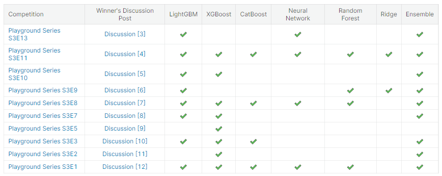
Take this simple example of an annotated table — it shows the type of models used in various winning solutions to simple tabular regression and classification competitions hosted on Kaggle. Even without understanding anything, our eyes will pick up on the pattern that there’s lot’s of check marks in the LightGBM and ensemble columns, so whatever those are, they sure are popular. This is a simple insight, but by arranging the data in just the right way it was obvious.
Clear visuals not only grab attention but also make your data storytelling more effective and memorable, and can save you a ton of explanation.
Number 4: Emphasise the key points
I never liked writing essays at school — in fact, given who’s likely to read this, I will bet most of you didn’t either! But one lesson that’s stuck with me throughout the years was my high-school teachers simple essay structure — first you tell them, then you tell them, then you tell them again, that is, the introduction, body and conclusion all say the same thing.
I didn’t really get it a the time but I have since seen the wisdom in it time and time again. If you jump right into a presentation then people won’t understand what they’re meant to be looking out for. Or if you forget to conclude the presentation people will likely only remember your last point! To avoid these pitfalls it’s almost always useful starting with your key points, elaborating on them, and then summarising them one last time, regardless of the medium — from essay to presentation.
This is especially true in data science as given the change of pace of the industry there’s always something new to be discussed, and chances are not everyone understands your niche like you do, so repetition helps carve out the main ideas.
So with that in mind, let’s wrap up with a summary of some of our key points… (See what I did there? 🙂 )
Conclusion
- Avoid jargon — don’t leave your audience trying to understand the latest buzz words or acronyms.
- Use real world examples wherever possible — bonus points if they’re relevant to the intended audience.
- Include simple visuals — Make sure the message is obvious.
- And don’t forget the importance of a clear structure.
Hopefully with these thoughts in mind you’ll be able to even better capture the attention of your next audience.
Thanks for reading and see you next time!
How I won a $10,000 essay writing contest was originally published in Towards Data Science on Medium, where people are continuing the conversation by highlighting and responding to this story.
How I Won a $10,000 Essay Writing Contest
Communication in Data Science
Recently I was lucky enough to win an essay writing contest on Kaggle, and have my work published in their 2023 AI report and while I definitely don’t see myself as the perfect communicator, I thought I’d share some of the lessons that I believe helped me take that prize winning spot!
I’m particularly proud of this achievement because in my experience one of the most important yet often overlooked things we do as data scientists is communicate and share our results.
In this post we’ll touch on things like the right type of language to use, how to talk about abstract concepts, using diagrams to convey patterns and finally overall structure. Hopefully, these tips and tricks might just work for you too next time you’re communicating or presenting!

Number 1: Avoid Jargon
Sounds obvious right? but this one is especially tough — we go to university/college, or study courses to improve our craft and these courses introduce us to a range of technical concepts, each with a specific name that we grow to understand. Next, whenever we talk to other students we use this same language, and finally by the time we enter industry these technical terms are so ingrained in us we use them without thinking.
What’s wrong with this? Out there in the real world these words are meaningless to most people.
Let me give you an example — in the area of tabular data, you might be fitting a model and trying to minimise one of the many acronym-based error metrics like Mean Average Prediction Error (MAPE). However quite often the people we’re communicating with will not understand these concepts at all. So what happens when we tell them all about how low we’ve gotten the MAPE in our latest forecasting model? They definitely won’t be impressed — At best they switch off — at worst they might feel uneasy wondering if they are supposed to know what the heck we’re talking about.
So what’s the solution? The key is to communicate complex concepts in much simpler everyday terms.
In the example above of course we still want to highlight that our models are accurate, but we are much better of explaining this in plain English such as by saying we’ve improved the average percentage error. Even better still would be explaining it in the concept of what the model is trying to do. For example, if we’re predicting the weather we might say that we’ve reduced the 12 hour forecast in degrees Celsius down from 5% down to 1%.
Number 2: Use Examples
Let’s face it — a lot of the concepts in data science are pretty abstract. Ever tried to explain to your mum what it is you do all day? Yeah, me too, it never goes well.
The good news is that most abstract concepts can be made clear by a tangible real world example. In the essay I attached I tried to make every point in the essay clear by using at least one example, and many times multiple examples. This is also true when trying to verbally explain concepts, and especially true when communicating with a less technical audience.
But which examples work best? The golden rule here is the more relevant an example is to the audience the better. For example, in my essay I constantly refer to Kaggle projects as examples, that’s because I know everybody that is reading the essay is on Kaggle and will be able to relate! If you were communicating the value of LLMs to teachers, maybe you’d talk about how they work in the context of summarising chapters of textbooks, or offering tailored writing feedback.
The idea is: get to know your audience and the content should follow!
Number 3: Use (Clear) Visuals
Visuals are exciting! Well, I think they are at least…
A clever visual or graphic can spice up any presentation. My personal belief is a great visual is one generated in a way that should make the intended pattern obvious.
Take this simple example of an annotated table — it shows the type of models used in various winning solutions to simple tabular regression and classification competitions hosted on Kaggle. Even without understanding anything, our eyes will pick up on the pattern that there’s lot’s of check marks in the LightGBM and ensemble columns, so whatever those are, they sure are popular. This is a simple insight, but by arranging the data in just the right way it was obvious.
Clear visuals not only grab attention but also make your data storytelling more effective and memorable, and can save you a ton of explanation.
Number 4: Emphasise the key points
I never liked writing essays at school — in fact, given who’s likely to read this, I will bet most of you didn’t either! But one lesson that’s stuck with me throughout the years was my high-school teachers simple essay structure — first you tell them, then you tell them, then you tell them again, that is, the introduction, body and conclusion all say the same thing.
I didn’t really get it a the time but I have since seen the wisdom in it time and time again. If you jump right into a presentation then people won’t understand what they’re meant to be looking out for. Or if you forget to conclude the presentation people will likely only remember your last point! To avoid these pitfalls it’s almost always useful starting with your key points, elaborating on them, and then summarising them one last time, regardless of the medium — from essay to presentation.
This is especially true in data science as given the change of pace of the industry there’s always something new to be discussed, and chances are not everyone understands your niche like you do, so repetition helps carve out the main ideas.
So with that in mind, let’s wrap up with a summary of some of our key points… (See what I did there? 🙂 )
Conclusion
- Avoid jargon — don’t leave your audience trying to understand the latest buzz words or acronyms.
- Use real world examples wherever possible — bonus points if they’re relevant to the intended audience.
- Include simple visuals — Make sure the message is obvious.
- And don’t forget the importance of a clear structure.
Hopefully with these thoughts in mind you’ll be able to even better capture the attention of your next audience.
Thanks for reading and see you next time!
How I won a $10,000 essay writing contest was originally published in Towards Data Science on Medium, where people are continuing the conversation by highlighting and responding to this story.
Denial of responsibility! Techno Blender is an automatic aggregator of the all world’s media. In each content, the hyperlink to the primary source is specified. All trademarks belong to their rightful owners, all materials to their authors. If you are the owner of the content and do not want us to publish your materials, please contact us by email – [email protected]. The content will be deleted within 24 hours.