
How to Add an Image to a Matplotlib Plot in Python | by Himalaya Bir Shrestha | Jun, 2022
Reading image data and adding it to a plot using Matplotlib
Adding an external image or icon to an existing plot not only increases the aesthetics but also adds to its clarity from a holistic viewpoint. The external image could be a logo of a company or product, a flag of a country, etc. These images help consolidate the message conveyed to the readers.
There are different packages available for image processing in Python. Some notable ones include OpenCV, imageio, scikit-image, Pillow, NumPy, SciPy, and Matplotlib. Matplotlib is one of the most prominent packages for data analysis and visualisation in Python. In this post, I am going to share the steps to read an image, display it and add it to an existing plot using Matplotlib in Python. Without further ado, let’s get started.
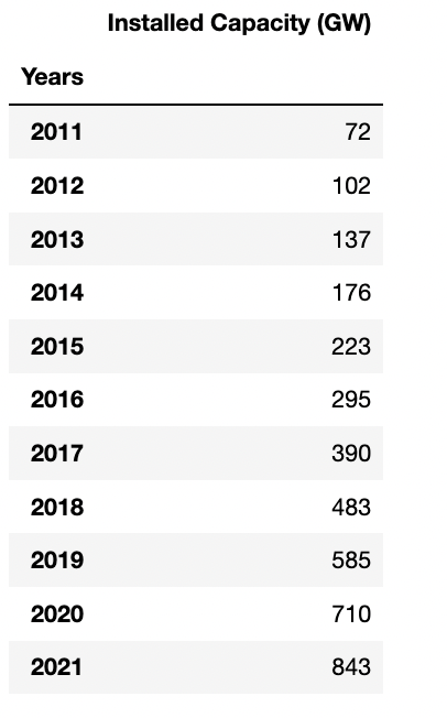
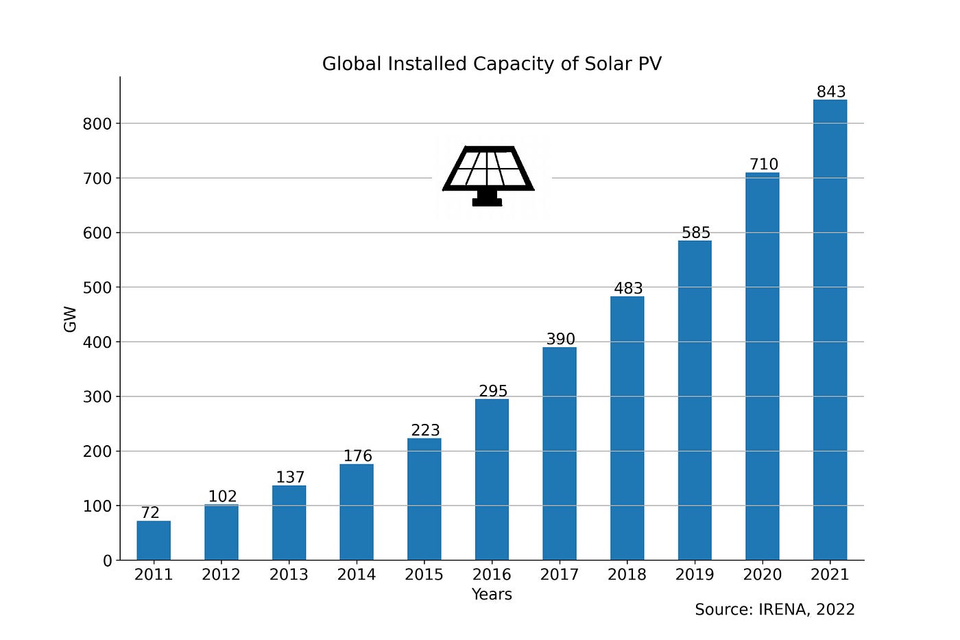
I start with a dataframe df which looks like the one below. df contains the global installed capacity of solar photovoltaic (PV) between 2011 and 2021. This data is obtained from (IRENA, 2021).
In this step, I create a regular bar plot with df. The code for the same is in the code block below. I removed the legend of the plot including its frame. And I set the spines on the right and top to be invisible. Furthermore, I added grid lines to the plot.
Using a for loop to iterate through each row of df, I added the value of each bar on its top using plt.text(x, y, s), where,
xis the position of years on the X-axis, from 0 to 10 (including 10)yandsare both based on values ofdf, i.e. the annual installed capacity of solar PV globally in Giga Watts.
fig, ax = plt.subplots(figsize = (12, 8))df.plot(kind = “bar”, ax = ax)plt.ylabel(“GW”)#Remove legend along with the frame
plt.legend([], frameon = False)plt.title(“Global Installed Capacity of Solar PV”)# Hide the right and top spines
ax.spines.right.set_visible(False)
ax.spines.top.set_visible(False)#Set xticks rotation to 0
plt.xticks(rotation = 0)#Add grid line
plt.grid(axis = “y”)#Adding value labels on top of bars
for i in range(len(df)):
installed = df.iloc[i][0]
plt.text(x = i — 0.2,
y = installed + 5,
s = str(installed))#Add source
plt.text(8, -100, “Source: IRENA, 2022”)plt.savefig(“../output/global solar pv trend.jpeg”,
dpi = 300)
plt.show()
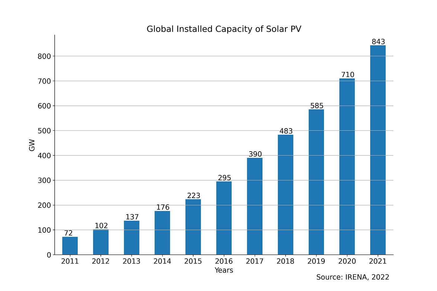
As a result, I get the following plot, which demonstrates a steep uptake in solar PV at the global level in the last decade.
Images can be read using different packages in Python such as Matplotlib, OpenCV, ImageIO, and PIL (GeeksforGeeks, 2022). In the plot above, I want to add an icon of a solar panel somewhere in the top centre. I drew a logo of a solar panel manually using Paint software. And this image is read using the image module of Matplotlib as follows:
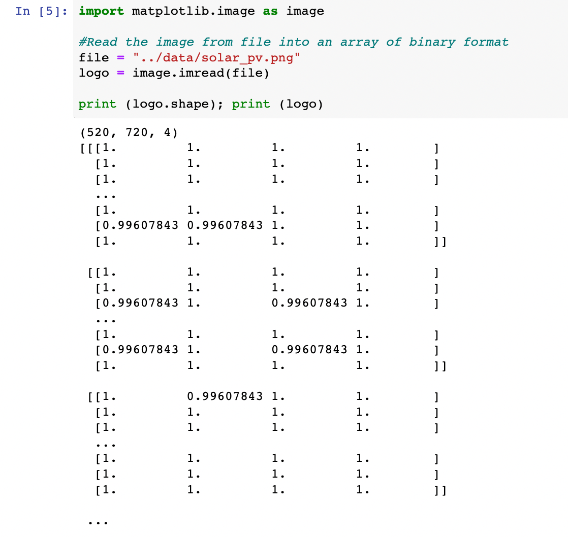
Here, logo is a 3D NumPy array of shape (520, 720, 4). The three-dimensional (3D) array is composed of 3 nested levels of arrays, one for each dimension (Adamsmith, 2022).
logo has the shape (M, N, 4). 520 and 720 refer to the number of rows and columns of the image. 4 refers to the image with RGBA values (0–1 float or 0–255 int and including transparency), i.e., values for each of Red, Green, Blue, and Alpha (Matplotlib, 2020).
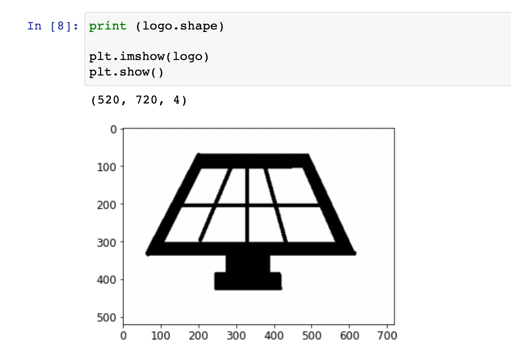
logo, which comprises the RGB(A) data can be displayed as an image on a 2D regular raster using plt.imshow(logo). According to the shape of the logo, the plot has 720 and 520 as limits on the X and Y-axis respectively as illustrated below:
To add the logo image to the bar plot, I created an OffsetBox (a simple container artist) and passed the logo inside of it. The zoom is set to 0.15 i.e. 15% of the original size of the image. This OffsetBox is named imagebox as it contains the image.
Next, I created an AnnotationBbox, which is a container for the imagebox. I specified a xy position for it on the top centre of the plot (5, 700) and hid the frames. This is represented in the code below, which is used along with the code block for the bar plot:
from matplotlib.offsetbox import (OffsetImage, AnnotationBbox)#The OffsetBox is a simple container artist.
#The child artists are meant to be drawn at a relative position to its #parent.
imagebox = OffsetImage(logo, zoom = 0.15)#Annotation box for solar pv logo
#Container for the imagebox referring to a specific position *xy*.
ab = AnnotationBbox(imagebox, (5, 700), frameon = False)
ax.add_artist(ab)
As a result, I could add the logo of the solar panel together with the bar plot showing the global solar PV trend.
Next, I wanted to add a circle around the solar panel to highlight it. The X and Y-axis in the bar plot have different scales. Each minor tick on the X-axis is in steps of 1 year, while each minor tick on the Y-axis is in steps of 100 GW. Therefore, adding a circle using plt.Circle((x,y),r) and ax.add_patch(circle) would make it appear uneven in the plot.
Instead, I used a scatter plot with the centre same as that of AnnotationBbox. I set the radius s to 20000, marker to “o” shape, color to “red”, and facecolors to “none” to add a circle around the solar panel.
plt.scatter(5, 700, s = 20000, marker = “o”,
color = “red”, facecolors = “none”)
The resulting plot is given below.

Adding an image or icon to an existing plot can add to both the visual attraction and perception. In this post, I described stepwise how an external image can be read as a NumPy array of binary format using Matplotlib, and how the image data can be displayed and added to a bar plot. In this context, I provided a simple example of adding a logo of a solar panel on top of the bar plot showing the global trend of installed capacity of solar PV. The notebook for this post is available in this GitHub repository. Thank you for reading!
Adamsmith, 2022. How to create a 3D NumPy array in Python
GeeksforGeeks, 2022. Reading images in Python.
IRENA, 2021. Statistics Time Series: Trends in Renewable Energy.
Matplotlib, 2020. matplotlib.axes.Axes.imshow
Reading image data and adding it to a plot using Matplotlib
Adding an external image or icon to an existing plot not only increases the aesthetics but also adds to its clarity from a holistic viewpoint. The external image could be a logo of a company or product, a flag of a country, etc. These images help consolidate the message conveyed to the readers.
There are different packages available for image processing in Python. Some notable ones include OpenCV, imageio, scikit-image, Pillow, NumPy, SciPy, and Matplotlib. Matplotlib is one of the most prominent packages for data analysis and visualisation in Python. In this post, I am going to share the steps to read an image, display it and add it to an existing plot using Matplotlib in Python. Without further ado, let’s get started.

I start with a dataframe df which looks like the one below. df contains the global installed capacity of solar photovoltaic (PV) between 2011 and 2021. This data is obtained from (IRENA, 2021).
In this step, I create a regular bar plot with df. The code for the same is in the code block below. I removed the legend of the plot including its frame. And I set the spines on the right and top to be invisible. Furthermore, I added grid lines to the plot.
Using a for loop to iterate through each row of df, I added the value of each bar on its top using plt.text(x, y, s), where,
xis the position of years on the X-axis, from 0 to 10 (including 10)yandsare both based on values ofdf, i.e. the annual installed capacity of solar PV globally in Giga Watts.
fig, ax = plt.subplots(figsize = (12, 8))df.plot(kind = “bar”, ax = ax)plt.ylabel(“GW”)#Remove legend along with the frame
plt.legend([], frameon = False)plt.title(“Global Installed Capacity of Solar PV”)# Hide the right and top spines
ax.spines.right.set_visible(False)
ax.spines.top.set_visible(False)#Set xticks rotation to 0
plt.xticks(rotation = 0)#Add grid line
plt.grid(axis = “y”)#Adding value labels on top of bars
for i in range(len(df)):
installed = df.iloc[i][0]
plt.text(x = i — 0.2,
y = installed + 5,
s = str(installed))#Add source
plt.text(8, -100, “Source: IRENA, 2022”)plt.savefig(“../output/global solar pv trend.jpeg”,
dpi = 300)
plt.show()
As a result, I get the following plot, which demonstrates a steep uptake in solar PV at the global level in the last decade.
Images can be read using different packages in Python such as Matplotlib, OpenCV, ImageIO, and PIL (GeeksforGeeks, 2022). In the plot above, I want to add an icon of a solar panel somewhere in the top centre. I drew a logo of a solar panel manually using Paint software. And this image is read using the image module of Matplotlib as follows:
Here, logo is a 3D NumPy array of shape (520, 720, 4). The three-dimensional (3D) array is composed of 3 nested levels of arrays, one for each dimension (Adamsmith, 2022).
logo has the shape (M, N, 4). 520 and 720 refer to the number of rows and columns of the image. 4 refers to the image with RGBA values (0–1 float or 0–255 int and including transparency), i.e., values for each of Red, Green, Blue, and Alpha (Matplotlib, 2020).
logo, which comprises the RGB(A) data can be displayed as an image on a 2D regular raster using plt.imshow(logo). According to the shape of the logo, the plot has 720 and 520 as limits on the X and Y-axis respectively as illustrated below:
To add the logo image to the bar plot, I created an OffsetBox (a simple container artist) and passed the logo inside of it. The zoom is set to 0.15 i.e. 15% of the original size of the image. This OffsetBox is named imagebox as it contains the image.
Next, I created an AnnotationBbox, which is a container for the imagebox. I specified a xy position for it on the top centre of the plot (5, 700) and hid the frames. This is represented in the code below, which is used along with the code block for the bar plot:
from matplotlib.offsetbox import (OffsetImage, AnnotationBbox)#The OffsetBox is a simple container artist.
#The child artists are meant to be drawn at a relative position to its #parent.
imagebox = OffsetImage(logo, zoom = 0.15)#Annotation box for solar pv logo
#Container for the imagebox referring to a specific position *xy*.
ab = AnnotationBbox(imagebox, (5, 700), frameon = False)
ax.add_artist(ab)
As a result, I could add the logo of the solar panel together with the bar plot showing the global solar PV trend.
Next, I wanted to add a circle around the solar panel to highlight it. The X and Y-axis in the bar plot have different scales. Each minor tick on the X-axis is in steps of 1 year, while each minor tick on the Y-axis is in steps of 100 GW. Therefore, adding a circle using plt.Circle((x,y),r) and ax.add_patch(circle) would make it appear uneven in the plot.
Instead, I used a scatter plot with the centre same as that of AnnotationBbox. I set the radius s to 20000, marker to “o” shape, color to “red”, and facecolors to “none” to add a circle around the solar panel.
plt.scatter(5, 700, s = 20000, marker = “o”,
color = “red”, facecolors = “none”)
The resulting plot is given below.
Adding an image or icon to an existing plot can add to both the visual attraction and perception. In this post, I described stepwise how an external image can be read as a NumPy array of binary format using Matplotlib, and how the image data can be displayed and added to a bar plot. In this context, I provided a simple example of adding a logo of a solar panel on top of the bar plot showing the global trend of installed capacity of solar PV. The notebook for this post is available in this GitHub repository. Thank you for reading!
Adamsmith, 2022. How to create a 3D NumPy array in Python
GeeksforGeeks, 2022. Reading images in Python.
IRENA, 2021. Statistics Time Series: Trends in Renewable Energy.
Matplotlib, 2020. matplotlib.axes.Axes.imshow
Denial of responsibility! Techno Blender is an automatic aggregator of the all world’s media. In each content, the hyperlink to the primary source is specified. All trademarks belong to their rightful owners, all materials to their authors. If you are the owner of the content and do not want us to publish your materials, please contact us by email – [email protected]. The content will be deleted within 24 hours.