
Learning Gadfly by Creating Beautiful Seaborn Plots in Julia | by René | May, 2022
An introduction to a versatile data visualization library for Julia, especially for Pythonistas who miss Seaborn when coding in Julia
One of the libraries I used a lot for drawing attractive and informative statistical graphics in Python was Seaborn. One of my favourite packages for data visualisation in Julia is Gadfly. It is based largely on Hadley Wickhams’s ggplot2 for R and Leland Wilkinson’s book The Grammar of Graphics.
In this introduction to Gadfly we wil create 6 beautiful Seaborn plots. In each plot new possibilities of Gadfly will be used.
We will create the following data visualizations:
After following along your will know Gadfly well enough to create great data visualisations on your own data. So let’s begin.
First let’s load all the Julia packages needed. If you need help setting up an Julia package environment, you might be interested in reading this story first.
using CSV
using DataFrames
using Gadfly
using Compose
using ColorSchemes
In this plot, we will use the Geom.point , set a Theme , manually specify colors and set the minimum and maximum values for the point size legend. We are trying to reproduce this plot as close as possible.
First we need to download the data and load it into a DataFrame.
download("https://raw.githubusercontent.com/mwaskom/seaborn-data/master/mpg.csv", "mpg.csv")
mpg = DataFrame(CSV.File("mpg.csv"))
Before plotting, we set the plot size first. This can be done in inch or in cm . The first argument used in the plot function is for the dataset (mpg). On the X-axis we will plot horsepower and on the Y-axis mpg (miles per gallon). Point colors will be based on the country of origin and the size of the points will reflect the car weight. To prevent overplotting, we set an alpha of 0.5 . In this plot we use hexadecimal color codes. But you can also use color names here, like red , green and blue . Or leave out this line for the default Gadfly colors. We also set the minimum and maximum values for the point seize legend. The color of this legend is set to black as default color.
set_default_plot_size(15cm, 12cm)
plot(
mpg,
x = :horsepower,
y = :mpg,
color = :origin,
size = :weight,
alpha = [0.5],
Geom.point,
Scale.color_discrete_manual("#5377C9", "#DF8A56", "#82CA70"),
Scale.size_area(
minvalue = minimum(mpg.weight),
maxvalue = maximum(mpg.weight)
),
Theme(
background_color = "white",
default_color = "black",
),
)
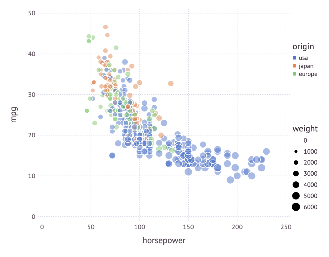
Congratulations, you just made your first beautiful Gadfly plot!
In this plot, we will use the Geom.boxplot , set the order of values on the X-axis, set the color order and set the position of the legend to top . To match the Seaborn version, we also set the spacing between the boxplots.
# download data
download("https://raw.githubusercontent.com/mwaskom/seaborn-data/master/tips.csv", "tips.csv")
tips = DataFrame(CSV.File("tips.csv"))# visualize data
set_default_plot_size(16cm, 12cm)
plot(
tips,
x = :day,
y = :total_bill,
color = :smoker,
Geom.boxplot,
Scale.x_discrete(
levels = ["Thur", "Fri", "Sat", "Sun"]
),
Scale.color_discrete_manual(
"#D0C4F4", "#A6D9AA",
order = [2, 1]
),
Theme(
key_position = :top,
boxplot_spacing = 10px,
background_color = "white",
),
)
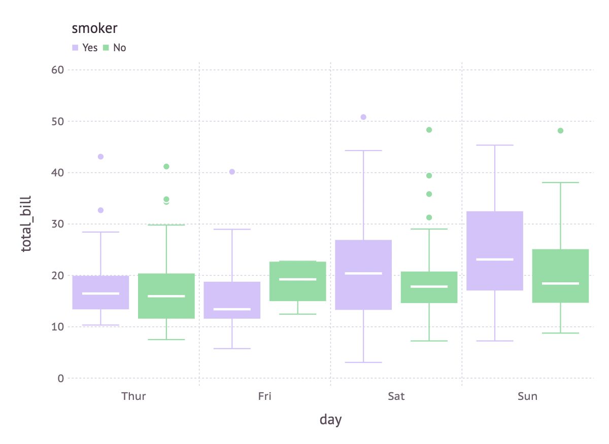
A very nice grouped boxplot in just a few lines of code!
What stands out in this visualisation — besides the data is filtered to match the Seaborn plot — is that relatieve positions are used to position the color keys Guide.colorkey(pos = [0.78w, -0.42h]). This position is relative to the width and hight of the plot. For this plot we will use the Geom.density2d . In Theme we will set the panel_fill color, the grid_color and the grid_line_width .
# download data
download("https://raw.githubusercontent.com/mwaskom/seaborn-data/master/iris.csv", "iris.csv")
iris = DataFrame(CSV.File("iris.csv"))# visualize data
set_default_plot_size(10cm, 15cm)
plot(
subset(iris, :species => ByRow(!=("versicolor"))),
x = :sepal_width,
y = :sepal_length,
color  = :species,
Scale.color_discrete_manual("#5377C9", "#DF8A56", "#82CA70"),
Geom.density2d,
Theme(
background_color = "white",
panel_fill = "#EAEAF1",
grid_color = "white",
grid_line_width = 1.5px,
),
Guide.colorkey(pos = [0.78w, -0.42h]),
)

In this plot we will use the Geom.beeswarm to match the Seaborn version. What’s new in this plot, is that we set the position of the yticks and set a ylabel for the values on the Y-axis.
# download data
download("https://raw.githubusercontent.com/mwaskom/seaborn-data/master/penguins.csv", penguins.csv)
penguins = DataFrame(CSV.File("penguins.csv"))# visualize data
set_default_plot_size(12cm, 16cm)
plot(
dropmissing(penguins, [:body_mass_g, :sex, :species]),
x = :sex,
y = :body_mass_g,
color = :species,
Geom.beeswarm,
Scale.color_discrete_manual("#5377C9", "#DF8A56", "#82CA70"),
Guide.yticks(ticks = 2000:1000:7000),
Guide.ylabel("body mass (g)"),
Theme(
background_color = "white",
),
)

At this moment (in Gadfly version 1.3.4) creating the same plot horizontal does not seem to work correctly. As soon as there is a solution, I will update the code and plot to a horizontal beeswarm.
In this plot we will use two layers to create de barplot we want. What is special about this barplot is that one bar represents a total and the other bar a part of the data. So these are not just stacked bars. We will use the Geom.bar with an horizontal orientation. And we will use a Theme per layer and a Theme for the whole plot.
# download data
download("https://raw.githubusercontent.com/mwaskom/seaborn-data/master/car_crashes.csv", "car_crashes.csv")
car_crashes = DataFrame(CSV.File("car_crashes.csv"))# visualize data
set_default_plot_size(5inch, 10inch)
p = plot(
sort(car_crashes, :total, rev = false),
layer(
x = :alcohol,
y = :abbrev,
Geom.bar(orientation = :horizontal),
Theme(
default_color = color("#617BBA"),
bar_spacing = 3px,
bar_highlight = color("white")
),
),
layer(
x = :total,
y = :abbrev,
Geom.bar(orientation = :horizontal),
Theme(
default_color = color("#B2C8E7"),
bar_spacing = 3px,
bar_highlight = color("white"),
),
),
Guide.xlabel("Automobile collisions per billion miles"),
Guide.ylabel(""),
Guide.manual_color_key("", ["Total", "Alcohol-involved"], ["#B2C8E7", "#617BBA"]),
Theme(
background_color = "white",
key_position = :bottom,
),
)
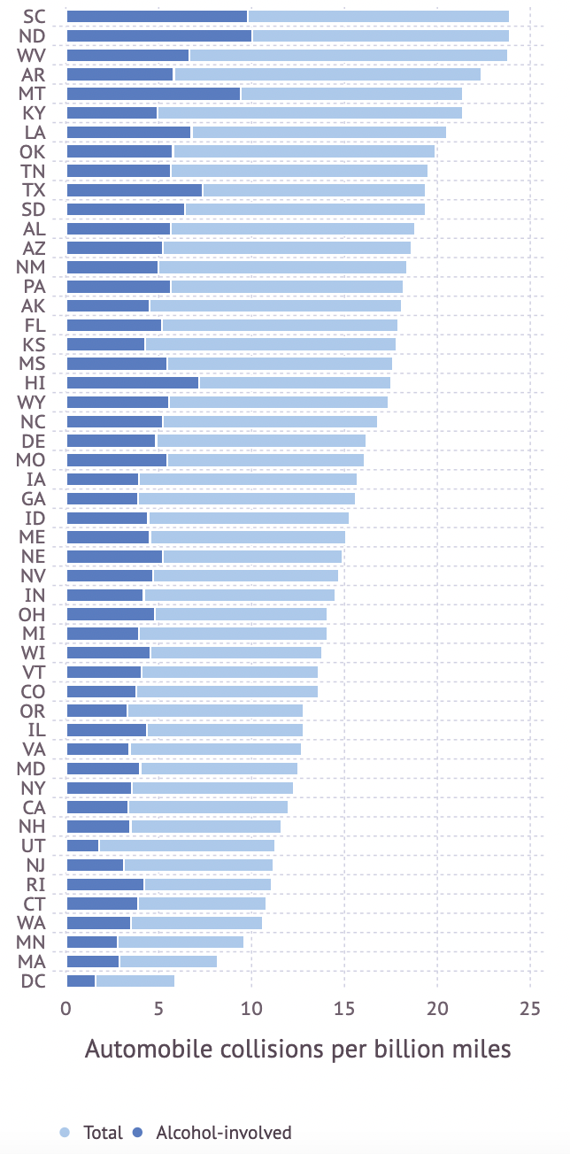
You can call your yourself a Gadfly expert, now!
Probably the most beautiful plot in this serie is the annotated heatmap. It’s also the most complex one because of the annotation. In this visualization, the colorschema magma from the ColorSchemes module is used. plasma , inferno, viridis andseaborn_rocket_gradient are also great colorschemes to try. The Geom.rectbin is used to create the heatmap.
# download data
download("https://raw.githubusercontent.com/mwaskom/seaborn-data/master/flights.csv", "flights.csv")
flights = DataFrame(CSV.File("flights.csv"))# visualize data
set_default_plot_size(17cm, 14cm)
plot(
flights,
x = :year,
y = :month,
color = :passengers,
Geom.rectbin,
Scale.ContinuousColorScale(
palette -> get(ColorSchemes.magma, palette)
),
Guide.xticks(
ticks=[minimum(flights.year):maximum(flights.year);]
),
Theme(background_color = "white"),
Guide.annotation(
compose(
context(),
text(
flights.year,
1:length(unique(flights.month)),
string.(flights.passengers),
repeat([hcenter], nrow(flights)),
repeat([vcenter], nrow(flights)),
),
fontsize(7pt),
stroke("white"),
),
)
)

I love the Python language and data visualisation libraries like Seaborn. That said, in my humble opinion, Gadfly is one of the most versatile data visualisation library for the Julia language (among others like Plots, Makie and Vega-Lite). Hope this introduction was useful, especially for those coming from Python and use Seaborn. Let me know if you are interested in a comparison story with the Makie package.
An introduction to a versatile data visualization library for Julia, especially for Pythonistas who miss Seaborn when coding in Julia
One of the libraries I used a lot for drawing attractive and informative statistical graphics in Python was Seaborn. One of my favourite packages for data visualisation in Julia is Gadfly. It is based largely on Hadley Wickhams’s ggplot2 for R and Leland Wilkinson’s book The Grammar of Graphics.
In this introduction to Gadfly we wil create 6 beautiful Seaborn plots. In each plot new possibilities of Gadfly will be used.
We will create the following data visualizations:
After following along your will know Gadfly well enough to create great data visualisations on your own data. So let’s begin.
First let’s load all the Julia packages needed. If you need help setting up an Julia package environment, you might be interested in reading this story first.
using CSV
using DataFrames
using Gadfly
using Compose
using ColorSchemes
In this plot, we will use the Geom.point , set a Theme , manually specify colors and set the minimum and maximum values for the point size legend. We are trying to reproduce this plot as close as possible.
First we need to download the data and load it into a DataFrame.
download("https://raw.githubusercontent.com/mwaskom/seaborn-data/master/mpg.csv", "mpg.csv")
mpg = DataFrame(CSV.File("mpg.csv"))
Before plotting, we set the plot size first. This can be done in inch or in cm . The first argument used in the plot function is for the dataset (mpg). On the X-axis we will plot horsepower and on the Y-axis mpg (miles per gallon). Point colors will be based on the country of origin and the size of the points will reflect the car weight. To prevent overplotting, we set an alpha of 0.5 . In this plot we use hexadecimal color codes. But you can also use color names here, like red , green and blue . Or leave out this line for the default Gadfly colors. We also set the minimum and maximum values for the point seize legend. The color of this legend is set to black as default color.
set_default_plot_size(15cm, 12cm)
plot(
mpg,
x = :horsepower,
y = :mpg,
color = :origin,
size = :weight,
alpha = [0.5],
Geom.point,
Scale.color_discrete_manual("#5377C9", "#DF8A56", "#82CA70"),
Scale.size_area(
minvalue = minimum(mpg.weight),
maxvalue = maximum(mpg.weight)
),
Theme(
background_color = "white",
default_color = "black",
),
)
Congratulations, you just made your first beautiful Gadfly plot!
In this plot, we will use the Geom.boxplot , set the order of values on the X-axis, set the color order and set the position of the legend to top . To match the Seaborn version, we also set the spacing between the boxplots.
# download data
download("https://raw.githubusercontent.com/mwaskom/seaborn-data/master/tips.csv", "tips.csv")
tips = DataFrame(CSV.File("tips.csv"))# visualize data
set_default_plot_size(16cm, 12cm)
plot(
tips,
x = :day,
y = :total_bill,
color = :smoker,
Geom.boxplot,
Scale.x_discrete(
levels = ["Thur", "Fri", "Sat", "Sun"]
),
Scale.color_discrete_manual(
"#D0C4F4", "#A6D9AA",
order = [2, 1]
),
Theme(
key_position = :top,
boxplot_spacing = 10px,
background_color = "white",
),
)
A very nice grouped boxplot in just a few lines of code!
What stands out in this visualisation — besides the data is filtered to match the Seaborn plot — is that relatieve positions are used to position the color keys Guide.colorkey(pos = [0.78w, -0.42h]). This position is relative to the width and hight of the plot. For this plot we will use the Geom.density2d . In Theme we will set the panel_fill color, the grid_color and the grid_line_width .
# download data
download("https://raw.githubusercontent.com/mwaskom/seaborn-data/master/iris.csv", "iris.csv")
iris = DataFrame(CSV.File("iris.csv"))# visualize data
set_default_plot_size(10cm, 15cm)
plot(
subset(iris, :species => ByRow(!=("versicolor"))),
x = :sepal_width,
y = :sepal_length,
color  = :species,
Scale.color_discrete_manual("#5377C9", "#DF8A56", "#82CA70"),
Geom.density2d,
Theme(
background_color = "white",
panel_fill = "#EAEAF1",
grid_color = "white",
grid_line_width = 1.5px,
),
Guide.colorkey(pos = [0.78w, -0.42h]),
)
In this plot we will use the Geom.beeswarm to match the Seaborn version. What’s new in this plot, is that we set the position of the yticks and set a ylabel for the values on the Y-axis.
# download data
download("https://raw.githubusercontent.com/mwaskom/seaborn-data/master/penguins.csv", penguins.csv)
penguins = DataFrame(CSV.File("penguins.csv"))# visualize data
set_default_plot_size(12cm, 16cm)
plot(
dropmissing(penguins, [:body_mass_g, :sex, :species]),
x = :sex,
y = :body_mass_g,
color = :species,
Geom.beeswarm,
Scale.color_discrete_manual("#5377C9", "#DF8A56", "#82CA70"),
Guide.yticks(ticks = 2000:1000:7000),
Guide.ylabel("body mass (g)"),
Theme(
background_color = "white",
),
)
At this moment (in Gadfly version 1.3.4) creating the same plot horizontal does not seem to work correctly. As soon as there is a solution, I will update the code and plot to a horizontal beeswarm.
In this plot we will use two layers to create de barplot we want. What is special about this barplot is that one bar represents a total and the other bar a part of the data. So these are not just stacked bars. We will use the Geom.bar with an horizontal orientation. And we will use a Theme per layer and a Theme for the whole plot.
# download data
download("https://raw.githubusercontent.com/mwaskom/seaborn-data/master/car_crashes.csv", "car_crashes.csv")
car_crashes = DataFrame(CSV.File("car_crashes.csv"))# visualize data
set_default_plot_size(5inch, 10inch)
p = plot(
sort(car_crashes, :total, rev = false),
layer(
x = :alcohol,
y = :abbrev,
Geom.bar(orientation = :horizontal),
Theme(
default_color = color("#617BBA"),
bar_spacing = 3px,
bar_highlight = color("white")
),
),
layer(
x = :total,
y = :abbrev,
Geom.bar(orientation = :horizontal),
Theme(
default_color = color("#B2C8E7"),
bar_spacing = 3px,
bar_highlight = color("white"),
),
),
Guide.xlabel("Automobile collisions per billion miles"),
Guide.ylabel(""),
Guide.manual_color_key("", ["Total", "Alcohol-involved"], ["#B2C8E7", "#617BBA"]),
Theme(
background_color = "white",
key_position = :bottom,
),
)
You can call your yourself a Gadfly expert, now!
Probably the most beautiful plot in this serie is the annotated heatmap. It’s also the most complex one because of the annotation. In this visualization, the colorschema magma from the ColorSchemes module is used. plasma , inferno, viridis andseaborn_rocket_gradient are also great colorschemes to try. The Geom.rectbin is used to create the heatmap.
# download data
download("https://raw.githubusercontent.com/mwaskom/seaborn-data/master/flights.csv", "flights.csv")
flights = DataFrame(CSV.File("flights.csv"))# visualize data
set_default_plot_size(17cm, 14cm)
plot(
flights,
x = :year,
y = :month,
color = :passengers,
Geom.rectbin,
Scale.ContinuousColorScale(
palette -> get(ColorSchemes.magma, palette)
),
Guide.xticks(
ticks=[minimum(flights.year):maximum(flights.year);]
),
Theme(background_color = "white"),
Guide.annotation(
compose(
context(),
text(
flights.year,
1:length(unique(flights.month)),
string.(flights.passengers),
repeat([hcenter], nrow(flights)),
repeat([vcenter], nrow(flights)),
),
fontsize(7pt),
stroke("white"),
),
)
)
I love the Python language and data visualisation libraries like Seaborn. That said, in my humble opinion, Gadfly is one of the most versatile data visualisation library for the Julia language (among others like Plots, Makie and Vega-Lite). Hope this introduction was useful, especially for those coming from Python and use Seaborn. Let me know if you are interested in a comparison story with the Makie package.
Denial of responsibility! Techno Blender is an automatic aggregator of the all world’s media. In each content, the hyperlink to the primary source is specified. All trademarks belong to their rightful owners, all materials to their authors. If you are the owner of the content and do not want us to publish your materials, please contact us by email – [email protected]. The content will be deleted within 24 hours.