
Lexicon-Based Sentiment Analysis Using R
An empirical analysis of sentiments conveyed through media briefings during the COVID-19 pandemic
During the COVID-19 pandemic, I decided to learn a new statistical technique to keep my mind occupied rather than constantly immersing myself in pandemic-related news. After evaluating several options, I found the concepts related to natural language processing (NLP) particularly captivating. So, I opted to delve deeper into this field and explore one specific technique: sentiment analysis, also known as “opinion mining” in academic literature. This analytical method empowers researchers to extract and interpret the emotions conveyed toward a specific subject within the written text. Through sentiment analysis, one can discern the polarity (positive or negative), nature, and intensity of sentiments expressed across various textual formats such as documents, customer reviews, and social media posts.
Amidst the pandemic, I observed a significant trend among researchers who turned to sentiment analysis as a tool to measure public responses to news and developments surrounding the virus. This involved analyzing user-generated content on popular social media platforms such as Twitter, YouTube, and Instagram. Intrigued by this methodology, my colleagues and I endeavored to contribute to the existing body of research by scrutinizing the daily briefings provided by public health authorities. In Alberta, Dr. Deena Hinshaw, who used to be the province’s chief medical officer of health, regularly delivered updates on the region’s response to the ongoing pandemic. Through our analysis of these public health announcements, we aimed to assess Alberta’s effectiveness in implementing communication strategies during this intricate public health crisis. Our investigation, conducted through the lenses of sentiment analysis, sought to shed light on the efficacy of communication strategies employed during this challenging period in public health [1, 2].
In this post, I aim to walk you through the process of performing sentiment analysis using R. Specifically, I’ll focus on “lexicon-based sentiment analysis,” which I’ll discuss in more detail in the next section. I’ll provide examples of lexicon-based sentiment analysis that we’ve integrated into the publications referenced earlier. Additionally, in future posts, I’ll delve into more advanced forms of sentiment analysis, making use of state-of-the-art pre-trained models accessible on Hugging Face.
Lexicon-Based Sentiment Analysis
As I learned more about sentiment analysis, I discovered that the predominant method for extracting sentiments is lexicon-based sentiment analysis. This approach entails utilizing a specific lexicon, essentially the vocabulary of a language or subject, to discern the direction and intensity of sentiments conveyed within a given text. Some lexicons, like the Bing lexicon [3], classify words as either positive or negative. Conversely, other lexicons provide more detailed sentiment labels, such as the NRC Emotion Lexicon [4], which categorizes words based on both positive and negative sentiments, as well as Plutchik’s [5] psych evolutionary theory of basic emotions (e.g., anger, fear, anticipation, trust, surprise, sadness, joy, and disgust).
Lexicon-based sentiment analysis operates by aligning words within a given text with those found in widely used lexicons such as NRC and Bing. Each word receives an assigned sentiment, typically categorized as positive or negative. The text’s collective sentiment score is subsequently derived by summing the individual sentiment scores of its constituent words. For instance, in a scenario where a text incorporates 50 positive and 30 negative words according to the Bing lexicon, the resulting sentiment score would be 20. This value indicates a predominance of positive sentiments within the text. Conversely, a negative total would imply a prevalence of negative sentiments.
Performing lexicon-based sentiment analysis using R can be both fun and tricky at the same time. While analyzing public health announcements in terms of sentiments, I found Julia Silge and David Robinson’s book, Text Mining with R, to be very helpful. The book has a chapter dedicated to sentiment analysis, where the authors demonstrate how to conduct sentiment analysis using general-purpose lexicons like Bing and NRC. However, Julia and David also highlight a major limitation of lexicon-based sentiment analysis. The analysis considers only single words (i.e., unigrams) and does not consider qualifiers before a word. For instance, negation words like “not” in “not true” are ignored, and sentiment analysis processes them as two separate words, “not” and “true”. Furthermore, if a particular word (either positive or negative) is repeatedly used throughout the text, this may skew the results depending on the polarity (positive or negative) of this word. Therefore, the results of lexicon-based sentiment analysis should be interpreted carefully.
Now, let’s move to our example, where we will conduct lexicon-based sentiment analysis using Dr. Deena Hinshaw’s media briefings during the COVID-19 pandemic. My goal is to showcase two R packages capable of running sentiment analysis 📉.
Example
For the sake of simplicity, we will focus on the first wave of the pandemic (March 2020 — June 2020). The transcripts of all media briefings were publicly available on the government of Alberta’s COVID-19 pandemic website (https://www.alberta.ca/covid). This dataset comes with an open data license that allows the public to access and use the information, including for commercial purposes. After importing these transcripts into R, I turned all the text into lowercase and then applied word tokenization using the tidytext and tokenizers packages. Word tokenization split the sentences in the media briefings into individual words for each entry (i.e., day of media briefings). Next, I applied lemmatization to the tokens to resolve each word into its canonical form using the textstem package. Finally, I removed common stopwords, such as “my,” “for,” “that,” “with,” and “for, using the stopwords package. The final dataset is available here. Now, let’s import the data into R and then review its content.
load("wave1_alberta.RData")

head(wave1_alberta, 10)
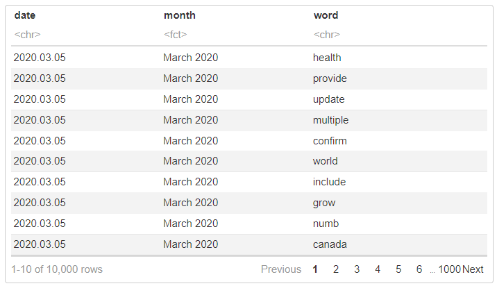
The dataset has three columns:
- month (the month of the media briefing)
- date (the exact date of the media briefing), and
- word (words or tokens used in media briefing)
Descriptive Analysis
Now, we can calculate some descriptive statistics to better understand the content of our dataset. We will begin by finding the top 5 words (based on their frequency) for each month.
library("dplyr")

wave1_alberta %>%
  group_by(month) %>%
  count(word, sort = TRUE) %>%
  slice_head(n = 5) %>%
  as.data.frame()
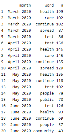
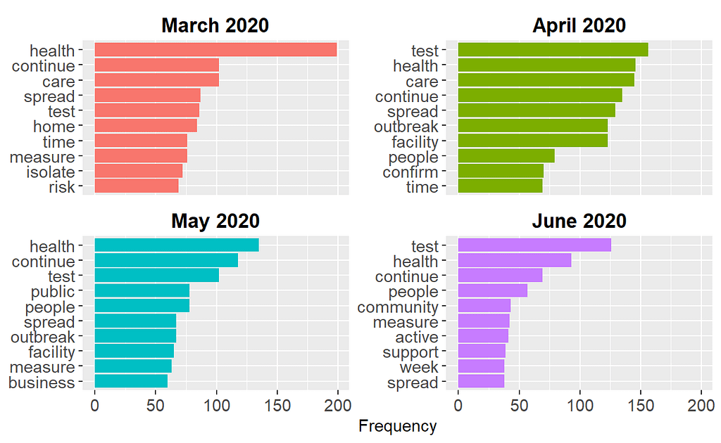
The output shows that words such as health, continue, and test were commonly used in the media briefings across this 4-month period. We can also expand our list to the most common 10 words and view the results visually:
library("tidytext")
library("ggplot2")

wave1_alberta %>%
  # Group by month
  group_by(month) %>%
  count(word, sort = TRUE) %>%
  # Find the top 10 words
  slice_head(n = 10) %>%
  ungroup() %>%
  # Order the words by their frequency within each month
  mutate(word = reorder_within(word, n, month)) %>%
  # Create a bar graph
  ggplot(aes(x = n, y = word, fill = month)) +
  geom_col() +
  scale_y_reordered() +
  facet_wrap(~ month, scales = "free_y") +
  labs(x = "Frequency", y = NULL) +
  theme(legend.position = "none",
        axis.text.x = element_text(size = 11),
        axis.text.y = element_text(size = 11),
        strip.background = element_blank(),
        strip.text = element_text(colour = "black", face = "bold", size = 13))
Since some words are common across all four months, the plot above may not necessarily show us the important words that are unique to each month. To find such important words, we can use Term Frequency — Inverse Document Frequency (TF-IDF)–a widely used technique in NLP for measuring how important a term is within a document relative to a collection of documents (for more detailed information about TF-IDF, check out my previous blog post). In our example, we will treat media briefings for each month as a document and calculate TF-IDF for the tokens (i.e., words) within each document. The first part of the R codes below creates a new dataset, wave1_tf_idf, by calculating TF-IDF for all tokens and selecting the tokens with the highest TF-IDF values within each month. Next, we use this dataset to create a bar plot with the TF-IDF values to view the common words unique to each month.
# Calculate TF-IDF for the words for each month
wave1_tf_idf <- wave1_alberta %>%
  count(month, word, sort = TRUE) %>%
  bind_tf_idf(word, month, n) %>%
  arrange(month, -tf_idf) %>%
  group_by(month) %>%
  top_n(10) %>%
  ungroup

# Visualize the results
wave1_tf_idf %>%
  mutate(word = reorder_within(word, tf_idf, month)) %>%
  ggplot(aes(word, tf_idf, fill = month)) +
  geom_col(show.legend = FALSE) +
  facet_wrap(~ month, scales = "free", ncol = 2) +
  scale_x_reordered() +
  coord_flip() +
  theme(strip.background = element_blank(),
        strip.text = element_text(colour = "black", face = "bold", size = 13),
        axis.text.x = element_text(size = 11),
        axis.text.y = element_text(size = 11)) +
  labs(x = NULL, y = "TF-IDF")
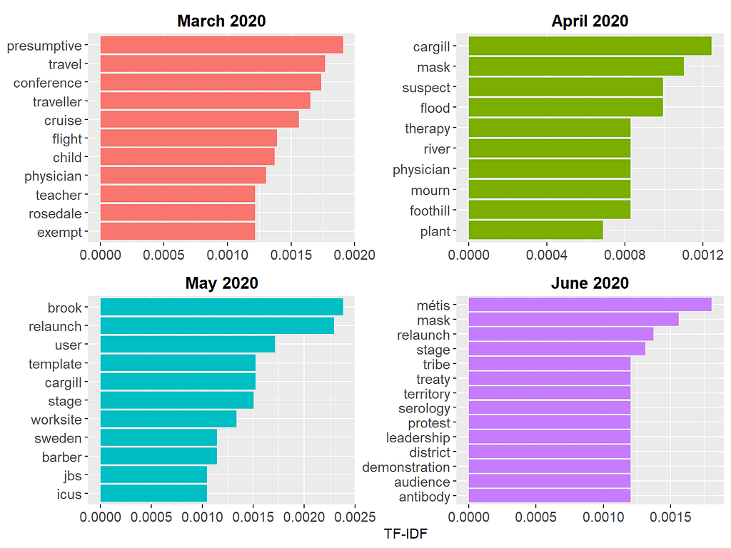
These results are more informative because the tokens shown in the figure reflect unique topics discussed each month. For example, in March 2020, the media briefings were mostly about limiting travel, returning from crowded conferences, and COVID-19 cases on cruise ships. In June 2020, the focus of the media briefings shifted towards mask requirements, people protesting pandemic-related restrictions, and so on.
Before we switch back to the sentiment analysis, let’s take a look at another descriptive variable: the length of each media briefing. This will show us whether the media briefings became longer or shorter over time.
wave1_alberta %>%
  # Save "day" as a separate variable
  mutate(day = substr(date, 9, 10)) %>%
  group_by(month, day) %>%
  # Count the number of words
  summarize(n = n()) %>%
  ggplot(aes(day, n, color = month, shape = month, group = month)) +
  geom_point(size = 2) +
  geom_line() +
  labs(x = "Days", y = "Number of Words") +
  theme(legend.position = "none",
        axis.text.x = element_text(angle = 90, size = 11),
        strip.background = element_blank(),
        strip.text = element_text(colour = "black", face = "bold", size = 11),
        axis.text.y = element_text(size = 11)) +
  ylim(0, 800) +
  facet_wrap(~ month, scales = "free_x")
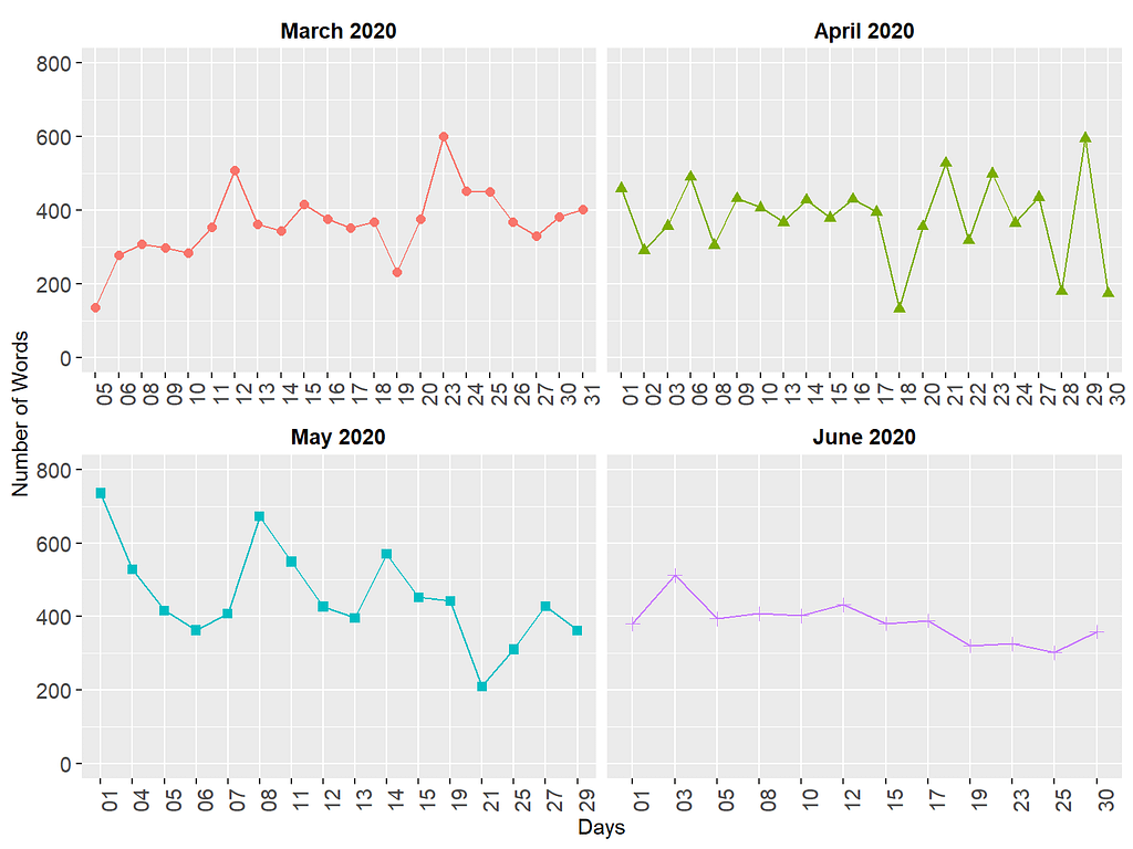
The figure above shows that the length of media briefings varied quite substantially over time. Especially in March and May, there are larger fluctuations (i.e., very long or short briefings), whereas, in June, the daily media briefings are quite similar in terms of length.
Sentiment Analysis with tidytext
After analyzing the dataset descriptively, we are ready to begin with the sentiment analysis. In the first part, we will use the tidytext package for performing sentiment analysis and computing sentiment scores. We will first import the lexicons into R and then merge them with our dataset. Using the Bing lexicon, we need to find the difference between the number of positive and negative words to produce a sentiment score (i.e., sentiment = the number of positive words — the number of negative words).
# From the three lexicons, Bing is already available in the tidytext page
# for AFINN and NRC, install the textdata package by uncommenting the next line
# install.packages("textdata")
get_sentiments("bing")
get_sentiments("afinn")
get_sentiments("nrc")

# We will need the spread function from tidyr
library("tidyr")

# Sentiment scores with bing (based on frequency)
wave1_alberta %>%
  mutate(day = substr(date, 9, 10)) %>%
  group_by(month, day) %>%
  inner_join(get_sentiments("bing")) %>%
  count(month, day, sentiment) %>%
  spread(sentiment, n) %>%
  mutate(sentiment = positive - negative) %>%
  ggplot(aes(day, sentiment, fill = month)) +
  geom_col(show.legend = FALSE) +
  labs(x = "Days", y = "Sentiment Score") +
  ylim(-50, 50) +
  theme(legend.position = "none", axis.text.x = element_text(angle = 90)) +
  facet_wrap(~ month, ncol = 2, scales = "free_x") +
  theme(strip.background = element_blank(),
        strip.text = element_text(colour = "black", face = "bold", size = 11),
        axis.text.x = element_text(size = 11),
        axis.text.y = element_text(size = 11))
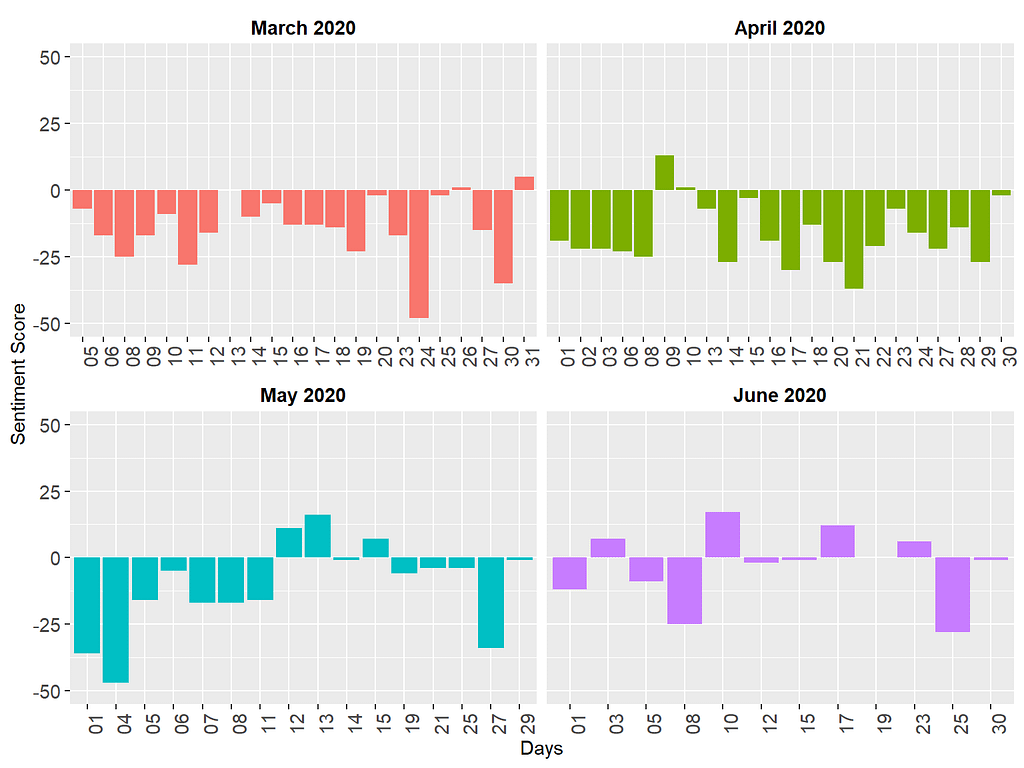
The figure above shows that the sentiments delivered in the media briefings were generally negative, which is not necessarily surprising since the media briefings were all about how many people passed away, hospitalization rates, potential outbreaks, etc. On certain days (e.g., March 24, 2020 and May 4, 2020), the media briefings were particularly more negative in terms of sentiments.
Next, we will use the AFINN lexicon. Unlike Bing that labels words as positive or negative, AFINN assigns a numerical weight to each word. The sign of the weight indicates the polarity of sentiments (i.e., positive or negative), while the value indicates the intensity of sentiments. Now, let’s see if these weighted values produce different sentiment scores.
wave1_alberta %>%
  mutate(day = substr(date, 9, 10)) %>%
  group_by(month, day) %>%
  inner_join(get_sentiments("afinn")) %>%
  group_by(month, day) %>%
  summarize(sentiment = sum(value),
            type = ifelse(sentiment >= 0, "positive", "negative")) %>%
  ggplot(aes(day, sentiment, fill = type)) +
  geom_col(show.legend = FALSE) +
  labs(x = "Days", y = "Sentiment Score") +
  ylim(-100, 100) +
  facet_wrap(~ month, ncol = 2, scales = "free_x") +
  theme(legend.position = "none",
        strip.background = element_blank(),
        strip.text = element_text(colour = "black", face = "bold", size = 11),
        axis.text.x = element_text(size = 11, angle = 90),
        axis.text.y = element_text(size = 11))
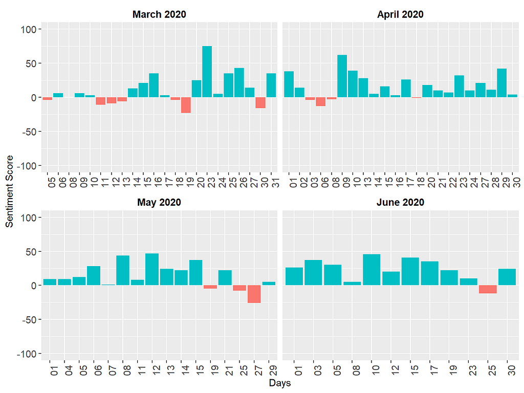
The results based on the AFINN lexicon seem to be quite different! Once we take the “weight” of the tokens into account, most media briefings turn out to be positive (see the green bars), although there are still some days with negative sentiments (see the red bars). The two analyses we have done so far have yielded very different for two reasons. First, as I mentioned above, the Bing lexicon focuses on the polarity of the words but ignores the intensity of the words (dislike and hate are considered negative words with equal intensity). Unlike the Bing lexicon, the AFINN lexicon takes the intensity into account, which impacts the calculation of the sentiment scores. Second, the Bing lexicon (6786 words) is fairly larger than the AFINN lexicon (2477 words). Therefore, it is likely that some tokens in the media briefings are included in the Bing lexicon, but not in the AFINN lexicon. Disregarding those tokens might have impacted the results.
The final lexicon we are going to try using the tidytext package is NRC. As I mentioned earlier, this lexicon uses Plutchik’s psych-evolutionary theory to label the tokens based on basic emotions such as anger, fear, and anticipation. We are going to count the number of words or tokens associated with each emotion and then visualize the results.
wave1_alberta %>%
  mutate(day = substr(date, 9, 10)) %>%
  group_by(month, day) %>%
  inner_join(get_sentiments("nrc")) %>%
  count(month, day, sentiment) %>%
  group_by(month, sentiment) %>%
  summarize(n_total = sum(n)) %>%
  ggplot(aes(n_total, sentiment, fill = sentiment)) +
  geom_col(show.legend = FALSE) +
  labs(x = "Frequency", y = "") +
  xlim(0, 2000) +
  facet_wrap(~ month, ncol = 2, scales = "free_x") +
  theme(strip.background = element_blank(),
        strip.text = element_text(colour = "black", face = "bold", size = 11),
        axis.text.x = element_text(size = 11),
        axis.text.y = element_text(size = 11))
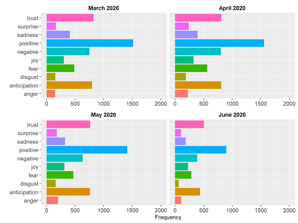
The figure shows that the media briefings are mostly positive each month. Dr. Hinshaw used words associated with “trust”, “anticipation”, and “fear”. Overall, the pattern of these emotions seems to remain very similar over time, indicating the consistency of the media briefings in terms of the type and intensity of the emotions delivered.
Sentiment Analysis with sentimentr
Another package for lexicon-based sentiment analysis is sentimentr (Rinker, 2021). Unlike the tidytext package, this package takes valence shifters (e.g., negation) into account, which can easily flip the polarity of a sentence with one word. For example, the sentence “I am not unhappy” is actually positive, but if we analyze it word by word, the sentence may seem to have a negative sentiment due to the words “not” and “unhappy”. Similarly, “I hardly like this book” is a negative sentence but the analysis of individual words, “hardly” and “like”, may yield a positive sentiment score. The sentimentr package addresses the limitations around sentiment detection with valence shifters (see the package author Tyler Rinker’s Github page for further details on sentimentr: https://github.com/trinker/sentimentr).
To benefit from the sentimentr package, we need the actual sentences in the media briefings rather than the individual tokens. Therefore, I had to create an untokenized version of the dataset, which is available here. We will first import this dataset into R, get individual sentences for each media briefing using the get_sentences() function, and then calculate sentiment scores by day and month via sentiment_by().
library("sentimentr")
library("magrittr")

load("wave1_alberta_sentence.RData")

# Calculate sentiment scores by day and month
wave1_sentimentr <- wave1_alberta_sentence %>%
  mutate(day = substr(date, 9, 10)) %>%
  get_sentences() %$%
  sentiment_by(text, list(month, day))

# View the dataset
head(wave1_sentimentr, 10)
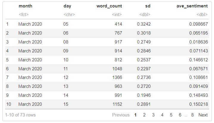
In the dataset we created, “ave_sentiment” is the average sentiment score for each day in March, April, May, and June (i.e., days where a media briefing was made). Using this dataset, we can visualize the sentiment scores.
wave1_sentimentr %>%
  group_by(month, day) %>%
  ggplot(aes(day, ave_sentiment, fill = ave_sentiment)) +
  scale_fill_gradient(low="red", high="blue") +
  geom_col(show.legend = FALSE) +
  labs(x = "Days", y = "Sentiment Score") +
  ylim(-0.1, 0.3) +
  facet_wrap(~ month, ncol = 2, scales = "free_x") +
  theme(legend.position = "none",
        strip.background = element_blank(),
        strip.text = element_text(colour = "black", face = "bold", size = 11),
        axis.text.x = element_text(size = 11, angle = 90),
        axis.text.y = element_text(size = 11))
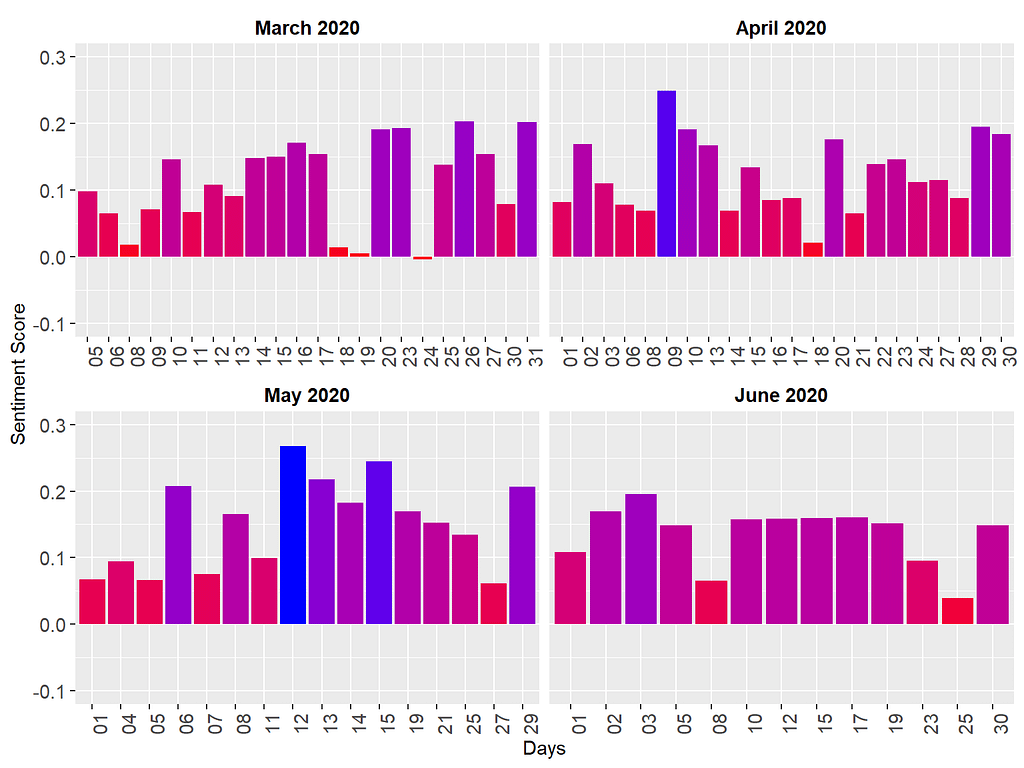
In the figure above, the blue bars represent highly positive sentiment scores, while the red bars depict comparatively lower sentiment scores. The patterns observed in the sentiment scores generated by sentimentr closely resemble those derived from the AFINN lexicon. Notably, this analysis is based on the original media briefings rather than solely tokens, with consideration given to valence shifters in the computation of sentiment scores. The convergence between the sentiment patterns identified by sentimentr and those from AFINN is not entirely unexpected. Both approaches incorporate similar weighting systems and mechanisms that account for word intensity. This alignment reinforces our confidence in the initial findings obtained through AFINN, validating the consistency and reliability of our analyses with sentiment.
Concluding Remarks
In conclusion, lexicon-based sentiment analysis in R offers a powerful tool for uncovering the emotional nuances within textual data. Throughout this post, we have explored the fundamental concepts of lexicon-based sentiment analysis and provided a practical demonstration of its implementation using R. By leveraging packages such as sentimentr and tidytext, we have illustrated how sentiment analysis can be seamlessly integrated into your data analysis workflow. As you embark on your journey into sentiment analysis, remember that the insights gained from this technique extend far beyond the surface of the text. They provide valuable perspectives on public opinion, consumer sentiment, and beyond. I encourage you to delve deeper into lexicon-based sentiment analysis, experiment with the examples presented here, and unlock the rich insights waiting to be discovered within your own data. Happy analyzing!
References
[1] Bulut, O., & Poth, C. N. (2022). Rapid assessment of communication consistency: Sentiment analysis of public health briefings during the COVID-19 pandemic. AIMS Public Health, 9(2), 293–306. https://doi.org/10.3934/publichealth.2022020
[2] Poth, C. N., Bulut, O., Aquilina, A. M., & Otto, S. J. G. (2021). Using data mining for rapid complex case study descriptions: Example of public health briefings during the onset of the COVID-19 pandemic. Journal of Mixed Methods Research, 15(3), 348–373. https://doi.org/10.1177/15586898211013925
[3] Hu, M., & Liu, B. (2004). Mining and summarizing customer reviews. Proceedings of the Tenth ACM SIGKDD International Conference on Knowledge Discovery and Data Mining, 168–177.
[4] Mohammad, S. M., & Turney, P. D. (2013). Crowdsourcing a word–emotion association lexicon. Computational Intelligence, 29(3), 436–465.
[5] Plutchik, R. (1980). A general psychoevolutionary theory of emotion. In Theories of emotion (pp. 3–33). Elsevier.
Lexicon-Based Sentiment Analysis Using R was originally published in Towards Data Science on Medium, where people are continuing the conversation by highlighting and responding to this story.
An empirical analysis of sentiments conveyed through media briefings during the COVID-19 pandemic

During the COVID-19 pandemic, I decided to learn a new statistical technique to keep my mind occupied rather than constantly immersing myself in pandemic-related news. After evaluating several options, I found the concepts related to natural language processing (NLP) particularly captivating. So, I opted to delve deeper into this field and explore one specific technique: sentiment analysis, also known as “opinion mining” in academic literature. This analytical method empowers researchers to extract and interpret the emotions conveyed toward a specific subject within the written text. Through sentiment analysis, one can discern the polarity (positive or negative), nature, and intensity of sentiments expressed across various textual formats such as documents, customer reviews, and social media posts.
Amidst the pandemic, I observed a significant trend among researchers who turned to sentiment analysis as a tool to measure public responses to news and developments surrounding the virus. This involved analyzing user-generated content on popular social media platforms such as Twitter, YouTube, and Instagram. Intrigued by this methodology, my colleagues and I endeavored to contribute to the existing body of research by scrutinizing the daily briefings provided by public health authorities. In Alberta, Dr. Deena Hinshaw, who used to be the province’s chief medical officer of health, regularly delivered updates on the region’s response to the ongoing pandemic. Through our analysis of these public health announcements, we aimed to assess Alberta’s effectiveness in implementing communication strategies during this intricate public health crisis. Our investigation, conducted through the lenses of sentiment analysis, sought to shed light on the efficacy of communication strategies employed during this challenging period in public health [1, 2].
In this post, I aim to walk you through the process of performing sentiment analysis using R. Specifically, I’ll focus on “lexicon-based sentiment analysis,” which I’ll discuss in more detail in the next section. I’ll provide examples of lexicon-based sentiment analysis that we’ve integrated into the publications referenced earlier. Additionally, in future posts, I’ll delve into more advanced forms of sentiment analysis, making use of state-of-the-art pre-trained models accessible on Hugging Face.
Lexicon-Based Sentiment Analysis
As I learned more about sentiment analysis, I discovered that the predominant method for extracting sentiments is lexicon-based sentiment analysis. This approach entails utilizing a specific lexicon, essentially the vocabulary of a language or subject, to discern the direction and intensity of sentiments conveyed within a given text. Some lexicons, like the Bing lexicon [3], classify words as either positive or negative. Conversely, other lexicons provide more detailed sentiment labels, such as the NRC Emotion Lexicon [4], which categorizes words based on both positive and negative sentiments, as well as Plutchik’s [5] psych evolutionary theory of basic emotions (e.g., anger, fear, anticipation, trust, surprise, sadness, joy, and disgust).
Lexicon-based sentiment analysis operates by aligning words within a given text with those found in widely used lexicons such as NRC and Bing. Each word receives an assigned sentiment, typically categorized as positive or negative. The text’s collective sentiment score is subsequently derived by summing the individual sentiment scores of its constituent words. For instance, in a scenario where a text incorporates 50 positive and 30 negative words according to the Bing lexicon, the resulting sentiment score would be 20. This value indicates a predominance of positive sentiments within the text. Conversely, a negative total would imply a prevalence of negative sentiments.
Performing lexicon-based sentiment analysis using R can be both fun and tricky at the same time. While analyzing public health announcements in terms of sentiments, I found Julia Silge and David Robinson’s book, Text Mining with R, to be very helpful. The book has a chapter dedicated to sentiment analysis, where the authors demonstrate how to conduct sentiment analysis using general-purpose lexicons like Bing and NRC. However, Julia and David also highlight a major limitation of lexicon-based sentiment analysis. The analysis considers only single words (i.e., unigrams) and does not consider qualifiers before a word. For instance, negation words like “not” in “not true” are ignored, and sentiment analysis processes them as two separate words, “not” and “true”. Furthermore, if a particular word (either positive or negative) is repeatedly used throughout the text, this may skew the results depending on the polarity (positive or negative) of this word. Therefore, the results of lexicon-based sentiment analysis should be interpreted carefully.
Now, let’s move to our example, where we will conduct lexicon-based sentiment analysis using Dr. Deena Hinshaw’s media briefings during the COVID-19 pandemic. My goal is to showcase two R packages capable of running sentiment analysis 📉.
Example
For the sake of simplicity, we will focus on the first wave of the pandemic (March 2020 — June 2020). The transcripts of all media briefings were publicly available on the government of Alberta’s COVID-19 pandemic website (https://www.alberta.ca/covid). This dataset comes with an open data license that allows the public to access and use the information, including for commercial purposes. After importing these transcripts into R, I turned all the text into lowercase and then applied word tokenization using the tidytext and tokenizers packages. Word tokenization split the sentences in the media briefings into individual words for each entry (i.e., day of media briefings). Next, I applied lemmatization to the tokens to resolve each word into its canonical form using the textstem package. Finally, I removed common stopwords, such as “my,” “for,” “that,” “with,” and “for, using the stopwords package. The final dataset is available here. Now, let’s import the data into R and then review its content.
load("wave1_alberta.RData")

head(wave1_alberta, 10)
The dataset has three columns:
- month (the month of the media briefing)
- date (the exact date of the media briefing), and
- word (words or tokens used in media briefing)
Descriptive Analysis
Now, we can calculate some descriptive statistics to better understand the content of our dataset. We will begin by finding the top 5 words (based on their frequency) for each month.
library("dplyr")

wave1_alberta %>%
  group_by(month) %>%
  count(word, sort = TRUE) %>%
  slice_head(n = 5) %>%
  as.data.frame()
The output shows that words such as health, continue, and test were commonly used in the media briefings across this 4-month period. We can also expand our list to the most common 10 words and view the results visually:
library("tidytext")
library("ggplot2")

wave1_alberta %>%
  # Group by month
  group_by(month) %>%
  count(word, sort = TRUE) %>%
  # Find the top 10 words
  slice_head(n = 10) %>%
  ungroup() %>%
  # Order the words by their frequency within each month
  mutate(word = reorder_within(word, n, month)) %>%
  # Create a bar graph
  ggplot(aes(x = n, y = word, fill = month)) +
  geom_col() +
  scale_y_reordered() +
  facet_wrap(~ month, scales = "free_y") +
  labs(x = "Frequency", y = NULL) +
  theme(legend.position = "none",
        axis.text.x = element_text(size = 11),
        axis.text.y = element_text(size = 11),
        strip.background = element_blank(),
        strip.text = element_text(colour = "black", face = "bold", size = 13))
Since some words are common across all four months, the plot above may not necessarily show us the important words that are unique to each month. To find such important words, we can use Term Frequency — Inverse Document Frequency (TF-IDF)–a widely used technique in NLP for measuring how important a term is within a document relative to a collection of documents (for more detailed information about TF-IDF, check out my previous blog post). In our example, we will treat media briefings for each month as a document and calculate TF-IDF for the tokens (i.e., words) within each document. The first part of the R codes below creates a new dataset, wave1_tf_idf, by calculating TF-IDF for all tokens and selecting the tokens with the highest TF-IDF values within each month. Next, we use this dataset to create a bar plot with the TF-IDF values to view the common words unique to each month.
# Calculate TF-IDF for the words for each month
wave1_tf_idf <- wave1_alberta %>%
  count(month, word, sort = TRUE) %>%
  bind_tf_idf(word, month, n) %>%
  arrange(month, -tf_idf) %>%
  group_by(month) %>%
  top_n(10) %>%
  ungroup

# Visualize the results
wave1_tf_idf %>%
  mutate(word = reorder_within(word, tf_idf, month)) %>%
  ggplot(aes(word, tf_idf, fill = month)) +
  geom_col(show.legend = FALSE) +
  facet_wrap(~ month, scales = "free", ncol = 2) +
  scale_x_reordered() +
  coord_flip() +
  theme(strip.background = element_blank(),
        strip.text = element_text(colour = "black", face = "bold", size = 13),
        axis.text.x = element_text(size = 11),
        axis.text.y = element_text(size = 11)) +
  labs(x = NULL, y = "TF-IDF")
These results are more informative because the tokens shown in the figure reflect unique topics discussed each month. For example, in March 2020, the media briefings were mostly about limiting travel, returning from crowded conferences, and COVID-19 cases on cruise ships. In June 2020, the focus of the media briefings shifted towards mask requirements, people protesting pandemic-related restrictions, and so on.
Before we switch back to the sentiment analysis, let’s take a look at another descriptive variable: the length of each media briefing. This will show us whether the media briefings became longer or shorter over time.
wave1_alberta %>%
  # Save "day" as a separate variable
  mutate(day = substr(date, 9, 10)) %>%
  group_by(month, day) %>%
  # Count the number of words
  summarize(n = n()) %>%
  ggplot(aes(day, n, color = month, shape = month, group = month)) +
  geom_point(size = 2) +
  geom_line() +
  labs(x = "Days", y = "Number of Words") +
  theme(legend.position = "none",
        axis.text.x = element_text(angle = 90, size = 11),
        strip.background = element_blank(),
        strip.text = element_text(colour = "black", face = "bold", size = 11),
        axis.text.y = element_text(size = 11)) +
  ylim(0, 800) +
  facet_wrap(~ month, scales = "free_x")
The figure above shows that the length of media briefings varied quite substantially over time. Especially in March and May, there are larger fluctuations (i.e., very long or short briefings), whereas, in June, the daily media briefings are quite similar in terms of length.
Sentiment Analysis with tidytext
After analyzing the dataset descriptively, we are ready to begin with the sentiment analysis. In the first part, we will use the tidytext package for performing sentiment analysis and computing sentiment scores. We will first import the lexicons into R and then merge them with our dataset. Using the Bing lexicon, we need to find the difference between the number of positive and negative words to produce a sentiment score (i.e., sentiment = the number of positive words — the number of negative words).
# From the three lexicons, Bing is already available in the tidytext page
# for AFINN and NRC, install the textdata package by uncommenting the next line
# install.packages("textdata")
get_sentiments("bing")
get_sentiments("afinn")
get_sentiments("nrc")

# We will need the spread function from tidyr
library("tidyr")

# Sentiment scores with bing (based on frequency)
wave1_alberta %>%
  mutate(day = substr(date, 9, 10)) %>%
  group_by(month, day) %>%
  inner_join(get_sentiments("bing")) %>%
  count(month, day, sentiment) %>%
  spread(sentiment, n) %>%
  mutate(sentiment = positive - negative) %>%
  ggplot(aes(day, sentiment, fill = month)) +
  geom_col(show.legend = FALSE) +
  labs(x = "Days", y = "Sentiment Score") +
  ylim(-50, 50) +
  theme(legend.position = "none", axis.text.x = element_text(angle = 90)) +
  facet_wrap(~ month, ncol = 2, scales = "free_x") +
  theme(strip.background = element_blank(),
        strip.text = element_text(colour = "black", face = "bold", size = 11),
        axis.text.x = element_text(size = 11),
        axis.text.y = element_text(size = 11))
The figure above shows that the sentiments delivered in the media briefings were generally negative, which is not necessarily surprising since the media briefings were all about how many people passed away, hospitalization rates, potential outbreaks, etc. On certain days (e.g., March 24, 2020 and May 4, 2020), the media briefings were particularly more negative in terms of sentiments.
Next, we will use the AFINN lexicon. Unlike Bing that labels words as positive or negative, AFINN assigns a numerical weight to each word. The sign of the weight indicates the polarity of sentiments (i.e., positive or negative), while the value indicates the intensity of sentiments. Now, let’s see if these weighted values produce different sentiment scores.
wave1_alberta %>%
  mutate(day = substr(date, 9, 10)) %>%
  group_by(month, day) %>%
  inner_join(get_sentiments("afinn")) %>%
  group_by(month, day) %>%
  summarize(sentiment = sum(value),
            type = ifelse(sentiment >= 0, "positive", "negative")) %>%
  ggplot(aes(day, sentiment, fill = type)) +
  geom_col(show.legend = FALSE) +
  labs(x = "Days", y = "Sentiment Score") +
  ylim(-100, 100) +
  facet_wrap(~ month, ncol = 2, scales = "free_x") +
  theme(legend.position = "none",
        strip.background = element_blank(),
        strip.text = element_text(colour = "black", face = "bold", size = 11),
        axis.text.x = element_text(size = 11, angle = 90),
        axis.text.y = element_text(size = 11))
The results based on the AFINN lexicon seem to be quite different! Once we take the “weight” of the tokens into account, most media briefings turn out to be positive (see the green bars), although there are still some days with negative sentiments (see the red bars). The two analyses we have done so far have yielded very different for two reasons. First, as I mentioned above, the Bing lexicon focuses on the polarity of the words but ignores the intensity of the words (dislike and hate are considered negative words with equal intensity). Unlike the Bing lexicon, the AFINN lexicon takes the intensity into account, which impacts the calculation of the sentiment scores. Second, the Bing lexicon (6786 words) is fairly larger than the AFINN lexicon (2477 words). Therefore, it is likely that some tokens in the media briefings are included in the Bing lexicon, but not in the AFINN lexicon. Disregarding those tokens might have impacted the results.
The final lexicon we are going to try using the tidytext package is NRC. As I mentioned earlier, this lexicon uses Plutchik’s psych-evolutionary theory to label the tokens based on basic emotions such as anger, fear, and anticipation. We are going to count the number of words or tokens associated with each emotion and then visualize the results.
wave1_alberta %>%
  mutate(day = substr(date, 9, 10)) %>%
  group_by(month, day) %>%
  inner_join(get_sentiments("nrc")) %>%
  count(month, day, sentiment) %>%
  group_by(month, sentiment) %>%
  summarize(n_total = sum(n)) %>%
  ggplot(aes(n_total, sentiment, fill = sentiment)) +
  geom_col(show.legend = FALSE) +
  labs(x = "Frequency", y = "") +
  xlim(0, 2000) +
  facet_wrap(~ month, ncol = 2, scales = "free_x") +
  theme(strip.background = element_blank(),
        strip.text = element_text(colour = "black", face = "bold", size = 11),
        axis.text.x = element_text(size = 11),
        axis.text.y = element_text(size = 11))
The figure shows that the media briefings are mostly positive each month. Dr. Hinshaw used words associated with “trust”, “anticipation”, and “fear”. Overall, the pattern of these emotions seems to remain very similar over time, indicating the consistency of the media briefings in terms of the type and intensity of the emotions delivered.
Sentiment Analysis with sentimentr
Another package for lexicon-based sentiment analysis is sentimentr (Rinker, 2021). Unlike the tidytext package, this package takes valence shifters (e.g., negation) into account, which can easily flip the polarity of a sentence with one word. For example, the sentence “I am not unhappy” is actually positive, but if we analyze it word by word, the sentence may seem to have a negative sentiment due to the words “not” and “unhappy”. Similarly, “I hardly like this book” is a negative sentence but the analysis of individual words, “hardly” and “like”, may yield a positive sentiment score. The sentimentr package addresses the limitations around sentiment detection with valence shifters (see the package author Tyler Rinker’s Github page for further details on sentimentr: https://github.com/trinker/sentimentr).
To benefit from the sentimentr package, we need the actual sentences in the media briefings rather than the individual tokens. Therefore, I had to create an untokenized version of the dataset, which is available here. We will first import this dataset into R, get individual sentences for each media briefing using the get_sentences() function, and then calculate sentiment scores by day and month via sentiment_by().
library("sentimentr")
library("magrittr")

load("wave1_alberta_sentence.RData")

# Calculate sentiment scores by day and month
wave1_sentimentr <- wave1_alberta_sentence %>%
  mutate(day = substr(date, 9, 10)) %>%
  get_sentences() %$%
  sentiment_by(text, list(month, day))

# View the dataset
head(wave1_sentimentr, 10)
In the dataset we created, “ave_sentiment” is the average sentiment score for each day in March, April, May, and June (i.e., days where a media briefing was made). Using this dataset, we can visualize the sentiment scores.
wave1_sentimentr %>%
  group_by(month, day) %>%
  ggplot(aes(day, ave_sentiment, fill = ave_sentiment)) +
  scale_fill_gradient(low="red", high="blue") +
  geom_col(show.legend = FALSE) +
  labs(x = "Days", y = "Sentiment Score") +
  ylim(-0.1, 0.3) +
  facet_wrap(~ month, ncol = 2, scales = "free_x") +
  theme(legend.position = "none",
        strip.background = element_blank(),
        strip.text = element_text(colour = "black", face = "bold", size = 11),
        axis.text.x = element_text(size = 11, angle = 90),
        axis.text.y = element_text(size = 11))
In the figure above, the blue bars represent highly positive sentiment scores, while the red bars depict comparatively lower sentiment scores. The patterns observed in the sentiment scores generated by sentimentr closely resemble those derived from the AFINN lexicon. Notably, this analysis is based on the original media briefings rather than solely tokens, with consideration given to valence shifters in the computation of sentiment scores. The convergence between the sentiment patterns identified by sentimentr and those from AFINN is not entirely unexpected. Both approaches incorporate similar weighting systems and mechanisms that account for word intensity. This alignment reinforces our confidence in the initial findings obtained through AFINN, validating the consistency and reliability of our analyses with sentiment.
Concluding Remarks
In conclusion, lexicon-based sentiment analysis in R offers a powerful tool for uncovering the emotional nuances within textual data. Throughout this post, we have explored the fundamental concepts of lexicon-based sentiment analysis and provided a practical demonstration of its implementation using R. By leveraging packages such as sentimentr and tidytext, we have illustrated how sentiment analysis can be seamlessly integrated into your data analysis workflow. As you embark on your journey into sentiment analysis, remember that the insights gained from this technique extend far beyond the surface of the text. They provide valuable perspectives on public opinion, consumer sentiment, and beyond. I encourage you to delve deeper into lexicon-based sentiment analysis, experiment with the examples presented here, and unlock the rich insights waiting to be discovered within your own data. Happy analyzing!
References
[1] Bulut, O., & Poth, C. N. (2022). Rapid assessment of communication consistency: Sentiment analysis of public health briefings during the COVID-19 pandemic. AIMS Public Health, 9(2), 293–306. https://doi.org/10.3934/publichealth.2022020
[2] Poth, C. N., Bulut, O., Aquilina, A. M., & Otto, S. J. G. (2021). Using data mining for rapid complex case study descriptions: Example of public health briefings during the onset of the COVID-19 pandemic. Journal of Mixed Methods Research, 15(3), 348–373. https://doi.org/10.1177/15586898211013925
[3] Hu, M., & Liu, B. (2004). Mining and summarizing customer reviews. Proceedings of the Tenth ACM SIGKDD International Conference on Knowledge Discovery and Data Mining, 168–177.
[4] Mohammad, S. M., & Turney, P. D. (2013). Crowdsourcing a word–emotion association lexicon. Computational Intelligence, 29(3), 436–465.
[5] Plutchik, R. (1980). A general psychoevolutionary theory of emotion. In Theories of emotion (pp. 3–33). Elsevier.
Lexicon-Based Sentiment Analysis Using R was originally published in Towards Data Science on Medium, where people are continuing the conversation by highlighting and responding to this story.
Denial of responsibility! Techno Blender is an automatic aggregator of the all world’s media. In each content, the hyperlink to the primary source is specified. All trademarks belong to their rightful owners, all materials to their authors. If you are the owner of the content and do not want us to publish your materials, please contact us by email – [email protected]. The content will be deleted within 24 hours.