
My Life Stats: I Tracked My Habits for a Year, and This Is What I Learned
I measured the time I spent on my daily activities (studying, doing sports, socializing, sleeping…) for 332 days in a row
Why? Just why would I do this?
This is probably the longest, most time-consuming experiment I’ve done in my life. On top of that, it has little scientific significance — the population sample is just one person — and is highly subjective (it completely relies on my memory and perception of time).
Then why do this? Routines, as any other method of self accountability, help me in lots of different ways. I started this at a low point in my life, trying to study myself and how different habits could be impacting my mood and mental health. The point was to be able to “hack” my own brain: if I knew — statistically — what made me happy and healthy in the long run (and what did the opposite!) I would be able to improve my life, and potentially give tips or help people similar to me going through rough times.
And why would this matter to you?
I think this introspective exercise is a great example of how data science can be applied to anything. Of course, It doesn’t have to be this kind of tracking and journaling. You can study anything you find valuable in your life: track your pet’s behaviour, your town’s weather, the delay rate in your local public transportation system… There’s plenty of personal analysis to be made: if there’s a dataset, you can study it! Luckily, data is everywhere — you just need to look in the right spot and keep track of it.
The method — what did I do and how did I do it?
I put aside some minutes every day to take personal notes regarding what I did and kept track of the time spent (in hours) on different activities and categories.
The variables I measured changed a bit along the year: some new popped up, some disappeared and others merged together. The final ones, and the ones which I have data for all the time records, are the following: Sleep, Writing, Studying, Sport, Music, Hygiene, Languages, Reading, Socializing, and Mood — a total of ten variables, covering what I believe to be the most important aspects of my life.
Initial exploration of the data
I first looked at the individual time series for four variables: Sleep, Studying, Socializing and Mood. I used Microsoft Excel to quickly draw some plots. They represent the daily number of hours spent (blue) and the moving average¹ for five days MA(5) (red) which I considered to be a good measure for my situation. The mood variable was rated from 10 (the greatest!) to 0 (awful!).
Regarding the data contained in the footnote of each plot: the total is the sum of the values of the series, the mean is the arithmetic mean of the series, the STD is the standard deviation and the relative deviation is the STD divided by the mean.
All things accounted for, I did well enough with sleep. I had rough days, like everyone else, but I think the trend is pretty stable. In fact, it is one of the least-varying of my study.

These are the hours I dedicated to my academic career. It fluctuates a lot — finding balance between work and studying often means having to cram projects on the weekends — but still, I consider myself satisfied with it.

Regarding this table, all I can say is that I’m surprised. The grand total is greater than I expected, given that I’m an introvert. Of course, hours with my colleagues at college also count. In terms of variability, the STD is really high, which makes sense given the difficulty of having a stablished routine regarding socializing.

This the least variable series — the relative deviation is the lowest among my studied variables. A priori, I’m satisfied with the observed trend. I think it’s positive to keep a fairly stable mood — and even better if it’s a good one.
Correlation study
After looking at the trends for the main variables, I decided to dive deeper and study the potential correlations² between them. Since my goal was being able to mathematically model and predict (or at least explain) “Mood”, correlations were an important metric to consider. From them, I could extract relationships like the following: “the days that I study the most are the ones that I sleep the least”, “I usually study languages and music together”, etc.
Before we do anything else, let’s open up a python file and import some key libraries from series analysis. I normally use aliases for them, as it is a common practice and makes things less verbose in the actual code.
import pandas as pd               #1.4.4
import numpy as np                #1.22.4
import seaborn as sns             #0.12.0
import matplotlib.pyplot as plt   #3.5.2
from pmdarima import arima        #2.0.4
We will make two different studies regarding correlation. We will look into the Person Correlation Coefficient³ (for linear relationships between variables) and the Spearman Correlation Coefficient⁴ (which studies monotonic relationships between variables). We will be using their implementation⁵ in pandas.
Pearson Correlation matrix
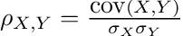
The Pearson Correlation Coefficient between two variables X and Y is computed as follows:
We can quickly calculate a correlation matrix, where every possible pairwise correlation is computed.
#read, select and normalize the data
raw = pd.read_csv("final_stats.csv", sep=";")
numerics = raw.select_dtypes('number')

#compute the correlation matrix
corr = numerics.corr(method='pearson')

#generate the heatmap
sns.heatmap(corr, annot=True)

#draw the plot
plt.show()
This is the raw Pearson Correlation matrix obtained from my data.

And these are the significant values⁶ — the ones that are, with a 95% confidence, different from zero. We perform a t-test⁷ with the following formula. For each correlation value rho, we discard it if:
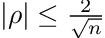
where n is the sample size. We can recycle the code from before and add in this filter.
#constants
N=332 #number of samples
STEST = 2/np.sqrt(N)

def significance_pearson(val):
    if np.abs(val)<STEST:
        return True
    return False

#read data
raw = pd.read_csv("final_stats.csv", sep=";")
numerics = raw.select_dtypes('number')

#calculate correlation
corr = numerics.corr(method='pearson')

#prepare masks
mask = corr.copy().applymap(significance_pearson)
mask2 = np.triu(np.ones_like(corr, dtype=bool)) #remove upper triangle
mask_comb = np.logical_or(mask, mask2)

c = sns.heatmap(corr, annot=True, mask=mask_comb)
c.set_xticklabels(c.get_xticklabels(), rotation=-45)
plt.show()
Those that have been discarded could just be noise, and wrongfully represent trends or relationships. In any case, it’s better to assume a true relationship is meaningless than consider meaningful one that isn’t (what we refer to as error type II being favored over error type I). This is especially true in a study with rather subjective measurments.

Spearman’s rank correlation coefficient
The spearman correlation coefficient can be calculated as follows:

As we did before, we can quickly compute the correlation matrix:
#read, select and normalize the data
raw = pd.read_csv("final_stats.csv", sep=";")
numerics = raw.select_dtypes('number')

#compute the correlation matrix
corr = numerics.corr(method='spearman') #pay attention to this change!

#generate the heatmap
sns.heatmap(corr, annot=True)

#draw the plot
plt.show()
This is the raw Spearman’s Rank Correlation matrix obtained from my data:

Let’s see what values are actually significant. The formula to check for significance is the following:

Here, we will filter out all t-values higher (in absolute value) than 1.96. Again, the reason they have been discarded is that we are not sure whether they are noise — random chance — or an actual trend. Let’s code it up:
#constants
N=332 #number of samples
TTEST = 1.96

def significance_spearman(val):
    if val==1:
        return True
    t = val * np.sqrt((N-2)/(1-val*val))
    if np.abs(t)<1.96:
        return True
    return False

#read data
raw = pd.read_csv("final_stats.csv", sep=";")
numerics = raw.select_dtypes('number')

#calculate correlation
corr = numerics.corr(method='spearman')

#prepare masks
mask = corr.copy().applymap(significance_spearman)
mask2 = np.triu(np.ones_like(corr, dtype=bool)) #remove upper triangle
mask_comb = np.logical_or(mask, mask2)

#plot the results
c = sns.heatmap(corr, annot=True, mask=mask_comb)
c.set_xticklabels(c.get_xticklabels(), rotation=-45)
plt.show()
These are the significant values.

I believe this chart better explains the apparent relationships between variables, as its criterion is more “natural” (it considers monotonic⁹, and not only linear, functions and relationships). It’s not as impacted by outliers as the other one (a couple of very bad days related to a certain variable won’t impact the overall correlation coefficient).
Still, I will leave both charts for the reader to judge and extract their own conclusions.
Time Series studies — ARIMA models
We can treat this data as a time series. Time might be an important factor when explaining variables: some of them might fluctuate periodically, or even be autocorrelated¹⁰. For example, a bad night might make me sleepy and cause me to oversleep the next day — that would be a time-wise correlation. In this section, I will be focusing only on the variables of the initial exploration.
Let’s explore the ARIMA model and find a good fit for our data. An ARIMA¹¹ model is a combination of an autoregressive model (AR¹²) and a moving average — hence its initials (Auto Regressive Integrated Moving Average). In this case, we will use pmdarima’s auto_arima method, a function inspired by R’s “forecast::autoarima” function, to determine the coefficients for our model.
for v in ['Sleep','Studying','Socializing','Mood']:
    arima.auto_arima(numerics[v], trace=True) #trace=True to see results
The results have been summarized in the following table:

Surprisingly, Sleep is not autoregressive, but Mood seems to be! As we can see, a simple ARIMA(1,0,0) — an AR(1) — represents Mood fairly well. This implies that the Mood from day D is explained by the Mood from day D-1, or the day before, and some normally distributed noise.
Despite seeming small, this consequence is interesting enough. Studying is also autoregressive, but follows an ARIMA(1,0,2) — meaning that it doesn’t directly follow a trend, but its moving average does. However, the AIC¹³ for this one is considerably higher, so it’s possible that the model might be overcomplicating the explanation of the observed behaviour.
FFT — Fast Fourier Transform
We can use a Discrete Fourier Transformation¹⁴ to analyse our data. With it, we should be able to notice any patterns regarding seasonality. The Fourier Transform is a data transformation operation capable of decomposing a series into its base components. This can be better understood through the image below:

Here is another example: We have a signal made out of two sine functions with frequency 1 and 10 respectively. After applying the FT, we see this:
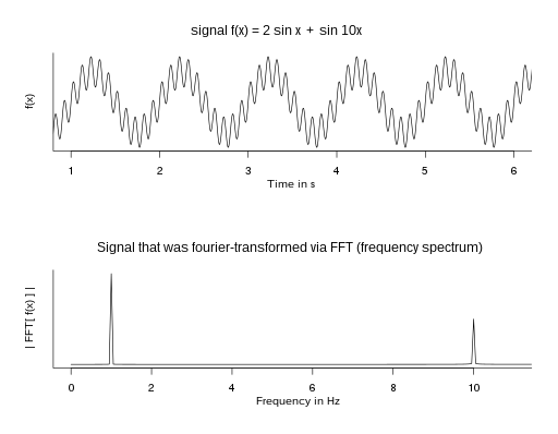
The result is a plot with two peaks, one at x=1 and one at x=10. The Fourier Transform has found the base components of our signal!
Let’s translate this into code:
for v in ['Sleep','Studying','Socializing','Mood']:
    t = np.arange(0,N,1)
    x = numerics[v]
    X = np.fft.fft(x)
    n = np.arange(0,len(X),1)
    T = N
    freq = n/T

    plt.figure(figsize = (8, 4))

    plt.subplot(121)
    plt.plot(t, x, 'r')
    plt.xlabel('Time (days)')
    plt.ylabel(v)

    plt.subplot(122)
    plt.stem(n, np.abs(X), 'b', markerfmt=" ", basefmt="-b")
    plt.xlabel('Freq (1/days)')
    plt.ylabel('FFT |X(freq)|')
    plt.xlim(0, 30)
    plt.ylim(0, 500)

    plt.tight_layout()
    plt.show()
Back to our case study, these are the results that our code outputs:

We can observe that Sleep has a significative value at frequency 1 — meaning that the data follows a 1-day cycle, which is not very helpful. Studying presents interesting values too: the first five or so are noticeably higher than the others. Unfortunately, noise takes over for them and for every other chart — no conclusion can be obtained with certainty.
To counteract it, we filter out the noise with a moving average. Let’s try applying MA(5) again and studying the FFT. The code will be almost the same except for the moving average.
def moving_average(x, w):
    return np.convolve(x, np.ones(w), 'valid') / w

k = 5
for v in ['Sleep','Studying','Socializing','Mood']:
    t = np.arange(0,N-k+1,1)
    x = moving_average(numerics[v], k)
    X = np.fft.fft(x)
    n = np.arange(0,len(X),1)
    T = N-k+1
    freq = n/T

    plt.figure(figsize = (8, 4))

    plt.subplot(121)
    plt.plot(t, x, 'r')
    plt.xlabel('Time (days)')
    plt.ylabel(v)

    plt.subplot(122)
    plt.stem(n, np.abs(X), 'b', markerfmt=" ", basefmt="-b")
    plt.xlabel('Freq (1/days)')
    plt.ylabel('FFT |X(freq)|')
    plt.xlim(0, 30)
    plt.ylim(0, 500)

    plt.tight_layout()
    plt.show()
These are the charts generated by our code:

After applying the MA, the noise has been slightly reduced. Still, it seems that there are no conclusions to be extracted from these — we can’t find any significant, clear frequency values.
Conclusions
After making different statistical studies, we can conclude the expected: human behaviour is very complicated — more, of course, than an Excel sheet and a couple of mathematical models can account for. Still, there’s value to be found in both methodical data recollection and the opportunities of analysis that arise from it. Let’s make a quick look at what we’ve done:
- Raw data and trendline overview.
- Pearson and Spearman correlation analysis and significance tests.
- ARIMA model fitting.
- Fast/Discrete Fourier Transform decomposition.
After doing these analysis, we were able to draw some insights about our data and how the different variables correlate to eachother. Here is the summary of our findings.
- In terms of relative deviation (variability), Mood and Sleep were the lowest (11.3%, 15.5% respectively), while Studying and Socializing were both avobe 100%.
- Socializing was found to be negatively correlated with almost all my hobbies, but positively correlated with my Mood (in both Pearson and Spearman). This is probably due to how when I meet with friends or family, I have to put my hobbies aside for the day, but I am generally happier than I would be by myself.
- Mood and Writing were negatively correlated (Spearman), which would be explained by the fact that I sometimes rant about my problems via short stories or writing on my diary.
- Mood and Studying were found to be autoregressive by the ARIMA fitting study, implying that the value on a certain day can be explained by the one before it.
- No clear decomposition could be found with the Discrete Fourier Transform, although some groups of frequencies peaked over others.
It is also worth noting that we got interesting “global” stats, which are, if not scientifically meaningful, interesting to know.
On a personal level, I think that this experiment has been helpful for me. Even if the final results are not conclusive, I believe that it helped me cope with the bad times and keep track of the good ones. Likewise, I think it is always positive to do some introspection and get to know oneself a bit better.
As a final bit, this is the cumulative chart — made again in MS Excel — for all the variables that could be accumulated (each one except mood and hygiene, which are not counted in hours but in a certain ranking; and sleep). I decided to plot it as a logarithmic chart because even if the accumulated variables were linear, their varying slopes made it hard for the viewer to see the data. That’s it! Enjoy!

As always, I encourage you to comment any thoughts or doubts you might have.
Code and data are on my github.
GitHub – Nerocraft4/habittracker
References
[1] Wikipedia. Moving Average. https://en.wikipedia.org/wiki/Moving_average
[2] Wikipedia. Correlation. https://en.wikipedia.org/wiki/Correlation
[3] Wikipedia. Pearson correlation coefficient. https://en.wikipedia.org/wiki/Pearson_correlation_coefficient
[4] Wikipedia. Spearman’s rank correlation coefficient. https://en.wikipedia.org/wiki/Spearman%27s_rank_correlation_coefficient
[5] Pandas documentation. pandas.DataFrame.corr. https://pandas.pydata.org/docs/reference/api/pandas.DataFrame.corr.html
[6] Wikipedia. Statistical significance. https://en.wikipedia.org/wiki/Statistical_significance
[7] Wikipedia. Student’s t-test. https://en.wikipedia.org/wiki/Student%27s_t-test
[8] Wikipedia. Rank correlation. https://en.wikipedia.org/wiki/Rank_correlation
[9] Wolfram MathWorld. Monotonic Function. https://mathworld.wolfram.com/MonotonicFunction.html
[10] Wikipedia. Autocorrelation. https://en.wikipedia.org/wiki/Autocorrelation
[11] Wikipedia. Autoregressive Integrated Moving Average. https://en.wikipedia.org/wiki/Autoregressive_integrated_moving_average
[12] Wikipedia. Autoregressive model. https://en.wikipedia.org/wiki/Autoregressive_model
[13] Science Direct. Akaike Information Criterion. https://www.sciencedirect.com/topics/social-sciences/akaike-information-criterion
[14] Wikipedia. Discrete Fourier transform. https://en.wikipedia.org/wiki/Discrete_Fourier_transform
My Life Stats: I Tracked My Habits for a Year, and This Is What I Learned was originally published in Towards Data Science on Medium, where people are continuing the conversation by highlighting and responding to this story.
I measured the time I spent on my daily activities (studying, doing sports, socializing, sleeping…) for 332 days in a row
Why? Just why would I do this?
This is probably the longest, most time-consuming experiment I’ve done in my life. On top of that, it has little scientific significance — the population sample is just one person — and is highly subjective (it completely relies on my memory and perception of time).
Then why do this? Routines, as any other method of self accountability, help me in lots of different ways. I started this at a low point in my life, trying to study myself and how different habits could be impacting my mood and mental health. The point was to be able to “hack” my own brain: if I knew — statistically — what made me happy and healthy in the long run (and what did the opposite!) I would be able to improve my life, and potentially give tips or help people similar to me going through rough times.
And why would this matter to you?
I think this introspective exercise is a great example of how data science can be applied to anything. Of course, It doesn’t have to be this kind of tracking and journaling. You can study anything you find valuable in your life: track your pet’s behaviour, your town’s weather, the delay rate in your local public transportation system… There’s plenty of personal analysis to be made: if there’s a dataset, you can study it! Luckily, data is everywhere — you just need to look in the right spot and keep track of it.
The method — what did I do and how did I do it?
I put aside some minutes every day to take personal notes regarding what I did and kept track of the time spent (in hours) on different activities and categories.
The variables I measured changed a bit along the year: some new popped up, some disappeared and others merged together. The final ones, and the ones which I have data for all the time records, are the following: Sleep, Writing, Studying, Sport, Music, Hygiene, Languages, Reading, Socializing, and Mood — a total of ten variables, covering what I believe to be the most important aspects of my life.
Initial exploration of the data
I first looked at the individual time series for four variables: Sleep, Studying, Socializing and Mood. I used Microsoft Excel to quickly draw some plots. They represent the daily number of hours spent (blue) and the moving average¹ for five days MA(5) (red) which I considered to be a good measure for my situation. The mood variable was rated from 10 (the greatest!) to 0 (awful!).
Regarding the data contained in the footnote of each plot: the total is the sum of the values of the series, the mean is the arithmetic mean of the series, the STD is the standard deviation and the relative deviation is the STD divided by the mean.

All things accounted for, I did well enough with sleep. I had rough days, like everyone else, but I think the trend is pretty stable. In fact, it is one of the least-varying of my study.
These are the hours I dedicated to my academic career. It fluctuates a lot — finding balance between work and studying often means having to cram projects on the weekends — but still, I consider myself satisfied with it.
Regarding this table, all I can say is that I’m surprised. The grand total is greater than I expected, given that I’m an introvert. Of course, hours with my colleagues at college also count. In terms of variability, the STD is really high, which makes sense given the difficulty of having a stablished routine regarding socializing.
This the least variable series — the relative deviation is the lowest among my studied variables. A priori, I’m satisfied with the observed trend. I think it’s positive to keep a fairly stable mood — and even better if it’s a good one.
Correlation study
After looking at the trends for the main variables, I decided to dive deeper and study the potential correlations² between them. Since my goal was being able to mathematically model and predict (or at least explain) “Mood”, correlations were an important metric to consider. From them, I could extract relationships like the following: “the days that I study the most are the ones that I sleep the least”, “I usually study languages and music together”, etc.
Before we do anything else, let’s open up a python file and import some key libraries from series analysis. I normally use aliases for them, as it is a common practice and makes things less verbose in the actual code.
import pandas as pd               #1.4.4
import numpy as np                #1.22.4
import seaborn as sns             #0.12.0
import matplotlib.pyplot as plt   #3.5.2
from pmdarima import arima        #2.0.4
We will make two different studies regarding correlation. We will look into the Person Correlation Coefficient³ (for linear relationships between variables) and the Spearman Correlation Coefficient⁴ (which studies monotonic relationships between variables). We will be using their implementation⁵ in pandas.
Pearson Correlation matrix
The Pearson Correlation Coefficient between two variables X and Y is computed as follows:
We can quickly calculate a correlation matrix, where every possible pairwise correlation is computed.
#read, select and normalize the data
raw = pd.read_csv("final_stats.csv", sep=";")
numerics = raw.select_dtypes('number')

#compute the correlation matrix
corr = numerics.corr(method='pearson')

#generate the heatmap
sns.heatmap(corr, annot=True)

#draw the plot
plt.show()
This is the raw Pearson Correlation matrix obtained from my data.
And these are the significant values⁶ — the ones that are, with a 95% confidence, different from zero. We perform a t-test⁷ with the following formula. For each correlation value rho, we discard it if:
where n is the sample size. We can recycle the code from before and add in this filter.
#constants
N=332 #number of samples
STEST = 2/np.sqrt(N)

def significance_pearson(val):
    if np.abs(val)<STEST:
        return True
    return False

#read data
raw = pd.read_csv("final_stats.csv", sep=";")
numerics = raw.select_dtypes('number')

#calculate correlation
corr = numerics.corr(method='pearson')

#prepare masks
mask = corr.copy().applymap(significance_pearson)
mask2 = np.triu(np.ones_like(corr, dtype=bool)) #remove upper triangle
mask_comb = np.logical_or(mask, mask2)

c = sns.heatmap(corr, annot=True, mask=mask_comb)
c.set_xticklabels(c.get_xticklabels(), rotation=-45)
plt.show()
Those that have been discarded could just be noise, and wrongfully represent trends or relationships. In any case, it’s better to assume a true relationship is meaningless than consider meaningful one that isn’t (what we refer to as error type II being favored over error type I). This is especially true in a study with rather subjective measurments.
Spearman’s rank correlation coefficient
The spearman correlation coefficient can be calculated as follows:
As we did before, we can quickly compute the correlation matrix:
#read, select and normalize the data
raw = pd.read_csv("final_stats.csv", sep=";")
numerics = raw.select_dtypes('number')

#compute the correlation matrix
corr = numerics.corr(method='spearman') #pay attention to this change!

#generate the heatmap
sns.heatmap(corr, annot=True)

#draw the plot
plt.show()
This is the raw Spearman’s Rank Correlation matrix obtained from my data:
Let’s see what values are actually significant. The formula to check for significance is the following:
Here, we will filter out all t-values higher (in absolute value) than 1.96. Again, the reason they have been discarded is that we are not sure whether they are noise — random chance — or an actual trend. Let’s code it up:
#constants
N=332 #number of samples
TTEST = 1.96

def significance_spearman(val):
    if val==1:
        return True
    t = val * np.sqrt((N-2)/(1-val*val))
    if np.abs(t)<1.96:
        return True
    return False

#read data
raw = pd.read_csv("final_stats.csv", sep=";")
numerics = raw.select_dtypes('number')

#calculate correlation
corr = numerics.corr(method='spearman')

#prepare masks
mask = corr.copy().applymap(significance_spearman)
mask2 = np.triu(np.ones_like(corr, dtype=bool)) #remove upper triangle
mask_comb = np.logical_or(mask, mask2)

#plot the results
c = sns.heatmap(corr, annot=True, mask=mask_comb)
c.set_xticklabels(c.get_xticklabels(), rotation=-45)
plt.show()
These are the significant values.
I believe this chart better explains the apparent relationships between variables, as its criterion is more “natural” (it considers monotonic⁹, and not only linear, functions and relationships). It’s not as impacted by outliers as the other one (a couple of very bad days related to a certain variable won’t impact the overall correlation coefficient).
Still, I will leave both charts for the reader to judge and extract their own conclusions.
Time Series studies — ARIMA models
We can treat this data as a time series. Time might be an important factor when explaining variables: some of them might fluctuate periodically, or even be autocorrelated¹⁰. For example, a bad night might make me sleepy and cause me to oversleep the next day — that would be a time-wise correlation. In this section, I will be focusing only on the variables of the initial exploration.
Let’s explore the ARIMA model and find a good fit for our data. An ARIMA¹¹ model is a combination of an autoregressive model (AR¹²) and a moving average — hence its initials (Auto Regressive Integrated Moving Average). In this case, we will use pmdarima’s auto_arima method, a function inspired by R’s “forecast::autoarima” function, to determine the coefficients for our model.
for v in ['Sleep','Studying','Socializing','Mood']:
    arima.auto_arima(numerics[v], trace=True) #trace=True to see results
The results have been summarized in the following table:
Surprisingly, Sleep is not autoregressive, but Mood seems to be! As we can see, a simple ARIMA(1,0,0) — an AR(1) — represents Mood fairly well. This implies that the Mood from day D is explained by the Mood from day D-1, or the day before, and some normally distributed noise.
Despite seeming small, this consequence is interesting enough. Studying is also autoregressive, but follows an ARIMA(1,0,2) — meaning that it doesn’t directly follow a trend, but its moving average does. However, the AIC¹³ for this one is considerably higher, so it’s possible that the model might be overcomplicating the explanation of the observed behaviour.
FFT — Fast Fourier Transform
We can use a Discrete Fourier Transformation¹⁴ to analyse our data. With it, we should be able to notice any patterns regarding seasonality. The Fourier Transform is a data transformation operation capable of decomposing a series into its base components. This can be better understood through the image below:
Here is another example: We have a signal made out of two sine functions with frequency 1 and 10 respectively. After applying the FT, we see this:
The result is a plot with two peaks, one at x=1 and one at x=10. The Fourier Transform has found the base components of our signal!
Let’s translate this into code:
for v in ['Sleep','Studying','Socializing','Mood']:
    t = np.arange(0,N,1)
    x = numerics[v]
    X = np.fft.fft(x)
    n = np.arange(0,len(X),1)
    T = N
    freq = n/T

    plt.figure(figsize = (8, 4))

    plt.subplot(121)
    plt.plot(t, x, 'r')
    plt.xlabel('Time (days)')
    plt.ylabel(v)

    plt.subplot(122)
    plt.stem(n, np.abs(X), 'b', markerfmt=" ", basefmt="-b")
    plt.xlabel('Freq (1/days)')
    plt.ylabel('FFT |X(freq)|')
    plt.xlim(0, 30)
    plt.ylim(0, 500)

    plt.tight_layout()
    plt.show()
Back to our case study, these are the results that our code outputs:
We can observe that Sleep has a significative value at frequency 1 — meaning that the data follows a 1-day cycle, which is not very helpful. Studying presents interesting values too: the first five or so are noticeably higher than the others. Unfortunately, noise takes over for them and for every other chart — no conclusion can be obtained with certainty.
To counteract it, we filter out the noise with a moving average. Let’s try applying MA(5) again and studying the FFT. The code will be almost the same except for the moving average.
def moving_average(x, w):
    return np.convolve(x, np.ones(w), 'valid') / w

k = 5
for v in ['Sleep','Studying','Socializing','Mood']:
    t = np.arange(0,N-k+1,1)
    x = moving_average(numerics[v], k)
    X = np.fft.fft(x)
    n = np.arange(0,len(X),1)
    T = N-k+1
    freq = n/T

    plt.figure(figsize = (8, 4))

    plt.subplot(121)
    plt.plot(t, x, 'r')
    plt.xlabel('Time (days)')
    plt.ylabel(v)

    plt.subplot(122)
    plt.stem(n, np.abs(X), 'b', markerfmt=" ", basefmt="-b")
    plt.xlabel('Freq (1/days)')
    plt.ylabel('FFT |X(freq)|')
    plt.xlim(0, 30)
    plt.ylim(0, 500)

    plt.tight_layout()
    plt.show()
These are the charts generated by our code:
After applying the MA, the noise has been slightly reduced. Still, it seems that there are no conclusions to be extracted from these — we can’t find any significant, clear frequency values.
Conclusions
After making different statistical studies, we can conclude the expected: human behaviour is very complicated — more, of course, than an Excel sheet and a couple of mathematical models can account for. Still, there’s value to be found in both methodical data recollection and the opportunities of analysis that arise from it. Let’s make a quick look at what we’ve done:
- Raw data and trendline overview.
- Pearson and Spearman correlation analysis and significance tests.
- ARIMA model fitting.
- Fast/Discrete Fourier Transform decomposition.
After doing these analysis, we were able to draw some insights about our data and how the different variables correlate to eachother. Here is the summary of our findings.
- In terms of relative deviation (variability), Mood and Sleep were the lowest (11.3%, 15.5% respectively), while Studying and Socializing were both avobe 100%.
- Socializing was found to be negatively correlated with almost all my hobbies, but positively correlated with my Mood (in both Pearson and Spearman). This is probably due to how when I meet with friends or family, I have to put my hobbies aside for the day, but I am generally happier than I would be by myself.
- Mood and Writing were negatively correlated (Spearman), which would be explained by the fact that I sometimes rant about my problems via short stories or writing on my diary.
- Mood and Studying were found to be autoregressive by the ARIMA fitting study, implying that the value on a certain day can be explained by the one before it.
- No clear decomposition could be found with the Discrete Fourier Transform, although some groups of frequencies peaked over others.
It is also worth noting that we got interesting “global” stats, which are, if not scientifically meaningful, interesting to know.
On a personal level, I think that this experiment has been helpful for me. Even if the final results are not conclusive, I believe that it helped me cope with the bad times and keep track of the good ones. Likewise, I think it is always positive to do some introspection and get to know oneself a bit better.
As a final bit, this is the cumulative chart — made again in MS Excel — for all the variables that could be accumulated (each one except mood and hygiene, which are not counted in hours but in a certain ranking; and sleep). I decided to plot it as a logarithmic chart because even if the accumulated variables were linear, their varying slopes made it hard for the viewer to see the data. That’s it! Enjoy!
As always, I encourage you to comment any thoughts or doubts you might have.
Code and data are on my github.
GitHub – Nerocraft4/habittracker
References
[1] Wikipedia. Moving Average. https://en.wikipedia.org/wiki/Moving_average
[2] Wikipedia. Correlation. https://en.wikipedia.org/wiki/Correlation
[3] Wikipedia. Pearson correlation coefficient. https://en.wikipedia.org/wiki/Pearson_correlation_coefficient
[4] Wikipedia. Spearman’s rank correlation coefficient. https://en.wikipedia.org/wiki/Spearman%27s_rank_correlation_coefficient
[5] Pandas documentation. pandas.DataFrame.corr. https://pandas.pydata.org/docs/reference/api/pandas.DataFrame.corr.html
[6] Wikipedia. Statistical significance. https://en.wikipedia.org/wiki/Statistical_significance
[7] Wikipedia. Student’s t-test. https://en.wikipedia.org/wiki/Student%27s_t-test
[8] Wikipedia. Rank correlation. https://en.wikipedia.org/wiki/Rank_correlation
[9] Wolfram MathWorld. Monotonic Function. https://mathworld.wolfram.com/MonotonicFunction.html
[10] Wikipedia. Autocorrelation. https://en.wikipedia.org/wiki/Autocorrelation
[11] Wikipedia. Autoregressive Integrated Moving Average. https://en.wikipedia.org/wiki/Autoregressive_integrated_moving_average
[12] Wikipedia. Autoregressive model. https://en.wikipedia.org/wiki/Autoregressive_model
[13] Science Direct. Akaike Information Criterion. https://www.sciencedirect.com/topics/social-sciences/akaike-information-criterion
[14] Wikipedia. Discrete Fourier transform. https://en.wikipedia.org/wiki/Discrete_Fourier_transform
My Life Stats: I Tracked My Habits for a Year, and This Is What I Learned was originally published in Towards Data Science on Medium, where people are continuing the conversation by highlighting and responding to this story.
Denial of responsibility! Techno Blender is an automatic aggregator of the all world’s media. In each content, the hyperlink to the primary source is specified. All trademarks belong to their rightful owners, all materials to their authors. If you are the owner of the content and do not want us to publish your materials, please contact us by email – [email protected]. The content will be deleted within 24 hours.