
Navigating the Cartographic Challenge: Halfway Through the #30DayMapChallenge
Every map tells a story, and every story brings us closer to understanding our world.
Visualizing the vastness of the world is no small feat. But to get a step closer to it, this November, I am participating in the #30DayMapChallenge. I have been enamored by geo visualizations from afar and dabbled a little myself, but I wanted to go deeper and learn how to build beautiful maps that tell stories. Hence, I participated in the #30DayMapChallenge.
What is the #30DayMapChallenge?
The #30DayMapChallenge is a community-driven event that unfolds each November. The idea is to create maps around different daily themes using the hashtag #30DayMapChallenge. There are no restrictions on the tools, technologies, or data used behind the maps.
This challenge has provided the perfect opportunity for me to dive into the world of mapping (pun intended). We’re halfway through November, and my favorite part of this challenge has been learning from and being inspired by the community while challenging my creativity each day.
In this article, I will share some of my favorite geo visualizations thus far that I’ve conjured up using Observable Plot, a JavaScript library for exploratory data visualization. You can find all of the visualizations along with data source and code in my #30DayMapChallenge collection. I used Observable Plot because I fell in love with the simplicity and ease of using it during the #30DayChartChallenge I participated in earlier this year.
All images in this article were created by the author.
Day 1 — Points
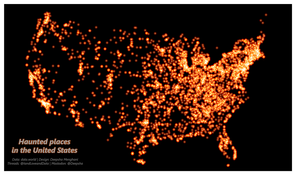
October is over, but the hauntings are not. For this theme, I chose to plot haunted places in the United States. I sourced the data from the data.world website, one of my favorite sources for dataset discovery. This dataset includes the latitude and longitude of every reported haunted location, making it perfect for plotting as “points.”
I used the Albers projection to plot the map of the USA and gave it a black background for a striking contrast effect. The main goal for this plot was to not only draw points at each location but to create a sort of glowing effect to align with my “haunting” theme. To achieve this, I layered each reported location with three points stacked on top of each other. First, a large “red” point with minimal opacity, then an “orange” point with a smaller radius and higher opacity, and finally, a “white” point with the smallest radius and highest opacity. These layered points created the effect of a white point with a fiery aura and a glowing effect. While I don’t think this exact combination would create a similar effect on every plot, the closeness of all points in this plot created the perfect effect I was looking to achieve.
This plot definitely added many East Coast locations to my list of future travels, perhaps in this life or maybe as a ghost.
Day 7 — Navigation
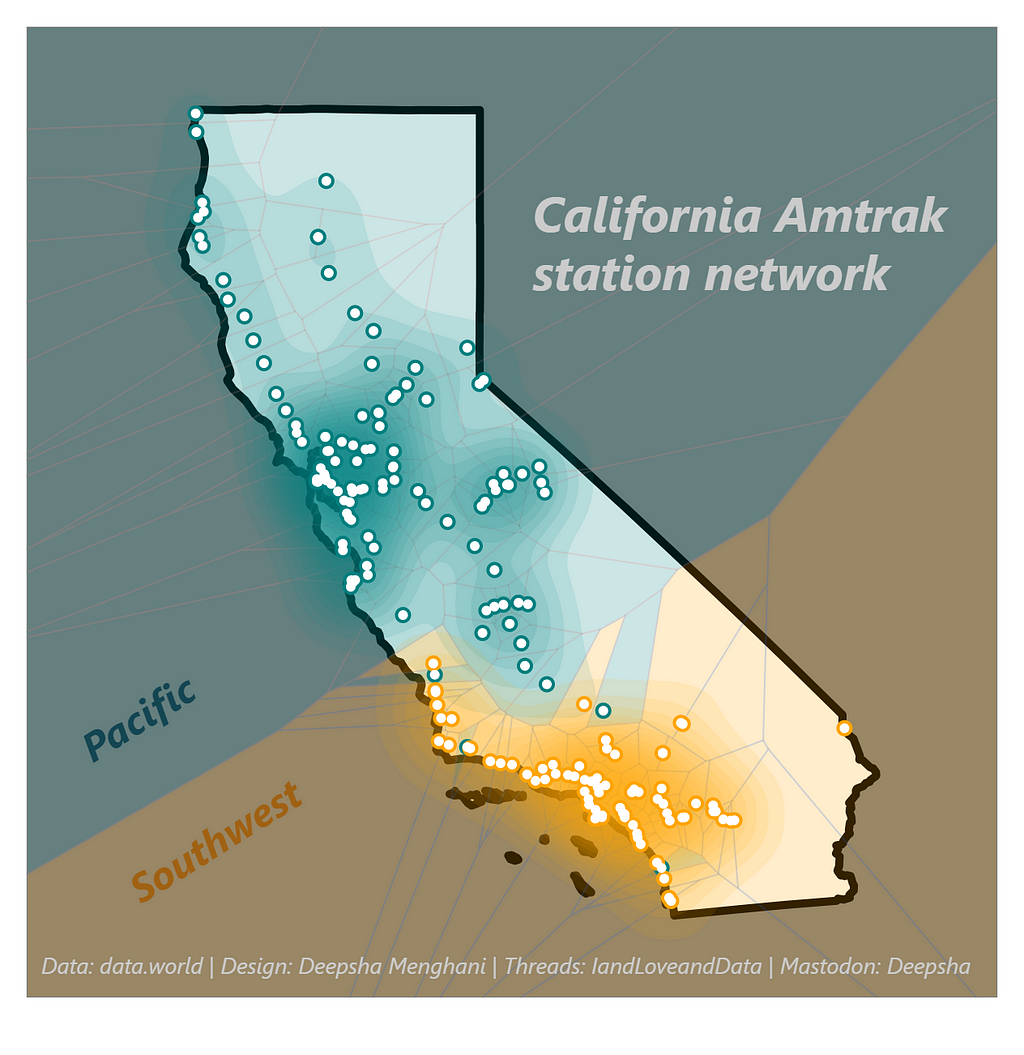
My favorite way to navigate this country is by the Amtrak system, so for the theme of navigation, I decided to plot the Amtrak stations for the state with the most stations, California, with data from data.world.
In visualizing California’s Amtrak station network, I aimed to highlight the connectivity and reach of rail travel within the Golden State. I chose a Mercator projection to accurately represent the network at the state level, with a color gradient background transitioning from the Pacific to the Southwest. Each station is marked by a ‘point,’ with major hubs distinguished by larger, more prominent markers. To further convey the spread and reach of the rail system, I overlaid the points with a Voronoi network diagram. This map serves not only as a tool for potential travelers but also as a testament to the infrastructure that facilitates movement across this vast state.
Day 8 — Africa
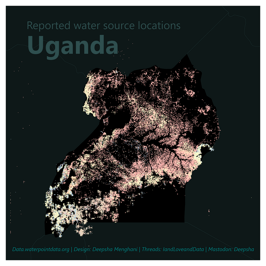
Tackling Africa’s theme, I zoomed in on Uganda’s reported water sources, with data from the Water Point Data Exchange via TidyTuesday.
The data provided a comprehensive list of water points, which I plotted using mercator projection to give an accurate representation of their distribution. The map’s dark background allows the water source points to stand out, drawing attention to regions with higher water source density. I plotted these locations as a Raster map to add a layer of texture. This map doesn’t just show locations; it tells a story of access, where the clustering of points can indicate areas of potential water stress or abundance.
Day 10 — North America
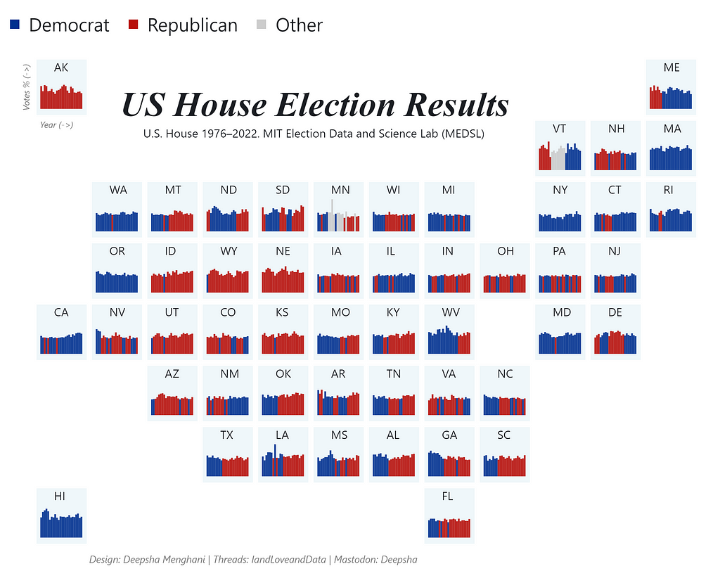
The US House Election Results map is a compact visualization of over five decades of political tides across the United States. I sourced the data from the MIT Election Data and Science Lab via TidyTuesday, providing detailed voting statistics by state.
The challenge was to present this extensive dataset in a way that was both informative and engaging. I opted for a grid layout, with each state’s voting trends represented by mini bar charts that allow for immediate visual comparison across years and states. The color-coding is straightforward — blue for Democrats, red for Republicans, and grey for others — to provide clear insights into the political landscape at a glance. This map functions as a visual history of American politics, showing shifts and patterns that might not be apparent from numbers alone.
Day 12 — South America
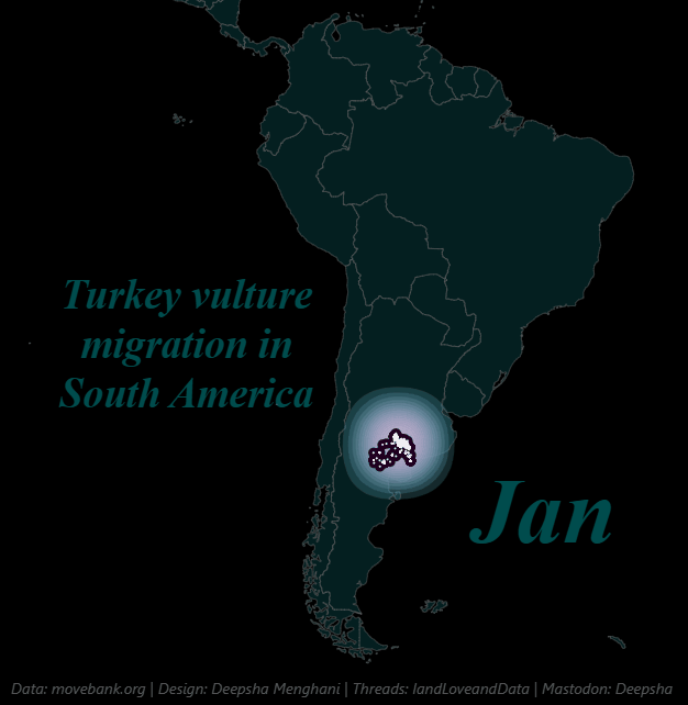
For this theme, I found a powerful dataset sourced from movebank.org via data.world about Turkey vulture migration in South America.
For this data visualization, I aimed to capture the dynamic nature of avian movement. The data included timestamped locations of tagged vultures, which allowed me to plot their journey over time. I chose a dark background to symbolize the vast area covered, with migration paths highlighted by a color gradient that easily allows the eyes to track the pattern. This map isn’t static; it’s designed to represent the ebb and flow of migration, with larger, more concentrated points possibly indicating key resting areas. It offers a glimpse into the patterns of nature and serves as a tool for conservationists tracking the health of these migratory routes.
This is certainly one of my favorite animated visualizations I have created because of how easily it facilitates the observation of a clear pattern of migration. There is so much more that can be done with this data, and I feel I have barely scratched the surface.
Day 13 — Choropleth
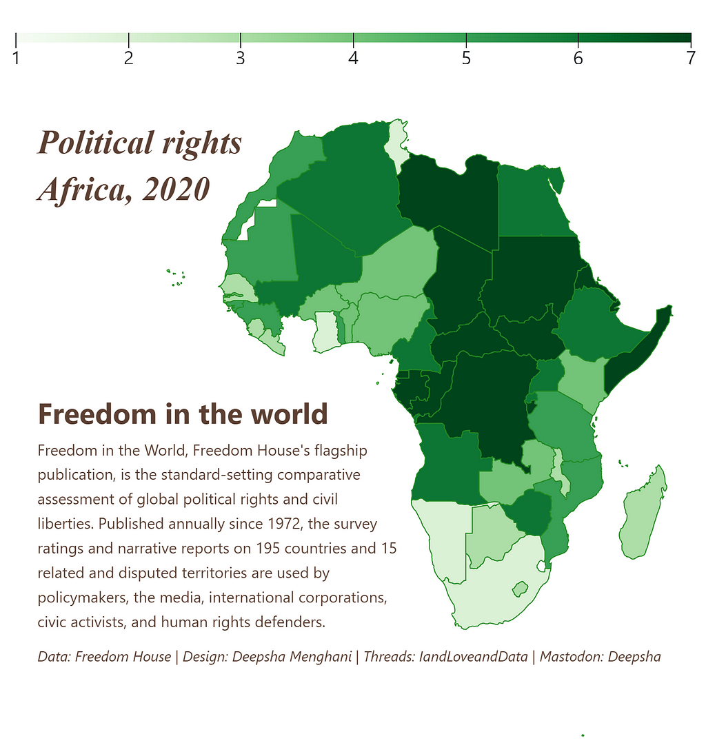
The choropleth map of Political Rights in Africa for 2020 is a sobering depiction of the continent’s diverse political landscape. Using data sourced from Freedom House via TidyTuesday, I aimed to illustrate the varying levels of political rights across the continent.
The map uses shades of green to represent the gradations in political rights, with darker hues indicating greater freedom. This color choice is symbolic, with green being associated with ‘proceed’ in many cultures, suggesting areas where political rights are advancing. Beyond its aesthetic value, this map serves as an analytical tool, presenting a snapshot of a complex and evolving political climate.
Reflections at the Midpoint
As we reach the midpoint of the #30daymapchallenge, it’s the perfect moment to pause and reflect on the journey thus far. Crafting maps each day, rather than charts, has been a different kind of exploration — one that merges the realms of data and geography, story and symbol.
As I continue the second half of the challenge, I’m excited to delve deeper into the art of mapping, armed with the lessons learned so far. To future challengers: let each theme inspire you, learn from the community, and treat each map as a step in your data visualization journey.
Once the full challenge is completed, I look forward to sharing an even richer collection of visualizations and the insights they have granted me. Until then, I encourage readers to dive into these datasets, to create and share their own interpretations, and to join in this global challenge of mapping.
You can find the code and data to reproduce all visualizations in this article in my Observable collection.
If you’d like, find me on Linkedin.
Navigating the Cartographic Challenge: Halfway Through the #30DayMapChallenge was originally published in Towards Data Science on Medium, where people are continuing the conversation by highlighting and responding to this story.

Every map tells a story, and every story brings us closer to understanding our world.
Visualizing the vastness of the world is no small feat. But to get a step closer to it, this November, I am participating in the #30DayMapChallenge. I have been enamored by geo visualizations from afar and dabbled a little myself, but I wanted to go deeper and learn how to build beautiful maps that tell stories. Hence, I participated in the #30DayMapChallenge.
What is the #30DayMapChallenge?
The #30DayMapChallenge is a community-driven event that unfolds each November. The idea is to create maps around different daily themes using the hashtag #30DayMapChallenge. There are no restrictions on the tools, technologies, or data used behind the maps.
This challenge has provided the perfect opportunity for me to dive into the world of mapping (pun intended). We’re halfway through November, and my favorite part of this challenge has been learning from and being inspired by the community while challenging my creativity each day.
In this article, I will share some of my favorite geo visualizations thus far that I’ve conjured up using Observable Plot, a JavaScript library for exploratory data visualization. You can find all of the visualizations along with data source and code in my #30DayMapChallenge collection. I used Observable Plot because I fell in love with the simplicity and ease of using it during the #30DayChartChallenge I participated in earlier this year.
All images in this article were created by the author.
Day 1 — Points
October is over, but the hauntings are not. For this theme, I chose to plot haunted places in the United States. I sourced the data from the data.world website, one of my favorite sources for dataset discovery. This dataset includes the latitude and longitude of every reported haunted location, making it perfect for plotting as “points.”
I used the Albers projection to plot the map of the USA and gave it a black background for a striking contrast effect. The main goal for this plot was to not only draw points at each location but to create a sort of glowing effect to align with my “haunting” theme. To achieve this, I layered each reported location with three points stacked on top of each other. First, a large “red” point with minimal opacity, then an “orange” point with a smaller radius and higher opacity, and finally, a “white” point with the smallest radius and highest opacity. These layered points created the effect of a white point with a fiery aura and a glowing effect. While I don’t think this exact combination would create a similar effect on every plot, the closeness of all points in this plot created the perfect effect I was looking to achieve.
This plot definitely added many East Coast locations to my list of future travels, perhaps in this life or maybe as a ghost.
Day 7 — Navigation
My favorite way to navigate this country is by the Amtrak system, so for the theme of navigation, I decided to plot the Amtrak stations for the state with the most stations, California, with data from data.world.
In visualizing California’s Amtrak station network, I aimed to highlight the connectivity and reach of rail travel within the Golden State. I chose a Mercator projection to accurately represent the network at the state level, with a color gradient background transitioning from the Pacific to the Southwest. Each station is marked by a ‘point,’ with major hubs distinguished by larger, more prominent markers. To further convey the spread and reach of the rail system, I overlaid the points with a Voronoi network diagram. This map serves not only as a tool for potential travelers but also as a testament to the infrastructure that facilitates movement across this vast state.
Day 8 — Africa
Tackling Africa’s theme, I zoomed in on Uganda’s reported water sources, with data from the Water Point Data Exchange via TidyTuesday.
The data provided a comprehensive list of water points, which I plotted using mercator projection to give an accurate representation of their distribution. The map’s dark background allows the water source points to stand out, drawing attention to regions with higher water source density. I plotted these locations as a Raster map to add a layer of texture. This map doesn’t just show locations; it tells a story of access, where the clustering of points can indicate areas of potential water stress or abundance.
Day 10 — North America
The US House Election Results map is a compact visualization of over five decades of political tides across the United States. I sourced the data from the MIT Election Data and Science Lab via TidyTuesday, providing detailed voting statistics by state.
The challenge was to present this extensive dataset in a way that was both informative and engaging. I opted for a grid layout, with each state’s voting trends represented by mini bar charts that allow for immediate visual comparison across years and states. The color-coding is straightforward — blue for Democrats, red for Republicans, and grey for others — to provide clear insights into the political landscape at a glance. This map functions as a visual history of American politics, showing shifts and patterns that might not be apparent from numbers alone.
Day 12 — South America
For this theme, I found a powerful dataset sourced from movebank.org via data.world about Turkey vulture migration in South America.
For this data visualization, I aimed to capture the dynamic nature of avian movement. The data included timestamped locations of tagged vultures, which allowed me to plot their journey over time. I chose a dark background to symbolize the vast area covered, with migration paths highlighted by a color gradient that easily allows the eyes to track the pattern. This map isn’t static; it’s designed to represent the ebb and flow of migration, with larger, more concentrated points possibly indicating key resting areas. It offers a glimpse into the patterns of nature and serves as a tool for conservationists tracking the health of these migratory routes.
This is certainly one of my favorite animated visualizations I have created because of how easily it facilitates the observation of a clear pattern of migration. There is so much more that can be done with this data, and I feel I have barely scratched the surface.
Day 13 — Choropleth
The choropleth map of Political Rights in Africa for 2020 is a sobering depiction of the continent’s diverse political landscape. Using data sourced from Freedom House via TidyTuesday, I aimed to illustrate the varying levels of political rights across the continent.
The map uses shades of green to represent the gradations in political rights, with darker hues indicating greater freedom. This color choice is symbolic, with green being associated with ‘proceed’ in many cultures, suggesting areas where political rights are advancing. Beyond its aesthetic value, this map serves as an analytical tool, presenting a snapshot of a complex and evolving political climate.
Reflections at the Midpoint
As we reach the midpoint of the #30daymapchallenge, it’s the perfect moment to pause and reflect on the journey thus far. Crafting maps each day, rather than charts, has been a different kind of exploration — one that merges the realms of data and geography, story and symbol.
As I continue the second half of the challenge, I’m excited to delve deeper into the art of mapping, armed with the lessons learned so far. To future challengers: let each theme inspire you, learn from the community, and treat each map as a step in your data visualization journey.
Once the full challenge is completed, I look forward to sharing an even richer collection of visualizations and the insights they have granted me. Until then, I encourage readers to dive into these datasets, to create and share their own interpretations, and to join in this global challenge of mapping.
You can find the code and data to reproduce all visualizations in this article in my Observable collection.
If you’d like, find me on Linkedin.
Navigating the Cartographic Challenge: Halfway Through the #30DayMapChallenge was originally published in Towards Data Science on Medium, where people are continuing the conversation by highlighting and responding to this story.
Denial of responsibility! Techno Blender is an automatic aggregator of the all world’s media. In each content, the hyperlink to the primary source is specified. All trademarks belong to their rightful owners, all materials to their authors. If you are the owner of the content and do not want us to publish your materials, please contact us by email – [email protected]. The content will be deleted within 24 hours.