
Predicting My Next Workout with Machine Learning: Part 1 | by Gabriel Cassimiro | Jul, 2022
End-to-end phyton project looking at exercise data from an Apple Watch, from data collection to model deployment
In this series of posts, I will go through all steps of an end-to-end machine learning project. From data extraction and preparation to the deployment of the model using an API and finally to the creation of a front end to actually solve the problem helping with decisions. The main topics of each one are:
- Project setup, Data Processing, and Data Exploration
- Model Experimenting
- Model Deployment
- Data App creation
So let’s begin with the first part:
The first and most crucial part of any project is clearly defining what problem you are solving. If you don’t have a clear definition of it, you should probably go back and brainstorm why you came up with that idea and if this is really a problem not only for you. There are a lot of methodologies in the product area that I won’t enter in this article to help in this step. For now, we will only focus on defining the current problem.
The Problem
Just like most people, I hope, I have a hard time staying fully motivated to work out every day. A tool that helps me sometimes is having a smartwatch to track my progress and help with features such as seeing friends’ workouts and competitions. However, they are not enough and I still have ups and downs in my motivation. That’s why I, as a Data Scientist, want to study my past workouts to figure out what the main variables that have motivated me in the past are, and to predict my probability of reaching my exercise goals in the future.
Defining it in one sentence we have:
My problem is maintaining motivation to work out for a long period of time
Now that we have defined what problem we want to solve, we can start setting up our project and our solution.
Project Setup
In a regular Data Science project, there are a couple of initial steps that we must follow.
- Git repository setup
- Infrastructure provisioning
- Environment setup
Being able to create versions of your project and your code is very important in any software project. So our first step will be creating a GitHub Repository in order to store and create versions of your code. Another interesting feature of GitHub is the capability of sharing and contributing to other people’s code.
I will not go step by step on how to create a repository; just type “How to create a Github Repository” and you’ll be good to go. For this project, I am using this repository.
The second part is provisioning infrastructure on the cloud to develop and later deploy your solution. For now, I will not need a cloud infrastructure because the data volume fits nicely in my laptop for this initial analysis. When we dive into creating experiments and tuning our Hyper Parameters I will show you how to do this on Google Cloud Platform, specifically using Vertex AI.
The last part is creating a virtual environment to develop. I like to use pyenv for this job. To install pyenv look here. Lastly, there are a lot of OS that you can use, but I personally prefer using a Unix based such as MacOS or if you have Windows you can install a windows subsystem for Linux. Another part of the environment is keeping track of your libraries via the requirements.txt file. There is an example in the GitHub repository of the project.
The data
Now, to get the data that we need we have to export the data from the Health App on an iPhone. This is really easy to do, so just look here at how to do it.
Now we can (finally) start coding.
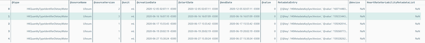
The export file comes as a zip containing a folder inside with routes, electrocardiograms, and an XML with all your health data. The code below will unzip the folder, parse the XML and save it as a CSV.
This is the first part of our data processing pipeline. If we wish to share this functionality or simply add newer data, having a code structured to process the data is essential. Note that the code is structured as a function. This will give us flexibility and modularity in our pipeline.
Now we have the following data frame ready to be modeled.
Haha, just kidding.
In real life, the data is almost never ready to use like a Kaggle Dataset. In this case, we have problems with data formats, metadata entries are stored inside lists, and dates have to be converted, just to name a few of the things we have to deal with this first.
What was done:
- Filter only Exercise minutes data
- Transform dates to DateTime format
- Transform values to float
- Create a date column without time, only with days
- Group the value for Exercise minutes for each day
Now we have a time series of our Exercise Minutes for each day. I selected Exercise Minutes instead of Burned Calories because this measures the days that I worked out instead of the calories spent. This is what we call a premise of the project. It is very important to keep track of these premises documenting them along with the problem statement.
Ok, we are making some progress now. So now we can begin creating models, right?
We have just a couple more things to do before that. First, we need to check the quality of the data, then we will create some features and do some exploratory plots to generate some insights before the modeling.
Data Quality check
When we talk about data quality we should go as deep as how the data is collected and think of some problems that can happen in the process. Since this data is collected on my Apple Watch, the first thing we should explore is what happens on the days I did not wear my watch?
This boils down to two things we always have to check in our data:
- Missing data
- Outliers
There is no missing data in terms of NAs. However, there are 167 observations with 0 as the number of exercise minutes, this appears to be the way they register days without the watch. We can clearly see it in this histogram:
Searching for outliers we can see that there is a couple of them, but we will keep them because they are accurate to the reality, not anomalies.

There are a lot of other checks we can do to verify data quality, but for this case, we will not go into them because this data source is standardized and pretty reliable.
Some important information we gathered from the data:
- There are 1.737 observations (days);
- 167 observations have 0 as the exercise minutes of that day;
- The dates go from 2017–09–25 to 2022–06–27;
- There are no missing dates in this range.
Feature Engineering
Now we can get on some fun stuff. The feature engineering step is where we create hypotheses of what features can be useful to the model. This is an iterative process so we will create some here, validate them later and add or remove features.
Some guesses that I have came from classic time-series features. They are:
- Date attributes (day, weekday, month, year, season)
- Lag features (how many calories were spent in the last period)
- Rolling Window features (moving average, standard deviation, max, min)
In the next part, we will add some other data such as sleep quality.
Here’s the code:
Another important transformation was creating a circular encoding of the month feature. This is a great trick to encode time features that have a cycle. This works by getting the sine and cosine for each month and in the end, we have something like this:
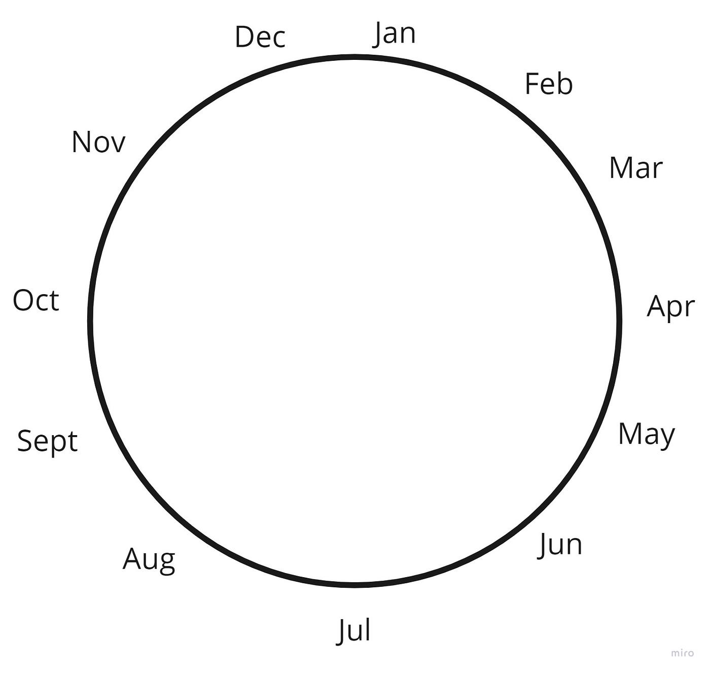
We can see that December and January are much closer to each other instead of being 1 and 12 which are farther apart.
Exploratory Analysis
Now we’ll go into some simple, but powerful analysis. This step can and often should be performed before the feature engineering, but in this case, I needed some features for the plots.
Remember: This is an iterative process
In a long project, you’ll go into these steps in many cycles before arriving at the final solution.
We already looked at the distribution of our data in a previous step, so now we can see how the minutes of exercise vary with some temporal features.
Let’s start with the years:
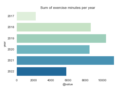
We can see that 2020 stopped my trend mainly because of lockdowns from the COVID pandemic.
We can compare the distribution of the data by each month.
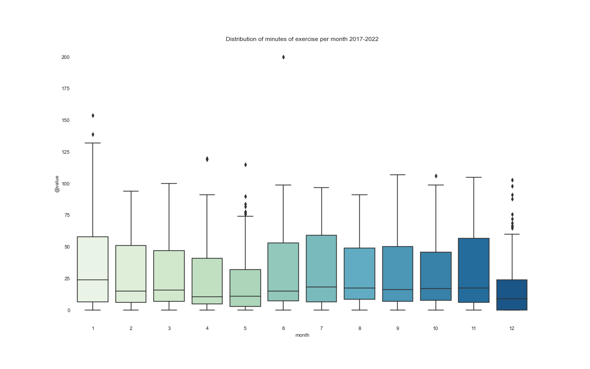
Here we can clearly see that December is not my best friend. The main causes are easy to identify: end-of-year parties, holidays, Christmas, and I usually go on vacation.
One more nice thing to look at is how my workouts vary across different days of the week. For this analysis, we consider Monday as label 0 and Sunday as label 6.
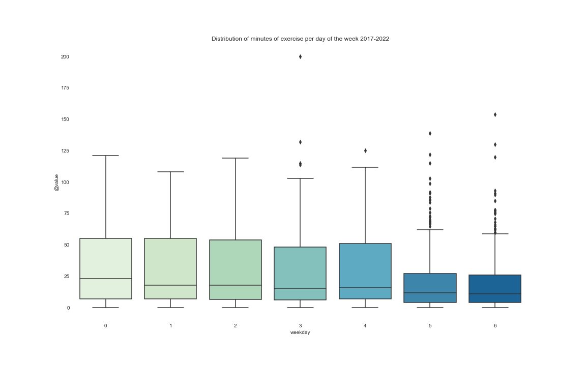
The median of exercise minutes is not that far from the other days of the week however, it is rarer to have big workouts on the weekend.
There are literally infinite visualizations you can create with your data. For now, we will stop at those above. The important thing here is to understand your data, the distributions, and how it behaves in different aggregations.
You can also create decisions based on those analyses. One example here is looking at the weekend data trend to be lower. A possible decision is to create a rule that I can only drink on the weekends if I work out.
The last thing we’ll do before the modeling is decomposing our time series. Oh, I forgot to mention but what we have here is a time series. Here’s the definition:
A Time Series is a series of repeated observations considered within a certain time interval that are taken at equal (regular/evenly spaced) time intervals
We can decompose a time series to understand two very useful things:
- Trend
- Seasonality
A time series consists of the joining of those two with some residuals. There are a couple of methods to decompose it, here we will use the additive method. Time series is a huge subject, so if you want to go deeper go here.
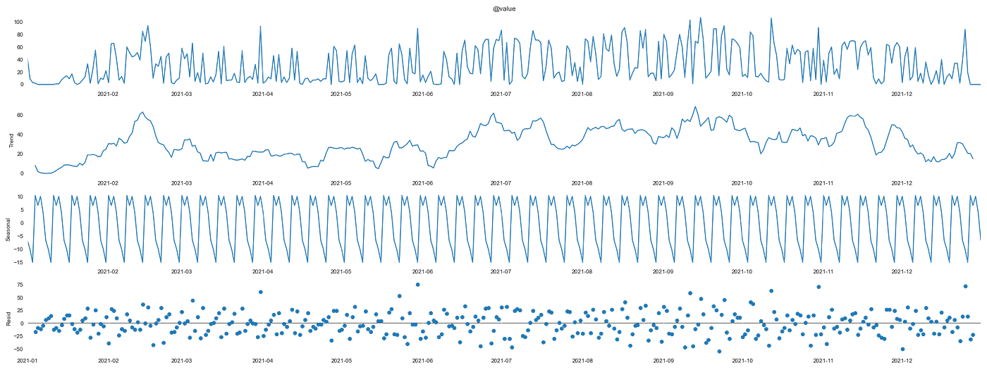
So that’s a lot of information, let’s dig into it.
The first plot is the original time series. The second one is the trend component, the third is the seasonality and the last one is the residuals.
The important information that we get from her is:
- We can identify a seasonality that can be related to the weeks, but not so much between months;
- The residuals appear to be uniformly distributed.
That helps us with two things. In the feature engineering step, we created features to capture the correct seasonality and if we wanted to apply classic time series models we would have to insert that seasonality in the parameters.
That is it for now.
Key Takeaways
The main takeaways of this part are:
- DEFINE THE PROBLEM;
- Set your environment up not forgetting to record your packages versions;
- Record your project premisses;
- Structure your data processing into functions that can be reused further down the road with new data;
- Understand and clean your data;
- If possible create some descriptive analysis that can already generate decisions.
In the next part:
- We will set up an experimenting framework with MLFlow to record and compare our models
- We will create multiple models and compare them
- We will choose a model and optimize its hyperparameters
End-to-end phyton project looking at exercise data from an Apple Watch, from data collection to model deployment
In this series of posts, I will go through all steps of an end-to-end machine learning project. From data extraction and preparation to the deployment of the model using an API and finally to the creation of a front end to actually solve the problem helping with decisions. The main topics of each one are:
- Project setup, Data Processing, and Data Exploration
- Model Experimenting
- Model Deployment
- Data App creation
So let’s begin with the first part:
The first and most crucial part of any project is clearly defining what problem you are solving. If you don’t have a clear definition of it, you should probably go back and brainstorm why you came up with that idea and if this is really a problem not only for you. There are a lot of methodologies in the product area that I won’t enter in this article to help in this step. For now, we will only focus on defining the current problem.
The Problem
Just like most people, I hope, I have a hard time staying fully motivated to work out every day. A tool that helps me sometimes is having a smartwatch to track my progress and help with features such as seeing friends’ workouts and competitions. However, they are not enough and I still have ups and downs in my motivation. That’s why I, as a Data Scientist, want to study my past workouts to figure out what the main variables that have motivated me in the past are, and to predict my probability of reaching my exercise goals in the future.
Defining it in one sentence we have:
My problem is maintaining motivation to work out for a long period of time
Now that we have defined what problem we want to solve, we can start setting up our project and our solution.
Project Setup
In a regular Data Science project, there are a couple of initial steps that we must follow.
- Git repository setup
- Infrastructure provisioning
- Environment setup
Being able to create versions of your project and your code is very important in any software project. So our first step will be creating a GitHub Repository in order to store and create versions of your code. Another interesting feature of GitHub is the capability of sharing and contributing to other people’s code.
I will not go step by step on how to create a repository; just type “How to create a Github Repository” and you’ll be good to go. For this project, I am using this repository.
The second part is provisioning infrastructure on the cloud to develop and later deploy your solution. For now, I will not need a cloud infrastructure because the data volume fits nicely in my laptop for this initial analysis. When we dive into creating experiments and tuning our Hyper Parameters I will show you how to do this on Google Cloud Platform, specifically using Vertex AI.
The last part is creating a virtual environment to develop. I like to use pyenv for this job. To install pyenv look here. Lastly, there are a lot of OS that you can use, but I personally prefer using a Unix based such as MacOS or if you have Windows you can install a windows subsystem for Linux. Another part of the environment is keeping track of your libraries via the requirements.txt file. There is an example in the GitHub repository of the project.
The data
Now, to get the data that we need we have to export the data from the Health App on an iPhone. This is really easy to do, so just look here at how to do it.
Now we can (finally) start coding.
The export file comes as a zip containing a folder inside with routes, electrocardiograms, and an XML with all your health data. The code below will unzip the folder, parse the XML and save it as a CSV.
This is the first part of our data processing pipeline. If we wish to share this functionality or simply add newer data, having a code structured to process the data is essential. Note that the code is structured as a function. This will give us flexibility and modularity in our pipeline.
Now we have the following data frame ready to be modeled.
Haha, just kidding.
In real life, the data is almost never ready to use like a Kaggle Dataset. In this case, we have problems with data formats, metadata entries are stored inside lists, and dates have to be converted, just to name a few of the things we have to deal with this first.
What was done:
- Filter only Exercise minutes data
- Transform dates to DateTime format
- Transform values to float
- Create a date column without time, only with days
- Group the value for Exercise minutes for each day
Now we have a time series of our Exercise Minutes for each day. I selected Exercise Minutes instead of Burned Calories because this measures the days that I worked out instead of the calories spent. This is what we call a premise of the project. It is very important to keep track of these premises documenting them along with the problem statement.
Ok, we are making some progress now. So now we can begin creating models, right?
We have just a couple more things to do before that. First, we need to check the quality of the data, then we will create some features and do some exploratory plots to generate some insights before the modeling.
Data Quality check
When we talk about data quality we should go as deep as how the data is collected and think of some problems that can happen in the process. Since this data is collected on my Apple Watch, the first thing we should explore is what happens on the days I did not wear my watch?
This boils down to two things we always have to check in our data:
- Missing data
- Outliers
There is no missing data in terms of NAs. However, there are 167 observations with 0 as the number of exercise minutes, this appears to be the way they register days without the watch. We can clearly see it in this histogram:
Searching for outliers we can see that there is a couple of them, but we will keep them because they are accurate to the reality, not anomalies.
There are a lot of other checks we can do to verify data quality, but for this case, we will not go into them because this data source is standardized and pretty reliable.
Some important information we gathered from the data:
- There are 1.737 observations (days);
- 167 observations have 0 as the exercise minutes of that day;
- The dates go from 2017–09–25 to 2022–06–27;
- There are no missing dates in this range.
Feature Engineering
Now we can get on some fun stuff. The feature engineering step is where we create hypotheses of what features can be useful to the model. This is an iterative process so we will create some here, validate them later and add or remove features.
Some guesses that I have came from classic time-series features. They are:
- Date attributes (day, weekday, month, year, season)
- Lag features (how many calories were spent in the last period)
- Rolling Window features (moving average, standard deviation, max, min)
In the next part, we will add some other data such as sleep quality.
Here’s the code:
Another important transformation was creating a circular encoding of the month feature. This is a great trick to encode time features that have a cycle. This works by getting the sine and cosine for each month and in the end, we have something like this:
We can see that December and January are much closer to each other instead of being 1 and 12 which are farther apart.
Exploratory Analysis
Now we’ll go into some simple, but powerful analysis. This step can and often should be performed before the feature engineering, but in this case, I needed some features for the plots.
Remember: This is an iterative process
In a long project, you’ll go into these steps in many cycles before arriving at the final solution.
We already looked at the distribution of our data in a previous step, so now we can see how the minutes of exercise vary with some temporal features.
Let’s start with the years:
We can see that 2020 stopped my trend mainly because of lockdowns from the COVID pandemic.
We can compare the distribution of the data by each month.
Here we can clearly see that December is not my best friend. The main causes are easy to identify: end-of-year parties, holidays, Christmas, and I usually go on vacation.
One more nice thing to look at is how my workouts vary across different days of the week. For this analysis, we consider Monday as label 0 and Sunday as label 6.
The median of exercise minutes is not that far from the other days of the week however, it is rarer to have big workouts on the weekend.
There are literally infinite visualizations you can create with your data. For now, we will stop at those above. The important thing here is to understand your data, the distributions, and how it behaves in different aggregations.
You can also create decisions based on those analyses. One example here is looking at the weekend data trend to be lower. A possible decision is to create a rule that I can only drink on the weekends if I work out.
The last thing we’ll do before the modeling is decomposing our time series. Oh, I forgot to mention but what we have here is a time series. Here’s the definition:
A Time Series is a series of repeated observations considered within a certain time interval that are taken at equal (regular/evenly spaced) time intervals
We can decompose a time series to understand two very useful things:
- Trend
- Seasonality
A time series consists of the joining of those two with some residuals. There are a couple of methods to decompose it, here we will use the additive method. Time series is a huge subject, so if you want to go deeper go here.
So that’s a lot of information, let’s dig into it.
The first plot is the original time series. The second one is the trend component, the third is the seasonality and the last one is the residuals.
The important information that we get from her is:
- We can identify a seasonality that can be related to the weeks, but not so much between months;
- The residuals appear to be uniformly distributed.
That helps us with two things. In the feature engineering step, we created features to capture the correct seasonality and if we wanted to apply classic time series models we would have to insert that seasonality in the parameters.
That is it for now.
Key Takeaways
The main takeaways of this part are:
- DEFINE THE PROBLEM;
- Set your environment up not forgetting to record your packages versions;
- Record your project premisses;
- Structure your data processing into functions that can be reused further down the road with new data;
- Understand and clean your data;
- If possible create some descriptive analysis that can already generate decisions.
In the next part:
- We will set up an experimenting framework with MLFlow to record and compare our models
- We will create multiple models and compare them
- We will choose a model and optimize its hyperparameters
Denial of responsibility! Techno Blender is an automatic aggregator of the all world’s media. In each content, the hyperlink to the primary source is specified. All trademarks belong to their rightful owners, all materials to their authors. If you are the owner of the content and do not want us to publish your materials, please contact us by email – [email protected]. The content will be deleted within 24 hours.