
Predicting Paper Breaks in a Paper Machine Using CNN’s | by Dave Buckley | Aug, 2022
Using image classification to predict impending process failures
Introduction
This article demonstrates use of CNN’s (Convolution Neural Networks) to predict an impending process failure in a paper machine using a real world dataset.
This is done by arranging data samples representing several consecutive time-slices into an image that is a snapshot of the past and current state. If conditions prior to a failure are different from normal operation, then images of the condition can warn of an impending failure. The purpose isn’t to classify a failure vs. a normal operation, but to classify a running state as normal or as a warning of an impending failure.
The image construction, model performance, and insights are discussed with several charts spanning a month of process data.
Why do this?
Industrial systems run on process controls. These keep the system running within parameters. Yet, systems shut down. Excluding other factors such as manual shut down, or equipment failure, upsets still happen. Identifying an impending failure could give operations staff time to prevent an upset. Additionally, analyzing a process in this way may provide insights into why or what combination of events lead to an upset and provide an opportunity to adjust the control system.
Dataset
The data used in this article is from ProcessMiner Inc. and can be found via a link to a download request form in the paper “Rare Event Classification in Multivariate Time Series” [1], used with permission.
This dataset covers approximately one month of operation of a paper machine with samples recorded at two-minute intervals. The features are not identified with specific process variable names and the data may have been adjusted for IP purposes. There is one categorical feature that appears to split the data into eight discrete operating scenarios which may be related to the type or weight of paper or some other parameter. I selected the most frequent subset making up 36% of the data from this feature (where feature X28 is 96) and reduced the number of features via data analysis and using feature and permutation importance. Knowledge of the specific features could improve this step. The charts in this article are from the best performing model and feature subset, with some comparisons of results from the other versions.
The paper breaks and feature X28 are shown below. The paper breaks are the vertical lines in time. The blue line is feature X28. The value 96 occurs in the beginning, middle, and end of the month as indicated by the arrows.

More data and knowledge of the meaning behind each feature may produce a better model that could also be refined with new data month over month. Separate models for other X28 values could be built with more data, or these samples could possibly be included through feature transformation with expert process knowledge.
This dataset only has process values recorded every two minutes. The original raw data is probably more detailed in time. Different or multiple time intervals could be used with other datasets to gain insights or provide short or longer period predictions.
Six samples are needed to make a single image, so any data with less than 6 samples between breaks was eliminated.
Converting Data to Images
The data is relabelled from 0 and 1 for normal and paper break, to 0 for normal, 1 for warning, and 2 for paper break. The five samples preceding each paper break are set to label 1.
Two derivatives with time are taken of the process measured values and saved in memory as new data tables. This gives a rate of change of the process measurements as a ‘velocity’ relative to position and an ‘acceleration’ relative to velocity. My thinking was that these derivative samples may be indicative of paper breaks when there are high rates of change even though the feature values are within set point ranges.
The three data tables are then scaled on a 0 to 1 range and 6 periods of data are assigned to an image covering a 12-minute period. Each successive image overlaps the previous one by 5 time periods. Each image is categorized by the label corresponding to the last time slice in that image: normal, warning, or paper break.
The images are built in 3 layers with the process variable values or ‘position’ as the first layer. The derivative of the process values or ‘velocity’ is the second layer, and the third layer is the ‘acceleration’ values.
Once the failure time slice is in the last row of an image, the process repeats by building the next image starting with the next 6 time periods following the previous failure time slice.
The picture below shows twelve consecutive images built from the dataset leading up to a paper break and the last image representing the condition after restarting the machine. The control point or measurement point value (position), ‘velocity’, and ‘acceleration’ bands are visible in each image. The image order is left to right by row with the upper left as the first image and lower right as the last. The numbers on the left are the original normal (0) and paper break (1) labels corresponding to the last time sample in each image. The numbers on the right are the adjusted labels with normal (0), warning (1), and paper break (2). The first five images are normal operating (00). The next five are warning condition (01) of the five samples prior to the actual paper break. The paper break is next (12) which is followed by a normal restart (00). All 6168 samples were created this way.

Image by Author
Models
I trained three separate models using three different image sets. These models differ in the features chosen for the image construction. The EDA / Position Feature Importance model used feature importance on a Random Forest model of only the original position values on discrete samples (not using images with stacked samples). This was the first model / feature list I worked with. The Feature Importance and Permutation Importance models use features high graded from a RF model built from the position, velocity and acceleration combined on discrete samples. I kept the same image construction basis, so position, velocity, and acceleration values are kept for any feature that ranks high whether it is the original position or a derived velocity or acceleration feature. Here is a sample chart of the best model over a 5-hour period. More charts on the performance of the best model are included later. (Upper track: normal 0, warning 1, paper break 2)

Training
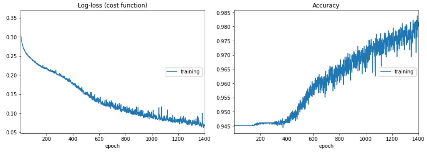
Training is similar to the prototype CNN model. I used a Sequential CNN model with two Conv2D, two MaxPooling, and a Flatten layer feeding a three-layer 128–64–3 network with Dropout. I did not under sample the normal class to keep as much variability in what a normal condition ‘looks like’. Thus, the high initial accuracy. Details can be found on Github here.
Results
I applied a custom classifier to the model probability predictions (predict_proba) rather than using the standard argmax prediction due to the imbalance in the dataset. Most of the images, about 94%, are from the normal class, and warning and paper break images make up about 5% and 1% respectively. The custom classifier eliminates a class if the predicted class probability is below the frequency of that class in the dataset. For example, if a warning and paper break probabilities are 8% and 3%, then the normal probability would be 89% and then is excluded. The prediction is the argmax of the remaining two probabilities and would be a warning. The custom classifier confusion matrix is on the left and the standard argmax prediction is on the right. Results are shown for three different models.

The custom classifier has a higher true positive rate on the warning state versus Argmax, but a higher false positive rate, predicting a warning for normal state conditions between 4 and 9 times more often depending on the model.
The objective is to predict a paper break before it happens to allow time for intervention. Thus, the higher true positive performance for the custom classifier (Adjusted Prediction) is attractive at this stage, even at the expense of higher false positive warning states. Although we want to reduce the number of false positives (nuisance alarms) in a production model, this isn’t at that state. There potentially is a lot to be learned from the false warnings in this situation versus just jumping ahead and adopting the low false warnings of the Feature Importance model with the standard Argmax classification. Refer to the two charts below using the same model. This first uses the custom classifier and the second the standard Argmax selection. The Argmax ignores the time where the process appears to be unsettled and ultimately has a paper break (high lighted with the circle) and avoids ‘false warnings’ and misses many of the named warnings, whereas the custom classifier shows almost all warnings. What is the real difference between these samples and the ones just prior to a paper break after a long stable operating run?


Looking at the results from the confusion matrix and the charts below, I see three things could be happening with these models and dataset.
Firstly, the models just may not be performing very well.
Secondly, remember the raw data only has normal and paper break classes. I arbitrarily selected five samples prior to a paper break as the warning class. There could be many “normal” samples where the process state is similar to a pre-failure condition and some of the false positives for a warning are actually times when the system is close to having a paper break but recovers to normal operating levels without incurring a break. This would be insightful and may be where the highest value is gained. e.g., Working with operations to explore similarities in actual pre-failure samples and other “normal” samples or to understand if the rate of change of a feature is more indicative of a problem even if the feature value is within set point limits. The dataset features are anonymized, and interpretation of my results are limited without knowing the features and not being an expert on paper machines. Knowledge of the actual features with good practice of iteration and review with domain experts (i.e., paper machine experts) would confirm insights or identify modelling issues.
Initial models with false positives can be valuable in understanding nuances in the process or process control system. In other words, even though a sample is labelled as normal, doesn’t mean that it isn’t running near or trending to a paper break (or process fault in other systems).
Thirdly, there may be a bias built into the way I labelled the warning states leading to higher false positives. I picked 5 time periods (10 minutes) before an actual break to be labelled as a warning to provide some practicality for time to intervene in the process. Conditions in the paper machine may develop to a paper break much faster, and thus 2 or 3 of the warning states before some, or all of the breaks, may not be representative of a process deviation. Thus, labelling data as a warning state when it is perfectly normal could lead the model to predict small process deviations as evidence of an imminent paper break and / or reduce the performance of predicting warnings in the test set. Reducing the number of warning states before a paper break may improve the model but would also reduce the time to intervene to prevent a break.
Charts
I have included several charts to give an overview of how the model performed as well as how different periods in the data appear as a smoothly running machine or as a somewhat unstable machine, sometimes after start-up. Charts are from the model built with features derived from Feature Importance run on samples with position and two derivatives using the adjusted predictor (classified based on the probability of class and the frequency of that class in the sample set). More charts are in Jupyter Notebooks on my Github.
The charts show the test and training results (running the training set through the final model) plotted together by the day and time of the samples. I present them this way because plots of the training and test sets ordered consecutively by sample don’t show how performance changes through the month because the samples are shuffled. Also, separate plots of the test and training sets by time have gaps from the missing data in either the test or training set.
These plots have two tracks. The upper track has the predicted class, normal (0), warning (1), and paper break (2) from the model. This track also has the actual labels for warnings as circles, and the paper breaks as diamonds. The test predictions are blue dots, and the training predictions are blue X’s. With shorter time intervals, it is easy to see where the prediction and actuals align.
The lower track has the probability of class (0 to 1) plotted for test and training predictions. Here test results are dots and training results are X’s. The probabilities by class are green for normal, yellow for warning, and red for paper breaks (also labelled as faults).
Chart 1 shows the distribution of the sample subset through the month with 58 paper breaks in this data subset.

Chart 2 is a 4–1/2 hour running period on May 5 from 13:00 to 17:30 hours. This shows how a small drop in normal probability below 94% is accompanied by a warning probability above its occurrence frequency in the data and thus a warning prediction. There are several ‘false’ warnings which could be due to irregular operating conditions. These periods of high ‘false’ warnings tend to happen more often close to a paper break or when there is a short run time from start-up to a paper break. The two breaks in the chart were predicted as warnings vs. breaks.

Chart 3 has a gap where 68 minutes of missing data. It appears that the machine ran continuously until the paper break at 23:00 hours. This interval has far fewer false warnings than in Chart 2 above.
Chart 4 shows a smooth run time over about 28 hours. The false warnings are more frequent after the machine restarts (on the left) and before the paper break at about 15:00 hours on the 14th of the month.

Chart 5 shows a clean 11 hour run time that precedes Chart 6.

Chart 6 follows Chart 5 above in time and shows the model predicting warnings consistently ahead of a paper break.

Chart 6a is the corresponding results from the base model (EDA / Position Feature Importance Model). This model used different features and has more ‘false warnings’ than the Feature Importance Model above (which uses position, velocity, and acceleration in the feature selection). There may be value in these false warning with different features but knowledge of the features is needed to determine the difference between insight and poor model performance.

Recap
The objective was not to classify paper breaks versus normal operating conditions since identifying the paper break after it has happened doesn’t have any operational benefit. Identifying changes in operating conditions that are likely to lead to a paper break potentially has value for operator intervention, improving process control logic, or understand second order or compounding effects of concurrent shifts in multiple process measurements.
This work showed that a CNN model could be used to predict or warn of an impending process failure on a real-world dataset. The model could be improved with more data and knowledge about the actual paper machine that produced the data. This approach could be used in other processes, not necessarily as a control system, but to explore upsets and fine tune systems.
This is not a production level model where minimizing false warnings is important. Digging into the possibility that the false positives are deviation cases that recovered (as stated above) is part of the iterative approach needed in developing production models that includes consulting with subject matter experts in the process design and operations. A model isn’t trained and deployed in one step. Insights can be gained in a multidisciplinary approach to understand whether the model just isn’t good, or if the model is telling you something and use that to improve the model or understand the industrial process.
I welcome your comments.
Special Thanks
Special thanks to Chitta Ranjan, Director of Science at ProcessMiner Inc. for graciously giving me permission to publish this article and share my approach and results.
Related Article
This is an extension of a prototype article where I created a synthetic dataset and trained a CNN image classification model on images representing normal conditions and pre-failure time slices as a warning state.
Reference
[1]Chitta Ranjan, Markku Mustonen, Kamran Paynabar, Karim Pourak, “Rare Event Classification in Multivariate Time Series”, 2018, arXiv:1809.10717, dataset used with permission.
Using image classification to predict impending process failures
Introduction
This article demonstrates use of CNN’s (Convolution Neural Networks) to predict an impending process failure in a paper machine using a real world dataset.
This is done by arranging data samples representing several consecutive time-slices into an image that is a snapshot of the past and current state. If conditions prior to a failure are different from normal operation, then images of the condition can warn of an impending failure. The purpose isn’t to classify a failure vs. a normal operation, but to classify a running state as normal or as a warning of an impending failure.
The image construction, model performance, and insights are discussed with several charts spanning a month of process data.
Why do this?
Industrial systems run on process controls. These keep the system running within parameters. Yet, systems shut down. Excluding other factors such as manual shut down, or equipment failure, upsets still happen. Identifying an impending failure could give operations staff time to prevent an upset. Additionally, analyzing a process in this way may provide insights into why or what combination of events lead to an upset and provide an opportunity to adjust the control system.
Dataset
The data used in this article is from ProcessMiner Inc. and can be found via a link to a download request form in the paper “Rare Event Classification in Multivariate Time Series” [1], used with permission.
This dataset covers approximately one month of operation of a paper machine with samples recorded at two-minute intervals. The features are not identified with specific process variable names and the data may have been adjusted for IP purposes. There is one categorical feature that appears to split the data into eight discrete operating scenarios which may be related to the type or weight of paper or some other parameter. I selected the most frequent subset making up 36% of the data from this feature (where feature X28 is 96) and reduced the number of features via data analysis and using feature and permutation importance. Knowledge of the specific features could improve this step. The charts in this article are from the best performing model and feature subset, with some comparisons of results from the other versions.
The paper breaks and feature X28 are shown below. The paper breaks are the vertical lines in time. The blue line is feature X28. The value 96 occurs in the beginning, middle, and end of the month as indicated by the arrows.
More data and knowledge of the meaning behind each feature may produce a better model that could also be refined with new data month over month. Separate models for other X28 values could be built with more data, or these samples could possibly be included through feature transformation with expert process knowledge.
This dataset only has process values recorded every two minutes. The original raw data is probably more detailed in time. Different or multiple time intervals could be used with other datasets to gain insights or provide short or longer period predictions.
Six samples are needed to make a single image, so any data with less than 6 samples between breaks was eliminated.
Converting Data to Images
The data is relabelled from 0 and 1 for normal and paper break, to 0 for normal, 1 for warning, and 2 for paper break. The five samples preceding each paper break are set to label 1.
Two derivatives with time are taken of the process measured values and saved in memory as new data tables. This gives a rate of change of the process measurements as a ‘velocity’ relative to position and an ‘acceleration’ relative to velocity. My thinking was that these derivative samples may be indicative of paper breaks when there are high rates of change even though the feature values are within set point ranges.
The three data tables are then scaled on a 0 to 1 range and 6 periods of data are assigned to an image covering a 12-minute period. Each successive image overlaps the previous one by 5 time periods. Each image is categorized by the label corresponding to the last time slice in that image: normal, warning, or paper break.
The images are built in 3 layers with the process variable values or ‘position’ as the first layer. The derivative of the process values or ‘velocity’ is the second layer, and the third layer is the ‘acceleration’ values.
Once the failure time slice is in the last row of an image, the process repeats by building the next image starting with the next 6 time periods following the previous failure time slice.
The picture below shows twelve consecutive images built from the dataset leading up to a paper break and the last image representing the condition after restarting the machine. The control point or measurement point value (position), ‘velocity’, and ‘acceleration’ bands are visible in each image. The image order is left to right by row with the upper left as the first image and lower right as the last. The numbers on the left are the original normal (0) and paper break (1) labels corresponding to the last time sample in each image. The numbers on the right are the adjusted labels with normal (0), warning (1), and paper break (2). The first five images are normal operating (00). The next five are warning condition (01) of the five samples prior to the actual paper break. The paper break is next (12) which is followed by a normal restart (00). All 6168 samples were created this way.
Image by Author
Models
I trained three separate models using three different image sets. These models differ in the features chosen for the image construction. The EDA / Position Feature Importance model used feature importance on a Random Forest model of only the original position values on discrete samples (not using images with stacked samples). This was the first model / feature list I worked with. The Feature Importance and Permutation Importance models use features high graded from a RF model built from the position, velocity and acceleration combined on discrete samples. I kept the same image construction basis, so position, velocity, and acceleration values are kept for any feature that ranks high whether it is the original position or a derived velocity or acceleration feature. Here is a sample chart of the best model over a 5-hour period. More charts on the performance of the best model are included later. (Upper track: normal 0, warning 1, paper break 2)
Training
Training is similar to the prototype CNN model. I used a Sequential CNN model with two Conv2D, two MaxPooling, and a Flatten layer feeding a three-layer 128–64–3 network with Dropout. I did not under sample the normal class to keep as much variability in what a normal condition ‘looks like’. Thus, the high initial accuracy. Details can be found on Github here.
Results
I applied a custom classifier to the model probability predictions (predict_proba) rather than using the standard argmax prediction due to the imbalance in the dataset. Most of the images, about 94%, are from the normal class, and warning and paper break images make up about 5% and 1% respectively. The custom classifier eliminates a class if the predicted class probability is below the frequency of that class in the dataset. For example, if a warning and paper break probabilities are 8% and 3%, then the normal probability would be 89% and then is excluded. The prediction is the argmax of the remaining two probabilities and would be a warning. The custom classifier confusion matrix is on the left and the standard argmax prediction is on the right. Results are shown for three different models.
The custom classifier has a higher true positive rate on the warning state versus Argmax, but a higher false positive rate, predicting a warning for normal state conditions between 4 and 9 times more often depending on the model.
The objective is to predict a paper break before it happens to allow time for intervention. Thus, the higher true positive performance for the custom classifier (Adjusted Prediction) is attractive at this stage, even at the expense of higher false positive warning states. Although we want to reduce the number of false positives (nuisance alarms) in a production model, this isn’t at that state. There potentially is a lot to be learned from the false warnings in this situation versus just jumping ahead and adopting the low false warnings of the Feature Importance model with the standard Argmax classification. Refer to the two charts below using the same model. This first uses the custom classifier and the second the standard Argmax selection. The Argmax ignores the time where the process appears to be unsettled and ultimately has a paper break (high lighted with the circle) and avoids ‘false warnings’ and misses many of the named warnings, whereas the custom classifier shows almost all warnings. What is the real difference between these samples and the ones just prior to a paper break after a long stable operating run?
Looking at the results from the confusion matrix and the charts below, I see three things could be happening with these models and dataset.
Firstly, the models just may not be performing very well.
Secondly, remember the raw data only has normal and paper break classes. I arbitrarily selected five samples prior to a paper break as the warning class. There could be many “normal” samples where the process state is similar to a pre-failure condition and some of the false positives for a warning are actually times when the system is close to having a paper break but recovers to normal operating levels without incurring a break. This would be insightful and may be where the highest value is gained. e.g., Working with operations to explore similarities in actual pre-failure samples and other “normal” samples or to understand if the rate of change of a feature is more indicative of a problem even if the feature value is within set point limits. The dataset features are anonymized, and interpretation of my results are limited without knowing the features and not being an expert on paper machines. Knowledge of the actual features with good practice of iteration and review with domain experts (i.e., paper machine experts) would confirm insights or identify modelling issues.
Initial models with false positives can be valuable in understanding nuances in the process or process control system. In other words, even though a sample is labelled as normal, doesn’t mean that it isn’t running near or trending to a paper break (or process fault in other systems).
Thirdly, there may be a bias built into the way I labelled the warning states leading to higher false positives. I picked 5 time periods (10 minutes) before an actual break to be labelled as a warning to provide some practicality for time to intervene in the process. Conditions in the paper machine may develop to a paper break much faster, and thus 2 or 3 of the warning states before some, or all of the breaks, may not be representative of a process deviation. Thus, labelling data as a warning state when it is perfectly normal could lead the model to predict small process deviations as evidence of an imminent paper break and / or reduce the performance of predicting warnings in the test set. Reducing the number of warning states before a paper break may improve the model but would also reduce the time to intervene to prevent a break.
Charts
I have included several charts to give an overview of how the model performed as well as how different periods in the data appear as a smoothly running machine or as a somewhat unstable machine, sometimes after start-up. Charts are from the model built with features derived from Feature Importance run on samples with position and two derivatives using the adjusted predictor (classified based on the probability of class and the frequency of that class in the sample set). More charts are in Jupyter Notebooks on my Github.
The charts show the test and training results (running the training set through the final model) plotted together by the day and time of the samples. I present them this way because plots of the training and test sets ordered consecutively by sample don’t show how performance changes through the month because the samples are shuffled. Also, separate plots of the test and training sets by time have gaps from the missing data in either the test or training set.
These plots have two tracks. The upper track has the predicted class, normal (0), warning (1), and paper break (2) from the model. This track also has the actual labels for warnings as circles, and the paper breaks as diamonds. The test predictions are blue dots, and the training predictions are blue X’s. With shorter time intervals, it is easy to see where the prediction and actuals align.
The lower track has the probability of class (0 to 1) plotted for test and training predictions. Here test results are dots and training results are X’s. The probabilities by class are green for normal, yellow for warning, and red for paper breaks (also labelled as faults).
Chart 1 shows the distribution of the sample subset through the month with 58 paper breaks in this data subset.
Chart 2 is a 4–1/2 hour running period on May 5 from 13:00 to 17:30 hours. This shows how a small drop in normal probability below 94% is accompanied by a warning probability above its occurrence frequency in the data and thus a warning prediction. There are several ‘false’ warnings which could be due to irregular operating conditions. These periods of high ‘false’ warnings tend to happen more often close to a paper break or when there is a short run time from start-up to a paper break. The two breaks in the chart were predicted as warnings vs. breaks.
Chart 3 has a gap where 68 minutes of missing data. It appears that the machine ran continuously until the paper break at 23:00 hours. This interval has far fewer false warnings than in Chart 2 above.
Chart 4 shows a smooth run time over about 28 hours. The false warnings are more frequent after the machine restarts (on the left) and before the paper break at about 15:00 hours on the 14th of the month.
Chart 5 shows a clean 11 hour run time that precedes Chart 6.
Chart 6 follows Chart 5 above in time and shows the model predicting warnings consistently ahead of a paper break.
Chart 6a is the corresponding results from the base model (EDA / Position Feature Importance Model). This model used different features and has more ‘false warnings’ than the Feature Importance Model above (which uses position, velocity, and acceleration in the feature selection). There may be value in these false warning with different features but knowledge of the features is needed to determine the difference between insight and poor model performance.
Recap
The objective was not to classify paper breaks versus normal operating conditions since identifying the paper break after it has happened doesn’t have any operational benefit. Identifying changes in operating conditions that are likely to lead to a paper break potentially has value for operator intervention, improving process control logic, or understand second order or compounding effects of concurrent shifts in multiple process measurements.
This work showed that a CNN model could be used to predict or warn of an impending process failure on a real-world dataset. The model could be improved with more data and knowledge about the actual paper machine that produced the data. This approach could be used in other processes, not necessarily as a control system, but to explore upsets and fine tune systems.
This is not a production level model where minimizing false warnings is important. Digging into the possibility that the false positives are deviation cases that recovered (as stated above) is part of the iterative approach needed in developing production models that includes consulting with subject matter experts in the process design and operations. A model isn’t trained and deployed in one step. Insights can be gained in a multidisciplinary approach to understand whether the model just isn’t good, or if the model is telling you something and use that to improve the model or understand the industrial process.
I welcome your comments.
Special Thanks
Special thanks to Chitta Ranjan, Director of Science at ProcessMiner Inc. for graciously giving me permission to publish this article and share my approach and results.
Related Article
This is an extension of a prototype article where I created a synthetic dataset and trained a CNN image classification model on images representing normal conditions and pre-failure time slices as a warning state.
Reference
[1]Chitta Ranjan, Markku Mustonen, Kamran Paynabar, Karim Pourak, “Rare Event Classification in Multivariate Time Series”, 2018, arXiv:1809.10717, dataset used with permission.
Denial of responsibility! Techno Blender is an automatic aggregator of the all world’s media. In each content, the hyperlink to the primary source is specified. All trademarks belong to their rightful owners, all materials to their authors. If you are the owner of the content and do not want us to publish your materials, please contact us by email – [email protected]. The content will be deleted within 24 hours.