
Spurious Correlations: The Comedy and Drama of Statistics
What not to do with statistics
By Celia Banks, PhD and Paul Boothroyd III

Introduction
Since Tyler Vigen coined the term ‘spurious correlations’ for “any random correlations dredged up from silly data” (Vigen, 2014) see: Tyler Vigen’s personal website, there have been many articles that pay tribute to the perils and pitfalls of this whimsical tendency to manipulate statistics to make correlation equal causation. See: HBR (2015), Medium (2016), FiveThirtyEight (2016). As data scientists, we are tasked with providing statistical analyses that either accept or reject null hypotheses. We are taught to be ethical in how we source data, extract it, preprocess it, and make statistical assumptions about it. And this is no small matter — global companies rely on the validity and accuracy of our analyses. It is just as important that our work be reproducible. Yet, in spite of all of the ‘good’ that we are taught to practice, there may be that one occasion (or more) where a boss or client will insist that you work the data until it supports the hypothesis and, above all, show how variable y causes variable x when correlated. This is the basis of p-hacking where you enter into a territory that is far from supported by ‘good’ practice. In this report, we learn how to conduct fallacious research using spurious correlations. We get to delve into ‘bad’ with the objective of learning what not to do when you are faced with that inevitable moment to deliver what the boss or client whispers in your ear.
The objective of this project is to teach you
what not to do with statistics
We’ll demonstrate the spurious correlation of two unrelated variables. Datasets from two different sources were preprocessed and merged together in order to produce visuals of relationships. Spurious correlations occur when two variables are misleadingly correlated, and it is further assumed that one variable directly affects the other variable so as to cause a certain outcome. The reason we chose this project idea is because we were interested in ways that manage a client’s expectations of what a data analysis project should produce. For team member Banks, sometimes she has had clients demonstrate displeasure with analysis results and actually on one occasion she was asked to go back and look at other data sources and opportunities to “help” arrive at the answers they were seeking. Yes, this is p-hacking — in this case, where the client insisted that causal relationships existed because they believe the correlations existed to cause an outcome.
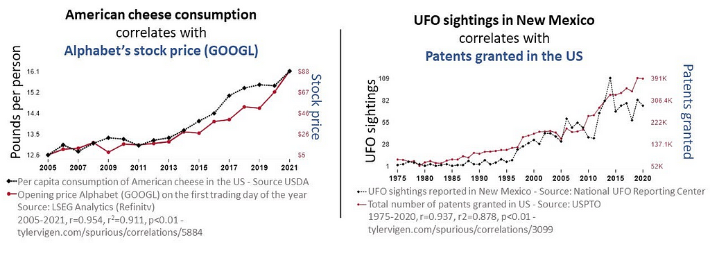
Examples of Spurious Correlations
Research Questions Pertinent to this Study
What are the research questions?
Why the heck do we need them?
We’re doing a “bad” analysis, right?
Research questions are the foundation of the research study. They guide the research process by focusing on specific topics that the researcher will investigate. Reasons why they are essential include but are not limited to: for focus and clarity; as guidance for methodology; establish the relevance of the study; help to structure the report; help the researcher evaluate results and interpret findings. In learning how a ‘bad’ analysis is conducted, we addressed the following questions:
(1) Are the data sources valid (not made up)?
(2) How were missing values handled?
(3) How were you able to merge dissimilar datasets?
(4) What are the response and predictor variables?
(5) Is the relationship between the response and predictor variables linear?
(6) Is there a correlation between the response and predictor variables?
(7) Can we say that there is a causal relationship between the variables?
(8) What explanation would you provide a client interested in the relationship between these two variables?
(9) Did you find spurious correlations in the chosen datasets?
(10) What learning was your takeaway in conducting this project?
Methodology
How did we conduct a study about
Spurious Correlations?
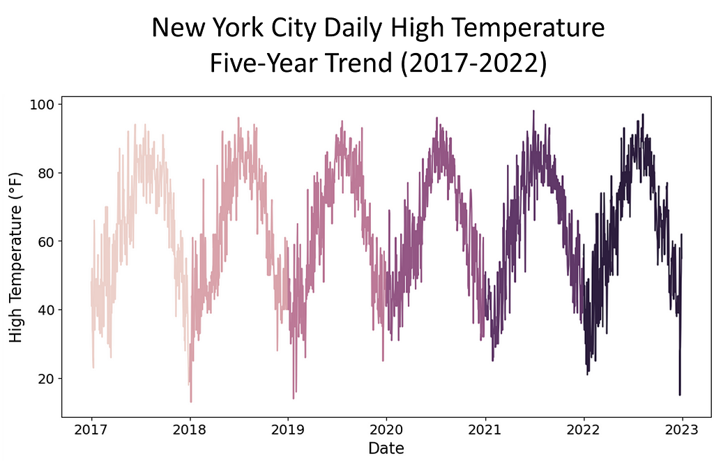
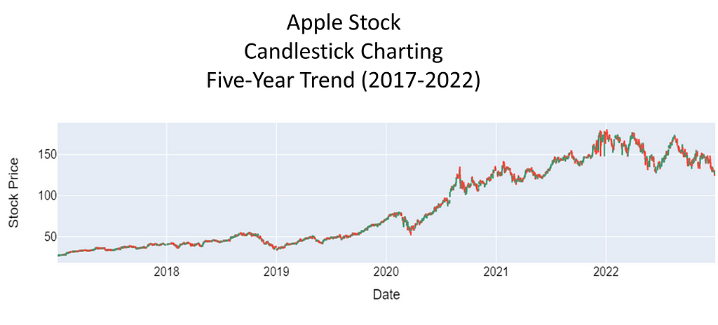
To investigate the presence of spurious correlations between variables, a comprehensive analysis was conducted. The datasets spanned different domains of economic and environmental factors that were collected and affirmed as being from public sources. The datasets contained variables with no apparent causal relationship but exhibited statistical correlation. The chosen datasets were of the Apple stock data, the primary, and daily high temperatures in New York City, the secondary. The datasets spanned the time period of January, 2017 through December, 2022.
Rigorous statistical techniques were used to analyze the data. A Pearson correlation coefficients was calculated to quantify the strength and direction of linear relationships between pairs of the variables. To complete this analysis, scatter plots of the 5-year daily high temperatures in New York City, candlestick charting of the 5-year Apple stock trend, and a dual-axis charting of the daily high temperatures versus sock trend were utilized to visualize the relationship between variables and to identify patterns or trends. Areas this methodology followed were:
The Data: Source/Extract/Process
Primary dataset: Apple Stock Price History | Historical AAPL Company Stock Prices | FinancialContent Business Page
Secondary dataset: New York City daily high temperatures from Jan 2017 to Dec 2022: https://www.extremeweatherwatch.com/cities/new-york/year-{year}
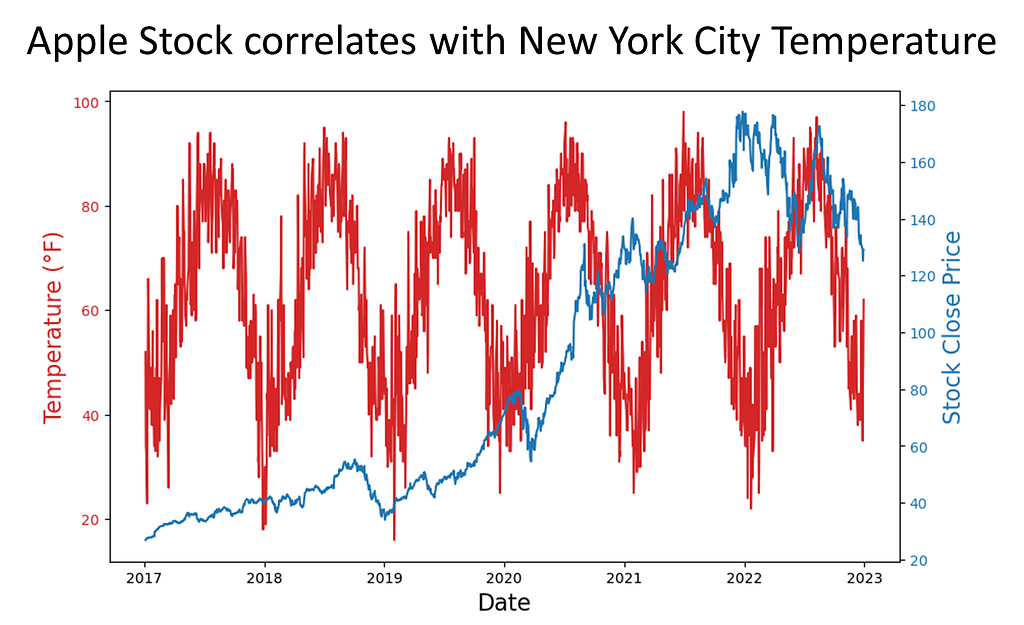
The data was affirmed as publicly sourced and available for reproducibility. Capturing the data over a time period of five years gave a meaningful view of patterns, trends, and linearity. Temperature readings saw seasonal trends. For temperature and stock, there were troughs and peaks in data points. Note temperature was in Fahrenheit, a meteorological setting. We used astronomical setting to further manipulate our data to pose stronger spuriousness. While the data could be downloaded as csv or xls files, for this assignment, Python’s Beautiful soup web scraping API was used.
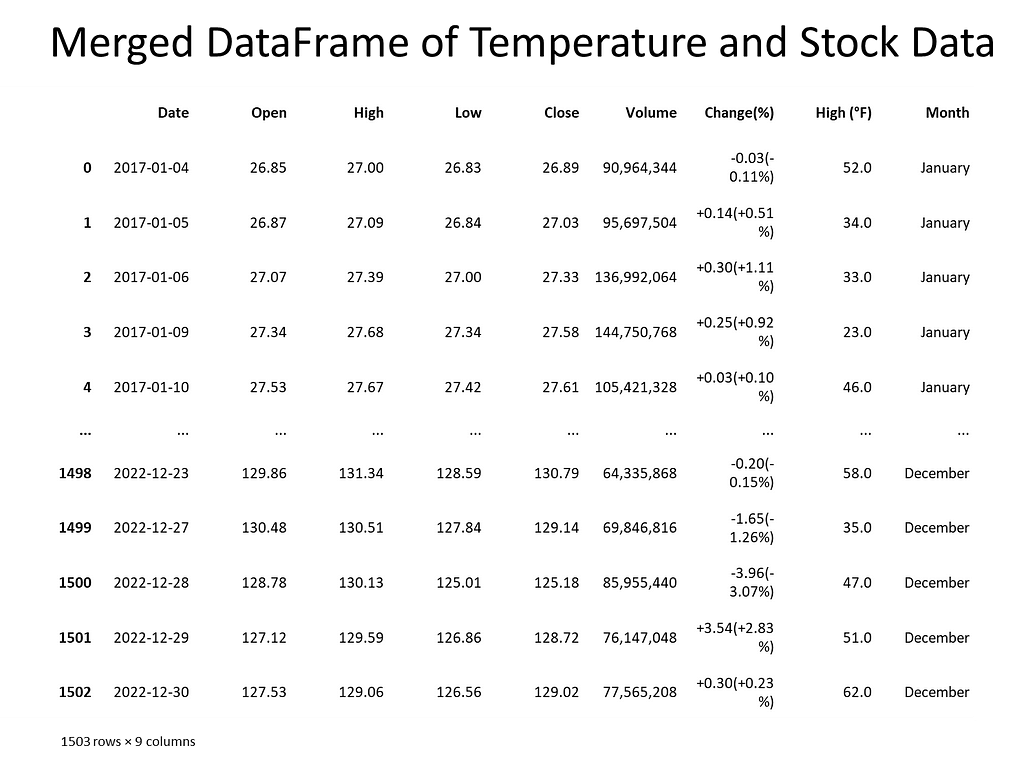
Next, the data was checked for missing values and how many records each contained. Weather data contained date, daily high, daily low temperature, and Apple stock data contained date, opening price, closing price, volume, stock price, stock name. To merge the datasets, the date columns needed to be in datetime format. An inner join matched records and discarded non-matching. For Apple stock, date and daily closing price represented the columns of interest. For the weather, date and daily high temperature represented the columns of interest.
The Data: Manipulation

To do ‘bad’ the right way, you have to
massage the data until you find the
relationship that you’re looking for…
Our earlier approach did not quite yield the intended results. So, instead of using the summer season of 2018 temperatures in five U.S. cities, we pulled five years of daily high temperatures for New York City and Apple Stock performance from January, 2017 through December, 2022. In conducting exploratory analysis, we saw weak correlations across the seasons and years. So, our next step was to convert the temperature. Instead of meteorological, we chose astronomical. This gave us ‘meaningful’ correlations across seasons.
With the new approach in place, we noticed that merging the datasets was problematic. The date fields were different where for weather, the date was month and day. For stock, the date was in year-month-day format. We addressed this by converting each dataset’s date column to datetime. Also, each date column was sorted either in chronological or reverse chronological order. This was resolved by sorting both date columns in ascending order.
Analysis I: Do We Have Spurious Correlation? Can We Prove It?
The spurious nature of the correlations
here is shown by shifting from
meteorological seasons (Spring: Mar-May,
Summer: Jun-Aug, Fall: Sep-Nov, Winter:
Dec-Feb) which are based on weather
patterns in the northern hemisphere, to
astronomical seasons (Spring: Apr-Jun,
Summer: Jul-Sep, Fall: Oct-Dec, Winter:
Jan-Mar) which are based on Earth’s tilt.
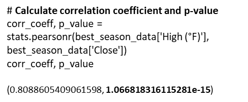
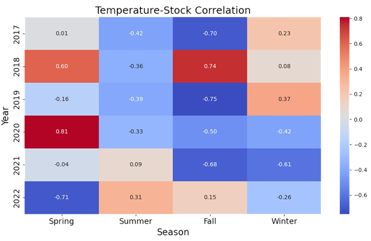
Once we accomplished the exploration, a key point in our analysis of spurious correlation was to determine if the variables of interest correlate. We eyeballed that Spring 2020 had a correlation of 0.81. We then determined if there was statistical significance — yes, and at p-value ≈ 0.000000000000001066818316115281, I’d say we have significance!


Analysis II: Additional Statistics to Test the Nature of Spuriousness
If there is truly spurious correlation, we may want to
consider if the correlation equates to causation — that
is, does a change in astronomical temperature cause
Apple stock to fluctuate? We employed further
statistical testing to prove or reject the hypothesis
that one variable causes the other variable.
There are numerous statistical tools that test for causality. Tools such as Instrumental Variable (IV) Analysis, Panel Data Analysis, Structural Equation Modelling (SEM), Vector Autoregression Models, Cointegration Analysis, and Granger Causality. IV analysis considers omitted variables in regression analysis; Panel Data studies fixed-effects and random effects models; SEM analyzes structural relationships; Vector Autoregression considers dynamic multivariate time series interactions; and Cointegration Analysis determines whether variables move together in a stochastic trend. We wanted a tool that could finely distinguish between genuine causality and coincidental association. To achieve this, our choice was Granger Causality.
Granger Causality
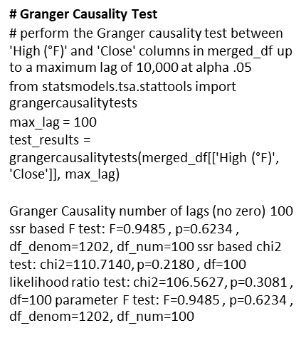
A Granger test checks whether past values can predict future ones. In our case, we tested whether past daily high temperatures in New York City could predict future values of Apple stock prices.
Ho: Daily high temperatures in New York City do not Granger cause Apple stock price fluctuation.
To conduct the test, we ran through 100 lags to see if there was a standout p-value. We encountered near 1.0 p-values, and this suggested that we could not reject the null hypothesis, and we concluded that there was no evidence of a causal relationship between the variables of interest.
Analysis III: Statistics to Validate Not Rejecting the Null Ho
Granger causality proved the p-value
insignificant in rejecting the null
hypothesis. But, is that enough?
Let’s validate our analysis.
To help in mitigating the risk of misinterpreting spuriousness as genuine causal effects, performing a Cross-Correlation analysis in conjunction with a Granger causality test will confirm its finding. Using this approach, if spurious correlation exists, we will observe significance in cross-correlation at some lags without consistent causal direction or without Granger causality being present.
Cross-Correlation Analysis
This method is accomplished by the following steps:
- Examine temporal patterns of correlations between variables;
- •If variable A Granger causes variable B, significant cross-correlation will occur between variable A and variable B at positive lags;
- Significant peaks in cross-correlation at specific lags infers the time delay between changes in the causal variable.
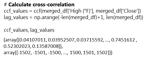
Interpretation:
The ccf and lag values show significance in positive correlation at certain lags. This confirms that spurious correlation exists. However, like the Granger causality, the cross-correlation analysis cannot support the claim that causality exists in the relationship between the two variables.
Wrapup: Key Learnings
- Spurious correlations are a form of p-hacking. Correlation does not imply causation.
- Even with ‘bad’ data tactics, statistical testing will root out the lack of significance. While there was statistical evidence of spuriousness in the variables, causality testing could not support the claim that causality existed in the relationship of the variables.
- A study cannot rest on the sole premise that variables displaying linearity can be correlated to exhibit causality. Instead, other factors that contribute to each variable must be considered.
- A non-statistical test of whether daily high temperatures in New York City cause Apple stock to fluctuate can be to just consider: If you owned an Apple stock certificate and you placed it in the freezer, would the value of the certificate be impacted by the cold? Similarly, if you placed the certificate outside on a sunny, hot day, would the sun impact the value of the certificate?
Ethical Considerations: P-Hacking is Not a Valid Analysis

Spurious correlations are not causality.
P-hacking may impact your credibility as a
data scientist. Be the adult in the room and
refuse to participate in bad statistics.
This study portrayed analysis that involved ‘bad’ statistics. It demonstrated how a data scientist could source, extract and manipulate data in such a way as to statistically show correlation. In the end, statistical testing withstood the challenge and demonstrated that correlation does not equal causality.
Conducting a spurious correlation brings ethical questions of using statistics to derive causation in two unrelated variables. It is an example of p-hacking, which exploits statistics in order to achieve a desired outcome. This study was done as academic research to show the absurdity in misusing statistics.
Another area of ethical consideration is the practice of web scraping. Many website owners warn against pulling data from their sites to use in nefarious ways or ways unintended by them. For this reason, sites like Yahoo Finance make stock data downloadable to csv files. This is also true for most weather sites where you can request time datasets of temperature readings. Again, this study is for academic research and to demonstrate one’s ability to extract data in a nonconventional way.
When faced with a boss or client that compels you to p-hack and offer something like a spurious correlation as proof of causality, explain the implications of their ask and respectfully refuse the project. Whatever your decision, it will have a lasting impact on your credibility as a data scientist.
Dr. Banks is CEO of I-Meta, maker of the patented Spice Chip Technology that provides Big Data analytics for various industries. Mr. Boothroyd, III is a retired Military Analyst. Both are veterans having honorably served in the United States military and both enjoy discussing spurious correlations. They are cohorts of the University of Michigan, School of Information MADS program…Go Blue!
References
Aschwanden, Christie. January 2016. You Can’t Trust What You Read About Nutrition. FiveThirtyEight. Retrieved January 24, 2024 from https://fivethirtyeight.com/features/you-cant-trust-what-you-read-about-nutrition/
Business Management: From the Magazine. June 2015. Beware Spurious Correlations. Harvard Business Review. Retrieved January 24, 2024 from https://hbr.org/2015/06/beware-spurious-correlations
Extreme Weather Watch. 2017–2023. Retrieved January 24, 2024 from https://www.extremeweatherwatch.com/cities/new-york/year-2017
Financial Content Services, Inc. Apple Stock Price History | Historical AAPL Company Stock Prices | Financial Content Business Page. Retrieved January 24, 2024 from
Plotlygraphs.July 2016. Spurious-Correlations. Medium. Retrieved January 24, 2024 from https://plotlygraphs.medium.com/spurious-correlations-56752fcffb69
Vigen, Tyler. Spurious Correlations. Retrieved February 1, 2024 from https://www.tylervigen.com/spurious-correlations
Mr. Vigen’s graphs were reprinted with permission from the author received on January 31, 2024.
Images were licensed from their respective owners.
Code Section
##########################
# IMPORT LIBRARIES SECTION
##########################
# Import web scraping tool
import requests
from bs4 import BeautifulSoup
import pandas as pd
import numpy as np

# Import visualization appropriate libraries
import plotly.graph_objects as go
from plotly.subplots import make_subplots
import seaborn as sns # New York temperature plotting
import plotly.graph_objects as go # Apple stock charting
from pandas.plotting import scatter_matrix # scatterplot matrix

# Import appropriate libraries for New York temperature plotting
import seaborn as sns
import matplotlib.pyplot as plt
from datetime import datetime, timedelta
import re

# Convert day to datetime library
import calendar

# Cross-correlation analysis library
from statsmodels.tsa.stattools import ccf

# Stats library
import scipy.stats as stats

# Granger causality library
from statsmodels.tsa.stattools import grangercausalitytests
##################################################################################
# EXAMINE THE NEW YORK CITY WEATHER AND APPLE STOCK DATA IN READYING FOR MERGE ...
##################################################################################

# Extract New York City weather data for the years 2017 to 2022 for all 12 months
# 5-YEAR NEW YORK CITY TEMPERATURE DATA

# Function to convert 'Day' column to a consistent date format for merging
def convert_nyc_date(day, month_name, year):
    month_num = datetime.strptime(month_name, '%B').month

    # Extract numeric day using regular expression
    day_match = re.search(r'\d+', day)
    day_value = int(day_match.group()) if day_match else 1

    date_str = f"{month_num:02d}-{day_value:02d}-{year}"

    try:
        return pd.to_datetime(date_str, format='%m-%d-%Y')
    except ValueError:
        return pd.to_datetime(date_str, errors='coerce')

# Set variables
years = range(2017, 2023)
all_data = [] # Initialize an empty list to store data for all years

# Enter for loop
for year in years:
    url = f'https://www.extremeweatherwatch.com/cities/new-york/year-{year}'
    response = requests.get(url)
    soup = BeautifulSoup(response.text, 'html.parser')

    div_container = soup.find('div', {'class': 'page city-year-page'})

    if div_container:
        select_month = div_container.find('select', {'class': 'form-control url-selector'})

        if select_month:
            monthly_data = []
            for option in select_month.find_all('option'):
                month_name = option.text.strip().lower()

                h5_tag = soup.find('a', {'name': option['value'][1:]}).find_next('h5', {'class': 'mt-4'})

                if h5_tag:
                    responsive_div = h5_tag.find_next('div', {'class': 'responsive'})
                    table = responsive_div.find('table', {'class': 'bordered-table daily-table'})

                    if table:
                        data = []
                        for row in table.find_all('tr')[1:]:
                            cols = row.find_all('td')
                            day = cols[0].text.strip()
                            high_temp = float(cols[1].text.strip())
                            data.append([convert_nyc_date(day, month_name, year), high_temp])

                        monthly_df = pd.DataFrame(data, columns=['Date', 'High (°F)'])
                        monthly_data.append(monthly_df)
                    else:
                        print(f"Table not found for {month_name.capitalize()} {year}")
                else:
                    print(f"h5 tag not found for {month_name.capitalize()} {year}")

            # Concatenate monthly data to form the complete dataframe for the year
            yearly_nyc_df = pd.concat(monthly_data, ignore_index=True)

            # Extract month name from the 'Date' column
            yearly_nyc_df['Month'] = yearly_nyc_df['Date'].dt.strftime('%B')

            # Capitalize the month names
            yearly_nyc_df['Month'] = yearly_nyc_df['Month'].str.capitalize()

            all_data.append(yearly_nyc_df)


######################################################################################################
# Generate a time series plot of the 5-year New York City daily high temperatures
######################################################################################################

# Concatenate the data for all years
if all_data:
    combined_df = pd.concat(all_data, ignore_index=True)

    # Create a line plot for each year
    plt.figure(figsize=(12, 6))
    sns.lineplot(data=combined_df, x='Date', y='High (°F)', hue=combined_df['Date'].dt.year)
    plt.title('New York City Daily High Temperature Time Series (2017-2022) - 5-Year Trend', fontsize=18)
    plt.xlabel('Date', fontsize=16)  # Set x-axis label
    plt.ylabel('High Temperature (°F)', fontsize=16)  # Set y-axis label
    plt.legend(title='Year', bbox_to_anchor=(1.05, 1), loc='upper left', fontsize=14)  # Display legend outside the plot
    plt.tick_params(axis='both', which='major', labelsize=14)  # Set font size for both axes' ticks
    plt.show()
# APPLE STOCK CODE

# Set variables
years = range(2017, 2023)
data = []  # Initialize an empty list to store data for all years

# Extract Apple's historical data for the years 2017 to 2022
for year in years:
    url = f'https://markets.financialcontent.com/stocks/quote/historical?Symbol=537%3A908440&Year={year}&Month=12&Range=12'
    response = requests.get(url)
    soup = BeautifulSoup(response.text, 'html.parser')
    table = soup.find('table', {'class': 'quote_detailed_price_table'})

    if table:
        for row in table.find_all('tr')[1:]:
            cols = row.find_all('td')
            date = cols[0].text

            # Check if the year is within the desired range
            if str(year) in date:
                open_price = cols[1].text
                high = cols[2].text
                low = cols[3].text
                close = cols[4].text
                volume = cols[5].text
                change_percent = cols[6].text
                data.append([date, open_price, high, low, close, volume, change_percent])

# Create a DataFrame from the extracted data
apple_df = pd.DataFrame(data, columns=['Date', 'Open', 'High', 'Low', 'Close', 'Volume', 'Change(%)'])

# Verify that DataFrame contains 5-years
# apple_df.head(50)

#################################################################
# Generate a Candlestick charting of the 5-year stock performance
#################################################################

new_apple_df = apple_df.copy()

# Convert Apple 'Date' column to a consistent date format
new_apple_df['Date'] = pd.to_datetime(new_apple_df['Date'], format='%b %d, %Y')

# Sort the datasets by 'Date' in ascending order
new_apple_df = new_apple_df.sort_values('Date')

# Convert numerical columns to float, handling empty strings
numeric_cols = ['Open', 'High', 'Low', 'Close', 'Volume', 'Change(%)']
for col in numeric_cols:
    new_apple_df[col] = pd.to_numeric(new_apple_df[col], errors='coerce')

# Create a candlestick chart
fig = go.Figure(data=[go.Candlestick(x=new_apple_df['Date'],
                open=new_apple_df['Open'],
                high=new_apple_df['High'],
                low=new_apple_df['Low'],
                close=new_apple_df['Close'])])

# Set the layout
fig.update_layout(title='Apple Stock Candlestick Chart',
                  xaxis_title='Date',
                  yaxis_title='Stock Price',
                  xaxis_rangeslider_visible=False,
                  font=dict(
                      family="Arial",
                      size=16,
                      color="Black"
                  ),
                  title_font=dict(
                      family="Arial",
                      size=20,
                      color="Black"
                  ),
                  xaxis=dict(
                      title=dict(
                          text="Date",
                          font=dict(
                              family="Arial",
                              size=18,
                              color="Black"
                          )
                      ),
                      tickfont=dict(
                          family="Arial",
                          size=16,
                          color="Black"
                      )
                  ),
                  yaxis=dict(
                      title=dict(
                          text="Stock Price",
                          font=dict(
                              family="Arial",
                              size=18,
                              color="Black"
                          )
                      ),
                      tickfont=dict(
                          family="Arial",
                          size=16,
                          color="Black"
                      )
                  )
)

# Show the chart
fig.show()
##########################################
# MERGE THE NEW_NYC_DF WITH NEW_APPLE_DF
##########################################
# Convert the 'Day' column in New York City combined_df to a consistent date format ...

new_nyc_df = combined_df.copy()

# Add missing weekends to NYC temperature data
start_date = new_nyc_df['Date'].min()
end_date = new_nyc_df['Date'].max()
weekend_dates = pd.date_range(start_date, end_date, freq='B')  # B: business day frequency (excludes weekends)
missing_weekends = weekend_dates[~weekend_dates.isin(new_nyc_df['Date'])]
missing_data = pd.DataFrame({'Date': missing_weekends, 'High (°F)': None})
new_nyc_df = pd.concat([new_nyc_df, missing_data]).sort_values('Date').reset_index(drop=True)  # Resetting index
new_apple_df = apple_df.copy()

# Convert Apple 'Date' column to a consistent date format
new_apple_df['Date'] = pd.to_datetime(new_apple_df['Date'], format='%b %d, %Y')

# Sort the datasets by 'Date' in ascending order
new_nyc_df = combined_df.sort_values('Date')
new_apple_df = new_apple_df.sort_values('Date')

# Merge the datasets on the 'Date' column
merged_df = pd.merge(new_apple_df, new_nyc_df, on='Date', how='inner')

# Verify the correct merge -- should merge only NYC temp records that match with Apple stock records by Date
merged_df
# Ensure the columns of interest are numeric
merged_df['High (°F)'] = pd.to_numeric(merged_df['High (°F)'], errors='coerce')
merged_df['Close'] = pd.to_numeric(merged_df['Close'], errors='coerce')
# UPDATED CODE BY PAUL USES ASTRONOMICAL TEMPERATURES
# CORRELATION HEATMAP OF YEAR-OVER-YEAR
# DAILY HIGH NYC TEMPERATURES VS.
# APPLE STOCK 2017-2023
import pandas as pd
import numpy as np
import matplotlib.pyplot as plt
import seaborn as sns
# Convert 'Date' to datetime
merged_df['Date'] = pd.to_datetime(merged_df['Date'])
# Define a function to map months to seasons
def map_season(month):
if month in [4, 5, 6]:
return 'Spring'
elif month in [7, 8, 9]:
return 'Summer'
elif month in [10, 11, 12]:
return 'Fall'
else:
return 'Winter'
# Extract month from the Date column and map it to seasons
merged_df['Season'] = merged_df['Date'].dt.month.map(map_season)
# Extract the years present in the data
years = merged_df['Date'].dt.year.unique()
# Create subplots for each combination of year and season
seasons = ['Spring', 'Summer', 'Fall', 'Winter']
# Convert 'Close' column to numeric
merged_df['Close'] = pd.to_numeric(merged_df['Close'], errors='coerce')
# Create an empty DataFrame to store correlation matrix
corr_matrix = pd.DataFrame(index=years, columns=seasons)
# Calculate correlation matrix for each combination of year and season
for year in years:
year_data = merged_df[merged_df['Date'].dt.year == year]
for season in seasons:
data = year_data[year_data['Season'] == season]
corr = data['High (°F)'].corr(data['Close'])
corr_matrix.loc[year, season] = corr
# Plot correlation matrix
plt.figure(figsize=(10, 6))
sns.heatmap(corr_matrix.astype(float), annot=True, cmap='coolwarm', fmt=".2f")
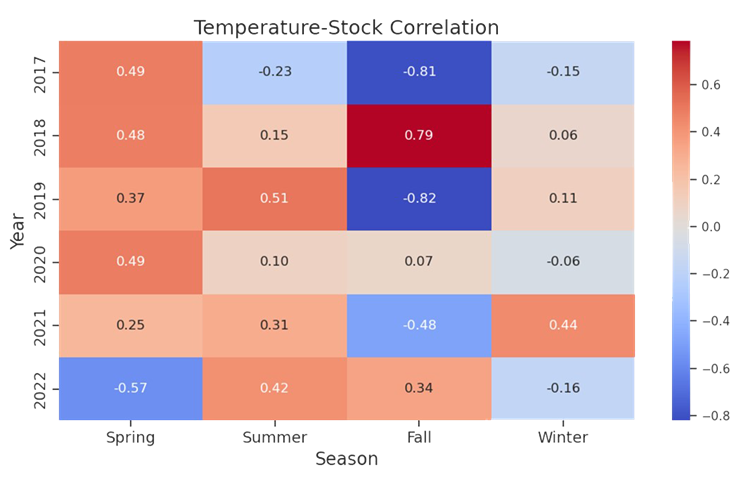
plt.title('Temperature-Stock Correlation', fontsize=18) # Set main title font size
plt.xlabel('Season', fontsize=16) # Set x-axis label font size
plt.ylabel('Year', fontsize=16) # Set y-axis label font size
plt.tick_params(axis='both', which='major', labelsize=14) # Set annotation font size
plt.tight_layout()
plt.show()
#######################
# STAT ANALYSIS SECTION
#######################
#############################################################
# GRANGER CAUSALITY TEST
# test whether past values of temperature (or stock prices)
# can predict future values of stock prices (or temperature).
# perform the Granger causality test between 'High (°F)' and
# 'Close' columns in merged_df up to a maximum lag of 255
#############################################################

# Perform Granger causality test
max_lag = 1  # Choose the maximum lag of 100 - Jupyter times out at higher lags
test_results = grangercausalitytests(merged_df[['High (°F)', 'Close']], max_lag)

# Interpretation:

# looks like none of the lag give a significant p-value
# at alpha .05, we cannot reject the null hypothesis, that is,
# we cannot conclude that Granger causality exists between daily high
# temperatures in NYC and Apple stock

#################################################################
# CROSS-CORRELATION ANALYSIS
# calculate the cross-correlation between 'High (°F)' and 'Close'
# columns in merged_df, and ccf_values will contain the
# cross-correlation coefficients, while lag_values will
# contain the corresponding lag values
#################################################################

# Calculate cross-correlation
ccf_values = ccf(merged_df['High (°F)'], merged_df['Close'])
lag_values = np.arange(-len(merged_df)+1, len(merged_df))

ccf_values, lag_values

# Interpretation:
# Looks like there is strong positive correlation in the variables
# in latter years and positive correlation in their respective
# lags. This confirms what our plotting shows us

########################################################
# LOOK AT THE BEST CORRELATION COEFFICIENT - 2020? LET'S
# EXPLORE FURTHER AND CALCULATE THE p-VALUE AND
# CONFIDENCE INTERVAL
########################################################

# Get dataframes for specific periods of spurious correlation

merged_df['year'] = merged_df['Date'].dt.year
best_season_data = merged_df.loc[(merged_df['year'] == 2020) & (merged_df['Season'] == 'Spring')]

# Calculate correlation coefficient and p-value
corr_coeff, p_value = stats.pearsonr(best_season_data['High (°F)'], best_season_data['Close'])
corr_coeff, p_value

# Perform bootstrapping to obtain confidence interval
def bootstrap_corr(data, n_bootstrap=1000):
    corr_values = []
    for _ in range(n_bootstrap):
        sample = data.sample(n=len(data), replace=True)
        corr_coeff, _ = stats.pearsonr(sample['High (°F)'], sample['Close'])
        corr_values.append(corr_coeff)
    return np.percentile(corr_values, [2.5, 97.5])  # 95% confidence interval

confidence_interval = bootstrap_corr(best_season_data)
confidence_interval
#####################################################################
# VISUALIZE RELATIONSHIP BETWEEN APPLE STOCK AND NYC DAILY HIGH TEMPS
#####################################################################

# Dual y-axis plotting using twinx() function from matplotlib
date = merged_df['Date']
temperature = merged_df['High (°F)']
stock_close = merged_df['Close']

# Create a figure and axis
fig, ax1 = plt.subplots(figsize=(10, 6))

# Plotting temperature on the left y-axis (ax1)
color = 'tab:red'
ax1.set_xlabel('Date', fontsize=16)
ax1.set_ylabel('Temperature (°F)', color=color, fontsize=16)
ax1.plot(date, temperature, color=color)
ax1.tick_params(axis='y', labelcolor=color)

# Create a secondary y-axis for the stock close prices
ax2 = ax1.twinx()
color = 'tab:blue'
ax2.set_ylabel('Stock Close Price', color=color, fontsize=16)
ax2.plot(date, stock_close, color=color)
ax2.tick_params(axis='y', labelcolor=color)

# Title and show the plot
plt.title('Apple Stock correlates with New York City Temperature', fontsize=18)
plt.show()
Spurious Correlations: The Comedy and Drama of Statistics was originally published in Towards Data Science on Medium, where people are continuing the conversation by highlighting and responding to this story.
What not to do with statistics
By Celia Banks, PhD and Paul Boothroyd III

Introduction
Since Tyler Vigen coined the term ‘spurious correlations’ for “any random correlations dredged up from silly data” (Vigen, 2014) see: Tyler Vigen’s personal website, there have been many articles that pay tribute to the perils and pitfalls of this whimsical tendency to manipulate statistics to make correlation equal causation. See: HBR (2015), Medium (2016), FiveThirtyEight (2016). As data scientists, we are tasked with providing statistical analyses that either accept or reject null hypotheses. We are taught to be ethical in how we source data, extract it, preprocess it, and make statistical assumptions about it. And this is no small matter — global companies rely on the validity and accuracy of our analyses. It is just as important that our work be reproducible. Yet, in spite of all of the ‘good’ that we are taught to practice, there may be that one occasion (or more) where a boss or client will insist that you work the data until it supports the hypothesis and, above all, show how variable y causes variable x when correlated. This is the basis of p-hacking where you enter into a territory that is far from supported by ‘good’ practice. In this report, we learn how to conduct fallacious research using spurious correlations. We get to delve into ‘bad’ with the objective of learning what not to do when you are faced with that inevitable moment to deliver what the boss or client whispers in your ear.
The objective of this project is to teach you
what not to do with statistics
We’ll demonstrate the spurious correlation of two unrelated variables. Datasets from two different sources were preprocessed and merged together in order to produce visuals of relationships. Spurious correlations occur when two variables are misleadingly correlated, and it is further assumed that one variable directly affects the other variable so as to cause a certain outcome. The reason we chose this project idea is because we were interested in ways that manage a client’s expectations of what a data analysis project should produce. For team member Banks, sometimes she has had clients demonstrate displeasure with analysis results and actually on one occasion she was asked to go back and look at other data sources and opportunities to “help” arrive at the answers they were seeking. Yes, this is p-hacking — in this case, where the client insisted that causal relationships existed because they believe the correlations existed to cause an outcome.
Examples of Spurious Correlations
Research Questions Pertinent to this Study
What are the research questions?
Why the heck do we need them?
We’re doing a “bad” analysis, right?
Research questions are the foundation of the research study. They guide the research process by focusing on specific topics that the researcher will investigate. Reasons why they are essential include but are not limited to: for focus and clarity; as guidance for methodology; establish the relevance of the study; help to structure the report; help the researcher evaluate results and interpret findings. In learning how a ‘bad’ analysis is conducted, we addressed the following questions:
(1) Are the data sources valid (not made up)?
(2) How were missing values handled?
(3) How were you able to merge dissimilar datasets?
(4) What are the response and predictor variables?
(5) Is the relationship between the response and predictor variables linear?
(6) Is there a correlation between the response and predictor variables?
(7) Can we say that there is a causal relationship between the variables?
(8) What explanation would you provide a client interested in the relationship between these two variables?
(9) Did you find spurious correlations in the chosen datasets?
(10) What learning was your takeaway in conducting this project?
Methodology
How did we conduct a study about
Spurious Correlations?
To investigate the presence of spurious correlations between variables, a comprehensive analysis was conducted. The datasets spanned different domains of economic and environmental factors that were collected and affirmed as being from public sources. The datasets contained variables with no apparent causal relationship but exhibited statistical correlation. The chosen datasets were of the Apple stock data, the primary, and daily high temperatures in New York City, the secondary. The datasets spanned the time period of January, 2017 through December, 2022.
Rigorous statistical techniques were used to analyze the data. A Pearson correlation coefficients was calculated to quantify the strength and direction of linear relationships between pairs of the variables. To complete this analysis, scatter plots of the 5-year daily high temperatures in New York City, candlestick charting of the 5-year Apple stock trend, and a dual-axis charting of the daily high temperatures versus sock trend were utilized to visualize the relationship between variables and to identify patterns or trends. Areas this methodology followed were:
The Data: Source/Extract/Process
Primary dataset: Apple Stock Price History | Historical AAPL Company Stock Prices | FinancialContent Business Page
Secondary dataset: New York City daily high temperatures from Jan 2017 to Dec 2022: https://www.extremeweatherwatch.com/cities/new-york/year-{year}
The data was affirmed as publicly sourced and available for reproducibility. Capturing the data over a time period of five years gave a meaningful view of patterns, trends, and linearity. Temperature readings saw seasonal trends. For temperature and stock, there were troughs and peaks in data points. Note temperature was in Fahrenheit, a meteorological setting. We used astronomical setting to further manipulate our data to pose stronger spuriousness. While the data could be downloaded as csv or xls files, for this assignment, Python’s Beautiful soup web scraping API was used.
Next, the data was checked for missing values and how many records each contained. Weather data contained date, daily high, daily low temperature, and Apple stock data contained date, opening price, closing price, volume, stock price, stock name. To merge the datasets, the date columns needed to be in datetime format. An inner join matched records and discarded non-matching. For Apple stock, date and daily closing price represented the columns of interest. For the weather, date and daily high temperature represented the columns of interest.
The Data: Manipulation
To do ‘bad’ the right way, you have to
massage the data until you find the
relationship that you’re looking for…
Our earlier approach did not quite yield the intended results. So, instead of using the summer season of 2018 temperatures in five U.S. cities, we pulled five years of daily high temperatures for New York City and Apple Stock performance from January, 2017 through December, 2022. In conducting exploratory analysis, we saw weak correlations across the seasons and years. So, our next step was to convert the temperature. Instead of meteorological, we chose astronomical. This gave us ‘meaningful’ correlations across seasons.
With the new approach in place, we noticed that merging the datasets was problematic. The date fields were different where for weather, the date was month and day. For stock, the date was in year-month-day format. We addressed this by converting each dataset’s date column to datetime. Also, each date column was sorted either in chronological or reverse chronological order. This was resolved by sorting both date columns in ascending order.
Analysis I: Do We Have Spurious Correlation? Can We Prove It?
The spurious nature of the correlations
here is shown by shifting from
meteorological seasons (Spring: Mar-May,
Summer: Jun-Aug, Fall: Sep-Nov, Winter:
Dec-Feb) which are based on weather
patterns in the northern hemisphere, to
astronomical seasons (Spring: Apr-Jun,
Summer: Jul-Sep, Fall: Oct-Dec, Winter:
Jan-Mar) which are based on Earth’s tilt.
Once we accomplished the exploration, a key point in our analysis of spurious correlation was to determine if the variables of interest correlate. We eyeballed that Spring 2020 had a correlation of 0.81. We then determined if there was statistical significance — yes, and at p-value ≈ 0.000000000000001066818316115281, I’d say we have significance!
Analysis II: Additional Statistics to Test the Nature of Spuriousness
If there is truly spurious correlation, we may want to
consider if the correlation equates to causation — that
is, does a change in astronomical temperature cause
Apple stock to fluctuate? We employed further
statistical testing to prove or reject the hypothesis
that one variable causes the other variable.
There are numerous statistical tools that test for causality. Tools such as Instrumental Variable (IV) Analysis, Panel Data Analysis, Structural Equation Modelling (SEM), Vector Autoregression Models, Cointegration Analysis, and Granger Causality. IV analysis considers omitted variables in regression analysis; Panel Data studies fixed-effects and random effects models; SEM analyzes structural relationships; Vector Autoregression considers dynamic multivariate time series interactions; and Cointegration Analysis determines whether variables move together in a stochastic trend. We wanted a tool that could finely distinguish between genuine causality and coincidental association. To achieve this, our choice was Granger Causality.
Granger Causality
A Granger test checks whether past values can predict future ones. In our case, we tested whether past daily high temperatures in New York City could predict future values of Apple stock prices.
Ho: Daily high temperatures in New York City do not Granger cause Apple stock price fluctuation.
To conduct the test, we ran through 100 lags to see if there was a standout p-value. We encountered near 1.0 p-values, and this suggested that we could not reject the null hypothesis, and we concluded that there was no evidence of a causal relationship between the variables of interest.
Analysis III: Statistics to Validate Not Rejecting the Null Ho
Granger causality proved the p-value
insignificant in rejecting the null
hypothesis. But, is that enough?
Let’s validate our analysis.
To help in mitigating the risk of misinterpreting spuriousness as genuine causal effects, performing a Cross-Correlation analysis in conjunction with a Granger causality test will confirm its finding. Using this approach, if spurious correlation exists, we will observe significance in cross-correlation at some lags without consistent causal direction or without Granger causality being present.
Cross-Correlation Analysis
This method is accomplished by the following steps:
- Examine temporal patterns of correlations between variables;
- •If variable A Granger causes variable B, significant cross-correlation will occur between variable A and variable B at positive lags;
- Significant peaks in cross-correlation at specific lags infers the time delay between changes in the causal variable.
Interpretation:
The ccf and lag values show significance in positive correlation at certain lags. This confirms that spurious correlation exists. However, like the Granger causality, the cross-correlation analysis cannot support the claim that causality exists in the relationship between the two variables.
Wrapup: Key Learnings
- Spurious correlations are a form of p-hacking. Correlation does not imply causation.
- Even with ‘bad’ data tactics, statistical testing will root out the lack of significance. While there was statistical evidence of spuriousness in the variables, causality testing could not support the claim that causality existed in the relationship of the variables.
- A study cannot rest on the sole premise that variables displaying linearity can be correlated to exhibit causality. Instead, other factors that contribute to each variable must be considered.
- A non-statistical test of whether daily high temperatures in New York City cause Apple stock to fluctuate can be to just consider: If you owned an Apple stock certificate and you placed it in the freezer, would the value of the certificate be impacted by the cold? Similarly, if you placed the certificate outside on a sunny, hot day, would the sun impact the value of the certificate?
Ethical Considerations: P-Hacking is Not a Valid Analysis
Spurious correlations are not causality.
P-hacking may impact your credibility as a
data scientist. Be the adult in the room and
refuse to participate in bad statistics.
This study portrayed analysis that involved ‘bad’ statistics. It demonstrated how a data scientist could source, extract and manipulate data in such a way as to statistically show correlation. In the end, statistical testing withstood the challenge and demonstrated that correlation does not equal causality.
Conducting a spurious correlation brings ethical questions of using statistics to derive causation in two unrelated variables. It is an example of p-hacking, which exploits statistics in order to achieve a desired outcome. This study was done as academic research to show the absurdity in misusing statistics.
Another area of ethical consideration is the practice of web scraping. Many website owners warn against pulling data from their sites to use in nefarious ways or ways unintended by them. For this reason, sites like Yahoo Finance make stock data downloadable to csv files. This is also true for most weather sites where you can request time datasets of temperature readings. Again, this study is for academic research and to demonstrate one’s ability to extract data in a nonconventional way.
When faced with a boss or client that compels you to p-hack and offer something like a spurious correlation as proof of causality, explain the implications of their ask and respectfully refuse the project. Whatever your decision, it will have a lasting impact on your credibility as a data scientist.
Dr. Banks is CEO of I-Meta, maker of the patented Spice Chip Technology that provides Big Data analytics for various industries. Mr. Boothroyd, III is a retired Military Analyst. Both are veterans having honorably served in the United States military and both enjoy discussing spurious correlations. They are cohorts of the University of Michigan, School of Information MADS program…Go Blue!
References
Aschwanden, Christie. January 2016. You Can’t Trust What You Read About Nutrition. FiveThirtyEight. Retrieved January 24, 2024 from https://fivethirtyeight.com/features/you-cant-trust-what-you-read-about-nutrition/
Business Management: From the Magazine. June 2015. Beware Spurious Correlations. Harvard Business Review. Retrieved January 24, 2024 from https://hbr.org/2015/06/beware-spurious-correlations
Extreme Weather Watch. 2017–2023. Retrieved January 24, 2024 from https://www.extremeweatherwatch.com/cities/new-york/year-2017
Financial Content Services, Inc. Apple Stock Price History | Historical AAPL Company Stock Prices | Financial Content Business Page. Retrieved January 24, 2024 from
Plotlygraphs.July 2016. Spurious-Correlations. Medium. Retrieved January 24, 2024 from https://plotlygraphs.medium.com/spurious-correlations-56752fcffb69
Vigen, Tyler. Spurious Correlations. Retrieved February 1, 2024 from https://www.tylervigen.com/spurious-correlations
Mr. Vigen’s graphs were reprinted with permission from the author received on January 31, 2024.
Images were licensed from their respective owners.
Code Section
##########################
# IMPORT LIBRARIES SECTION
##########################
# Import web scraping tool
import requests
from bs4 import BeautifulSoup
import pandas as pd
import numpy as np

# Import visualization appropriate libraries
import plotly.graph_objects as go
from plotly.subplots import make_subplots
import seaborn as sns # New York temperature plotting
import plotly.graph_objects as go # Apple stock charting
from pandas.plotting import scatter_matrix # scatterplot matrix

# Import appropriate libraries for New York temperature plotting
import seaborn as sns
import matplotlib.pyplot as plt
from datetime import datetime, timedelta
import re

# Convert day to datetime library
import calendar

# Cross-correlation analysis library
from statsmodels.tsa.stattools import ccf

# Stats library
import scipy.stats as stats

# Granger causality library
from statsmodels.tsa.stattools import grangercausalitytests
##################################################################################
# EXAMINE THE NEW YORK CITY WEATHER AND APPLE STOCK DATA IN READYING FOR MERGE ...
##################################################################################

# Extract New York City weather data for the years 2017 to 2022 for all 12 months
# 5-YEAR NEW YORK CITY TEMPERATURE DATA

# Function to convert 'Day' column to a consistent date format for merging
def convert_nyc_date(day, month_name, year):
    month_num = datetime.strptime(month_name, '%B').month

    # Extract numeric day using regular expression
    day_match = re.search(r'\d+', day)
    day_value = int(day_match.group()) if day_match else 1

    date_str = f"{month_num:02d}-{day_value:02d}-{year}"

    try:
        return pd.to_datetime(date_str, format='%m-%d-%Y')
    except ValueError:
        return pd.to_datetime(date_str, errors='coerce')

# Set variables
years = range(2017, 2023)
all_data = [] # Initialize an empty list to store data for all years

# Enter for loop
for year in years:
    url = f'https://www.extremeweatherwatch.com/cities/new-york/year-{year}'
    response = requests.get(url)
    soup = BeautifulSoup(response.text, 'html.parser')

    div_container = soup.find('div', {'class': 'page city-year-page'})

    if div_container:
        select_month = div_container.find('select', {'class': 'form-control url-selector'})

        if select_month:
            monthly_data = []
            for option in select_month.find_all('option'):
                month_name = option.text.strip().lower()

                h5_tag = soup.find('a', {'name': option['value'][1:]}).find_next('h5', {'class': 'mt-4'})

                if h5_tag:
                    responsive_div = h5_tag.find_next('div', {'class': 'responsive'})
                    table = responsive_div.find('table', {'class': 'bordered-table daily-table'})

                    if table:
                        data = []
                        for row in table.find_all('tr')[1:]:
                            cols = row.find_all('td')
                            day = cols[0].text.strip()
                            high_temp = float(cols[1].text.strip())
                            data.append([convert_nyc_date(day, month_name, year), high_temp])

                        monthly_df = pd.DataFrame(data, columns=['Date', 'High (°F)'])
                        monthly_data.append(monthly_df)
                    else:
                        print(f"Table not found for {month_name.capitalize()} {year}")
                else:
                    print(f"h5 tag not found for {month_name.capitalize()} {year}")

            # Concatenate monthly data to form the complete dataframe for the year
            yearly_nyc_df = pd.concat(monthly_data, ignore_index=True)

            # Extract month name from the 'Date' column
            yearly_nyc_df['Month'] = yearly_nyc_df['Date'].dt.strftime('%B')

            # Capitalize the month names
            yearly_nyc_df['Month'] = yearly_nyc_df['Month'].str.capitalize()

            all_data.append(yearly_nyc_df)


######################################################################################################
# Generate a time series plot of the 5-year New York City daily high temperatures
######################################################################################################

# Concatenate the data for all years
if all_data:
    combined_df = pd.concat(all_data, ignore_index=True)

    # Create a line plot for each year
    plt.figure(figsize=(12, 6))
    sns.lineplot(data=combined_df, x='Date', y='High (°F)', hue=combined_df['Date'].dt.year)
    plt.title('New York City Daily High Temperature Time Series (2017-2022) - 5-Year Trend', fontsize=18)
    plt.xlabel('Date', fontsize=16)  # Set x-axis label
    plt.ylabel('High Temperature (°F)', fontsize=16)  # Set y-axis label
    plt.legend(title='Year', bbox_to_anchor=(1.05, 1), loc='upper left', fontsize=14)  # Display legend outside the plot
    plt.tick_params(axis='both', which='major', labelsize=14)  # Set font size for both axes' ticks
    plt.show()
# APPLE STOCK CODE

# Set variables
years = range(2017, 2023)
data = []  # Initialize an empty list to store data for all years

# Extract Apple's historical data for the years 2017 to 2022
for year in years:
    url = f'https://markets.financialcontent.com/stocks/quote/historical?Symbol=537%3A908440&Year={year}&Month=12&Range=12'
    response = requests.get(url)
    soup = BeautifulSoup(response.text, 'html.parser')
    table = soup.find('table', {'class': 'quote_detailed_price_table'})

    if table:
        for row in table.find_all('tr')[1:]:
            cols = row.find_all('td')
            date = cols[0].text

            # Check if the year is within the desired range
            if str(year) in date:
                open_price = cols[1].text
                high = cols[2].text
                low = cols[3].text
                close = cols[4].text
                volume = cols[5].text
                change_percent = cols[6].text
                data.append([date, open_price, high, low, close, volume, change_percent])

# Create a DataFrame from the extracted data
apple_df = pd.DataFrame(data, columns=['Date', 'Open', 'High', 'Low', 'Close', 'Volume', 'Change(%)'])

# Verify that DataFrame contains 5-years
# apple_df.head(50)

#################################################################
# Generate a Candlestick charting of the 5-year stock performance
#################################################################

new_apple_df = apple_df.copy()

# Convert Apple 'Date' column to a consistent date format
new_apple_df['Date'] = pd.to_datetime(new_apple_df['Date'], format='%b %d, %Y')

# Sort the datasets by 'Date' in ascending order
new_apple_df = new_apple_df.sort_values('Date')

# Convert numerical columns to float, handling empty strings
numeric_cols = ['Open', 'High', 'Low', 'Close', 'Volume', 'Change(%)']
for col in numeric_cols:
    new_apple_df[col] = pd.to_numeric(new_apple_df[col], errors='coerce')

# Create a candlestick chart
fig = go.Figure(data=[go.Candlestick(x=new_apple_df['Date'],
                open=new_apple_df['Open'],
                high=new_apple_df['High'],
                low=new_apple_df['Low'],
                close=new_apple_df['Close'])])

# Set the layout
fig.update_layout(title='Apple Stock Candlestick Chart',
                  xaxis_title='Date',
                  yaxis_title='Stock Price',
                  xaxis_rangeslider_visible=False,
                  font=dict(
                      family="Arial",
                      size=16,
                      color="Black"
                  ),
                  title_font=dict(
                      family="Arial",
                      size=20,
                      color="Black"
                  ),
                  xaxis=dict(
                      title=dict(
                          text="Date",
                          font=dict(
                              family="Arial",
                              size=18,
                              color="Black"
                          )
                      ),
                      tickfont=dict(
                          family="Arial",
                          size=16,
                          color="Black"
                      )
                  ),
                  yaxis=dict(
                      title=dict(
                          text="Stock Price",
                          font=dict(
                              family="Arial",
                              size=18,
                              color="Black"
                          )
                      ),
                      tickfont=dict(
                          family="Arial",
                          size=16,
                          color="Black"
                      )
                  )
)

# Show the chart
fig.show()
##########################################
# MERGE THE NEW_NYC_DF WITH NEW_APPLE_DF
##########################################
# Convert the 'Day' column in New York City combined_df to a consistent date format ...

new_nyc_df = combined_df.copy()

# Add missing weekends to NYC temperature data
start_date = new_nyc_df['Date'].min()
end_date = new_nyc_df['Date'].max()
weekend_dates = pd.date_range(start_date, end_date, freq='B')  # B: business day frequency (excludes weekends)
missing_weekends = weekend_dates[~weekend_dates.isin(new_nyc_df['Date'])]
missing_data = pd.DataFrame({'Date': missing_weekends, 'High (°F)': None})
new_nyc_df = pd.concat([new_nyc_df, missing_data]).sort_values('Date').reset_index(drop=True)  # Resetting index
new_apple_df = apple_df.copy()

# Convert Apple 'Date' column to a consistent date format
new_apple_df['Date'] = pd.to_datetime(new_apple_df['Date'], format='%b %d, %Y')

# Sort the datasets by 'Date' in ascending order
new_nyc_df = combined_df.sort_values('Date')
new_apple_df = new_apple_df.sort_values('Date')

# Merge the datasets on the 'Date' column
merged_df = pd.merge(new_apple_df, new_nyc_df, on='Date', how='inner')

# Verify the correct merge -- should merge only NYC temp records that match with Apple stock records by Date
merged_df
# Ensure the columns of interest are numeric
merged_df['High (°F)'] = pd.to_numeric(merged_df['High (°F)'], errors='coerce')
merged_df['Close'] = pd.to_numeric(merged_df['Close'], errors='coerce')

# UPDATED CODE BY PAUL USES ASTRONOMICAL TEMPERATURES

# CORRELATION HEATMAP OF YEAR-OVER-YEAR
# DAILY HIGH NYC TEMPERATURES VS.
# APPLE STOCK 2017-2023

import pandas as pd
import numpy as np
import matplotlib.pyplot as plt
import seaborn as sns

# Convert 'Date' to datetime
merged_df['Date'] = pd.to_datetime(merged_df['Date'])

# Define a function to map months to seasons
def map_season(month):
    if month in [4, 5, 6]:
        return 'Spring'
    elif month in [7, 8, 9]:
        return 'Summer'
    elif month in [10, 11, 12]:
        return 'Fall'
    else:
        return 'Winter'

# Extract month from the Date column and map it to seasons
merged_df['Season'] = merged_df['Date'].dt.month.map(map_season)

# Extract the years present in the data
years = merged_df['Date'].dt.year.unique()

# Create subplots for each combination of year and season
seasons = ['Spring', 'Summer', 'Fall', 'Winter']

# Convert 'Close' column to numeric
merged_df['Close'] = pd.to_numeric(merged_df['Close'], errors='coerce')

# Create an empty DataFrame to store correlation matrix
corr_matrix = pd.DataFrame(index=years, columns=seasons)

# Calculate correlation matrix for each combination of year and season
for year in years:
    year_data = merged_df[merged_df['Date'].dt.year == year]
    for season in seasons:
        data = year_data[year_data['Season'] == season]
        corr = data['High (°F)'].corr(data['Close'])
        corr_matrix.loc[year, season] = corr

# Plot correlation matrix
plt.figure(figsize=(10, 6))
sns.heatmap(corr_matrix.astype(float), annot=True, cmap='coolwarm', fmt=".2f")
plt.title('Temperature-Stock Correlation', fontsize=18)  # Set main title font size
plt.xlabel('Season', fontsize=16)  # Set x-axis label font size
plt.ylabel('Year', fontsize=16)  # Set y-axis label font size
plt.tick_params(axis='both', which='major', labelsize=14)  # Set annotation font size
plt.tight_layout()
plt.show()
#######################
# STAT ANALYSIS SECTION
#######################
#############################################################
# GRANGER CAUSALITY TEST
# test whether past values of temperature (or stock prices)
# can predict future values of stock prices (or temperature).
# perform the Granger causality test between 'High (°F)' and
# 'Close' columns in merged_df up to a maximum lag of 255
#############################################################

# Perform Granger causality test
max_lag = 1  # Choose the maximum lag of 100 - Jupyter times out at higher lags
test_results = grangercausalitytests(merged_df[['High (°F)', 'Close']], max_lag)

# Interpretation:

# looks like none of the lag give a significant p-value
# at alpha .05, we cannot reject the null hypothesis, that is,
# we cannot conclude that Granger causality exists between daily high
# temperatures in NYC and Apple stock

#################################################################
# CROSS-CORRELATION ANALYSIS
# calculate the cross-correlation between 'High (°F)' and 'Close'
# columns in merged_df, and ccf_values will contain the
# cross-correlation coefficients, while lag_values will
# contain the corresponding lag values
#################################################################

# Calculate cross-correlation
ccf_values = ccf(merged_df['High (°F)'], merged_df['Close'])
lag_values = np.arange(-len(merged_df)+1, len(merged_df))

ccf_values, lag_values

# Interpretation:
# Looks like there is strong positive correlation in the variables
# in latter years and positive correlation in their respective
# lags. This confirms what our plotting shows us

########################################################
# LOOK AT THE BEST CORRELATION COEFFICIENT - 2020? LET'S
# EXPLORE FURTHER AND CALCULATE THE p-VALUE AND
# CONFIDENCE INTERVAL
########################################################

# Get dataframes for specific periods of spurious correlation

merged_df['year'] = merged_df['Date'].dt.year
best_season_data = merged_df.loc[(merged_df['year'] == 2020) & (merged_df['Season'] == 'Spring')]

# Calculate correlation coefficient and p-value
corr_coeff, p_value = stats.pearsonr(best_season_data['High (°F)'], best_season_data['Close'])
corr_coeff, p_value

# Perform bootstrapping to obtain confidence interval
def bootstrap_corr(data, n_bootstrap=1000):
    corr_values = []
    for _ in range(n_bootstrap):
        sample = data.sample(n=len(data), replace=True)
        corr_coeff, _ = stats.pearsonr(sample['High (°F)'], sample['Close'])
        corr_values.append(corr_coeff)
    return np.percentile(corr_values, [2.5, 97.5])  # 95% confidence interval

confidence_interval = bootstrap_corr(best_season_data)
confidence_interval
#####################################################################
# VISUALIZE RELATIONSHIP BETWEEN APPLE STOCK AND NYC DAILY HIGH TEMPS
#####################################################################

# Dual y-axis plotting using twinx() function from matplotlib
date = merged_df['Date']
temperature = merged_df['High (°F)']
stock_close = merged_df['Close']

# Create a figure and axis
fig, ax1 = plt.subplots(figsize=(10, 6))

# Plotting temperature on the left y-axis (ax1)
color = 'tab:red'
ax1.set_xlabel('Date', fontsize=16)
ax1.set_ylabel('Temperature (°F)', color=color, fontsize=16)
ax1.plot(date, temperature, color=color)
ax1.tick_params(axis='y', labelcolor=color)

# Create a secondary y-axis for the stock close prices
ax2 = ax1.twinx()
color = 'tab:blue'
ax2.set_ylabel('Stock Close Price', color=color, fontsize=16)
ax2.plot(date, stock_close, color=color)
ax2.tick_params(axis='y', labelcolor=color)

# Title and show the plot
plt.title('Apple Stock correlates with New York City Temperature', fontsize=18)
plt.show()
Spurious Correlations: The Comedy and Drama of Statistics was originally published in Towards Data Science on Medium, where people are continuing the conversation by highlighting and responding to this story.
Denial of responsibility! Techno Blender is an automatic aggregator of the all world’s media. In each content, the hyperlink to the primary source is specified. All trademarks belong to their rightful owners, all materials to their authors. If you are the owner of the content and do not want us to publish your materials, please contact us by email – [email protected]. The content will be deleted within 24 hours.