
Time Series Forecasting on Power Consumption | by Giovanni Valdata | Oct, 2022
This article aims at leveraging time series analysis to predict Power Consumption in the city of Tétouan, Morocco
The project’s goal is to leverage time series analysis to predict energy consumption in 10-minute windows for the city of Tétouan in Morocco.
Context
According to a 2014 Census, Tétouan is a city in Morocco with a population of 380,000 people, occupying an area of 11,570 km². The city is located in the northern portion of the country and it faces the Mediterranean sea. The weather is particularly hot and humid during the summer.
According to the state-owned ONEE, the “National Office of Electricity and Drinking Water”, Morocco’s energy production in 2019 came primarily from coal (38%), followed by hydroelectricity (16%), fuel oil (8 %), natural gas (18%), wind (11%), solar (7%), and others (2%) [1].
Given the strong dependency on non-renewable sources (64%), forecasting energy consumption could help the stakeholders better manage purchases and stock. On top of that, Morocco’s plan is to reduce energy imports by increasing production from renewable sources. It’s common knowledge that sources like wind and solar present the risk of not being available all year round. Understanding the energy needs of the country, starting with a medium-sized city, could be a step further in planning these resources.
Data
The Supervisory Control and Data Acquisition System (SCADA) of Amendis, a public service operator, is responsible for collecting and providing the project’s power consumption data. The distribution network is powered by 3 zone stations, namely: Quads, Smir and Boussafou. The 3 zone stations power 3 different areas of the city, this is why we have three potential target variables.
The data, which you can find at this link [2][3], has 52,416 energy consumption observations in 10-minute windows starting from January 1st, 2017, all the way through December 30th (not 31st) of the same year. Some of the features are:
Date Time: Time window of ten minutes.Temperature: Weather Temperature in °CHumidity: Weather Humidity in %Wind Speed: Wind Speed in km/hZone 1 Power Consumptionin KiloWatts (KW)Zone 2 Power Consumptionin KWZone 3 Power Consumptionin KW
Importing Dataset
The very first step of virtually every data science project is importing the dataset we’ll be working with along with the libraries needed for the first sections.
The libraries needed for the data import and EDA portions of the project are certainly Pandas and NumPy, along with Matplotlib and Seaborn.
#Importing libraries
import pandas as pd
import numpy as np
import matplotlib.pyplot as plt
import seaborn as sns
We can load the data directly from the UCI machine learning repository by using the following link. If you execute the search of that same link on your browser, it initiates the file’s download.
# Load data from URL using pandas read_csv method
df = pd.read_csv('https://archive.ics.uci.edu/ml/machine-learning-databases/00616/Tetuan%20City%20power%20consumption.csv')df.head()
With the command df.head() , we can visualize all the column’s first 5 rows of the dataset. I renamed all of them to be able to fit them in the sections below.
|    | DateTime      |   Temp |   Hum |   Wind |
|---:|:--------------|-------:|------:|-------:|
|  0 | 1/1/2017 0:00 |  6.559 |  73.8 |  0.083 |
|  1 | 1/1/2017 0:10 |  6.414 |  74.5 |  0.083 |
|  2 | 1/1/2017 0:20 |  6.313 |  74.5 |  0.08  |
|  3 | 1/1/2017 0:30 |  6.121 |  75   |  0.083 |
|  4 | 1/1/2017 0:40 |  5.921 |  75.7 |  0.081 |
We notice that each feature presents only numerical values, we can therefore assume that a potential prediction task will need regression techniques and not classification.
|    |   Diff Fl |   Zone 1 PC |   Zone 2 PC |   Zone 3 PC |
|---:|----------:|------------:|------------:|------------:|
|  0 |     0.119 |     34055.7 |     16128.9 |     20241   |
|  1 |     0.085 |     29814.7 |     19375.1 |     20131.1 |
|  2 |     0.1   |     29128.1 |     19006.7 |     19668.4 |
|  3 |     0.096 |     28228.9 |     18361.1 |     18899.3 |
|  4 |     0.085 |     27335.7 |     17872.3 |     18442.4 |
As the dataset’s index is in numbers, I can use the DateTime column as my index, it’s going to be easier for the chart plotting.
#transforming DateTime column into index
df = df.set_index('DateTime')
df.index = pd.to_datetime(df.index)
The command df.set_index() allows us to substitute the current index with the DateTime column and the command pd.to_datetime() changes the new index’s format into a readable one.
Exploratory Data Analysis (EDA)
We can now focus on data exploration and visualization.
Let’s start by plotting a correlation matrix using seaborn. The correlation matrix shows us the single correlation between each feature and the others on the dataset. In general, the correlation can be:
- <0.3 and therefore weak
- between 0.3 and 0.6 and therefore moderate
- between 0.6 and 0.9 and therefore strong
- >0.9 extremely strong
The sign, on the other hand, indicates whether the two factors grow in the same direction or in the opposite one. A correlation of -0.9 indicates that as one variable increases the other decreases. Depending on the uncertainty of the environment though, the ranges can change. In quantitative finance, a 0.3 or 0.4 correlation can be considered strong.
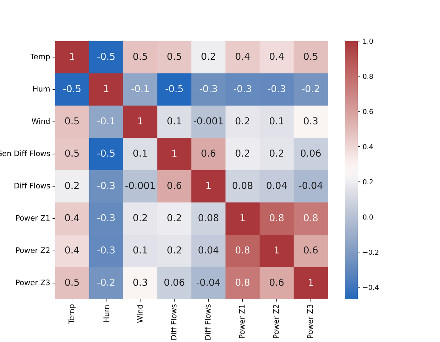
Let’s take analyze the general trends of the factors compared to power consumption:
Temperatureis positively correlated to all the power consumption zones. Higher use of air conditioning could be a possible explanation for this.Humidityon the other hand, shows a slight negative correlation with the power consumption of all three areasPower Z1,Power Z2, andPower Z3show a high correlation between each other. This suggests there is a slight difference in the consumption patterns of all the areas but they all tend to increase and decrease together.
Feature Creation
From this point on, I sourced the majority of the code from a Kaggle Notebook published by Kaggle’s grandmaster Rob Mulla [4] and adapted it to my case. I definitely recommend taking a look at his great work.
As the section title suggests, feature creation combined with EDA represents the third step. In time series analysis and forecasting, “time” can be the only feature you have at your disposal so it’s better to extract as much information as possible from it. The following function creates columns out of the DateTime index.
For example, at the time 1/1/2017 0:10 , the command df.index.hour will extract the value 0, since it’s midnight. df.index.dayofweek will show a 6 as January 1st, 2017 was a Sunday (numeration starts from 0), and so on.
by running the function create_features on our df, we instantly create all the features defined in the function.
def create_features(df):
"""
Create time series features based on time series index.
"""
df = df.copy()
df['hour'] = df.index.hour
df['dayofweek'] = df.index.dayofweek
df['quarter'] = df.index.quarter
df['month'] = df.index.month
df['year'] = df.index.year
df['dayofyear'] = df.index.dayofyear
df['dayofmonth'] = df.index.day
df['weekofyear'] = df.index.isocalendar().week
return dfdf = create_features(df)
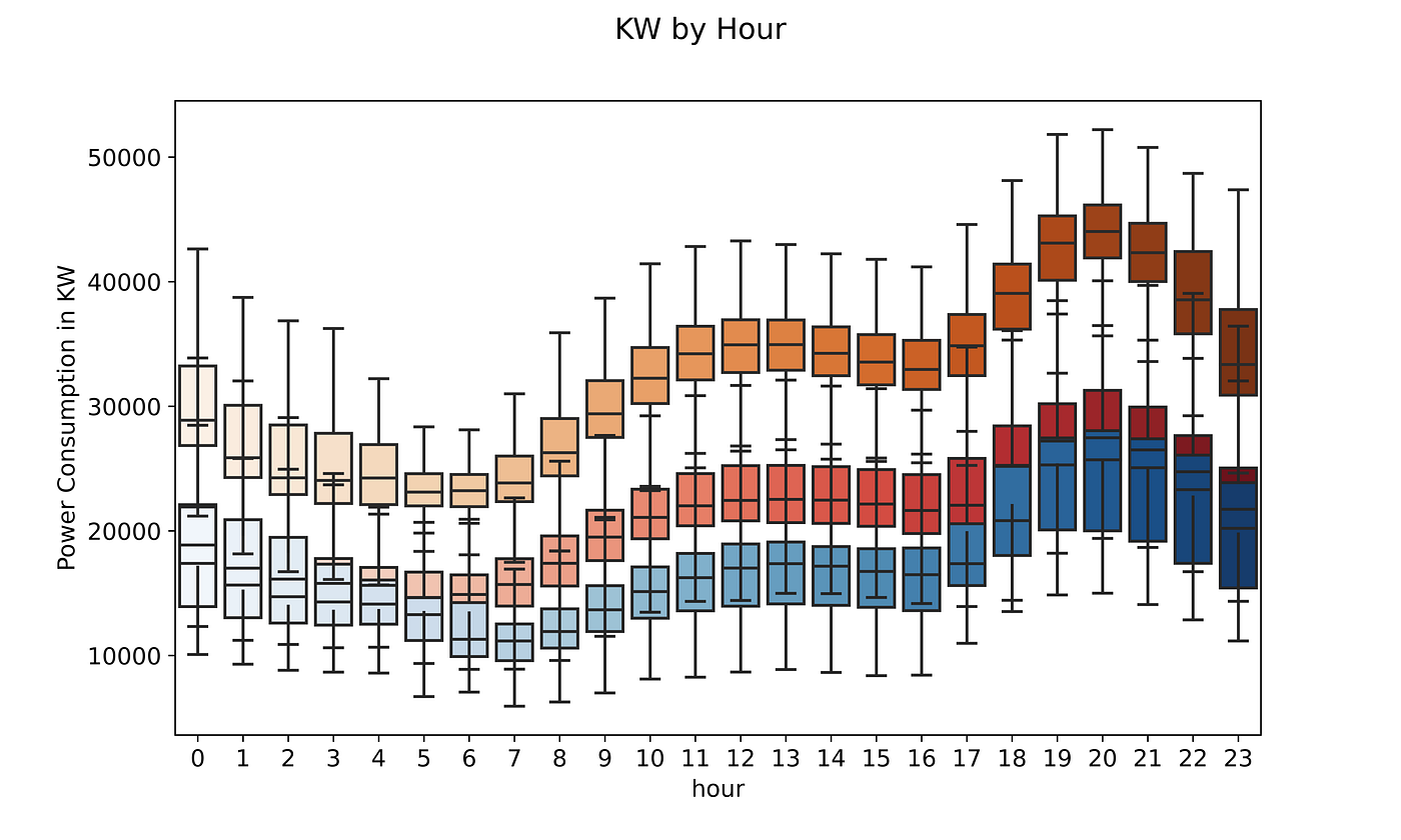
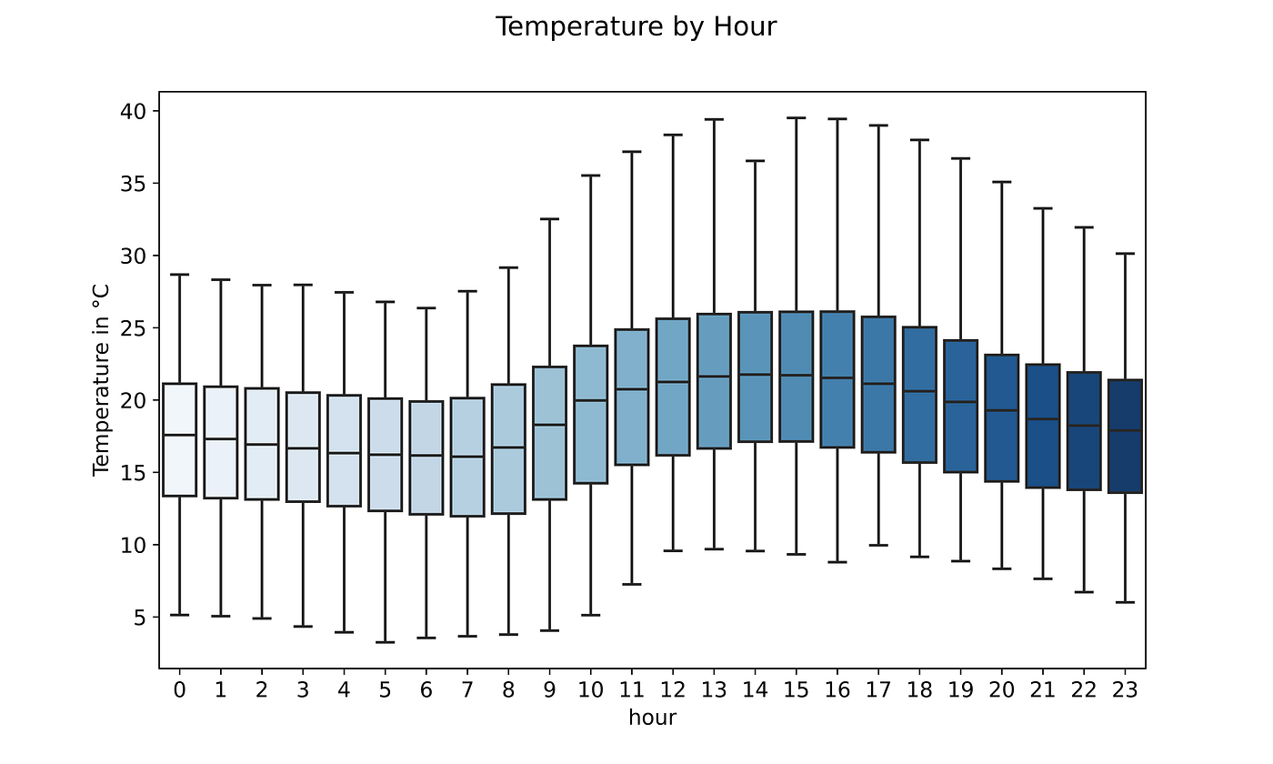
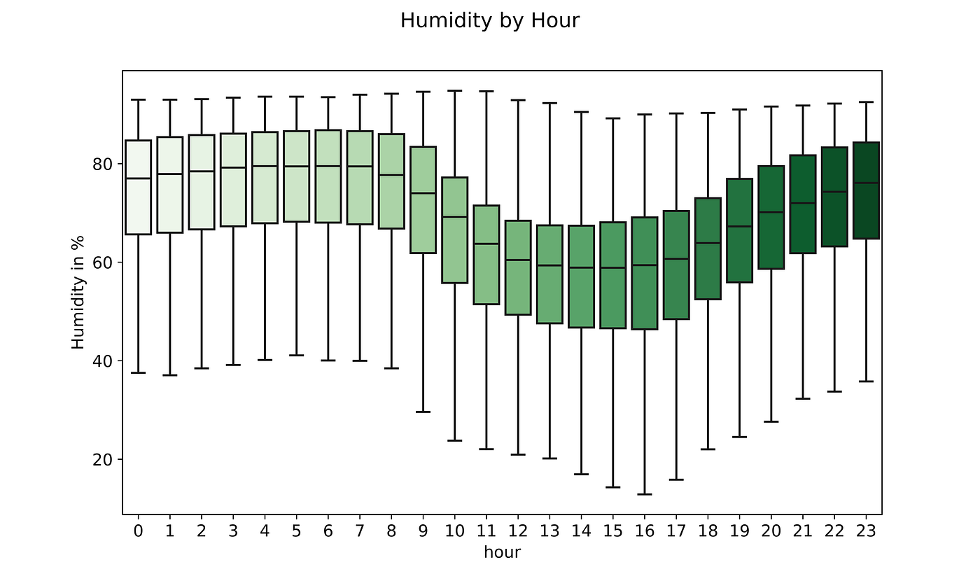
At this point, we can boxplot each feature to see the minimum, 25th percentile, average, 75th percentile, and maximum consumption by a certain timeframe.
If we plot it by hour we can see how zone 1 has a much higher average consumption compared to zone 2 and 3. On top of that, the average consumption increases during the hours in the evening for all three areas.
Temperature, as expected, shows a growth trend during the central hours of the day to then decrease in the evening. That is why only 50% of the time consumption and temperature move together. As the temperature starts to decrease in the first hours of the evening, power consumption suddenly skyrockets.
Humidity, on the other hand, increases during the colder hours and decreases during the hottest ones throughout the day.
A simple moving average (SMA) is a fundamental piece of information to smoothen our predictions. A moving average calculates the mean of all the data points in a time series in order to extract valuable information for the prediction algorithm.
#Calculating moving averagedf['SMA30'] = df['Zone 1 Power Consumption'].rolling(30).mean()
df['SMA15'] = df['Zone 1 Power Consumption'].rolling(15).mean()
One can indicate how many days to include in the SMA by using the command rolling(n_days).mean() .
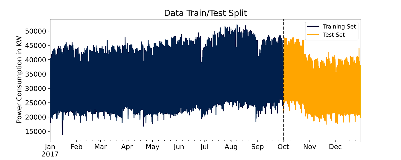
Train Test Split
At this stage, the dataset can be split between training and testing. In a normal scenario, we would randomly select new records to train the algorithm and test it on the remaining ones. In this case, it’s important to preserve a time sequence between the training and testing records.
70% of the data available is from January 1st until October 10th so that’s going to be our training set whereas from October 2nd until December 30th (the last data point available) will be our testing set.
You will notice that the Temperature ,dayofyear ,hour ,dayofweek ,SMA30 , and SMA15 columns have been selected as input for the model. Before launching the final training phase, I calculated every column’s feature importance and excluded the ones that return a value of 0. If you would like to see a project in which I applied this technique, take a look at this article for some more in-depth explanation.
I initially select only Zone 1 Power Consumption as the target variable because proceeding area by area makes more sense in this scenario, as each one has its specific electricity needs. Another way to solve the problem was to create a fourth column summing the three areas’ energy demand.
#defining input and target variableX_train = df.loc[:'10-01-2017',['Temperature','dayofyear', 'hour', 'dayofweek', 'SMA30', 'SMA15']]y_train = df.loc[:'10-01-2017', ['Zone 1 Power Consumption']]X_test = df.loc['10-01-2017':,['Temperature','dayofyear', 'hour', 'dayofweek', 'SMA30', 'SMA15']]y_test = df.loc['10-01-2017':, ['Zone 1 Power Consumption']]
From the chart, you can see electricity consumption peaks towards the end of August and reaches its lowest in January, again, I see the temperature trend playing an important role here. It is indeed one of the features we included in our model.
Predictions
To predict records in our test set the algorithm I decided to use is Gradient Boosting, I briefly explained how it works and what it does best in one of my previous articles.
Out of the hyperparameters set in the following code section, I’d say the most relevant ones are:
n_estimators: the number of learning rounds the XGBoost algorithm will try to learn from the training datamax_depth: the maximum depth a tree can have, a deeper tree is more likely to cause overfittinglearning_rate: or shrinkage factor, as new trees are created to correct residual errors, the learning rate (<1.0) “slows down” the ability of the model to fit the data and consequently learn as the number of trees increasesverbose: how often the model prints out on the console the result, we set 100 here as then_estimatorsis quite high. The default value is 1.
import xgboost as xgb
from sklearn.metrics import mean_squared_error
reg = xgb.XGBRegressor(base_score=0.5, booster='gbtree',
n_estimators=1500,
early_stopping_rounds=50,
objective='reg:linear',
max_depth=6,
learning_rate=0.03,
random_state = 48)reg.fit(X_train, y_train,
eval_set=[(X_train, y_train), (X_test, y_test)],
verbose=100)
The column we’re interested in is the right one as that RMSE value is associated with the test set, whereas the left one is associated with the training set. You can clearly see the root mean squared error quickly decreasing at each iteration until it reaches a minimum after the 600 estimators threshold.
[0]    validation_0-rmse:32788.2     validation_1-rmse:30041.3
[100]  validation_0-rmse:1909.16     validation_1-rmse:2153.27
[200]  validation_0-rmse:902.714     validation_1-rmse:2118.83
[300]  validation_0-rmse:833.652     validation_1-rmse:2061.93
[400]  validation_0-rmse:789.513     validation_1-rmse:1952.1
[500]  validation_0-rmse:761.867     validation_1-rmse:1928.96
[600]  validation_0-rmse:737.458     validation_1-rmse:1920.88
[700]  validation_0-rmse:712.632     validation_1-rmse:1921.39
[800]  validation_0-rmse:694.613     validation_1-rmse:1920.75
[900]  validation_0-rmse:676.772     validation_1-rmse:1917.38
[1000] validation_0-rmse:662.595     validation_1-rmse:1920.73
[1100] validation_0-rmse:647.64      validation_1-rmse:1925.71
[1200] validation_0-rmse:634.896     validation_1-rmse:1927.89
[1300] validation_0-rmse:620.82      validation_1-rmse:1932.68
[1400] validation_0-rmse:609.903     validation_1-rmse:1937.36
[1499] validation_0-rmse:599.637     validation_1-rmse:1935.59XGBRegressor(early_stopping_rounds=50, learning_rate=0.03, max_depth=6,n_estimators=1500, random_state=48)
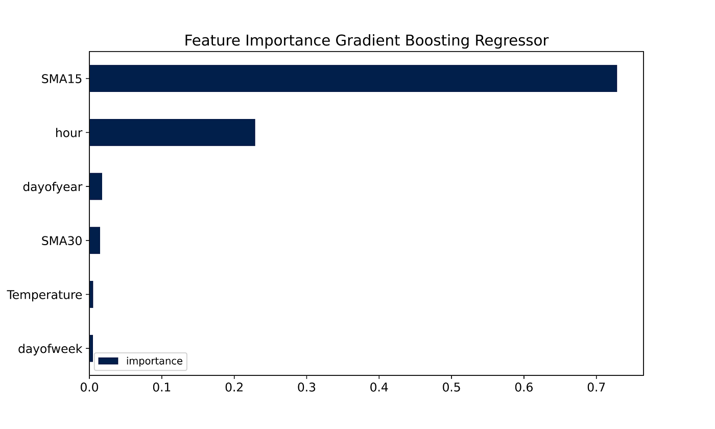
By plotting the importance each feature played in predicting the correct result we can clearly notice some relevant patterns.
fi = pd.DataFrame(data=reg.feature_importances_,
index=X_train.columns,
columns=['importance'])
The two most important factors are the 15-day SMA and the hour of that specific measurement. The temperature, as expected, is the only external factor that is relatively significant to predict energy consumption. As anticipated, all other factors in the initial dataset played virtually no role in the forecasting portion of the project, their importance was in fact 0.
We can finally see the overall performance of the model once I merge it back with the initial dataset.
y_test = pd.DataFrame(y_test)
y_test['prediction'] = reg.predict(X_test)
df = df.merge(y_test[['prediction']], how='left', left_index=True, right_index=True)
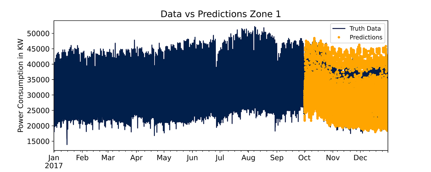
Overall, predictions follow the typical downtrend of the cold season even though the model has some trouble identifying the peaks in November and December.
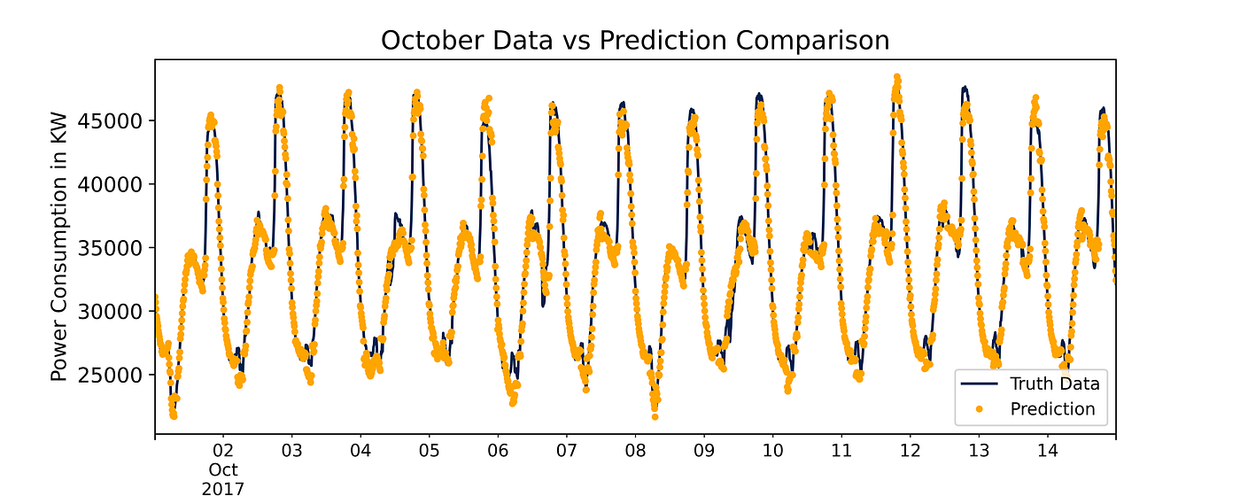
If we zoom into the first 15 days of October we can clearly see how close the predictions are to the test data for that month.
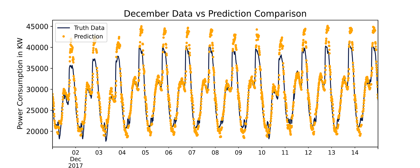
But in December, peak predictions are far away from the actual records. This can be improved in future models by either tuning hyperparameters or improving feature engineering, along with many other options.
And the accuracy metrics highlight the good but not excellent performance of the regressor. R² indicates the percentage of the variability observed in the target variable that is explained by the regression model. In this case, 91% of the observed data can be explained by the model, it’s a good result.
The Mean Absolute Error (MAE) is simply calculated as the average of the absolute errors. The score tells us that the model is off 1354.63 KWs on average from the actual record, is this bad? How much does it cost to provide roughly 1300 KWs more (or less) than needed every 10 minutes in terms of electricity spending? Here’s how you evaluate whether it’s bad or not.
The Mean Squared Error (MSE) is calculated similarly to the MAE, but it adds the square to the actual vs prediction difference. Our model is good on average the MAE tells us but the MSE suggests that the model can be wrong by a lot. The squared difference tends in fact to magnify bigger mistakes the model makes by adding the weighting factor.
Finally, the Root Mean Squared Error (RMSE) is simply the squared root of the MSE. You will notice that the squared root of 3746515.40 is 1935.59. In this case, the RMSE is much more useful than the MSE. We know that 1935 is slightly higher than the MAE of 1354.63, this suggests that our model predicts well on average but tends to be “wrong” a little too much on specific records, where actual vs predicted are too far away from each other.
The ideal scenario would be to have MAE, MSE, and RMSE as close as possible to 0, but not precisely 0, we still want to avoid overfitting.
r2:                      0.9101
MAE:                  1354.6314
MSE:               3746515.4004
RMSE:                 1935.5917
I hope you enjoyed the project and that it’ll be useful for any time series analysis you need to do!
Hyperparameter tuning and feature engineering are the two major areas of improvement for future projects. On top of that, it is usually good practice to deploy a naïve regressor and therefore compare the accuracy scores with a benchmark.
Future tasks include gathering actual data on power consumption in 2018 in Tétouan and forecasting those records.
This article aims at leveraging time series analysis to predict Power Consumption in the city of Tétouan, Morocco
The project’s goal is to leverage time series analysis to predict energy consumption in 10-minute windows for the city of Tétouan in Morocco.
Context
According to a 2014 Census, Tétouan is a city in Morocco with a population of 380,000 people, occupying an area of 11,570 km². The city is located in the northern portion of the country and it faces the Mediterranean sea. The weather is particularly hot and humid during the summer.
According to the state-owned ONEE, the “National Office of Electricity and Drinking Water”, Morocco’s energy production in 2019 came primarily from coal (38%), followed by hydroelectricity (16%), fuel oil (8 %), natural gas (18%), wind (11%), solar (7%), and others (2%) [1].
Given the strong dependency on non-renewable sources (64%), forecasting energy consumption could help the stakeholders better manage purchases and stock. On top of that, Morocco’s plan is to reduce energy imports by increasing production from renewable sources. It’s common knowledge that sources like wind and solar present the risk of not being available all year round. Understanding the energy needs of the country, starting with a medium-sized city, could be a step further in planning these resources.
Data
The Supervisory Control and Data Acquisition System (SCADA) of Amendis, a public service operator, is responsible for collecting and providing the project’s power consumption data. The distribution network is powered by 3 zone stations, namely: Quads, Smir and Boussafou. The 3 zone stations power 3 different areas of the city, this is why we have three potential target variables.
The data, which you can find at this link [2][3], has 52,416 energy consumption observations in 10-minute windows starting from January 1st, 2017, all the way through December 30th (not 31st) of the same year. Some of the features are:
Date Time: Time window of ten minutes.Temperature: Weather Temperature in °CHumidity: Weather Humidity in %Wind Speed: Wind Speed in km/hZone 1 Power Consumptionin KiloWatts (KW)Zone 2 Power Consumptionin KWZone 3 Power Consumptionin KW
Importing Dataset
The very first step of virtually every data science project is importing the dataset we’ll be working with along with the libraries needed for the first sections.
The libraries needed for the data import and EDA portions of the project are certainly Pandas and NumPy, along with Matplotlib and Seaborn.
#Importing libraries
import pandas as pd
import numpy as np
import matplotlib.pyplot as plt
import seaborn as sns
We can load the data directly from the UCI machine learning repository by using the following link. If you execute the search of that same link on your browser, it initiates the file’s download.
# Load data from URL using pandas read_csv method
df = pd.read_csv('https://archive.ics.uci.edu/ml/machine-learning-databases/00616/Tetuan%20City%20power%20consumption.csv')df.head()
With the command df.head() , we can visualize all the column’s first 5 rows of the dataset. I renamed all of them to be able to fit them in the sections below.
|    | DateTime      |   Temp |   Hum |   Wind |
|---:|:--------------|-------:|------:|-------:|
|  0 | 1/1/2017 0:00 |  6.559 |  73.8 |  0.083 |
|  1 | 1/1/2017 0:10 |  6.414 |  74.5 |  0.083 |
|  2 | 1/1/2017 0:20 |  6.313 |  74.5 |  0.08  |
|  3 | 1/1/2017 0:30 |  6.121 |  75   |  0.083 |
|  4 | 1/1/2017 0:40 |  5.921 |  75.7 |  0.081 |
We notice that each feature presents only numerical values, we can therefore assume that a potential prediction task will need regression techniques and not classification.
|    |   Diff Fl |   Zone 1 PC |   Zone 2 PC |   Zone 3 PC |
|---:|----------:|------------:|------------:|------------:|
|  0 |     0.119 |     34055.7 |     16128.9 |     20241   |
|  1 |     0.085 |     29814.7 |     19375.1 |     20131.1 |
|  2 |     0.1   |     29128.1 |     19006.7 |     19668.4 |
|  3 |     0.096 |     28228.9 |     18361.1 |     18899.3 |
|  4 |     0.085 |     27335.7 |     17872.3 |     18442.4 |
As the dataset’s index is in numbers, I can use the DateTime column as my index, it’s going to be easier for the chart plotting.
#transforming DateTime column into index
df = df.set_index('DateTime')
df.index = pd.to_datetime(df.index)
The command df.set_index() allows us to substitute the current index with the DateTime column and the command pd.to_datetime() changes the new index’s format into a readable one.
Exploratory Data Analysis (EDA)
We can now focus on data exploration and visualization.
Let’s start by plotting a correlation matrix using seaborn. The correlation matrix shows us the single correlation between each feature and the others on the dataset. In general, the correlation can be:
- <0.3 and therefore weak
- between 0.3 and 0.6 and therefore moderate
- between 0.6 and 0.9 and therefore strong
- >0.9 extremely strong
The sign, on the other hand, indicates whether the two factors grow in the same direction or in the opposite one. A correlation of -0.9 indicates that as one variable increases the other decreases. Depending on the uncertainty of the environment though, the ranges can change. In quantitative finance, a 0.3 or 0.4 correlation can be considered strong.
Let’s take analyze the general trends of the factors compared to power consumption:
Temperatureis positively correlated to all the power consumption zones. Higher use of air conditioning could be a possible explanation for this.Humidityon the other hand, shows a slight negative correlation with the power consumption of all three areasPower Z1,Power Z2, andPower Z3show a high correlation between each other. This suggests there is a slight difference in the consumption patterns of all the areas but they all tend to increase and decrease together.
Feature Creation
From this point on, I sourced the majority of the code from a Kaggle Notebook published by Kaggle’s grandmaster Rob Mulla [4] and adapted it to my case. I definitely recommend taking a look at his great work.
As the section title suggests, feature creation combined with EDA represents the third step. In time series analysis and forecasting, “time” can be the only feature you have at your disposal so it’s better to extract as much information as possible from it. The following function creates columns out of the DateTime index.
For example, at the time 1/1/2017 0:10 , the command df.index.hour will extract the value 0, since it’s midnight. df.index.dayofweek will show a 6 as January 1st, 2017 was a Sunday (numeration starts from 0), and so on.
by running the function create_features on our df, we instantly create all the features defined in the function.
def create_features(df):
"""
Create time series features based on time series index.
"""
df = df.copy()
df['hour'] = df.index.hour
df['dayofweek'] = df.index.dayofweek
df['quarter'] = df.index.quarter
df['month'] = df.index.month
df['year'] = df.index.year
df['dayofyear'] = df.index.dayofyear
df['dayofmonth'] = df.index.day
df['weekofyear'] = df.index.isocalendar().week
return dfdf = create_features(df)
At this point, we can boxplot each feature to see the minimum, 25th percentile, average, 75th percentile, and maximum consumption by a certain timeframe.
If we plot it by hour we can see how zone 1 has a much higher average consumption compared to zone 2 and 3. On top of that, the average consumption increases during the hours in the evening for all three areas.
Temperature, as expected, shows a growth trend during the central hours of the day to then decrease in the evening. That is why only 50% of the time consumption and temperature move together. As the temperature starts to decrease in the first hours of the evening, power consumption suddenly skyrockets.
Humidity, on the other hand, increases during the colder hours and decreases during the hottest ones throughout the day.
A simple moving average (SMA) is a fundamental piece of information to smoothen our predictions. A moving average calculates the mean of all the data points in a time series in order to extract valuable information for the prediction algorithm.
#Calculating moving averagedf['SMA30'] = df['Zone 1 Power Consumption'].rolling(30).mean()
df['SMA15'] = df['Zone 1 Power Consumption'].rolling(15).mean()
One can indicate how many days to include in the SMA by using the command rolling(n_days).mean() .
Train Test Split
At this stage, the dataset can be split between training and testing. In a normal scenario, we would randomly select new records to train the algorithm and test it on the remaining ones. In this case, it’s important to preserve a time sequence between the training and testing records.
70% of the data available is from January 1st until October 10th so that’s going to be our training set whereas from October 2nd until December 30th (the last data point available) will be our testing set.
You will notice that the Temperature ,dayofyear ,hour ,dayofweek ,SMA30 , and SMA15 columns have been selected as input for the model. Before launching the final training phase, I calculated every column’s feature importance and excluded the ones that return a value of 0. If you would like to see a project in which I applied this technique, take a look at this article for some more in-depth explanation.
I initially select only Zone 1 Power Consumption as the target variable because proceeding area by area makes more sense in this scenario, as each one has its specific electricity needs. Another way to solve the problem was to create a fourth column summing the three areas’ energy demand.
#defining input and target variableX_train = df.loc[:'10-01-2017',['Temperature','dayofyear', 'hour', 'dayofweek', 'SMA30', 'SMA15']]y_train = df.loc[:'10-01-2017', ['Zone 1 Power Consumption']]X_test = df.loc['10-01-2017':,['Temperature','dayofyear', 'hour', 'dayofweek', 'SMA30', 'SMA15']]y_test = df.loc['10-01-2017':, ['Zone 1 Power Consumption']]
From the chart, you can see electricity consumption peaks towards the end of August and reaches its lowest in January, again, I see the temperature trend playing an important role here. It is indeed one of the features we included in our model.
Predictions
To predict records in our test set the algorithm I decided to use is Gradient Boosting, I briefly explained how it works and what it does best in one of my previous articles.
Out of the hyperparameters set in the following code section, I’d say the most relevant ones are:
n_estimators: the number of learning rounds the XGBoost algorithm will try to learn from the training datamax_depth: the maximum depth a tree can have, a deeper tree is more likely to cause overfittinglearning_rate: or shrinkage factor, as new trees are created to correct residual errors, the learning rate (<1.0) “slows down” the ability of the model to fit the data and consequently learn as the number of trees increasesverbose: how often the model prints out on the console the result, we set 100 here as then_estimatorsis quite high. The default value is 1.
import xgboost as xgb
from sklearn.metrics import mean_squared_error
reg = xgb.XGBRegressor(base_score=0.5, booster='gbtree',
n_estimators=1500,
early_stopping_rounds=50,
objective='reg:linear',
max_depth=6,
learning_rate=0.03,
random_state = 48)reg.fit(X_train, y_train,
eval_set=[(X_train, y_train), (X_test, y_test)],
verbose=100)
The column we’re interested in is the right one as that RMSE value is associated with the test set, whereas the left one is associated with the training set. You can clearly see the root mean squared error quickly decreasing at each iteration until it reaches a minimum after the 600 estimators threshold.
[0]    validation_0-rmse:32788.2     validation_1-rmse:30041.3
[100]  validation_0-rmse:1909.16     validation_1-rmse:2153.27
[200]  validation_0-rmse:902.714     validation_1-rmse:2118.83
[300]  validation_0-rmse:833.652     validation_1-rmse:2061.93
[400]  validation_0-rmse:789.513     validation_1-rmse:1952.1
[500]  validation_0-rmse:761.867     validation_1-rmse:1928.96
[600]  validation_0-rmse:737.458     validation_1-rmse:1920.88
[700]  validation_0-rmse:712.632     validation_1-rmse:1921.39
[800]  validation_0-rmse:694.613     validation_1-rmse:1920.75
[900]  validation_0-rmse:676.772     validation_1-rmse:1917.38
[1000] validation_0-rmse:662.595     validation_1-rmse:1920.73
[1100] validation_0-rmse:647.64      validation_1-rmse:1925.71
[1200] validation_0-rmse:634.896     validation_1-rmse:1927.89
[1300] validation_0-rmse:620.82      validation_1-rmse:1932.68
[1400] validation_0-rmse:609.903     validation_1-rmse:1937.36
[1499] validation_0-rmse:599.637     validation_1-rmse:1935.59XGBRegressor(early_stopping_rounds=50, learning_rate=0.03, max_depth=6,n_estimators=1500, random_state=48)
By plotting the importance each feature played in predicting the correct result we can clearly notice some relevant patterns.
fi = pd.DataFrame(data=reg.feature_importances_,
index=X_train.columns,
columns=['importance'])
The two most important factors are the 15-day SMA and the hour of that specific measurement. The temperature, as expected, is the only external factor that is relatively significant to predict energy consumption. As anticipated, all other factors in the initial dataset played virtually no role in the forecasting portion of the project, their importance was in fact 0.
We can finally see the overall performance of the model once I merge it back with the initial dataset.
y_test = pd.DataFrame(y_test)
y_test['prediction'] = reg.predict(X_test)
df = df.merge(y_test[['prediction']], how='left', left_index=True, right_index=True)
Overall, predictions follow the typical downtrend of the cold season even though the model has some trouble identifying the peaks in November and December.
If we zoom into the first 15 days of October we can clearly see how close the predictions are to the test data for that month.
But in December, peak predictions are far away from the actual records. This can be improved in future models by either tuning hyperparameters or improving feature engineering, along with many other options.
And the accuracy metrics highlight the good but not excellent performance of the regressor. R² indicates the percentage of the variability observed in the target variable that is explained by the regression model. In this case, 91% of the observed data can be explained by the model, it’s a good result.
The Mean Absolute Error (MAE) is simply calculated as the average of the absolute errors. The score tells us that the model is off 1354.63 KWs on average from the actual record, is this bad? How much does it cost to provide roughly 1300 KWs more (or less) than needed every 10 minutes in terms of electricity spending? Here’s how you evaluate whether it’s bad or not.
The Mean Squared Error (MSE) is calculated similarly to the MAE, but it adds the square to the actual vs prediction difference. Our model is good on average the MAE tells us but the MSE suggests that the model can be wrong by a lot. The squared difference tends in fact to magnify bigger mistakes the model makes by adding the weighting factor.
Finally, the Root Mean Squared Error (RMSE) is simply the squared root of the MSE. You will notice that the squared root of 3746515.40 is 1935.59. In this case, the RMSE is much more useful than the MSE. We know that 1935 is slightly higher than the MAE of 1354.63, this suggests that our model predicts well on average but tends to be “wrong” a little too much on specific records, where actual vs predicted are too far away from each other.
The ideal scenario would be to have MAE, MSE, and RMSE as close as possible to 0, but not precisely 0, we still want to avoid overfitting.
r2:                      0.9101
MAE:                  1354.6314
MSE:               3746515.4004
RMSE:                 1935.5917
I hope you enjoyed the project and that it’ll be useful for any time series analysis you need to do!
Hyperparameter tuning and feature engineering are the two major areas of improvement for future projects. On top of that, it is usually good practice to deploy a naïve regressor and therefore compare the accuracy scores with a benchmark.
Future tasks include gathering actual data on power consumption in 2018 in Tétouan and forecasting those records.
Denial of responsibility! Techno Blender is an automatic aggregator of the all world’s media. In each content, the hyperlink to the primary source is specified. All trademarks belong to their rightful owners, all materials to their authors. If you are the owner of the content and do not want us to publish your materials, please contact us by email – [email protected]. The content will be deleted within 24 hours.