
Two Methods for Performing Graphical Residuals Analysis | by Federico Trotta | May, 2022
A couple of techniques to guess if you can use or not a linear model in your ML problem
An essential part of a regression analysis is to understand if we can use a linear model or not for solving our ML problem. There are many ways to do this, and, generally, we have to use multiple ways to understand if our data are really linear distributed.
In this article, we will see two different graphical methods for analyzing the residuals in a regression problem: but those are just two methods useful for understanding if our data are linearly distributed.
You can use just one of these methods, or even both, but you will need the help of other metrics to better validate your hypothesis (the model to be used is linear): we’ll see other methods in future articles.
But first of all…what are the residuals in a regression problem?
A good idea when performing a regression analysis is to check first for its linearity. When we perform a simple linear regression analysis we get the so-called “line of best fit” which is the line that best approximates the data we are studying. Generally, the line that “best fits” the data is calculated with the Ordinary Least Squares method. There are many ways to find the line that best fits the data; one, for example, is to use one regularization method (if you want to deepen the concepts behind regularization, you can read my explanation here).
Let’s consider we apply the simple linear regression formula to our data; what usually happens is that the data points don’t fall exactly on the regression line (even if we use one of the two regularized methods); they are scattered around our “best fitted” line. In this scenario, we call residual the vertical distance between a data point and the regression line. Thus, the residuals can be:
- Positive if they are above the regression line
- Negative if they are below the regression line
- Zero if the regression line actually passes through the point
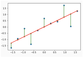
So, residuals can also be seen as the difference between any data point and the regression line, and, for this reason, they are sometimes called “errors”. Error, in this context, doesn’t mean that there’s something wrong with the analysis: it just means that there is some unexplained difference.
Now, let’s see how we can graphically represent residuals and how we can interpret these graphs.
One of the graphs related to the residuals we may be interested in is the “Residuals VS Predicted values” plot. This kind of graph has to be plotted when we have predicted the values with our linear model.
I’m taking the following code from one of my projects. Let’s say we have our values predicted by our linear model: we want to plot the “residuals vs predicted” graphs; we can do it with this code:
import matplotlib.pyplot as plt
import seaborn as sns#figure size
plt.figure(figsize=(10, 7))#residual plot (y_test and Y_test_pred already calculated)
sns.residplot(x=y_test, y=y_test_pred)#labeling
plt.title('REDISUALS VS PREDICTED VALUES')
plt.xlabel('PREDICTED VALUES (DIABETES PROGRESSION)')
plt.ylabel('REDISUALS')
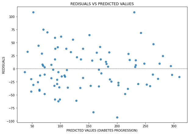
What can we say about this plot?
The residuals are randomly distributed (there is no clear pattern in the plot above), which tells us that the (linear) model chosen is not bad, but there are too many high values of the residuals (even over 100) which means that the errors of the model are high.
A plot like that can give us the perception that we can apply a linear model for solving our ML problem. In the specific case of the project, I could not(if you want to deepen it you can read part I of my study and part II), and this is why I wrote above that we need to “integrate” these plots with other metrics, before declaring the data are really linear distributed.
Is there a way by which the residuals can warn us the linear model we are applying is not a good choice? Let’s say you find a graph like that:
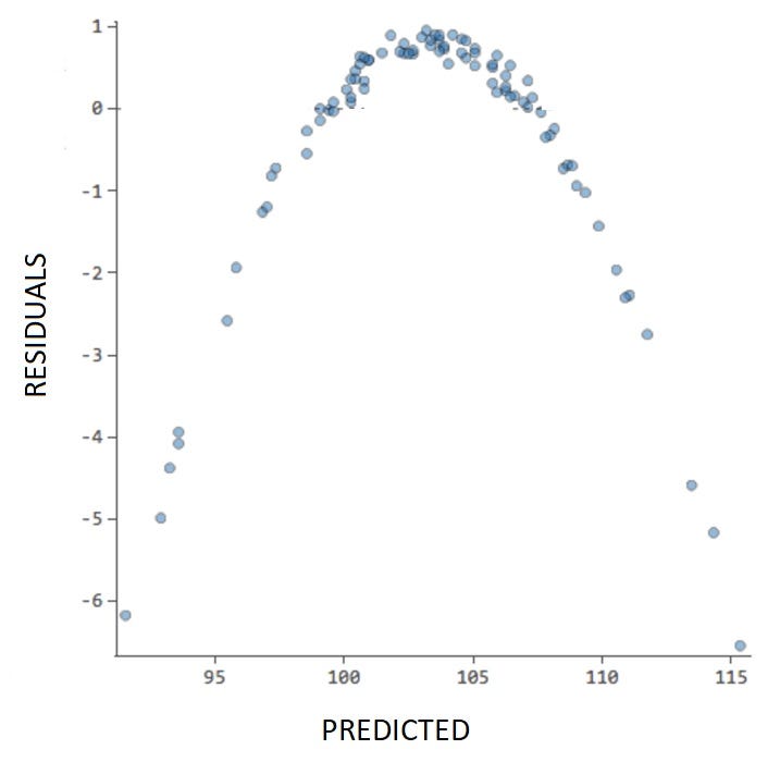
In this case, the plot shows a clear pattern (a parable) and it indicates to us that the linear model is probably not a good choice for this ML problem.
Summarizing:
This kind of plot can give us an intuition about whether we can use the linear model for our regression analysis or not. If the plots show no particular pattern, it is probable we can use a linear model; if there is a particular pattern, it’s probable we should try a different ML model. In any case, after this plot, we must use other metrics to validate our initial intuition.
The QQ Plot is the “Quantile-Quantile” plot and is a graphical method for comparing two probability distributions by plotting their quantiles against each other.
Let’s say we have our data (called “data”) to plot in a qq-plot; we can do it with the following code:
import statsmodels.api as sm
import pylab
#qq-plot
sm.qqplot(data, line='45')#showing plot
pylab.show()
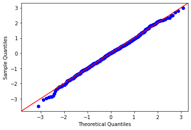
If the result shows us the residuals are distributed around a line, just like in the plot above, then there are good possibilities that we can use a linear model to solve our ML problem. But, again: we’ll need other metrics to confirm this initial intuition.
As we are performing a regression analysis, a good idea is to first test for ist linearity. The first thing we have to do is calculate some metrics (for example, R² and MSE) and get the first intuition on the problem, trying to understand if we can use a linear model to solve it; then, we can use one (or both) of the plots we have seen in this article to strengthen (or not!) our initial intuition; then, we have to use other methods to finally decide if we can apply a linear model to our problem or not (but we’ll see these methods in another article).
A couple of techniques to guess if you can use or not a linear model in your ML problem

An essential part of a regression analysis is to understand if we can use a linear model or not for solving our ML problem. There are many ways to do this, and, generally, we have to use multiple ways to understand if our data are really linear distributed.
In this article, we will see two different graphical methods for analyzing the residuals in a regression problem: but those are just two methods useful for understanding if our data are linearly distributed.
You can use just one of these methods, or even both, but you will need the help of other metrics to better validate your hypothesis (the model to be used is linear): we’ll see other methods in future articles.
But first of all…what are the residuals in a regression problem?
A good idea when performing a regression analysis is to check first for its linearity. When we perform a simple linear regression analysis we get the so-called “line of best fit” which is the line that best approximates the data we are studying. Generally, the line that “best fits” the data is calculated with the Ordinary Least Squares method. There are many ways to find the line that best fits the data; one, for example, is to use one regularization method (if you want to deepen the concepts behind regularization, you can read my explanation here).
Let’s consider we apply the simple linear regression formula to our data; what usually happens is that the data points don’t fall exactly on the regression line (even if we use one of the two regularized methods); they are scattered around our “best fitted” line. In this scenario, we call residual the vertical distance between a data point and the regression line. Thus, the residuals can be:
- Positive if they are above the regression line
- Negative if they are below the regression line
- Zero if the regression line actually passes through the point
So, residuals can also be seen as the difference between any data point and the regression line, and, for this reason, they are sometimes called “errors”. Error, in this context, doesn’t mean that there’s something wrong with the analysis: it just means that there is some unexplained difference.
Now, let’s see how we can graphically represent residuals and how we can interpret these graphs.
One of the graphs related to the residuals we may be interested in is the “Residuals VS Predicted values” plot. This kind of graph has to be plotted when we have predicted the values with our linear model.
I’m taking the following code from one of my projects. Let’s say we have our values predicted by our linear model: we want to plot the “residuals vs predicted” graphs; we can do it with this code:
import matplotlib.pyplot as plt
import seaborn as sns#figure size
plt.figure(figsize=(10, 7))#residual plot (y_test and Y_test_pred already calculated)
sns.residplot(x=y_test, y=y_test_pred)#labeling
plt.title('REDISUALS VS PREDICTED VALUES')
plt.xlabel('PREDICTED VALUES (DIABETES PROGRESSION)')
plt.ylabel('REDISUALS')
What can we say about this plot?
The residuals are randomly distributed (there is no clear pattern in the plot above), which tells us that the (linear) model chosen is not bad, but there are too many high values of the residuals (even over 100) which means that the errors of the model are high.
A plot like that can give us the perception that we can apply a linear model for solving our ML problem. In the specific case of the project, I could not(if you want to deepen it you can read part I of my study and part II), and this is why I wrote above that we need to “integrate” these plots with other metrics, before declaring the data are really linear distributed.
Is there a way by which the residuals can warn us the linear model we are applying is not a good choice? Let’s say you find a graph like that:
In this case, the plot shows a clear pattern (a parable) and it indicates to us that the linear model is probably not a good choice for this ML problem.
Summarizing:
This kind of plot can give us an intuition about whether we can use the linear model for our regression analysis or not. If the plots show no particular pattern, it is probable we can use a linear model; if there is a particular pattern, it’s probable we should try a different ML model. In any case, after this plot, we must use other metrics to validate our initial intuition.
The QQ Plot is the “Quantile-Quantile” plot and is a graphical method for comparing two probability distributions by plotting their quantiles against each other.
Let’s say we have our data (called “data”) to plot in a qq-plot; we can do it with the following code:
import statsmodels.api as sm
import pylab
#qq-plot
sm.qqplot(data, line='45')#showing plot
pylab.show()
If the result shows us the residuals are distributed around a line, just like in the plot above, then there are good possibilities that we can use a linear model to solve our ML problem. But, again: we’ll need other metrics to confirm this initial intuition.
As we are performing a regression analysis, a good idea is to first test for ist linearity. The first thing we have to do is calculate some metrics (for example, R² and MSE) and get the first intuition on the problem, trying to understand if we can use a linear model to solve it; then, we can use one (or both) of the plots we have seen in this article to strengthen (or not!) our initial intuition; then, we have to use other methods to finally decide if we can apply a linear model to our problem or not (but we’ll see these methods in another article).
Denial of responsibility! Techno Blender is an automatic aggregator of the all world’s media. In each content, the hyperlink to the primary source is specified. All trademarks belong to their rightful owners, all materials to their authors. If you are the owner of the content and do not want us to publish your materials, please contact us by email – [email protected]. The content will be deleted within 24 hours.