Two Quick Code Snippets for Animated Plots | by Gustavo Santos | Jul, 2022
Use the libraries plotly or gif to create animated plots in Python
It is not the first time I post about Data Visualization. It is certainly something that calls my attention. I love visualizing the data while exploring a new dataset because I believe that our brain was designed to capture much more information from images that it can from text or numbers.
I am certain that is not just me who thinks that way. MIT scientists found out that our brain can identify images seen for a little as 13 milliseconds! Can you believe that? I doubt that the same can be done with text or numbers.
Well, just think about a magazine. What draws your eyes attention first? The pictures or infographics or the text? I will leave that thought to you, though.
Animated
Coming back to the topic, there are plenty of libraries for plotting graphics in Python. Matplotlib, Seaborn, Bokeh, Plotly and the list goes on and on. I have even written here a full post on why you should explore and use more plotly express for exploration of data due to its amazing interactivity.
Ok, but what else can we do to make our presentation even more impactful?
The option that I want to put on the table is animated plots. One thing I can tell you, they cause impact at first sight. I stop every single time to look at those when I see one on LinkedIn. I think they tell the story so well in some cases.
Obviously, it is a matter of audience and message to be sent. Not every graphic or dataset is suited for animated plots. This is an evaluation that you should do for your project and presentation. I think they work pretty well for time series. How is the line created throughout the months, for example.
Plotly Express
Let’s code now. The first option to create an animated plot is using one of my favorite Python libs: Plotly Express.
import plotly.express as px
import pandas as pd
import numpy as np
Let’s create some values in a dataset.
# create dataframe
df = pd.DataFrame( {'week': np.random.randint(1,21, size=200),
'P1': np.random.randint(10,220, size=200),
'P2': np.random.randint(15,200, size=200),
'P3': np.random.randint(10,490, size=200),
'P4': np.random.randint(10,980, size=200) } )df = df.melt(id_vars='week', var_name= 'product', value_vars= df.columns[1:], value_name='sales')
df = df.groupby(['week', 'product']).sales.mean().reset_index()
df = df.sort_values(by=['week', 'product', 'sales'])
Now we can plot an animated bar plot to check the changes by product by week.
# Animated graphicfig = px.bar(df, x="product", y="sales", color="product",
animation_frame="week", animation_group="product", range_y=[0,750])
fig.update_layout(height=600, width=800)
fig.show()
It is equally easy to create an animated scatterplot.
fig = px.scatter(df, x="week", y="sales", animation_frame="week", animation_group="product", size="sales", color="product", hover_name="product", range_x=[0,20], range_y=[0,800])fig.update_layout(height=600, width=1000)
gif Library
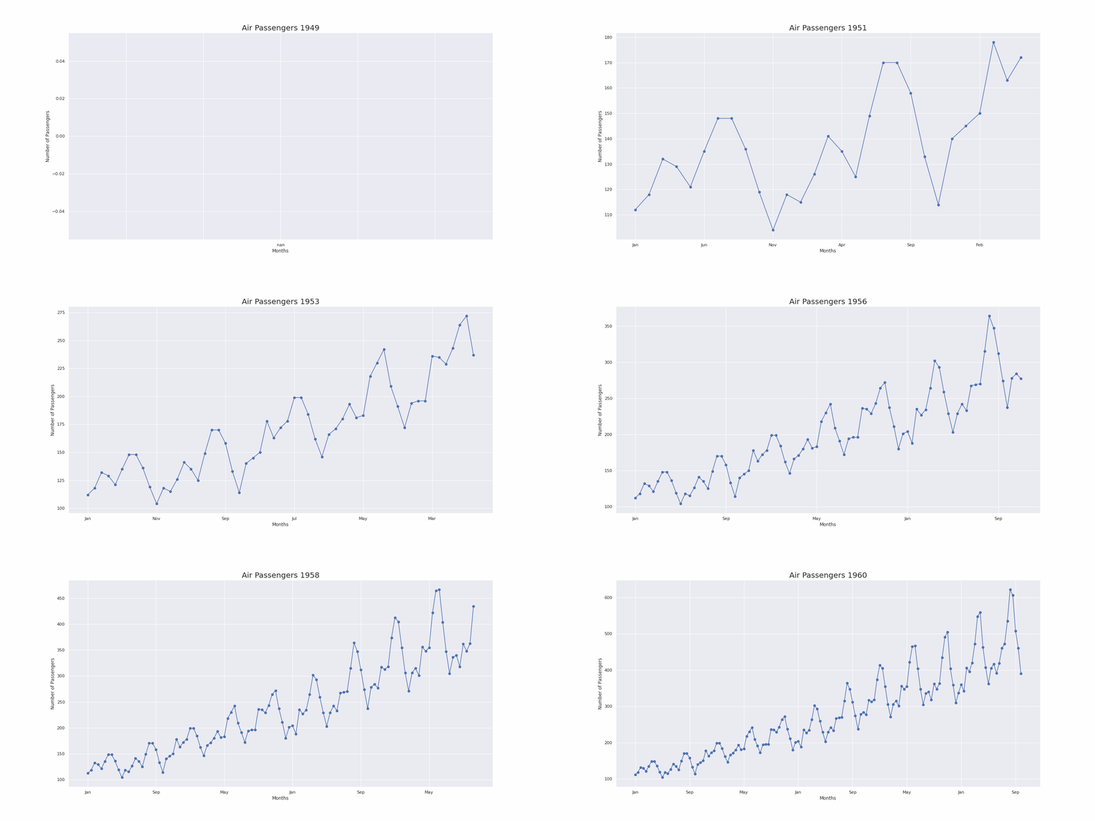
The second way to create an animated plot is using the gif library. What this lib does is to create a series of plots and put them in a frame sequence, creating an animated gif image.
First, let’s get some time series data for plotting. We’re using the famous Air Passengers dataset, an open data that we can get directly from the seaborn library.
import seaborn as sns
df = sns.load_dataset('flights')
Next, we create a function that will create one plot per observation.
# Create a plot function to create the frames@gif.frame
def plot_flights(df, i):
df = df.copy()
# Get the year for the plot title
yr = df['year'][i]
# Force X axis to be entirely plotted at once
df.iloc[i:] = np.nan
#Plot
ax = df.plot(x='month', y= 'passengers', legend=False,
style="o-", figsize=(20,10))
ax.set_title(f"Air Passengers {yr}", size=20)
ax.set_xlabel("Months")
ax.set_ylabel("Number of Passengers")
@gif.frameis a decorator used by thegiflibrary to create the sequence of frames.df.iloc[i:] = np.nanwill transform all the future observations to NA. This is a programmatic way to plot only one value at a time (i=0 all NAs, i=1, only index 0 is plotted, i=2, only 0 and 1 are plotted…) and still have the X axis plotted from end-to-end, so it does not change during the animation. The plot size will remain the same, making it easier to watch.
Now we create a loop to create the frames, using the function.
# Build the gif "frames"frames = []
for i in range(df.shape[0]):
frame = plot_flights(df, i)
frames.append(frame)
And finally, save the resulting GIF image.
# Choose the duration between frames (milliseconds) and save to file:gif.save(frames, 'gif_example.gif', duration=180)

Before You Go
Animated plots are a impactful resource for a good presentation. Like we showed here, time series, bar plots and scatterplots are easy to be created.
However, not all the plots are suitable to be animated. You should be aware of the best situation when to use animation. Not all publics will enjoy that as well, since the animated graphics are not the best for in depth analysis, for example, when you need a static image to look, compare and understand.
To create animated line plots, I suggest you to use thegif library, since it appears to be easier to code than plotly, for this graphic type. If you check the documentation, you will see that animated line plots require a little more coding using dash modules. For bar and scatter, on the other hand, gor for plotly.express without a doubt.
Reference
If this content is useful to you, follow my blog for more.
And consider subscribing to Medium, if you’d like to read plently of good content. You can use this referral code.
Use the libraries plotly or gif to create animated plots in Python

It is not the first time I post about Data Visualization. It is certainly something that calls my attention. I love visualizing the data while exploring a new dataset because I believe that our brain was designed to capture much more information from images that it can from text or numbers.
I am certain that is not just me who thinks that way. MIT scientists found out that our brain can identify images seen for a little as 13 milliseconds! Can you believe that? I doubt that the same can be done with text or numbers.
Well, just think about a magazine. What draws your eyes attention first? The pictures or infographics or the text? I will leave that thought to you, though.
Animated
Coming back to the topic, there are plenty of libraries for plotting graphics in Python. Matplotlib, Seaborn, Bokeh, Plotly and the list goes on and on. I have even written here a full post on why you should explore and use more plotly express for exploration of data due to its amazing interactivity.
Ok, but what else can we do to make our presentation even more impactful?
The option that I want to put on the table is animated plots. One thing I can tell you, they cause impact at first sight. I stop every single time to look at those when I see one on LinkedIn. I think they tell the story so well in some cases.
Obviously, it is a matter of audience and message to be sent. Not every graphic or dataset is suited for animated plots. This is an evaluation that you should do for your project and presentation. I think they work pretty well for time series. How is the line created throughout the months, for example.
Plotly Express
Let’s code now. The first option to create an animated plot is using one of my favorite Python libs: Plotly Express.
import plotly.express as px
import pandas as pd
import numpy as np
Let’s create some values in a dataset.
# create dataframe
df = pd.DataFrame( {'week': np.random.randint(1,21, size=200),
'P1': np.random.randint(10,220, size=200),
'P2': np.random.randint(15,200, size=200),
'P3': np.random.randint(10,490, size=200),
'P4': np.random.randint(10,980, size=200) } )df = df.melt(id_vars='week', var_name= 'product', value_vars= df.columns[1:], value_name='sales')
df = df.groupby(['week', 'product']).sales.mean().reset_index()
df = df.sort_values(by=['week', 'product', 'sales'])
Now we can plot an animated bar plot to check the changes by product by week.
# Animated graphicfig = px.bar(df, x="product", y="sales", color="product",
animation_frame="week", animation_group="product", range_y=[0,750])
fig.update_layout(height=600, width=800)
fig.show()
It is equally easy to create an animated scatterplot.
fig = px.scatter(df, x="week", y="sales", animation_frame="week", animation_group="product", size="sales", color="product", hover_name="product", range_x=[0,20], range_y=[0,800])fig.update_layout(height=600, width=1000)
gif Library
The second way to create an animated plot is using the gif library. What this lib does is to create a series of plots and put them in a frame sequence, creating an animated gif image.
First, let’s get some time series data for plotting. We’re using the famous Air Passengers dataset, an open data that we can get directly from the seaborn library.
import seaborn as sns
df = sns.load_dataset('flights')
Next, we create a function that will create one plot per observation.
# Create a plot function to create the frames@gif.frame
def plot_flights(df, i):
df = df.copy()
# Get the year for the plot title
yr = df['year'][i]
# Force X axis to be entirely plotted at once
df.iloc[i:] = np.nan
#Plot
ax = df.plot(x='month', y= 'passengers', legend=False,
style="o-", figsize=(20,10))
ax.set_title(f"Air Passengers {yr}", size=20)
ax.set_xlabel("Months")
ax.set_ylabel("Number of Passengers")
@gif.frameis a decorator used by thegiflibrary to create the sequence of frames.df.iloc[i:] = np.nanwill transform all the future observations to NA. This is a programmatic way to plot only one value at a time (i=0 all NAs, i=1, only index 0 is plotted, i=2, only 0 and 1 are plotted…) and still have the X axis plotted from end-to-end, so it does not change during the animation. The plot size will remain the same, making it easier to watch.
Now we create a loop to create the frames, using the function.
# Build the gif "frames"frames = []
for i in range(df.shape[0]):
frame = plot_flights(df, i)
frames.append(frame)
And finally, save the resulting GIF image.
# Choose the duration between frames (milliseconds) and save to file:gif.save(frames, 'gif_example.gif', duration=180)

Before You Go
Animated plots are a impactful resource for a good presentation. Like we showed here, time series, bar plots and scatterplots are easy to be created.
However, not all the plots are suitable to be animated. You should be aware of the best situation when to use animation. Not all publics will enjoy that as well, since the animated graphics are not the best for in depth analysis, for example, when you need a static image to look, compare and understand.
To create animated line plots, I suggest you to use thegif library, since it appears to be easier to code than plotly, for this graphic type. If you check the documentation, you will see that animated line plots require a little more coding using dash modules. For bar and scatter, on the other hand, gor for plotly.express without a doubt.
Reference
If this content is useful to you, follow my blog for more.
And consider subscribing to Medium, if you’d like to read plently of good content. You can use this referral code.
