
Visualisation 101: Choosing the Best Visualisation Type
Comprehensive guide for different visualisation use cases
I believe that the primary goal of analysts is to help their product teams make the right decisions based on data. It means that the main result of analysts’ work is not just getting some numbers or dashboards but influencing reasonable data-driven decisions. So, presenting the results of our research is a critical part of analysts’ day-to-day work.
Have you ever experienced not noticing some obvious anomaly until you create a graph? You are not alone. Almost nobody can extract insights from dry tables of numbers. That’s why we need visualisations to unveil the insights in the data. Serving as a bridge between data and product teams, a data analyst needs to excel in visualisation.
That’s why I would like to discuss data visualisations and start with the framework to choose the most suitable chart type for your use case.
Why do we need visualisations?
It might be tempting to look at data just using summary statistics. You can compare datasets by mean values and variance and not look at data at all. However, it might lead to misinterpretations of your data and wrong decisions.
One of the most famous examples is Anscombe’s quartet. It was created by statistician Francis Anscombe, and it consists of 4 data sets with almost equal descriptive statistics: means, variances and correlations. But when we look at the data, we can see how different the datasets are.

You can find more mind-blowing examples (even a dinosaur) with the same descriptive statistics here.
This example clearly shows how outliers can skew your summary statistics and why we need to visualise our data.
Besides outliers, visualisations are also a better way to present the results of your research. Graphs are more easily comprehensible and have the ability to consolidate a substantial amount of data. So, it’s an essential domain for analysts to pay attention to.
Context is a starting point
When we start to think about visualisation for our task, we need to define its primary goal or the context for the visualisation.
There are two significant use cases for creating charts: exploratory and explanatory analytics.
Exploratory visualisations are your “private talk” with data when trying to find insights and understand the internal structure. For such visualisations, you might pay less attention to design and details, i.e., omit titles or not use consistent colour schemes across charts, since these visualisations are only for your eyes.
I usually start with a bunch of quick chart prototypes. However, even in this case, you still need to think about the most suitable chart type. Proper visualisation can help you find insights, while the wrong one can hide the clues. So, choose wisely.
Explanatory visualisations are intended to convey information to your audience. In this case, you need to focus more on details and the context to achieve your goal.
When I am working on explanatory visualisations, I usually think about the following questions to define my goal crystal-clearly:
- Who is my audience? What context do they have? What information do I need to explain to them? What are they interested in?
- What do I want to achieve? What concerns my audience might have? What information can I show them to achieve my goal?
- Am I showing the whole picture? Do I need to look at the question from the other point of view to give all the information for the audience to make an informed decision?
Also, your decisions on visualisation might depend on the medium, whether you will make a live presentation or just send it in Slack or via e-mail. Here are a couple of examples:
- In the case of a live presentation, you can have fewer comments on charts since you can talk about all the needed context, while in an e-mail, it’s better to provide all the details.
- A table with many numbers won’t work for live presentations since the slide with so much information might distract the audience from your speech. At the same time, it’s absolutely okay for written communication when the audience can go through all the numbers at their own pace.
So, when choosing a chart type, we shouldn’t think about visualisations in isolation. We need to consider our primary goal and audience. Please keep it in mind.
The perception of visualisation
How many different types of charts do you know? I bet you can name quite a few of them: linear charts, bar charts, Sankey diagrams, heat maps, box plots, bubble charts, etc. But have you ever thought about visualisations more granularly: what are the building blocks, and how are they perceived by your readers?
William S. Cleveland and Robert McGill investigated this question in their article “Graphical Perception: Theory, Experimentation, and Application to the Development of Graphical Methods” in the Journal of American Statistical Association, September 1984. This article focuses on visual perception — the ability to decode information presented in a chart. The authors identified a set of building blocks for visualisations — visual encodings — for example, position, length, area or colour saturation. No surprise, different visual encodings have different levels of difficulty for people to interpret.
The authors tried to hypothesise and test these hypotheses via experiments on how accurately people can extract information from the graph depending on the elements used. Their goal was to test how valid people’s judgements are.
They used previous psychological research and experiments to rank different visualisation building blocks from the most accurate to the least. Here’s the list:
- position — for example, scatter plot;
- length — for example, bar chart;
- direction or slope — for example, line chart;
- angle— for example, pie chart;
- area — for example, bubble chart;
- volume — 3D chart;
- colour hue and saturation — for example, heat map.
I’ve highlighted only the most common elements from the article for analytical day-to-day tasks.
As we discussed earlier, the primary goal of visualisation is to convey information, and we need to focus on our audience and how they perceive the message. So, we are interested in people’s correct understanding. That’s why I usually try to use visual encodings from the top of the list since they are easier for people to interpret.
Tools for visualisations
We will see many chart examples below, so let’s quickly discuss the tools I use for it.
There are lots of options for visualisation:
- Excel or Google Sheet,
- BI tools like Tableau or Superset,
- Libraries in Python or R.
In most cases, I prefer using the Plotly library for Python since it allows you to create nicely-looking interactive charts easily. In rare cases, I use Matplotlib or Seaborn. For example, I prefer Matplotlib for histograms (as you will see below) because, by default, it gives me exactly what I need, while this is not the case with Plotly.
Now, let’s jump to the practice and discuss use cases and how to choose the best visualisations to address them.
What chart type to use?
You might often be stuck thinking about what chart to use in your use case since so many of them exist.
There are valuable tools, such as a pretty handy Chart Chooser described in the “Storytelling with Data” blog. It can help you to get some ideas of what to start with.
Stephen Few proposed the other approach I find pretty helpful. He has an article, “Eenie, Meenie, Minie, Moe: Selecting the Right Graph for Your Message”. In this article, he identifies the seven common use cases for data visualisations and proposes visualisation types to address them.
Here is the list of these use cases:
- Time series
- Nominal comparison
- Deviation
- Ranking
- Part-to-whole
- Frequency distribution
- Correlation
We will go through all of them and discuss some examples of visualisations for each case. I don’t entirely agree with the author’s proposals regarding visualisation types, and I will share my view on it.
Graph examples below are based on synthetic data unless it’s explicitly mentioned.
Time series
What is a use case? It is the most common use case for visualisation. We want to look at changes in one or several metrics over time quite often.
Chart recommendations
The most straightforward option (especially if you have several metrics) is to use a line chart. It highlights the trend and gives the audience a complete overview of the data.
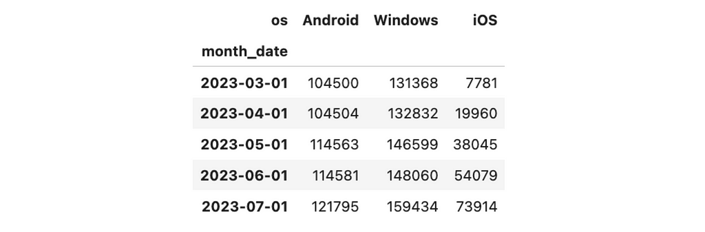
For example, I used a line chart to show how the number of sessions on each platform changes over time. We can see that iOS is the fastest-growing segment, while the others are pretty stagnant.

Using a line plot (not a scatter plot) is essential because the line plot emphasises trends via slopes.
You can get such a graph quite effortlessly using Plotly. We have a dataset like this with a monthly number of sessions.
Then, we can use Plotly Express to create a line chart, passing data, title and overriding labels.
import plotly.express as px

px.line(
  ts_df,
  title = '<b>Sessions by platforms</b>',
  labels = {'value': 'sessions', 'os': 'platform', 'month_date': 'month'},
  color_discrete_map={
      'Android': px.colors.qualitative.Vivid[1],
      'Windows': px.colors.qualitative.Vivid[2],
      'iOS': px.colors.qualitative.Vivid[4]
  }
)
We won’t discuss in detail design and how to tweak it in Plotly here since it’s a pretty huge topic that deserves a separate article.
We usually put time on an x-axis for line charts and use equal periods between data points.
There’s a common misunderstanding that we must make the y-axis zero-based (it must include 0). However, it’s not true for line charts. In some cases, such an approach might even hinder the insights in your data.
For example, compare the two charts below. On the first chart, the number of sessions looks pretty stable, while on the second one, the drop-off in the middle of December is quite apparent. However, it’s exactly the same dataset, and only y-ranges differ.


Your options for time series data are not limited to line charts. Sometimes, a bar chart can be a better option, for example, if you have few data points and want to emphasise individual values rather than trends.

Creating a bar chart in Plotly is also pretty straightforward.
fig = px.bar(
    df,
    title = '<b>Sessions</b>',
    labels = {'value': 'sessions', 'os': 'platform', 'month_date': 'month'},
    text_auto = ',.6r' # specifying format for bar labels
)

fig.update_layout(xaxis_type='category')
# to prevent converting string to dates
fig.update_layout(showlegend = False)
# hiding ledend since we don't need it
Nominal comparison
What is a use case? It’s the case when you want to compare one or several metrics across segments.
Chart recommendations
If you have a couple of data points, you can use just numbers in text instead of a chart. I like this approach since it’s concise and uncluttered.

In many cases, bar charts will be handy to compare the metrics. Even though vertical bar charts are usually more common, horizontal ones will be a better option when you have long names for segments.
For example, we can compare the annual GMVs (Gross Merchandise Value) per customer for different regions.
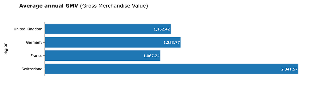
To make a bar chart horizontal, you just need to pass orientation = "h".
fig = px.bar(df,
  text_auto = ',.6r',
  title = '<b>Average annual GMV</b> (Gross Merchandise Value)',
  labels = {'country': 'region', 'value': 'average GMV in GBP'},
  orientation = 'h'
)

fig.update_layout(showlegend = False)
fig.update_xaxes(visible = False) # to hide x-axes
Important note: always use zero-based axes for bar charts. Otherwise, you might mislead your audience.
When there are too many numbers for a bar chart, I prefer a heat map. In this case, we use colour saturation to encode the numbers, which is not very accurate, so we also keep the labels. For example, let’s add another dimension to our average GMV view.
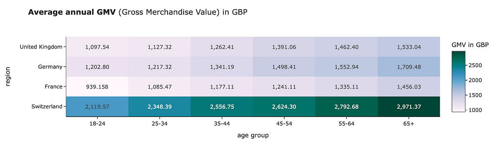
No surprise, you can create a heat map in Plotly as well.
fig = px.imshow(
  table_df.values,
  x = table_df.columns, # labels for x-axis
  y = table_df.index, # labels for y-axis
  text_auto=',.6r', aspect="auto",
  labels=dict(x="age group", y="region", color="GMV in GBP"),
  color_continuous_scale='pubugn',
  title = '<b>Average annual GMV</b> (Gross Merchandise Value) in GBP'
)

fig.show()
Deviation
What is a use case? It’s the case when we want to highlight the differences between values and baseline (for example, benchmark or forecast).
Chart recommendations
For the case of comparing metrics for different segments, the best way to convey this idea using visualisations is the combination of bar charts and baseline.
We did such a visualisation in one of my previous articles in our research on topic modelling for hotel reviews. I compared the share of customer reviews mentioning the particular topic for each hotel chain and baseline (average rate across all the comments). I’ve also highlighted segments that are significantly different with colour.

Also, we often have a task to show deviation from the prediction. We can use line plots comparing dynamics for the forecast and the factual data. I prefer to show the forecast as a dotted line to emphasise that it’s not so solid as fact.

This case of a line chart is a bit more complicated than the ones we discussed above. So, instead of Plotly Express, we will need to use Plotly Graphical Objects to customise the chart.
import plotly.graph_objects as go

# creating a figure
fig = go.Figure()

# adding dashed line trace for forecast
fig.add_trace(
    go.Scatter(
        mode='lines',
        x=df.index,
        y=df.forecast,
        line=dict(color='#696969', dash='dot', width = 3),
        showlegend=True,
        name = 'forecast'
    )
)

# adding solid line trace for factual data
fig.add_trace(
    go.Scatter(
        mode='lines',
        x=df.index,
        y=df.fact,
        marker=dict(size=6, opacity=1, color = 'navy'),
        showlegend=True,
        name = 'fact'
    )
)

# setting title and size of layout
fig.update_layout(
  width = 800,
  height = 400,
  title = '<b>Daily Active Users:</b> forecast vs fact'
)

# specifying axis labels
fig.update_xaxes(title = 'day')
fig.update_yaxes(title = 'number of users')
Ranking
What is a use case? This task is similar to the Nominal comparison. We also want to compare metrics across the several segments, but we would like to accentuate the ranking — the order of the segments. For example, it could be the top 3 regions with the highest average annual GMV or the top 3 marketing campaigns with the highest ROI.
Chart recommendations
No surprise, we can use bar charts similar to the nominal comparison. The only vital nuance to keep in mind is ordering the segments on your chart by the metric you’re interested in. For example, we can visualise the top 3 regions by annual Gross Merchandise Value.

Part-to-whole
What is use case? The goal is to understand what is the split of total by some subdivisions. You might want to do it for one segment or for several at the same time to compare their structures.
Chart recommendations
The most straightforward solution would be to use a bar chart to show the share of each category or subdivision. It’s worth ordering your categories in descending order to make visualisation easier to interpret.
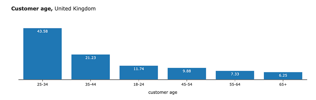
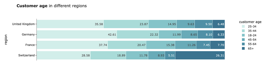
The above approach works both for one or several segments. However, sometimes, it’s easier to compare the structure using a stacked bar chart. For example, we can look at the share of customers by age in different regions.
Pie charts are often used in such cases. But I wouldn’t recommend you do it. As we know from visual perception research, comparing angles or areas is more challenging than just lengths. So, bar charts would be preferable.
Also, we might have a task to look at the structure over time. The ideal option would be an area chart. It will show you both split across subdivisions and trends via slopes (that’s why it’s a better option than just a bar chart with months as categories).

To create an area chart, you can use px.area function in Plotly.
px.area(
  df,
  title = '<b>Customer age</b> in Switzerland',
  labels = {'value': 'share of users, %',
            'age_group': 'customer age', 'month': 'month'},
  color_discrete_sequence=px.colors.diverging.balance
)
Frequency distribution
What is a use case? I usually start with such visualisation when working with new data. The goal is to understand how value is distributed:
- Is it normally distributed?
- Is it unimodal?
- Do we have any outliers in our data?
Chart recommendations
The first choice for frequency distributions is histograms (vertical bar charts usually without margins between categories). I typically prefer normed histograms since they are easier to interpret than absolute values.
If you want to see frequency distributions for several metrics, you can draw several histograms simultaneously. In this case, it’s crucial to use normed histograms. Otherwise, you won’t be able to compare distributions if the number of objects differs in groups.
For example, we can visualise the distributions of annual GMVs for customers from the United Kingdom and Switzerland.
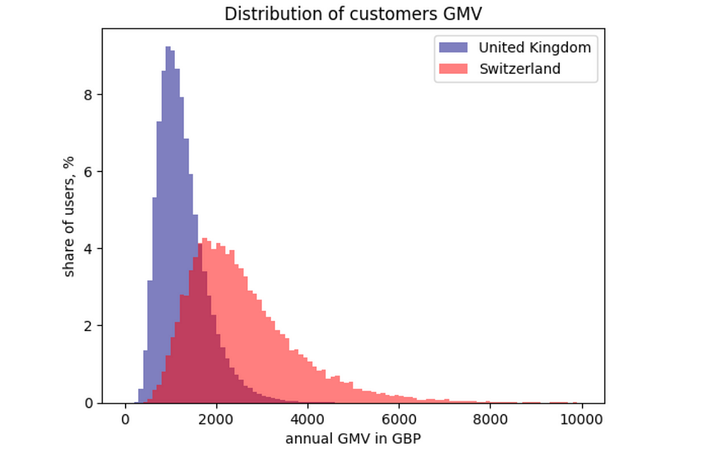
For this visualisation, I used matplotlib. I prefer matplotlib to Plotly for histograms because I like their default design.
from matplotlib import pyplot

hist_range = [0, 10000]
hist_bins = 100

pyplot.hist(
    distr_df[distr_df.region == 'United Kingdom'].value.values,
    label = 'United Kingdom',
    alpha = 0.5, range = hist_range, bins = hist_bins,
    color = 'navy',
    # calculating weights to get normalised histogram
    weights = np.ones_like(distr_df[distr_df.region == 'United Kingdom'].index)*100/distr_df[distr_df.region == 'United Kingdom'].shape[0]
)

pyplot.hist(
    distr_df[distr_df.region == 'Switzerland'].value.values,
    label = 'Switzerland',
    color = 'red',
    alpha = 0.5, range = hist_range, bins = hist_bins,
    weights = np.ones_like(distr_df[distr_df.region == 'Switzerland'].index)*100/distr_df[distr_df.region == 'Switzerland'].shape[0]
)

pyplot.legend(loc = 'upper right')
pyplot.title('Distribution of customers GMV')
pyplot.xlabel('annual GMV in GBP')
pyplot.ylabel('share of users, %')
pyplot.show()
If you want to compare distributions across many categories, reading many histograms on the same graph would be challenging. So, I would recommend you use box plots. They show less information (only medians, quartiles and outliers) and require some education for the audience. However, in the case of many categories, it might be your best option.
For example, let’s look at the distributions of the time spent on site by region.

If you don’t remember how to read a box plot, here’s a scheme that gives some clues.
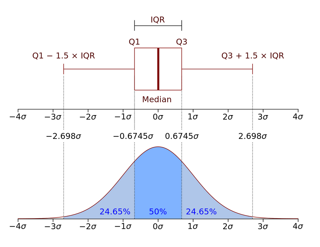
So, let’s go through all the building blocks of the box plot visualisation:
- the box on the visualisation shows IQR (interquartile range) — 25% and 75% percentiles,
- the line in the middle of the box specifies the median (50% percentile),
- whiskers equal to 1.5 * IQR or to the min/max value in the dataset if they are less extreme,
- if you have any numbers more extreme than 1.5 * IQR (outliers), they will be depicted as points on the graph.
Here is the code to generate a box plot in Plotly. I used Graphical Objects instead of Plotly Express to eliminate outliers from the visualisation. It comes in handy when you have extreme outliers or too many of them in your dataset.
fig = go.Figure()

fig.add_trace(go.Box(
    y=distr_df[distr_df.region == 'United Kingdom'].value,
    name="United Kingdom",
    boxpoints=False, # no data points
    marker_color=px.colors.qualitative.Prism[0],
    line_color=px.colors.qualitative.Prism[0]
))

fig.add_trace(go.Box(
    y=distr_df[distr_df.region == 'Germany'].value,
    name="Germany",
    boxpoints=False, # no data points
    marker_color=px.colors.qualitative.Prism[1],
    line_color=px.colors.qualitative.Prism[1]
))

fig.add_trace(go.Box(
    y=distr_df[distr_df.region == 'France'].value,
    name="France",
    boxpoints=False, # no data points
    marker_color=px.colors.qualitative.Prism[2],
    line_color=px.colors.qualitative.Prism[2]
))

fig.add_trace(go.Box(
    y=distr_df[distr_df.region == 'Switzerland'].value,
    name="Switzerland",
    boxpoints=False, # no data points
    marker_color=px.colors.qualitative.Prism[3],
    line_color=px.colors.qualitative.Prism[3]
))
fig.update_layout(title = '<b>Time spent on site</b> per month')
fig.update_yaxes(title = 'time spent in minutes')
fig.update_xaxes(title = 'region')
fig.show()
Correlation
What is a use case? The goal is to understand the relation between two numeric datasets, whether one value increases with the other one or not.
Chart recommendations
A scatter plot is the best solution to show a correlation between the values. You might also want to add a trend line to highlight the relation between metrics.

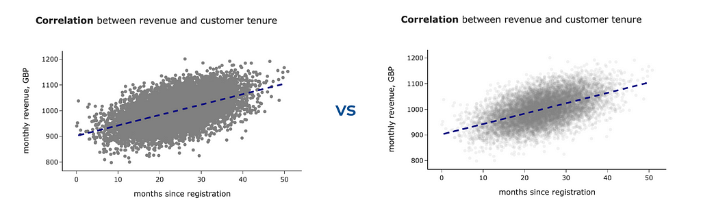
If you have many data points, you might face a problem with a scatter plot: it’s impossible to see the data structure with too many points because they overlay each other. In this case, reducing opacity might help you to reveal the relation.
For example, compare the two graphs below. The second one gives a better understanding of the data distribution.
We will use Plotly Graphical objects for this graph since it’s pretty custom. To create such a graph, we need to specify two traces — one for the scatter plot and one for the regression line.
import plotly.graph_objects as go

# scatter plot
fig = go.Figure()
fig.add_trace(
    go.Scatter(
        mode='markers',
        x=corr_df.x,
        y=corr_df.y,
        marker=dict(size=6, opacity=0.1, color = 'grey'),
        showlegend=False
    )
)

# regression line
fig.add_trace(
    go.Scatter(
        mode='lines',
        x=linear_corr_df.x,
        y=linear_corr_df.linear_regression,
        line=dict(color='navy', dash='dash', width = 3),
        showlegend=False
    )
)

fig.update_layout(width = 600, height = 400,
    title = '<b>Correlation</b> between revenue and customer tenure')
fig.update_xaxes(title = 'months since registration')
fig.update_yaxes(title = 'monthly revenue, GBP')
It’s essential to put the regression line as the second trace because otherwise, it would be overlayed by a scatter plot.
Also, it might be insightful to show frequency distributions for both variables. It doesn’t sound effortless, but you can easily do this using a joint plot from seaborn library. Here’s a code for it.
import seaborn as sns

sns.set_theme(style="darkgrid")

g = sns.jointplot(
  x="x", y="y", data=corr_df,
  kind="reg", truncate=False,
  joint_kws = {'scatter_kws':dict(alpha=0.15), 'line_kws':{'color':'navy'}},
  color="royalblue", height=7)

g.set_axis_labels('months since registration', 'monthly revenue, GBP')
We’ve covered all the use cases for data visualisations.
Is it all the visualisation types I need to know?
I must confess that from time to time, I face tasks when the above suggestions are not enough, and I need some other graphs.
Here are some examples:
- Sankey diagrams or sunburst charts for customer journey maps,
- Choropleth for data when you need to show geographical data,
- Word clouds to give a very high-level view of texts,
- Sparklines if you want to see trends for multiple lines.
For inspiration, I usually use the galleries of popular visualisation libraries, for example, Plotly or seaborn.
Also, you can always ask ChatGPT about the possible options to present your data. It provides quite a reasonable guidance.

Summary
In this article, we’ve discussed the basics of data visualisations:
- Why do we need to visualise data?
- What questions should you ask yourself before you start working on visualisation?
- What are the basic building blocks, and which ones are the easiest for the audience to perceive?
- What are the common use cases for data visualisation, and what chart types you can use to address them?
I hope the provided framework will help you not to be stuck by a variety of options and create better visualisations for your audience.
Thank you a lot for reading this article. If you have any follow-up questions or comments, please leave them in the comments section.
Visualisation 101: Choosing the Best Visualisation Type was originally published in Towards Data Science on Medium, where people are continuing the conversation by highlighting and responding to this story.
Comprehensive guide for different visualisation use cases

I believe that the primary goal of analysts is to help their product teams make the right decisions based on data. It means that the main result of analysts’ work is not just getting some numbers or dashboards but influencing reasonable data-driven decisions. So, presenting the results of our research is a critical part of analysts’ day-to-day work.
Have you ever experienced not noticing some obvious anomaly until you create a graph? You are not alone. Almost nobody can extract insights from dry tables of numbers. That’s why we need visualisations to unveil the insights in the data. Serving as a bridge between data and product teams, a data analyst needs to excel in visualisation.
That’s why I would like to discuss data visualisations and start with the framework to choose the most suitable chart type for your use case.
Why do we need visualisations?
It might be tempting to look at data just using summary statistics. You can compare datasets by mean values and variance and not look at data at all. However, it might lead to misinterpretations of your data and wrong decisions.
One of the most famous examples is Anscombe’s quartet. It was created by statistician Francis Anscombe, and it consists of 4 data sets with almost equal descriptive statistics: means, variances and correlations. But when we look at the data, we can see how different the datasets are.
You can find more mind-blowing examples (even a dinosaur) with the same descriptive statistics here.
This example clearly shows how outliers can skew your summary statistics and why we need to visualise our data.
Besides outliers, visualisations are also a better way to present the results of your research. Graphs are more easily comprehensible and have the ability to consolidate a substantial amount of data. So, it’s an essential domain for analysts to pay attention to.
Context is a starting point
When we start to think about visualisation for our task, we need to define its primary goal or the context for the visualisation.
There are two significant use cases for creating charts: exploratory and explanatory analytics.
Exploratory visualisations are your “private talk” with data when trying to find insights and understand the internal structure. For such visualisations, you might pay less attention to design and details, i.e., omit titles or not use consistent colour schemes across charts, since these visualisations are only for your eyes.
I usually start with a bunch of quick chart prototypes. However, even in this case, you still need to think about the most suitable chart type. Proper visualisation can help you find insights, while the wrong one can hide the clues. So, choose wisely.
Explanatory visualisations are intended to convey information to your audience. In this case, you need to focus more on details and the context to achieve your goal.
When I am working on explanatory visualisations, I usually think about the following questions to define my goal crystal-clearly:
- Who is my audience? What context do they have? What information do I need to explain to them? What are they interested in?
- What do I want to achieve? What concerns my audience might have? What information can I show them to achieve my goal?
- Am I showing the whole picture? Do I need to look at the question from the other point of view to give all the information for the audience to make an informed decision?
Also, your decisions on visualisation might depend on the medium, whether you will make a live presentation or just send it in Slack or via e-mail. Here are a couple of examples:
- In the case of a live presentation, you can have fewer comments on charts since you can talk about all the needed context, while in an e-mail, it’s better to provide all the details.
- A table with many numbers won’t work for live presentations since the slide with so much information might distract the audience from your speech. At the same time, it’s absolutely okay for written communication when the audience can go through all the numbers at their own pace.
So, when choosing a chart type, we shouldn’t think about visualisations in isolation. We need to consider our primary goal and audience. Please keep it in mind.
The perception of visualisation
How many different types of charts do you know? I bet you can name quite a few of them: linear charts, bar charts, Sankey diagrams, heat maps, box plots, bubble charts, etc. But have you ever thought about visualisations more granularly: what are the building blocks, and how are they perceived by your readers?
William S. Cleveland and Robert McGill investigated this question in their article “Graphical Perception: Theory, Experimentation, and Application to the Development of Graphical Methods” in the Journal of American Statistical Association, September 1984. This article focuses on visual perception — the ability to decode information presented in a chart. The authors identified a set of building blocks for visualisations — visual encodings — for example, position, length, area or colour saturation. No surprise, different visual encodings have different levels of difficulty for people to interpret.
The authors tried to hypothesise and test these hypotheses via experiments on how accurately people can extract information from the graph depending on the elements used. Their goal was to test how valid people’s judgements are.
They used previous psychological research and experiments to rank different visualisation building blocks from the most accurate to the least. Here’s the list:
- position — for example, scatter plot;
- length — for example, bar chart;
- direction or slope — for example, line chart;
- angle— for example, pie chart;
- area — for example, bubble chart;
- volume — 3D chart;
- colour hue and saturation — for example, heat map.
I’ve highlighted only the most common elements from the article for analytical day-to-day tasks.
As we discussed earlier, the primary goal of visualisation is to convey information, and we need to focus on our audience and how they perceive the message. So, we are interested in people’s correct understanding. That’s why I usually try to use visual encodings from the top of the list since they are easier for people to interpret.
Tools for visualisations
We will see many chart examples below, so let’s quickly discuss the tools I use for it.
There are lots of options for visualisation:
- Excel or Google Sheet,
- BI tools like Tableau or Superset,
- Libraries in Python or R.
In most cases, I prefer using the Plotly library for Python since it allows you to create nicely-looking interactive charts easily. In rare cases, I use Matplotlib or Seaborn. For example, I prefer Matplotlib for histograms (as you will see below) because, by default, it gives me exactly what I need, while this is not the case with Plotly.
Now, let’s jump to the practice and discuss use cases and how to choose the best visualisations to address them.
What chart type to use?
You might often be stuck thinking about what chart to use in your use case since so many of them exist.
There are valuable tools, such as a pretty handy Chart Chooser described in the “Storytelling with Data” blog. It can help you to get some ideas of what to start with.
Stephen Few proposed the other approach I find pretty helpful. He has an article, “Eenie, Meenie, Minie, Moe: Selecting the Right Graph for Your Message”. In this article, he identifies the seven common use cases for data visualisations and proposes visualisation types to address them.
Here is the list of these use cases:
- Time series
- Nominal comparison
- Deviation
- Ranking
- Part-to-whole
- Frequency distribution
- Correlation
We will go through all of them and discuss some examples of visualisations for each case. I don’t entirely agree with the author’s proposals regarding visualisation types, and I will share my view on it.
Graph examples below are based on synthetic data unless it’s explicitly mentioned.
Time series
What is a use case? It is the most common use case for visualisation. We want to look at changes in one or several metrics over time quite often.
Chart recommendations
The most straightforward option (especially if you have several metrics) is to use a line chart. It highlights the trend and gives the audience a complete overview of the data.
For example, I used a line chart to show how the number of sessions on each platform changes over time. We can see that iOS is the fastest-growing segment, while the others are pretty stagnant.
Using a line plot (not a scatter plot) is essential because the line plot emphasises trends via slopes.
You can get such a graph quite effortlessly using Plotly. We have a dataset like this with a monthly number of sessions.
Then, we can use Plotly Express to create a line chart, passing data, title and overriding labels.
import plotly.express as px

px.line(
  ts_df,
  title = '<b>Sessions by platforms</b>',
  labels = {'value': 'sessions', 'os': 'platform', 'month_date': 'month'},
  color_discrete_map={
      'Android': px.colors.qualitative.Vivid[1],
      'Windows': px.colors.qualitative.Vivid[2],
      'iOS': px.colors.qualitative.Vivid[4]
  }
)
We won’t discuss in detail design and how to tweak it in Plotly here since it’s a pretty huge topic that deserves a separate article.
We usually put time on an x-axis for line charts and use equal periods between data points.
There’s a common misunderstanding that we must make the y-axis zero-based (it must include 0). However, it’s not true for line charts. In some cases, such an approach might even hinder the insights in your data.
For example, compare the two charts below. On the first chart, the number of sessions looks pretty stable, while on the second one, the drop-off in the middle of December is quite apparent. However, it’s exactly the same dataset, and only y-ranges differ.
Your options for time series data are not limited to line charts. Sometimes, a bar chart can be a better option, for example, if you have few data points and want to emphasise individual values rather than trends.
Creating a bar chart in Plotly is also pretty straightforward.
fig = px.bar(
    df,
    title = '<b>Sessions</b>',
    labels = {'value': 'sessions', 'os': 'platform', 'month_date': 'month'},
    text_auto = ',.6r' # specifying format for bar labels
)

fig.update_layout(xaxis_type='category')
# to prevent converting string to dates
fig.update_layout(showlegend = False)
# hiding ledend since we don't need it
Nominal comparison
What is a use case? It’s the case when you want to compare one or several metrics across segments.
Chart recommendations
If you have a couple of data points, you can use just numbers in text instead of a chart. I like this approach since it’s concise and uncluttered.
In many cases, bar charts will be handy to compare the metrics. Even though vertical bar charts are usually more common, horizontal ones will be a better option when you have long names for segments.
For example, we can compare the annual GMVs (Gross Merchandise Value) per customer for different regions.
To make a bar chart horizontal, you just need to pass orientation = "h".
fig = px.bar(df,
  text_auto = ',.6r',
  title = '<b>Average annual GMV</b> (Gross Merchandise Value)',
  labels = {'country': 'region', 'value': 'average GMV in GBP'},
  orientation = 'h'
)

fig.update_layout(showlegend = False)
fig.update_xaxes(visible = False) # to hide x-axes
Important note: always use zero-based axes for bar charts. Otherwise, you might mislead your audience.
When there are too many numbers for a bar chart, I prefer a heat map. In this case, we use colour saturation to encode the numbers, which is not very accurate, so we also keep the labels. For example, let’s add another dimension to our average GMV view.
No surprise, you can create a heat map in Plotly as well.
fig = px.imshow(
  table_df.values,
  x = table_df.columns, # labels for x-axis
  y = table_df.index, # labels for y-axis
  text_auto=',.6r', aspect="auto",
  labels=dict(x="age group", y="region", color="GMV in GBP"),
  color_continuous_scale='pubugn',
  title = '<b>Average annual GMV</b> (Gross Merchandise Value) in GBP'
)

fig.show()
Deviation
What is a use case? It’s the case when we want to highlight the differences between values and baseline (for example, benchmark or forecast).
Chart recommendations
For the case of comparing metrics for different segments, the best way to convey this idea using visualisations is the combination of bar charts and baseline.
We did such a visualisation in one of my previous articles in our research on topic modelling for hotel reviews. I compared the share of customer reviews mentioning the particular topic for each hotel chain and baseline (average rate across all the comments). I’ve also highlighted segments that are significantly different with colour.
Also, we often have a task to show deviation from the prediction. We can use line plots comparing dynamics for the forecast and the factual data. I prefer to show the forecast as a dotted line to emphasise that it’s not so solid as fact.
This case of a line chart is a bit more complicated than the ones we discussed above. So, instead of Plotly Express, we will need to use Plotly Graphical Objects to customise the chart.
import plotly.graph_objects as go

# creating a figure
fig = go.Figure()

# adding dashed line trace for forecast
fig.add_trace(
    go.Scatter(
        mode='lines',
        x=df.index,
        y=df.forecast,
        line=dict(color='#696969', dash='dot', width = 3),
        showlegend=True,
        name = 'forecast'
    )
)

# adding solid line trace for factual data
fig.add_trace(
    go.Scatter(
        mode='lines',
        x=df.index,
        y=df.fact,
        marker=dict(size=6, opacity=1, color = 'navy'),
        showlegend=True,
        name = 'fact'
    )
)

# setting title and size of layout
fig.update_layout(
  width = 800,
  height = 400,
  title = '<b>Daily Active Users:</b> forecast vs fact'
)

# specifying axis labels
fig.update_xaxes(title = 'day')
fig.update_yaxes(title = 'number of users')
Ranking
What is a use case? This task is similar to the Nominal comparison. We also want to compare metrics across the several segments, but we would like to accentuate the ranking — the order of the segments. For example, it could be the top 3 regions with the highest average annual GMV or the top 3 marketing campaigns with the highest ROI.
Chart recommendations
No surprise, we can use bar charts similar to the nominal comparison. The only vital nuance to keep in mind is ordering the segments on your chart by the metric you’re interested in. For example, we can visualise the top 3 regions by annual Gross Merchandise Value.
Part-to-whole
What is use case? The goal is to understand what is the split of total by some subdivisions. You might want to do it for one segment or for several at the same time to compare their structures.
Chart recommendations
The most straightforward solution would be to use a bar chart to show the share of each category or subdivision. It’s worth ordering your categories in descending order to make visualisation easier to interpret.
The above approach works both for one or several segments. However, sometimes, it’s easier to compare the structure using a stacked bar chart. For example, we can look at the share of customers by age in different regions.
Pie charts are often used in such cases. But I wouldn’t recommend you do it. As we know from visual perception research, comparing angles or areas is more challenging than just lengths. So, bar charts would be preferable.
Also, we might have a task to look at the structure over time. The ideal option would be an area chart. It will show you both split across subdivisions and trends via slopes (that’s why it’s a better option than just a bar chart with months as categories).
To create an area chart, you can use px.area function in Plotly.
px.area(
  df,
  title = '<b>Customer age</b> in Switzerland',
  labels = {'value': 'share of users, %',
            'age_group': 'customer age', 'month': 'month'},
  color_discrete_sequence=px.colors.diverging.balance
)
Frequency distribution
What is a use case? I usually start with such visualisation when working with new data. The goal is to understand how value is distributed:
- Is it normally distributed?
- Is it unimodal?
- Do we have any outliers in our data?
Chart recommendations
The first choice for frequency distributions is histograms (vertical bar charts usually without margins between categories). I typically prefer normed histograms since they are easier to interpret than absolute values.
If you want to see frequency distributions for several metrics, you can draw several histograms simultaneously. In this case, it’s crucial to use normed histograms. Otherwise, you won’t be able to compare distributions if the number of objects differs in groups.
For example, we can visualise the distributions of annual GMVs for customers from the United Kingdom and Switzerland.
For this visualisation, I used matplotlib. I prefer matplotlib to Plotly for histograms because I like their default design.
from matplotlib import pyplot

hist_range = [0, 10000]
hist_bins = 100

pyplot.hist(
    distr_df[distr_df.region == 'United Kingdom'].value.values,
    label = 'United Kingdom',
    alpha = 0.5, range = hist_range, bins = hist_bins,
    color = 'navy',
    # calculating weights to get normalised histogram
    weights = np.ones_like(distr_df[distr_df.region == 'United Kingdom'].index)*100/distr_df[distr_df.region == 'United Kingdom'].shape[0]
)

pyplot.hist(
    distr_df[distr_df.region == 'Switzerland'].value.values,
    label = 'Switzerland',
    color = 'red',
    alpha = 0.5, range = hist_range, bins = hist_bins,
    weights = np.ones_like(distr_df[distr_df.region == 'Switzerland'].index)*100/distr_df[distr_df.region == 'Switzerland'].shape[0]
)

pyplot.legend(loc = 'upper right')
pyplot.title('Distribution of customers GMV')
pyplot.xlabel('annual GMV in GBP')
pyplot.ylabel('share of users, %')
pyplot.show()
If you want to compare distributions across many categories, reading many histograms on the same graph would be challenging. So, I would recommend you use box plots. They show less information (only medians, quartiles and outliers) and require some education for the audience. However, in the case of many categories, it might be your best option.
For example, let’s look at the distributions of the time spent on site by region.
If you don’t remember how to read a box plot, here’s a scheme that gives some clues.
So, let’s go through all the building blocks of the box plot visualisation:
- the box on the visualisation shows IQR (interquartile range) — 25% and 75% percentiles,
- the line in the middle of the box specifies the median (50% percentile),
- whiskers equal to 1.5 * IQR or to the min/max value in the dataset if they are less extreme,
- if you have any numbers more extreme than 1.5 * IQR (outliers), they will be depicted as points on the graph.
Here is the code to generate a box plot in Plotly. I used Graphical Objects instead of Plotly Express to eliminate outliers from the visualisation. It comes in handy when you have extreme outliers or too many of them in your dataset.
fig = go.Figure()

fig.add_trace(go.Box(
    y=distr_df[distr_df.region == 'United Kingdom'].value,
    name="United Kingdom",
    boxpoints=False, # no data points
    marker_color=px.colors.qualitative.Prism[0],
    line_color=px.colors.qualitative.Prism[0]
))

fig.add_trace(go.Box(
    y=distr_df[distr_df.region == 'Germany'].value,
    name="Germany",
    boxpoints=False, # no data points
    marker_color=px.colors.qualitative.Prism[1],
    line_color=px.colors.qualitative.Prism[1]
))

fig.add_trace(go.Box(
    y=distr_df[distr_df.region == 'France'].value,
    name="France",
    boxpoints=False, # no data points
    marker_color=px.colors.qualitative.Prism[2],
    line_color=px.colors.qualitative.Prism[2]
))

fig.add_trace(go.Box(
    y=distr_df[distr_df.region == 'Switzerland'].value,
    name="Switzerland",
    boxpoints=False, # no data points
    marker_color=px.colors.qualitative.Prism[3],
    line_color=px.colors.qualitative.Prism[3]
))
fig.update_layout(title = '<b>Time spent on site</b> per month')
fig.update_yaxes(title = 'time spent in minutes')
fig.update_xaxes(title = 'region')
fig.show()
Correlation
What is a use case? The goal is to understand the relation between two numeric datasets, whether one value increases with the other one or not.
Chart recommendations
A scatter plot is the best solution to show a correlation between the values. You might also want to add a trend line to highlight the relation between metrics.
If you have many data points, you might face a problem with a scatter plot: it’s impossible to see the data structure with too many points because they overlay each other. In this case, reducing opacity might help you to reveal the relation.
For example, compare the two graphs below. The second one gives a better understanding of the data distribution.
We will use Plotly Graphical objects for this graph since it’s pretty custom. To create such a graph, we need to specify two traces — one for the scatter plot and one for the regression line.
import plotly.graph_objects as go

# scatter plot
fig = go.Figure()
fig.add_trace(
    go.Scatter(
        mode='markers',
        x=corr_df.x,
        y=corr_df.y,
        marker=dict(size=6, opacity=0.1, color = 'grey'),
        showlegend=False
    )
)

# regression line
fig.add_trace(
    go.Scatter(
        mode='lines',
        x=linear_corr_df.x,
        y=linear_corr_df.linear_regression,
        line=dict(color='navy', dash='dash', width = 3),
        showlegend=False
    )
)

fig.update_layout(width = 600, height = 400,
    title = '<b>Correlation</b> between revenue and customer tenure')
fig.update_xaxes(title = 'months since registration')
fig.update_yaxes(title = 'monthly revenue, GBP')
It’s essential to put the regression line as the second trace because otherwise, it would be overlayed by a scatter plot.
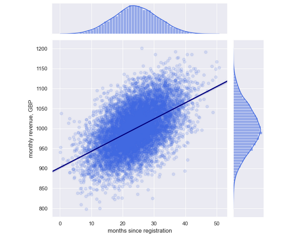
Also, it might be insightful to show frequency distributions for both variables. It doesn’t sound effortless, but you can easily do this using a joint plot from seaborn library. Here’s a code for it.
import seaborn as sns

sns.set_theme(style="darkgrid")

g = sns.jointplot(
  x="x", y="y", data=corr_df,
  kind="reg", truncate=False,
  joint_kws = {'scatter_kws':dict(alpha=0.15), 'line_kws':{'color':'navy'}},
  color="royalblue", height=7)

g.set_axis_labels('months since registration', 'monthly revenue, GBP')
We’ve covered all the use cases for data visualisations.
Is it all the visualisation types I need to know?
I must confess that from time to time, I face tasks when the above suggestions are not enough, and I need some other graphs.
Here are some examples:
- Sankey diagrams or sunburst charts for customer journey maps,
- Choropleth for data when you need to show geographical data,
- Word clouds to give a very high-level view of texts,
- Sparklines if you want to see trends for multiple lines.
For inspiration, I usually use the galleries of popular visualisation libraries, for example, Plotly or seaborn.
Also, you can always ask ChatGPT about the possible options to present your data. It provides quite a reasonable guidance.
Summary
In this article, we’ve discussed the basics of data visualisations:
- Why do we need to visualise data?
- What questions should you ask yourself before you start working on visualisation?
- What are the basic building blocks, and which ones are the easiest for the audience to perceive?
- What are the common use cases for data visualisation, and what chart types you can use to address them?
I hope the provided framework will help you not to be stuck by a variety of options and create better visualisations for your audience.
Thank you a lot for reading this article. If you have any follow-up questions or comments, please leave them in the comments section.
Visualisation 101: Choosing the Best Visualisation Type was originally published in Towards Data Science on Medium, where people are continuing the conversation by highlighting and responding to this story.
Denial of responsibility! Techno Blender is an automatic aggregator of the all world’s media. In each content, the hyperlink to the primary source is specified. All trademarks belong to their rightful owners, all materials to their authors. If you are the owner of the content and do not want us to publish your materials, please contact us by email – [email protected]. The content will be deleted within 24 hours.