
Visualizations in Data Science: Functional Histogram in Python | by Grzegorz Sikora | Jun, 2022
Useful for binning multivariate data
In this article, I will present the concept of the functional histogram, a histogram for multivariate data, and present its simple implementation in Python with the help of the NumPy and Pandas libraries. Such a tool gives the first adhoc information about the distribution of multivariate objects and is a good starting step in the investigation of multidimensional datasets. Finally, I will show its visualization for some exemplary simulated dataset with multivariate vectors. In my opinion, functional histogram and functional boxplot are must-known tools of every data scientist working with multidimensional data.
Anyone familiar with statistics or data analysis knows that one of the basic charts to know the distribution of data is the histogram. The histogram, however, has two major drawbacks. The first one concerns the choice of bin numbers and there are many theories and rules developed on this subject (e.g. square-root choice, Sturges’ formula, Rice Rule, among others). The second disadvantage of the histogram is much more serious from the point of view of today’s realities of the data science world. This is its limitation to one-dimensional data. Big data is everywhere these days. The overwhelming majority of datasets analyzed by data scientists and data analysts are multidimensional. Therefore, there is a need for a tool such as a multivariate (functional) histogram that will allow binning of multidimensional objects like functions or vectors. Such a visual tool should be “basic” in nature and be only the first step and preliminary method to further more advanced ML clustering techniques. Therefore, I strongly believe, that for every professional working in data science the motivation for the multivariate histogram is pretty obvious. We all, data science people must think multidimensionally. Why? Because only then we will conclude about complicated datasets more deeply, uncovering mysteries of their multidimensional structures.
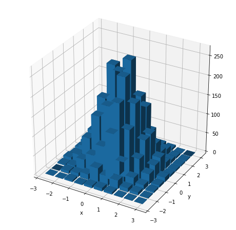
Let us start our process of multivariate histogram consideration with the bivariate case. Bivariate case means that we possess some collection of 2D objects of the form (X1, X2), so points on a plane, and we would like to count their occurrence in 2D bins of the form [a1,b1]x[a2,b2]. If the point (X1, X2) lies in the rectangular 2D bin [a1,b1]x[a2,b2] that exactly means a1 ≤ X1 ≤ b1and a2≤ X2≤ b2. So, if we have 2D points on a plane falling into some rectangular 2D bins, some subsets of a plane, to show the information about the number of their occurrence (or a percentage fraction of their occurrence) we need the third axis, the third dimension to draw the histogram for such a dataset. Let us simulate some exemplary points from the 2D normal distribution and plot the histogram in 3D space.
# Imports.
import matplotlib.pyplot as plt
from matplotlib.patches import Rectangle
import numpy as np
import pandas as pd# Generate 2D normal data.
mean = [0, 0]
cov = [[1, 0], [0, 1]]
x, y = np.random.multivariate_normal(mean, cov, 5000).T# Scatterplot.
plt.figure(figsize=(8,8))
plt.plot(x ,y, 'o')
plt.xlabel('x')
plt.ylabel('y')
plt.show()
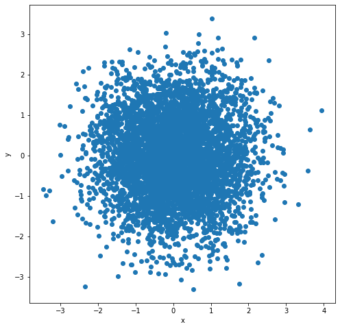
fig = plt.figure(figsize=(8,8))
ax = fig.add_subplot(projection='3d')
hist, xedges, yedges = np.histogram2d(x, y, bins=10, range=[[-3, 3], [-3, 3]])# Construct arrays for the anchor positions of the 16 bars.
xpos, ypos = np.meshgrid(xedges[:-1] + 0.25, yedges[:-1] + 0.25, indexing="ij")
xpos = xpos.ravel()
ypos = ypos.ravel()
zpos = 0# Construct arrays with the dimensions for the 16 bars.
dx = dy = 0.5 * np.ones_like(zpos)
dz = hist.ravel()ax.bar3d(xpos, ypos, zpos, dx, dy, dz, zsort='average')
ax.set_xlabel('x')
ax.set_ylabel('y')
plt.show()
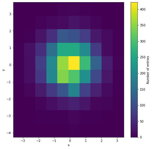
Of course, instead of drawing the histogram in 3D with such cubes, we can draw a 2D heatmap where the color replaces the height of such cubes.
plt.figure(figsize=(8,8))
plt.hist2d(x, y, bins=10, density=False)
cb = plt.colorbar()
cb.set_label('Number of entries')
plt.xlabel('x')
plt.ylabel('y')
plt.show()
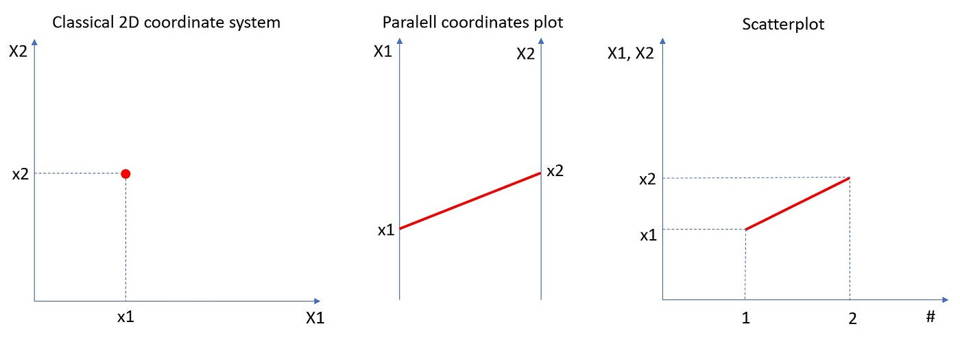
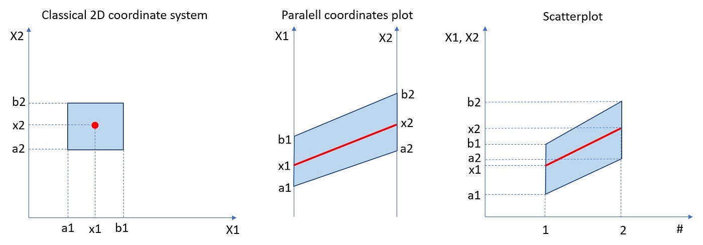
But what about more general scenarios, when we have a dataset of n-dimensional vectors of the form (X1, X2, …Xn)? Histograming such dataset and present their occurrences in n-dimensional rectangles [a1,b1]x[a2,b2]x…x[an,bn] would require (n+1)-dimensional space. Really hard to visualize. So, what we can do instead? To come up with an idea of how to solve such a problem, let us simplify it and go back to the bivariate case and 3D histogram. Instead of showing such histogram in 3D or as a 2D heatmap, we can use the “parallel coordinates” approach which is equivalent to the “scatterplot” approach. In the plot below we can see that the point (X1, X2) on the 2D plane corresponds to the line between X1-value on the first vertical axis and X2-value on the second vertical axis. Those are “parallel coordinates” axes. The same red line is also presented in the equivalent scatterplot.
Let us look at the same plot but with 2D rectangular bin [a1,b1]x[a2,b2].
In the rest of the article, we will be using the scatterplot approach, because it is more natural for time series type datasets. But it is good to remember that there is an equivalent parallel coordinates approach.
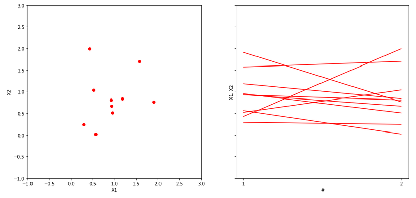
Now, let us assume that we possess a dataset of ten 2D points on a plane. Those points we can present in the equivalent scatterplot form, see below.
x = 2*np.random.random(10)
y = 2*np.random.random(10)
fig, (ax1, ax2) = plt.subplots(1, 2, sharey=True, figsize=(15,7))
ax1.plot(x, y, 'ro')
ax1.axis([-1, 3, -1, 3])
ax1.set_xlabel('X1')
ax1.set_ylabel('X2')
for x1, x2 in zip(x,y):
ax2.plot([1, 2], [x1, x2] , 'r')
ax2.set_xticks([1, 2])
ax2.set_xlabel('#')
ax2.set_ylabel('X1, X2');
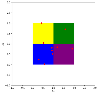
We would like to bin them into four 2D rectangular bins, see below.
fig, ax = plt.subplots(figsize=(8,8))
ax.plot(x, y, 'ro')
ax.add_patch(Rectangle((0, 0), 1, 1, facecolor = 'blue'))
ax.add_patch(Rectangle((1, 1), 1, 1, facecolor = 'green'))
ax.add_patch(Rectangle((1, 0), 1, 1, facecolor = 'purple'))
ax.add_patch(Rectangle((0, 1), 1, 1, facecolor = 'yellow'))
ax.axis([-1, 3, -1, 3])
ax.set_xlabel('X1')
ax.set_ylabel('X2');
Now, the crucial step is the transition of our dataset and 2D rectangular bins into an equivalent dataset of lines and parallelogram regions on a scatterplot. Let us notice, that in the standard 2D plot with a classical coordinate system our rectangular bins are disjoint. But in the corresponding scatterplot, equivalent parallelogram regions are not disjoint. Therefore, to draw a clear histogram for line objects in the scatterplot, we have to use subplots, please see below.
fig, axs = plt.subplots(4, 3, sharey=True, figsize=(13,15))
cols = ['blue', 'green', 'purple', 'yellow']
rect = [(0,0), (1,1), (1,0), (0,1)]
per=[([0,0], [1,1]), ([1,1], [2,2]), ([1,0], [2,1]), ([0,1],[1,2]) ]
for i in range(4):
axs[i,0].plot(x, y, 'ro')
axs[i,0].add_patch(Rectangle(rect[i], 1, 1, facecolor=cols[i]))
axs[i,0].axis([-1, 3, -1, 3])
axs[i,0].set_xlabel('X1')
axs[i,0].set_ylabel('X2')
for x1, x2 in zip(x,y):
axs[i,1].plot([1, 2], [x1, x2] , 'r')
axs[i,1].fill_between([1, 2], per[i][0], per[i][1],
facecolor=cols[i])
axs[i,1].set_xticks([1, 2])
axs[i,1].set_xlabel('#')
axs[i,1].set_ylabel('X1, X2')
axs[i,2].fill_between([1, 2], per[i][0], per[i][1],
facecolor=cols[i])
axs[i,2].set_xticks([1, 2])
axs[i,2].set_xlabel('#')
axs[i,2].set_ylabel('X1, X2');
frac=sum(((rect[i][0]<=x) & (x<=rect[i][0]+1)) &
((rect[i][1]<=y) & (y<=rect[i][1]+1)))/len(x)
for x1, x2 in zip(x,y):
if ((rect[i][0]<=x1) & (x1<=rect[i][0]+1)) &
((rect[i][1]<=x2) & (x2<=rect[i][1]+1)):
axs[i,2].plot([1, 2], [x1, x2] , 'r')
axs[i,2].text(1.4, -0.5, s=str(100*frac)+'%', fontsize=14)
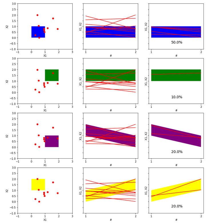
Let us comment and think about the plot above in more detail. The left column has plots of 2D points on a plane with the classical system of coordinates. Everything is clear, the distribution of points is easily visible, the rectangular 2D bins are disjoint. For such data, it would be easy to create both a histogram in 3D and a heatmap in 2D with an appropriate color scale corresponding to the point concentration in bins. The middle column has scatter plots, the points in 2D now correspond to lines. These lines intersect many times, which makes the drawing of the data presented in this way less legible than the 2D points on the plane. Rectangular 2D bins correspond to parallelogram areas on such scatterplots. However, they are not disjoint, so we used subplots to make the drawing more clear. The last column shows the same parallelogram areas but only with lines that completely lie in them. In addition, the percentage fraction of such containing lines is given. Therefore, the plots in the right column can be understood as a histogram of our data represented by scatterplot lines. For 2D data, so points on a plane, such a functional histogram may appear less natural than a 3D histogram or a 2D heatmap. However, its main advantage is the potential to histogram high-dimensional data when a 3D histogram or 2D heatmap is impossible to draw. We will see that in the next more demanding example.
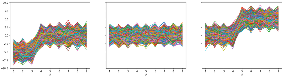
First, let us generate some toy dataset. Our dataset will be a Pandas data frame with 9 columns and 50000 rows. You can think about such data according to your needs, but for our purposes, we will think that each row is one object of length 9. Dataset was generated from a standard normal distribution and modified with some shift, please see below. But the way of data generation is not crucial, and the functional histogram method with implementation is universal and should work with any multivariate dataset.
N = 50000 # N-number of d-dimensional vectors
d = 9 # d-dimension
r = np.random.randn(N, d)
df=pd.DataFrame(r, columns=np.arange(1,10))
df.iloc[30000::,4::] = df.iloc[30000::,4::]+5 #some modification
df.iloc[:20000,:3] = df.iloc[:20000,:3]-5# Plots:
fig, (ax1, ax2, ax3) = plt.subplots(1, 3, sharey=True,
figsize=(20,5))
ax1.plot(df.iloc[:20000,:].T)
ax1.set_xlabel('#')ax2.plot(df.iloc[20000:30000,:].T)
ax2.set_xlabel('#')ax3.plot(df.iloc[30000:,:].T)
ax3.set_xlabel('#')
plt.show()
Let us plot all 50000 vectors from our dataset on one scatterplot, see below.
plt.figure(figsize=(12,8))
plt.plot(df.T)
plt.xlabel('#')
plt.show()
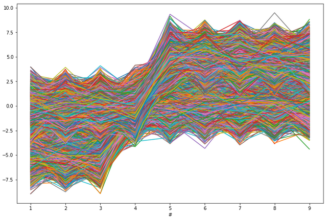
Let us forget how the data was generated and modified, and assume simply that we got such a dataset to analyze and cluster. We would like to uncover our three generated groups of the dataset (of course in practical reality we do not know the number of groups). With so many objects (so many lines), such a plot is very unreadable and looks like spaghetti swirling. It seems very hard to recognize both individual lines and binned groups of lines of similar patterns. To histogram such a complicated and unclear dataset we will use the NumPy function histogramdd. This function from NumPy has six arguments, but for us, the most important are the sample argument and the optional bins argument. The sample argument is just the our dataset. The crucial in our consideration is the bins argument. Now, let us go through different scenarios of bins argument in our example.
First case
Case with bins=int with “The number of bins for all dimensions (nx=ny=…=bins).” This is the case, where we propose one integer to be the number of bins for each column. This optional argument is also connected with another optional range argument. If the range is not provided and bins=n, the interval from min to max of each column will be divided into n subintervals of equal length. Let us see how it looks for our data with bins=2.
# Histogram for D-dimensional data.
H, edges = np.histogramdd(r, bins=(2,2,2,2,2,2,2,2,2))# Scatterplot of data and bin edges points.
plt.figure(figsize=(12,8))
plt.plot(df.T, 'blue', alpha=0.01)
plt.plot(np.arange(1,10), edges,'ko')
plt.show()
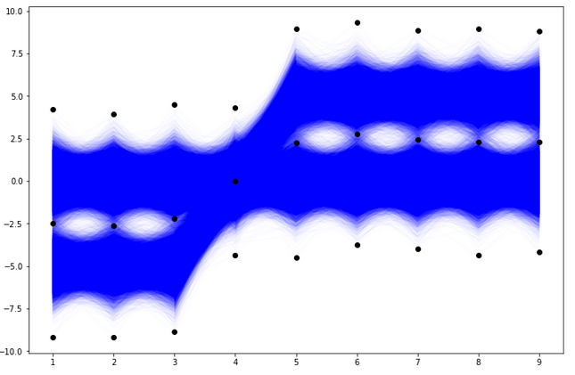
With bins=2 and 9 columns we see that the 9D space of our data has

9D dimensional bins. In general, with bins=k and the number of columns n and n-dimensional dataset, there would be

n-dimensional bins. The exemplary 9D bin for our data looks like in the picture below.
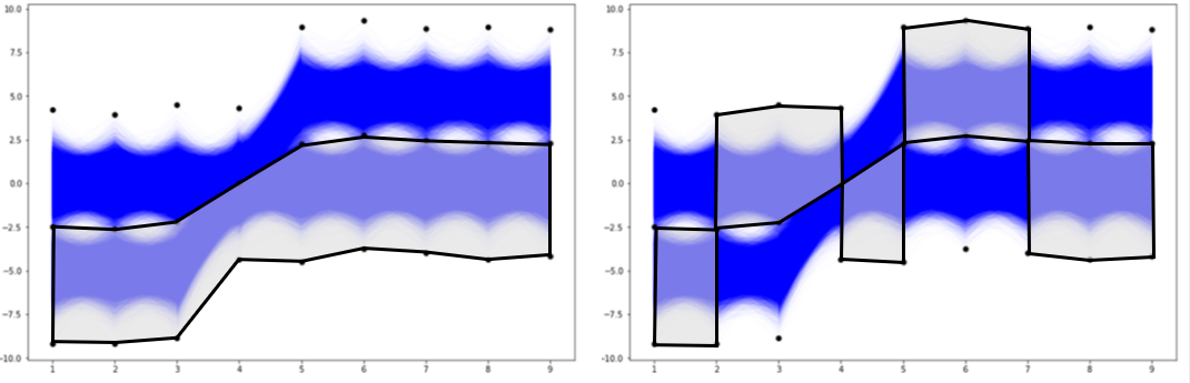
How we initialize the grid of bin edge points will be crucial to histogramming our multivariate data. Now, let us check the result of the histogramdd function for such proposed bins.
eps = 2 # threshold for the groups quantity
H = 100*H/N
m = np.transpose(np.array(np.where(H>eps)))
H_eps = H[H>eps]
m = m[[np.where(H_eps==i)[0][0] for i in np.sort(H_eps)[::-1]]]
H_eps = np.sort(H_eps)[::-1]
if len(m)>0:
print(f'Data are grouped in {len(m)} groups:' +
','.join(str(int(i))+'%' for i in H_eps) + f'''. Rest of
{100-sum(H_eps)}% trajectories are not concentrated in at
least {eps}% groups.''')
for i, val in enumerate(m):
y1 = [edges[i][j] for i,j in zip(range(0,d),val)]
y2 = [edges[i][j+1] for i,j in zip(range(0,d),val)]
plt.plot(y1, 'k')
plt.plot(y2, 'k')
plt.ylim([np.min(r)-0.1, np.max(r)+0.1])
plt.title(label=f'Region of {int(H_eps[i])}% of vectors')
plt.show()
else:
print(f'''There are no classes with at least {eps}% of
cells. Try to lower number of bins.''')
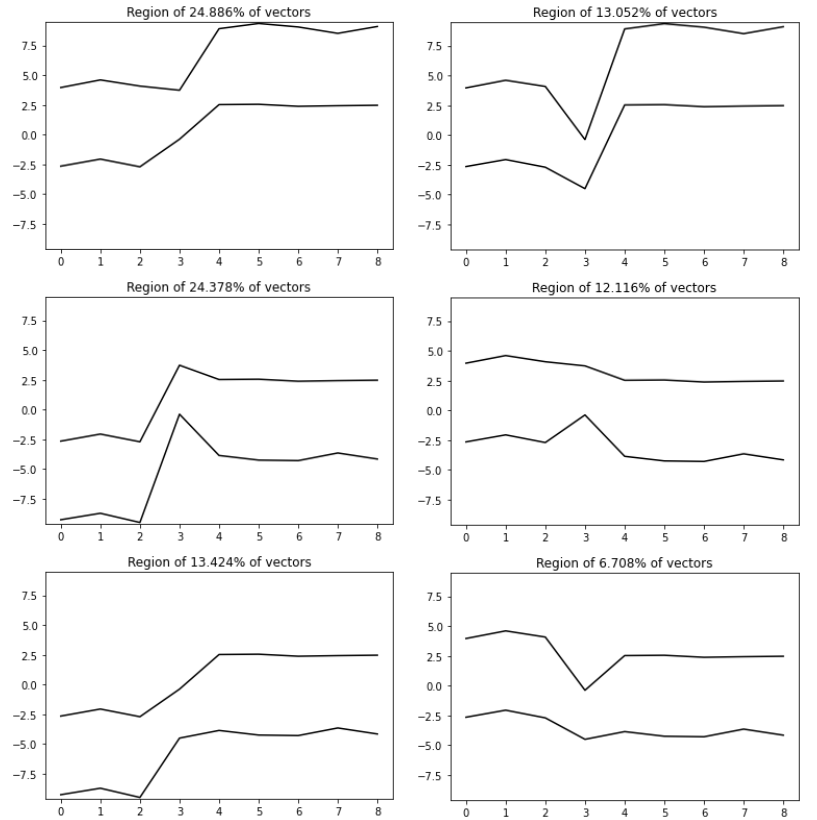
The results of histogramming our dataset with bins parameter constantly equal 2 are six groups containing 24.886%, 24.378%, 13.424%, 13.052%, 12.116%, and 6.708% of vectors. Totally, that gives 94.564% of the vectors from the dataset. The rest 5.436% of vectors are not concentrated at any of the 9D bins (designed according to our bins edges grid) with at least 2% quantity. This 2% threshold quantity is the eps parameter in the first line of our code above (of course we can play with this parameter, we can use some additional knowledge of what minimum group quantity should be). If we compare obtained results with our 3 groups of generated data (there were 40%, 20%, 40%), we can see that it is not good clustering. This is due to the edges of the badly (too dense) proposed bins, especially for the fourth column. Let us check now, the another proposition of the grid for bins edges.
Second case
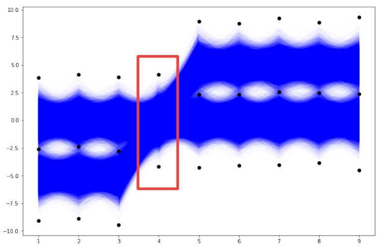
Case with bins being a sequence of integers, i.e. “The number of bins for each dimension (n1, n2, … =bins).” This is the case, where we propose one integer to be the number of bins per each column. So each column can have a different number of that parameter. If the range is not provided, the interval from min to max of a specific column will be divided into the corresponding number (from the sequence n1, n2, …) subintervals of equal length. If we look at the previous plots of our dataset, it should be noticed that the column number 4 is more concentrated than other columns (there is no gap in the middle of the data corresponding 4th column), please see below.
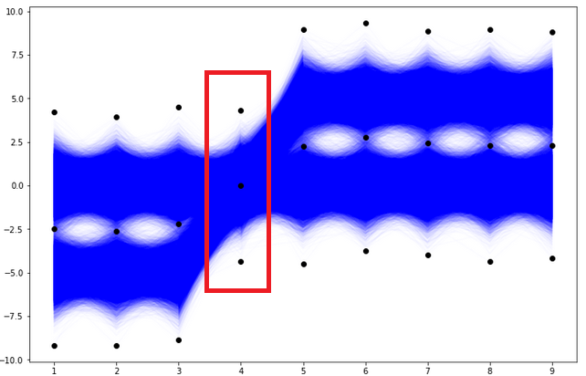
Therefore, we will check the result of the functional histogram — function histogramdd for parameter bins=(2, 2, 2, 1, 2, 2, 2, 2, 2). The only difference in this case compared to the first case is that the data from the 4th column is not divided into subintervals. So, the new grid of bin edge points looks like in the plot below.
# Scatterplot of data and bin edges points.
plt.figure(figsize=(12,8))
plt.plot(df.T,'blue',alpha=0.01)
[plt.plot((i+1)*np.ones(len(val)), val,'ko') for i, val in enumerate(edges)]
plt.show()
in general, with bins=(n1, n2, …, n9) and 9 columns, the 9D space of our data has n1*n2*…*n9 9D dimensional bins. In this particular case with bins=(2, 2, 2, 1, 2, 2, 2, 2, 2) we have 256 9D dimensional bins (this is of course the half of the previous case of 512 bins). The exemplary 9D bin for our data looks like in the picture below. We see that in this case each of the 9D bins includes the entire set of values of the 4th column. Let us check the result of the histogramdd function for such corrected bins (to code is as above with the only change of the bins parameter).
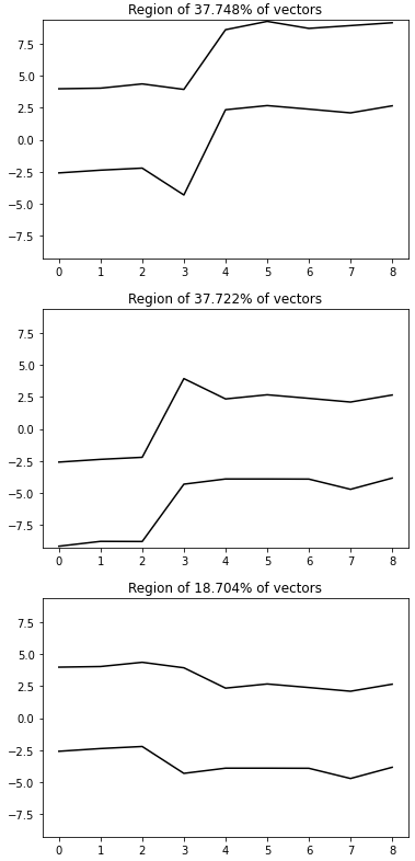
The results of histogramming our dataset with bins=(2, 2, 2, 1, 2, 2, 2, 2, 2) are three groups containing 37.748%, 37.722%, and 18.704% of vectors. Totally, that gives 94.174% of the vectors from the dataset. The rest 5.826% of vectors are not concentrated at any of the 9D bins (designed according to our bins edges grid) with at least 2% quantity. Let us go to the detailed results and check which vectors were not properly grouped, see the picture below.
H, edges = np.histogramdd(r, bins = (2,2,2,1,2,2,2,2,2))eps = 2
H = 100*H/N
m = np.transpose(np.array(np.where(H > eps)))
H_eps = H[H > eps]
m = m[[np.where(H_eps==i)[0][0] for i in np.sort(H_eps)[::-1]]]
H_eps = np.sort(H_eps)[::-1]
groups = [group_3, group_1, group_2]
if len(m)>0:
print(f'Data are grouped in {len(m)} groups: '+', '.join(str(i)+'%'
for i in H_eps)+f'. Rest of {100-sum(H_eps)}% trajectories are not concentrated in at least {eps}% groups.')
for i, val in enumerate(m):
y1=[edges[i][j] for i,j in zip(range(0,d),val)]
y2=[edges[i][j+1] for i,j in zip(range(0,d),val)]
fig, (ax1, ax2) = plt.subplots(1, 2, sharey=True, figsize=(20,5))
ax1.plot(y1,'k')
ax1.plot(y2,'k')
group = groups[i]
data = group[((y1 <= group)&(group <= y2)).all(axis=1)]
ax1.plot(range(0,9), data.T, 'b')
ax1.set_ylim([np.min(r)-0.1,np.max(r)+0.1])
ax1.set_title(label=f'Region of {H_eps[i]}% of vectors')
ax2.plot(y1,'k')
ax2.plot(y2,'k')
not_clasterized = group[((y1 > group) | (group > y2)).any(axis=1)]
ax2.plot(range(0,9), not_clasterized.T, 'r')
ax2.set_title(f'Not clusterized {round(not_clasterized.shape[0]/N*100, 3)}% of data')
else:
print(f'There are no classes with at least {eps}% of cells. Try to lower number of bins.')
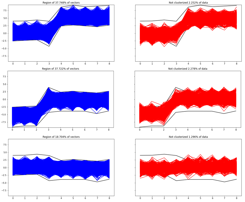
As we see, the detailed results of the functional histogram uncovered properly our initial three groups of our dataset.
Let us summarize some information from our exemplary dataset and conclusions from the functional histogram application.
- Functional histogram is a histogram for multivariate data. Its implementation is available in NumPy as the histogamdd function. It is a natural and primary tool for studying multidimensional datasets.
- In the practical application of multivariate histogram via histogramdd function, the crucial is the arrangement of the grid of points in bins parameter. There is no universal choice of the proper bins edges. Therefore any additional domain knowledge, and any suspicions can be valuable. The final proper result of multivariate histogramming strongly depends on the net of bins edges.
- Functional histogram should be a tool on the first try. But it should be not used in isolation. It is a good starting step to further more advanced ML clustering methods and techniques.
- In general, multivariate histogramming could be computationally inefficient, especially for extremely multidimensional datasets. With each dimension, the computational complexity increases exponentially fast. That is a general problem of the curse of dimensionality.
- Finally, the functional histogram for multidimensional data could be implemented from scratch or using a different library than NumPy, e.g. by using a categorical parallel coordinate plot from the Plotly library.
Definitely, everyone analyzing multidimensional datasets should know and have in their arsenal of statistical and graphical tools the functional histogram. Well applied it can help untangle multidimensional data of spaghetti look.
If you are interested in Data Science topics and you think my article is valuable, you can follow me on LinkedIn or Medium. I would be more than happy to discuss any Data Science, Stats, Maths, or ML topic with you. You can also become a Medium member, get unlimited access to all the content, and support all writers using my referral link. Thanks Greg!
Useful for binning multivariate data
In this article, I will present the concept of the functional histogram, a histogram for multivariate data, and present its simple implementation in Python with the help of the NumPy and Pandas libraries. Such a tool gives the first adhoc information about the distribution of multivariate objects and is a good starting step in the investigation of multidimensional datasets. Finally, I will show its visualization for some exemplary simulated dataset with multivariate vectors. In my opinion, functional histogram and functional boxplot are must-known tools of every data scientist working with multidimensional data.
Anyone familiar with statistics or data analysis knows that one of the basic charts to know the distribution of data is the histogram. The histogram, however, has two major drawbacks. The first one concerns the choice of bin numbers and there are many theories and rules developed on this subject (e.g. square-root choice, Sturges’ formula, Rice Rule, among others). The second disadvantage of the histogram is much more serious from the point of view of today’s realities of the data science world. This is its limitation to one-dimensional data. Big data is everywhere these days. The overwhelming majority of datasets analyzed by data scientists and data analysts are multidimensional. Therefore, there is a need for a tool such as a multivariate (functional) histogram that will allow binning of multidimensional objects like functions or vectors. Such a visual tool should be “basic” in nature and be only the first step and preliminary method to further more advanced ML clustering techniques. Therefore, I strongly believe, that for every professional working in data science the motivation for the multivariate histogram is pretty obvious. We all, data science people must think multidimensionally. Why? Because only then we will conclude about complicated datasets more deeply, uncovering mysteries of their multidimensional structures.
Let us start our process of multivariate histogram consideration with the bivariate case. Bivariate case means that we possess some collection of 2D objects of the form (X1, X2), so points on a plane, and we would like to count their occurrence in 2D bins of the form [a1,b1]x[a2,b2]. If the point (X1, X2) lies in the rectangular 2D bin [a1,b1]x[a2,b2] that exactly means a1 ≤ X1 ≤ b1and a2≤ X2≤ b2. So, if we have 2D points on a plane falling into some rectangular 2D bins, some subsets of a plane, to show the information about the number of their occurrence (or a percentage fraction of their occurrence) we need the third axis, the third dimension to draw the histogram for such a dataset. Let us simulate some exemplary points from the 2D normal distribution and plot the histogram in 3D space.
# Imports.
import matplotlib.pyplot as plt
from matplotlib.patches import Rectangle
import numpy as np
import pandas as pd# Generate 2D normal data.
mean = [0, 0]
cov = [[1, 0], [0, 1]]
x, y = np.random.multivariate_normal(mean, cov, 5000).T# Scatterplot.
plt.figure(figsize=(8,8))
plt.plot(x ,y, 'o')
plt.xlabel('x')
plt.ylabel('y')
plt.show()
fig = plt.figure(figsize=(8,8))
ax = fig.add_subplot(projection='3d')
hist, xedges, yedges = np.histogram2d(x, y, bins=10, range=[[-3, 3], [-3, 3]])# Construct arrays for the anchor positions of the 16 bars.
xpos, ypos = np.meshgrid(xedges[:-1] + 0.25, yedges[:-1] + 0.25, indexing="ij")
xpos = xpos.ravel()
ypos = ypos.ravel()
zpos = 0# Construct arrays with the dimensions for the 16 bars.
dx = dy = 0.5 * np.ones_like(zpos)
dz = hist.ravel()ax.bar3d(xpos, ypos, zpos, dx, dy, dz, zsort='average')
ax.set_xlabel('x')
ax.set_ylabel('y')
plt.show()
Of course, instead of drawing the histogram in 3D with such cubes, we can draw a 2D heatmap where the color replaces the height of such cubes.
plt.figure(figsize=(8,8))
plt.hist2d(x, y, bins=10, density=False)
cb = plt.colorbar()
cb.set_label('Number of entries')
plt.xlabel('x')
plt.ylabel('y')
plt.show()
But what about more general scenarios, when we have a dataset of n-dimensional vectors of the form (X1, X2, …Xn)? Histograming such dataset and present their occurrences in n-dimensional rectangles [a1,b1]x[a2,b2]x…x[an,bn] would require (n+1)-dimensional space. Really hard to visualize. So, what we can do instead? To come up with an idea of how to solve such a problem, let us simplify it and go back to the bivariate case and 3D histogram. Instead of showing such histogram in 3D or as a 2D heatmap, we can use the “parallel coordinates” approach which is equivalent to the “scatterplot” approach. In the plot below we can see that the point (X1, X2) on the 2D plane corresponds to the line between X1-value on the first vertical axis and X2-value on the second vertical axis. Those are “parallel coordinates” axes. The same red line is also presented in the equivalent scatterplot.
Let us look at the same plot but with 2D rectangular bin [a1,b1]x[a2,b2].
In the rest of the article, we will be using the scatterplot approach, because it is more natural for time series type datasets. But it is good to remember that there is an equivalent parallel coordinates approach.
Now, let us assume that we possess a dataset of ten 2D points on a plane. Those points we can present in the equivalent scatterplot form, see below.
x = 2*np.random.random(10)
y = 2*np.random.random(10)
fig, (ax1, ax2) = plt.subplots(1, 2, sharey=True, figsize=(15,7))
ax1.plot(x, y, 'ro')
ax1.axis([-1, 3, -1, 3])
ax1.set_xlabel('X1')
ax1.set_ylabel('X2')
for x1, x2 in zip(x,y):
ax2.plot([1, 2], [x1, x2] , 'r')
ax2.set_xticks([1, 2])
ax2.set_xlabel('#')
ax2.set_ylabel('X1, X2');
We would like to bin them into four 2D rectangular bins, see below.
fig, ax = plt.subplots(figsize=(8,8))
ax.plot(x, y, 'ro')
ax.add_patch(Rectangle((0, 0), 1, 1, facecolor = 'blue'))
ax.add_patch(Rectangle((1, 1), 1, 1, facecolor = 'green'))
ax.add_patch(Rectangle((1, 0), 1, 1, facecolor = 'purple'))
ax.add_patch(Rectangle((0, 1), 1, 1, facecolor = 'yellow'))
ax.axis([-1, 3, -1, 3])
ax.set_xlabel('X1')
ax.set_ylabel('X2');
Now, the crucial step is the transition of our dataset and 2D rectangular bins into an equivalent dataset of lines and parallelogram regions on a scatterplot. Let us notice, that in the standard 2D plot with a classical coordinate system our rectangular bins are disjoint. But in the corresponding scatterplot, equivalent parallelogram regions are not disjoint. Therefore, to draw a clear histogram for line objects in the scatterplot, we have to use subplots, please see below.
fig, axs = plt.subplots(4, 3, sharey=True, figsize=(13,15))
cols = ['blue', 'green', 'purple', 'yellow']
rect = [(0,0), (1,1), (1,0), (0,1)]
per=[([0,0], [1,1]), ([1,1], [2,2]), ([1,0], [2,1]), ([0,1],[1,2]) ]
for i in range(4):
axs[i,0].plot(x, y, 'ro')
axs[i,0].add_patch(Rectangle(rect[i], 1, 1, facecolor=cols[i]))
axs[i,0].axis([-1, 3, -1, 3])
axs[i,0].set_xlabel('X1')
axs[i,0].set_ylabel('X2')
for x1, x2 in zip(x,y):
axs[i,1].plot([1, 2], [x1, x2] , 'r')
axs[i,1].fill_between([1, 2], per[i][0], per[i][1],
facecolor=cols[i])
axs[i,1].set_xticks([1, 2])
axs[i,1].set_xlabel('#')
axs[i,1].set_ylabel('X1, X2')
axs[i,2].fill_between([1, 2], per[i][0], per[i][1],
facecolor=cols[i])
axs[i,2].set_xticks([1, 2])
axs[i,2].set_xlabel('#')
axs[i,2].set_ylabel('X1, X2');
frac=sum(((rect[i][0]<=x) & (x<=rect[i][0]+1)) &
((rect[i][1]<=y) & (y<=rect[i][1]+1)))/len(x)
for x1, x2 in zip(x,y):
if ((rect[i][0]<=x1) & (x1<=rect[i][0]+1)) &
((rect[i][1]<=x2) & (x2<=rect[i][1]+1)):
axs[i,2].plot([1, 2], [x1, x2] , 'r')
axs[i,2].text(1.4, -0.5, s=str(100*frac)+'%', fontsize=14)
Let us comment and think about the plot above in more detail. The left column has plots of 2D points on a plane with the classical system of coordinates. Everything is clear, the distribution of points is easily visible, the rectangular 2D bins are disjoint. For such data, it would be easy to create both a histogram in 3D and a heatmap in 2D with an appropriate color scale corresponding to the point concentration in bins. The middle column has scatter plots, the points in 2D now correspond to lines. These lines intersect many times, which makes the drawing of the data presented in this way less legible than the 2D points on the plane. Rectangular 2D bins correspond to parallelogram areas on such scatterplots. However, they are not disjoint, so we used subplots to make the drawing more clear. The last column shows the same parallelogram areas but only with lines that completely lie in them. In addition, the percentage fraction of such containing lines is given. Therefore, the plots in the right column can be understood as a histogram of our data represented by scatterplot lines. For 2D data, so points on a plane, such a functional histogram may appear less natural than a 3D histogram or a 2D heatmap. However, its main advantage is the potential to histogram high-dimensional data when a 3D histogram or 2D heatmap is impossible to draw. We will see that in the next more demanding example.
First, let us generate some toy dataset. Our dataset will be a Pandas data frame with 9 columns and 50000 rows. You can think about such data according to your needs, but for our purposes, we will think that each row is one object of length 9. Dataset was generated from a standard normal distribution and modified with some shift, please see below. But the way of data generation is not crucial, and the functional histogram method with implementation is universal and should work with any multivariate dataset.
N = 50000 # N-number of d-dimensional vectors
d = 9 # d-dimension
r = np.random.randn(N, d)
df=pd.DataFrame(r, columns=np.arange(1,10))
df.iloc[30000::,4::] = df.iloc[30000::,4::]+5 #some modification
df.iloc[:20000,:3] = df.iloc[:20000,:3]-5# Plots:
fig, (ax1, ax2, ax3) = plt.subplots(1, 3, sharey=True,
figsize=(20,5))
ax1.plot(df.iloc[:20000,:].T)
ax1.set_xlabel('#')ax2.plot(df.iloc[20000:30000,:].T)
ax2.set_xlabel('#')ax3.plot(df.iloc[30000:,:].T)
ax3.set_xlabel('#')
plt.show()
Let us plot all 50000 vectors from our dataset on one scatterplot, see below.
plt.figure(figsize=(12,8))
plt.plot(df.T)
plt.xlabel('#')
plt.show()
Let us forget how the data was generated and modified, and assume simply that we got such a dataset to analyze and cluster. We would like to uncover our three generated groups of the dataset (of course in practical reality we do not know the number of groups). With so many objects (so many lines), such a plot is very unreadable and looks like spaghetti swirling. It seems very hard to recognize both individual lines and binned groups of lines of similar patterns. To histogram such a complicated and unclear dataset we will use the NumPy function histogramdd. This function from NumPy has six arguments, but for us, the most important are the sample argument and the optional bins argument. The sample argument is just the our dataset. The crucial in our consideration is the bins argument. Now, let us go through different scenarios of bins argument in our example.
First case
Case with bins=int with “The number of bins for all dimensions (nx=ny=…=bins).” This is the case, where we propose one integer to be the number of bins for each column. This optional argument is also connected with another optional range argument. If the range is not provided and bins=n, the interval from min to max of each column will be divided into n subintervals of equal length. Let us see how it looks for our data with bins=2.
# Histogram for D-dimensional data.
H, edges = np.histogramdd(r, bins=(2,2,2,2,2,2,2,2,2))# Scatterplot of data and bin edges points.
plt.figure(figsize=(12,8))
plt.plot(df.T, 'blue', alpha=0.01)
plt.plot(np.arange(1,10), edges,'ko')
plt.show()
With bins=2 and 9 columns we see that the 9D space of our data has
9D dimensional bins. In general, with bins=k and the number of columns n and n-dimensional dataset, there would be
n-dimensional bins. The exemplary 9D bin for our data looks like in the picture below.
How we initialize the grid of bin edge points will be crucial to histogramming our multivariate data. Now, let us check the result of the histogramdd function for such proposed bins.
eps = 2 # threshold for the groups quantity
H = 100*H/N
m = np.transpose(np.array(np.where(H>eps)))
H_eps = H[H>eps]
m = m[[np.where(H_eps==i)[0][0] for i in np.sort(H_eps)[::-1]]]
H_eps = np.sort(H_eps)[::-1]
if len(m)>0:
print(f'Data are grouped in {len(m)} groups:' +
','.join(str(int(i))+'%' for i in H_eps) + f'''. Rest of
{100-sum(H_eps)}% trajectories are not concentrated in at
least {eps}% groups.''')
for i, val in enumerate(m):
y1 = [edges[i][j] for i,j in zip(range(0,d),val)]
y2 = [edges[i][j+1] for i,j in zip(range(0,d),val)]
plt.plot(y1, 'k')
plt.plot(y2, 'k')
plt.ylim([np.min(r)-0.1, np.max(r)+0.1])
plt.title(label=f'Region of {int(H_eps[i])}% of vectors')
plt.show()
else:
print(f'''There are no classes with at least {eps}% of
cells. Try to lower number of bins.''')
The results of histogramming our dataset with bins parameter constantly equal 2 are six groups containing 24.886%, 24.378%, 13.424%, 13.052%, 12.116%, and 6.708% of vectors. Totally, that gives 94.564% of the vectors from the dataset. The rest 5.436% of vectors are not concentrated at any of the 9D bins (designed according to our bins edges grid) with at least 2% quantity. This 2% threshold quantity is the eps parameter in the first line of our code above (of course we can play with this parameter, we can use some additional knowledge of what minimum group quantity should be). If we compare obtained results with our 3 groups of generated data (there were 40%, 20%, 40%), we can see that it is not good clustering. This is due to the edges of the badly (too dense) proposed bins, especially for the fourth column. Let us check now, the another proposition of the grid for bins edges.
Second case
Case with bins being a sequence of integers, i.e. “The number of bins for each dimension (n1, n2, … =bins).” This is the case, where we propose one integer to be the number of bins per each column. So each column can have a different number of that parameter. If the range is not provided, the interval from min to max of a specific column will be divided into the corresponding number (from the sequence n1, n2, …) subintervals of equal length. If we look at the previous plots of our dataset, it should be noticed that the column number 4 is more concentrated than other columns (there is no gap in the middle of the data corresponding 4th column), please see below.
Therefore, we will check the result of the functional histogram — function histogramdd for parameter bins=(2, 2, 2, 1, 2, 2, 2, 2, 2). The only difference in this case compared to the first case is that the data from the 4th column is not divided into subintervals. So, the new grid of bin edge points looks like in the plot below.
# Scatterplot of data and bin edges points.
plt.figure(figsize=(12,8))
plt.plot(df.T,'blue',alpha=0.01)
[plt.plot((i+1)*np.ones(len(val)), val,'ko') for i, val in enumerate(edges)]
plt.show()
in general, with bins=(n1, n2, …, n9) and 9 columns, the 9D space of our data has n1*n2*…*n9 9D dimensional bins. In this particular case with bins=(2, 2, 2, 1, 2, 2, 2, 2, 2) we have 256 9D dimensional bins (this is of course the half of the previous case of 512 bins). The exemplary 9D bin for our data looks like in the picture below. We see that in this case each of the 9D bins includes the entire set of values of the 4th column. Let us check the result of the histogramdd function for such corrected bins (to code is as above with the only change of the bins parameter).
The results of histogramming our dataset with bins=(2, 2, 2, 1, 2, 2, 2, 2, 2) are three groups containing 37.748%, 37.722%, and 18.704% of vectors. Totally, that gives 94.174% of the vectors from the dataset. The rest 5.826% of vectors are not concentrated at any of the 9D bins (designed according to our bins edges grid) with at least 2% quantity. Let us go to the detailed results and check which vectors were not properly grouped, see the picture below.
H, edges = np.histogramdd(r, bins = (2,2,2,1,2,2,2,2,2))eps = 2
H = 100*H/N
m = np.transpose(np.array(np.where(H > eps)))
H_eps = H[H > eps]
m = m[[np.where(H_eps==i)[0][0] for i in np.sort(H_eps)[::-1]]]
H_eps = np.sort(H_eps)[::-1]
groups = [group_3, group_1, group_2]
if len(m)>0:
print(f'Data are grouped in {len(m)} groups: '+', '.join(str(i)+'%'
for i in H_eps)+f'. Rest of {100-sum(H_eps)}% trajectories are not concentrated in at least {eps}% groups.')
for i, val in enumerate(m):
y1=[edges[i][j] for i,j in zip(range(0,d),val)]
y2=[edges[i][j+1] for i,j in zip(range(0,d),val)]
fig, (ax1, ax2) = plt.subplots(1, 2, sharey=True, figsize=(20,5))
ax1.plot(y1,'k')
ax1.plot(y2,'k')
group = groups[i]
data = group[((y1 <= group)&(group <= y2)).all(axis=1)]
ax1.plot(range(0,9), data.T, 'b')
ax1.set_ylim([np.min(r)-0.1,np.max(r)+0.1])
ax1.set_title(label=f'Region of {H_eps[i]}% of vectors')
ax2.plot(y1,'k')
ax2.plot(y2,'k')
not_clasterized = group[((y1 > group) | (group > y2)).any(axis=1)]
ax2.plot(range(0,9), not_clasterized.T, 'r')
ax2.set_title(f'Not clusterized {round(not_clasterized.shape[0]/N*100, 3)}% of data')
else:
print(f'There are no classes with at least {eps}% of cells. Try to lower number of bins.')
As we see, the detailed results of the functional histogram uncovered properly our initial three groups of our dataset.
Let us summarize some information from our exemplary dataset and conclusions from the functional histogram application.
- Functional histogram is a histogram for multivariate data. Its implementation is available in NumPy as the histogamdd function. It is a natural and primary tool for studying multidimensional datasets.
- In the practical application of multivariate histogram via histogramdd function, the crucial is the arrangement of the grid of points in bins parameter. There is no universal choice of the proper bins edges. Therefore any additional domain knowledge, and any suspicions can be valuable. The final proper result of multivariate histogramming strongly depends on the net of bins edges.
- Functional histogram should be a tool on the first try. But it should be not used in isolation. It is a good starting step to further more advanced ML clustering methods and techniques.
- In general, multivariate histogramming could be computationally inefficient, especially for extremely multidimensional datasets. With each dimension, the computational complexity increases exponentially fast. That is a general problem of the curse of dimensionality.
- Finally, the functional histogram for multidimensional data could be implemented from scratch or using a different library than NumPy, e.g. by using a categorical parallel coordinate plot from the Plotly library.
Definitely, everyone analyzing multidimensional datasets should know and have in their arsenal of statistical and graphical tools the functional histogram. Well applied it can help untangle multidimensional data of spaghetti look.
If you are interested in Data Science topics and you think my article is valuable, you can follow me on LinkedIn or Medium. I would be more than happy to discuss any Data Science, Stats, Maths, or ML topic with you. You can also become a Medium member, get unlimited access to all the content, and support all writers using my referral link. Thanks Greg!
Denial of responsibility! Techno Blender is an automatic aggregator of the all world’s media. In each content, the hyperlink to the primary source is specified. All trademarks belong to their rightful owners, all materials to their authors. If you are the owner of the content and do not want us to publish your materials, please contact us by email – [email protected]. The content will be deleted within 24 hours.