
Visualizing Routes on Interactive Maps with Python: Part 1
A pragmatic guide to interactive data visualization for transportation problems with Folium
👁️ This is article #6 of the series covering the project “An Intelligent Decision Support System for Tourism in Python”. Please note the present article is self-contained and independent of the previous ones in the series, so you can read it and code along without needing to read the previous ones. Just ignore any references to previous articles when you encounter them.
This article is two things at once: a tutorial on using folium to display routes, and a guide to incremental data visualization, where the priorities are to (1) have something working, then (2) something useful, and only then (3) something beautiful. As such, this guide will be a valuable tool for people developing general routing applications, especially when the goal is to have a prototype, fast. One such routing application is trip plan optimization, the unifying theme of this article series. I invite you to take a look at it if you want to learn about how to design and incrementally build a decision support system from scratch. If, however, you only want to visualize routes in an interactive way for faster time-to-insights, this article will demonstrate a quick but powerful approach to doing so—because I know you need to get it done, and then get it good. Part 2 will demonstrate a slower but more robust approach to doing the same.
Table of contents
1. Previous sprint recap
2. Data and dependencies set up
3. Showing routes on maps: a pragmatic approach
- 3.1 Displaying sites
- 3.2 Displaying routes
- 3.3 Enriching the map with interactive information
- 3.4 Dealing with closed routes, a.k.a. tours
- 3.5 Bonus: Adding KPIs to the map
4. Conclusion (or planning for next sprint)
1. Previous sprint recap
In the previous article, we created an optimizer class à la scikit-learn to solve the Traveling Salesman Problem (TSP) for an arbitrary set of locations in just one simple method call. Long story short, if you have a dataframe with site locations, this optimizer can be “fitted” to those locations to automatically provide the optimal (minimal distance) tour.
A classy approach to solving Traveling Salesman Problems effectively with Python
At the end of it, we concluded that, even though solving the TSP in a one-liner is super convenient, the output of such optimizer was not enough for a finished prototype. We needed a way to visualize that output quickly, to intuitively verify it and share it with others. Hence, that need is what motivates the goal of this sprint, the sixth in the series: take the output of the optimizer, i.e., a route in the form of ordered locations, and show it graphically on a map. Note that the optimizer’s output, a dataframe storing the optimal route, is now our input, and the output we need to make is the route displayed on a map. The input is general: just an ordered sequence of locations that could represent any kind of route: the stops a transit bus does on any given day, the set of addresses a postal service worker visits to deliver the mail, the path a rider of a food delivery company travels to service many residencies. What matters to us is the visualization of generic routes, and we’ll develop the functionality to do that in this article.
2. Data and dependencies set up
2.1 Install dependencies
We’ll use the beautiful Folium library to create maps, which uses the Leaflet.js library under the hood to allow Python programmers to easily create interactive maps. We’ll also need Geopy, a powerful geocoding library (which you already installed if you created the virtual environment at the beginning of the series). Both are standard packages installable through pip or conda. Choose one of these two commands for installation:
conda install -y -c conda-forge geopy folium

pip insall geopy folium

# In case of errors, use these specific versions (used for this article)
# folium              0.14.0
# geopy               2.3.0
# pandas              2.0.3
2.2 Prepare input data
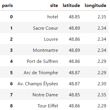
For the introductory example, let’s take a set of famous sites in Paris.
from typing import Tuple, List, Dict

import pandas as pd
import folium

pd.set_option('display.precision', 2)


df_sites = pd.DataFrame(
    [['hotel',              48.8527, 2.3542],
     ['Sacre Coeur',        48.8867, 2.3431],
     ['Louvre',             48.8607, 2.3376],
     ['Montmartre',         48.8872, 2.3388],
     ['Port de Suffren',    48.8577, 2.2902],
     ['Arc de Triomphe',    48.8739, 2.2950],
     ['Av. Champs Élysées', 48.8710, 2.3036],
     ['Notre Dame',         48.8531, 2.3498],
     ['Tour Eiffel',        48.8585, 2.2945]],
    columns=pd.Index(['site', 'latitude', 'longitude'], name='paris')
)

df_sites
Let’s see a “quick” way to plot these sites on a map using folium.
3. Showing routes on maps: a pragmatic approach
In case you are not following this article series, let me point out that we’re following an agile approach in the creation of a decision support system, so we build it incrementally in so-called “sprints”. This entails we first want to arrive at a working prototype that solves the minimum valuable problem for a trip planning system. This prototype can’t be considered complete until we have a minimalist visualization functionality, hence this article. Once we have the prototype ready, i.e., once the first version of the system is usable in a way that adds marginal value, we can start perfecting its implementation to make it easy to extend, so we can add to the system more realistic features of the real, more general problem. Thus, we’re interested now in a good enough way — not the definitive way — to display a route on a map in some meaningful manner. The more definite way will come in part 2 and part 3, where we will refactor the code created here so it follows an object-oriented design (custom types and classes) that can better handle the growing complexity of the routes that emerge from the addition of more details and requirements to the trip planning problem. But for now, this article (part 1) attempts to demonstrate a pragmatic and quicker way of creating interactive routes with Python. Let’s see how.
3.1 Displaying sites
We first need to create a map of Paris. We can center it at the average location of our group of sites:
avg_location = df_sites[['latitude', 'longitude']].mean()
map_paris = folium.Map(location=avg_location, zoom_start=13)
Then, to display the sites on top of it, we create one marker for each of the sites, and add it to the map. Markers only need a location, but to quickly recognize which site is at each marker, we pass the site name to the tooltip attribute, so we see a pop-up with the name of the site any time we hover over the markers:
for site in df_sites.itertuples():
    marker = folium.Marker(location=(site.latitude, site.longitude),
                           tooltip=site.site)
    marker.add_to(map_paris)

map_paris
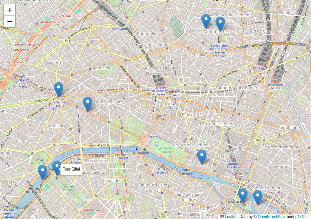
Of course, you can zoom in and out, and move around the map if you need to, with the + | – buttons in the upper-left corner and by click-and-drag.
3.2 Displaying routes
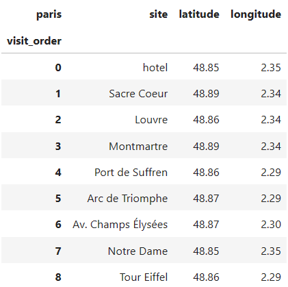
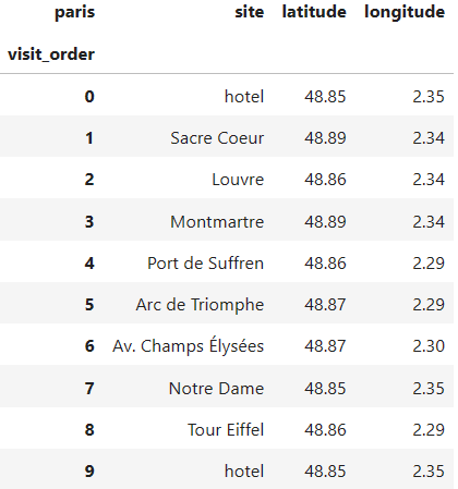
The sites we just displayed aren’t really ordered, but let’s pretend they are. Let’s say the dataframe contains a route in the city, where the numbers in the index indicate the visit order of those sites:
df_route = df_sites.copy()
df_route.index.name = 'visit_order'

df_route
Now the sites are “connected” in a specific order (the visit order), so we should also represent that fact in the map by adding lines connecting consecutive stops in the route. These lines, or more precisely, “segments”, are created with folium.PolyLine objects. To add them to the map in one go we create some more columns in df_route, holding the information of the "next stops", so each stop is mapped to its following stop, constituting a route segment. That way, each row can store info about both the stops and the segments of the route.
df_route_segments = df_route.join(
    df_route.shift(-1),  # map each stop to its next stop
    rsuffix='_next'
).dropna()  # last stop has no "next one", so drop it

df_route_segments

For a fixed row, the first three columns hold information for the “current” site, and the next three columns hold information for the “next site” in the route. This allows us to create a marker and a segment in the same for-loop iteration:
map_paris = folium.Map(location=avg_location, zoom_start=13)

for stop in df_route_segments.itertuples():
    # marker for current stop
    marker = folium.Marker(location=(stop.latitude, stop.longitude),
                           tooltip=stop.site)
    # line for the route segment connecting current to next stop
    line = folium.PolyLine(
        locations=[(stop.latitude, stop.longitude),
                   (stop.latitude_next, stop.longitude_next)],
        tooltip=f"{stop.site} to {stop.site_next}",
    )
    # add elements to the map
    marker.add_to(map_paris)
    line.add_to(map_paris)

# maker for last stop wasn't added in for loop, so adding it now
folium.Marker(location=(stop.latitude_next, stop.longitude_next),
              tooltip=stop.site_next).add_to(map_paris);

map_paris
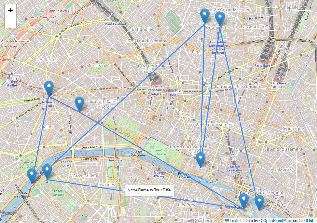
Now the order in which the stops are visited is clear, and when you hover over each line with the mouse you see which two stops the line is connecting. The same is true for markers, the names of the sites they reference are displayed when hovering over them.
3.3 Enriching the map with interactive information
This is all well and good to get a rough idea of what the route looks like, but we can make the map a bit more insightful with little extra effort by adding more information that can be displayed interactively. For starters, where does the route start? With the current view, it’s not straightforward which of the sites is the “initial one”. There are two markers that are connected to only one segment, so it must be one of these, but we’d have to look at the dataframe to distinguish the “start” from the “finish” site. A better way is to indicate the initial site with a special icon so that we can recognize it at a glance. We do that by adding a folium.Icon object to each marker, making the initial site have a distinct icon:
map_paris = folium.Map(location=avg_location, zoom_start=13)

for stop in df_route_segments.itertuples():
    initial_stop = stop.Index == 0
    # icon for current stop
    icon = folium.Icon(icon='home' if initial_stop else 'info-sign',
                       color='cadetblue' if initial_stop else 'red')
    # marker for current stop
    marker = folium.Marker(location=(stop.latitude, stop.longitude),
                           icon=icon, tooltip=stop.site)
    # line for the route segment connecting current to next stop
    line = folium.PolyLine(
        locations=[(stop.latitude, stop.longitude),
                   (stop.latitude_next, stop.longitude_next)],
        tooltip=f"{stop.site} to {stop.site_next}",
    )
    # add elements to the map
    marker.add_to(map_paris)
    line.add_to(map_paris)

# When for loop ends, the stop variable has the second-to-last
# stop in the route, so the marker for the last stop is missing
# We add it now using the "next" columns of the last row
folium.Marker(
    location=(stop.latitude_next, stop.longitude_next),
    tooltip=stop.site_next,
    icon = folium.Icon(icon='info-sign', color='red')
).add_to(map_paris);

map_paris  # show map
At a glance, it’s clear now that the route starts at the marker with a “home” icon. Let’s exploit the interactivity a little further by showing some more information on the map that helps us understand the route even better. The basic info we’ll add is the distances between stops and the visit order number of each stop. Since we have in each row of df_route_segments both the starting and ending points of segments, we can easily add a column with the distance between consecutive stops.
For readers interested in the current article only (i.e., not in the past articles), I have declared the function ellipsoidal_distance below. If, on the contrary, you've followed along in the article series, you already know about that function, as we developed it (and made the case for it) in the article on computing distance matrices. Feel free to re-use that function here, to avoid duplicated code. To get the distance in meters between location loc1 and location loc2, you just need to:
from geoutils import GeoAnalyzer
distance = GeoAnalyzer.ellipsoidal_distance(loc1, loc2)
from geopy.distance import geodesic

_Location = Tuple[float, float]


def ellipsoidal_distance(point1: _Location, point2: _Location) -> float:
    """Calculate ellipsoidal distance (in meters) between point1 and
    point2 where each point is represented as a tuple (lat, lon)"""
    return geodesic(point1, point2).meters
The function ellipsoidal_distance accepts two locations (two tuples of coordinates) and returns the geodesic distance between them, in meters. For a more in-depth explanation and justification of the geodesic distance, I invite you to read the article where we created it:
Compute the Distance Matrix of a Set of Sites from Their Coordinates in Python
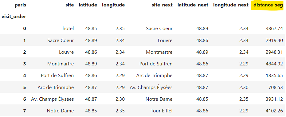
We can add the new column 'distance_seg' because we have both endpoints of the segment in each row:
df_route_segments['distance_seg'] = df_route_segments.apply(
    lambda stop: ellipsoidal_distance(
        (stop.latitude, stop.longitude),
        (stop.latitude_next, stop.longitude_next)),
    axis=1
)

df_route_segments
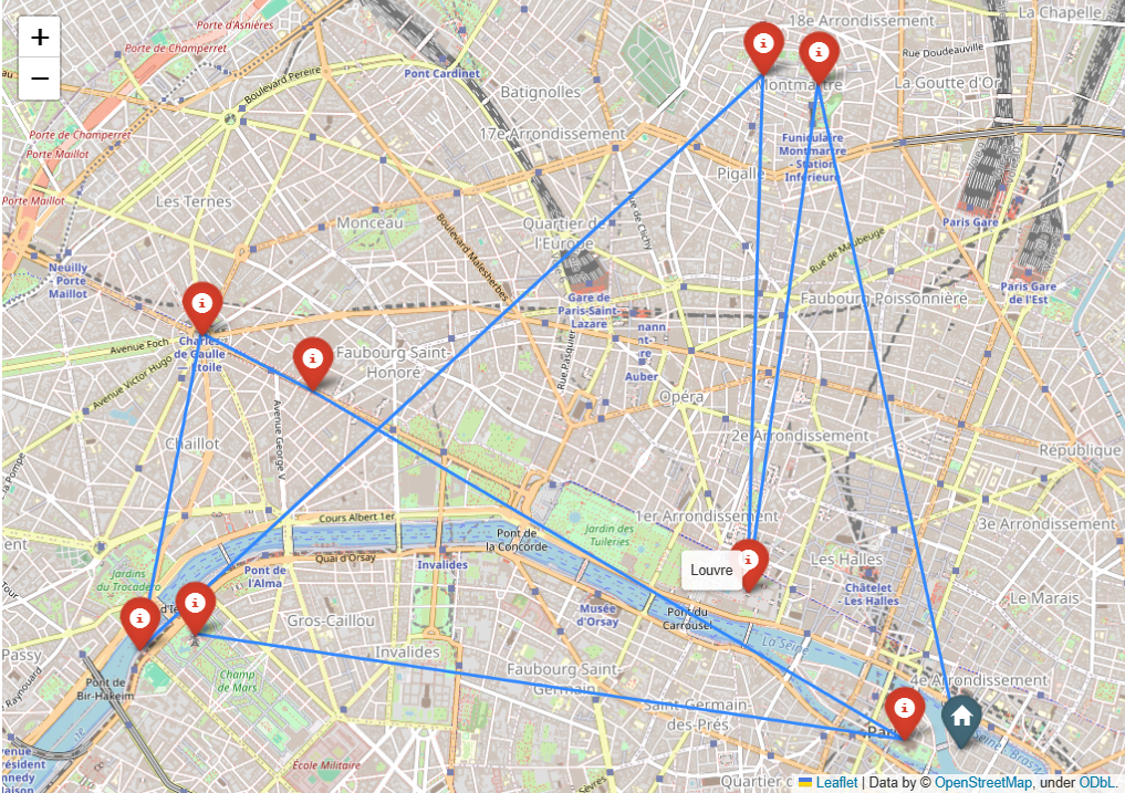
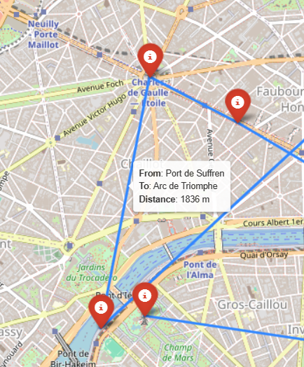
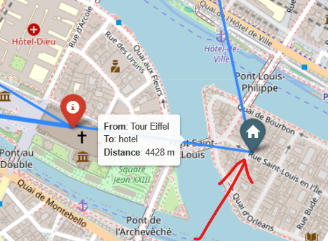
Having this new column, we can take their values and include them in the string we pass to tooltip when creating the lines of the map, thereby making each segment’s distance available at the tip of the cursor. While we're at it, let's add the "stop numbers" to the markers too, so that more context is given to each marker on the overall route:
map_paris = folium.Map(location=avg_location, zoom_start=13)

for stop in df_route_segments.itertuples():
    initial_stop = stop.Index == 0
    # marker for current stop
    icon = folium.Icon(icon='home' if initial_stop else 'info-sign',
                       color='cadetblue' if initial_stop else 'red')
    marker = folium.Marker(
        location=(stop.latitude, stop.longitude),
        icon=icon,
        # display the name and stop number at each site's marker
        tooltip=f"<b>Name</b>: {stop.site} <br>" \
              + f"<b>Stop number</b>: {stop.Index} <br>"
    )
    # line for the route segment connecting current to next stop
    line = folium.PolyLine(
        locations=[(stop.latitude, stop.longitude),
                   (stop.latitude_next, stop.longitude_next)],
        # display the start, end, and distance of each segment
        tooltip=f"<b>From</b>: {stop.site} <br>" \
              + f"<b>To</b>: {stop.site_next} <br>" \
              + f"<b>Distance</b>: {stop.distance_seg:.0f} m",
    )
    # add elements to the map
    marker.add_to(map_paris)
    line.add_to(map_paris)

# add route's last marker, as it wasn't included in for loop
folium.Marker(
    location=(stop.latitude_next, stop.longitude_next),
    tooltip=f"<b>Name</b>: {stop.site_next} <br>" \
          + f"<b>Stop number</b>: {stop.Index + 1} <br>",
    icon = folium.Icon(icon='info-sign', color='red')
).add_to(map_paris);

map_paris  # show map
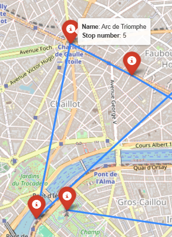
Note how we’ve used a bit of HTML to render the “hover text” displayed on markers and lines more nicely.
The current behavior seems general enough to be encapsulated into some helper functions:
def _make_route_segments_df(df_route: pd.DataFrame) -> pd.DataFrame:
    """Given a dataframe whose rows are ordered stops in a route,
    and where the index has integers representing the visit order of those
    stops, return a dataframe having new columns with the information of
    each stop's next site"""
    df_route_segments = df_route.join(
        df_route.shift(-1),  # map each stop to its next
        rsuffix='_next').dropna()

    df_route_segments['distance_seg'] = df_route_segments.apply(
        lambda stop: ellipsoidal_distance(
            (stop.latitude, stop.longitude),
            (stop.latitude_next, stop.longitude_next)
        ), axis=1
    )
    return df_route_segments


def plot_route_on_map(df_route: pd.DataFrame) -> folium.Map:
    """Takes a dataframe of a route and displays it on a map, adding
    a marker for each stop and a line for each pair of consecutive
    stops"""
    df_route_segments = _make_route_segments_df(df_route)

    # create empty map
    avg_location = df_route[['latitude', 'longitude']].mean()
    map_route = folium.Map(location=avg_location, zoom_start=13)

    for stop in df_route_segments.itertuples():
        initial_stop = stop.Index == 0
        # marker for current stop
        icon = folium.Icon(icon='home' if initial_stop else 'info-sign',
                           color='cadetblue' if initial_stop else 'red')
        marker = folium.Marker(
            location=(stop.latitude, stop.longitude),
            icon=icon,
            tooltip=f"<b>Name</b>: {stop.site} <br>" \
                  + f"<b>Stop number</b>: {stop.Index} <br>"
        )
        # line for the route segment connecting current to next stop
        line = folium.PolyLine(
            locations=[(stop.latitude, stop.longitude),
                       (stop.latitude_next, stop.longitude_next)],
            # add to each line its start, end, and distance
            tooltip=f"<b>From</b>: {stop.site} <br>" \
                  + f"<b>To</b>: {stop.site_next} <br>" \
                  + f"<b>Distance</b>: {stop.distance_seg:.0f} m",
        )
        # add elements to the map
        marker.add_to(map_route)
        line.add_to(map_route)

    # When for loop ends, the stop variable has the second-to-last stop in
    # the route, so the marker for the last stop is missing, and we add it
    # now using the "next" columns of the last row
    folium.Marker(
        location=(stop.latitude_next, stop.longitude_next),
        tooltip=f"<b>Name</b>: {stop.site_next} <br>" \
              + f"<b>Stop number</b>: {stop.Index + 1} <br>",
        icon = folium.Icon(icon='info-sign', color='red')
    ).add_to(map_route)

    return map_route
3.4 Dealing with closed routes, a.k.a. tours
What happens if we have a dataframe df_route representing a closed tour, i.e., a route that starts and ends at the same site? How will the map reflect that? Let's build such a dataframe and test it. We take the previous df_route, having an open route, and add a new row at the end with the same info as in the first row, thus making the route closed:
df_route_closed = pd.concat(
   [df_route, df_route.head(1)], ignore_index=True
)
df_route_closed.index.name = df_route.index.name

df_route_closed
Thanks to setting ignore_index=True, the index number, which represents the visit order, has been incremented in one unit automatically. Now we just proceed as before, creating the map, but this time with our new helper function plot_route_on_map:
plot_route_on_map(df_route_closed)
It works almost fine, because the new line representing the “closing” segment is created as it should, but there’s a problem with the markers: a new red marker is added on top of the previously added blue marker for the initial site, hiding it. This is simply how Folium works, adding elements on top of elements (notice how the marker’s shadow is darker for the ‘hotel’ than for the other markers, a subtle way of saying that there’s more than one marker in that location). To avoid losing that helpful blue “home” icon indicating the starting stop of the route, we need to skip adding the last marker (after the for-loop ends) only when the last stop coincides with the starting site of the route. We can do that by checking the condition directly, on df_route, and by only adding this last marker if the route is not closed:
# NOTE: trimmed down function for reference only, do not copy-paste.
def plot_route_on_map(df_route: pd.DataFrame) -> folium.Map:
    #----- map is created here -----
    # ...
    #----- markers are created here -----
    for stop in df_route_segments.itertuples():
        # ...
        # ( ఠ ͟ʖ ఠ)
        # ...
        # for loop ends!

    ### 𝗡𝗲𝘄 𝗰𝗼𝗻𝗱𝗶𝘁𝗶𝗼𝗻 𝗰𝗵𝗲𝗰𝗸𝗲𝗿 ###
    # check if first site's name and location coincide with last's?
    first_stop = df_route_closed.iloc[0][['site', 'latitude', 'longitude']]
    last_stop = df_route_closed.iloc[-1][['site', 'latitude', 'longitude']]
    is_closed_tour = (first_stop == last_stop).all()

    # When for loop ends, the marker for the last stop is missing
    # (**unless the route is closed**). if the route is not closed,
    # we add it now using the "next" columns of the last row
    if not is_closed_tour:
        folium.Marker(
            location=(stop.latitude_next, stop.longitude_next),
            tooltip=f"<b>Name</b>: {stop.site_next} <br>" \
                  + f"<b>Stop number</b>: {stop.Index + 1} <br>",
            icon = folium.Icon(icon='info-sign', color='red')
        ).add_to(map_route)

    return map_route
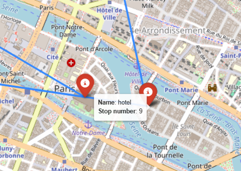
After editing plot_route_on_map as indicated above, the desired behavior is restored, i.e., the “home” icon for the initial site is not overridden by the last stop in the tour:
plot_route_on_map(df_route_closed)
With this final view, we can easily know the distance between two consecutive stops (and the sites it’s connecting) with just one move of the cursor. Besides, we can check the chronological order in which sites are visited just by hovering over them. This interactivity can help us evaluate the quality of the routes we deal with, regardless of the routing problem at hand.
3.5 Bonus: Adding KPIs to the map
To cap it all, let’s add a feature that can make the map even more insightful.
There’s always information that is not directly associated with any site or segment in a route, but with the route as a whole. This information is important to know about too, and tends to be global properties, like IDs or names, or relevant metrics associated with the routes. We can display them too on a folium map with a simple trick.
If we want to display information that isn’t linked to any single marker or line, but that pertains to the route as a whole, we can add it as text blocks in folium maps. This is useful for business dashboards, for example, where one usually wants to display things like the name/ID of the route or various metrics that attempt to summarize it in some relevant sense.
As an example, I’ll add at the top-left corner a title for the map, and at the bottom-right corner two very basic KPIs for routes: the number of stops and the total distance it traverses. We define the names of the different pieces of text we want to display (in the TAG_ constants), and extract their respective values from df_route_segments, the dataframe having all the "segments data":
TAG_ROUTE_NAME = "Name"
TAG_NUMBER_STOPS = "Num stops"
TAG_TOTAL_DISTANCE = "Distance"
_SPACE_HTML = " " # needed to add empty spaces between KPIs
# get summary info to display on map
name = df_route_segments.columns.name.capitalize()
n_stops = df_route_segments['site'].size
route_distance = df_route_segments['distance_seg'].sum().round(0)
For each piece of text we want to add, we need to convert it to HTML and add it to the map in a special way. The string having the HTML code for the text needs to go inside a folium.Element. These are the steps: (1) Make a basic HTML string with the info to be displayed, (2) style it with more HTML, and (3) add it to the map’s root HTML element. I know, talking about maps gets me lost too, so let’s just do it.
💡Tip: If you’re using Jupyter Notebook or Lab, I recommend you use the IPython.display.HTML class to gain quick feedback on your HTML code, like this:
from IPython.display import HTML, display
# show a hello world message in blue and bold
display(HTML("<span style='color:steelblue'>Hello <b>world</b></span>"))
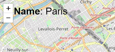
Adding a title to the map
First, create the basic HTML string for the title:
_html_text_title = f"<b>{TAG_ROUTE_NAME}</b>: {name}"

display(HTML(_html_text_title))  # [Out]: 𝗡𝗮𝗺𝗲: Paris
Second, style this basic HTML string as you wish. Here, I want the title to be black, located at the top-left of the map, and, for improved readability, I want the text to have some background white shadow:
STYLE_TITLE = (
    "position:absolute;z-index:100000;left:5vw;color:black;"
    "font-size:30px;text-shadow:-1px 0 white, 0 1px white, 0 1px white"
)
html_title = f'<h3 style="{STYLE_TITLE}">{_html_text_title}</h3>'

# let's see how that title looks like on the map (run all in same cell):
map_with_title = plot_route_on_map(df_route)

root_map = map_with_title.get_root()
root_map.html.add_child(folium.Element(html_title))

map_with_title
That looks nice. Now, the same thing for the KPIs:
Adding KPIs to the map
As we did before, first, we create the basic HTML string for the KPIs. For this case, the display will be different, and of course, it depends on personal taste: I like my KPIs displayed horizontally at the bottom-right of the map. Feel free to change the style parameters to suite your aesthetic preferences.
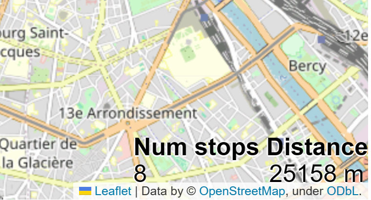
_html_text_summary = f"""
<b>{TAG_NUMBER_STOPS}</b> <b>{TAG_TOTAL_DISTANCE}</b>
<br>
{n_stops} {16 * _SPACE_HTML} {route_distance:.0f} m
"""

display(HTML(_html_text_summary))
# [Out]:
# 𝐍𝐮𝐦 𝐬𝐭𝐨𝐩𝐬  𝐃𝐢𝐬𝐭𝐚𝐧𝐜𝐞
# 8          25158 m
The style is very similar, the only change is a slightly smaller font size. We keep the white background shadow as it’s key for the clarity of the KPIs displayed:
STYLE_SUMMARY = (
    "position:absolute;z-index:100000;font-size:20px;"
    "right:0;bottom:0;color:black;"
    "text-shadow:-1px 0 white, 0 1px white, 0 1px white"
)
html_summary = f'<h2 style="{STYLE_SUMMARY}">{_html_text_summary}</h2>'

# let's see how the KPIs look like (run all in same cell):
map_with_kpis = plot_route_on_map(df_route)

root_map = map_with_kpis.get_root()
root_map.html.add_child(folium.Element(html_summary))

map_with_kpis
Alright, this is starting to look great! Let’s combine both the title and KPIs now!
my_map = plot_route_on_map(df_route)

root_map = my_map.get_root()
root_map.html.add_child(folium.Element(html_title))  # add title
root_map.html.add_child(folium.Element(html_summary))  # add summary KPIs
my_map  # check it out

Thanks to the text we’ve added, the map now conveys more useful information on the route (and looks more professional, doesn’t it?). Without even moving the mouse, we can see valuable information on the corners; and thanks to interactivity, with a very quick hovering around, we can see the names and visiting order of the different sites, as well as the distance between any pair of stops. Let’s make this functionality reusable by wrapping it up into helper functions, and let’s create a new, more general function, display_route_on_map, that will create a map like plot_route_on_map did, with the added option of including the name and KPI information to the map. First, the functions to obtain the HTML strings:
def _get_text_for_title(df_route_segments):
    """Given a dataframe representing a route, where the column index has
    the name of the route, returns an HTML string with a nice display of
    this name"""
    # 1) get the info to display
    name = df_route_segments.columns.name
    name = name.capitalize() if name else ''

    # 2) parse the info as HTML for addition to map
    _html_text_title = f"<b>{TAG_ROUTE_NAME}</b>: {name}"
    html_title = f'<h3 style="{STYLE_TITLE}">{_html_text_title}</h3>'
    return html_title


def _get_kpis_to_display_on_map(df_route_segments):
    """Given a dataframe representing a route, and having columns 'site'
    and 'distance_seg', returns an HTML string with a nice display of
    the number of sites and the total distance of the route"""
    # 1) get the info to display
    n_stops = df_route_segments['site'].size
    route_distance = df_route_segments['distance_seg'].sum().round(0)

    # 2) parse the info as HTML for addition to map
    _html_text_summary = f"""
    <b>{TAG_NUMBER_STOPS}</b> <b>{TAG_TOTAL_DISTANCE}</b>
    <br>
    {n_stops} {16 * _SPACE_HTML} {route_distance:.0f} m
    """
    html_summary = f'<h2 style="{STYLE_SUMMARY}">{_html_text_summary}</h2>'
    return html_summary
We can control the addition of the title and KPIs to the map with the attribute include_kpis of the new function:
def display_route_on_map(df_route, include_kpis=True) -> folium.Map:
    """Given a dataframe representing a route, creates a folium map
    and adds markers for the stops and lines for the route segments,
    with the option to also add an automatic title and 2 KPIs:
     - number of stops in the route
     - total distance of route

    Parameters
    ----------
    df_route : pd.DataFrame
      A dataframe representing a route, whereby each row contains
      information on a different stop of the route, and rows are sorted
      by stop visiting order.
    include_kpis : bool (default=True)
      Whether to include the title and the 2 KPIs in the map

    Returns
    -------
    A folium map that can be displayed or re-used"""
    # 1) create empty map
    avg_location = df_route[['latitude', 'longitude']].mean()
    map_route = folium.Map(location=avg_location, zoom_start=13)

    # 2) create DF with segment information
    df_route_segments = _make_route_segments_df(df_route)

    # 3) add title and KPIs to the map
    if include_kpis:
        html_title = _get_text_for_title(df_route_segments)
        html_summary = _get_kpis_to_display_on_map(df_route_segments)
        root_map = map_route.get_root()
        root_map.html.add_child(folium.Element(html_title))  # add title
        root_map.html.add_child(folium.Element(html_summary))  # add KPIs

    # 4) add route to the map
    for stop in df_route_segments.itertuples():
        initial_stop = stop.Index == 0
        # marker for current stop
        icon = folium.Icon(icon='home' if initial_stop else 'info-sign',
                           color='cadetblue' if initial_stop else 'red')
        marker = folium.Marker(
            location=(stop.latitude, stop.longitude),
            icon=icon,
            tooltip=f"<b>Name</b>: {stop.site} <br>" \
                  + f"<b>Stop number</b>: {stop.Index} <br>"
        )
        # line for the route segment connecting current to next stop
        line = folium.PolyLine(
            locations=[(stop.latitude, stop.longitude),
                       (stop.latitude_next, stop.longitude_next)],
            # add to each line its start, end, and distance
            tooltip=f"<b>From</b>: {stop.site} <br>" \
                  + f"<b>To</b>: {stop.site_next} <br>" \
                  + f"<b>Distance</b>: {stop.distance_seg:.0f} m",
        )
        # add elements to the map
        marker.add_to(map_route)
        line.add_to(map_route)

    # does the first site's name and location coincide with the last's?
    first_stop = df_route_closed.iloc[0][['site', 'latitude', 'longitude']]
    last_stop = df_route_closed.iloc[-1][['site', 'latitude', 'longitude']]
    is_closed_tour = (first_stop == last_stop).all()

    # When for loop ends, the stop variable has the second-to-last
    # stop in the route, so the marker for the last stop is missing
    # (**unless the route is closed**). We add it now using
    # the "next" columns of the last row, if the route is open
    if not is_closed_tour:
        folium.Marker(
            location=(stop.latitude_next, stop.longitude_next),
            tooltip=f"<b>Name</b>: {stop.site_next} <br>" \
                  + f"<b>Stop number</b>: {stop.Index + 1} <br>",
            icon = folium.Icon(icon='info-sign', color='red')
        ).add_to(map_route)

    return map_route
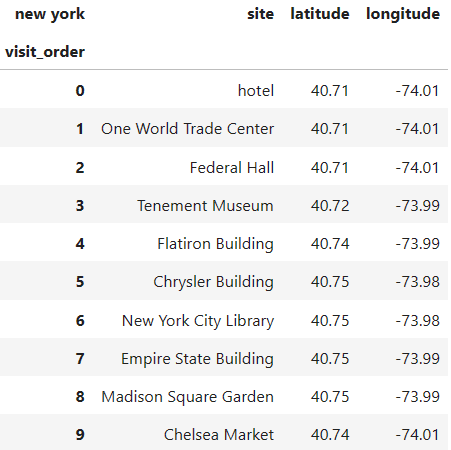
Let’s do a final test of our display_route_on_map function with a tour on a different city: New York. The dataframe below has a set of iconic sites of the city (and a random hotel) in no particular order:
df_route_ny = pd.DataFrame(
    [['hotel',                  40.710400, -74.006670],
     ['One World Trade Center', 40.713658, -74.013285],
     ['Federal Hall',           40.708051, -74.010223],
     ['Tenement Museum',        40.718807, -73.990051],
     ['Flatiron Building',      40.739665, -73.989976],
     ['Chrysler Building',      40.750542, -73.975632],
     ['New York City Library',  40.752471, -73.982162],
     ['Empire State Building',  40.747814, -73.985289],
     ['Madison Square Garden',  40.749924, -73.993853],
     ['Chelsea Market',         40.742750, -74.006877]],
    columns=pd.Index(['site', 'latitude', 'longitude'], name='new york')
)
df_route_ny.index.name = 'visit_order'

df_route_ny
With the dataframe of the route ready, a nice visualization is just a single function call away:
display_route_on_map(df_route_ny)
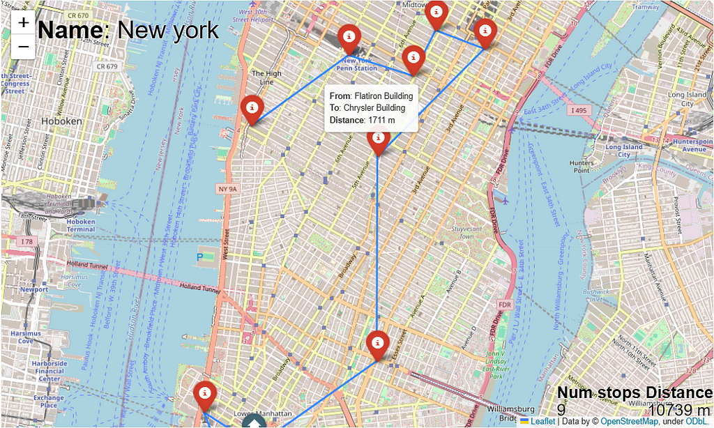
We get a simple, yet powerful visualization of the route on top of Manhattan. At a glance, we know how much distance the route covers, and we don’t even need to bother counting red markers: the “Num stops” KPI is telling us already. For more context, all markers and route segments are interactive and will display some useful information in pop-ups when we caringly pass our mouse over them. Mission accomplished!
4. Conclusion (or planning for next sprint)
In this article, we’ve developed a pragmatic approach to taking generic routes stored in dataframes and displaying them on top of maps using interactive markers and segments that help us gain more context and get more information. If that was all you were after, I hope I’ve served you well and you’re able to expand on it for your own projects.
If you’re a reader of the “An Intelligent Decision Support System for Tourism in Python” article series, and you want to keep learning applied prescriptive analytics through the building of a trip planning system, please keep on reading, as in the next sprint we’re going to integrate this mapping functionality with the Traveling Salesman Optimizer we created in the previous sprint, so we can easily evaluate the optimal tours we generate. Stay tuned to witness the tour de force we’re gonna build together!
An intelligent decision support system for tourism in Python
Thanks for reading, and see you in the next one! 📈😊
Feel free to follow me, ask me questions, give me feedback, or contact me on LinkedIn.
Visualizing Routes on Interactive Maps with Python: Part 1 was originally published in Towards Data Science on Medium, where people are continuing the conversation by highlighting and responding to this story.
A pragmatic guide to interactive data visualization for transportation problems with Folium

👁️ This is article #6 of the series covering the project “An Intelligent Decision Support System for Tourism in Python”. Please note the present article is self-contained and independent of the previous ones in the series, so you can read it and code along without needing to read the previous ones. Just ignore any references to previous articles when you encounter them.
This article is two things at once: a tutorial on using folium to display routes, and a guide to incremental data visualization, where the priorities are to (1) have something working, then (2) something useful, and only then (3) something beautiful. As such, this guide will be a valuable tool for people developing general routing applications, especially when the goal is to have a prototype, fast. One such routing application is trip plan optimization, the unifying theme of this article series. I invite you to take a look at it if you want to learn about how to design and incrementally build a decision support system from scratch. If, however, you only want to visualize routes in an interactive way for faster time-to-insights, this article will demonstrate a quick but powerful approach to doing so—because I know you need to get it done, and then get it good. Part 2 will demonstrate a slower but more robust approach to doing the same.
Table of contents
1. Previous sprint recap
2. Data and dependencies set up
3. Showing routes on maps: a pragmatic approach
- 3.1 Displaying sites
- 3.2 Displaying routes
- 3.3 Enriching the map with interactive information
- 3.4 Dealing with closed routes, a.k.a. tours
- 3.5 Bonus: Adding KPIs to the map
4. Conclusion (or planning for next sprint)
1. Previous sprint recap
In the previous article, we created an optimizer class à la scikit-learn to solve the Traveling Salesman Problem (TSP) for an arbitrary set of locations in just one simple method call. Long story short, if you have a dataframe with site locations, this optimizer can be “fitted” to those locations to automatically provide the optimal (minimal distance) tour.
A classy approach to solving Traveling Salesman Problems effectively with Python
At the end of it, we concluded that, even though solving the TSP in a one-liner is super convenient, the output of such optimizer was not enough for a finished prototype. We needed a way to visualize that output quickly, to intuitively verify it and share it with others. Hence, that need is what motivates the goal of this sprint, the sixth in the series: take the output of the optimizer, i.e., a route in the form of ordered locations, and show it graphically on a map. Note that the optimizer’s output, a dataframe storing the optimal route, is now our input, and the output we need to make is the route displayed on a map. The input is general: just an ordered sequence of locations that could represent any kind of route: the stops a transit bus does on any given day, the set of addresses a postal service worker visits to deliver the mail, the path a rider of a food delivery company travels to service many residencies. What matters to us is the visualization of generic routes, and we’ll develop the functionality to do that in this article.
2. Data and dependencies set up
2.1 Install dependencies
We’ll use the beautiful Folium library to create maps, which uses the Leaflet.js library under the hood to allow Python programmers to easily create interactive maps. We’ll also need Geopy, a powerful geocoding library (which you already installed if you created the virtual environment at the beginning of the series). Both are standard packages installable through pip or conda. Choose one of these two commands for installation:
conda install -y -c conda-forge geopy folium

pip insall geopy folium

# In case of errors, use these specific versions (used for this article)
# folium              0.14.0
# geopy               2.3.0
# pandas              2.0.3
2.2 Prepare input data
For the introductory example, let’s take a set of famous sites in Paris.
from typing import Tuple, List, Dict

import pandas as pd
import folium

pd.set_option('display.precision', 2)


df_sites = pd.DataFrame(
    [['hotel',              48.8527, 2.3542],
     ['Sacre Coeur',        48.8867, 2.3431],
     ['Louvre',             48.8607, 2.3376],
     ['Montmartre',         48.8872, 2.3388],
     ['Port de Suffren',    48.8577, 2.2902],
     ['Arc de Triomphe',    48.8739, 2.2950],
     ['Av. Champs Élysées', 48.8710, 2.3036],
     ['Notre Dame',         48.8531, 2.3498],
     ['Tour Eiffel',        48.8585, 2.2945]],
    columns=pd.Index(['site', 'latitude', 'longitude'], name='paris')
)

df_sites
Let’s see a “quick” way to plot these sites on a map using folium.
3. Showing routes on maps: a pragmatic approach
In case you are not following this article series, let me point out that we’re following an agile approach in the creation of a decision support system, so we build it incrementally in so-called “sprints”. This entails we first want to arrive at a working prototype that solves the minimum valuable problem for a trip planning system. This prototype can’t be considered complete until we have a minimalist visualization functionality, hence this article. Once we have the prototype ready, i.e., once the first version of the system is usable in a way that adds marginal value, we can start perfecting its implementation to make it easy to extend, so we can add to the system more realistic features of the real, more general problem. Thus, we’re interested now in a good enough way — not the definitive way — to display a route on a map in some meaningful manner. The more definite way will come in part 2 and part 3, where we will refactor the code created here so it follows an object-oriented design (custom types and classes) that can better handle the growing complexity of the routes that emerge from the addition of more details and requirements to the trip planning problem. But for now, this article (part 1) attempts to demonstrate a pragmatic and quicker way of creating interactive routes with Python. Let’s see how.
3.1 Displaying sites
We first need to create a map of Paris. We can center it at the average location of our group of sites:
avg_location = df_sites[['latitude', 'longitude']].mean()
map_paris = folium.Map(location=avg_location, zoom_start=13)
Then, to display the sites on top of it, we create one marker for each of the sites, and add it to the map. Markers only need a location, but to quickly recognize which site is at each marker, we pass the site name to the tooltip attribute, so we see a pop-up with the name of the site any time we hover over the markers:
for site in df_sites.itertuples():
    marker = folium.Marker(location=(site.latitude, site.longitude),
                           tooltip=site.site)
    marker.add_to(map_paris)

map_paris
Of course, you can zoom in and out, and move around the map if you need to, with the + | – buttons in the upper-left corner and by click-and-drag.
3.2 Displaying routes
The sites we just displayed aren’t really ordered, but let’s pretend they are. Let’s say the dataframe contains a route in the city, where the numbers in the index indicate the visit order of those sites:
df_route = df_sites.copy()
df_route.index.name = 'visit_order'

df_route
Now the sites are “connected” in a specific order (the visit order), so we should also represent that fact in the map by adding lines connecting consecutive stops in the route. These lines, or more precisely, “segments”, are created with folium.PolyLine objects. To add them to the map in one go we create some more columns in df_route, holding the information of the "next stops", so each stop is mapped to its following stop, constituting a route segment. That way, each row can store info about both the stops and the segments of the route.
df_route_segments = df_route.join(
    df_route.shift(-1),  # map each stop to its next stop
    rsuffix='_next'
).dropna()  # last stop has no "next one", so drop it

df_route_segments
For a fixed row, the first three columns hold information for the “current” site, and the next three columns hold information for the “next site” in the route. This allows us to create a marker and a segment in the same for-loop iteration:
map_paris = folium.Map(location=avg_location, zoom_start=13)

for stop in df_route_segments.itertuples():
    # marker for current stop
    marker = folium.Marker(location=(stop.latitude, stop.longitude),
                           tooltip=stop.site)
    # line for the route segment connecting current to next stop
    line = folium.PolyLine(
        locations=[(stop.latitude, stop.longitude),
                   (stop.latitude_next, stop.longitude_next)],
        tooltip=f"{stop.site} to {stop.site_next}",
    )
    # add elements to the map
    marker.add_to(map_paris)
    line.add_to(map_paris)

# maker for last stop wasn't added in for loop, so adding it now
folium.Marker(location=(stop.latitude_next, stop.longitude_next),
              tooltip=stop.site_next).add_to(map_paris);

map_paris
Now the order in which the stops are visited is clear, and when you hover over each line with the mouse you see which two stops the line is connecting. The same is true for markers, the names of the sites they reference are displayed when hovering over them.
3.3 Enriching the map with interactive information
This is all well and good to get a rough idea of what the route looks like, but we can make the map a bit more insightful with little extra effort by adding more information that can be displayed interactively. For starters, where does the route start? With the current view, it’s not straightforward which of the sites is the “initial one”. There are two markers that are connected to only one segment, so it must be one of these, but we’d have to look at the dataframe to distinguish the “start” from the “finish” site. A better way is to indicate the initial site with a special icon so that we can recognize it at a glance. We do that by adding a folium.Icon object to each marker, making the initial site have a distinct icon:
map_paris = folium.Map(location=avg_location, zoom_start=13)

for stop in df_route_segments.itertuples():
    initial_stop = stop.Index == 0
    # icon for current stop
    icon = folium.Icon(icon='home' if initial_stop else 'info-sign',
                       color='cadetblue' if initial_stop else 'red')
    # marker for current stop
    marker = folium.Marker(location=(stop.latitude, stop.longitude),
                           icon=icon, tooltip=stop.site)
    # line for the route segment connecting current to next stop
    line = folium.PolyLine(
        locations=[(stop.latitude, stop.longitude),
                   (stop.latitude_next, stop.longitude_next)],
        tooltip=f"{stop.site} to {stop.site_next}",
    )
    # add elements to the map
    marker.add_to(map_paris)
    line.add_to(map_paris)

# When for loop ends, the stop variable has the second-to-last
# stop in the route, so the marker for the last stop is missing
# We add it now using the "next" columns of the last row
folium.Marker(
    location=(stop.latitude_next, stop.longitude_next),
    tooltip=stop.site_next,
    icon = folium.Icon(icon='info-sign', color='red')
).add_to(map_paris);

map_paris  # show map
At a glance, it’s clear now that the route starts at the marker with a “home” icon. Let’s exploit the interactivity a little further by showing some more information on the map that helps us understand the route even better. The basic info we’ll add is the distances between stops and the visit order number of each stop. Since we have in each row of df_route_segments both the starting and ending points of segments, we can easily add a column with the distance between consecutive stops.
For readers interested in the current article only (i.e., not in the past articles), I have declared the function ellipsoidal_distance below. If, on the contrary, you've followed along in the article series, you already know about that function, as we developed it (and made the case for it) in the article on computing distance matrices. Feel free to re-use that function here, to avoid duplicated code. To get the distance in meters between location loc1 and location loc2, you just need to:
from geoutils import GeoAnalyzer
distance = GeoAnalyzer.ellipsoidal_distance(loc1, loc2)
from geopy.distance import geodesic

_Location = Tuple[float, float]


def ellipsoidal_distance(point1: _Location, point2: _Location) -> float:
    """Calculate ellipsoidal distance (in meters) between point1 and
    point2 where each point is represented as a tuple (lat, lon)"""
    return geodesic(point1, point2).meters
The function ellipsoidal_distance accepts two locations (two tuples of coordinates) and returns the geodesic distance between them, in meters. For a more in-depth explanation and justification of the geodesic distance, I invite you to read the article where we created it:
Compute the Distance Matrix of a Set of Sites from Their Coordinates in Python
We can add the new column 'distance_seg' because we have both endpoints of the segment in each row:
df_route_segments['distance_seg'] = df_route_segments.apply(
    lambda stop: ellipsoidal_distance(
        (stop.latitude, stop.longitude),
        (stop.latitude_next, stop.longitude_next)),
    axis=1
)

df_route_segments
Having this new column, we can take their values and include them in the string we pass to tooltip when creating the lines of the map, thereby making each segment’s distance available at the tip of the cursor. While we're at it, let's add the "stop numbers" to the markers too, so that more context is given to each marker on the overall route:
map_paris = folium.Map(location=avg_location, zoom_start=13)

for stop in df_route_segments.itertuples():
    initial_stop = stop.Index == 0
    # marker for current stop
    icon = folium.Icon(icon='home' if initial_stop else 'info-sign',
                       color='cadetblue' if initial_stop else 'red')
    marker = folium.Marker(
        location=(stop.latitude, stop.longitude),
        icon=icon,
        # display the name and stop number at each site's marker
        tooltip=f"<b>Name</b>: {stop.site} <br>" \
              + f"<b>Stop number</b>: {stop.Index} <br>"
    )
    # line for the route segment connecting current to next stop
    line = folium.PolyLine(
        locations=[(stop.latitude, stop.longitude),
                   (stop.latitude_next, stop.longitude_next)],
        # display the start, end, and distance of each segment
        tooltip=f"<b>From</b>: {stop.site} <br>" \
              + f"<b>To</b>: {stop.site_next} <br>" \
              + f"<b>Distance</b>: {stop.distance_seg:.0f} m",
    )
    # add elements to the map
    marker.add_to(map_paris)
    line.add_to(map_paris)

# add route's last marker, as it wasn't included in for loop
folium.Marker(
    location=(stop.latitude_next, stop.longitude_next),
    tooltip=f"<b>Name</b>: {stop.site_next} <br>" \
          + f"<b>Stop number</b>: {stop.Index + 1} <br>",
    icon = folium.Icon(icon='info-sign', color='red')
).add_to(map_paris);

map_paris  # show map
Note how we’ve used a bit of HTML to render the “hover text” displayed on markers and lines more nicely.
The current behavior seems general enough to be encapsulated into some helper functions:
def _make_route_segments_df(df_route: pd.DataFrame) -> pd.DataFrame:
    """Given a dataframe whose rows are ordered stops in a route,
    and where the index has integers representing the visit order of those
    stops, return a dataframe having new columns with the information of
    each stop's next site"""
    df_route_segments = df_route.join(
        df_route.shift(-1),  # map each stop to its next
        rsuffix='_next').dropna()

    df_route_segments['distance_seg'] = df_route_segments.apply(
        lambda stop: ellipsoidal_distance(
            (stop.latitude, stop.longitude),
            (stop.latitude_next, stop.longitude_next)
        ), axis=1
    )
    return df_route_segments


def plot_route_on_map(df_route: pd.DataFrame) -> folium.Map:
    """Takes a dataframe of a route and displays it on a map, adding
    a marker for each stop and a line for each pair of consecutive
    stops"""
    df_route_segments = _make_route_segments_df(df_route)

    # create empty map
    avg_location = df_route[['latitude', 'longitude']].mean()
    map_route = folium.Map(location=avg_location, zoom_start=13)

    for stop in df_route_segments.itertuples():
        initial_stop = stop.Index == 0
        # marker for current stop
        icon = folium.Icon(icon='home' if initial_stop else 'info-sign',
                           color='cadetblue' if initial_stop else 'red')
        marker = folium.Marker(
            location=(stop.latitude, stop.longitude),
            icon=icon,
            tooltip=f"<b>Name</b>: {stop.site} <br>" \
                  + f"<b>Stop number</b>: {stop.Index} <br>"
        )
        # line for the route segment connecting current to next stop
        line = folium.PolyLine(
            locations=[(stop.latitude, stop.longitude),
                       (stop.latitude_next, stop.longitude_next)],
            # add to each line its start, end, and distance
            tooltip=f"<b>From</b>: {stop.site} <br>" \
                  + f"<b>To</b>: {stop.site_next} <br>" \
                  + f"<b>Distance</b>: {stop.distance_seg:.0f} m",
        )
        # add elements to the map
        marker.add_to(map_route)
        line.add_to(map_route)

    # When for loop ends, the stop variable has the second-to-last stop in
    # the route, so the marker for the last stop is missing, and we add it
    # now using the "next" columns of the last row
    folium.Marker(
        location=(stop.latitude_next, stop.longitude_next),
        tooltip=f"<b>Name</b>: {stop.site_next} <br>" \
              + f"<b>Stop number</b>: {stop.Index + 1} <br>",
        icon = folium.Icon(icon='info-sign', color='red')
    ).add_to(map_route)

    return map_route
3.4 Dealing with closed routes, a.k.a. tours
What happens if we have a dataframe df_route representing a closed tour, i.e., a route that starts and ends at the same site? How will the map reflect that? Let's build such a dataframe and test it. We take the previous df_route, having an open route, and add a new row at the end with the same info as in the first row, thus making the route closed:
df_route_closed = pd.concat(
   [df_route, df_route.head(1)], ignore_index=True
)
df_route_closed.index.name = df_route.index.name

df_route_closed
Thanks to setting ignore_index=True, the index number, which represents the visit order, has been incremented in one unit automatically. Now we just proceed as before, creating the map, but this time with our new helper function plot_route_on_map:
plot_route_on_map(df_route_closed)
It works almost fine, because the new line representing the “closing” segment is created as it should, but there’s a problem with the markers: a new red marker is added on top of the previously added blue marker for the initial site, hiding it. This is simply how Folium works, adding elements on top of elements (notice how the marker’s shadow is darker for the ‘hotel’ than for the other markers, a subtle way of saying that there’s more than one marker in that location). To avoid losing that helpful blue “home” icon indicating the starting stop of the route, we need to skip adding the last marker (after the for-loop ends) only when the last stop coincides with the starting site of the route. We can do that by checking the condition directly, on df_route, and by only adding this last marker if the route is not closed:
# NOTE: trimmed down function for reference only, do not copy-paste.
def plot_route_on_map(df_route: pd.DataFrame) -> folium.Map:
    #----- map is created here -----
    # ...
    #----- markers are created here -----
    for stop in df_route_segments.itertuples():
        # ...
        # ( ఠ ͟ʖ ఠ)
        # ...
        # for loop ends!

    ### 𝗡𝗲𝘄 𝗰𝗼𝗻𝗱𝗶𝘁𝗶𝗼𝗻 𝗰𝗵𝗲𝗰𝗸𝗲𝗿 ###
    # check if first site's name and location coincide with last's?
    first_stop = df_route_closed.iloc[0][['site', 'latitude', 'longitude']]
    last_stop = df_route_closed.iloc[-1][['site', 'latitude', 'longitude']]
    is_closed_tour = (first_stop == last_stop).all()

    # When for loop ends, the marker for the last stop is missing
    # (**unless the route is closed**). if the route is not closed,
    # we add it now using the "next" columns of the last row
    if not is_closed_tour:
        folium.Marker(
            location=(stop.latitude_next, stop.longitude_next),
            tooltip=f"<b>Name</b>: {stop.site_next} <br>" \
                  + f"<b>Stop number</b>: {stop.Index + 1} <br>",
            icon = folium.Icon(icon='info-sign', color='red')
        ).add_to(map_route)

    return map_route
After editing plot_route_on_map as indicated above, the desired behavior is restored, i.e., the “home” icon for the initial site is not overridden by the last stop in the tour:
plot_route_on_map(df_route_closed)
With this final view, we can easily know the distance between two consecutive stops (and the sites it’s connecting) with just one move of the cursor. Besides, we can check the chronological order in which sites are visited just by hovering over them. This interactivity can help us evaluate the quality of the routes we deal with, regardless of the routing problem at hand.
3.5 Bonus: Adding KPIs to the map
To cap it all, let’s add a feature that can make the map even more insightful.
There’s always information that is not directly associated with any site or segment in a route, but with the route as a whole. This information is important to know about too, and tends to be global properties, like IDs or names, or relevant metrics associated with the routes. We can display them too on a folium map with a simple trick.
If we want to display information that isn’t linked to any single marker or line, but that pertains to the route as a whole, we can add it as text blocks in folium maps. This is useful for business dashboards, for example, where one usually wants to display things like the name/ID of the route or various metrics that attempt to summarize it in some relevant sense.
As an example, I’ll add at the top-left corner a title for the map, and at the bottom-right corner two very basic KPIs for routes: the number of stops and the total distance it traverses. We define the names of the different pieces of text we want to display (in the TAG_ constants), and extract their respective values from df_route_segments, the dataframe having all the "segments data":
TAG_ROUTE_NAME = "Name"
TAG_NUMBER_STOPS = "Num stops"
TAG_TOTAL_DISTANCE = "Distance"
_SPACE_HTML = " " # needed to add empty spaces between KPIs
# get summary info to display on map
name = df_route_segments.columns.name.capitalize()
n_stops = df_route_segments['site'].size
route_distance = df_route_segments['distance_seg'].sum().round(0)
For each piece of text we want to add, we need to convert it to HTML and add it to the map in a special way. The string having the HTML code for the text needs to go inside a folium.Element. These are the steps: (1) Make a basic HTML string with the info to be displayed, (2) style it with more HTML, and (3) add it to the map’s root HTML element. I know, talking about maps gets me lost too, so let’s just do it.
💡Tip: If you’re using Jupyter Notebook or Lab, I recommend you use the IPython.display.HTML class to gain quick feedback on your HTML code, like this:
from IPython.display import HTML, display
# show a hello world message in blue and bold
display(HTML("<span style='color:steelblue'>Hello <b>world</b></span>"))
Adding a title to the map
First, create the basic HTML string for the title:
_html_text_title = f"<b>{TAG_ROUTE_NAME}</b>: {name}"

display(HTML(_html_text_title))  # [Out]: 𝗡𝗮𝗺𝗲: Paris
Second, style this basic HTML string as you wish. Here, I want the title to be black, located at the top-left of the map, and, for improved readability, I want the text to have some background white shadow:
STYLE_TITLE = (
    "position:absolute;z-index:100000;left:5vw;color:black;"
    "font-size:30px;text-shadow:-1px 0 white, 0 1px white, 0 1px white"
)
html_title = f'<h3 style="{STYLE_TITLE}">{_html_text_title}</h3>'

# let's see how that title looks like on the map (run all in same cell):
map_with_title = plot_route_on_map(df_route)

root_map = map_with_title.get_root()
root_map.html.add_child(folium.Element(html_title))

map_with_title
That looks nice. Now, the same thing for the KPIs:
Adding KPIs to the map
As we did before, first, we create the basic HTML string for the KPIs. For this case, the display will be different, and of course, it depends on personal taste: I like my KPIs displayed horizontally at the bottom-right of the map. Feel free to change the style parameters to suite your aesthetic preferences.
_html_text_summary = f"""
<b>{TAG_NUMBER_STOPS}</b> <b>{TAG_TOTAL_DISTANCE}</b>
<br>
{n_stops} {16 * _SPACE_HTML} {route_distance:.0f} m
"""

display(HTML(_html_text_summary))
# [Out]:
# 𝐍𝐮𝐦 𝐬𝐭𝐨𝐩𝐬  𝐃𝐢𝐬𝐭𝐚𝐧𝐜𝐞
# 8          25158 m
The style is very similar, the only change is a slightly smaller font size. We keep the white background shadow as it’s key for the clarity of the KPIs displayed:
STYLE_SUMMARY = (
    "position:absolute;z-index:100000;font-size:20px;"
    "right:0;bottom:0;color:black;"
    "text-shadow:-1px 0 white, 0 1px white, 0 1px white"
)
html_summary = f'<h2 style="{STYLE_SUMMARY}">{_html_text_summary}</h2>'

# let's see how the KPIs look like (run all in same cell):
map_with_kpis = plot_route_on_map(df_route)

root_map = map_with_kpis.get_root()
root_map.html.add_child(folium.Element(html_summary))

map_with_kpis
Alright, this is starting to look great! Let’s combine both the title and KPIs now!
my_map = plot_route_on_map(df_route)

root_map = my_map.get_root()
root_map.html.add_child(folium.Element(html_title))  # add title
root_map.html.add_child(folium.Element(html_summary))  # add summary KPIs
my_map  # check it out
Thanks to the text we’ve added, the map now conveys more useful information on the route (and looks more professional, doesn’t it?). Without even moving the mouse, we can see valuable information on the corners; and thanks to interactivity, with a very quick hovering around, we can see the names and visiting order of the different sites, as well as the distance between any pair of stops. Let’s make this functionality reusable by wrapping it up into helper functions, and let’s create a new, more general function, display_route_on_map, that will create a map like plot_route_on_map did, with the added option of including the name and KPI information to the map. First, the functions to obtain the HTML strings:
def _get_text_for_title(df_route_segments):
    """Given a dataframe representing a route, where the column index has
    the name of the route, returns an HTML string with a nice display of
    this name"""
    # 1) get the info to display
    name = df_route_segments.columns.name
    name = name.capitalize() if name else ''

    # 2) parse the info as HTML for addition to map
    _html_text_title = f"<b>{TAG_ROUTE_NAME}</b>: {name}"
    html_title = f'<h3 style="{STYLE_TITLE}">{_html_text_title}</h3>'
    return html_title


def _get_kpis_to_display_on_map(df_route_segments):
    """Given a dataframe representing a route, and having columns 'site'
    and 'distance_seg', returns an HTML string with a nice display of
    the number of sites and the total distance of the route"""
    # 1) get the info to display
    n_stops = df_route_segments['site'].size
    route_distance = df_route_segments['distance_seg'].sum().round(0)

    # 2) parse the info as HTML for addition to map
    _html_text_summary = f"""
    <b>{TAG_NUMBER_STOPS}</b> <b>{TAG_TOTAL_DISTANCE}</b>
    <br>
    {n_stops} {16 * _SPACE_HTML} {route_distance:.0f} m
    """
    html_summary = f'<h2 style="{STYLE_SUMMARY}">{_html_text_summary}</h2>'
    return html_summary
We can control the addition of the title and KPIs to the map with the attribute include_kpis of the new function:
def display_route_on_map(df_route, include_kpis=True) -> folium.Map:
    """Given a dataframe representing a route, creates a folium map
    and adds markers for the stops and lines for the route segments,
    with the option to also add an automatic title and 2 KPIs:
     - number of stops in the route
     - total distance of route

    Parameters
    ----------
    df_route : pd.DataFrame
      A dataframe representing a route, whereby each row contains
      information on a different stop of the route, and rows are sorted
      by stop visiting order.
    include_kpis : bool (default=True)
      Whether to include the title and the 2 KPIs in the map

    Returns
    -------
    A folium map that can be displayed or re-used"""
    # 1) create empty map
    avg_location = df_route[['latitude', 'longitude']].mean()
    map_route = folium.Map(location=avg_location, zoom_start=13)

    # 2) create DF with segment information
    df_route_segments = _make_route_segments_df(df_route)

    # 3) add title and KPIs to the map
    if include_kpis:
        html_title = _get_text_for_title(df_route_segments)
        html_summary = _get_kpis_to_display_on_map(df_route_segments)
        root_map = map_route.get_root()
        root_map.html.add_child(folium.Element(html_title))  # add title
        root_map.html.add_child(folium.Element(html_summary))  # add KPIs

    # 4) add route to the map
    for stop in df_route_segments.itertuples():
        initial_stop = stop.Index == 0
        # marker for current stop
        icon = folium.Icon(icon='home' if initial_stop else 'info-sign',
                           color='cadetblue' if initial_stop else 'red')
        marker = folium.Marker(
            location=(stop.latitude, stop.longitude),
            icon=icon,
            tooltip=f"<b>Name</b>: {stop.site} <br>" \
                  + f"<b>Stop number</b>: {stop.Index} <br>"
        )
        # line for the route segment connecting current to next stop
        line = folium.PolyLine(
            locations=[(stop.latitude, stop.longitude),
                       (stop.latitude_next, stop.longitude_next)],
            # add to each line its start, end, and distance
            tooltip=f"<b>From</b>: {stop.site} <br>" \
                  + f"<b>To</b>: {stop.site_next} <br>" \
                  + f"<b>Distance</b>: {stop.distance_seg:.0f} m",
        )
        # add elements to the map
        marker.add_to(map_route)
        line.add_to(map_route)

    # does the first site's name and location coincide with the last's?
    first_stop = df_route_closed.iloc[0][['site', 'latitude', 'longitude']]
    last_stop = df_route_closed.iloc[-1][['site', 'latitude', 'longitude']]
    is_closed_tour = (first_stop == last_stop).all()

    # When for loop ends, the stop variable has the second-to-last
    # stop in the route, so the marker for the last stop is missing
    # (**unless the route is closed**). We add it now using
    # the "next" columns of the last row, if the route is open
    if not is_closed_tour:
        folium.Marker(
            location=(stop.latitude_next, stop.longitude_next),
            tooltip=f"<b>Name</b>: {stop.site_next} <br>" \
                  + f"<b>Stop number</b>: {stop.Index + 1} <br>",
            icon = folium.Icon(icon='info-sign', color='red')
        ).add_to(map_route)

    return map_route
Let’s do a final test of our display_route_on_map function with a tour on a different city: New York. The dataframe below has a set of iconic sites of the city (and a random hotel) in no particular order:
df_route_ny = pd.DataFrame(
    [['hotel',                  40.710400, -74.006670],
     ['One World Trade Center', 40.713658, -74.013285],
     ['Federal Hall',           40.708051, -74.010223],
     ['Tenement Museum',        40.718807, -73.990051],
     ['Flatiron Building',      40.739665, -73.989976],
     ['Chrysler Building',      40.750542, -73.975632],
     ['New York City Library',  40.752471, -73.982162],
     ['Empire State Building',  40.747814, -73.985289],
     ['Madison Square Garden',  40.749924, -73.993853],
     ['Chelsea Market',         40.742750, -74.006877]],
    columns=pd.Index(['site', 'latitude', 'longitude'], name='new york')
)
df_route_ny.index.name = 'visit_order'

df_route_ny
With the dataframe of the route ready, a nice visualization is just a single function call away:
display_route_on_map(df_route_ny)
We get a simple, yet powerful visualization of the route on top of Manhattan. At a glance, we know how much distance the route covers, and we don’t even need to bother counting red markers: the “Num stops” KPI is telling us already. For more context, all markers and route segments are interactive and will display some useful information in pop-ups when we caringly pass our mouse over them. Mission accomplished!
4. Conclusion (or planning for next sprint)
In this article, we’ve developed a pragmatic approach to taking generic routes stored in dataframes and displaying them on top of maps using interactive markers and segments that help us gain more context and get more information. If that was all you were after, I hope I’ve served you well and you’re able to expand on it for your own projects.
If you’re a reader of the “An Intelligent Decision Support System for Tourism in Python” article series, and you want to keep learning applied prescriptive analytics through the building of a trip planning system, please keep on reading, as in the next sprint we’re going to integrate this mapping functionality with the Traveling Salesman Optimizer we created in the previous sprint, so we can easily evaluate the optimal tours we generate. Stay tuned to witness the tour de force we’re gonna build together!
An intelligent decision support system for tourism in Python
Thanks for reading, and see you in the next one! 📈😊
Feel free to follow me, ask me questions, give me feedback, or contact me on LinkedIn.
Visualizing Routes on Interactive Maps with Python: Part 1 was originally published in Towards Data Science on Medium, where people are continuing the conversation by highlighting and responding to this story.
Denial of responsibility! Techno Blender is an automatic aggregator of the all world’s media. In each content, the hyperlink to the primary source is specified. All trademarks belong to their rightful owners, all materials to their authors. If you are the owner of the content and do not want us to publish your materials, please contact us by email – [email protected]. The content will be deleted within 24 hours.