
Wind energy analytics toolbox: Expected power estimator | by Abiodun Olaoye | Aug, 2022
An open-source module for predicting power production from operating wind turbines
Introduction
In this article, I will cover the procedure for estimating the expected power from operating wind turbines and present a case study with exploratory data analysis. All images are by the author unless otherwise stated in the caption.
Predicting the power output from operational turbines is valuable for technical and commercial purposes. Wind energy experts track the performance of turbines by comparing current production with expected values based on vendor-provided or historically calculated benchmarks.
A power curve defines the relationship between the wind speed and power output from a turbine and is the most important plot in wind turbine performance analysis.

Turbine manufacturers provide vendor power curves typically based on uninterrupted airflow towards the turbine. However, the power output from operating wind turbines is affected by factors such as terrain, anemometer placement, and proximity to other units onsite.
Hence, the historical operating behavior of each turbine known as the operational power curve may be preferred as the benchmark. The newly released Expected Power module uses a turbine-level operational power curve to estimate the power output.
Estimation procedure

The estimation procedure starts with filtering the historical (training) data to remove abnormal operational data such as downtimes, deratings, and underperformance data points.
Next, the cleaned operational data is binned using 0.5m/s wind speed buckets with the median wind speed and mean power taken as the representative power curve data point for each bucket.
Three interpolation methods namely linear, quadratic and cubic as defined in Scipy interp1 are recommended for the interpolation of the binned power curve data.
Module usage
The open-source scada-data-analysis library hosted on PyPi contains the expected power module and details of code implementation can be found on Github. The library can be installed by a simple pip command as shown here.
# Pip install library
pip install scada-data-analysis
In addition, the project Github repo may be cloned as follows:
# Clone github repo
git clone https://github.com/abbey2017/wind-energy-analytics.git
Start by importing the Pandas library.
# Import relevant libraries
import pandas as pd
Next, load training and test operational data
# Load scada data
train_df = pd.read_csv(r'../datasets/training_data.zip')
test_df = pd.read_csv(r'../datasets/test_data.zip')
The module consists of an ExpectedPower estimator with fit and predict methods. The estimator is instantiated with column labels for unique turbine identifier, wind speed, and power as well as the estimation approach (method), and interpolation kind.
# Instantiate estimator class
power_model = ExpectedPower(turbine_label='Wind_turbine_name', windspeed_label='Ws_avg', power_label='P_avg', method='binning', kind='linear')# Fit the estimator with the training data
power_model = power_model.fit(train_df)# Predict the power output based on wind speed from test data
pred_df = power_model.predict(test_df)
Only the binning approach is currently implemented while an autoML approach will be considered in a future release 🔨.
Case Study:
Predicting the expected power from operational wind turbines
In this example, we will perform exploratory data analysis (EDA), predict the expected power, calculate the production losses and visualize the results.
The turbine SCADA data is from the La Haute Borne wind farm in France operated by Engie and it is publicly available.
Data Exploration
First, we import the relevant libraries for our analysis.

Then, we load the data and check if it was properly read

Next, we inspect the number of rows and columns in the data

Now, let’s look at the number of turbines and the time interval of the data.

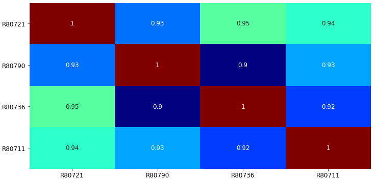
To complete the EDA, we may want to know which turbine’s production is most correlated with other turbines onsite. Here, we perform a correlation analysis based on the power output from each turbine.
Data Processing
In this analysis, the required columns are time stamp (Date_time), turbine identifier (Wind_turbine_name), wind speed (Ws_avg), and power output (P_avg). Hence, we can extract these columns from the data.

In addition, we must ensure that there are no missing values in the data as the selected features are critical to the analysis. As shown below, less than one percent of the data points have missing values.

The following code snippet was used to generate a visualization of the missing values before and after they were removed.
# Create a custom color map
from matplotlib.colors import LinearSegmentedColormapmyColors = ((0.0, 0.8, 0.0, 1.0), (0.8, 0.0, 0.0, 1.0))
cmap = LinearSegmentedColormap.from_list('Custom', myColors, len(myColors))# Plot heatmap
plt.figure(figsize=(15,6))
ax = sns.heatmap(scada_df.isna().astype(int)+1, cmap=cmap);# Post-process visualization
plt.xticks(fontsize=12)
plt.yticks(fontsize=12)
colorbar = ax.collections[0].colorbar
colorbar.set_ticks([1.2, 1.8]) # [0.95, 1.05] with no missing values
colorbar.set_ticklabels(['Available', 'Missing'], fontsize=12)
Before missing values were removed:
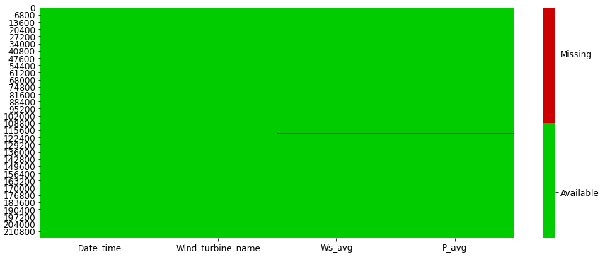
After removing missing values:

Next, we create training and test data using a 70–30 chronological split of the cleaned data.

The training and test data have the following shape:

Modeling
Let’s build the power prediction model by fitting our estimator to the training data.

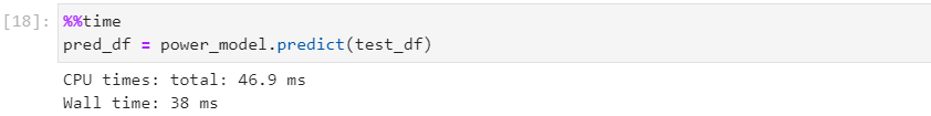
Then, predict the expected power from the turbines using the test data.
Results
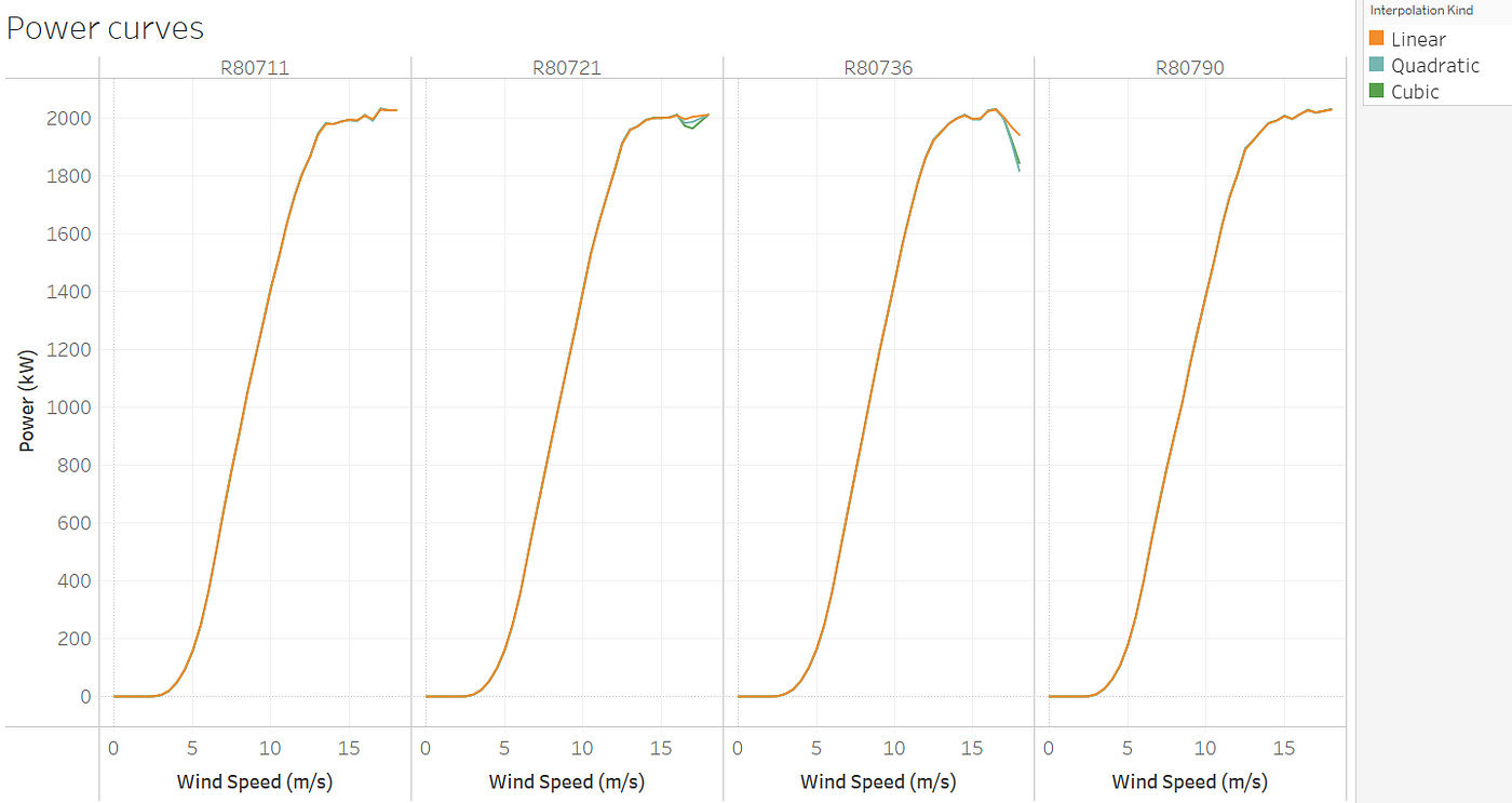
In analyzing the results, we will use the root mean square error (RMSE) metric and visualize the results. Also, we will compare three interpolation methods namely linear, quadratic, and cubic.

As shown in the table below, all three methods have comparable performance and may be used to estimate the expected power.

Additionally, the plot below shows the expected power curve for each turbine using the different interpolation methods and based on the test data.
For each turbine in the test data, the time series of the expected power estimated using the cubic model compared with actual production is shown below:

Now, we can calculate the production loss of each turbine to identify which one should be prioritized for repair.


As shown in the plot above, turbine R80790 has the biggest production loss within the period considered and should be prioritized for an operational check. In addition, turbine R80721 produced more than expected and can be considered the best performing turbine within the same period.
To conclude this example, it is often helpful to report hourly production losses for business purposes. The time series of the losses is shown below:

If you made it this far into the article, you’re a Medium champ!
A Peek into the future
In this article, we introduced the expected power module for estimating the power output from operating wind turbines and presented a case study with exploratory data analysis and modeling.
The next module we hope to release would help to calculate the annual energy production (AEP) from the power curve and wind speed distribution of a wind farm. This would help provide a quick and easy-to-use module for a critical task in wind energy analysis.
The Expected Power module is now available on PyPi and please don’t forget to Star the Github Repo. You can also play with the Jupyter lab notebook used in this article here.
An open-source module for predicting power production from operating wind turbines
Introduction
In this article, I will cover the procedure for estimating the expected power from operating wind turbines and present a case study with exploratory data analysis. All images are by the author unless otherwise stated in the caption.
Predicting the power output from operational turbines is valuable for technical and commercial purposes. Wind energy experts track the performance of turbines by comparing current production with expected values based on vendor-provided or historically calculated benchmarks.
A power curve defines the relationship between the wind speed and power output from a turbine and is the most important plot in wind turbine performance analysis.
Turbine manufacturers provide vendor power curves typically based on uninterrupted airflow towards the turbine. However, the power output from operating wind turbines is affected by factors such as terrain, anemometer placement, and proximity to other units onsite.
Hence, the historical operating behavior of each turbine known as the operational power curve may be preferred as the benchmark. The newly released Expected Power module uses a turbine-level operational power curve to estimate the power output.
Estimation procedure
The estimation procedure starts with filtering the historical (training) data to remove abnormal operational data such as downtimes, deratings, and underperformance data points.
Next, the cleaned operational data is binned using 0.5m/s wind speed buckets with the median wind speed and mean power taken as the representative power curve data point for each bucket.
Three interpolation methods namely linear, quadratic and cubic as defined in Scipy interp1 are recommended for the interpolation of the binned power curve data.
Module usage
The open-source scada-data-analysis library hosted on PyPi contains the expected power module and details of code implementation can be found on Github. The library can be installed by a simple pip command as shown here.
# Pip install library
pip install scada-data-analysis
In addition, the project Github repo may be cloned as follows:
# Clone github repo
git clone https://github.com/abbey2017/wind-energy-analytics.git
Start by importing the Pandas library.
# Import relevant libraries
import pandas as pd
Next, load training and test operational data
# Load scada data
train_df = pd.read_csv(r'../datasets/training_data.zip')
test_df = pd.read_csv(r'../datasets/test_data.zip')
The module consists of an ExpectedPower estimator with fit and predict methods. The estimator is instantiated with column labels for unique turbine identifier, wind speed, and power as well as the estimation approach (method), and interpolation kind.
# Instantiate estimator class
power_model = ExpectedPower(turbine_label='Wind_turbine_name', windspeed_label='Ws_avg', power_label='P_avg', method='binning', kind='linear')# Fit the estimator with the training data
power_model = power_model.fit(train_df)# Predict the power output based on wind speed from test data
pred_df = power_model.predict(test_df)
Only the binning approach is currently implemented while an autoML approach will be considered in a future release 🔨.
Case Study:
Predicting the expected power from operational wind turbines
In this example, we will perform exploratory data analysis (EDA), predict the expected power, calculate the production losses and visualize the results.
The turbine SCADA data is from the La Haute Borne wind farm in France operated by Engie and it is publicly available.
Data Exploration
First, we import the relevant libraries for our analysis.
Then, we load the data and check if it was properly read
Next, we inspect the number of rows and columns in the data
Now, let’s look at the number of turbines and the time interval of the data.
To complete the EDA, we may want to know which turbine’s production is most correlated with other turbines onsite. Here, we perform a correlation analysis based on the power output from each turbine.
Data Processing
In this analysis, the required columns are time stamp (Date_time), turbine identifier (Wind_turbine_name), wind speed (Ws_avg), and power output (P_avg). Hence, we can extract these columns from the data.
In addition, we must ensure that there are no missing values in the data as the selected features are critical to the analysis. As shown below, less than one percent of the data points have missing values.
The following code snippet was used to generate a visualization of the missing values before and after they were removed.
# Create a custom color map
from matplotlib.colors import LinearSegmentedColormapmyColors = ((0.0, 0.8, 0.0, 1.0), (0.8, 0.0, 0.0, 1.0))
cmap = LinearSegmentedColormap.from_list('Custom', myColors, len(myColors))# Plot heatmap
plt.figure(figsize=(15,6))
ax = sns.heatmap(scada_df.isna().astype(int)+1, cmap=cmap);# Post-process visualization
plt.xticks(fontsize=12)
plt.yticks(fontsize=12)
colorbar = ax.collections[0].colorbar
colorbar.set_ticks([1.2, 1.8]) # [0.95, 1.05] with no missing values
colorbar.set_ticklabels(['Available', 'Missing'], fontsize=12)
Before missing values were removed:
After removing missing values:
Next, we create training and test data using a 70–30 chronological split of the cleaned data.
The training and test data have the following shape:
Modeling
Let’s build the power prediction model by fitting our estimator to the training data.
Then, predict the expected power from the turbines using the test data.
Results
In analyzing the results, we will use the root mean square error (RMSE) metric and visualize the results. Also, we will compare three interpolation methods namely linear, quadratic, and cubic.
As shown in the table below, all three methods have comparable performance and may be used to estimate the expected power.
Additionally, the plot below shows the expected power curve for each turbine using the different interpolation methods and based on the test data.
For each turbine in the test data, the time series of the expected power estimated using the cubic model compared with actual production is shown below:
Now, we can calculate the production loss of each turbine to identify which one should be prioritized for repair.
As shown in the plot above, turbine R80790 has the biggest production loss within the period considered and should be prioritized for an operational check. In addition, turbine R80721 produced more than expected and can be considered the best performing turbine within the same period.
To conclude this example, it is often helpful to report hourly production losses for business purposes. The time series of the losses is shown below:
If you made it this far into the article, you’re a Medium champ!
A Peek into the future
In this article, we introduced the expected power module for estimating the power output from operating wind turbines and presented a case study with exploratory data analysis and modeling.
The next module we hope to release would help to calculate the annual energy production (AEP) from the power curve and wind speed distribution of a wind farm. This would help provide a quick and easy-to-use module for a critical task in wind energy analysis.
The Expected Power module is now available on PyPi and please don’t forget to Star the Github Repo. You can also play with the Jupyter lab notebook used in this article here.
Denial of responsibility! Techno Blender is an automatic aggregator of the all world’s media. In each content, the hyperlink to the primary source is specified. All trademarks belong to their rightful owners, all materials to their authors. If you are the owner of the content and do not want us to publish your materials, please contact us by email – [email protected]. The content will be deleted within 24 hours.