
Working with Survey Data — Clean and Visualize Likert Scale Questions in R | by Martina Giron | Aug, 2022
How to format your data for quantitative analysis
If you’ve ever read or written a survey, you’ve probably encountered Likert type questions. These are questions that are answerable on some scale like strongly disagree to strongly agree, or always to never. This scale allows us to quantify sentiments that are otherwise subjective. Today, we’ll discuss how to clean, aggregate, and visualize this type of data.
We’ll be using data from a product satisfaction survey with 1000 respondents. Our goals are to recode and reshape this data to make them suitable for calculating summary statistics and creating visualizations. You can download the dataset here.
This dataset gives us the applicant ID, as well as their responses to each question encoded in one column each. As you can see, the column heads aren’t proper variable names. This would make it difficult to call them in functions. So let’s use colnames() to rename them by category and item number. Be sure to save the original names to a separate file for future reference. We’ll also need to load the tidyverse package to perform our data wrangling and visualization.
Our responses are still in text form. We need to recode them with a numerical scale to perform quantitative analysis. We can write a function using case_when() to accomplish this. This can also be done with gsub(), but I prefer this method because it makes our code more compact and readable.
Sometimes, phrases are stated negatively to ensure that the person answering the survey is not indiscriminately inputting all high or all low-scoring answers. Thus, we would have to:
- Identify which items are scaled positively or negatively.
- In our case, all items are scaled positively except for the following:

2. Apply the function as is for items scaled positively, and flip the scale for items scaled negatively.
- Here, I wrote two separate functions for the positively and negatively scaled items.
- To apply the positive one, I removed the id column and all negatively scaled items using
select(), so I can easilymutate_all()the positive ones that remained. - To apply the negative one, I did the opposite and retained only the negatively scaled items before applying the
mutate_all(). - After applying both functions, we must recombine our data using
cbind().

- Since this survey measures overall product satisfaction, we want to know the total scores of each respondent for all items. We can do this with the
rowSums()function on the recoded data.
- Now, let’s get the total scores for each category. We can use
mutate()to create new columns with the category totals. Therowwise()function allows us to perform operations across columns. Remember to useungroup()after performing all operations to revert your data into tidy format. - As an exercise, you can try calculating the category means yourself!
We want our data to be in tidy format to analyze and visualize it. In this case, it means pivoting our data so that our new columns will contain just the ID number, question number, category, and response. First, we’ll pivot on question number and response. Then, we can assign their categories with mutate(). We’ll use str_match() together with regular expressions, or regex, to get the category and question number from the question column. Here, “^[^_]+(?=_)” means get all characters before the underscore, and “[0–9]$” means get the last digit of the string.

We can now calculate summary statistics for our data. Since we want to calculate statistics by category, we’ll group by this variable. Then, we’ll pass our data into the summarise() function. Here is our expected output:
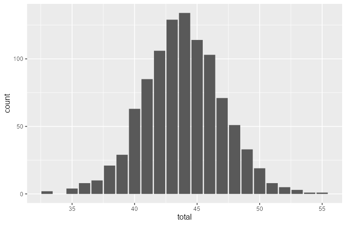
First, let’s get an overview of the distribution of the total score. We used the survey_recoded data because this dataset contains the total score per respondent. Notice that the data appears to approximately follow a normal distribution. This is expected, because of our large sample size of 1000.

Now, let’s look at the category-level distributions. We’ll use the survey_long for our data, and pass category to facet_wrap() to do this.

We can also look at the question-level distributions through the same method. Here, I added an extra argument nrow = 3, so that all questions from the same category appear in one row.

Lastly, let’s look at the average response level per question. We divided the variable response by 1000 because without it, our graph would just give us the sum of the scores per question. We also added ylim(0,5), since otherwise, our graph would only have 0 to 4 on its y-axis. This is because the maximum average scores for the questions are never higher than 4.
This tutorial focused on preparing survey data for exploratory analyses. The bar graphs we created were insightful, but we can work on their aesthetics to make them more professional and attention-grabbing. Read my tutorial on how you can do this:
For a deeper analysis, we can also perform statistical tests to test for correlations and measure the survey’s reliability. You can read more about these concepts and try applying them with R’s cor.test() function and cronbach.alpha() from the ltm package.
How to format your data for quantitative analysis
If you’ve ever read or written a survey, you’ve probably encountered Likert type questions. These are questions that are answerable on some scale like strongly disagree to strongly agree, or always to never. This scale allows us to quantify sentiments that are otherwise subjective. Today, we’ll discuss how to clean, aggregate, and visualize this type of data.
We’ll be using data from a product satisfaction survey with 1000 respondents. Our goals are to recode and reshape this data to make them suitable for calculating summary statistics and creating visualizations. You can download the dataset here.
This dataset gives us the applicant ID, as well as their responses to each question encoded in one column each. As you can see, the column heads aren’t proper variable names. This would make it difficult to call them in functions. So let’s use colnames() to rename them by category and item number. Be sure to save the original names to a separate file for future reference. We’ll also need to load the tidyverse package to perform our data wrangling and visualization.
Our responses are still in text form. We need to recode them with a numerical scale to perform quantitative analysis. We can write a function using case_when() to accomplish this. This can also be done with gsub(), but I prefer this method because it makes our code more compact and readable.
Sometimes, phrases are stated negatively to ensure that the person answering the survey is not indiscriminately inputting all high or all low-scoring answers. Thus, we would have to:
- Identify which items are scaled positively or negatively.
- In our case, all items are scaled positively except for the following:
2. Apply the function as is for items scaled positively, and flip the scale for items scaled negatively.
- Here, I wrote two separate functions for the positively and negatively scaled items.
- To apply the positive one, I removed the id column and all negatively scaled items using
select(), so I can easilymutate_all()the positive ones that remained. - To apply the negative one, I did the opposite and retained only the negatively scaled items before applying the
mutate_all(). - After applying both functions, we must recombine our data using
cbind().
- Since this survey measures overall product satisfaction, we want to know the total scores of each respondent for all items. We can do this with the
rowSums()function on the recoded data.
- Now, let’s get the total scores for each category. We can use
mutate()to create new columns with the category totals. Therowwise()function allows us to perform operations across columns. Remember to useungroup()after performing all operations to revert your data into tidy format. - As an exercise, you can try calculating the category means yourself!
We want our data to be in tidy format to analyze and visualize it. In this case, it means pivoting our data so that our new columns will contain just the ID number, question number, category, and response. First, we’ll pivot on question number and response. Then, we can assign their categories with mutate(). We’ll use str_match() together with regular expressions, or regex, to get the category and question number from the question column. Here, “^[^_]+(?=_)” means get all characters before the underscore, and “[0–9]$” means get the last digit of the string.
We can now calculate summary statistics for our data. Since we want to calculate statistics by category, we’ll group by this variable. Then, we’ll pass our data into the summarise() function. Here is our expected output:
First, let’s get an overview of the distribution of the total score. We used the survey_recoded data because this dataset contains the total score per respondent. Notice that the data appears to approximately follow a normal distribution. This is expected, because of our large sample size of 1000.
Now, let’s look at the category-level distributions. We’ll use the survey_long for our data, and pass category to facet_wrap() to do this.
We can also look at the question-level distributions through the same method. Here, I added an extra argument nrow = 3, so that all questions from the same category appear in one row.
Lastly, let’s look at the average response level per question. We divided the variable response by 1000 because without it, our graph would just give us the sum of the scores per question. We also added ylim(0,5), since otherwise, our graph would only have 0 to 4 on its y-axis. This is because the maximum average scores for the questions are never higher than 4.
This tutorial focused on preparing survey data for exploratory analyses. The bar graphs we created were insightful, but we can work on their aesthetics to make them more professional and attention-grabbing. Read my tutorial on how you can do this:
For a deeper analysis, we can also perform statistical tests to test for correlations and measure the survey’s reliability. You can read more about these concepts and try applying them with R’s cor.test() function and cronbach.alpha() from the ltm package.
Denial of responsibility! Techno Blender is an automatic aggregator of the all world’s media. In each content, the hyperlink to the primary source is specified. All trademarks belong to their rightful owners, all materials to their authors. If you are the owner of the content and do not want us to publish your materials, please contact us by email – [email protected]. The content will be deleted within 24 hours.