
You deserve a better ROC curve
Extract deeper insights with ROC threshold visualization
All source in this article is available on Github! Feel free to reuse graphics in any context without attribution (no rights reserved).
Motivation
Receiver operating characteristic (ROC) curves are invaluable for understanding the behavior of a model. There is more information packed into those curves than you typically see, though. By visualizing the threshold value, we can learn more about our classifier. As a bonus, retaining this information makes ROC curves more intuitive.
History
ROC curves were motivated by a wartime challenge. In World War II, folks wanted to quantify the behaviors of radar systems. Let’s consider four possible outcomes of radar interpretation:
True negative (TN): There are no planes in range, and the radar technician reports no planes. Phew.
True positive (TP): There is a plane in range, and the radar technician reports a plane. At least we know it is there!
False negative (TN): There is a plane in range, but the radar technician doesn’t report it. Uh oh, we’re unprepared.
False positive (FP): There are no planes in range, but the radar technician reports a plane. We’re wasting resources preparing for a plane that isn’t real!
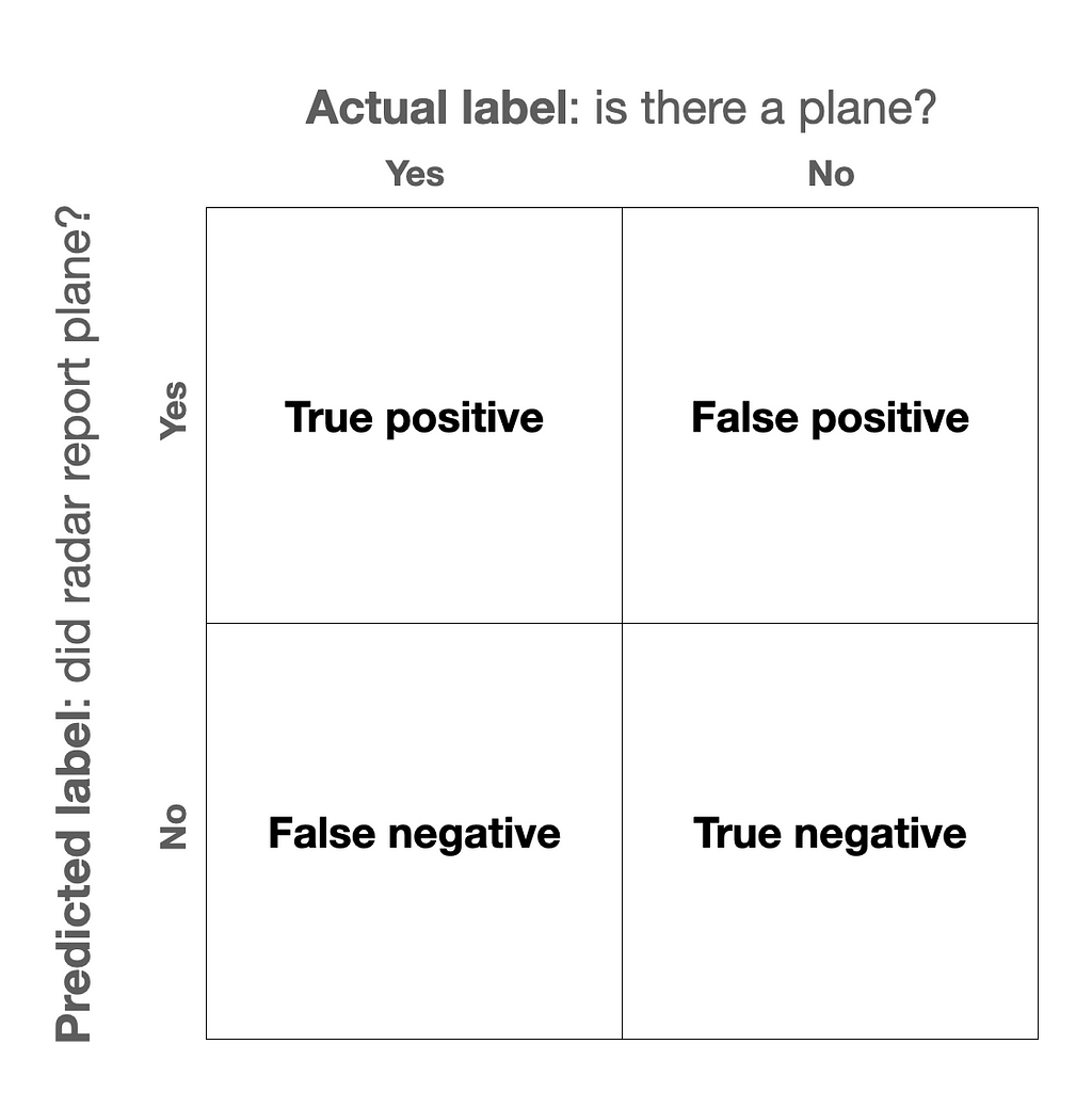
Obviously, the former two outcomes are better than the latter two, i.e., true is better than false. In reality, though, we have to manage a trade off.
If our radar technician is having lots of false negatives, for instance, we can have her commanding officer shout at her until she reports more of the stuff that shows up on her screen. By lowering her “decision threshold” for what she reports, she’ll get fewer false negatives and more true positives. Unfortunately, though, she will also be more likely to accidentally report false positives.
To summarize this trade off in the “operating characteristics” of a radar “receiver,” military analysts came up with… the “receiver operating characteristic” curve.
Standard ROC curve
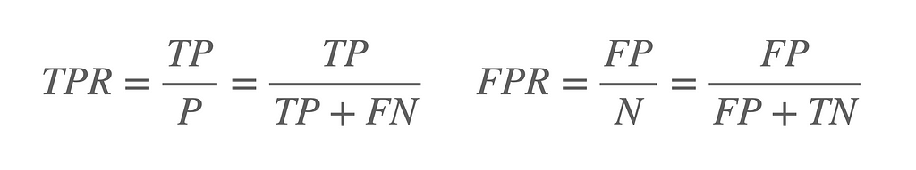
How can we meaningfully summarize the relationship between these four quantities? One way is to use true positive rate (TPR) and false positive rate (FPR).
TPR goes by a lot of names. You might know it as “sensitivity” or “recall”. It is the fraction of all the actual positives (TP+FN) that our model labels as positives. It is the fraction of all the genuine planes that our radar tech reports as planes. In contrast, FPR is the percentage of non-plane scenarios (FP+TN) that our radar tech reports as planes.
A ROC curve plots TPR as a function of FPR at different decision thresholds. Based on these definitions, we want to minimize our FPR while maximizing our TPR.
There is an easy way to achieve a low FPR… never report any planes (blue). There is also an easy way to achieve a high TPR… call everything a plane (yellow). Ideally, though, we would achieve both. We would have 100% TPR with a 0% FPR. Our radar technician would correctly report all the real planes without accidentally reporting a single non-plane (green). If we are really, really bad at our jobs, we could fail to correctly report any real planes while calling every non-plane a plane (red).
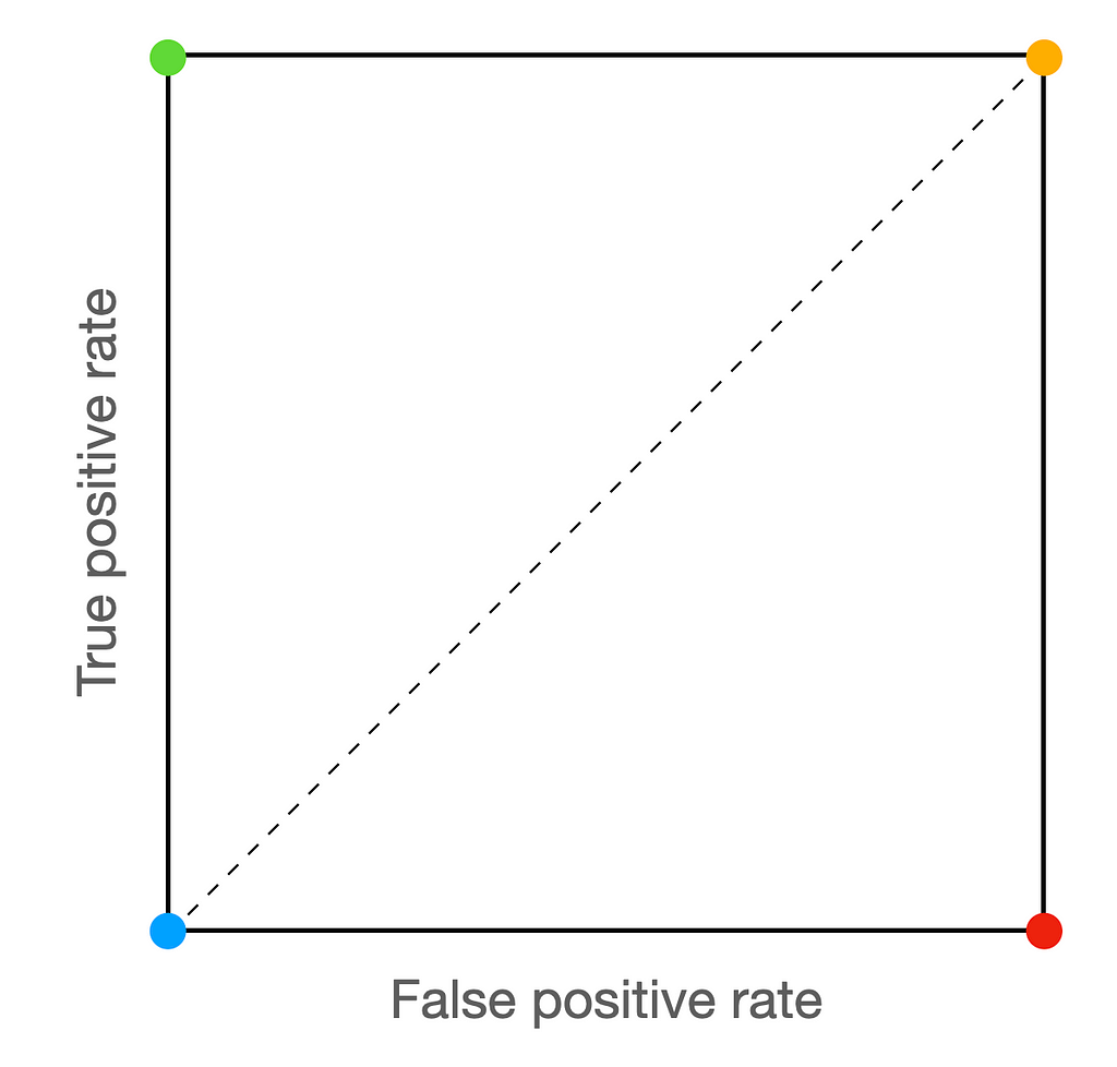
A good model (or radar tech) will bend towards the green corner. A bad model (i.e., random) will hug the diagonal. A ludicrously bad model (i.e., worse than random) will bend towards the red corner.
This is starting to get abstract, though… let’s tie this back down with our concrete radar example.
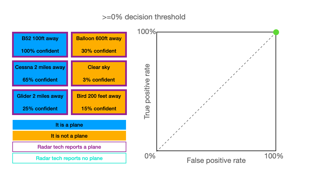
Let’s consider six classification scenaios for our imaginary radar tech, three planes and three non-planes. For each, she reports her confidence on a sliding scale from 0% to 100%. At a given threshold, we imagine that our radar tech reports everything about that threshold as a plane. Then, we compute the FPR and TPR using the equations above. The result of plotting these values is… the ROC curve shown above!
ROC curve with thresholds
Here’s my issue: we used the decision threshold values to compute that green line, but then we threw that information away! From the green line, we can’t tell what decision threshold value resulted in each point. That information can be really handy when choosing what decision threshold to use after deployment.
Let’s try preserving that info with a color map, instead. I haven’t found a good name online for this sort of ROC curve… so I’m calling it a rainbow ROC.
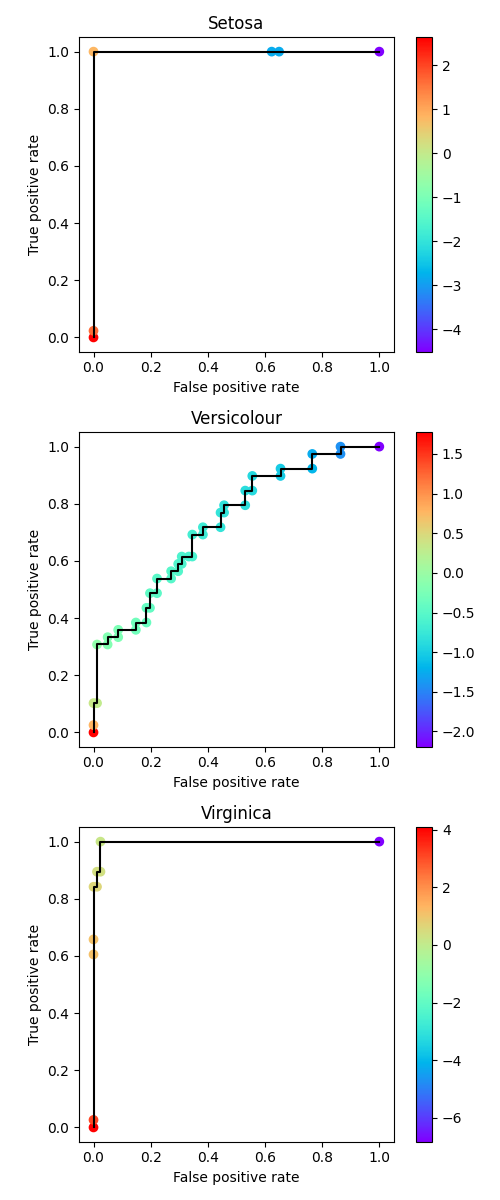
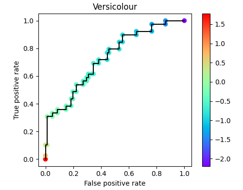
Let’s put down the radar tech example and consider a real classifier instead. Let’s use the iris dataset. We’ll treat the three-class problem as a one-versus-rest problem, resulting in one ROC per class.
First, we need to load the dataset and fit our model. We’ll use a basic SVM!
https://medium.com/media/50029016634d3e54b9865900423a6f4a/href
Now that we have our classifier, we can get classification scores and generate our ROC curves.
https://medium.com/media/d9fc6359f1d66a6e3f34546e18d32a49/href
The result is a ROC curve with visualized decision thresholds. Based on our tolerance for false positive rate and desired true positive rate, we can select an appropriate decision threshold for our use case.
Conclusion
The rainbow ROC helps us keep threshold info, and, at least for me, makes it easier to interpret a ROC curve. Thanks for reading! I hope you learned something.
You deserve a better ROC curve was originally published in Towards Data Science on Medium, where people are continuing the conversation by highlighting and responding to this story.
Extract deeper insights with ROC threshold visualization
All source in this article is available on Github! Feel free to reuse graphics in any context without attribution (no rights reserved).
Motivation
Receiver operating characteristic (ROC) curves are invaluable for understanding the behavior of a model. There is more information packed into those curves than you typically see, though. By visualizing the threshold value, we can learn more about our classifier. As a bonus, retaining this information makes ROC curves more intuitive.
History
ROC curves were motivated by a wartime challenge. In World War II, folks wanted to quantify the behaviors of radar systems. Let’s consider four possible outcomes of radar interpretation:
True negative (TN): There are no planes in range, and the radar technician reports no planes. Phew.
True positive (TP): There is a plane in range, and the radar technician reports a plane. At least we know it is there!
False negative (TN): There is a plane in range, but the radar technician doesn’t report it. Uh oh, we’re unprepared.
False positive (FP): There are no planes in range, but the radar technician reports a plane. We’re wasting resources preparing for a plane that isn’t real!
Obviously, the former two outcomes are better than the latter two, i.e., true is better than false. In reality, though, we have to manage a trade off.
If our radar technician is having lots of false negatives, for instance, we can have her commanding officer shout at her until she reports more of the stuff that shows up on her screen. By lowering her “decision threshold” for what she reports, she’ll get fewer false negatives and more true positives. Unfortunately, though, she will also be more likely to accidentally report false positives.
To summarize this trade off in the “operating characteristics” of a radar “receiver,” military analysts came up with… the “receiver operating characteristic” curve.
Standard ROC curve
How can we meaningfully summarize the relationship between these four quantities? One way is to use true positive rate (TPR) and false positive rate (FPR).
TPR goes by a lot of names. You might know it as “sensitivity” or “recall”. It is the fraction of all the actual positives (TP+FN) that our model labels as positives. It is the fraction of all the genuine planes that our radar tech reports as planes. In contrast, FPR is the percentage of non-plane scenarios (FP+TN) that our radar tech reports as planes.
A ROC curve plots TPR as a function of FPR at different decision thresholds. Based on these definitions, we want to minimize our FPR while maximizing our TPR.
There is an easy way to achieve a low FPR… never report any planes (blue). There is also an easy way to achieve a high TPR… call everything a plane (yellow). Ideally, though, we would achieve both. We would have 100% TPR with a 0% FPR. Our radar technician would correctly report all the real planes without accidentally reporting a single non-plane (green). If we are really, really bad at our jobs, we could fail to correctly report any real planes while calling every non-plane a plane (red).
A good model (or radar tech) will bend towards the green corner. A bad model (i.e., random) will hug the diagonal. A ludicrously bad model (i.e., worse than random) will bend towards the red corner.
This is starting to get abstract, though… let’s tie this back down with our concrete radar example.
Let’s consider six classification scenaios for our imaginary radar tech, three planes and three non-planes. For each, she reports her confidence on a sliding scale from 0% to 100%. At a given threshold, we imagine that our radar tech reports everything about that threshold as a plane. Then, we compute the FPR and TPR using the equations above. The result of plotting these values is… the ROC curve shown above!
ROC curve with thresholds
Here’s my issue: we used the decision threshold values to compute that green line, but then we threw that information away! From the green line, we can’t tell what decision threshold value resulted in each point. That information can be really handy when choosing what decision threshold to use after deployment.
Let’s try preserving that info with a color map, instead. I haven’t found a good name online for this sort of ROC curve… so I’m calling it a rainbow ROC.
Let’s put down the radar tech example and consider a real classifier instead. Let’s use the iris dataset. We’ll treat the three-class problem as a one-versus-rest problem, resulting in one ROC per class.
First, we need to load the dataset and fit our model. We’ll use a basic SVM!
https://medium.com/media/50029016634d3e54b9865900423a6f4a/href
Now that we have our classifier, we can get classification scores and generate our ROC curves.
https://medium.com/media/d9fc6359f1d66a6e3f34546e18d32a49/href
The result is a ROC curve with visualized decision thresholds. Based on our tolerance for false positive rate and desired true positive rate, we can select an appropriate decision threshold for our use case.
Conclusion
The rainbow ROC helps us keep threshold info, and, at least for me, makes it easier to interpret a ROC curve. Thanks for reading! I hope you learned something.
You deserve a better ROC curve was originally published in Towards Data Science on Medium, where people are continuing the conversation by highlighting and responding to this story.
Denial of responsibility! Techno Blender is an automatic aggregator of the all world’s media. In each content, the hyperlink to the primary source is specified. All trademarks belong to their rightful owners, all materials to their authors. If you are the owner of the content and do not want us to publish your materials, please contact us by email – [email protected]. The content will be deleted within 24 hours.