
9 Visualizations that Catch More Attention than a Bar Chart | by Boriharn K | Aug, 2022
Creating eye-catching graphs with Python to use instead of bar charts.
A bar chart is a 2-dimensional graph with rectangular bars on the X or Y-axis. We use the rectangular bars to compare values among discrete categories by comparing their heights or lengths. This chart is typical in data visualization since it is simple to create and easy to understand.
However, in some situations, such as creating infographics or presenting data to the public that needs to catch people’s attention, the bar chart may not be attractive enough. Sometimes using too many bar charts may result in a dull display.
There is a variety of charts in data visualization. Practically, graphs can be improved or change forms. This article will show nine ideas that you can not only use instead of the bar chart, but also make the obtained results look good.

Disclaimer!!
The intention of this article is not against the bar chart. Every chart has its advantages. This article aims to show visualizations that can catch attention more than bar charts. By the way, they are not perfect; they also have their pros and cons.
Let’s get started.
Starting with importing libraries
import numpy as np
import pandas as pd
import matplotlib.pyplot as plt
import seaborn as sns%matplotlib inline
To show that the method mentioned in this article can be applied to real-world data, we will use data from a List of countries by carbon dioxide emissions on Wikipedia. This article shows a list of sovereign states and territories by CO2 emissions in 2018.
This article uses the data from Wikipedia under the terms of the Creative Commons Attribution-ShareAlike 3.0 Unported License.
I followed the useful steps to download the data from Web Scraping a Wikipedia Table into a Dataframe.
Use BeautifulSoup to parse the obtained data
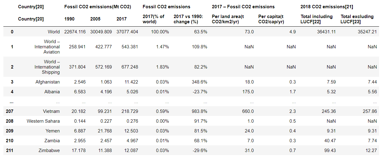
For example, I will select the last column, 2018 CO2 emissions/Total excluding LUCF(Land Use-Change and Forestry), and filter only countries with CO2 emissions between 200 to 1000 MTCO2e (Metric tons of carbon dioxide equivalent).
The codes below can be modified, if you want to use other columns or change the CO2 emissions range.
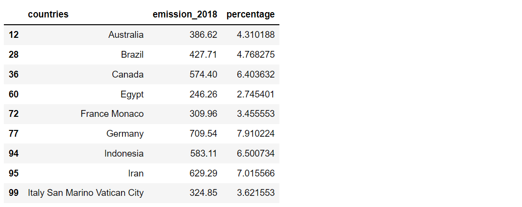
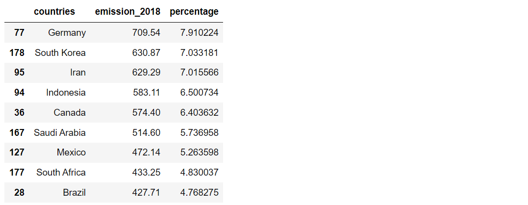
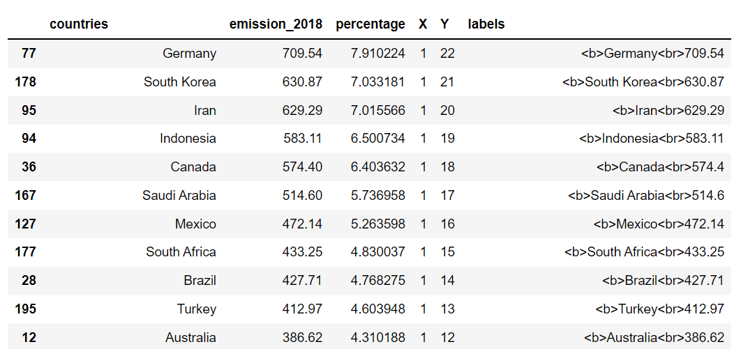
After getting the DataFrame, we will sort the CO2 emissions to get another DataFrame. Both DataFrames, the normal and sorted DataFrame, will be used for plotting later. The reason behind creating two DataFrame is to show that the results can be different.
df_s = df.sort_values(by='emission_2018', ascending=False)
df_s.head(9)
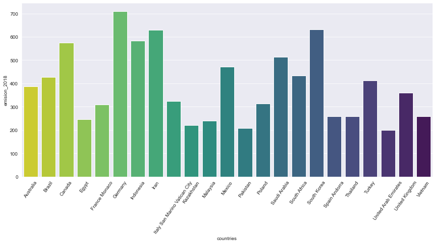
Now that everything is ready, let’s plot a bar chart for comparing with results from other visualizations later.
Before continuing, we will define a function to extract a list of colors for later use with each visualization.
Apply the function to get a list of colors.
pal_vi = get_color('viridis_r', len(df))
pal_plas = get_color('plasma_r', len(df))
pal_spec = get_color('Spectral', len(df))
pal_hsv = get_color('hsv', len(df))
In this article, there are 9 visualizations, which we can categorize into two groups:
Modifying rectangle bars
- Circular bar chart (aka Race Track Plot)
- Radial bar chart
- Treemap
- Waffle charts
- Interactive bar chart
Changing forms
- Pie chart
- Radar chart
- Bubble chart
- Circle packing
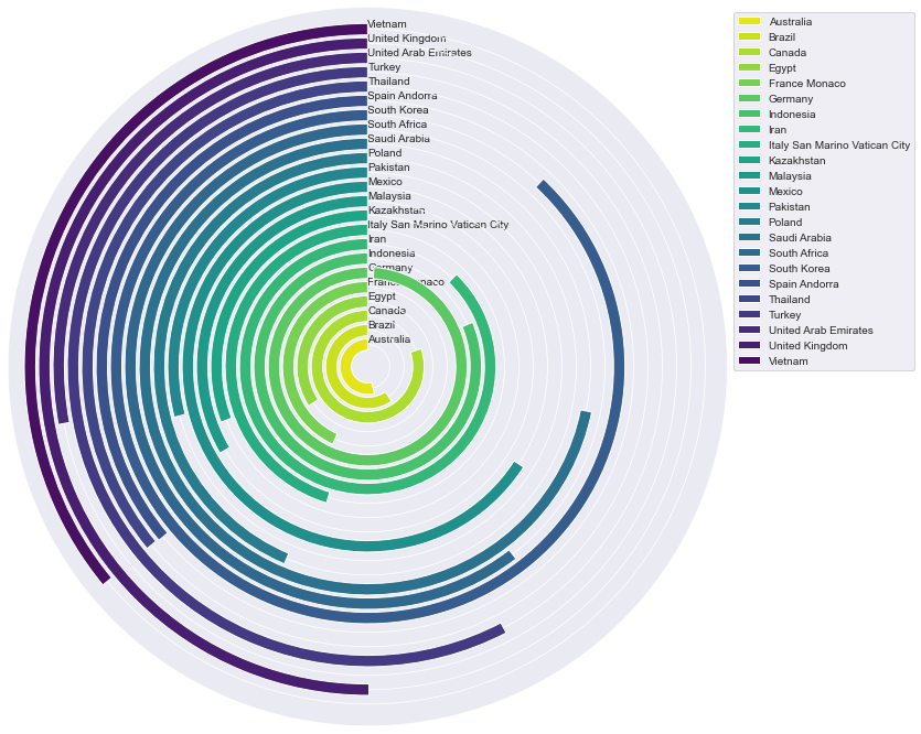
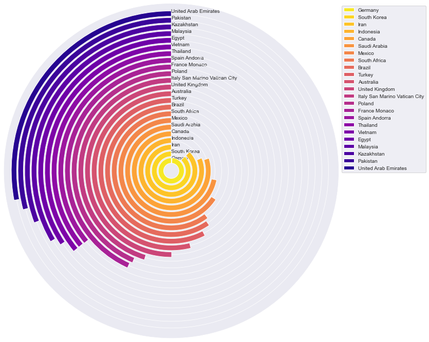
- Changing the direction with a Circular bar chart (aka Race track plot)
The concept of a circular bar chart is to express the bars around the center of a circle. Each bar starts from the same degree and moves in the same direction. The one that can complete the loop has the highest value.
This is a good idea to get readers’ attention. By the way, the bars that stop in the middle of the circle are hard to read. Beware that the length of each bar is not equal. The ones close to the center will have a shorter length than those far from the center.
Plot a circular bar chart with the DataFrame

Plot a circular bar chart with the sorted DataFrame
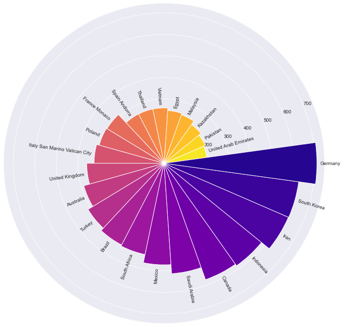
2. Starting from the center with a Radial bar chart
The concept of a radial bar chart is varying the direction of the bars. Instead of having the same direction, each bar starts from the center of a circle and moves in a different direction to the edge of the circle.
Please consider that the bars not located adjacent to each other may be hard to compare. The labels are at different angles along the radial bars; this can cause an inconvenience to users.
Plot a radial bar chart with the DataFrame
Plot a radial bar chart with the sorted DataFrame
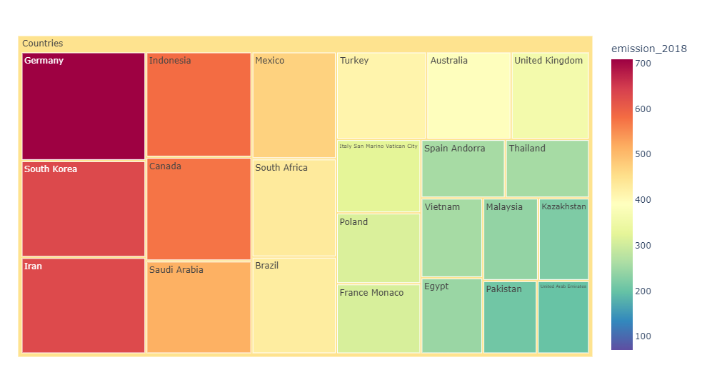
3. Using area for comparing with Treemap
A treemap helps display hierarchical data by using areas of rectangles. Even though our data has no hierarchy, we can still apply a treemap by showing only one hierarchy level.
Plotting a treemap, usually, the data is sorted in descending from the maximum value. With many rectangles, please be aware that the little ones may be hard to read or distinguish from the others.
Create an interactive treemap with Plotly:
4. Combining little squares with a Waffle chart
Besides the fancy name, the waffle chart is a good idea for creating an infographic. It consists of many smaller squares combined into a large rectangle, making the result look like a waffle.
Normally, the squares are arranged in a 10-by-10 layout to show the ratio or progress. By the way, the number of squares can be changed to suit the data.
Plot a waffle chart displaying every country’s CO2 emissions
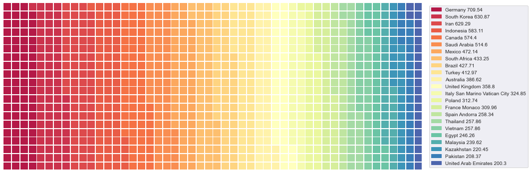
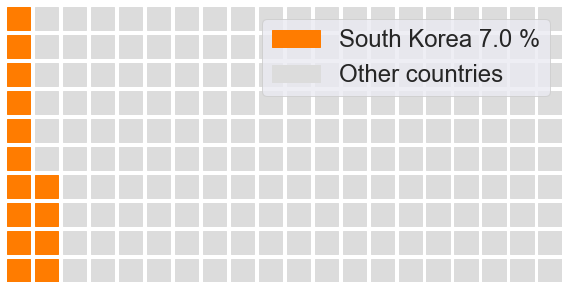
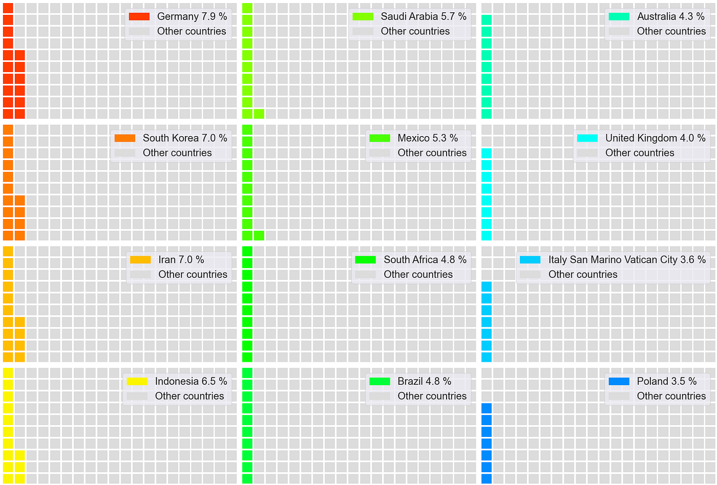
The result may look attractive and colorful, but it is hard to distinguish between close shades of color. This can be considered a limitation of the waffle chart. Thus, it can be said that the waffle chart is suitable for comparing data with a few categories.
To avoid the difficulty in reading, let’s plot each country, one by one, against the other countries. Then, combine them into a photo collage. With the code below, please take into account that the plots will be exported on your computer for importing later.
Plot each country’s waffle chart
Now that we have each country’s waffle chart, let’s define a function to create a photo collage. I found an excellent code below to combine the plots from Stack Overflow(link).
Apply the function to get a photo collage
# to create a fit photo collage:
# width = number of columns * figure width
# height = number of rows * figure heightget_collage(5, 5, 2840, 1445, save_name, 'Collage_waffle.png')
5. Changing nothing but making the bar chart interactive
We can turn a simple bar chart into an interactive one. This is a good idea in case you want to remain using the bar chart. The obtained result can be played or filtered the way users want. Plotly is a useful library that helps create an interactive pie chart easily.
The only concern is showing the interactive bar chart to end users; there should be an instruction explaining how to use the function.
Plot an interactive bar chart
6. Showing percentages in pie chart
A pie chart is another typical chart in data visualization. It is basically a circular statistical graphic divided into slices to show numerical proportion. The ordinary pie chart can be converted into an interactive one so that the result can be played or filtered. We can use Plotly to create an interactive pie chart.
Same as using the interactive bar chart, there should be an instruction explaining how to use the function in case the readers are end users.
Plot an interactive pie chart
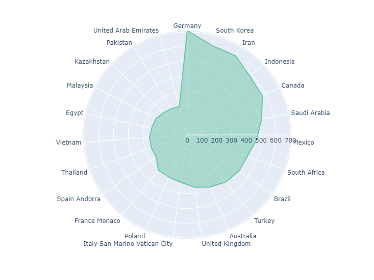
7. Plotting around a circle with a Radar chart
A radar chart is a graphical method of displaying multivariate data. In comparison, bar graphs are mainly used with categorical data. To apply the radar chart with categorical data, we can consider each category as a variable in the multivariate data. The value of each category will be plotted from the center.
With many categories, users can find it difficult to compare the data that are not located next to each other. This can be solved by applying the radar chart with sorted data. Thus, users can determine what values are higher or lower than the others.
Plot a radar chart with the DataFrame.
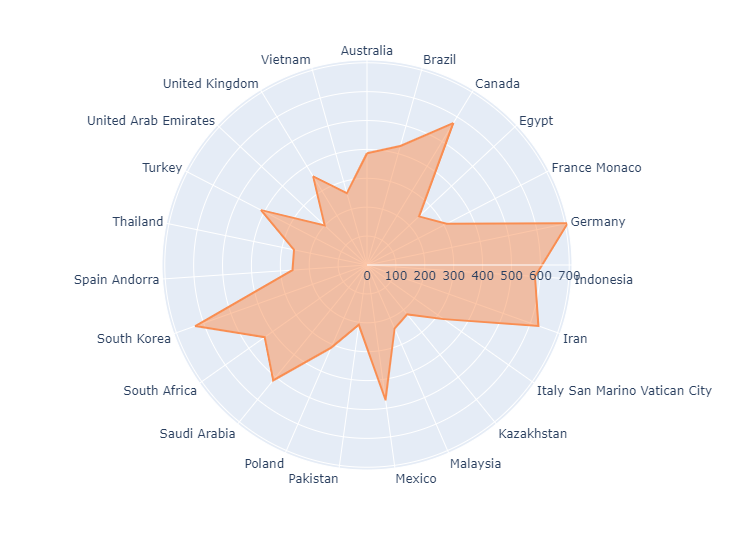
Plot a radar chart with the sorted DataFrame.
8. Using many circles with a Bubble chart
Theoretically, a bubble chart is a scatter plot with different sizes of the datapoint. This is an ideal plot for displaying three-dimensional data, X value, Y value, and data size.
A good thing about applying a bubble chart with categorical data with no X and Y values is that we can locate the bubbles the way we want. For example, the code below shows how to plot the bubbles vertically.
Create a list of X values, Y values, and labels. Then, add them as columns to the DataFrame. If you want to plot the bubbles in a horizontal direction, alternate the values between the X and Y columns.
Plot a vertical bubble chart
To go further, we can display the bubbles in different forms. Let’s try to plot them in a circular direction.
To do that, we need to calculate X and Y coordinates. Start with dividing 360 degrees by the number of rows. Then, convert the degrees with Cosine and Sine functions to obtain X and Y coordinates, respectively.
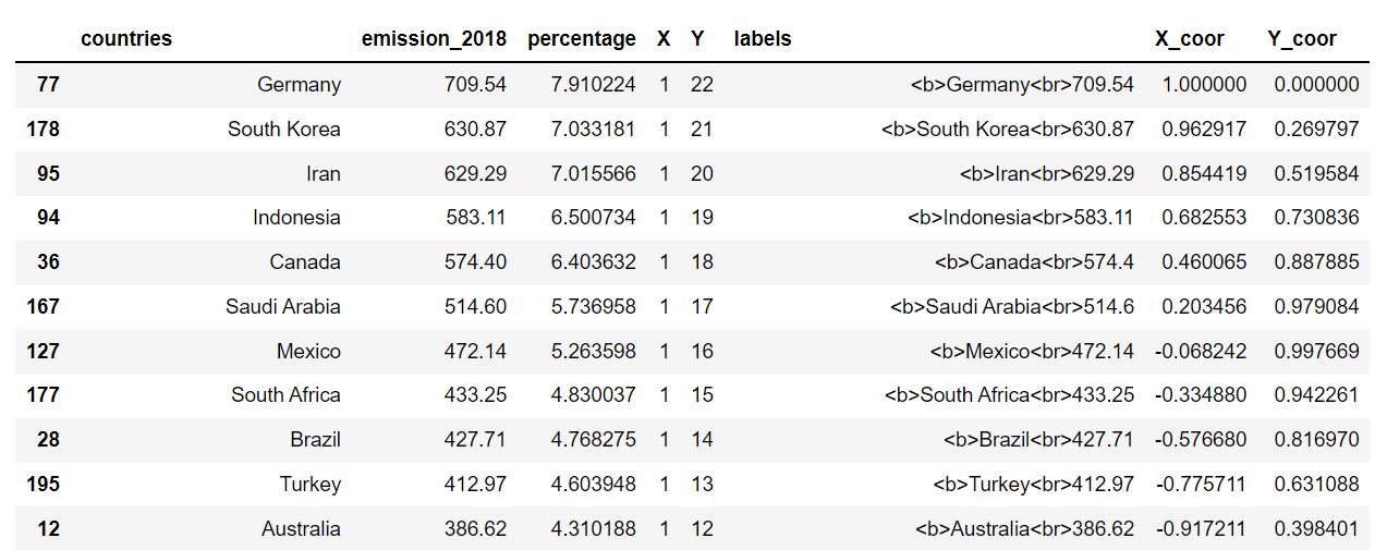
Plot the bubbles in a circular direction
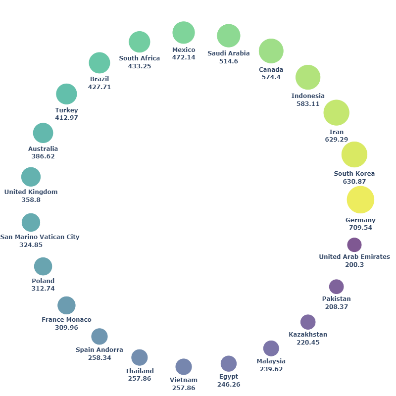
It can be noticed that the more complex we locate the bubbles, the more space we lose. We can save space for other visualizations with a vertical or horizontal bubble plot.
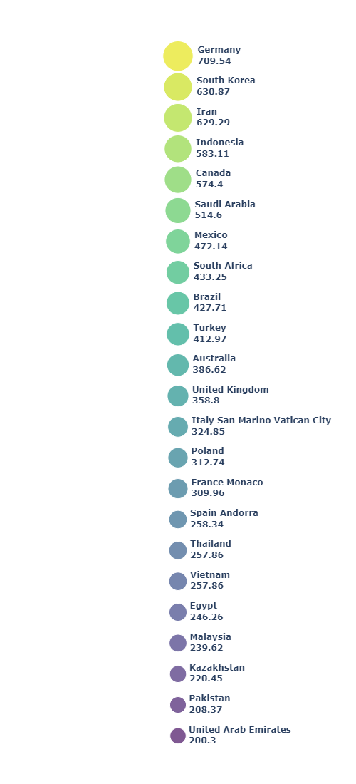
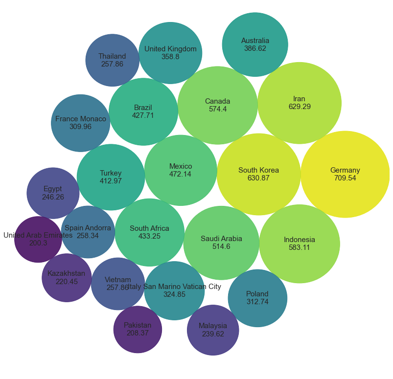
9. Clustering the bubbles with Circle packing
Lastly, let’s group the bubbles with no overlapping area. Circle packing is a good idea for plotting the bubbles while saving space. We need to calculate each bubble’s position and size. Fortunately, there is a library called circlify that makes the calculation easy.
A drawback of circle packing is that it is hard to figure out the difference between bubbles that have close sizes. This can be solved by labeling each bubble with its value.
Plot the circle packing
Summary
There is nothing wrong with the bar chart. Practically, the bar chart is simple and easy to use. However, any chart is perfect and suitable for every job. Data visualization sometimes needs to catch attention, such as creating infographics, which the bar chart may not be able to deliver attractiveness.
This article has shown nine visualizations showing the same data dimension as the bar chart and catching attention. By the way, these charts also have their cons. Please consider that they may be difficult to read or unsuitable for an official report.
If you have any suggestions or recommendations, please feel free to leave a comment. Thanks for reading.
Creating eye-catching graphs with Python to use instead of bar charts.

A bar chart is a 2-dimensional graph with rectangular bars on the X or Y-axis. We use the rectangular bars to compare values among discrete categories by comparing their heights or lengths. This chart is typical in data visualization since it is simple to create and easy to understand.
However, in some situations, such as creating infographics or presenting data to the public that needs to catch people’s attention, the bar chart may not be attractive enough. Sometimes using too many bar charts may result in a dull display.
There is a variety of charts in data visualization. Practically, graphs can be improved or change forms. This article will show nine ideas that you can not only use instead of the bar chart, but also make the obtained results look good.
Disclaimer!!
The intention of this article is not against the bar chart. Every chart has its advantages. This article aims to show visualizations that can catch attention more than bar charts. By the way, they are not perfect; they also have their pros and cons.
Let’s get started.
Starting with importing libraries
import numpy as np
import pandas as pd
import matplotlib.pyplot as plt
import seaborn as sns%matplotlib inline
To show that the method mentioned in this article can be applied to real-world data, we will use data from a List of countries by carbon dioxide emissions on Wikipedia. This article shows a list of sovereign states and territories by CO2 emissions in 2018.
This article uses the data from Wikipedia under the terms of the Creative Commons Attribution-ShareAlike 3.0 Unported License.
I followed the useful steps to download the data from Web Scraping a Wikipedia Table into a Dataframe.
Use BeautifulSoup to parse the obtained data
For example, I will select the last column, 2018 CO2 emissions/Total excluding LUCF(Land Use-Change and Forestry), and filter only countries with CO2 emissions between 200 to 1000 MTCO2e (Metric tons of carbon dioxide equivalent).
The codes below can be modified, if you want to use other columns or change the CO2 emissions range.
After getting the DataFrame, we will sort the CO2 emissions to get another DataFrame. Both DataFrames, the normal and sorted DataFrame, will be used for plotting later. The reason behind creating two DataFrame is to show that the results can be different.
df_s = df.sort_values(by='emission_2018', ascending=False)
df_s.head(9)
Now that everything is ready, let’s plot a bar chart for comparing with results from other visualizations later.
Before continuing, we will define a function to extract a list of colors for later use with each visualization.
Apply the function to get a list of colors.
pal_vi = get_color('viridis_r', len(df))
pal_plas = get_color('plasma_r', len(df))
pal_spec = get_color('Spectral', len(df))
pal_hsv = get_color('hsv', len(df))
In this article, there are 9 visualizations, which we can categorize into two groups:
Modifying rectangle bars
- Circular bar chart (aka Race Track Plot)
- Radial bar chart
- Treemap
- Waffle charts
- Interactive bar chart
Changing forms
- Pie chart
- Radar chart
- Bubble chart
- Circle packing
- Changing the direction with a Circular bar chart (aka Race track plot)
The concept of a circular bar chart is to express the bars around the center of a circle. Each bar starts from the same degree and moves in the same direction. The one that can complete the loop has the highest value.
This is a good idea to get readers’ attention. By the way, the bars that stop in the middle of the circle are hard to read. Beware that the length of each bar is not equal. The ones close to the center will have a shorter length than those far from the center.
Plot a circular bar chart with the DataFrame
Plot a circular bar chart with the sorted DataFrame
2. Starting from the center with a Radial bar chart
The concept of a radial bar chart is varying the direction of the bars. Instead of having the same direction, each bar starts from the center of a circle and moves in a different direction to the edge of the circle.
Please consider that the bars not located adjacent to each other may be hard to compare. The labels are at different angles along the radial bars; this can cause an inconvenience to users.
Plot a radial bar chart with the DataFrame
Plot a radial bar chart with the sorted DataFrame
3. Using area for comparing with Treemap
A treemap helps display hierarchical data by using areas of rectangles. Even though our data has no hierarchy, we can still apply a treemap by showing only one hierarchy level.
Plotting a treemap, usually, the data is sorted in descending from the maximum value. With many rectangles, please be aware that the little ones may be hard to read or distinguish from the others.
Create an interactive treemap with Plotly:
4. Combining little squares with a Waffle chart
Besides the fancy name, the waffle chart is a good idea for creating an infographic. It consists of many smaller squares combined into a large rectangle, making the result look like a waffle.
Normally, the squares are arranged in a 10-by-10 layout to show the ratio or progress. By the way, the number of squares can be changed to suit the data.
Plot a waffle chart displaying every country’s CO2 emissions
The result may look attractive and colorful, but it is hard to distinguish between close shades of color. This can be considered a limitation of the waffle chart. Thus, it can be said that the waffle chart is suitable for comparing data with a few categories.
To avoid the difficulty in reading, let’s plot each country, one by one, against the other countries. Then, combine them into a photo collage. With the code below, please take into account that the plots will be exported on your computer for importing later.
Plot each country’s waffle chart
Now that we have each country’s waffle chart, let’s define a function to create a photo collage. I found an excellent code below to combine the plots from Stack Overflow(link).
Apply the function to get a photo collage
# to create a fit photo collage:
# width = number of columns * figure width
# height = number of rows * figure heightget_collage(5, 5, 2840, 1445, save_name, 'Collage_waffle.png')
5. Changing nothing but making the bar chart interactive
We can turn a simple bar chart into an interactive one. This is a good idea in case you want to remain using the bar chart. The obtained result can be played or filtered the way users want. Plotly is a useful library that helps create an interactive pie chart easily.
The only concern is showing the interactive bar chart to end users; there should be an instruction explaining how to use the function.
Plot an interactive bar chart
6. Showing percentages in pie chart
A pie chart is another typical chart in data visualization. It is basically a circular statistical graphic divided into slices to show numerical proportion. The ordinary pie chart can be converted into an interactive one so that the result can be played or filtered. We can use Plotly to create an interactive pie chart.
Same as using the interactive bar chart, there should be an instruction explaining how to use the function in case the readers are end users.
Plot an interactive pie chart
7. Plotting around a circle with a Radar chart
A radar chart is a graphical method of displaying multivariate data. In comparison, bar graphs are mainly used with categorical data. To apply the radar chart with categorical data, we can consider each category as a variable in the multivariate data. The value of each category will be plotted from the center.
With many categories, users can find it difficult to compare the data that are not located next to each other. This can be solved by applying the radar chart with sorted data. Thus, users can determine what values are higher or lower than the others.
Plot a radar chart with the DataFrame.
Plot a radar chart with the sorted DataFrame.
8. Using many circles with a Bubble chart
Theoretically, a bubble chart is a scatter plot with different sizes of the datapoint. This is an ideal plot for displaying three-dimensional data, X value, Y value, and data size.
A good thing about applying a bubble chart with categorical data with no X and Y values is that we can locate the bubbles the way we want. For example, the code below shows how to plot the bubbles vertically.
Create a list of X values, Y values, and labels. Then, add them as columns to the DataFrame. If you want to plot the bubbles in a horizontal direction, alternate the values between the X and Y columns.
Plot a vertical bubble chart
To go further, we can display the bubbles in different forms. Let’s try to plot them in a circular direction.
To do that, we need to calculate X and Y coordinates. Start with dividing 360 degrees by the number of rows. Then, convert the degrees with Cosine and Sine functions to obtain X and Y coordinates, respectively.
Plot the bubbles in a circular direction
It can be noticed that the more complex we locate the bubbles, the more space we lose. We can save space for other visualizations with a vertical or horizontal bubble plot.
9. Clustering the bubbles with Circle packing
Lastly, let’s group the bubbles with no overlapping area. Circle packing is a good idea for plotting the bubbles while saving space. We need to calculate each bubble’s position and size. Fortunately, there is a library called circlify that makes the calculation easy.
A drawback of circle packing is that it is hard to figure out the difference between bubbles that have close sizes. This can be solved by labeling each bubble with its value.
Plot the circle packing
Summary
There is nothing wrong with the bar chart. Practically, the bar chart is simple and easy to use. However, any chart is perfect and suitable for every job. Data visualization sometimes needs to catch attention, such as creating infographics, which the bar chart may not be able to deliver attractiveness.
This article has shown nine visualizations showing the same data dimension as the bar chart and catching attention. By the way, these charts also have their cons. Please consider that they may be difficult to read or unsuitable for an official report.
If you have any suggestions or recommendations, please feel free to leave a comment. Thanks for reading.
Denial of responsibility! Techno Blender is an automatic aggregator of the all world’s media. In each content, the hyperlink to the primary source is specified. All trademarks belong to their rightful owners, all materials to their authors. If you are the owner of the content and do not want us to publish your materials, please contact us by email – [email protected]. The content will be deleted within 24 hours.