
A New Type of Categorical Correlation Coefficient | by Lance Darragh | Jun, 2022
The Categorical Prediction Coefficient
(All images unless otherwise noted are by the author.)
Introduction
The most common reason for wanting to know the correlation between variables is to develop predictive models. The higher the correlation of an input variable with the outcome variable, the better predictor variable it will be. But checking the correlations between input variables is also important. It’s necessary to remove multicollinearity from the model, which can degrade the legitimacy of model metrics and model performance.
For numerical variables, we can create a table (a correlation matrix) to easily see the correlations of all input variables with the outcome variable and between all input variables at the same time. The comparisons are easy because the correlations are all on the same scale, usually from -1 to 1. But this is not the case with categorical variables.
For categorical variables, a correlation matrix is not easy to use or even always meaningful because the values calculated are usually not even relative to each other. Each correlation value has its own critical value that it must be compared to, which changes based on the degrees of freedom of each variable pair (and the chosen confidence level). For example, we may have three correlations with an outcome variable, 20, 30, and 40. The ones with a correlation of 20 and 30 may have five degrees of freedom and be above their critical value of 15. But the variable with a correlation of 40 may be below its critical value of 45 and not even be correlated.
Wouldn’t it be nice if there was a way to create a correlation matrix where all values are on the same scale as we can for numerical variables? Well, now there is.
Binary Classification Example
Let’s imagine we have a binary outcome variable with values A and B and a binary input variable with values C and D. If for every occurrence of C in the input variable, the outcome variable is A. And for every occurrence of D in the input variable, the outcome variable is B, then we’d have a perfect predictor. We’d have the best-performing model if this were the only input to our model. We’d have perfect model metrics, and the prediction coefficient would be 1. If each input variable value has a 50/50 split of A and B, then we have the least helpful predictor. We’d have the worst-performing model if this were the only input to our model. The prediction coefficient would be 0. The same applies to relationships between input variables. If one corresponds to the other 100% of the time, we’d be putting essentially the same information into the model, and a check for relationships between them should be done.
Let’s analyze this. A 50/50 split of a binary variable would be a uniform distribution. What we’re asking is, for each value of the input variable, how much does the distribution of the outcome variable follow a uniform distribution? If it matches perfectly, each value of the outcome variable occurs the same number of times, then this value of the input variable adds the least information to the model. If this is the case for all input variable values, the prediction coefficient would be 0. It adds the most information to the model if it’s as far from a uniform distribution as possible; 100% are all one value. If this is the case for all input variable values, the prediction coefficient would be 1. The same principle generalizes to categorical variables with any number of values.
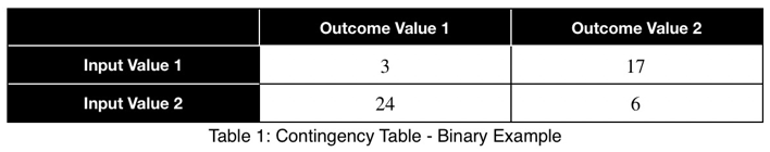
Let’s quantify this. For any dataset with two categorical variables, we create a contingency table where each cell represents the number of rows with that particular input/output combination, the rankings. For example,
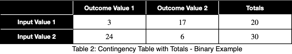
We’ll sum across the rows to get the total number of each input variable value.
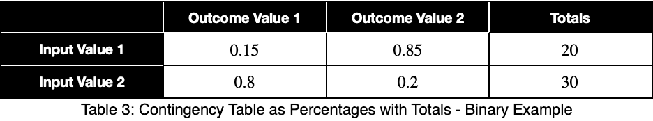
We’ll calculate the percentage of occurrence of each outcome variable value for each input variable value by dividing by the totals in each row. In decimal form, we have
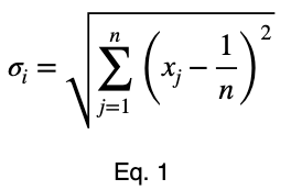
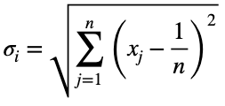
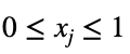
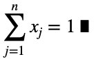
We’ll calculate the variation from the expected value of a uniform distribution, 0.5 for two possible values, and normalize the results. We’ll calculate this like standard deviation. We’ll let n be the number of unique values of the outcome variable across the whole dataset. Assuming they’re all equally probable, 1/n is the probability of getting any one value of the outcome variable, the expected value of a uniform distribution. We’ll let xⱼ be the percentage of occurrence of each of the j values of the outcome variable for one value of the input variable. For each of the i values of the input variable, we calculate

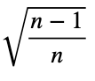
Next, we’ll normalize these values by the maximum value Eq. 1 can take.
Proof
To prove this, we’ll use mathematical induction. Mathematical induction states that for all integers n and k, if we can prove something is true for n = k and n = k + 1, then it is true for all n ≥ k. We’ll show that it’s true for n = 2 and n = 3. Then by mathematical induction, it will be true for all n ≥ 2.
For n = 2, we have
and
where
and
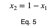
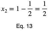
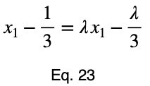
We can solve Eq. 3 for x₁ and substitute it into Eq. 3 to make Eq. 3 a function of one variable.
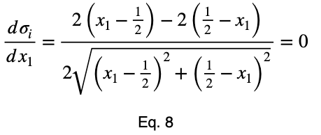
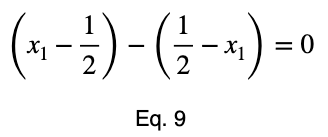
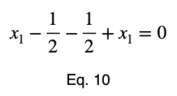
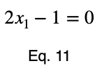
We’ll take the derivative, set it equal to zero, and find the critical points.
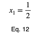
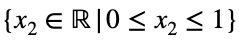
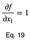
Using Eq. 5, we find the critical value of x₂ that corresponds to this value of x₁.
Now we’ll create a table of the function values at the critical point and the endpoints to determine the maximum value.
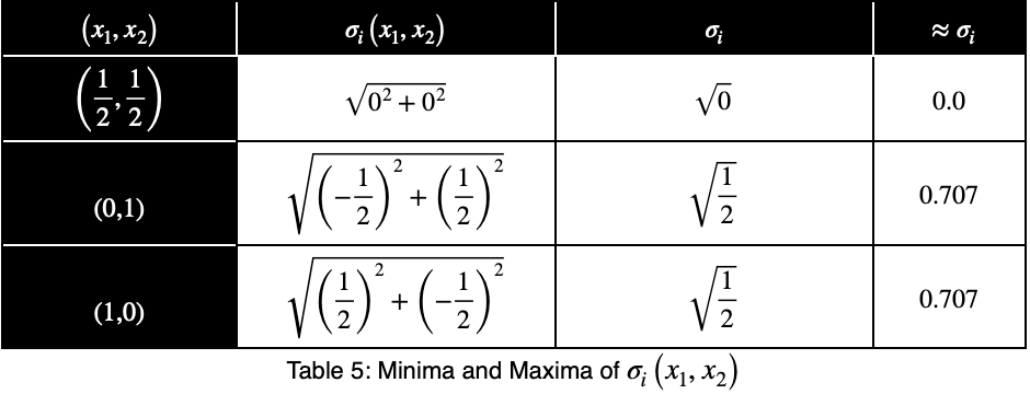
The maximum value occurs at (x₁, x₂) = (0, 1) and (x₁, x₂) = (1, 0), which both evaluate to
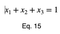
For n = 3, we’ll use the method of Lagrange multipliers. We have
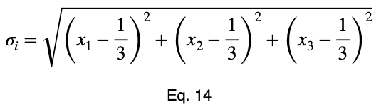
where
and
We’ll convert our constraint equation into a function by bringing all terms to one side of the equation.
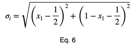
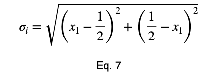
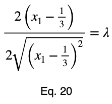
We’ll take the derivative of 𝜎ᵢ with respect to x₁ and set it equal to the derivative of f(x₁, x₂, x₃) with respect to x₁ multiplied by the Lagrange multiplier λ.
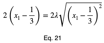
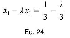
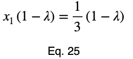
Usually, we’d repeat this procedure for x₁ and x₂, solve for each of them in terms of λ, substitute them into our constraint equation, and use these four equations to solve for the four unknowns, resulting in our critical points. But while simplifying Eq. 20, our λ terms cancel, and we solve for x₁ directly.
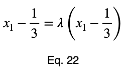
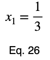
The equations to solve for x₂ and x₃ are the same as that of x₁, swapping out the variable. This gives us our critical point.
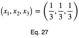
Now we’ll create a table of values, evaluating our function at this point and its endpoints.
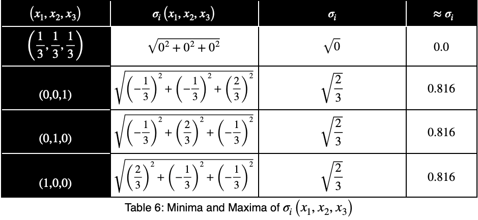
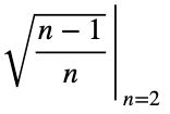
Our maximum value is the square root of 2/3, which is equal to
By mathematical induction, the maximum value of
is
for all integers n ≥ 2 and for all real numbers xⱼ such that for each xⱼ
and
For n = 1, we have the trivial case that there is only one value of the outcome variable.
Back to The Binary Classification Example
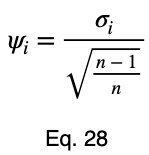
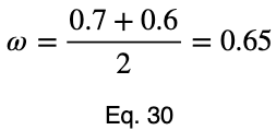
Now, we’ll divide by the square root of 1/2 to get our normalized variations, ψᵢ .
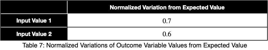
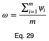
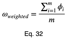
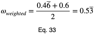
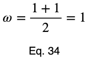
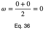
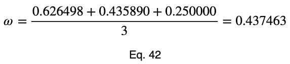
We’ll take the average of these values to get our prediction coefficient, ω. We’ll let m be the number of unique input variable values.
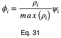
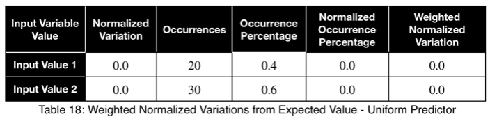
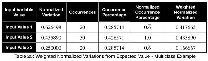
To account for how much the variation in each input variable contributes to the entire dataset, we can take a weighted average with the weights being their percentages of occurrence in the dataset. But we’ll normalize our weights by dividing each of them by their maximum value. Letting 𝜌ᵢ be the occurrence percentage of each of the input variables and ϕᵢ be the weighted normalized variations, we have
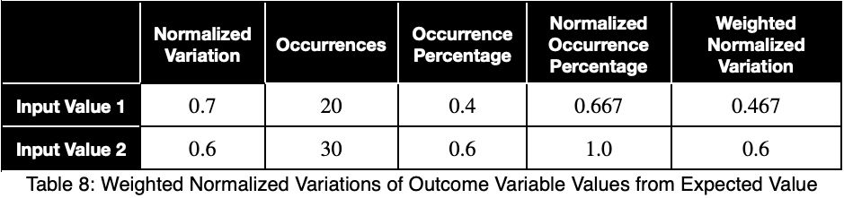
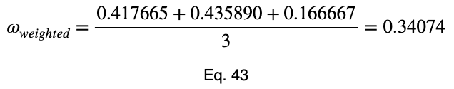
Taking the average of these, we have our weighted prediction coefficient.
Special Cases
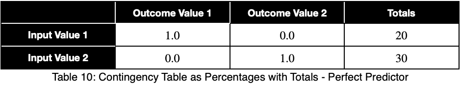
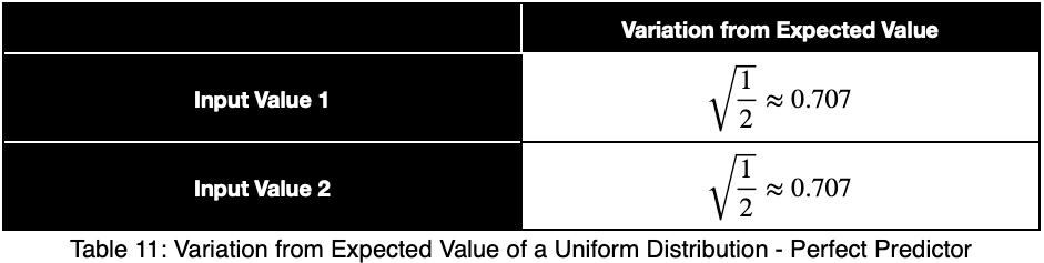
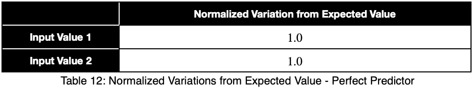
Let’s see what a perfect predictor looks like.
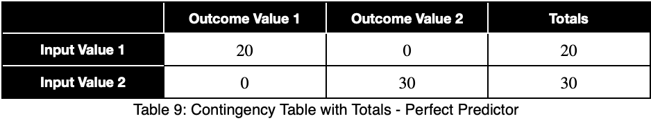
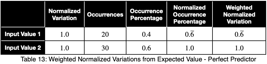
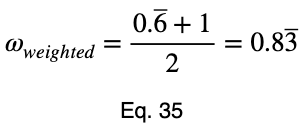
Notice that the weighting causes even a perfect predictor to have a value less than one.
When trying to identify data leakage and relationships between input variables, like multicollinearity between numerical variables, the unweighted prediction coefficient may be more indicative. When using the prediction coefficient for feature selection, the weighted prediction coefficient may give a better overall representation. Analyzing both is recommended.
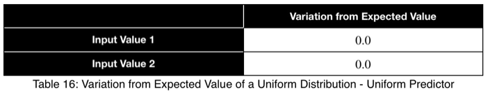
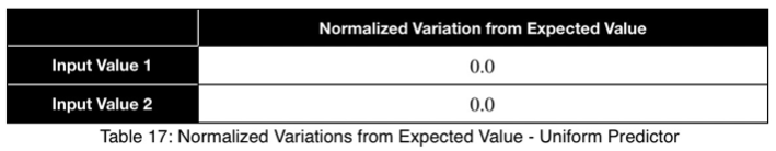
Let’s look at a uniform predictor.
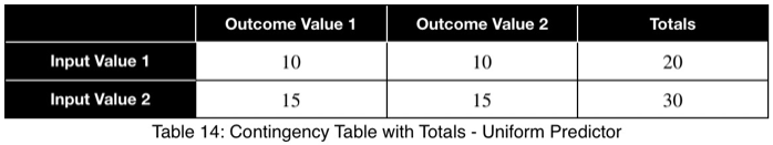
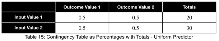
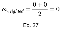
Notice that the values of ω and the weighted ω from our first example, although somewhat far from one, do not indicate a poor predictor variable. Our maximum percentages of occurrence of the outcome variable were 85 and 80 percent for the first and second values of the input variable, respectively. This is a reasonably strong predictor. When comparing values between many input variables simultaneously, like in a correlation matrix, the relative values will clearly indicate which will perform better as predictor variables.
To get a better feel for what these values indicate, let’s see the trend of how this prediction coefficient changes depending on how frequently one value of the outcome variable occurs for one value of the input variable.
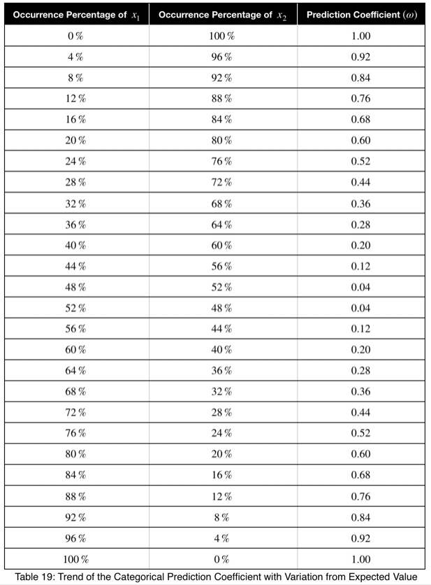
We can see that the prediction coefficient equals the difference between x₁ and 1/n with n = 2, multiplied by 2. So given a prediction coefficient for a pair of binary variables, we could take the value, divide it by 2, add 0.5 and calculate the maximum percentage of occurrence of one of the outcome variable values, telling us exactly how strongly the outcome variable is predicted by this variable by its percentage of occurrence.
Here’s the graph.
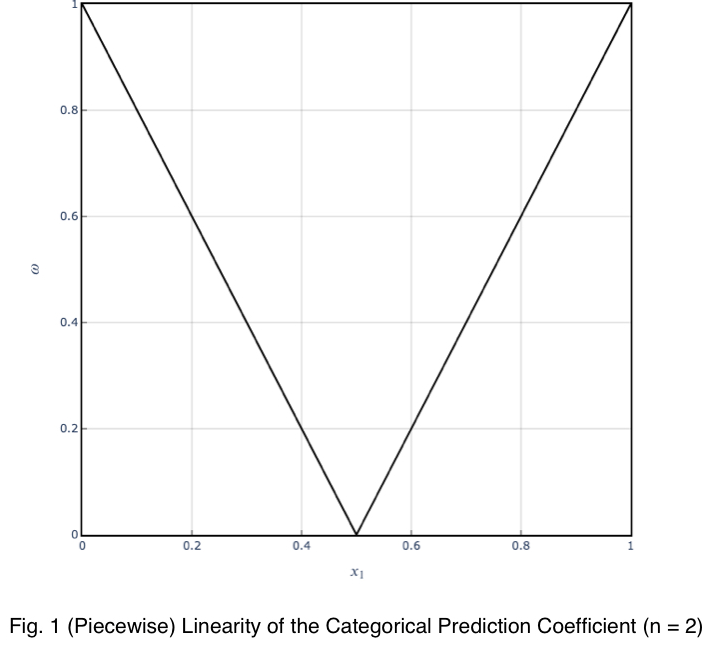
The trend is linear, and the coefficient can be used with confidence.
p-value
Our null hypothesis is that, for each input variable value, each outcome variable value is equally probable. And their percentages of occurrence follow a uniform distribution. The probability of obtaining the occurrences of each outcome variable value is equal to that calculated from the multinomial distribution’s probability mass function (PMF). A binary outcome variable’s probability values would follow the PMF of the binomial distribution, which is a special case of the multinomial distribution. We have to calculate this probability for each input variable value. Then we’ll take the average of them. There’s no need to worry about accounting for the percentage of occurrences for each value. The probability calculation already accounts for that.
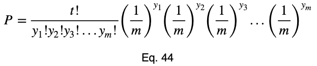
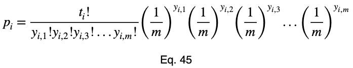
Here’s the formula for the probability of obtaining any number of occurrences from a total number of trials that follow the binomial distribution where each value is equally probable. To avoid redefining variables we’re already using, we’ll slightly vary from the standard notation. Let t be the total number of trials, y₁ be the number of occurrences of one outcome variable value, y₂ be the number of occurrences of the other outcome variable value, and P be the probability of obtaining the y₁ and y₂ occurrences that we did out of the t trials. As a reminder, m is the total possible values of the outcome variable. And the null hypothesis is that each one of these m values is equally probable. So the probability of either of them occurring is 1/m.
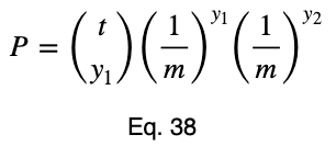
We could use tᵢ choose y₂ instead of tᵢ choose y₁ in Eq. 38 and get the same probability. For those unfamiliar with this formula, click here to learn more about it.
Now we’ll add our subscript i to denote this for each input variable value and change the capital P to a lowercase p.
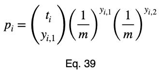
We’ll see the more general formula for the multinomial distribution in the multiclass classification example.
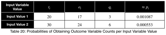
For our first example, we have
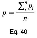
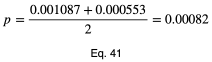
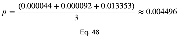
Then we take the average to get the p-value.
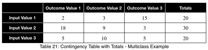
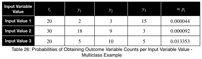
Multiclass Classification Example
Let’s say we have a variable in our dataset with the following counts of input and outcome values.
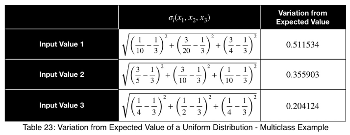
Using Eq. 1, we calculate our variation from the expected value, which is 1/3 for three possible outcome values.
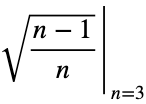
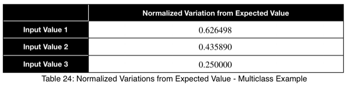
Now we’ll normalize by dividing by the square root of (n — 1)/n with n = 3, the square root of 2/3.
Here we see a value of 0.4 to 0.5 indicating a strong predictor.
Here’s the formula for the probability mass function of the multinomial distribution when the probability of each possible value is 1/m. P will be the probability, t will be the total number of outcome variable values, and y₁ through yₘ will be the number of occurrences of each of the m outcome variable values.
For more information on this formula, click here.
Now we’ll add our subscript i to notate that this is for each of the i input variable values.
For an outcome variable with three values, the trend of the prediction coefficient with one outcome variable value occurrence percentage is essentially piecewise linear. If we split the remaining percentage equally between the other two values, we get this graph.
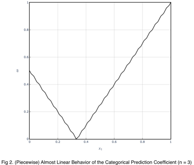
The variations from the straight line are not something to be concerned about in practice. When we evaluate it at every 4%, the trend is exactly linear for each piece. And even in this graph, the trend of each piece is still monotonic.
Our minimum value occurs at the expected value of a uniform distribution, 1/3 for an outcome variable with three values. As the number of outcome variable values increases, this value tends to zero. And the values can be estimated by a straight line from the origin with a slope of 1.
Correlation Matrix
The prediction coefficient is not bidirectional, but it is possible to see the relationships of both directions in one view. We can create a correlation matrix where each cell treats the variable in the row as the input and the variable in the column as the outcome. This creates a matrix composed of two diagonal matrices, each showing one of the two directions.
For example,
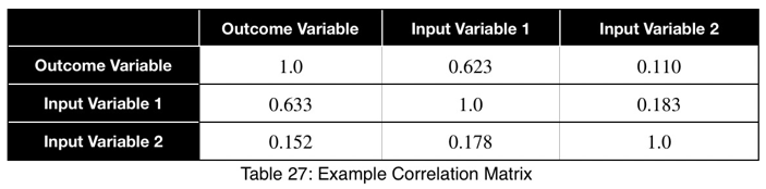
Using this, we can sort our table in descending order in the first column and see our input variables in order of the strongest predictors. We can also detect data leakage and relationships between input variables. We can see that Input Variable 1 has a strong relationship with the outcome variable in both directions, which could be a sign of data leakage. Input Variable 2 is not a strong predictor of the outcome variable and does not have a strong relationship with Input Variable 1.
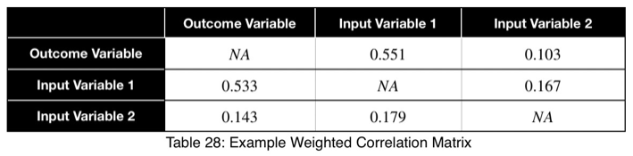
For the weighted coefficients, we’ll replace the diagonal with NA.
Conclusion
This method is intended to ease the detection of strong relationships between categorical variables. Having a number in the same range for all pairs of variables will make detecting which variables have stronger relationships than others much simpler, easier, and faster. Although it’s called a prediction coefficient, it tells us how much the variation in one variable relates to the variation in another variable. And we have a single number that will tell us how well one variable will perform as a predictor of another based on that information.
Algorithm
An optimized implementation of the algorithm has been developed and will be released for free. A prerelease in Python is available here. An official release will be available soon. I may release a version in R. Please put in the comments what other languages you’d like it in, and I’ll do my best to accommodate. To be notified when future releases become available, click Follow by my name.
The Categorical Prediction Coefficient

(All images unless otherwise noted are by the author.)
Introduction
The most common reason for wanting to know the correlation between variables is to develop predictive models. The higher the correlation of an input variable with the outcome variable, the better predictor variable it will be. But checking the correlations between input variables is also important. It’s necessary to remove multicollinearity from the model, which can degrade the legitimacy of model metrics and model performance.
For numerical variables, we can create a table (a correlation matrix) to easily see the correlations of all input variables with the outcome variable and between all input variables at the same time. The comparisons are easy because the correlations are all on the same scale, usually from -1 to 1. But this is not the case with categorical variables.
For categorical variables, a correlation matrix is not easy to use or even always meaningful because the values calculated are usually not even relative to each other. Each correlation value has its own critical value that it must be compared to, which changes based on the degrees of freedom of each variable pair (and the chosen confidence level). For example, we may have three correlations with an outcome variable, 20, 30, and 40. The ones with a correlation of 20 and 30 may have five degrees of freedom and be above their critical value of 15. But the variable with a correlation of 40 may be below its critical value of 45 and not even be correlated.
Wouldn’t it be nice if there was a way to create a correlation matrix where all values are on the same scale as we can for numerical variables? Well, now there is.
Binary Classification Example
Let’s imagine we have a binary outcome variable with values A and B and a binary input variable with values C and D. If for every occurrence of C in the input variable, the outcome variable is A. And for every occurrence of D in the input variable, the outcome variable is B, then we’d have a perfect predictor. We’d have the best-performing model if this were the only input to our model. We’d have perfect model metrics, and the prediction coefficient would be 1. If each input variable value has a 50/50 split of A and B, then we have the least helpful predictor. We’d have the worst-performing model if this were the only input to our model. The prediction coefficient would be 0. The same applies to relationships between input variables. If one corresponds to the other 100% of the time, we’d be putting essentially the same information into the model, and a check for relationships between them should be done.
Let’s analyze this. A 50/50 split of a binary variable would be a uniform distribution. What we’re asking is, for each value of the input variable, how much does the distribution of the outcome variable follow a uniform distribution? If it matches perfectly, each value of the outcome variable occurs the same number of times, then this value of the input variable adds the least information to the model. If this is the case for all input variable values, the prediction coefficient would be 0. It adds the most information to the model if it’s as far from a uniform distribution as possible; 100% are all one value. If this is the case for all input variable values, the prediction coefficient would be 1. The same principle generalizes to categorical variables with any number of values.
Let’s quantify this. For any dataset with two categorical variables, we create a contingency table where each cell represents the number of rows with that particular input/output combination, the rankings. For example,
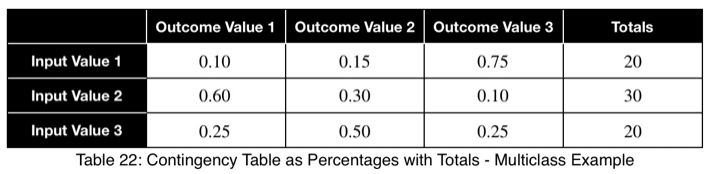
We’ll sum across the rows to get the total number of each input variable value.
We’ll calculate the percentage of occurrence of each outcome variable value for each input variable value by dividing by the totals in each row. In decimal form, we have
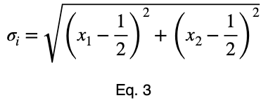
We’ll calculate the variation from the expected value of a uniform distribution, 0.5 for two possible values, and normalize the results. We’ll calculate this like standard deviation. We’ll let n be the number of unique values of the outcome variable across the whole dataset. Assuming they’re all equally probable, 1/n is the probability of getting any one value of the outcome variable, the expected value of a uniform distribution. We’ll let xⱼ be the percentage of occurrence of each of the j values of the outcome variable for one value of the input variable. For each of the i values of the input variable, we calculate
Next, we’ll normalize these values by the maximum value Eq. 1 can take.
Proof
To prove this, we’ll use mathematical induction. Mathematical induction states that for all integers n and k, if we can prove something is true for n = k and n = k + 1, then it is true for all n ≥ k. We’ll show that it’s true for n = 2 and n = 3. Then by mathematical induction, it will be true for all n ≥ 2.
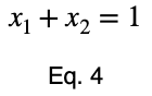
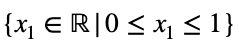
For n = 2, we have
and
where
and
We can solve Eq. 3 for x₁ and substitute it into Eq. 3 to make Eq. 3 a function of one variable.
We’ll take the derivative, set it equal to zero, and find the critical points.
Using Eq. 5, we find the critical value of x₂ that corresponds to this value of x₁.
Now we’ll create a table of the function values at the critical point and the endpoints to determine the maximum value.
The maximum value occurs at (x₁, x₂) = (0, 1) and (x₁, x₂) = (1, 0), which both evaluate to
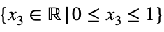
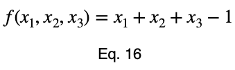
For n = 3, we’ll use the method of Lagrange multipliers. We have
where
and
We’ll convert our constraint equation into a function by bringing all terms to one side of the equation.
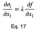
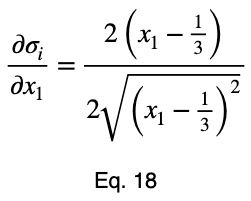
We’ll take the derivative of 𝜎ᵢ with respect to x₁ and set it equal to the derivative of f(x₁, x₂, x₃) with respect to x₁ multiplied by the Lagrange multiplier λ.
Usually, we’d repeat this procedure for x₁ and x₂, solve for each of them in terms of λ, substitute them into our constraint equation, and use these four equations to solve for the four unknowns, resulting in our critical points. But while simplifying Eq. 20, our λ terms cancel, and we solve for x₁ directly.
The equations to solve for x₂ and x₃ are the same as that of x₁, swapping out the variable. This gives us our critical point.
Now we’ll create a table of values, evaluating our function at this point and its endpoints.
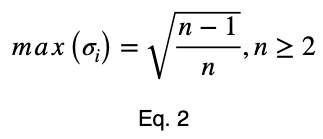
Our maximum value is the square root of 2/3, which is equal to
By mathematical induction, the maximum value of
is
for all integers n ≥ 2 and for all real numbers xⱼ such that for each xⱼ
and
For n = 1, we have the trivial case that there is only one value of the outcome variable.
Back to The Binary Classification Example
Now, we’ll divide by the square root of 1/2 to get our normalized variations, ψᵢ .
We’ll take the average of these values to get our prediction coefficient, ω. We’ll let m be the number of unique input variable values.
To account for how much the variation in each input variable contributes to the entire dataset, we can take a weighted average with the weights being their percentages of occurrence in the dataset. But we’ll normalize our weights by dividing each of them by their maximum value. Letting 𝜌ᵢ be the occurrence percentage of each of the input variables and ϕᵢ be the weighted normalized variations, we have
Taking the average of these, we have our weighted prediction coefficient.
Special Cases
Let’s see what a perfect predictor looks like.
Notice that the weighting causes even a perfect predictor to have a value less than one.
When trying to identify data leakage and relationships between input variables, like multicollinearity between numerical variables, the unweighted prediction coefficient may be more indicative. When using the prediction coefficient for feature selection, the weighted prediction coefficient may give a better overall representation. Analyzing both is recommended.
Let’s look at a uniform predictor.
Notice that the values of ω and the weighted ω from our first example, although somewhat far from one, do not indicate a poor predictor variable. Our maximum percentages of occurrence of the outcome variable were 85 and 80 percent for the first and second values of the input variable, respectively. This is a reasonably strong predictor. When comparing values between many input variables simultaneously, like in a correlation matrix, the relative values will clearly indicate which will perform better as predictor variables.
To get a better feel for what these values indicate, let’s see the trend of how this prediction coefficient changes depending on how frequently one value of the outcome variable occurs for one value of the input variable.
We can see that the prediction coefficient equals the difference between x₁ and 1/n with n = 2, multiplied by 2. So given a prediction coefficient for a pair of binary variables, we could take the value, divide it by 2, add 0.5 and calculate the maximum percentage of occurrence of one of the outcome variable values, telling us exactly how strongly the outcome variable is predicted by this variable by its percentage of occurrence.
Here’s the graph.
The trend is linear, and the coefficient can be used with confidence.
p-value
Our null hypothesis is that, for each input variable value, each outcome variable value is equally probable. And their percentages of occurrence follow a uniform distribution. The probability of obtaining the occurrences of each outcome variable value is equal to that calculated from the multinomial distribution’s probability mass function (PMF). A binary outcome variable’s probability values would follow the PMF of the binomial distribution, which is a special case of the multinomial distribution. We have to calculate this probability for each input variable value. Then we’ll take the average of them. There’s no need to worry about accounting for the percentage of occurrences for each value. The probability calculation already accounts for that.
Here’s the formula for the probability of obtaining any number of occurrences from a total number of trials that follow the binomial distribution where each value is equally probable. To avoid redefining variables we’re already using, we’ll slightly vary from the standard notation. Let t be the total number of trials, y₁ be the number of occurrences of one outcome variable value, y₂ be the number of occurrences of the other outcome variable value, and P be the probability of obtaining the y₁ and y₂ occurrences that we did out of the t trials. As a reminder, m is the total possible values of the outcome variable. And the null hypothesis is that each one of these m values is equally probable. So the probability of either of them occurring is 1/m.
We could use tᵢ choose y₂ instead of tᵢ choose y₁ in Eq. 38 and get the same probability. For those unfamiliar with this formula, click here to learn more about it.
Now we’ll add our subscript i to denote this for each input variable value and change the capital P to a lowercase p.
We’ll see the more general formula for the multinomial distribution in the multiclass classification example.
For our first example, we have
Then we take the average to get the p-value.
Multiclass Classification Example
Let’s say we have a variable in our dataset with the following counts of input and outcome values.
Using Eq. 1, we calculate our variation from the expected value, which is 1/3 for three possible outcome values.
Now we’ll normalize by dividing by the square root of (n — 1)/n with n = 3, the square root of 2/3.
Here we see a value of 0.4 to 0.5 indicating a strong predictor.
Here’s the formula for the probability mass function of the multinomial distribution when the probability of each possible value is 1/m. P will be the probability, t will be the total number of outcome variable values, and y₁ through yₘ will be the number of occurrences of each of the m outcome variable values.
For more information on this formula, click here.
Now we’ll add our subscript i to notate that this is for each of the i input variable values.
For an outcome variable with three values, the trend of the prediction coefficient with one outcome variable value occurrence percentage is essentially piecewise linear. If we split the remaining percentage equally between the other two values, we get this graph.
The variations from the straight line are not something to be concerned about in practice. When we evaluate it at every 4%, the trend is exactly linear for each piece. And even in this graph, the trend of each piece is still monotonic.
Our minimum value occurs at the expected value of a uniform distribution, 1/3 for an outcome variable with three values. As the number of outcome variable values increases, this value tends to zero. And the values can be estimated by a straight line from the origin with a slope of 1.
Correlation Matrix
The prediction coefficient is not bidirectional, but it is possible to see the relationships of both directions in one view. We can create a correlation matrix where each cell treats the variable in the row as the input and the variable in the column as the outcome. This creates a matrix composed of two diagonal matrices, each showing one of the two directions.
For example,
Using this, we can sort our table in descending order in the first column and see our input variables in order of the strongest predictors. We can also detect data leakage and relationships between input variables. We can see that Input Variable 1 has a strong relationship with the outcome variable in both directions, which could be a sign of data leakage. Input Variable 2 is not a strong predictor of the outcome variable and does not have a strong relationship with Input Variable 1.
For the weighted coefficients, we’ll replace the diagonal with NA.
Conclusion
This method is intended to ease the detection of strong relationships between categorical variables. Having a number in the same range for all pairs of variables will make detecting which variables have stronger relationships than others much simpler, easier, and faster. Although it’s called a prediction coefficient, it tells us how much the variation in one variable relates to the variation in another variable. And we have a single number that will tell us how well one variable will perform as a predictor of another based on that information.
Algorithm
An optimized implementation of the algorithm has been developed and will be released for free. A prerelease in Python is available here. An official release will be available soon. I may release a version in R. Please put in the comments what other languages you’d like it in, and I’ll do my best to accommodate. To be notified when future releases become available, click Follow by my name.
Denial of responsibility! Techno Blender is an automatic aggregator of the all world’s media. In each content, the hyperlink to the primary source is specified. All trademarks belong to their rightful owners, all materials to their authors. If you are the owner of the content and do not want us to publish your materials, please contact us by email – [email protected]. The content will be deleted within 24 hours.