
Unlocking Insights: Building a Scorecard with Logistic Regression
After a credit card? An insurance policy? Ever wondered about the three-digit number that shapes these decisions?
Introduction
Scores are used by a large number of industries to make decisions. Financial institutions and insurance providers are using scores to determine whether someone is right for credit or a policy. Some nations are even using social scoring to determine an individual’s trustworthiness and judge their behaviour.
For example, before a score was used to make an automatic decision, a customer would go into a bank and speak to a person regarding how much they want to borrow and why they need a loan. The bank employee may impose their own thoughts and biases into their decision-making process. Where is this person from? What are they wearing? Even, how do I feel today?
A score levels the playing field and allows everyone to be assessed on the same basis.
Recently, I have been taking part in several Kaggle competitions and analyses of featured datasets. The first playground competition of 2024 aimed to determine the likelihood of a customer leaving a bank. This is a common task that is useful for marketing departments. For this competition, I thought I would put aside the tree-based and ensemble modelling techniques normally required to be competitive in these tasks, and go back to the basics: a logistic regression.
Here, I will guide you through the development of the logistic regression model, its conversion into a score, and its presentation as a scorecard. The aim of doing this is to show how this can reveal insights about your data and its relationship to a binary target. The advantage of this type of model is that it is simpler and easier to explain, even to non-technical audiences.
My Kaggle notebook with all my code and maths can be found here. This article will focus on the highlights.
What is a Score?
The score we are describing here is based on a logistic regression model. The model assigns weights to our input features and will output a probability that we can convert through a calibration step into a score. Once we have this, we can represent it with a scorecard: showing how an individual is scoring based on their available data.
Let’s go through a simple example.
Mr X walks into a bank looking for loan for a new business. The bank uses a simple score based on income and age to determine whether the individual should be approved.
https://medium.com/media/74dab52f4579a0fc5fb8b7b2c28a25de/href
Mr X is a young individual with a relatively low income. He is penalised for his age, but scores well (second best) in the income band. In total, he scores 24 points in this scorecard, which is a mid-range score (the maximum number of points being 52).
A score cut-off would often be used by the bank to say how many points are needed to be accepted based on internal policy. A score is based on a logistic regression which is built on some binary definition, using a set of features to predict the log odds.
https://medium.com/media/94e36e165aa5823ed869cc06ad42564d/href
In the case of a bank, the logistic regression may be trying to predict those that have missed payments. For an insurance provider, those who have made a claim before. For a social score, those that have ever attended an anarchist gathering (not really sure what these scores would be predicting but I would be fascinated to know!).
We will not go through everything required for a full model development, but some of the key steps that will be explored are:
- Weights of Evidence Transformation: Making our continuous features discrete by banding them up as with the Mr X example.
- Calibrating our Logistic Regression Outputs to Generate a Score: Making our probability into a more user-friendly number by converting it into a score.
- Representing Our Score as a Scorecard: Showing how each feature contributes to the final score.
Weights of Evidence Transformation
In the Mr X example, we saw that the model had two features which were based on numeric values: the age and income of Mr X. These variables were banded into groups to make it easier to understand the model and what drives an individual’s score. Using these continuous variables directly (as oppose to within a group) could mean significantly different scores for small differences in values. In the context of credit or insurance risk, this makes a decision harder to justify and explain.
There are a variety of ways to approach the banding, but normally an initial automated approach is taken, before fine-tuning the groupings manually to make qualitative sense. Here, I fed each continuous feature individually into a decision tree to get an initial set of groupings.
Once the groupings were available, I calculated the weights of evidence for each band. The formula for this is shown below:
https://medium.com/media/91bbe7a0b0420ffa7278abf14c563965/href
This is a commonly used transformation technique in scorecard modelling where a logistic regression is used given its linear relationship to the log odds, the thing that the logistic regression is aimed to predict. I will not go into the maths of this here as this is covered in full detail in my Kaggle notebook.
Once we have the weights of evidence for each banded feature, we can visualise the trend. From the Kaggle data used for bank churn prediction, I have included a couple of features to illustrate the transformations.
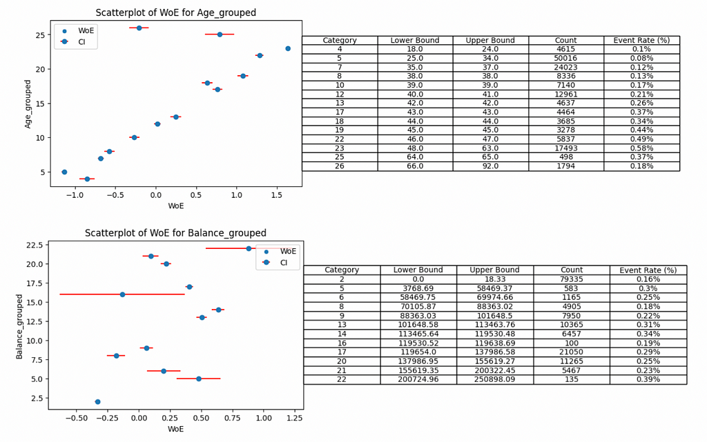
The red bars surrounding each weights of evidence show a 95% confidence interval, implying we are 95% sure that the weights of evidence would fall within this range. Narrow intervals are associated with robust groups that have sufficient volume to be confident in the weights of evidence.
For example, categories 16 and 22 of the grouped balance have low volumes of customers leaving the bank (19 and 53 cases in each group respectively) and have the widest confidence intervals.
The patterns reveal insights about the feature relationship and the chance of a customer leaving the bank. The age feature is slightly simpler to understand so we will tackle that first.
As a customer gets older they are more likely to leave the bank.
The trend is fairly clear and mostly monotonic except some groups, for example 25–34 year old individuals are less likely to leave than 18–24 year old cases. Unless there is a strong argument to support why this is the case (domain knowledge comes into play!), we may consider grouping these two categories to ensure a monotonic trend.
A monotonic trend is important when making decisions to grant credit or an insurance policy as this is often a regulatory requirement to make the models interpretable and not just accurate.
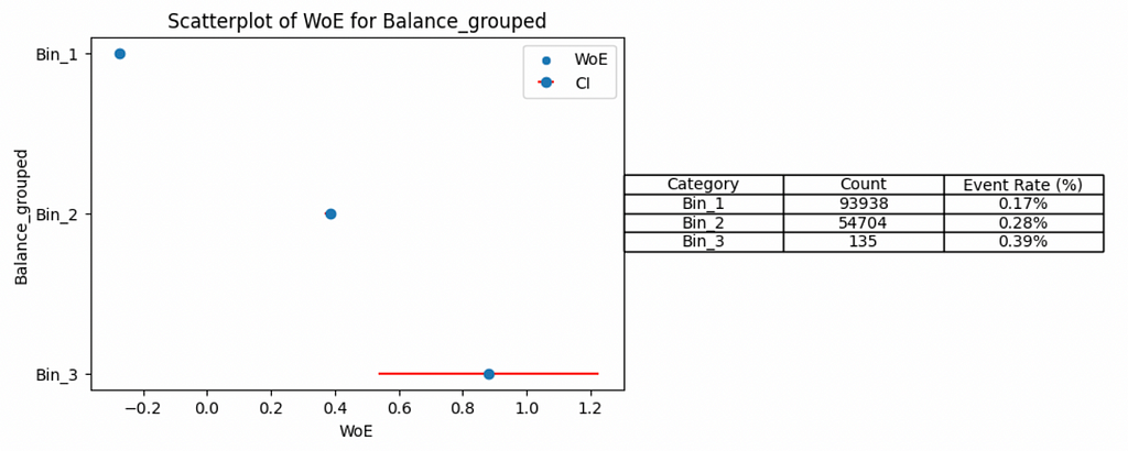
This brings us on to the balance feature. The pattern is not clear and we don’t have a real argument to make here. It does seem that customers with lower balances have less chance to leave the bank but you would need to band several of the groups to make this trend make any sense.
By grouping categories 2–9, 13–21 and leaving 22 on its own (into bins 1, 2 and 3 respectively) we can start to see the trend. However, the down side of this is losing granularity in our features and likely impacting downstream model performance.
For the Kaggle competition, my model did not need to be explainable, so I did not regroup any of the features and just focused on producing the most predictive score based on the automatic groupings I applied. In an industry setting, I may think twice about doing this.
It is worth noting that our insights are limited to the features we have available and there may be other underlying causes for the observed behaviour. For example, the age trend may have been driven by policy changes over time such as the move to online banking, but there is no feasible way to capture this in the model without additional data being available.
If you want to perform auto groupings to numeric features, apply this transformation and make these associated graphs for yourselves, they can be created for any binary classification task using the Python repository I put together here.
Once these features are available, we can fit a logistic regression. The fitted logistic regression will have an intercept and each feature in the model will have a coefficient assigned to it. From this, we can output the probability that someone is going to leave the bank. I won’t spend time here discussing how I fit the regression, but as before, all the details are available in my Kaggle notebook.
Calibrating our Logistic Regression Outputs to Generate a Score
The fitted logistic regression can output a probability, however this is not particularly useful for non-technical users of the score. As such, we need to calibrate these probabilities and transform them into something neater and more interpretable.
Remember that the logistic regression is aimed at predicting the log odds. We can create the score by performing a linear transformation to these odds in the following way:
https://medium.com/media/0b78a2fd2fb9a75d4c9a0bb0697bfb77/href
In credit risk, the points to double the odds and 1:1 odds are typically set to 20 and 500 respectively, however this is not always the case and the values may differ. For the purposes of my analysis, I stuck to these values.
We can visualise the calibrated score by plotting its distribution.
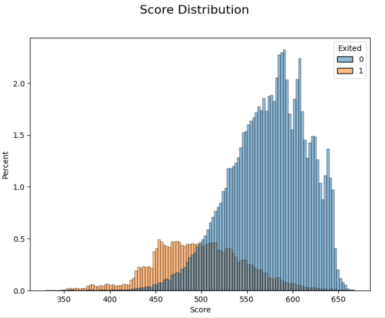
I split the distribution by the target variable (whether a customer leaves the bank), this provides a useful validation that all the previous steps have been done correctly. Those more likely to leave the bank score lower and those who stay score higher. There is an overlap, but a score is rarely perfect!
Based on this score, a marketing department may set a score cut-off to determine which customers should be targeted with a particular marketing campaign. This cut-off can be set by looking at this distribution and converting a score back to a probability.
Translating a score of 500 would give a probability of 50% (remember that our 1:1 odds are equal to 500 for the calibration step). This would imply that half of our customers below a score of 500 would leave the bank. If we want to target more of these customers, we would just need to raise the score cut-off.
Representing Our Score as a Scorecard
We already know that the logistic regression is made up of an intercept and a set of weights for each of the used features. We also know that the weights of evidence have a direct linear relationship with the log odds. Knowing this, we can convert the weights of evidence for each feature to understand its contribution to the overall score.
https://medium.com/media/e69a07d4dc043fc9e3699bc2b2dd6ef2/href
I have displayed this for all features in the model in my Kaggle notebook, but below are examples we have already seen when transforming the variables into their weights of evidence form.
Age
https://medium.com/media/ce6554c9f3ddc40d5ff3383a9b065c03/href
Balance
https://medium.com/media/ad7a78d5872d37060014ccf0a274388c/href
The advantage of this representation, as opposed to the weights of evidence form, is it should make sense to anyone without needing to understand the underlying maths. I can tell a marketing colleague that customers age 48 to 63 years old are scoring lower than other customers. A customer with no balance in their account is more likely to leave than someone with a high balance.
You may have noticed that in the scorecard the balance trend is the opposite to what was observed at the weights of evidence stage. Now, low balances are scoring lower. This is due to the coefficient attached to this feature in the model. It is negative and so is flipping the initial trend. This can happen as there are various interactions happening between the features during the fitting of the model. A decision must be made whether these sorts of interactions are acceptable or whether you would want to drop the feature if the trend becomes unintuitive.
Supporting documentation can explain the full detail of any score and how it is developed (or at least should!), but with just the scorecard, anyone should be able to get immediate insights!
Conclusion
We have explored some of the key steps in developing a score based on a logistic regression and the insights that it can bring. The simplicity of the final output is why this type of score is still used to this day in the face of more advanced classification techniques.
The score I developed for this competition had an area under the curve of 87.4%, while the top solutions based on ensemble techniques were around 90%. This shows that the simple model is still competitive, although not perfect if you are just looking for accuracy. However, if for your next classification task you are looking for something simple and easily explainable, what about considering a scorecard to gain insights into your data?
Reference
[1] Walter Reade, Ashley Chow, Binary Classification with a Bank Churn Dataset (2024), Kaggle.
Unlocking Insights: Building a Scorecard with Logistic Regression was originally published in Towards Data Science on Medium, where people are continuing the conversation by highlighting and responding to this story.
After a credit card? An insurance policy? Ever wondered about the three-digit number that shapes these decisions?
Introduction
Scores are used by a large number of industries to make decisions. Financial institutions and insurance providers are using scores to determine whether someone is right for credit or a policy. Some nations are even using social scoring to determine an individual’s trustworthiness and judge their behaviour.
For example, before a score was used to make an automatic decision, a customer would go into a bank and speak to a person regarding how much they want to borrow and why they need a loan. The bank employee may impose their own thoughts and biases into their decision-making process. Where is this person from? What are they wearing? Even, how do I feel today?
A score levels the playing field and allows everyone to be assessed on the same basis.

Recently, I have been taking part in several Kaggle competitions and analyses of featured datasets. The first playground competition of 2024 aimed to determine the likelihood of a customer leaving a bank. This is a common task that is useful for marketing departments. For this competition, I thought I would put aside the tree-based and ensemble modelling techniques normally required to be competitive in these tasks, and go back to the basics: a logistic regression.
Here, I will guide you through the development of the logistic regression model, its conversion into a score, and its presentation as a scorecard. The aim of doing this is to show how this can reveal insights about your data and its relationship to a binary target. The advantage of this type of model is that it is simpler and easier to explain, even to non-technical audiences.
My Kaggle notebook with all my code and maths can be found here. This article will focus on the highlights.
What is a Score?
The score we are describing here is based on a logistic regression model. The model assigns weights to our input features and will output a probability that we can convert through a calibration step into a score. Once we have this, we can represent it with a scorecard: showing how an individual is scoring based on their available data.
Let’s go through a simple example.
Mr X walks into a bank looking for loan for a new business. The bank uses a simple score based on income and age to determine whether the individual should be approved.
https://medium.com/media/74dab52f4579a0fc5fb8b7b2c28a25de/href
Mr X is a young individual with a relatively low income. He is penalised for his age, but scores well (second best) in the income band. In total, he scores 24 points in this scorecard, which is a mid-range score (the maximum number of points being 52).
A score cut-off would often be used by the bank to say how many points are needed to be accepted based on internal policy. A score is based on a logistic regression which is built on some binary definition, using a set of features to predict the log odds.
https://medium.com/media/94e36e165aa5823ed869cc06ad42564d/href
In the case of a bank, the logistic regression may be trying to predict those that have missed payments. For an insurance provider, those who have made a claim before. For a social score, those that have ever attended an anarchist gathering (not really sure what these scores would be predicting but I would be fascinated to know!).
We will not go through everything required for a full model development, but some of the key steps that will be explored are:
- Weights of Evidence Transformation: Making our continuous features discrete by banding them up as with the Mr X example.
- Calibrating our Logistic Regression Outputs to Generate a Score: Making our probability into a more user-friendly number by converting it into a score.
- Representing Our Score as a Scorecard: Showing how each feature contributes to the final score.
Weights of Evidence Transformation
In the Mr X example, we saw that the model had two features which were based on numeric values: the age and income of Mr X. These variables were banded into groups to make it easier to understand the model and what drives an individual’s score. Using these continuous variables directly (as oppose to within a group) could mean significantly different scores for small differences in values. In the context of credit or insurance risk, this makes a decision harder to justify and explain.
There are a variety of ways to approach the banding, but normally an initial automated approach is taken, before fine-tuning the groupings manually to make qualitative sense. Here, I fed each continuous feature individually into a decision tree to get an initial set of groupings.
Once the groupings were available, I calculated the weights of evidence for each band. The formula for this is shown below:
https://medium.com/media/91bbe7a0b0420ffa7278abf14c563965/href
This is a commonly used transformation technique in scorecard modelling where a logistic regression is used given its linear relationship to the log odds, the thing that the logistic regression is aimed to predict. I will not go into the maths of this here as this is covered in full detail in my Kaggle notebook.
Once we have the weights of evidence for each banded feature, we can visualise the trend. From the Kaggle data used for bank churn prediction, I have included a couple of features to illustrate the transformations.
The red bars surrounding each weights of evidence show a 95% confidence interval, implying we are 95% sure that the weights of evidence would fall within this range. Narrow intervals are associated with robust groups that have sufficient volume to be confident in the weights of evidence.
For example, categories 16 and 22 of the grouped balance have low volumes of customers leaving the bank (19 and 53 cases in each group respectively) and have the widest confidence intervals.
The patterns reveal insights about the feature relationship and the chance of a customer leaving the bank. The age feature is slightly simpler to understand so we will tackle that first.
As a customer gets older they are more likely to leave the bank.
The trend is fairly clear and mostly monotonic except some groups, for example 25–34 year old individuals are less likely to leave than 18–24 year old cases. Unless there is a strong argument to support why this is the case (domain knowledge comes into play!), we may consider grouping these two categories to ensure a monotonic trend.
A monotonic trend is important when making decisions to grant credit or an insurance policy as this is often a regulatory requirement to make the models interpretable and not just accurate.
This brings us on to the balance feature. The pattern is not clear and we don’t have a real argument to make here. It does seem that customers with lower balances have less chance to leave the bank but you would need to band several of the groups to make this trend make any sense.
By grouping categories 2–9, 13–21 and leaving 22 on its own (into bins 1, 2 and 3 respectively) we can start to see the trend. However, the down side of this is losing granularity in our features and likely impacting downstream model performance.
For the Kaggle competition, my model did not need to be explainable, so I did not regroup any of the features and just focused on producing the most predictive score based on the automatic groupings I applied. In an industry setting, I may think twice about doing this.
It is worth noting that our insights are limited to the features we have available and there may be other underlying causes for the observed behaviour. For example, the age trend may have been driven by policy changes over time such as the move to online banking, but there is no feasible way to capture this in the model without additional data being available.
If you want to perform auto groupings to numeric features, apply this transformation and make these associated graphs for yourselves, they can be created for any binary classification task using the Python repository I put together here.
Once these features are available, we can fit a logistic regression. The fitted logistic regression will have an intercept and each feature in the model will have a coefficient assigned to it. From this, we can output the probability that someone is going to leave the bank. I won’t spend time here discussing how I fit the regression, but as before, all the details are available in my Kaggle notebook.
Calibrating our Logistic Regression Outputs to Generate a Score
The fitted logistic regression can output a probability, however this is not particularly useful for non-technical users of the score. As such, we need to calibrate these probabilities and transform them into something neater and more interpretable.
Remember that the logistic regression is aimed at predicting the log odds. We can create the score by performing a linear transformation to these odds in the following way:
https://medium.com/media/0b78a2fd2fb9a75d4c9a0bb0697bfb77/href
In credit risk, the points to double the odds and 1:1 odds are typically set to 20 and 500 respectively, however this is not always the case and the values may differ. For the purposes of my analysis, I stuck to these values.
We can visualise the calibrated score by plotting its distribution.
I split the distribution by the target variable (whether a customer leaves the bank), this provides a useful validation that all the previous steps have been done correctly. Those more likely to leave the bank score lower and those who stay score higher. There is an overlap, but a score is rarely perfect!
Based on this score, a marketing department may set a score cut-off to determine which customers should be targeted with a particular marketing campaign. This cut-off can be set by looking at this distribution and converting a score back to a probability.
Translating a score of 500 would give a probability of 50% (remember that our 1:1 odds are equal to 500 for the calibration step). This would imply that half of our customers below a score of 500 would leave the bank. If we want to target more of these customers, we would just need to raise the score cut-off.
Representing Our Score as a Scorecard
We already know that the logistic regression is made up of an intercept and a set of weights for each of the used features. We also know that the weights of evidence have a direct linear relationship with the log odds. Knowing this, we can convert the weights of evidence for each feature to understand its contribution to the overall score.
https://medium.com/media/e69a07d4dc043fc9e3699bc2b2dd6ef2/href
I have displayed this for all features in the model in my Kaggle notebook, but below are examples we have already seen when transforming the variables into their weights of evidence form.
Age
https://medium.com/media/ce6554c9f3ddc40d5ff3383a9b065c03/href
Balance
https://medium.com/media/ad7a78d5872d37060014ccf0a274388c/href
The advantage of this representation, as opposed to the weights of evidence form, is it should make sense to anyone without needing to understand the underlying maths. I can tell a marketing colleague that customers age 48 to 63 years old are scoring lower than other customers. A customer with no balance in their account is more likely to leave than someone with a high balance.
You may have noticed that in the scorecard the balance trend is the opposite to what was observed at the weights of evidence stage. Now, low balances are scoring lower. This is due to the coefficient attached to this feature in the model. It is negative and so is flipping the initial trend. This can happen as there are various interactions happening between the features during the fitting of the model. A decision must be made whether these sorts of interactions are acceptable or whether you would want to drop the feature if the trend becomes unintuitive.
Supporting documentation can explain the full detail of any score and how it is developed (or at least should!), but with just the scorecard, anyone should be able to get immediate insights!
Conclusion
We have explored some of the key steps in developing a score based on a logistic regression and the insights that it can bring. The simplicity of the final output is why this type of score is still used to this day in the face of more advanced classification techniques.
The score I developed for this competition had an area under the curve of 87.4%, while the top solutions based on ensemble techniques were around 90%. This shows that the simple model is still competitive, although not perfect if you are just looking for accuracy. However, if for your next classification task you are looking for something simple and easily explainable, what about considering a scorecard to gain insights into your data?
Reference
[1] Walter Reade, Ashley Chow, Binary Classification with a Bank Churn Dataset (2024), Kaggle.
Unlocking Insights: Building a Scorecard with Logistic Regression was originally published in Towards Data Science on Medium, where people are continuing the conversation by highlighting and responding to this story.
Denial of responsibility! Techno Blender is an automatic aggregator of the all world’s media. In each content, the hyperlink to the primary source is specified. All trademarks belong to their rightful owners, all materials to their authors. If you are the owner of the content and do not want us to publish your materials, please contact us by email – [email protected]. The content will be deleted within 24 hours.