
Visualizations in Data Science: Empirical Interval Probability Function | by Grzegorz Sikora | Jul, 2022
Useful in a data distribution study
In practical everyday data science tasks, we often study the distribution of some data, in particular with the use of graphical statistical methods such as histogram, boxplot, or empirical CDF (ECDF for short). In this article, I will introduce a new type of graph obtained as a heatmap of the values of a newly defined function, the so-called empirical interval probability function (EIPF for short). This graph provides complete information on the distribution of data, is more general than other graphical methods, and includes the results of a histogram as well as ECDF. Python implementation of EIPF is also included.
Empirical CDF reminder
First, let us recall the ECDF function. For the data sample (X1, X2, …, Xn) it is a function

so the domain of this function (arguments) is the set of real numbers (or some subset of real numbers) and the set of values is the closed interval [0, 1]. The function has the following formula

where I is the so-called indicator function of the form

Simply, I(A) indicates by its value 1 if condition A is satisfied, otherwise, its value is zero. The ECDF function could be rewritten

Simply, the ECDF function for some argument t gives us the number of observations in the sample that are less or equal t divided by n — the sample length. Therefore, we can say that value of ECDF at t, so F(t), is the fraction of data in the sample less or equal t. Because values of the EIPF function are some fractions, it is natural that they are from interval [0, 1]. With the ECDF function very often one consider the so called survival function, which is

So, S(t) is a fraction of data in the sample that are greater then t.
ECDF function has many interesting properties, well studied by statisticians, e. g. convergence of ECDF to the theoretical CDF when the sample length n increases. But in this article, I would like to concentrate on some practical aspects and try to modify this function. Let us plot the ECDF for some exemplary generated dataset.

Let us think for a moment in a more abstract manner (I know, I have just written practical aspects…). Arguments of ECDF are real numbers and values of ECDF give the fraction of data less or equal specific argument. But about such a condition

we can think

So, more abstractly, we can say that the arguments of ECDF are not real numbers but (equivalently) the left-infinite intervals of the form above. We can even say that, in some sense, the domain (set of arguments) of ECDF is indexed by the family of left-infinite intervals

equipped in the natural ordering inclusion relation`

Now the question is why I have mentioned and described such an abstract approach for the domain of ECDF. After all, it is much simpler to think about just real numbers than some left-infinite intervals…
But, now, we can try to change our left-infinite intervals and consider the family of closed two-sided bounded intervals of the form

And this leads us to the new function, our EIPF.
Empirical Interval Probability Function — definition and implementation
The EIPF function we define as a function

of the two real variables of the form

Simply, the EIPF function for some arguments s, t gives us the number of observations in the sample that are from the interval [s, t] divided by n — the sample length. Therefore, we can say that value of EIPF at s, t, so F(s, t), is the fraction of data in the sample from the interval [s, t]. There is a natural connection between EIPF and ECDF function:

So, the EIPF is simply the function whose values are some increments of the ECDF function.
Because this function has a 2-dimensional domain, to plot its values we use a heatmap, please see the figure below.

Below is the Python implementation of the EIPF function.
Let me briefly comment on the input parameters and the output of the eipf function implemented above.
Input parameters:
data — it is a Numpy array of our dataset.
grid_x — it is a parameter for x-axis. It could be an integer(default value is 100) and in such case, the interval from the minimum of a dataset to the maximum of a dataset is divided into grid_x subintervals of equal length. Or it could be a Numpy array of any numbers for the grid of the x-axis.
grid_y — it is a parameter for the y-axis. It is an optional argument. When it is not provided then grid_y=grid_x. If it is provided (the same as grid_x) it could be an integer or a Numpy array.
plot — it is a boolean parameter (default value is False) indicating if the eipf function returns a figure object.
Output parameters:
The output of the eipf function is a Tuple with the following items:
args_x — it is a Numpy array with any numbers for a grid of the x-axis. If grid_x parameter is a Numpy array than args_x=grid_x. If grid_x is an integer, the args_x is a Numpy array with numbers equally spaced between the min and max of a dataset.
args_y — the same as args_x but for the y-axis.
eipf_values — it is a NumPy array with computed values of the EIPF function.
fig — it is a figure object obtained only when plot=True.
Now, let us generate some random dataset from the standard normal distribution, compute, and plot the EIPF function.

Empirical Interval Probability Function —properties
In this part of the story let me point out the beneficial properties of the EIPF function and its heatmap:
- The column behavior:
If we concentrate on a single column on the heatmap of EIPF, so we set the concrete value of s argument (which is the left edge of the interval [s, t]), we get the following behavior of the EIPF function:

So, the EIPF function increases with t, which is intuitively clear because we are expanding the interval [s, t] to the right, and more observations fall between s and t. Mathematically we can write:

Please see also the figure below.

2. The first column:
The first column is special because of a few important things. This is the column for s being the minimum of our dataset. First of all, this is the only column with the whole spectrum of values from 0% to 100%. That should be intuitively clear because shifting s argument to the right (the lower edge of the interval [s,t]) will result in the loss of some observations in [s,t], please see figures below.


The assumption that [s,t] is a nonempty interval, i.e. s<t result in the being of the EIPF heatmap the upper triangular heatmap.
The second important thing about the first column is much more interesting and beneficial. I mentioned the ECDF function at the beginning of the story for two reasons. The first one was the step-by-step description of creating the EIPF by modifying the ‘inequality condition’ (observation less than t) in ECDF for an ‘interval condition’ (observation in [s,t]). Now, the second reason is that the values of the ECDF function are stored in the EIPF function. Let us see some details for s argument being the minimum of our dataset:

We see that when s is the minimum of our dataset, being below the threshold t means the same as being between the minimum and the threshold t (because our dataset is always finite and bounded). So, the values of the first column of EIPF are values of the ECDF function, please see the figure below.
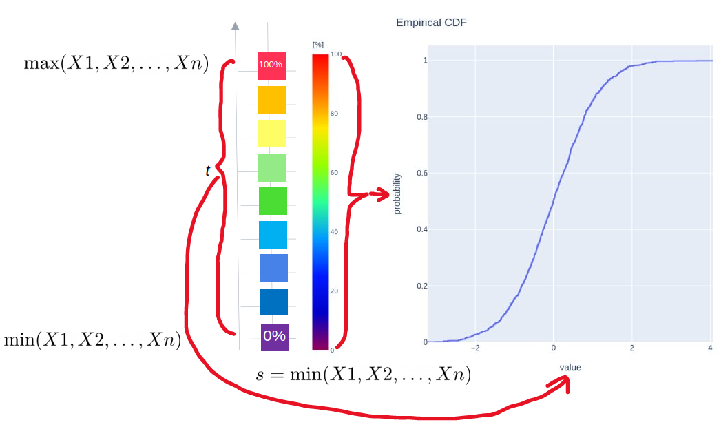
To summarize, the EIPF function gives us exactly the same information as the ECDF function (and much more of course).
3. The raw behavior
If we concentrate on a single row on the heatmap of EIPF, so we set the concrete value of t argument (which is the right edge of the interval [s, t]), we get the following behavior of the EIPF function:

So, the EIPF function decreases with s, which is intuitively clear because we are shortening the interval [s, t] (from the left side), and fewer observations fall between s and t. Mathematically we can write:

Please see also the figure below.

We can conclude that the row behavior is analogous (by transposition) to the column behavior of the EIPF heatmap.
4. The first raw behavior
The first row is also special because of a few important things. This is the row for t being the maximum of our dataset. First of all, this is the only row with the whole spectrum of values from 0% to 100%. That should be intuitively clear because lowering t argument (the right edge of the interval [s,t]) will result in the loss of some observations in [s,t], please see the figures below.


The second important thing about the first row is also much more interesting and beneficial. I mentioned the survival function (1-ECDF) at the beginning of the story for a reason. The reason is that the values of the 1-ECDF function are stored in the EIPF function. Let us see some details for t argument being the maximum of our dataset:

We see that when t is the maximum of our dataset, being above the threshold t means the same as being between the threshold s and the maximum (because our dataset is always finite and bounded). So, the values of the first row of EIPF are values of the survival function, please see the figure below.

To summarize, the EIPF function gives us exactly the same information as the survival function (and much more of course).
5. Histogram
Now let us compare the histogram for the exemplary dataset (from the standard normal distribution) with the corresponding EIPF heatmap.

We see the case when the grid of the x-axis is the same for the histogram and the EIPF heatmap. Then, all information from the histogram (bins heights) is concentrated on the main diagonal of our EIPF heatmap. So, the colors from the main diagonal correspond directly to the bins heights of the histogram. Therefore, the EIPF function stores the same information as the histogram (and much more of course).
6. Histogram of any design
However, the histogram has a very serious drawback. The choice of the number of bins is always unknown. Of course, there are many rules (e.g. Sturges’ rule, Rice Rule, among others) for choosing the number of bins, but in general, a wrong bins selection can lead to a confusing histogram. Let us consider the previous example, but with the histogram with twice as wide bins and a non-changed EIPF heatmap, please see the figure below.

Again, all information from the histogram with changed bins (bins heights) is also available on the EIPF heatmap.
Having specific domain knowledge in concrete tasks, we may be interested in very peculiar bins choice for observations from our dataset, please see the figure below

Hence, we can conclude that the EIPF heatmap stores information of any designed histogram.
Empirical Interval Probability Function — examples
In this part of the story, we investigate whether certain data distribution features visible on the histogram will also be visible on the EIPF heatmap. We consider three cases with three different distributions manifesting three different properties:
- Skewed distribution

2. Distribution with high kurtosis

3. Bimodal distribution

We can easily conclude that the considered shape properties of data distribution are also visible on the EIPF heatmap.
Key takeaways
In this article, starting from the ECDF function, we defined the EIPF function and used a heatmap to visualize its values. Python implementation is also included. EIPF heatmap is a graphical tool for examining data distribution, it is an alternative to a histogram, ECDF, and other tools. Its main advantages are:
— it presents information such as ECDF and survival function,
— it presents information such as a histogram and a histogram composed of any kind, so there are no problems with the selection of the number of bins. It can be used as a tool for creating any histogram, especially for specific bin selection.
— it presents various patterns of data distribution, e.g. skewness, bimodality, etc.
What can be a disadvantage of the EIPF is that we visualize it as a heatmap for one-dimensional data, and most often a heatmap is used to count two-dimensional points on a plane. Therefore, this tool can be (especially at the beginning of cognition) unintuitive. However, its great advantage is that it presents data fractions falling into any interval [s, t]. Of course, the EIPF heatmap should not be used in isolation, it enriches the data scientist’s toolset. It is always good to know another graphical method of examining the distribution of data.
If you are interested in Data Science topics and you think my article is valuable, you can follow me on LinkedIn or Medium. I would be more than happy to discuss any Data Science, Stats, Maths, or ML topic with you. You can also become a Medium member, get unlimited access to all the content, and support all writers using my referral link. Thanks, Greg!
Useful in a data distribution study
In practical everyday data science tasks, we often study the distribution of some data, in particular with the use of graphical statistical methods such as histogram, boxplot, or empirical CDF (ECDF for short). In this article, I will introduce a new type of graph obtained as a heatmap of the values of a newly defined function, the so-called empirical interval probability function (EIPF for short). This graph provides complete information on the distribution of data, is more general than other graphical methods, and includes the results of a histogram as well as ECDF. Python implementation of EIPF is also included.
Empirical CDF reminder
First, let us recall the ECDF function. For the data sample (X1, X2, …, Xn) it is a function
so the domain of this function (arguments) is the set of real numbers (or some subset of real numbers) and the set of values is the closed interval [0, 1]. The function has the following formula
where I is the so-called indicator function of the form
Simply, I(A) indicates by its value 1 if condition A is satisfied, otherwise, its value is zero. The ECDF function could be rewritten
Simply, the ECDF function for some argument t gives us the number of observations in the sample that are less or equal t divided by n — the sample length. Therefore, we can say that value of ECDF at t, so F(t), is the fraction of data in the sample less or equal t. Because values of the EIPF function are some fractions, it is natural that they are from interval [0, 1]. With the ECDF function very often one consider the so called survival function, which is
So, S(t) is a fraction of data in the sample that are greater then t.
ECDF function has many interesting properties, well studied by statisticians, e. g. convergence of ECDF to the theoretical CDF when the sample length n increases. But in this article, I would like to concentrate on some practical aspects and try to modify this function. Let us plot the ECDF for some exemplary generated dataset.
Let us think for a moment in a more abstract manner (I know, I have just written practical aspects…). Arguments of ECDF are real numbers and values of ECDF give the fraction of data less or equal specific argument. But about such a condition
we can think
So, more abstractly, we can say that the arguments of ECDF are not real numbers but (equivalently) the left-infinite intervals of the form above. We can even say that, in some sense, the domain (set of arguments) of ECDF is indexed by the family of left-infinite intervals
equipped in the natural ordering inclusion relation`
Now the question is why I have mentioned and described such an abstract approach for the domain of ECDF. After all, it is much simpler to think about just real numbers than some left-infinite intervals…
But, now, we can try to change our left-infinite intervals and consider the family of closed two-sided bounded intervals of the form
And this leads us to the new function, our EIPF.
Empirical Interval Probability Function — definition and implementation
The EIPF function we define as a function
of the two real variables of the form
Simply, the EIPF function for some arguments s, t gives us the number of observations in the sample that are from the interval [s, t] divided by n — the sample length. Therefore, we can say that value of EIPF at s, t, so F(s, t), is the fraction of data in the sample from the interval [s, t]. There is a natural connection between EIPF and ECDF function:
So, the EIPF is simply the function whose values are some increments of the ECDF function.
Because this function has a 2-dimensional domain, to plot its values we use a heatmap, please see the figure below.
Below is the Python implementation of the EIPF function.
Let me briefly comment on the input parameters and the output of the eipf function implemented above.
Input parameters:
data — it is a Numpy array of our dataset.
grid_x — it is a parameter for x-axis. It could be an integer(default value is 100) and in such case, the interval from the minimum of a dataset to the maximum of a dataset is divided into grid_x subintervals of equal length. Or it could be a Numpy array of any numbers for the grid of the x-axis.
grid_y — it is a parameter for the y-axis. It is an optional argument. When it is not provided then grid_y=grid_x. If it is provided (the same as grid_x) it could be an integer or a Numpy array.
plot — it is a boolean parameter (default value is False) indicating if the eipf function returns a figure object.
Output parameters:
The output of the eipf function is a Tuple with the following items:
args_x — it is a Numpy array with any numbers for a grid of the x-axis. If grid_x parameter is a Numpy array than args_x=grid_x. If grid_x is an integer, the args_x is a Numpy array with numbers equally spaced between the min and max of a dataset.
args_y — the same as args_x but for the y-axis.
eipf_values — it is a NumPy array with computed values of the EIPF function.
fig — it is a figure object obtained only when plot=True.
Now, let us generate some random dataset from the standard normal distribution, compute, and plot the EIPF function.
Empirical Interval Probability Function —properties
In this part of the story let me point out the beneficial properties of the EIPF function and its heatmap:
- The column behavior:
If we concentrate on a single column on the heatmap of EIPF, so we set the concrete value of s argument (which is the left edge of the interval [s, t]), we get the following behavior of the EIPF function:
So, the EIPF function increases with t, which is intuitively clear because we are expanding the interval [s, t] to the right, and more observations fall between s and t. Mathematically we can write:
Please see also the figure below.
2. The first column:
The first column is special because of a few important things. This is the column for s being the minimum of our dataset. First of all, this is the only column with the whole spectrum of values from 0% to 100%. That should be intuitively clear because shifting s argument to the right (the lower edge of the interval [s,t]) will result in the loss of some observations in [s,t], please see figures below.
The assumption that [s,t] is a nonempty interval, i.e. s<t result in the being of the EIPF heatmap the upper triangular heatmap.
The second important thing about the first column is much more interesting and beneficial. I mentioned the ECDF function at the beginning of the story for two reasons. The first one was the step-by-step description of creating the EIPF by modifying the ‘inequality condition’ (observation less than t) in ECDF for an ‘interval condition’ (observation in [s,t]). Now, the second reason is that the values of the ECDF function are stored in the EIPF function. Let us see some details for s argument being the minimum of our dataset:
We see that when s is the minimum of our dataset, being below the threshold t means the same as being between the minimum and the threshold t (because our dataset is always finite and bounded). So, the values of the first column of EIPF are values of the ECDF function, please see the figure below.
To summarize, the EIPF function gives us exactly the same information as the ECDF function (and much more of course).
3. The raw behavior
If we concentrate on a single row on the heatmap of EIPF, so we set the concrete value of t argument (which is the right edge of the interval [s, t]), we get the following behavior of the EIPF function:
So, the EIPF function decreases with s, which is intuitively clear because we are shortening the interval [s, t] (from the left side), and fewer observations fall between s and t. Mathematically we can write:
Please see also the figure below.
We can conclude that the row behavior is analogous (by transposition) to the column behavior of the EIPF heatmap.
4. The first raw behavior
The first row is also special because of a few important things. This is the row for t being the maximum of our dataset. First of all, this is the only row with the whole spectrum of values from 0% to 100%. That should be intuitively clear because lowering t argument (the right edge of the interval [s,t]) will result in the loss of some observations in [s,t], please see the figures below.
The second important thing about the first row is also much more interesting and beneficial. I mentioned the survival function (1-ECDF) at the beginning of the story for a reason. The reason is that the values of the 1-ECDF function are stored in the EIPF function. Let us see some details for t argument being the maximum of our dataset:
We see that when t is the maximum of our dataset, being above the threshold t means the same as being between the threshold s and the maximum (because our dataset is always finite and bounded). So, the values of the first row of EIPF are values of the survival function, please see the figure below.
To summarize, the EIPF function gives us exactly the same information as the survival function (and much more of course).
5. Histogram
Now let us compare the histogram for the exemplary dataset (from the standard normal distribution) with the corresponding EIPF heatmap.
We see the case when the grid of the x-axis is the same for the histogram and the EIPF heatmap. Then, all information from the histogram (bins heights) is concentrated on the main diagonal of our EIPF heatmap. So, the colors from the main diagonal correspond directly to the bins heights of the histogram. Therefore, the EIPF function stores the same information as the histogram (and much more of course).
6. Histogram of any design
However, the histogram has a very serious drawback. The choice of the number of bins is always unknown. Of course, there are many rules (e.g. Sturges’ rule, Rice Rule, among others) for choosing the number of bins, but in general, a wrong bins selection can lead to a confusing histogram. Let us consider the previous example, but with the histogram with twice as wide bins and a non-changed EIPF heatmap, please see the figure below.
Again, all information from the histogram with changed bins (bins heights) is also available on the EIPF heatmap.
Having specific domain knowledge in concrete tasks, we may be interested in very peculiar bins choice for observations from our dataset, please see the figure below
Hence, we can conclude that the EIPF heatmap stores information of any designed histogram.
Empirical Interval Probability Function — examples
In this part of the story, we investigate whether certain data distribution features visible on the histogram will also be visible on the EIPF heatmap. We consider three cases with three different distributions manifesting three different properties:
- Skewed distribution
2. Distribution with high kurtosis
3. Bimodal distribution
We can easily conclude that the considered shape properties of data distribution are also visible on the EIPF heatmap.
Key takeaways
In this article, starting from the ECDF function, we defined the EIPF function and used a heatmap to visualize its values. Python implementation is also included. EIPF heatmap is a graphical tool for examining data distribution, it is an alternative to a histogram, ECDF, and other tools. Its main advantages are:
— it presents information such as ECDF and survival function,
— it presents information such as a histogram and a histogram composed of any kind, so there are no problems with the selection of the number of bins. It can be used as a tool for creating any histogram, especially for specific bin selection.
— it presents various patterns of data distribution, e.g. skewness, bimodality, etc.
What can be a disadvantage of the EIPF is that we visualize it as a heatmap for one-dimensional data, and most often a heatmap is used to count two-dimensional points on a plane. Therefore, this tool can be (especially at the beginning of cognition) unintuitive. However, its great advantage is that it presents data fractions falling into any interval [s, t]. Of course, the EIPF heatmap should not be used in isolation, it enriches the data scientist’s toolset. It is always good to know another graphical method of examining the distribution of data.
If you are interested in Data Science topics and you think my article is valuable, you can follow me on LinkedIn or Medium. I would be more than happy to discuss any Data Science, Stats, Maths, or ML topic with you. You can also become a Medium member, get unlimited access to all the content, and support all writers using my referral link. Thanks, Greg!
Denial of responsibility! Techno Blender is an automatic aggregator of the all world’s media. In each content, the hyperlink to the primary source is specified. All trademarks belong to their rightful owners, all materials to their authors. If you are the owner of the content and do not want us to publish your materials, please contact us by email – [email protected]. The content will be deleted within 24 hours.